
CHAPTER FIVE
BUILDING FROM CIRCLES, TRIANGLES, AND MORE
While combining lines, boxes, and arrows goes a long way, you'll need to be able to draw elements based on other shapes, like circles and triangles. Once you master that, we'll explore some more complex forms like simple representations of people and cursor hands. Let's jump in.
CIRCULAR ELEMENTS
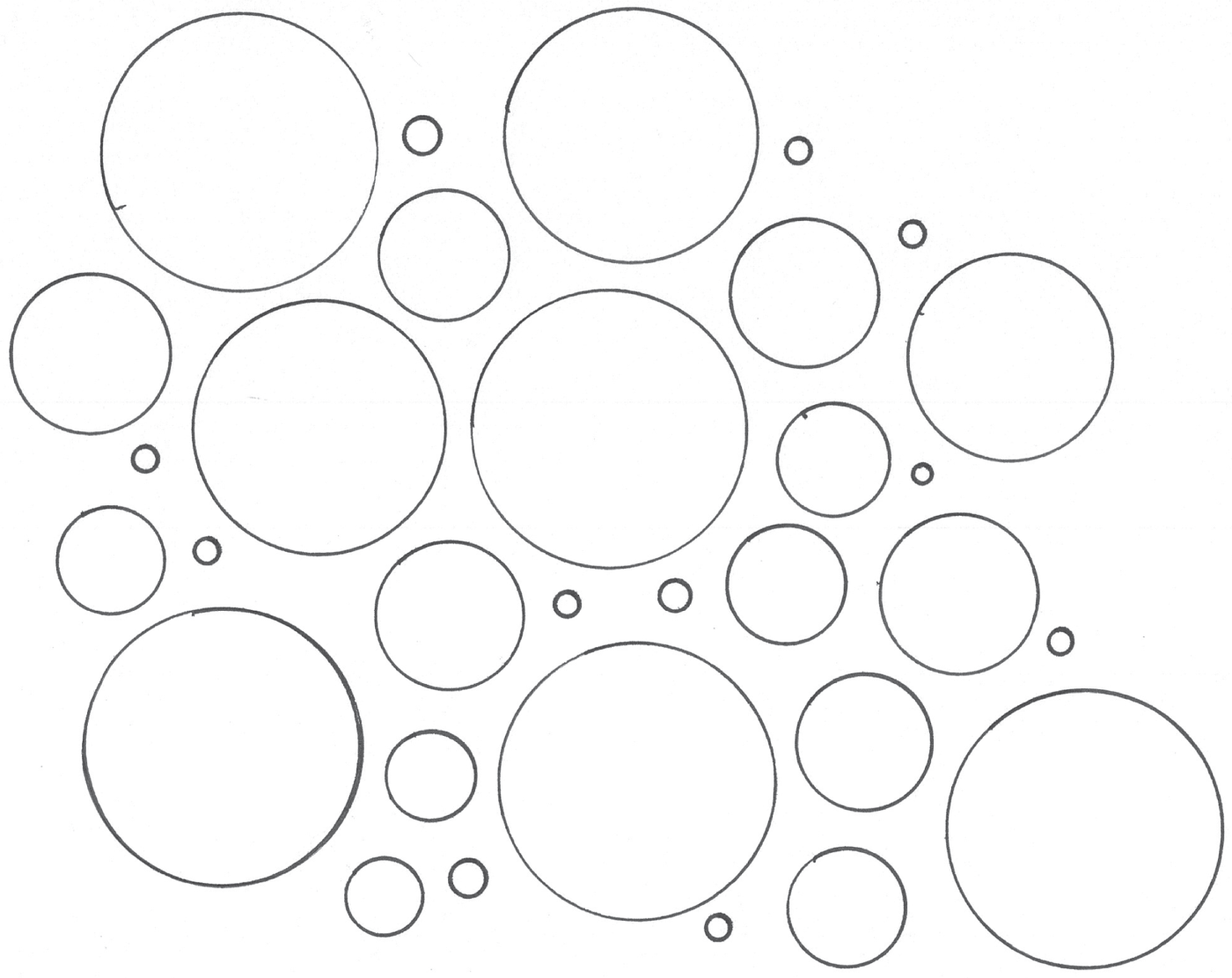
Let's start with a basic circle and a few elements we can build out of circles. Get your circle template or compass ready. Let's try drawing a bunch of circles similar to Figure 5.1. Feel free to use different sizes and fill up your paper.
Forms: Radio Groups
We'll start with the most utilitarian yet essential uses of the circle, and that's in forms. Circles are what separate a checklist from a radio group. Radio groups allow people to make only one selection within the group.
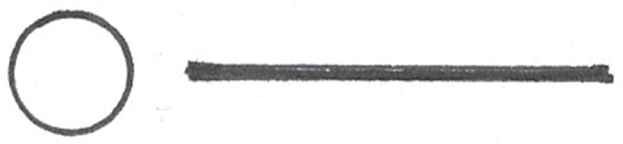
Remember how we drew the checklist? Instead of using squares and checks, let's use circles and points. Let's start with a basic circle as drawn in Figure 5.2. Let's draw a small circle that's approximately a quarter inch in diameter.

Next, just as we did with the check box, let's add a thick text line to the right of the radio button as depicted in Figure 5.3.
Radio buttons only make sense when they appear in a group, so let's draw a few more of these lockups in a stack as illustrated in Figure 5.4.

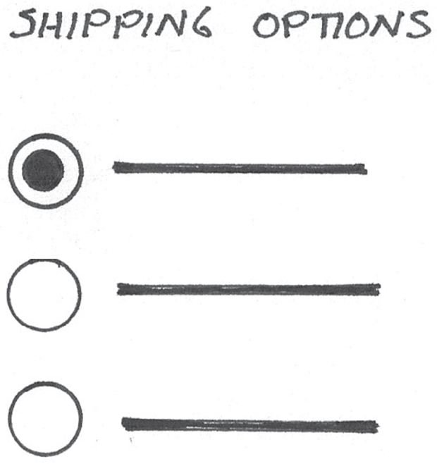
To finish off our radio group, we'll add a label and a preselected option by filling in one of the dots as depicted in Figure 5.5. A radio group enables you to select one item within the group. A good example of this is when you're ordering a product online and choosing a shipping option. You can select only one shipping method.
The Circle as a Symbol
Circles are an important element in human culture and have been a metaphor embraced by virtually every civilization that has ever existed (Lima, 2017). Important in nature and city layouts and a metaphor for a community, it's not going away anytime soon. Given its importance as a symbol, you can bet that it still remains as a key visual in today's technologically advanced society. Now, without further ado, let's jump in and explore the powerful symbolism that comes with a circle.
Status Icons
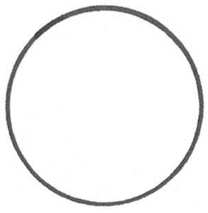
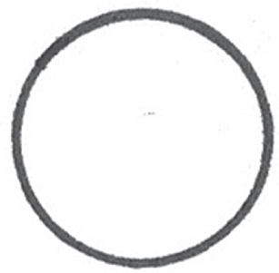
You can place any number of symbols inside a circle to create an icon. Let's start with the circle itself, as drawn in Figure 5.6.

You can add any type of character in the middle of the circle to create an icon, as depicted in Figure 5.7. An exclamation point might represent a warning or an alert. An X can represent a failure or error. Check marks might represent a positive or completed status. Flip the exclamation point upside down to create a lowercase I and we have ourselves an information icon. The possibilities are endless. Since the majority of drawings consist of many boxes and angular forms, the curved nature of the circle will draw attention, which is why this is a good form to combine with a status icon.

Time Icon
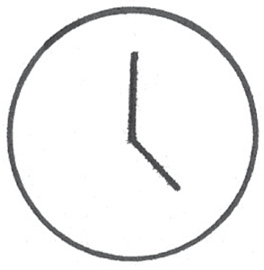
Let's use a circle to represent time. For this, we'll draw a classic representation of an analog clock with two hands. This symbol has carried its meaning for hundreds of years. Let's start by drawing a circle as sketched in Figure 5.8.
In order to draw a clock, start with the origin or center point of the circle. Draw two hands, one longer than the other as drawn in Figure 5.9. You can draw them in any direction you prefer to represent a desired time.
Emojis
At the end of the day, other people are going to use the products we're designing. In some cases, it's important to be able to express their emotion, whether it's when mapping the ways in which they use an existing product or mapping an emotional curve in a research presentation. Circles are a great starting point for creating emojis, as drawn in Figure 5.10. Let's start with a basic circle. For this exercise, it helps to keep the circle small.
By adding two points and a few curved lines, we can express a range of emotions through drawing. This enables us to bring a human element into our drawing. Check out the collection of emojis in Figure 5.11. This covers a range of emotions. I even threw in a few extras for fun. Try drawing a few of these expressions yourself.

Profile Icons
Let's draw another commonly used icon. This can be used to represent avatars and profile images. You can even use it to represent people in a process diagram or org chart. Once again, we'll start with a simple circle as depicted in Figure 5.12.

Next, we'll add another circle inside the first circle. It should be centered horizontally, but it can appear in a slightly offset location as depicted in Figure 5.13.
We can draw two lines to form the shoulder lines that will connect the inner circle to the outer circle, as illustrated in Figure 5.14.

Finally, we'll bring this all together by filling in lines as depicted in Figure 5.15.
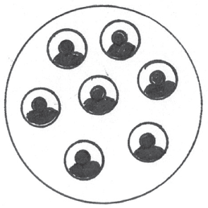
We can use multiples of the drawing in Figure 5.15 to represent a community as depicted in Figure 5.16. We can use this metaphor to represent user groups, online communities, and teams within an organization.
Charts
You can also include various types of charts to convey information. The following sections describe some of the options.
Pie Charts
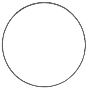
Let's try drawing a pie chart. Pie charts are great for showing part-to-whole relationships. They enable us to visualize how the parts of something make up its whole. Invented in the beginning of the nineteenth century, this chart still remains a staple in most modern dashboards. Love it or hate it, it's here to stay. Let's build a pie chart out of a circle. We'll begin by drawing another circle, as illustrated in Figure 5.17.
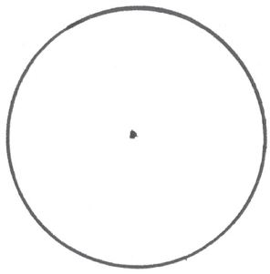
Inside your circle, mark a point at the circle's origin as highlighted in Figure 5.18. It's best to use a pencil for this since the pencil mark can be erased.
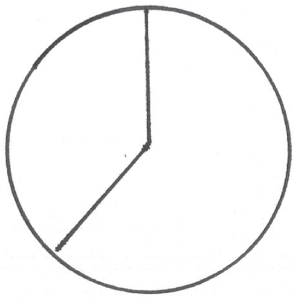
Next, we'll draw lines that extend from the circle's origin to its border as depicted in Figure 5.19. Moving in a clockwise direction, I start with my largest slice and work down from there. The result is an iconic and more readable pie chart drawing. Of course in real life, this might not be the case. We'll discuss how to adapt your drawings to account for real-world scenarios, constraints, and data in Chapter 9, “Telling Engaging Stories.”
Finally, for effect we can use shading to fill in a specific slice of the pie as depicted in Figure 5.20. This is optional, and we'll discuss shading techniques later in Chapter 6, “Illustrating Light, Motion, and Other Concepts.” In case you're interested, I used both pencil and pen to create this textured fill.

Donut Charts
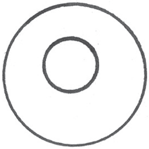
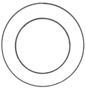
One of my favorite versions of variations of the pie chart is the donut chart. You can use the space in the empty, inner circle of the donut to highlight key metrics. Let's revisit the circle from Figure 5.17. Then, let's draw an inner circle. You can use the guides on your circle template to properly line up the inner circle. The goal is to create two concentric circles on your paper as drawn in Figure 5.21.
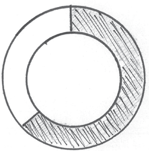
Next, we can draw dividing lines to form two segments. We can fill in one of the segments as depicted in Figure 5.22.
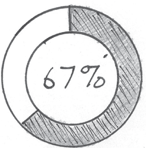
Finally, let's leverage our reason for using a donut chart by using the empty space in the middle of the donut. In this drawing, let's highlight the metric displayed in the chart as depicted in Figure 5.23.
Scatterplots
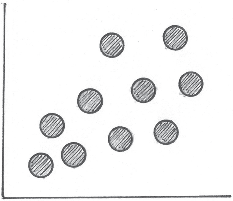
Now we will create a basic scatterplot chart. Scatterplots help us visualize a comparison between two variables. Once again, let's start by drawing a small circle about a quarter inch in diameter as depicted in Figure 5.24.

We can draw a few other circles in a cluster. For this drawing, my cluster of circles will run from left to right and from bottom to top as depicted in Figure 5.25.

Next, let's draw an x- and y-axis using a straightedge, as drawn in Figure 5.26.

Finally, we can fill in the dots for effect as depicted in Figure 5.27. There we have it. A scatterplot!
Bubble Charts
Let's take the scatterplot a step further. Bubble charts enable us to compare three variables. Each plot's size can be based on the value of the third metric. The plots begin to look like bubbles, hence the name bubble chart.
Hans Rosling created a famous bubble chart that shows the correlation between a country's income per person and life expectancy. These two variables are measured on the x- and y-axis, respectively. In this chart, Hans introduced a third variable, which is each country's population. He used the size of each country's bubble to represent its population. At the time this book was written, you could view this visualization at gapminder.org.
If you end up drawing one of these, be prepared to describe what the size of the bubble represents. To draw the bubble chart, we'll follow the same steps we followed to draw the scatterplot; however, we'll use different size circles as shown in Figure 5.28.

These are just a few elements that can be built from circles. These elements are yet another set of building blocks to add to your kit.
It's important to keep in mind that not all screens are rectangular. Take a look at the Nest Learning Thermostat in Figure 5.29. Notice how the visualizations and user interface are all based on circles.

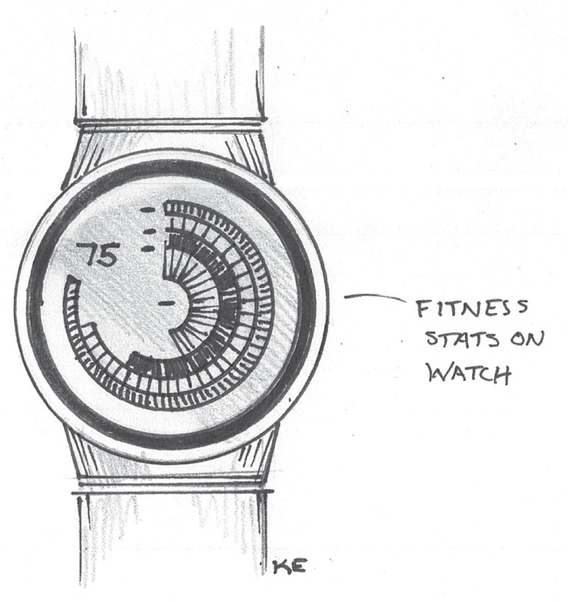
The interface on the thermostat is based on circles. The process for drawing this would be nearly identical to the one we used to draw the donut chart in Figures 5.21, 5.22, and 5.23. Why not try it out? Grab your pen and paper and try to draw the elements on the thermostat's display. As mentioned in Chapter 2, “Reframing Our Thinking,” some wearables like watches have circular screens. It's important to keep in mind that several watch screen elements can be built from circles, like the graphs depicted in the concept sketch in Figure 5.30. There are plenty of other screens that are circular in shape, and as we move into the future, circular screens will become more and more commonplace in our lives.
TRIANGULAR ELEMENTS
The triangle is one of my all-time favorite shapes. It is a symbol of strength and resilience. It's also used in many structures because it is revered as the strongest shape in nature.
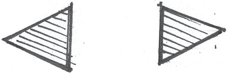
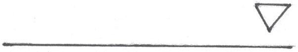
Let's see how triangles can be used in our digital product drawings—starting with Figure 5.31.
Navigation Controls
In the following sections, we will look at the options for including navigation controls.
Expand/Collapse Controls
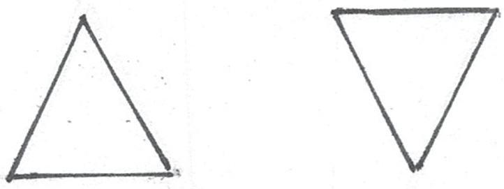
To draw an expand/collapse control, draw a small triangle that points up. Draw another one that points down. Now we have ourselves an expand/collapse control as drawn in Figure 5.32
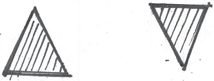
As we did with some of our earlier drawings, we might consider filling in the arrow, because it could be an indicator of something we can interact with on the screen (Figure 5.33).
Forward/Backward Arrows
To create a navigational arrow, we can turn our triangles on their sides and point them to the right or left as depicted in Figure 5.34.
Icons: Alerts, Warnings, and Anomalies
Here, we will look at various icons you can create. To create an alert icon, we'll draw a slightly larger triangle, as shown in Figure 5.35.
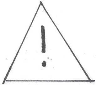
Next, we'll place an exclamation point in the middle of it, as drawn in Figure 5.36.
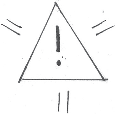
Just for fun, let's add a few small accent lines outside of the triangle to symbolize the urgency of the alert, as drawn in Figure 5.37.
Forms: Drop-Down Menus
Finally, let's draw a drop-down menu. To do this, we can draw an inverted triangle and a baseline that represents the field. The triangle should appear at the right end of the baseline as illustrated in Figure 5.38.
An alternate way to represent a drop-down is by placing the arrow inside a box as drawn in Figure 5.39.

I think it's safe to say that we're building out a robust library of common elements. So far we covered various screen elements built from circles and triangles. Next, feel free to look at some of your favorite apps and devices. Look at their screens. See if you can distill their elements down into some of these basic shapes and draw them. You can use the symbols and drawings we've already covered in this chapter.
ADVANCED ICONS AND SYMBOLS
It's time to start drawing some complex shapes and forms that you'll commonly use in your digital product drawings. This section is all about icons like the ones depicted in Figure 5.40. Some of these forms will help you describe ways in which people will interact with your product, others will focus on people themselves, the centerpiece of all of our product design work. Others will be used to enhance existing charts, graphs, maps, and visualizations we previously covered. Let's jump in!
Octagons and Stop Signs
Let's grab a pencil and draw a square as depicted in Figure 5.41. Be sure to draw lightly as we'll eventually erase these pencil lines.
Now, draw diagonal lines cutting off each of the corners of the square as illustrated in Figure 5.42.
Next, trace the resulting shape with a pen, then erase the pencil lines as depicted in Figure 5.43. You should be left with an octagon. It's okay if the shape isn't perfect. As long as it reads as an octagon, it's a success.


Now you have an octagon. You can add any number of icons and accents to this shape. For example, this can be used to represent the end of a process diagram. It can also be used to represent an alert. In Figure 5.44, I turned the octagon into a stop sign.

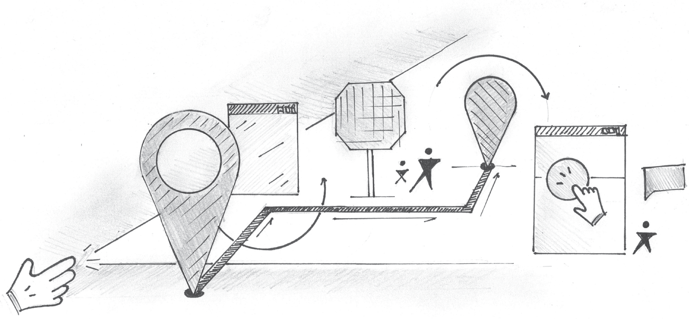
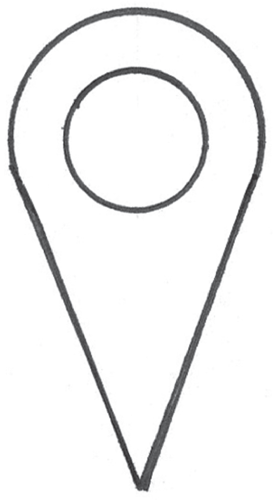
Location Markers
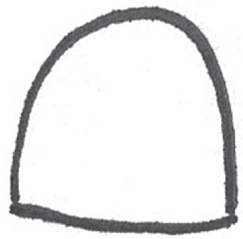
If you're not good at drawing maps, that's okay. We can use a placeholder icon to represent the concept of a location. To do this, we might simply draw an upside-down teardrop. Let's grab a circle template and get started. First, we'll draw the upper 60 percent of the circle, as depicted in Figure 5.45.
Next, we'll connect the open-ended portion of the circle by adding two straight lines that point downward, connecting to form a V shape as drawn in Figure 5.46.

Finally, we can add other accents, such as an inner circle for effect as illustrated in Figure 5.47. This isn't required, but it may fortify the meaning of the symbol.
People
People can be one of the most intimidating things to draw. When we're creating a new product, however, people are what matter most, especially if you work on a user experience team. Arguably, this is one of the most important elements in your visual language. There are several ways in which we can represent people without having to draw a perfect anatomically correct human body. Let's take a look.
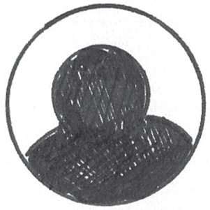
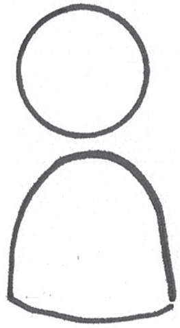
One abstract yet elegant way to represent a person is as follows. Let's start by drawing a hump or upside down letter U as depicted in Figure 5.48.

Next, we'll connect the bottom of the hump with a slightly curved horizontal line as drawn in Figure 5.49.
After that, we'll add a circle above the existing drawing as displayed in Figure 5.50.
Finally, we can add some shading to draw attention to our icon. I chose a simple hatching pattern as depicted in Figure 5.51. I'll share more on shading later in Chapter 6.

The resulting drawing may look more like a board game piece than a human but it's enough to get the point across. In fact, a lot of the people icons found in our favorite mobile apps look like this. The example in Figure 5.52 depicts how people might be represented in a workflow diagram.
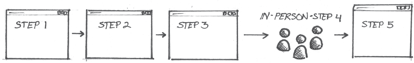
In this scenario, the people icons used in the fourth step of this workflow diagram represent a process step that is completed in person and not within an app screen like the other steps.
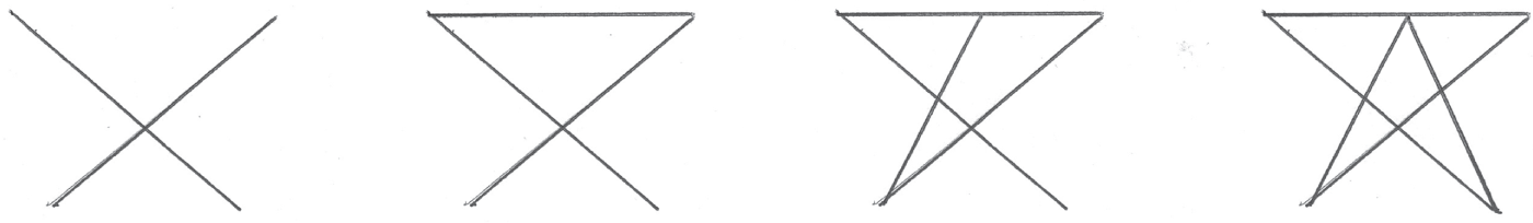
Another way to draw people is by drawing a partial star shape. Make sure the top point of the star does not cross the horizontal connector line of the next highest two points. Use Figure 5.53 as a reference when creating the semi-star shape.
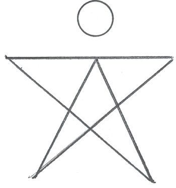
Next, let's add a circle in place of the missing point, as drawn in Figure 5.54.
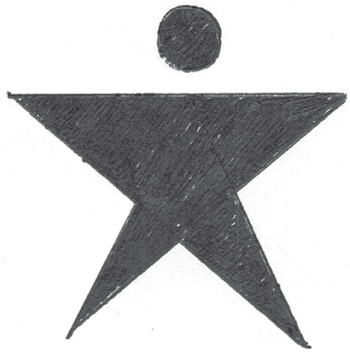
We can fill in the shape for effect (Figure 5.55). This drawing will look like a stylized stick figure.
Finally, Figure 5.56 depicts how this version of the icon might look in a process diagram. In this case we're using the icons to show people completing the fourth step, which takes place offline.

REPRESENTING INTERACTIONS
In nearly all cases, it's important to represent a method for interaction and input. This is especially true when drawing a flow of screens that represents the steps a person takes to complete a task or to achieve a goal when using your product. Let's start with the most difficult drawing. Then we'll fall back on a few easier alternatives.
Pointer Hands and Cursors
Hands are arguably the most difficult thing to draw. I've been drawing and painting since I was five years old, and I still struggle with drawing hands. To this day I don't know how I made it through my life drawing class in design school. Anyway, hands can be used to represent gestures and touch events on a mobile device. They can also be used to represent the click state of a mouse cursor. Let's take a look at how to represent a basic hand. Hands are simply a series of connected humps. Assuming we're drawing a right hand, the thumb should point in a northwest direction as drawn in Figure 5.57.
Now, let's draw the pointer finger. The pointer finger should be the longest finger and should point to the north, as depicted in Figure 5.58.

Next, add three small humps representing the remaining fingers. They should point in the same direction as the pointer finger, and they should be considerably shorter as drawn in Figure 5.59.
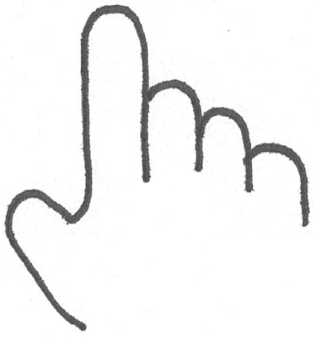
Finally, add a line that runs down to the wrist, representing the right side of the hand. You can even extend the line beneath the thumb downward if you wish, as illustrated in Figure 5.60
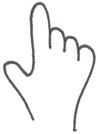
Now let's have some fun. Note the extra details added to the drawing in Figure 5.61. Let's add two accent lines to make them look like Mickey Mouse hands. This is something I always do for fun, and you'd be surprised at how many people picked up on this in the past and commented on it.
Click Interactions
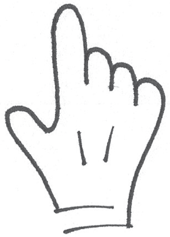
Starting with our previous drawing, we can add other accents that further describe the interaction. We can add three radiating accent lines to represent a click or selection state, as drawn in Figure 5.62. For effect, I also added a drop-shadow to this hand, since it will appear to float over all of the screen elements.
Gestural Interactions
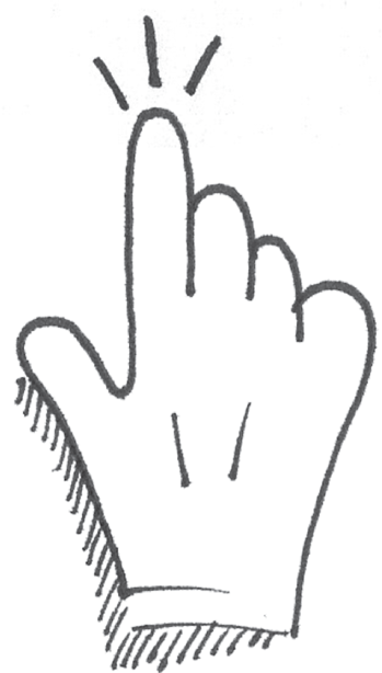
Let's revisit the hand drawing from Figure 5.61. Aside from adding a few embellishments like a drop shadow, we can add an arrow to suggest a swipe gesture, as displayed in Figure 5.63. The possibilities are endless.

Describing interactions is an essential part of any digital product drawing. It helps your colleagues understand how people will interact with your product. Let's revisit the telemedicine app concept I shared earlier in this book (Figure 5.64). Notice how the hand icon explains the video player's behavior when the screen is scrolling.

Alternatives for Drawing Gestures
So how did your hand drawings turn out? It'll probably take some practice to master. Here's a backup option for drawing gestures and mouse interactions. We can replace the hand with a filled dot as depicted in Figure 5.65. The same radiating accent lines and arrows will suggest the same click and swipe interactions as in our previous hand drawing.
