
CHAPTER SIX
ILLUSTRATING LIGHT, MOTION, AND OTHER CONCEPTS
Sometimes it takes more than the basic icons and symbols covered in the last two chapters to communicate the essence of an idea. Illustrating concepts like light, depth, form, material, motion, and texture can further explain your idea (see Figure 6.1).
There are a few simple ways to convey these concepts in your product drawings without having to have the skill or training of an accomplished artist. Let's take a closer look.
SHADING TECHNIQUES
Before we dive into the actual concepts, let's talk about shading. You can use different shading techniques to communicate many of the concepts explained in this chapter. Take a look at the drawing in Figure 6.2. In it, we can see how Leonardo da Vinci created a sense of light through the use of shading to help his viewers understand the complexities of this polyhedron form.
The drawing's light source originates from the top-left corner of the drawing. He used darker shading to represent surfaces that face farther away from the light source. Da Vinci's use of shading also gives us an increased sense of the polyhedron's material, shape, and texture.

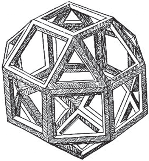
Source: Polyhedra by Leonardo da Vinci, from Luca Pacioli’s “De divina proportione,” 1509 edition
Now let's do a deep dive into shading. We will examine how shading can be used to suggest concepts like light, elevation, depth, texture, focus, and more. There are many different techniques that can be used to create shading in a drawing. Figure 6.3 highlights a few popular ones. Pointillism, hatching, crosshatching, contour shading, and scribbling are all popular techniques. We can differentiate these techniques by looking at the marks we make on the paper to create them.

Most of these techniques consist of lines, points, or both. Pointillism relies on a collection of points to create a shade, while the remaining techniques rely on lines to create the shade. The density of these marks determine how light or dark the shade appears. We will take a look at each of these techniques in more detail as we introduce and explore the concept of lighting later in this chapter.
USING ACCENT MARKS
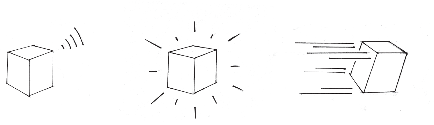
Let's revisit our knowledge of basic marks like the points and lines discussed in Chapter 3, “Lines and Points.” We can add some stylized versions of these marks to our product drawings to convey concepts like elevation, sound, motion, luminance, and texture. Figure 6.4 highlights a few examples of this.
Now, let's take a look at how shading techniques and accent marks can be used to communicate several common yet abstract concepts.
LOOKING AT LIGHTING
This is one of my favorite concepts, and understanding the basics of lighting will help you better communicate the related concepts we'll review later in this chapter. To create a light source in our drawings, we can use the various aforementioned shading techniques to illustrate the shadows.
Pointillism
Many classic paintings were created using pointillism, a technique in which painted dots in distinct patterns were used to create the larger picture. Paul Signac's painting depicted in Figure 6.5 is a textbook example of pointillism.

Source: The Port of Saint-Tropez, Paul Signac 1901, oil on canvas, National Museum of Western Art, Tokyo
In this example, he uses a set of points in lieu of lines to create every element in the scene, including the boats and buildings. He also used it to describe the water, light, and the various textures within the painting. Pointillism, while somewhat tedious, is an effective way to create shadows that suggest a light source.
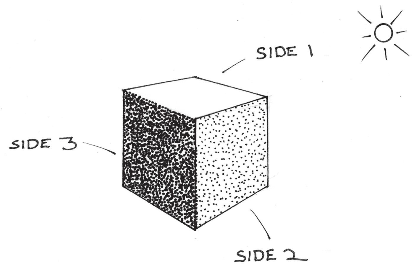
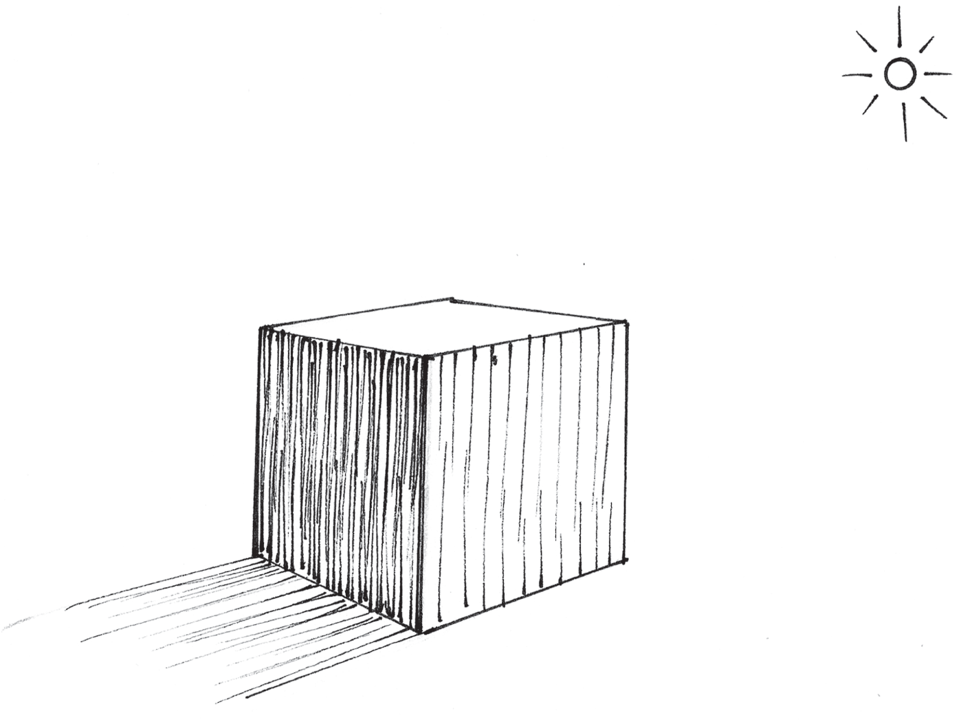
As you can see from Signac's painting, when there is a higher concentration of dots, the shadow appears darker. Notice the cube drawing in Figure 6.6. If our light source appears to the top right of the cube, the sides that face away appear darker.
Side 1 is the lightest. Side 2 is slightly darker since it doesn't directly face the light source. Side 3 is completely opposite of the light source and faces away from it. This is the darkest side, therefore it contains the highest concentration of points.
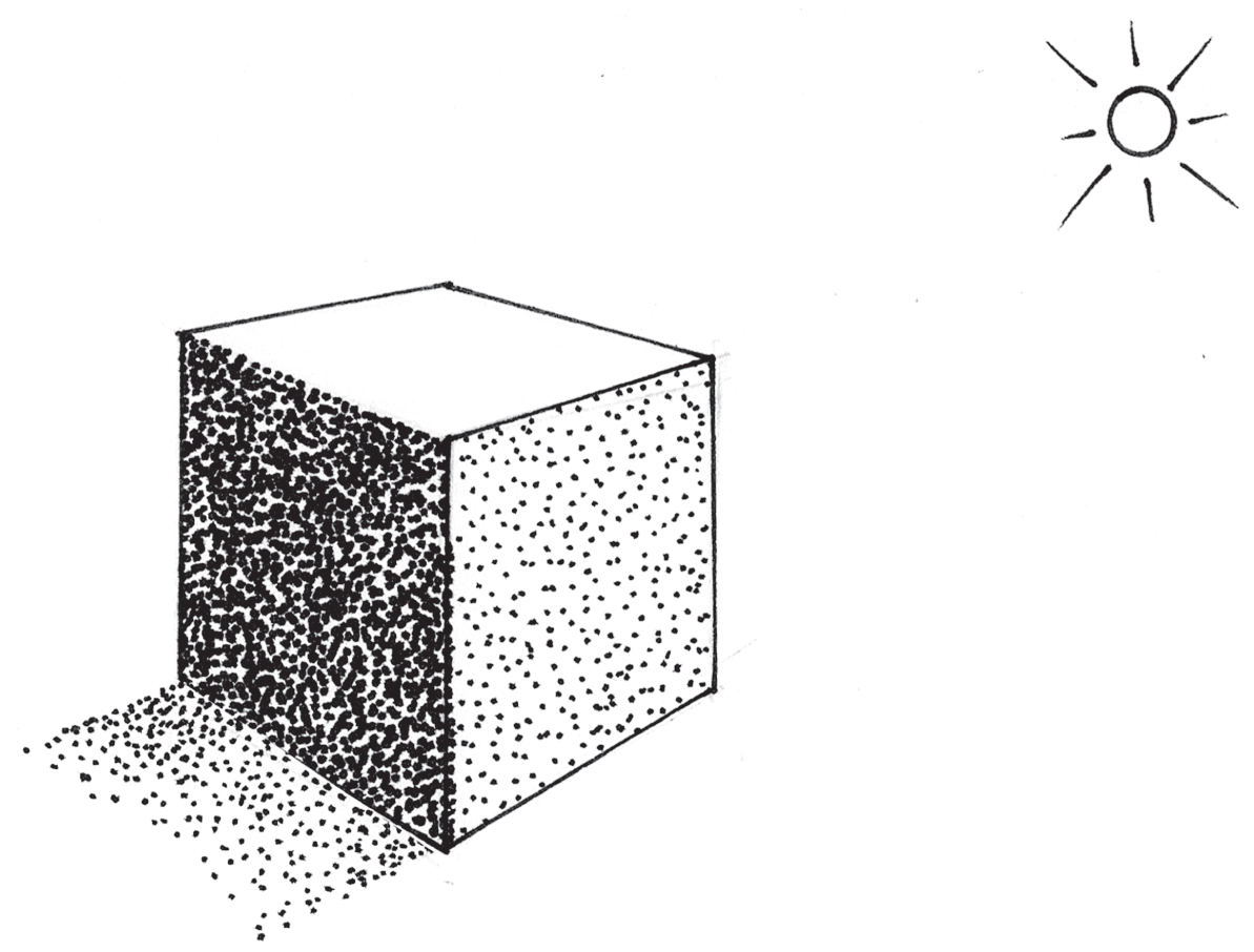
To make this more realistic, we can use a few points to suggest a cast shadow coming off of the darkest side of the cube, as depicted in Figure 6.7. This will give the object some visual weight and grounding, thus making the light source appear a bit more believable.
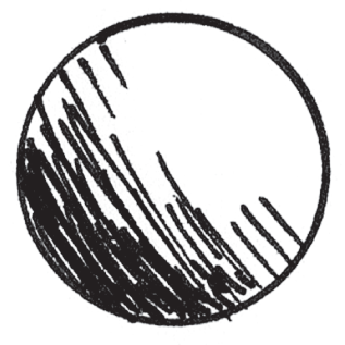
In Figure 6.8, we're applying pointillism to a sphere. Notice how the shading follows the curvature of the spherical form. We can create a gradient effect by slowly increasing the amount of points and their proximity to each other as we move away from the light source toward the lower left of the sphere, as depicted in Figure 6.8.

Go ahead and give it a try. Draw a few cubes and spheres. You can even trace the sample cube in this book and then shade it. Once you've practiced this technique a few times, we'll move on to some other shading techniques.
Hatching
Hatching is the use of lines to create shading. As with pointillism, the higher the concentration of lines, the darker the shading appears. Let's revisit our cube example in Figure 6.9. Again, notice how the hatching becomes denser on the sides of the cube that face farther away from the light source.
Now, let's look at an example of how the density of hatching lines can gradually increase to shade a spherical surface (Figure 6.10).
Crosshatching
Crosshatching is similar to hatching. It works the same way. The only difference is that the hatching lines intersect to form the shading. Again, the density of crosshatching determines the darkness of the shade. Figure 6.11 depicts an example of crosshatching.

Contour Shading
The lines used to create hatching can also follow the contour of the underlying form. Notice how curved hatching lines follow the outline of the sphere in Figure 6.12.

Now, let's have some fun. I included a more complex form, as you'll see in Figure 6.13. Notice how the hatching lines follow the contour of the ribbon.
Scribbled Shading
One last technique is to use basic scribbles. This works nicely if you're working with graphite and pencils. Softer pencils can be used to create darker scribbles. Just as with the aforementioned techniques, the higher the density of scribbles, the darker the shadow will appear. Figure 6.14 depicts how scribbles can be used to add shading to a ribbon form.

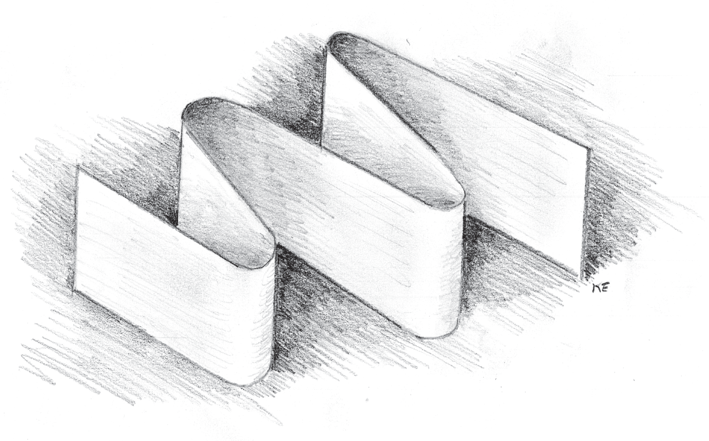
You can even use your finger to smudge or blend the shading for a smoother gradient. Personally, I'm a fan of texture, so I left behind visible pencil strokes in my shading. Just for good measure, I even threw in some shading around the object to describe the surface it's resting on.
USING ELEVATION
In the UX world, elevation is a concept used to improve the usability of a UI. It can be used to describe an element's hierarchical importance. This powerful concept is even highlighted in popular design systems like Google's Material Design. We can add elevation to any element by providing a sense of light and shading. If you think about it, most elements on a screen are layered on top of each other as depicted by the cross section concept drawing in Figure 6.15. Elevation can be considered an affordance within a UI that improves the overall usability. It can shed light on areas that have scrolling content. Let's take a look at how it can be applied to a few basic UI elements.

Modals and Dialogs
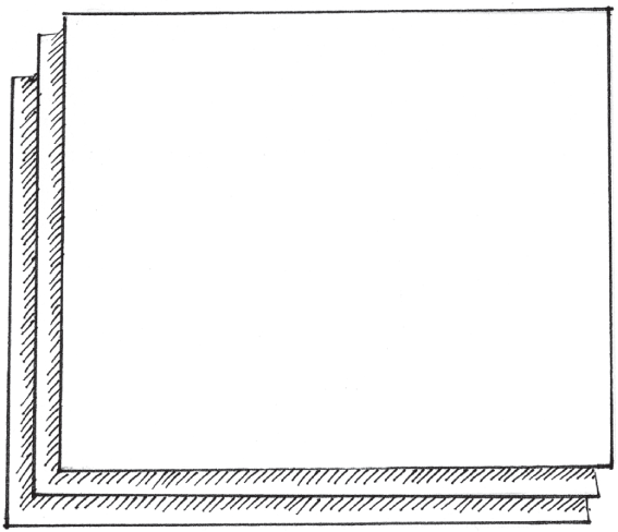
Modals and dialogs are common elements found in most desktop user interfaces. These elements are panels that pop up when you click or tap an option on the screen. They usually contain additional information and contextual actions. Modals and dialogs usually appear to be elevated off of the rest of the screen. To draw one of these elements, let's start by drawing a box inside of a box as illustrated in Figure 6.16.

Next, let's add shading along the left and bottom outer edges of the inner box as drawn in Figure 6.17. Feel free to use the shading method of your choice. The inner panel should now appear elevated.

In this example I used hatching to create the drop shadow. Assuming the light source is located to the upper right of the image in Figure 6.17, the shadow would be cast to the lower-left of the inner box. I was mindful of the direction of the hatching lines I used to create my shading. This accentuates the direction of the cast shadow and makes it more believable to the viewer.
How about we bring this panel to life and make it look like a dialog? To do this, let's add a title at the top of the inner box and some buttons in the lower-right corner of the inner box, as depicted in Figure 6.18. I'm going to fill in the right button to suggest that it's a primary action.

Some modals and dialogs use shading to draw more attention to themselves. In Figure 6.19, I'm using hatching to fill in the space between the inner and outer boxes.

In this case, I leveraged the range of tools mentioned in Chapter 3. I started with a heavy weight 0.5 mm Pigma Micron pen. I used the same pen to create the initial drop shadow. I used a pen with a thinner 0.35 mm point to add the additional shadow hatching texture that appears between the inner dialog box and the outer screen border. This difference in line weight adds an extra sense of polish to the drawing. It also helps the viewer understand the difference between the shadow and the shades used in this drawing.
Fixed Position Elements
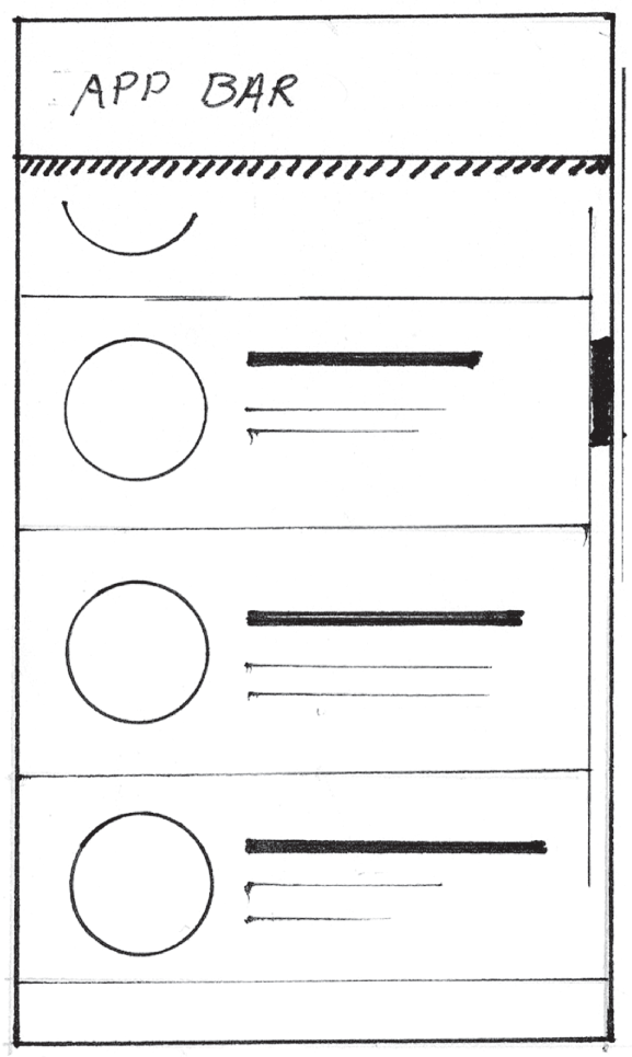
Accent lines can be used to represent stationary or “sticky” elements in the UI. By running a parallel accent line beneath the header of an app bar, we can imply that its position is fixed, as depicted in Figure 6.20.
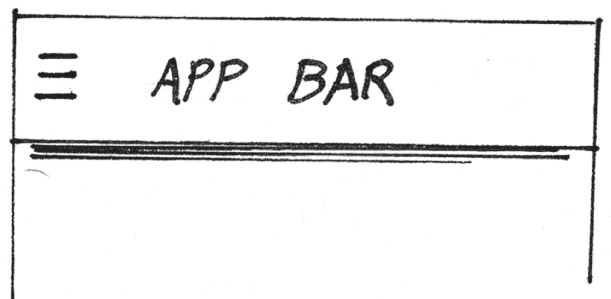
We can also add a scroll bar drawing (Chapter 4, “Building from Rectangles”) and a few list items as illustrated in Figure 6.21. When we do this, the drawing infers the app bar is always visible and the list content scrolls beneath it.

Alternatively, instead of using an accent line beneath the app bar, we can use our favorite shading technique to create a drop shadow, as depicted in Figure 6.22.
Cards
Remember the card stack example from Chapter 4? It's depicted in Figure 6.23. Let's add some additional touches to show that the cards are elevated.

We can add some hatching coming off of the left and bottom sides of the cards in the stack to give it a sense of depth, as drawn in Figure 6.24.
Interaction Hands and Cursors
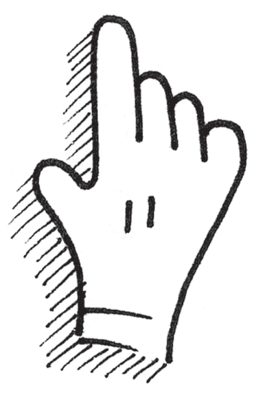
We can introduce the concept of elevation when drawing cursor hands to represent mouse interactions (Figure 6.25).

After all, the mouse cursor floats above the UI, so we should represent it that way. We can apply a drop shadow using the hatching technique as depicted in Figure 6.26.
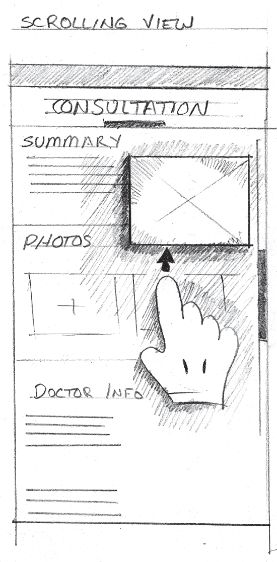
We can also use the same technique when suggesting gestural interactions within our digital product drawings. We can see an illustrated example of this applied to a mobile app layout as drawn in Figure 6.27. In this case, the purpose of the sketch was to propose a novel scrolling interaction, so I exaggerated the shadows used on our gestural interaction. The arrow shows the direction of the gesture that causes the scrolling and the popping out of the video player window.
Other UI Elements
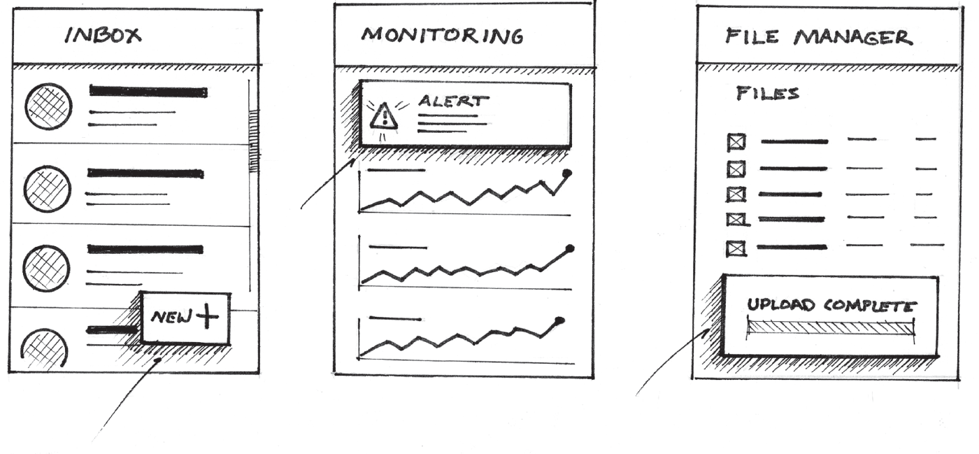
Other UI elements that are typically elevated include action buttons, alerts, onboarding information, and status indicators. Using the aforementioned techniques, we can give these elements a sense of elevation as highlighted in Figure 6.28.
These techniques can be used on any UI element you want to appear elevated or on its own vertical plane. Go ahead, give it a try!
USING TEXTURE
Believe it or not, there are a few cases in which texture can be used to help your colleagues understand your UX drawings. For example, textures can be applied to interactive elements like buttons and actions, giving them a tactile look and feel in your drawing. Figure 6.29 depicts a UI with textured avatar images that double as selection controls. To show that the icons are interactive, I used a texture.
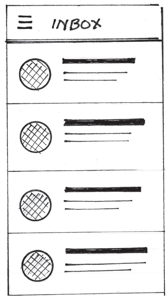
Adding these textures can help others further understand which elements in the proposed product drawing are touchable or interactive.
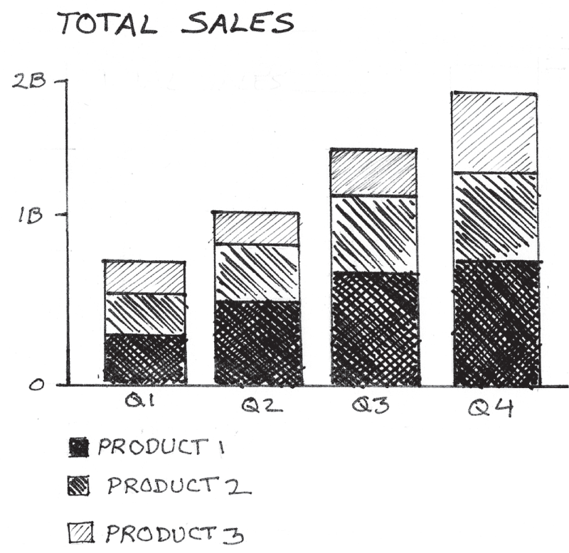
Textures can be used for conveying semantic meaning. If you're drawing a product with charts, graphs, and visualizations, textures can help your colleagues understand how they might visualize the different categories of data within your product. This can be especially useful when drawing charts that will show categories of information, such as stacked bar charts, stacked area charts, pie charts, and donut charts; Figure 6.30 shows a stacked bar chart.
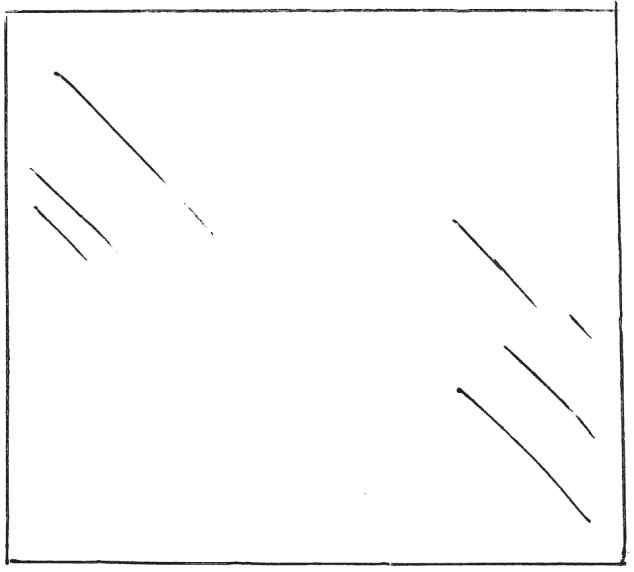
Textures can be used to represent physical materials. Let's draw another box. By placing a few diagonal lines near the top-left and lower-right corners of the box, as you'll see in Figure 6.31, we can imply that the rectangle is made of glass or some sort of glossy material. The lines can vary in length for added effect. This is a highly stylized solution that works in a pinch.
There are plenty of other ways to include texture in your drawings. These are just a few useful suggestions to get you started. After more practice and experience, you'll be able to come up with plenty of other ways to use textures to convey a new idea.
CAPTURING MOTION
This is one of the most fun concepts to capture. In a digital product drawing, we can describe transitional states between screens. Motion allows us to suggest how animated transitions may work, look, and feel. Let's try representing the concept of motion in a drawing. We'll start by drawing a railroad boxcar. To do this, we will draw a rectangle. Then, just for fun, we'll add a few small lines and circles representing wheels, as depicted in Figure 6.32.

Now, let's add motion lines behind the boxcar to imply its forward motion. To do this properly, it's important to start the lines near the object, then draw away from it as illustrated in Figure 6.33. The direction of the lines implies motion.

In addition to adding motion lines, you can imply motion by distorting the shape itself. In the example in Figure 6.34, I distorted my box, offsetting the top horizontal line of the box to imply forward motion and speed.

Figure 6.34 is an example of a motion line in a UX drawing. Some UIs feature spinning panels. Figure 6.35 highlights an example of the transition from one panel to another using a spin transition, and we can see that curved motion lines were added to further describe the transition.

CONVEYING LUMINANCE
Let's take a look at how we can convey a sense of brightness within a product drawing. We can do this by applying a few minimal lines. In addition to providing a light source, the concept of luminance can help us understand the importance of an element in our proposed digital product. For example, luminance may be applied to an icon that may light up in order to grab someone's attention when there is an active alert. It can even be applied to physical products that have LEDs that light up in order to provide visual feedback.
Let's jump in. If we draw accent lines radiating off of a shape such as the circle in Figure 6.36, it implies that the circle is illuminated.
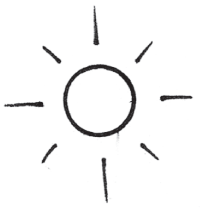
Longer lines placed farther away from the light source infer a higher level of brightness (Figure 6.37). This is a great way to communicate the concept of light without adding any shading to your drawing.

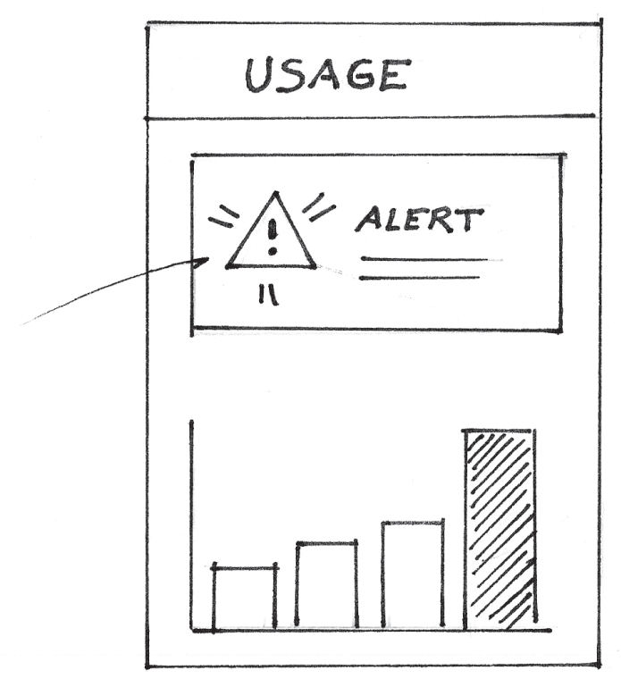
We can do the same with an alert icon, as depicted in Figure 6.38.

COMMUNICATING SOUND
We can use similar techniques to communicate sound by borrowing from the methods used to communicate the idea of luminance. When applied to alert notifications, we can use the same drawing we used for luminance to describe that the notification plays sound when it is displayed (Figure 6.39).
We can use different line styles to symbolize audio feedback as well. Take a look at an alternative method displayed in Figure 6.40.

These are just a few ways to represent concepts in your drawings. Shading is the technique used to bring most of these concepts to life. Using accent lines to represent luminance, motion, and sound can help you provide additional details in your drawing.
Just as artists use these same techniques to enable people to engage with their artwork, we can use them to enable our colleagues to connect with our ideas on a much deeper level.
I had the chance to connect with a longtime friend and colleague, Borbay, Time Out's most creative New Yorker of 2009, successful painter, NFT artist, and gallery owner. He leverages many of these concepts in his own paintings. According to Borbay, when you correctly deliver light, you deliver something more than a painting. You capture emotion, and these visuals become living breathing experiences for the viewer. Borbay's painting in Figure 6.41 provides a great example of this. In product drawing, this can be helpful when using drawings to sell your next great idea.
Borbay also uses texture to create a sense of depth and light in his works, which also invoke certain feelings in the viewer. Through the use of creative license and exaggerating concepts like light and texture, Borbay explains that you can create a painting of a field that will make the viewer cry, while depicting a lighting storm in a way that brings joy to the viewer. All of this takes practice, of course, but it's a skill that you can build as you become more comfortable over time with drawing in your day-to-day work.

Source: Radio City Music Hall, Borbay, 2020
Further thinking about how to illustrate these concepts can help you start a deeper conversation with your colleagues about how your product will look, work, and respond to its users. You can even suggest how one might feel while using your product.
Applying these concepts may feel intimidating at first, and yes, it will take some practice. You can develop these skills over time. It's important to remember that we can all draw, and as Borbay suggests, we probably had our artistic development unintentionally stunted by an early-age, throw-away comment, like, “That's not the best.” Or, perhaps we experienced an overwhelming feeling of inadequacy compared to our peers' ability. If our artistic ability is frozen in time, we can unfreeze it by proceeding with an open mind and giving it another go.