
CHAPTER EIGHT
USING FLOWS TO TELL STORIES
Now that we covered the “how to draw” content, let's have some fun. We now have a working visual library of elements, and we reviewed ways to combine them and create an array of screens and detailed UX drawings. Let's take a look at how we can use this knowledge to start telling stories.
In the last chapter, we created a basic flow. We started with a process diagram and then drew screens based on each step in the illustrated process. Most digital experiences are designed based on the key needs of the people using our proposed product, website, or experience. The solutions we create should help these people accomplish their high-priority goals and tasks.
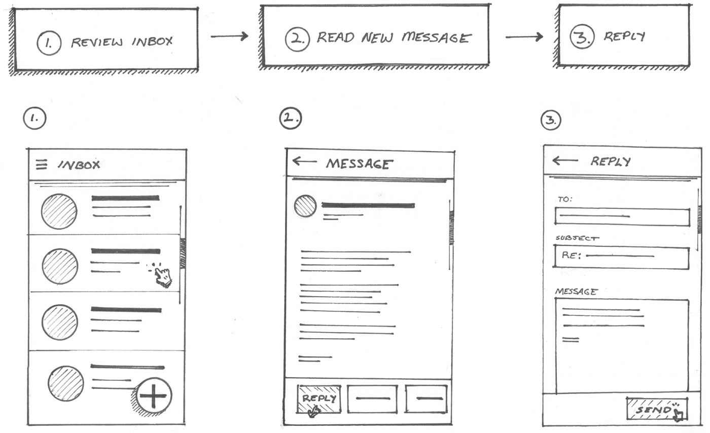
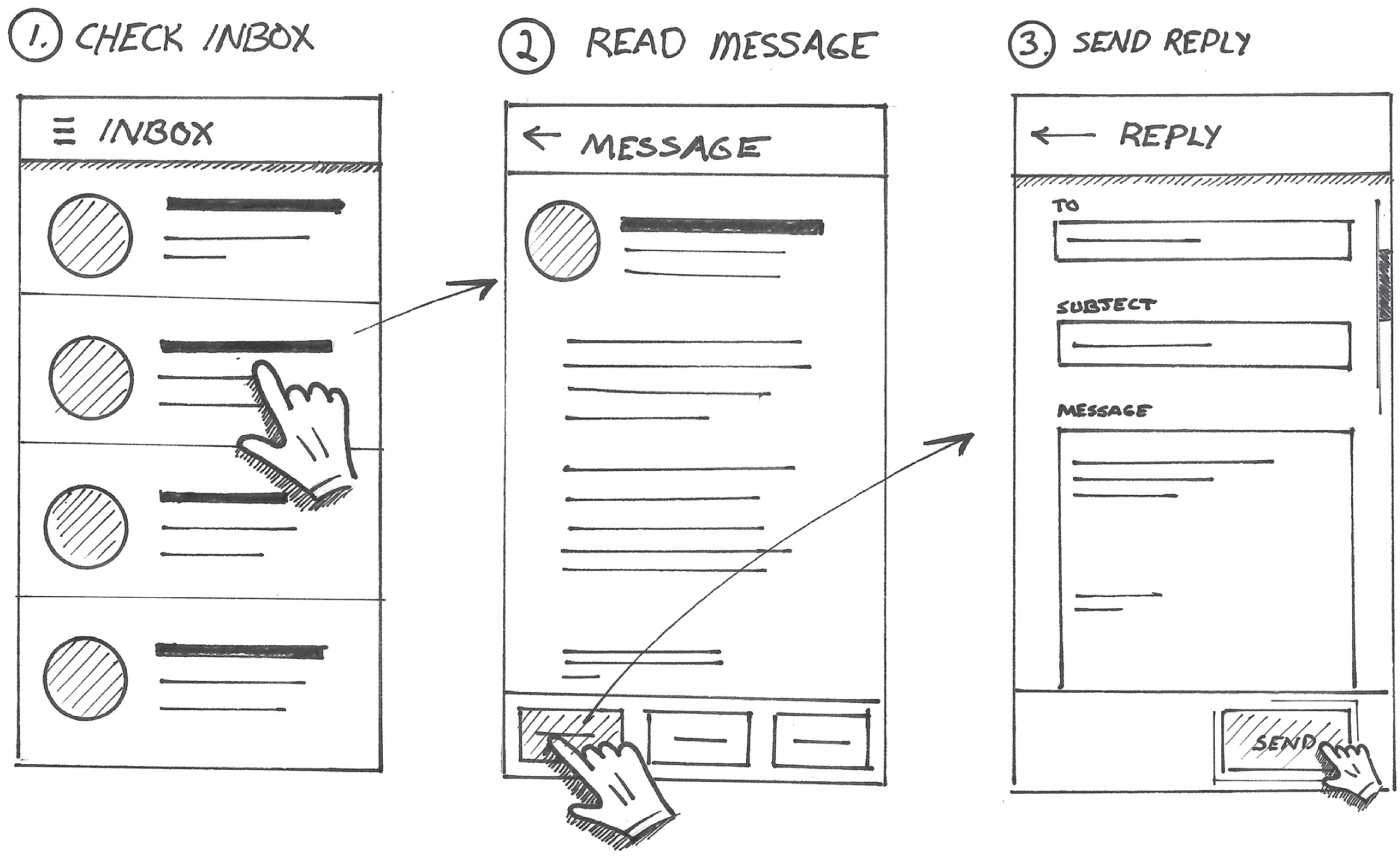
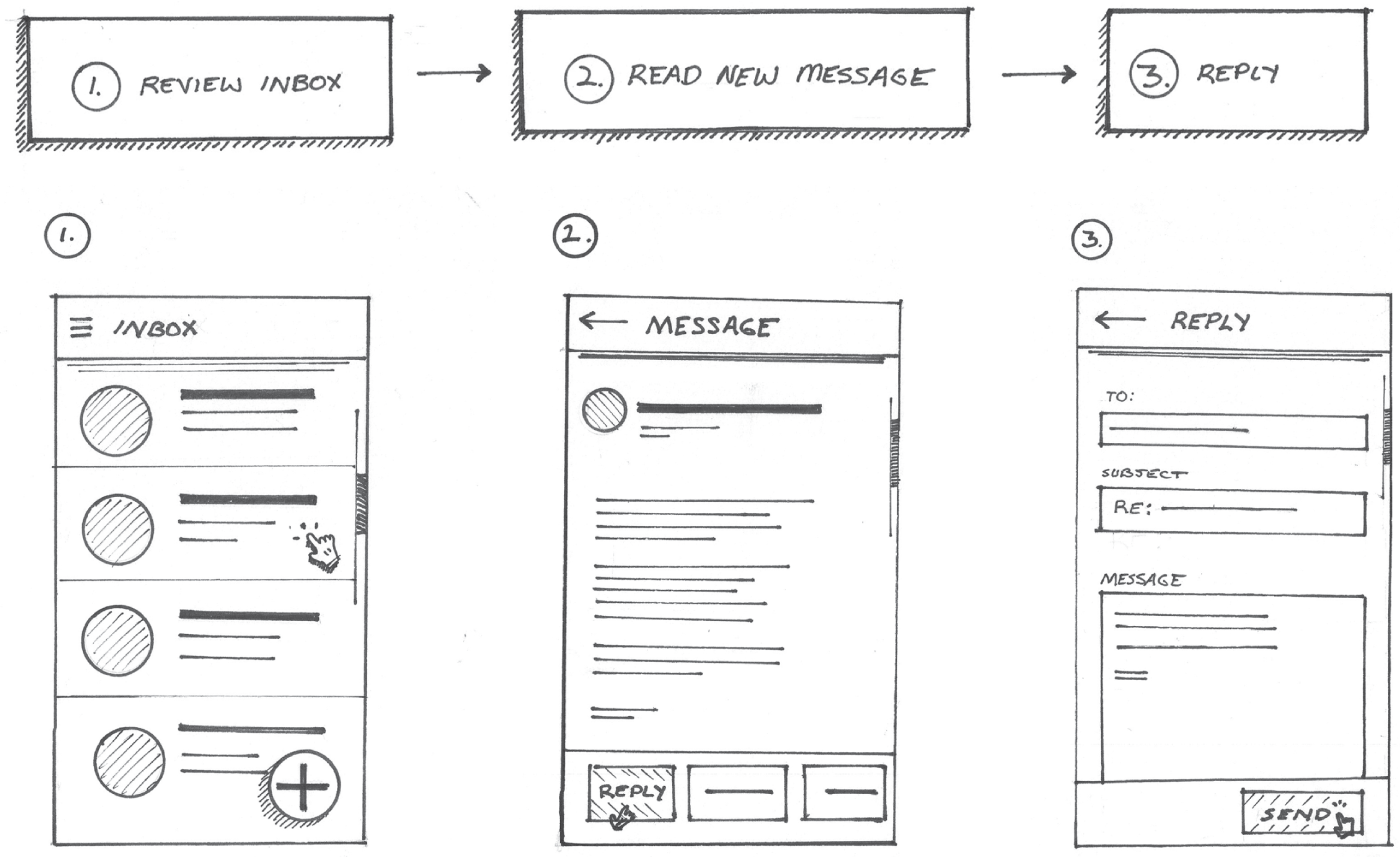
Our designs should be built around these goals and tasks. Because of this, we usually present our designs as a flow of screens, or steps, in a process that represent our proposed method for completing a task or accomplishing a goal in our proposed product. For example, let's revisit our inbox app flow from the last chapter (Figure 8.1). This design was optimized for someone who wanted to complete the task of finding an important email and replying to it.
To bring this flow to life, you first need to understand the syntax of a great screen flow, and then we'll review some additional elements that increased the impact of this drawing.
STARTING WITH THE SYNTAX
Just as there are different written languages, such as English, Spanish, French, and German, there are different visual languages. This book refers to the visual language of digital products and UX design. Let's think about the building blocks of our visual library. We can consider these items the “words” of our visual language. If we refer back to our inbox flow, shown in Figure 8.2, the interface elements, such as the email list, the message, and form controls, are the nouns. Concepts like light, motion, elevation, and texture describe these nouns. These are the adjectives of our visual language. Finally, the actions we take to move us forward in the flow, like tapping buttons, gestural interactions, scrolling, and typing our reply, are the verbs in our visual language.
A good flow starts with syntax. Just as the right syntax of nouns, verbs, and adjectives enables us to craft a coherent sentence, the right syntax of visual elements enables us to craft a coherent flow that describes the completion of a task or goal in our digital product. If we were to omit a word from a sentence, the sentence might lose its meaning. The same is true for our flows. If we omit a step from our flow, it will also lose some of its meaning. Let's take a look.
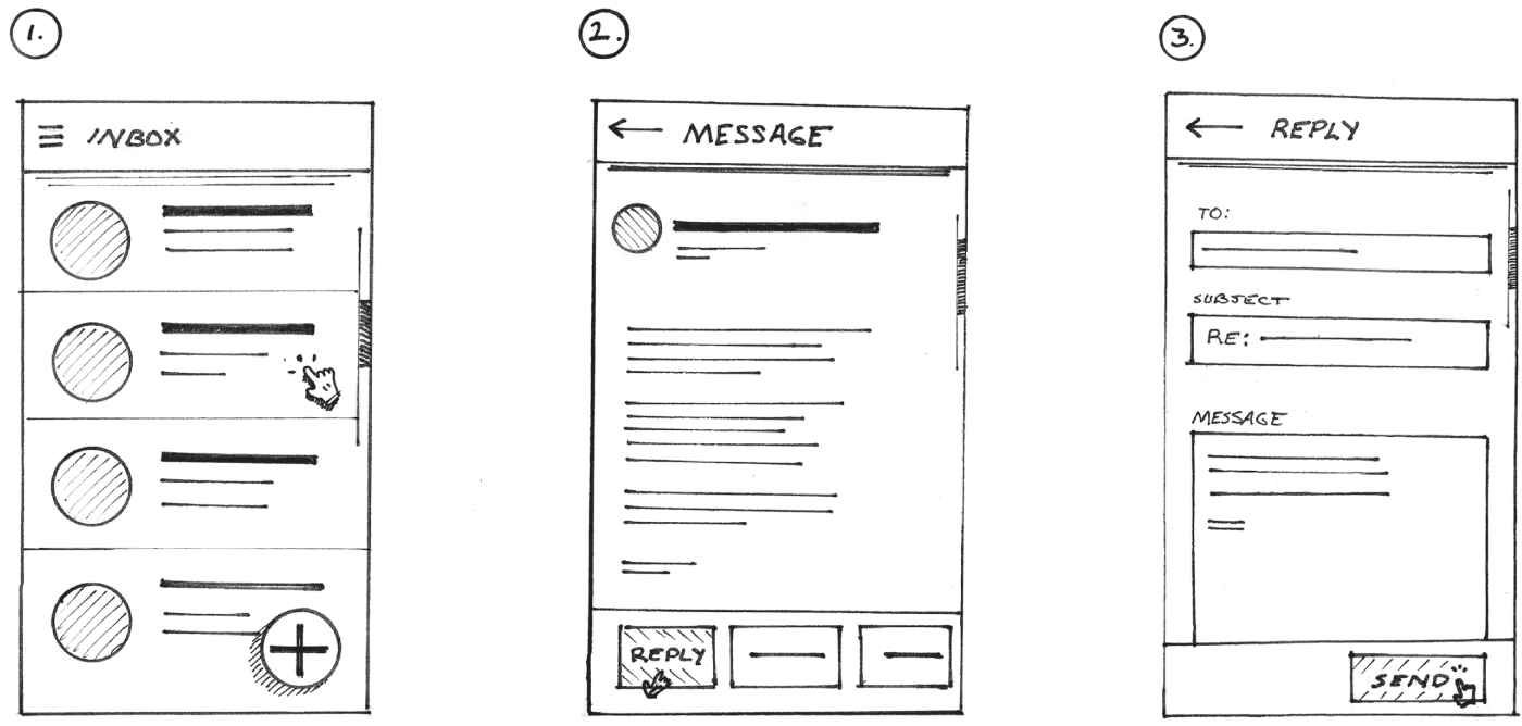
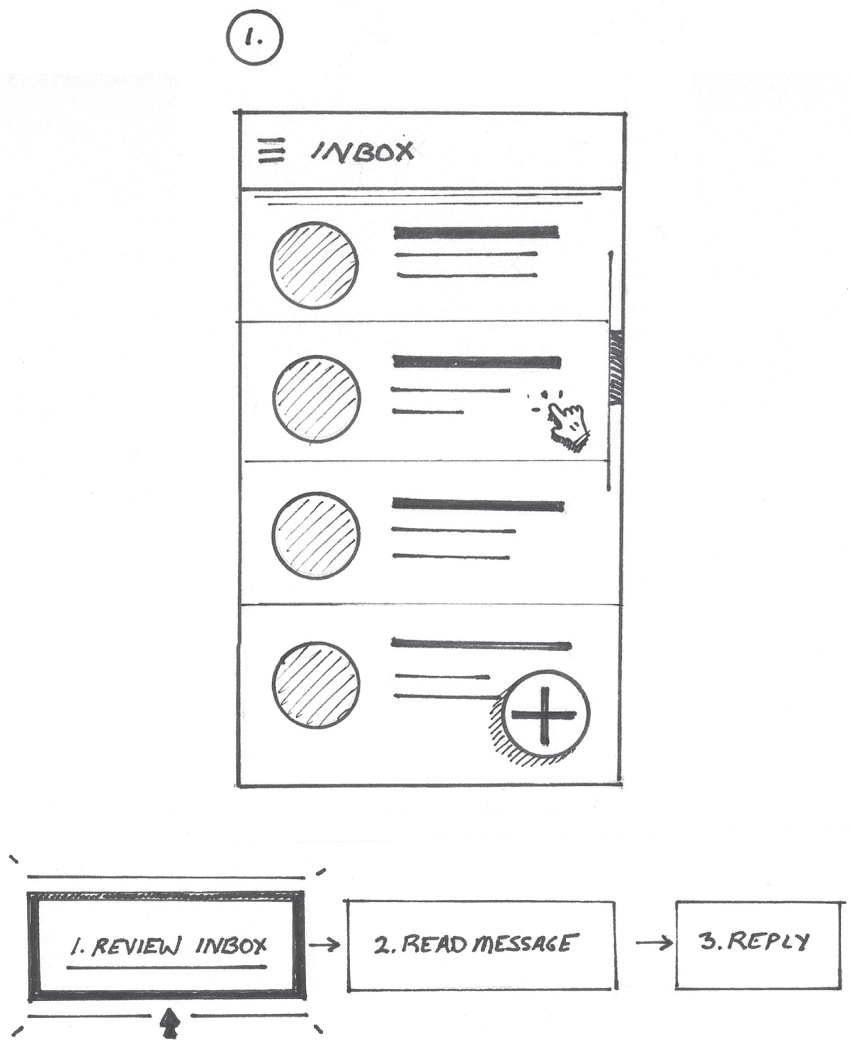
Using our inbox example, if we were to omit step 2 from the original inbox example in Figure 8.2, the flow becomes much more difficult to understand, as you can see in Figure 8.3. When looking at this, you might wonder how we got from the inbox screen on the left directly to the reply screen on the right. There's no visible option to directly reply to a message available on the inbox screen drawing.

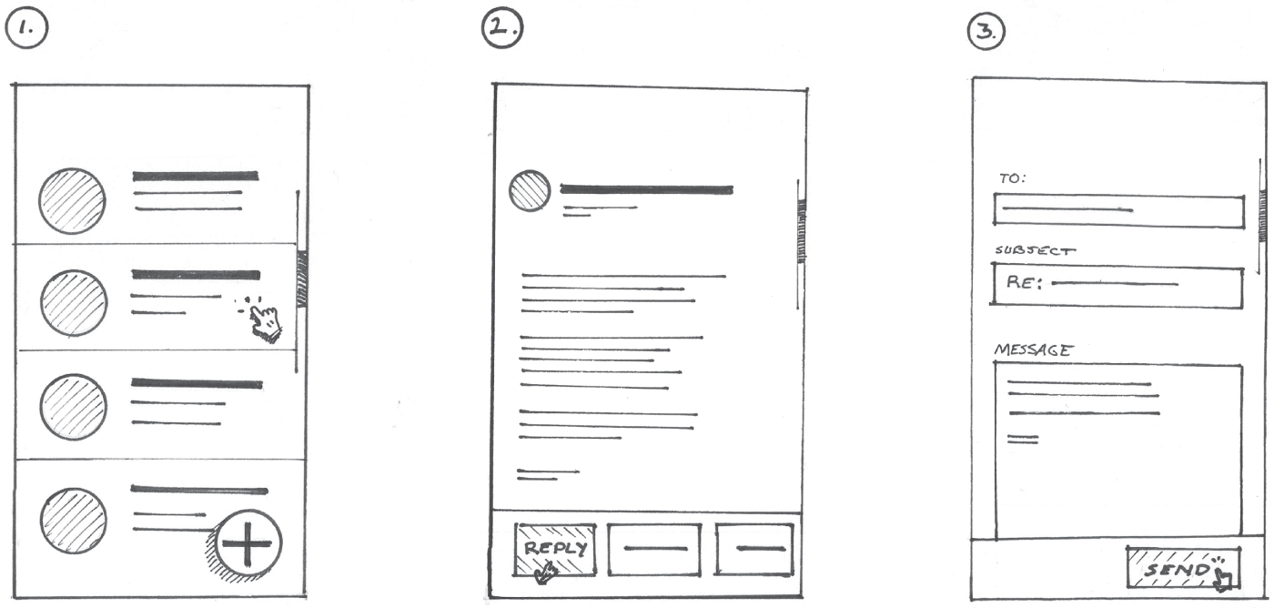
It's not only a matter of missing screens, there are key elements in each screen that help us understand the syntax of this flow. For example, if we were to remove the app bars atop each of the drawings as shown in Figure 8.4, we lose our sense of orientation within the flow. Wayfinding in this flow is much more difficult.
Remember, when you're sharing a new idea, your teammates cannot read your mind. They're seeing a representation of your idea for the very first time. It's important to make sure all the necessary elements are in each screen and each step is represented.
In the tech industry, the lingo we use to describe our work is constantly evolving. Not everyone will be up to speed on that lingo. Your drawings can further define the lingo you're using. At the time in which this book was written, the metaverse and Web3 were all the rage. Not everyone knew what that referred to at first. Drawing can be used to better articulate ideas created for evolving tech platforms and new surfaces and spaces. To do this right, the bottom line is this: our teammates need to see all the screens and understand all the steps taken to complete the goal or task at hand in our proposed product, even if some of the steps seem redundant.
SHOWING INTERACTIONS
Interactions are the glue that holds our flows and storyboards together. These are the aforementioned verbs in our visual language. They are a crucial part of any UX drawing because they are a representation of how people will interact with our products. They also show how someone will move forward to the next step in order to accomplish their goal. Helping your teammates understand how someone will arrive on a screen and how they will get to the next screen will help them better understand your ideas.
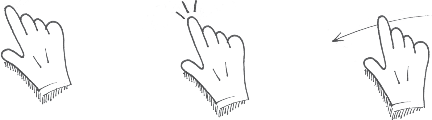
To represent interactions, we will use drawings of different cursor types and gestures as depicted in Figure 8.5 to represent different types of interaction in our flows. Drawing these individual items was covered in more detail in Chapter 5, “Building from Circles, Triangles, and More.”
In our inbox example, you'll notice we showed a small touch interaction on each screen. We can assume that this is the interaction that moves us to the next step. In Figure 8.6, I enlarged the interactions to place more focus on them.

Another way we can place focus on the sequence is to connect each screen by drawing arrows directly from the interaction to the next screen, as depicted in Figure 8.7. It's up to you to determine how much focus is appropriate to place on the interactions depicted in your flow. This does take some focus off of some of the interface details in each screen, but it's effective in showing the ease of interaction within the flow.
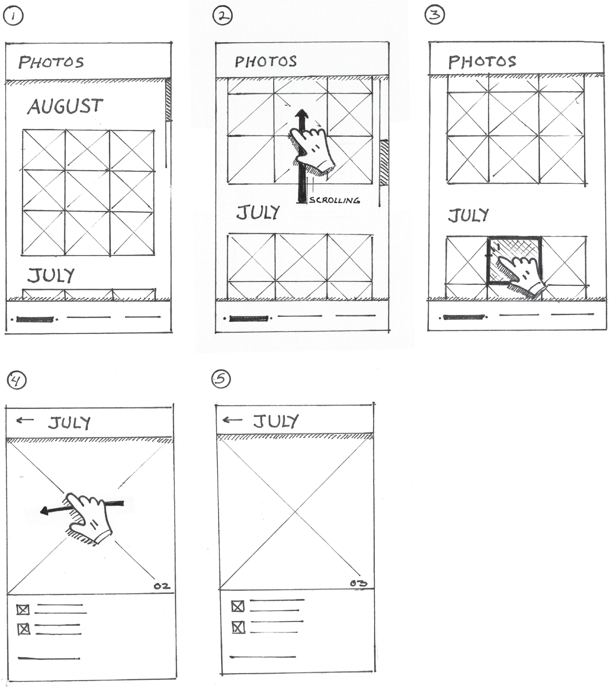
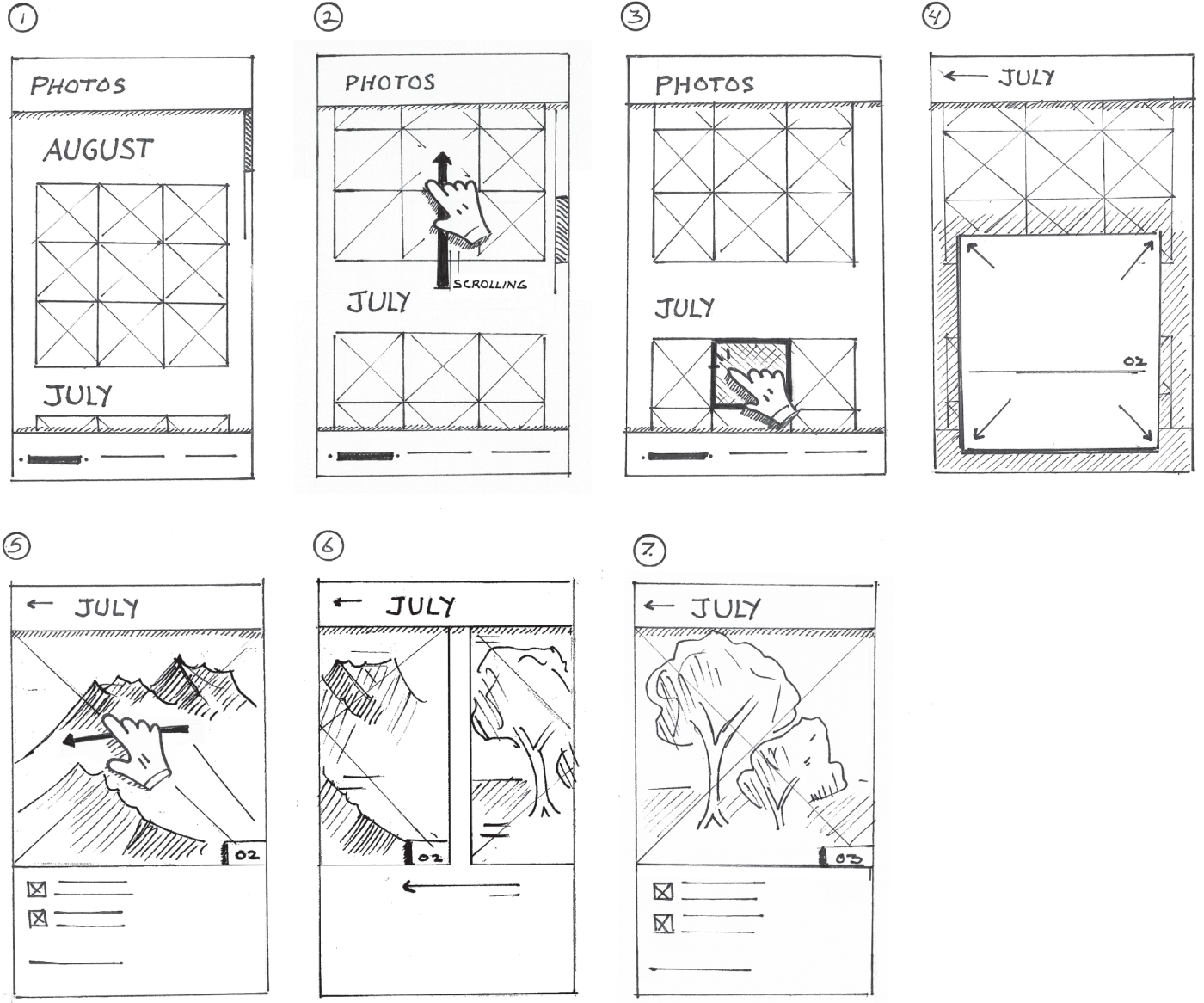
Let's imagine we're creating a flow that represents the key screens of a new photos app. The flow we will see in Figure 8.8 demonstrates how someone would find the perfect photo from last month's trip to share with family and friends. Since the app will run on a mobile device, the design will rely on gestures like swiping and scrolling to find the photo. Notice how they are represented in Figure 8.8.
JUST ENOUGH INFORMATION
If you look at steps 4 and 5 in Figure 8.8, you'll notice they look very similar. It's difficult to discern how the steps differ from each other. The gesture depicted in step 4 and the numbers 02 and 03 in the bottom-right corner of the images in steps 4 and 5 are our only indications that something has changed. Sometimes, in a case like this, we need to make it more obvious that something has changed as a result of the swipe interaction between steps 4 and 5. In this particular flow, the user can swipe to access the next image. To make this more obvious, I'm going to use some basic marks and shading to suggest the content in each of the photos as depicted in Figure 8.9.
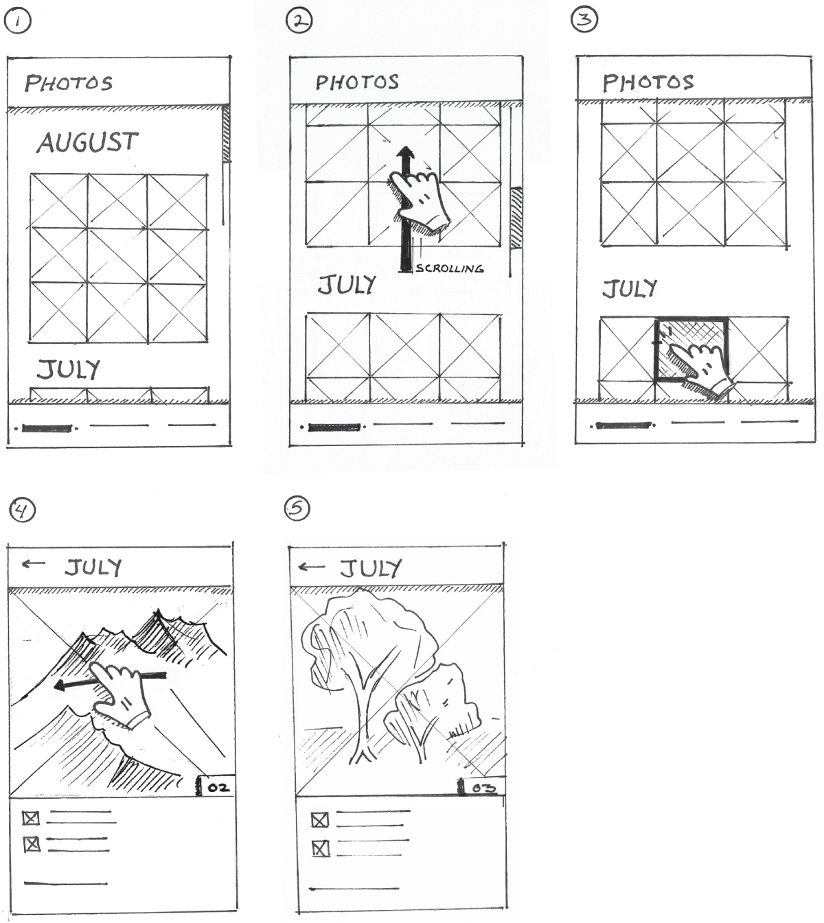
The key is that the two images look drastically different from one another. That way, people looking at this image can understand that the swipe gesture led us to an entirely new image. For the first image in step 4, let's suggest some mountains. In the image in step 5, let's suggest some trees. You can rough in different shapes or whatever you wish to suggest the change in images.
DEPICTING TRANSITIONS
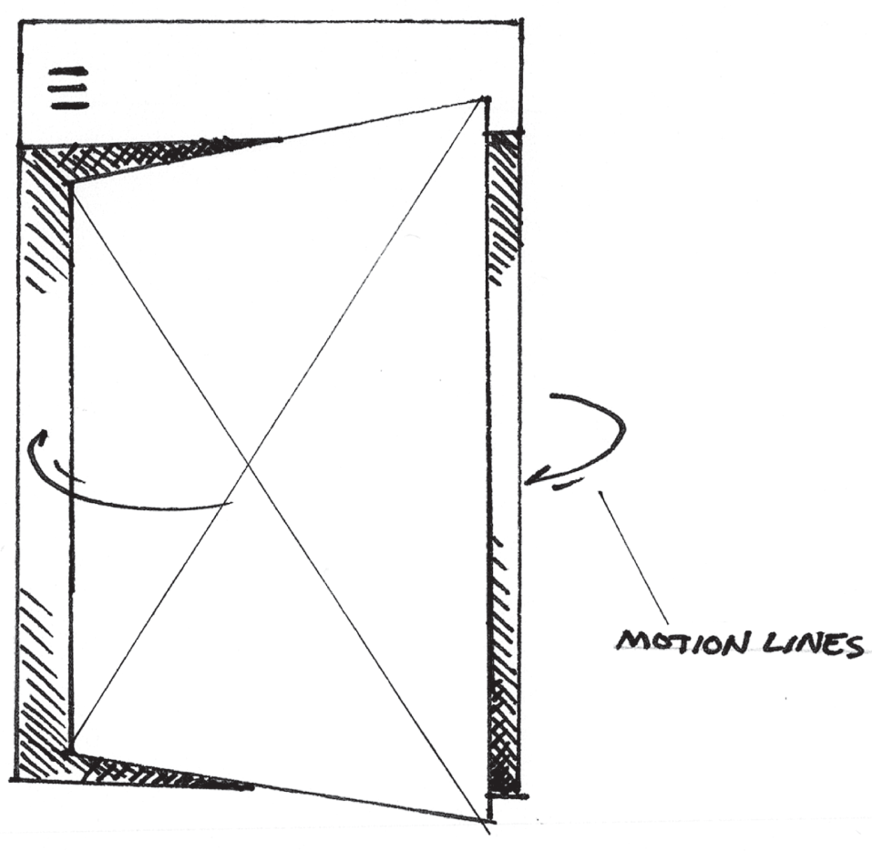
In some cases, animation is used to help strengthen people's mental model of an interface, and if done well, it can be used to help teach people how it works. Because of this, there are times when we should consider representing animation in our drawings, especially when it's a crucial part of our proposed design. We can use arrows and motion lines (Figure 8.10) to demonstrate how animated transitions might work.
Now, let's revisit our photos app flow. While the gestures do a fine job connecting the screens in our flow, there's still some missing information that will better describe the specifics of this flow. Let's add a few key transitional screens into our flow as you see in Figure 8.11. This will enable us to further describe the relationship between the interactions, the subsequent animations, and the transitions from the photo grid to individual photos.
In this example, we added two transitional screens. The first is depicted in step 4 of Figure 8.11. It shows the photo that was tapped in step 3. The photo morphs into a card. It's moving forward and taking over the screen. This helps us better understand how we transitioned from step 3 to step 5. In this transition frame, additional details of the photo card are coming into view. The arrows show the direction in which the photo card grows.
In Step 6, we see another transition screen. This time, we are seeing a depiction of the photos animating as a result of the swipe interaction in the previous step. This highlights how someone might swipe forward to navigate to the next photo in the card view. I also threw in the impression of the mountains and the trees to make the transition more believable. This also helps us understand that there's a difference between steps 5 and 7.
LABELS AND ANNOTATIONS
Since our visual library mostly consists of shapes and icons that carry symbolic meaning, we often need to add text and notes to further describe our ideas.
First and foremost, we can use labels in lieu of lines to represent screen titles and sections of content. Let's revisit our telemedicine app example. I isolated a key part of this drawing in Figure 8.12. Notice how I used handwritten labels to further describe the content sections like the video feed, summary, photos, and other details. These labels appear right in the drawing. I also used labels to show an outline of the content that will appear in this screen. This provides more detail on the hierarchy of information that would appear on this screen. This reference appears to the right of the drawing in Figure 8.12.
In addition to labels, annotations can be used to further highlight the thought process behind our drawings, the organization of our layouts, and their connection to real-world constraints and scenarios.
Figure 8.13, another isolated view of the full app drawing, points to the additional notes and doodles that begin to describe how the layout may work in landscape mode. These notes appear to the right of the consultation screen layout drawing. While the full landscape mode wasn't yet designed, these notes were used as a conversation starter to help my teammates and project stakeholders begin to brainstorm how a landscape view might work.


Let's go back to the full drawing as you will see it (Figure 8.14). Annotations help us understand that we're looking at two different versions of the same screen. The first drawing on the left is the default state of the screen. The second is a scrolling view that demonstrates how the video player remains fixed throughout a consultation as the rest of the screen scrolls. The labels above each screen and a few other noted details highlighted in Figure 8.14 help us understand this.
When you have the luxury of presenting your own drawings to your team, your annotations may be somewhat minimal. If your drawings are going to be part of a presentation that's left behind to be read later, your annotations might be much heavier because the people who will see it later may not have the context. In this case, the drawings are integrated into a slide deck that are part of a larger design presentation with plenty of complementary text.

While we're on the subject of text and annotations, I want to point out that handwriting matters. It's important that your notes and labels can be read by others, especially in your absence. While my handwriting is terrible at best, I always try to pull it together for my product drawings.
Here's something that helped me: I always admired the works of famous architects like Frank Lloyd Wright, who introduced several revolutionary new construction techniques. His ideas were clearly articulated through beautifully labeled drawings. Just as Wright was introducing a lot of new ideas in the architecture community, we are introducing a lot of new ideas in the tech industry.
At an early age I adopted a similar writing style. After all, most blueprints are labeled with all uppercase handwriting. The style invokes a serious and technical feel, something that I want to carry into my own work.
Label positioning and leveling is also important. It's okay to use a straightedge and a pencil to draw construction lines first, as suggested in Figure 8.15. Construction lines will provide a clean baseline for your handwritten label. We can use construction to align the height of the small and large capital letters in each label.

Finally, letter quality is important. We should always use clean lines to draw each letter form. It's okay if it takes longer to write each letter. Take your time! Clearly written labels will enable your teammates to do less work interpreting your drawing. Give it a try. You'll be surprised at how quickly you can elevate the quality of your existing drawings.
If you're still not feeling good about your handwriting or ability to add labels and annotations to your sketches, you might consider adding them digitally once your drawings are scanned and embedded in your design presentation.
BEING CONSCIOUS OF COMPOSITION
As you might imagine, our UX drawings can become quite detailed and complex. Illustrating a task, even with the most elegant of interface designs, may still require several drawings. It's important to think about where the sketches will live and what purpose they will serve. This will help you determine how to best arrange your flows.
For example, the composition we used earlier (Figure 8.16), where we show everything at once, including the workflow diagram and corresponding screens, works well if you have a dedicated UX space and you're going to hang up your drawings on a large wall. That method also works well if you're using a whiteboard.
If you're going to be dropping your sketches into a digital slide deck, or if you're creating a multipage presentation doc, your flow might span several pages or slides. In this case, you might consider showing one screen per page as suggested in Figure 8.17. Notice how we're using the process diagram on each page for additional context and wayfinding purposes. The corresponding step is highlighted in the diagram at all times.
Minimaps can be a crucial wayfinding mechanism, especially in a long flow with many screens and steps. If your product's information architecture is more important to your team, you can show context and location by drawing on each page a mini–information architecture (IA) map instead of the process diagram. You can map the screen to its place in the IA for each process step illustrated, as suggested in Figure 8.18.
These are just a few examples of how you can create a flow. If the flow is going to break onto multiple pages, it's important to consider what element will provide the greater context on each page of the flow, whether it's a process diagram, IA map, or some other drawing. The possibilities here are endless, and I can't wait to see what you come up with as you start to include drawing in your product design process. I will provide more details on how you can combine different types of drawings with your flows to tell an engaging story in the next chapter.
No matter what composition you use for your flow, there's a few tactical things you must consider in order to improve readability. Drawings can be quite complex, so it's important to provide a starting point in every flow. Think about the reading direction of your culture. Western cultures read from left to right and top to bottom. With this in mind, the first screen should appear at the left or top of your flow depending on its orientation, as you will see highlighted in Figure 8.19. I highly recommend numbering the steps to further establish the starting screen in the flow.

Highlighting the sequence and direction of the flow is also important. Numbering is a nice way to do this with linear flows. Some screen flows may include decision points and dependencies and highlight multiple outcomes. For these, I highly suggest using arrows to connect each of the screens, as highlighted in Figure 8.20.
Finally, readability can be improved through well-aligned drawings. Screens in a horizontal flow should be vertically aligned with each other. Screens on a vertical flow should be horizontally aligned with each other. Additionally, I suggest making sure some of the key elements in the screen are also aligned. That way your flow is optimized for readability. You'll want your teammates to focus on the content of the drawing rather than how it was drawn.

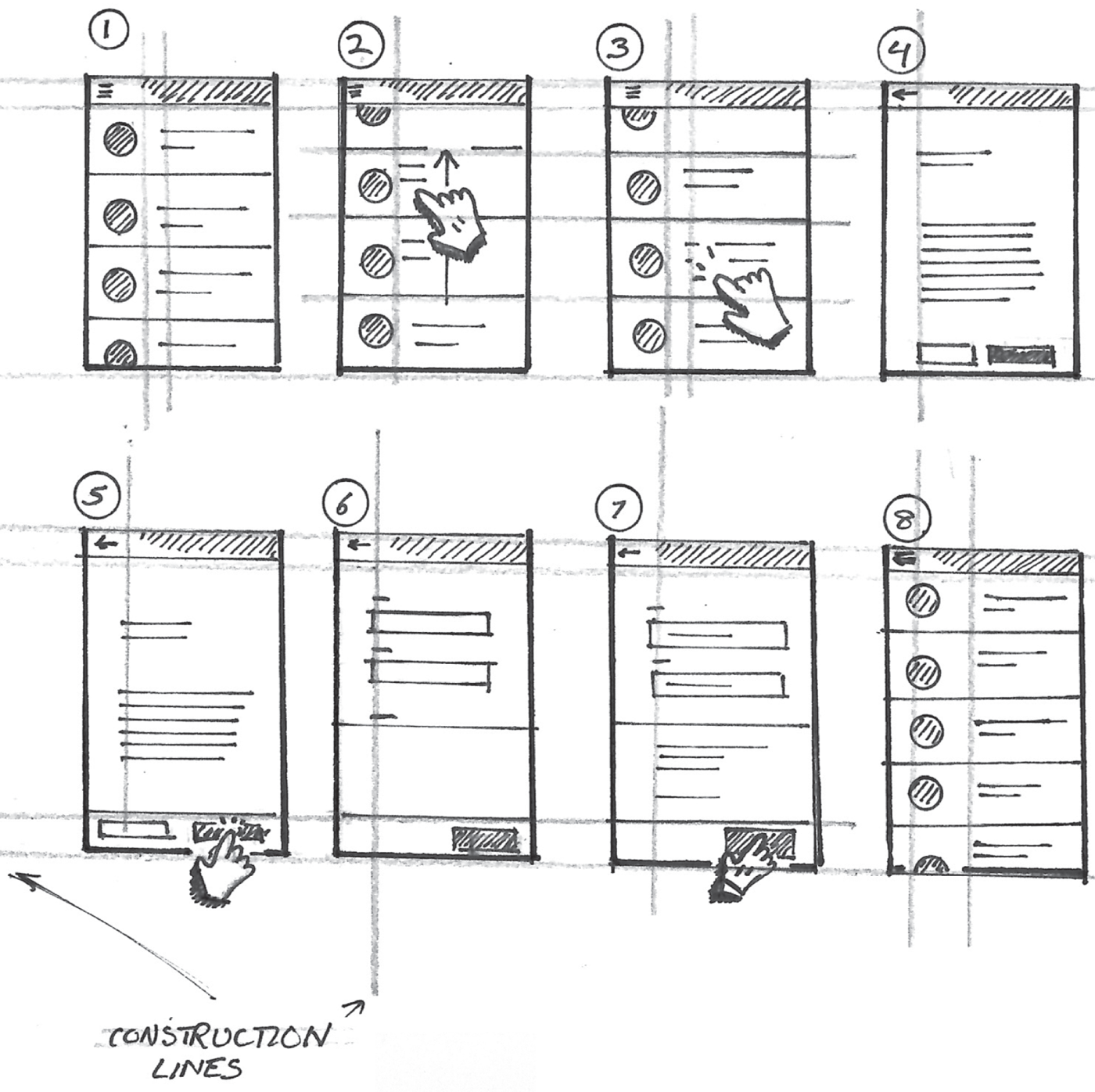
When I start a new drawing, especially for a design presentation, I use construction lines drawn with pencil to make sure my screens and their elements are properly aligned. Take a look at Figure 8.21. This example shows the construction lines I used to draw the flow depicted earlier in Figure 8.19. Once you apply ink to your drawing, these lines can be erased and no one will ever know they existed.
I can't stress enough the importance of this, especially if you're wondering how to draw with the elegance and polish of a seasoned UX designer. Clean alignments of screens and their key elements will enable people to focus more on the content of your flows and less on how they were drawn.
Using a flow is the best way to develop and share new designs for screen-based products. It helps you and your team focus on designing the best possible methods for your product's users to accomplish an important task or achieve their goals using your product.
Thinking about the syntax of your flow will help your teammates and stakeholders better understand your ideas. Annotations will help you further describe the steps and key details in your design. Considering where your drawings will live and how they will be consumed by your peers will enable you to make better decisions as to how to structure your flows and optimize their layouts for readability.
These considerations will enable you to elicit the right feedback from your team, and it will enable them to focus on what matters. Now that we covered the basics of a flow, let's talk about how to use what we already know in order to tell a rich story that will contribute to a better outcome.