
CHAPTER NINE
TELLING ENGAGING STORIES
Now that we're assembling our drawings into flows, let's have some fun and take things a step further. Let's focus on the art of sharing drawings with colleagues and enabling them to connect with your ideas.
One of my favorite paintings is the Great Wave Off Kanagawa, as illustrated in Figure 9.1. Do you know what this painting is about? Take a guess. At first glance you might suspect that it is a depiction of a tidal wave, or a ship that's about to capsize. After all, these elements are prominently featured in the composition.
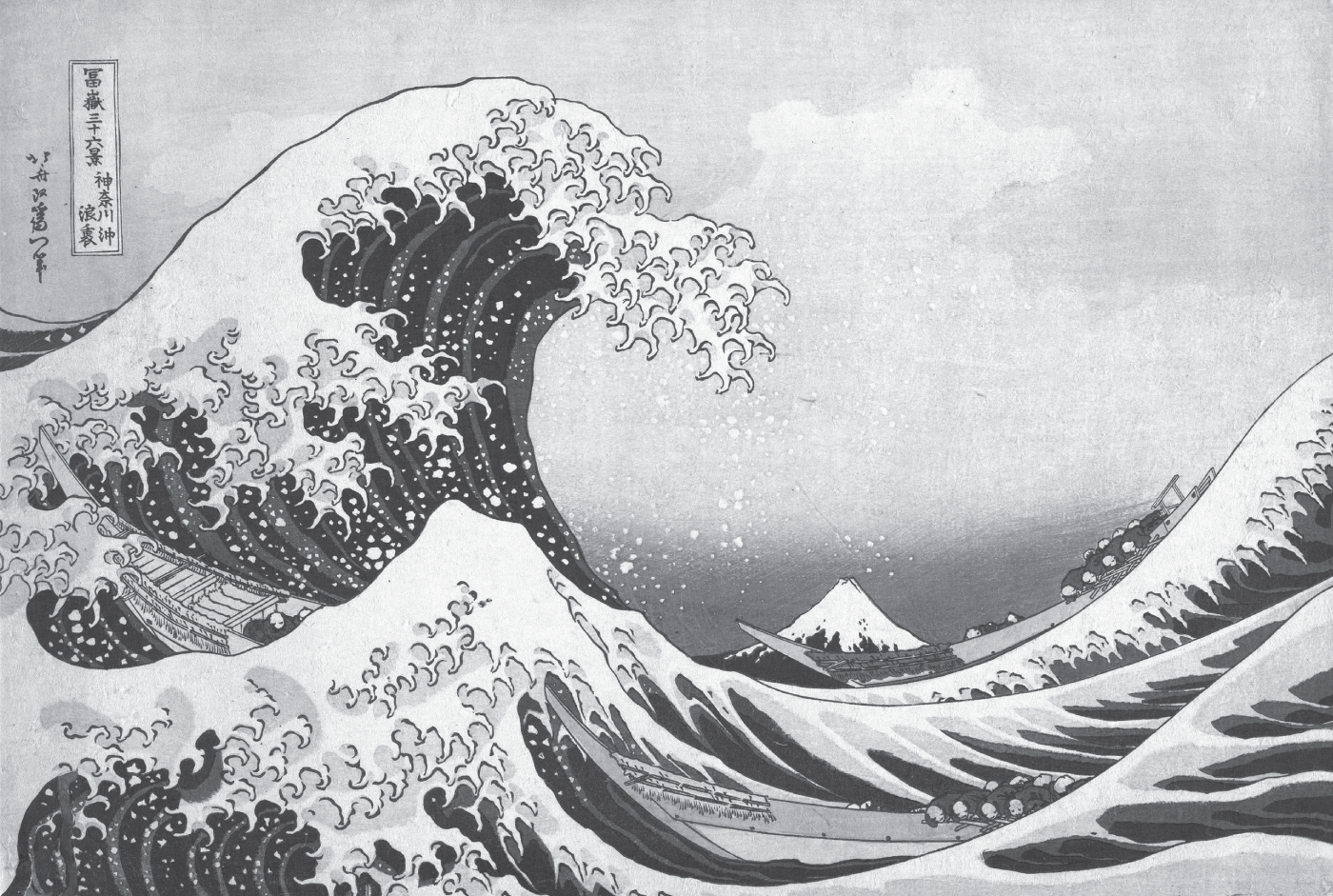
Source: The Great Wave off Kanagawa, by Katsushika Hokusai
It turns out that this is a depiction of Mount Fuji, which is pictured in the background. In fact, The Great Wave Off Kanagawa is one painting in a larger series, Thirty-Six Views of Mount Fuji. Figure 9.2, Figure 9.3, and Figure 9.4 highlight a few pieces from this series. You'll notice that each painting in the series features a unique composition that provides a view of Mount Fuji. The volcano is more prominently featured in some of the works and less in others. It typically appears as a background element.
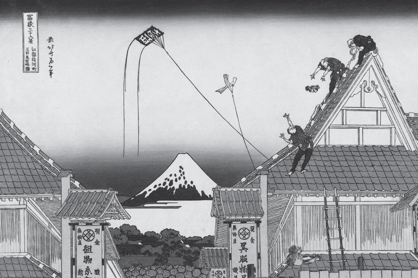
Source: Part of the series Thirty-Six Views of Mount Fuji, no. 02, by Katsushika Hokusai

Source: Enoshima in Sagami Province. Part of the series Thirty-Six Views of Mount Fuji, by Katsushika Hokusai

Source: Honjo Tatekawa, the timberyard at Honjo, by Katsushika Hokusai
Manuel Lima, who is well known for his work in data visualization and the author of the foreword to this book, also published a wonderful article comparing Mount Fuji to a data set. In the article, Manuel explained how there are infinite ways to view the data set, just as Hokusai, the artist, created different ways to view Mount Fuji in his series.
It turns out, just as Manuel thinks of a data set as Mount Fuji, we can think of our ideas as Mount Fuji. There are endless ways to view them. Our drawings may provide one or many views of an idea. We curate and arrange several of the elements in our visual library into a composition to create that unique point of view. This point of view is ultimately passed on to our colleagues that we're sharing the drawing with. What do we want them to see? What do we want them to take away from our ideas? How do we want them to feel about them? What is important for them to focus on? These are just a few of the considerations we will take into account when drawing our view of an idea.
The results of the compositional decisions set the purpose and meaning of the visual statement and carry strong implications for what the viewer receives. (Dondis 1973, 20) In order for our drawing to resonate with colleagues, it's important to give them a view of our idea that is realistic, engaging, and grounded in reality. Let's take a look at a few ways to do this.
This is going to be helpful when you're creating drawings to share with colleagues. It will help your teammates connect with your ideas on a deeper level, and it will enable them to provide more thoughtful feedback and give you the ability to build on your ideas more effectively, thus moving the design thinking process forward. After all, design happens best in a group. Let's jump in and explore techniques for making our drawings more effective through storytelling.
REAL-WORLD CONSTRAINTS
First and foremost, as we're creating our UX drawings, we always need to keep in mind real-world scenarios and constraints that will affect our decision-making throughout our product design process. Drawings that are not connected to reality will rarely lead to a successful outcome. Even when I'm facilitating a design workshop, I notice the drawings that lack consideration for real-world constraints are usually quickly discarded by the team. With that all being said, it's not difficult to connect your ideas to reality. Let's take a look at a few things to consider when grounding ideas in reality.
Start with Content—Everything Else Follows
Years ago, when I was just entering the professional world as a young designer, I cared a lot about visual design, maybe even too much for my own good. In fact, I was formally trained as a visual designer, and my degree is in fine arts. Shortly after graduating, I landed my first job at a small mom-and-pop shop advertising agency in a small Pennsylvania college town. I designed several microsites and online promotions for Scripps Networks, Lutron, and Yahoo!
During this time, I was encouraged to sketch my early ideas, just as we did in design school. I would review the copy deck created by the copywriter; then I'd start sketching different layout options and considerations for big ideas and visual design themes that would bring the copy to life. Sadly, in doing this, I wasn't as focused on the content itself as much as I was the overall design direction.
When I moved from concept sketches to creating computer-generated designs, I started working with actual content. During this time, I realized my early drawings were useless and got me nowhere in the process. They were just crude marks on a piece of paper and nothing more. They meant absolutely nothing because they were content-agnostic layouts. They didn't account for the amount of content, whether or not it was user-generated or editable or had the potential to scale up. At the time, I wondered why drawing was even supposed to be helpful. This was an honest rookie mistake; however, it made me skip the drawing part of the process for a good five years, which showed in my design work.
It wasn't until slightly later in my career, when I was working at Electronic Ink, a well-respected UX consultancy in Philadelphia, with a more experienced team with seasoned leadership did I understand the value drawing could provide. After watching my colleagues and observing their process, I wised up and realized that content comes first and everything else follows.
Once I started analyzing the text, its main points, and the underlying story it supported, I began to think about properly developing my ideas through drawings. I started thinking about how to better integrate the content with a visual experience in a proper flow and tone. I started thinking about how to incorporate large and small chunks of content into different sections of the website layout, thus creating a much better web page design.
Information Sources
This story from my early career focuses on websites; content is still king when it comes to a digital product's interface. When thinking about the components and screen-based elements in your UX drawing, think about the information that will be populated in these elements.
If you're not working with static content, then a lot of questions will arise. Where will it come from? Is it available today? How often will it be updated? Is it necessary to show when it was last updated? What is the plan for maintaining the content moving forward?
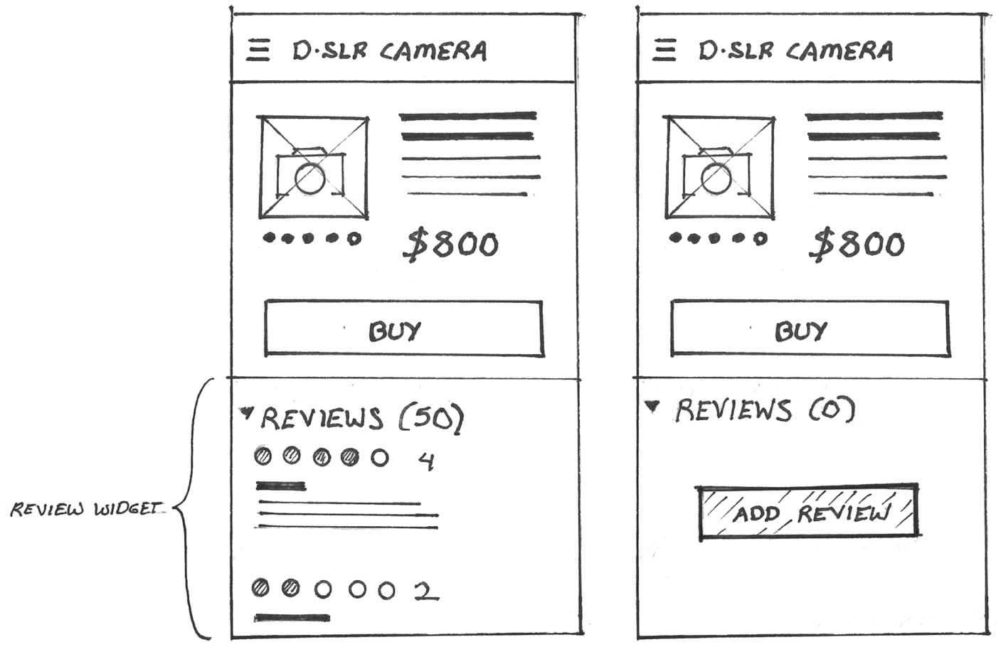
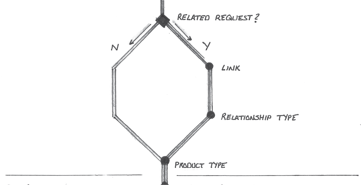
If content is going to be user-generated, then there are different scenarios we will have to account for. When sharing our drawings with our colleagues, we must speak to these scenarios. Let's imagine we're creating an e-commerce site for selling digital cameras and we're planning on featuring a customer reviews widget at the bottom of each product page, as drawn in the example in Figure 9.5.
Since customer reviews are user-generated, it's likely that some products may have a lot of reviews. Some may not have any at all. What does that empty state look like when there aren't any reviews? We should consider these situations, as depicted in Figure 9.6.
These are just some examples of the questions and scenarios that may be raised by your colleagues, especially when it comes to content and its source. Early on in the process, you don't have to flesh out all the fine details, but it is important to start considering them, as these considerations will help your teammates get on board with your ideas much more quickly. Let's look at a few more ways to ground your ideas in reality.

Interface Patterns and Widgets
Let's continue to expand on this content-centric approach to design. It's necessary to consider the volume of content and text you may be displaying in your digital product, app, or website. Let's revisit the previous product reviews widget example. In this case, since content will be user-generated, and the lengths of the reviews will vary greatly, it will be important to consider scale.
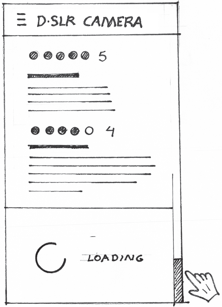
Each review can be lengthy, especially ones posted by people who are dissatisfied with the product. It's important to account for this in the drawing and consider how long reviews might be handled. A simple scroll bar may work, or applying a Show More label or an expand control within each review may be helpful (Figure 9.7). Even if you don't want to decide on a solution in the drawing, it's worth annotating. It's essential to show that you've considered these scenarios when sharing with your colleagues.

Also consider the volume of reviews. In this case, I'd anticipate a lot. Will the reviews fall on multiple pages, or will they load progressively? Alluding to how the widget handles high volumes of information, as depicted in Figure 9.8, will be helpful.
Reviewing Data
Considering scale is especially important when designing dashboards and visualizations. Let's imagine we're going to use a visualization to provide a key insight or answer an important question a user is asking of the data. First, understanding the size of the data set is important. Reviewing real data sets up front will influence the decision making here. Will there be an order of one, tens, hundreds, thousands, or millions of data points in the visualization?
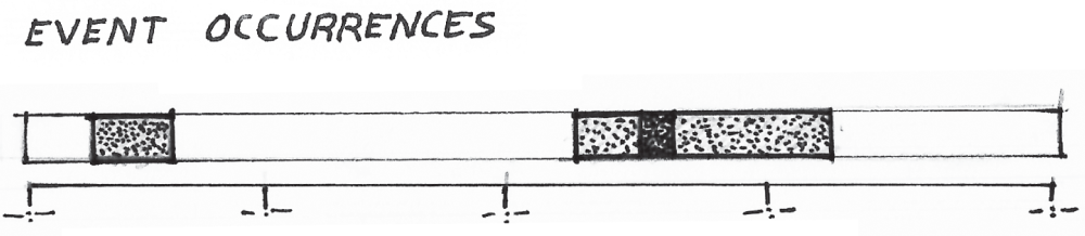
Let's imagine we're creating a visualization that shows event occurrences over time. If we're dealing with a limited set of events, let's say on the order of tens of events, and the duration of each event is important to the user, we might represent blocks drawn on a swimlane. Each block represents an event occurrence and its length represents its duration, as you will see in Figure 9.9. We can even get an impression of cases when events overlap. This, of course, only will work when dealing with a very limited set of events.
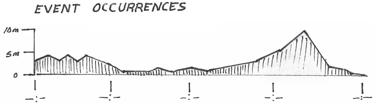
If we're going to show millions of event occurrences, and it's more important for someone to see unexpected spikes and dips in those occurrences, the aforementioned swimlane likely won't work. Showing thousands of events on a single swimlane would likely not be readable. Instead, histograms, like the one illustrated in Figure 9.10, are a more scalable solution and can be used to render an infinite amount of events. They also do a better job of highlighting unexpected trends, spikes, and dips in event occurrences.

If we're going to show trends over time and we know there's a lot of data and we have limited space to show the graph, perhaps we should include an area chart (Figure 9.11) in our drawing instead of a histogram or bar chart. Line charts are more readable as sparklines than histograms.
Knowing the data set and considering how it will scale up or down in your chart will enable you to make more realistic design decisions, even early on in your process when you're just sketching out your initial ideas. These considerations will make your drawing that much more realistic, and they'll make your ideas more concrete when it comes time to share with the rest of your team.
Show Something New—Start the Conversation
While you should always be ready to discuss how your hand-drawn proposal considers real-world constraints, it's sometimes nice to throw a few blue sky ideas into your presentations that demonstrate a breadth of thinking or provide a fresh perspective. You can sprinkle these big ideas into your presentation as you deem necessary. Who knows? Maybe it will lead to a meaningful change to your product's road map. The nice thing about a drawing is that it doesn't require a lot of investment. I typically use drawings as a conversation starter. If you decide to do this, just be ready to explain the constraint that needs to be removed in order to get to this state. For example, “if we had access to X we can now do Y as depicted in this concept sketch.”
As you continue to include drawing in your process, you'll start to gain an understanding of the people you're working with and how much detail you'll need to provide. If your teammates are more visionary in nature, then you may not need to provide as many explanations. If they're people who aren't used to working with drawings, then it will be important to make the drawings as concrete as possible by clearly describing how the proposed drawing respects real-world constraints and scenarios. These people may rely on more detailed drawings and annotations to understand your big idea.
INVOKING EMOTION
There will be times, perhaps in a stakeholder meeting, when you're using drawings to sell your ideas. When doing this, it's important to pull out all the stops and consider some ways in which your audience will subconsciously connect with your drawings. Let's take a look at a few hacks that can accomplish this.
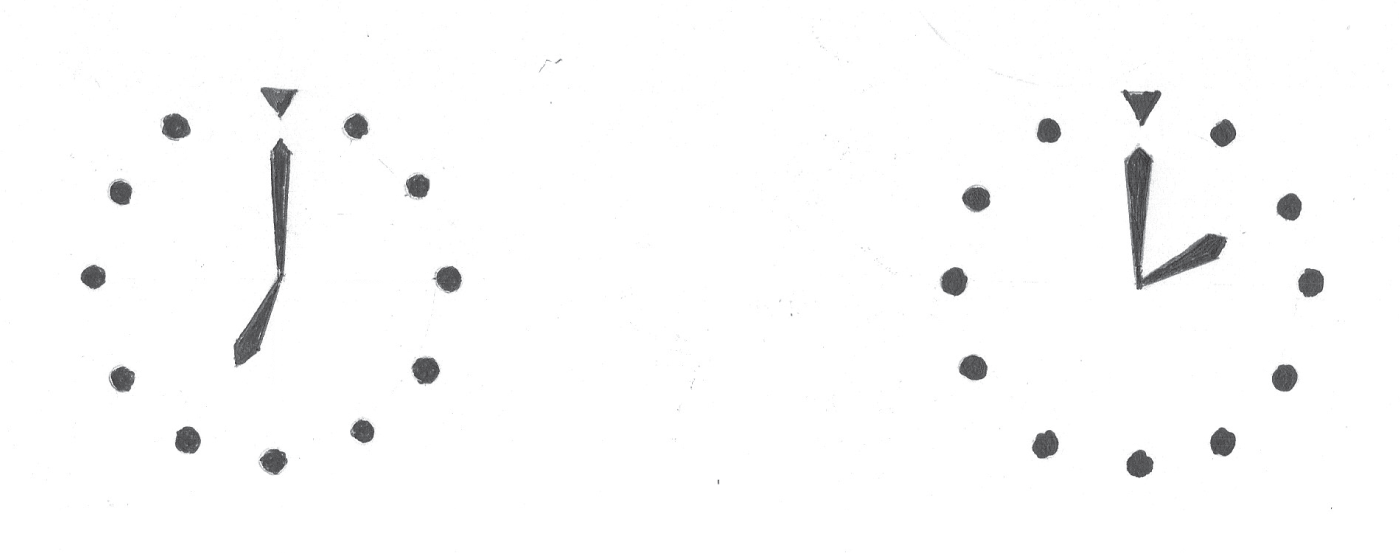
First and foremost, I always try to invoke a feeling of positivity in my teammates. I've always had an appreciation for wristwatches. Have you ever noticed that on watch websites and advertisements, the watch always reads 10:10, as drawn in Figure 9.12?
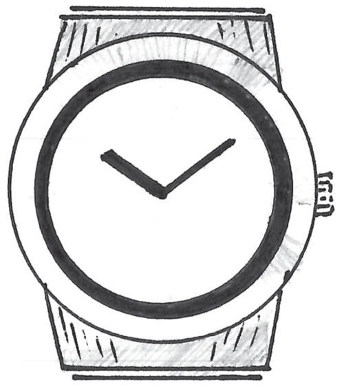
The visual shape of the hands projects a feeling of positivity. We can use similar tricks in our digital product drawings. If we look back at some of the elements in our visual language, we can draw them in a very specific way to do this. Let's look at the charts in Figure 9.13. Notice how the bars and lines increase in height toward the right of the chart.

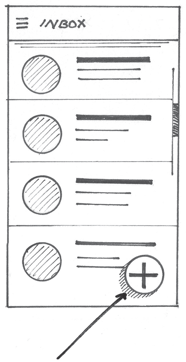
This can invoke a feeling of positivity through implicit forward progress and upward movement. We can apply these same techniques to texture and shading. For example, let's look at the inbox drawing in Figure 9.14. Notice how the shading used in the circular profile avatar images moves in an upward direction from left to right? This tiny detail is easily overlooked but contributes to that positive vibe the viewer may experience when looking at it.

Finally, let's look at the same inbox example, but this time, let's focus on the elevated floating action button as highlighted by the arrow in Figure 9.15. Notice the direction of the hatching lines I used to show elevation? They're also moving an upward direction, again invoking that same positive feeling.
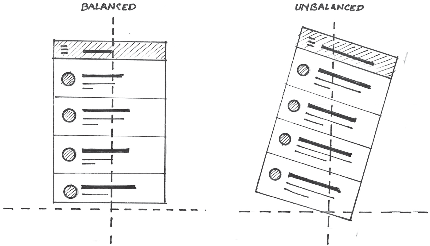
Next, as humans, our need for balance is the most important psychological and psychical influence on us. In her book A Primer in Visual Literacy, Donis A. Dondis (1973, 22) describes the importance of balance in great detail. Equilibrium becomes our firmest and strongest visual reference, both our conscious and unconscious bias for making visual judgements. Items that appear to be unstable create visual stress. As humans, we subconsciously evaluate the stability of forms by imposing a vertical and horizontal axis on the forms we see, as depicted in Figure 9.16. The slightest angle of rotation will even throw off this sense of imposed balance, causing this stress. Notice how the drawing on the right, which isn't level, gives off a more stressful vibe than the left image, which is level in nature?
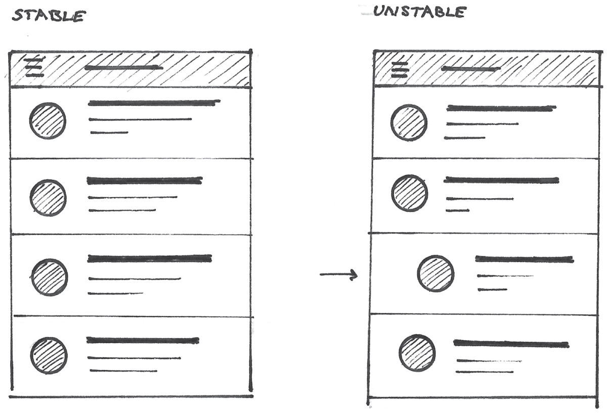
Unless implying animation, or drawing a very important screen element, it's important to ensure that all items in our product drawings appear structurally sound, as depicted in Figure 9.17. In this scenario, the image on the left appears structurally sound. The circular profile images in the list view are aligned and stacked on top of each other. Compare that to the image on the right, which appears unstable. The lack of alignment in the circular profile images makes the list appear top heavy. This will also cause visual stress. Caring for alignments and small structural details like this will enable you to instill a sense of relaxation in your teammates when they're looking at your drawing.
All of these techniques are very subtle, yet they can play a powerful role in establishing a positive first impression in a viewer. First impressions are important. They are formed within milliseconds of first seeing a drawing. They can last for months (Gunaydin, Selcuk, and Zayas 2017) and affect personal judgments even in the presence of contradictory evidence about the individual (Rydell and McConnell 2006). This is why it's important to consider these fine, seemingly trivial details when creating a digital product drawing to share with colleagues, especially influential stakeholders.
ADAPTING THE VISUAL LANGUAGE
Speaking of knowing your audience, there are some cases where you may have to adapt your visual language to something that's familiar to them. Let's go back to an exercise we reviewed in Chapter 2, “Reframing Our Thinking,” where we explored ways to represent the values of 7 and 14. In one of the examples, we represented the values of 7 and 14 using a clock display as depicted in Figure 9.18.
When you first saw the clock drawings, was it obvious that they represented the values of 7 and 14? It's likely that this drawing won't make sense for most people living in America that are not in the military or working in healthcare. This drawing will read as 2 instead of 14. There are better, more reliable ways to represent the values of 7 and 14 to these people, as depicted in Figure 9.19.

Let's review an actual example of a time when I had to adapt the visual language of my drawing. In 2012, I spent a lot of time working with a popular investment banking firm in New York City. As a result of the Dodd-Frank Act and the great recession of 2008, the US Securities Exchange Commission (SEC) mandated changes in how banks develop and launch new financial products. The current process was tedious, and bloated, and no one knew exactly how to complete it.
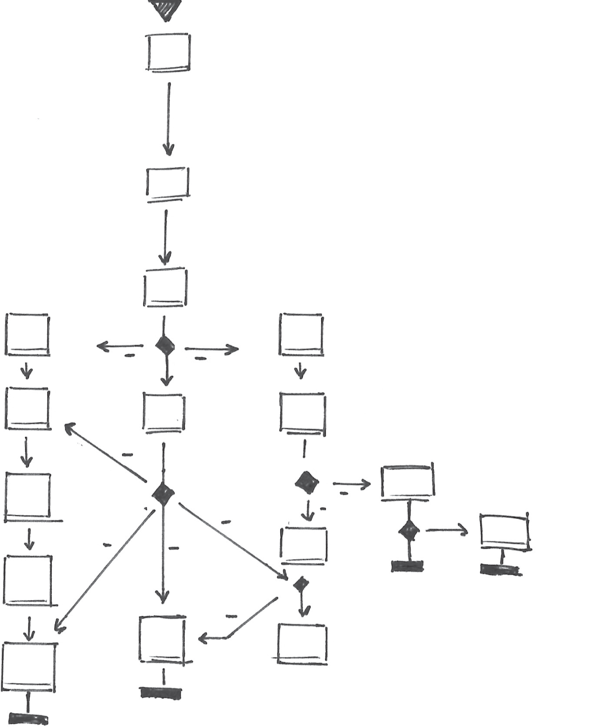
This was an intense project to say the least. The stakeholder team spent several weeks trying to describe the problem to us. It was so complex, we kept getting hung up on various points in their process. The team was currently using traditional workflow diagrams to communicate the steps in their product review process. Figure 9.20 shows a very high-level example of a workflow diagram.
These diagrams were so complex, and no one in the stakeholder group understood the underlying visual language. Opportunities for collaboration and gathering feedback were missed simply because people couldn't understand it.
I quickly realized that we needed a new way to express the same idea. At one point, I started to think about how visual language might be applied in a way that can get everyone on the same page. After several design workshops, we mapped out a new, ideal process.

To communicate the new workflow, I tried taking cues from the visual language of subway maps. After all, most of the stakeholders lived in London, New York, or Tokyo, all cities with prominent subway systems. By using this familiar visual metaphor, the team would better understand our proposal for the redesign of this complex process.
By adopting a station stop and train line metaphor, we were able to illustrate how a new product approval process could be designed to adapt to each user. The resulting map depicts the data collected by a product proposer. Figure 9.21 depicts part of this subway map. The map represents possible tracks through a long proposal form. The map also highlights the most influential steps in the review process.
We used the metaphor to highlight special requirements necessary for each step. Since we were building a giant submission form based on this process, we could also start to illustrate ways in which the data would be entered and captured in the product. We took cues from how subway diagrams highlight special features like elevators, transfer walkways, and pay phones (back when that was a thing). Express tracks and local routes with more stops (Figure 9.22) illustrated areas where additional information would need to be captured based on previous input.
We used colors and shading (Figure 9.23) to represent different train lines and transfer points so the team could follow the main possible routes through the process.
Unlike with the traditional workflow diagram, using this familiar visual language to express both requirements and workflows meant diverse users could interpret our design even when we were not there to present it ourselves. Expressed in a familiar idiom that transcended text, it was much easier for our audience to offer feedback and ultimately buy in. Not only did this visual language augment the collaboration between research, design, content strategy, and development, it earned the appreciation of the client's IT team. As a result, the map became the IT department's requirements document of record.

This is just one example of how changing the symbols, icons, and visual language used in a diagram drastically changed my team's perception of the same idea. There will be times when you'll have to consider this. As you become more comfortable with drawing, and as you continue to develop your visual library, you'll be able to come up with more ways to modify it based on your audience and their perspective.
WAYFINDING AND LANDMARKS
Since we're using drawing to develop and share new ideas with our colleagues, it's important to help them maintain a sense of orientation within the flow or storyboard. After all, this is the first time they're seeing your new idea. Just as in a well-designed mobile app or visualization, it's necessary to enable someone to understand where they came from, how they got here, and where they can go. In Chapter 8, “Using Flows to Tell Stories,” we covered techniques used to do this. Showing mini maps and numerical labels next to screen-based drawings will start to give your colleagues a sense of location within your drawings. This is a good start.
Landmarks are another orientation mechanism, and they're used in several modern-day experiences. Disney Imagineers placed a large castle landmark (Figure 9.24) at the central hub of their parks. It's the tallest structure in the park, and visible from nearly everywhere.

Upon entering the park, guests experience a carefully engineered sight line to this castle, as depicted in Figure 9.25. From this perspective, the castle draws guests down the main corridor and into the other areas of the park. No matter where you are in the park, you can always enjoy a line of sight to the castle.
Once guests find their way to the other sections of the park, behind this landmark, they always have a sight line back to it, thus having a way to get back to the entrance corridor. This sight line, or view of the castle, is a crucial mechanism for wayfinding throughout the park. It gives guests a sense of location and orientation. Because of this, Disney was able to minimize the use of signage in these parks.
We can use these same wayfinding techniques in our digital product drawings. When creating drawings to share with your teammates, you should consider how you may use visual landmarks within your drawings to enable your colleagues to remain oriented within your ideas. This can reduce the need to add extraneous text to your drawings. Your result will have less clutter and make it easier to convey the essence of your idea.

Let's look at the example coming up in Figure 9.26. This flow depicts a single screen with a rich set of features. Notice how at the bottom of each drawing, we can see navigation tabs. The selected tab always remains in the same position throughout the experience. We can consider these tabs as a key landmark. They're going to remain stationary, and like the Disney castle, and no matter what screen drawing we're focusing on, we will always be able to see them and know where we are.

Once the tabs are established as a landmark, I'll start removing some of the details within that landmark in later screens. This is because focus typically shifts from the global navigation to details and features of the specific screen we're on. Doing this enables us to focus on the more important details of each specific screen drawing without adding unnecessary noise. In the example, you'll notice that I included all of the labels for the tab navigation up front. In the following screens I remove the labels for unselected tabs but make sure the selected tab is always in the same location. This removes noise from the drawing and brings focus to the interaction at hand.
Just as in Disney parks, as we move past the castle and deeper into the park, we start focusing on the details and attractions in our local area of the park. We don't need to see all the details of the castle. We just know it's there and that's good enough.
Another example of providing great wayfinding is to reuse key visual elements in our transition from one screen to another. Let's go back to our inbox example, shown in Figure 9.27.
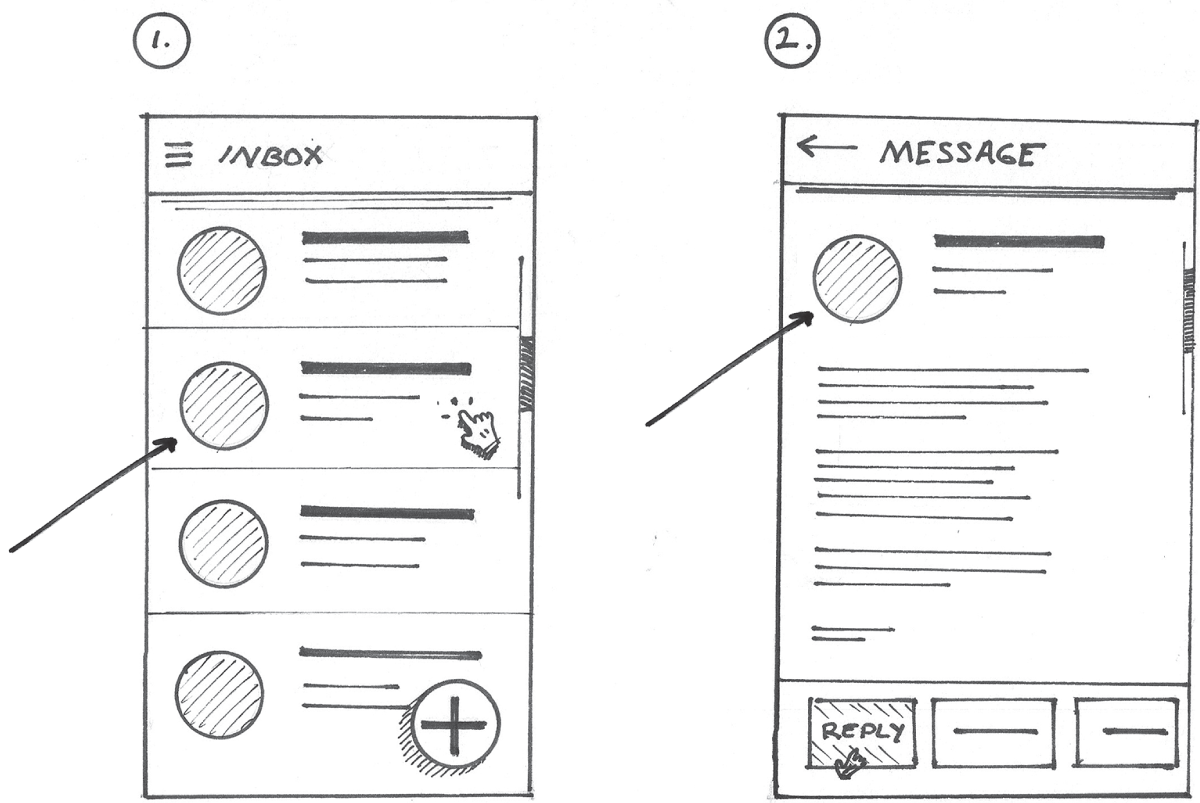
For this example, we're going to focus on the first two screens. Let's take a look at the objects highlighted by the arrows in Figure 9.27. Notice how the elements in the list item including the circular profile icon, list item title, and subtitle text on the left are reused in the image on the right. These same items appear in the same arrangement and form header on the message screen on the right. Notice how they're drawn the same way across drawings. For instance, the same shading technique was used for the avatar image. The title and subtitle lines are similar in length relative to each other. Considering details like this will help someone better understand your idea.
Now, taking a step back for a minute, let's not forget that reusing screen elements isn't only good for your drawing process, it has much greater benefits to the outcome we're striving for. Reusing screen elements across an interaction like this will ultimately improve usability of the app you're developing.
CHOREOGRAPHY AND TIMING
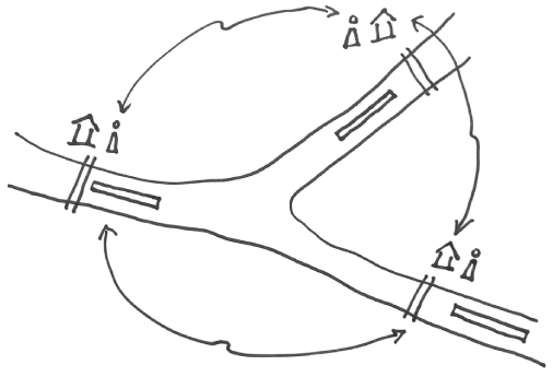
In some cases, the order in which elements of the drawing are introduced can help our teammates better understand the problem space, our ideas, and the ultimate solution. New items can be introduced as we turn pages in a printed presentation. They can be introduced over the course of several slides in a digital presentation deck, or they can be drawn in a specific order on a whiteboard in front of a crowd. Let's go back to the anecdote shared by professor emeritus Dan Boyarski from Carnegie Mellon University. If you recall from Chapter 1, “Why Draw?” we recounted a time when Professor Boyarski invited students to describe a problem using the whiteboard. One student explained how her group was trying to find an effective way for these people to talk to each other as they control barge traffic on the rivers, as illustrated by the drawing in Figure 9.28.
Boyarski describes the drawing being a useful element in describing the problem. He also went on to explain that what was even more valuable was the way the story and drawing unfolded together. This really enabled the rest of the class to understand the problem.
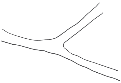
For example, the presenter started off by establishing that her group was evaluating barges traveling up and down the three rivers by drawing these elements first. This worked like an establishing shot in a movie or an orienter panel in a comic. It helped the class all agree on the setting and context. It helped the students gain a shared understanding of the problem space. They could see that they were discussing the efficiency of ship traffic on three intersecting rivers, as illustrated in Figure 9.29.
The student gradually introduced additional constraints and complexities into the problem by drawing the locks. Representing the locks as lines barricading the boats from proceeding (Figure 9.30), while telling the class that only one boat can pass through at a time brought up a critical bottleneck in the flow of ships up and down the three rivers. Showing the barges and locks initiated the tension of the underlying narrative.
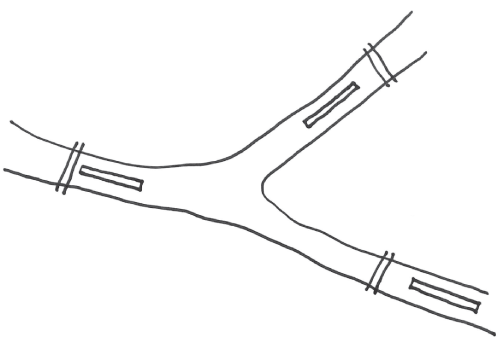
Finally, adding the control stations and people brought a human element to the story, as drawn in Figure 9.31. It was also drawn when the presenter got to the climax, or peak, of the story.

The final addition to the drawing outlined the opportunity that would solve the aforementioned pain point, which was enabling the people controlling the locks to better communicate and plan the flow of traffic, as depicted in Figure 9.32.

If we were to see the full drawing up front, we would've missed some of these key details that set up the story and clearly defined the opportunity to improve communication.
The sequence of elements added to the drawing can follow the arc of the underlying story you're telling through drawing. In his book The Visual Language of Comics, Dr. Cohn lays out several types of images that support this arc. In this sequence, the first elements of the drawing were our orienter (Figure 9.29). Next, we saw the barges locks drawn, which established the tension in our story (Figure 9.30). The peak, or climax, of the story occurred when people were added to the drawing (Figure 9.31) and we realized they cannot communicate with each other. Finally, when the final elements were added to the drawing, we see the story's release (Figure 9.32). In this final state, we see the aftermath of the story, or the opportunity to improve communications between the river traffic controllers, which was represented by the arrows.
When you're using drawings to tell a story about your product or service, think about how the elements of your drawing should be unveiled to support the different phases of the story arc. What should be used to establish context? What elements can be used to build tension in your story? What elements support the aftermath of the story? Thinking about this will enable you to unfold an image along with a proper narrative that will resonate with your teammates.
Because of the approach we take in this book, we can actually think about the timing and order in which we introduce elements into our drawing at the whiteboard. With some practice, you will no longer have to think about how to draw all the elements in your visual library. Instead, you'll be thinking more about how to compose them into a meaningful drawing. You'll even be able to draw them while talking to your colleagues at the same time. When you get to this level of comfort, you can begin to think about the overarching story and which items you want to introduce, just as the students did with the ship traffic scenario.
If the situation permits, and you want to share your great idea at the whiteboard, do a practice drawing on a notepad or sketchbook as your team is discussing possible solutions. That way, you can sort out which elements you want to draw and their importance and order to tell the best possible story. Once you take the whiteboard marker, you hold nearly all of the power in the meeting, so you'll want to make the best use of it.
PACKAGING YOUR DRAWINGS
My wife always says that it's all in the packaging. That's true for sketches, and considering where and how they live plays a major role in how people engage with them. I try to hang up my drawings, especially early ones, in my work space. That way I have a chance to live with them and subconsciously reflect on their content. As time passes and you become familiar with the work, you'll either gain additional insight into your ideas, or maybe contempt. Posting other material may aid the discovery of new explorations to consider (Buxton 2007, 154). This helps me develop better, more thoughtful ideas early on. If you have a dedicated UX space in your home or office, I'd suggest doing the same. If you hang your drawings in a public area, oftentimes you'll notice your colleagues coming by and looking at them, which usually leads to some fun impromptu conversations about the work. These casual interactions can lead to a great idea, and they can also help you become used to discussing your work in a casual setting. This can especially become useful when it's time to present your work to stakeholders in a more formal setting. I usually add sticky notes next to each drawing or group of drawings for displaying additional notes.
There are many ways to present your drawings. In some cases, the drawings can be dropped into a digital slide deck or multipage PDF. You can add additional notes in the actual slide, which can be nice if your handwriting isn't the prettiest. You can use some of the techniques mentioned in Chapter 8 for combining mini maps, process diagrams, and screens to tell the story of your idea.
If you're working on a formal design presentation, and you have access to a scanner, it's a good idea to use scanned drawings rather than photos taken with a phone camera. This will give your drawings a sense of visual polish and refinement. Doing this also ensures that there aren't any focus issues with your drawing and that all the proper details are clearly presented.
Just as we discussed in the previous section on timing and choreography, you can also introduce new elements on each slide to help people better understand the problem space and your solutions. You may consider recording your presentation in your favorite virtual meetings app so that you can provide a voice-over narration and change the slides accordingly. This works especially well if you're an effective public speaker and storyteller. It's especially valuable in those situations where you cannot be present to share your own work.
These are just some of the things you may consider when creating a UX drawing. This chapter focused on techniques that will enable you to create more engaging presentations that elicit the best possible feedback from your colleagues. Showing consideration for real-world scenarios and constraints within the drawings will help you build credibility among your colleagues, especially the engineers who will be building out the idea. Modifying your drawing's visual language and providing proper landmarks within each drawing will help your team better comprehend your idea. If you're selling an idea, think about how to subtly invoke a certain emotion from your teammates. Finally, modifying the visual language and considering the use of key landmarks and the timing in which you reveal elements in the drawing can help your colleagues better understand and even engage with your ideas.