
CHAPTER SEVEN
THE SYSTEM
Let's pause for a moment and take stock of everything we've covered up until now. So far in this book, we took an in-depth look at a comprehensive set of reusable elements, or building blocks, that can be used in all of our digital product drawings. We also reviewed several ways to describe concepts like light, sound, texture, and motion.
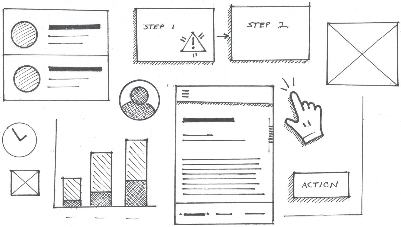
You are now armed with the right toolkit for creating a full product drawing. Let's think of your visual library as a system as illustrated in Figure 7.1. Just like the components in a design system, they can be combined in different ways to develop, share, and collaborate on an infinite amount of ideas. That's the focus of this chapter.
PUTTING IT TOGETHER
Not sold on this? Let's create a fairly detailed UX drawing. Moving forward, we are going to leverage our drawing system to create multiple drawings to convey an idea. Now, most UX drawings represent some sort of user journey, task, or flow. We will discuss this more in the next chapter. For this example, let's pretend we're designing a new email app for mobile devices.
Before we jump in, let's define the task we're going to illustrate. In this case, we'll show how someone can locate, read, and reply to an email in a hypothetical new email experience. To do this, let's first brainstorm the process for responding to an email. Then we will map it in a process diagram. Remember, if you can draw boxes and arrows, you can draw a process diagram.
Think about the last time you checked your email. Once you opened your email app, I'm going to guess that you looked at your inbox first and scanned all the unread messages. This will be the first step in our diagram, as illustrated in Figure 7.2.

Next, I'm going to guess that you found a message that captured your attention. Maybe it was something urgent; you tapped on it and read it. That will be the next step illustrated in our diagram, as shown in Figure 7.3.

Finally, I'm going to go ahead and guess you replied to the message. That will be our third and final step in the process diagram. Let's number the steps in our diagram as illustrated in Figure 7.4. If you need a refresher on process diagrams, please refer back to Chapter 2, “Reframing Our Thinking.”

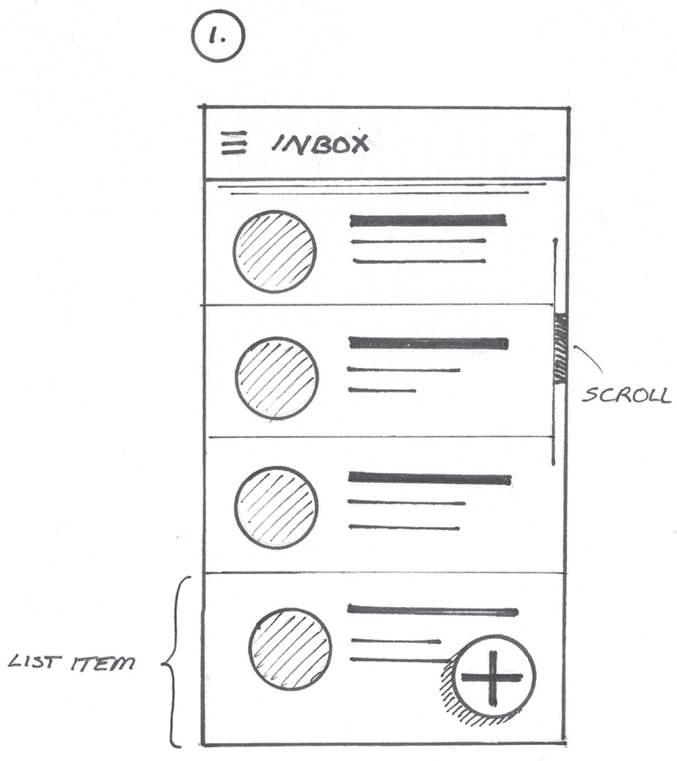
Now, let's draw some screens that correspond with each step in our process diagram. First, to draw the inbox screen, we'll use an app bar, list view, and floating button. Since the app bar and button appear to float above the rest of the scrolling content, we'll draw them first, as you will see in Figure 7.5.

In doing this, these objects will appear in front of the other elements. I even added some accent lines beneath the app bar and some hatching to the lower left of the floating button to show that they're elevated.
Next, we'll add some list items and a scroll bar, as drawn in Figure 7.6. Since the list scrolls behind the floating button, none of the elements within the list item should be drawn on top of the floating button. To make life easier, consider creating the drawing with a pencil so you can erase any mistakes. You can always go over your pencil lines with ink later on.
Since the list of messages in the inbox screen scrolls, we'll add our symbol for a scroll bar, and we'll use some hatching to show that the app bar remains in a fixed position and the content scrolls beneath it, as highlighted in Figure 7.6.
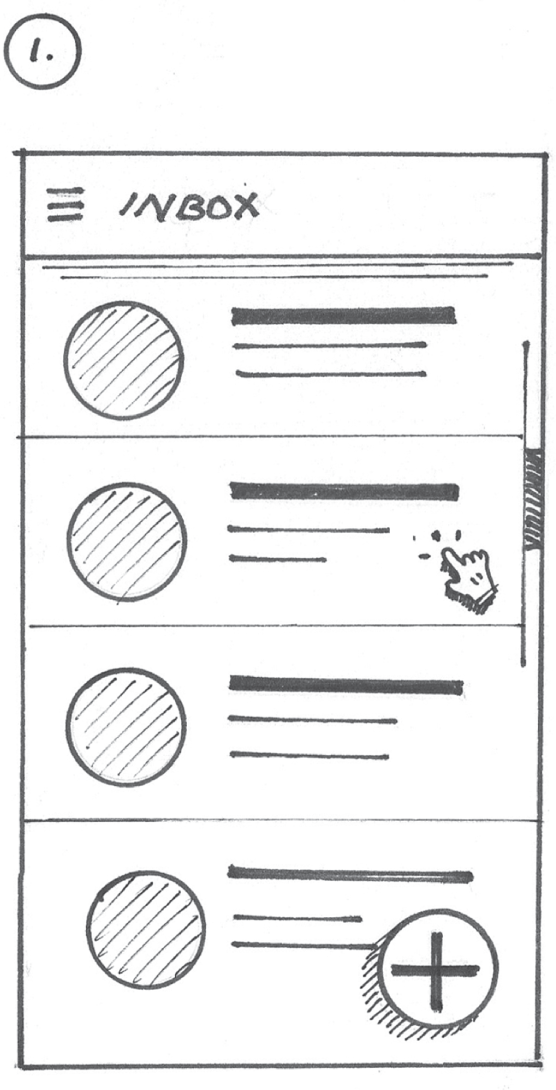
Finally, we can add a cursor hand to show which list item was tapped to get to the next screen, as you will see in Figure 7.7.
I chose to add it over the second list item. Don't forget, we can use hatching to apply a drop shadow coming off the lower-left side of the cursor hand. This implies that the cursor hand is not part of the actual screen layout.
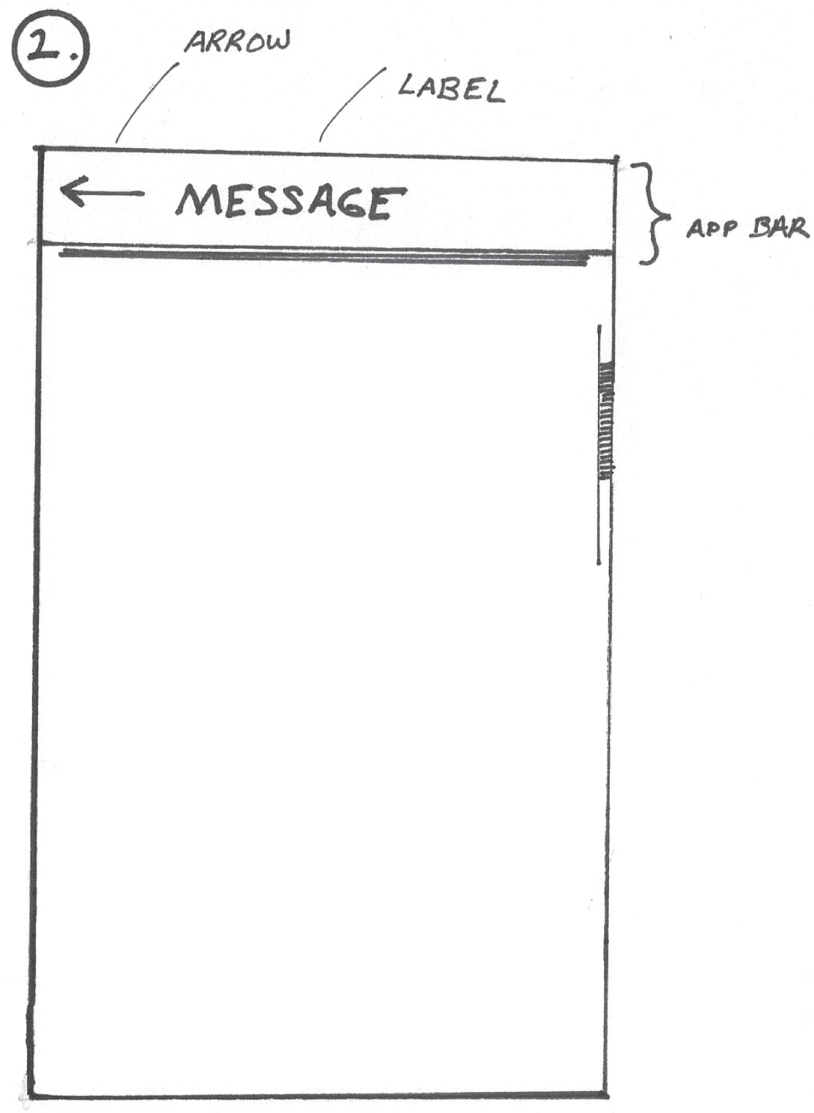
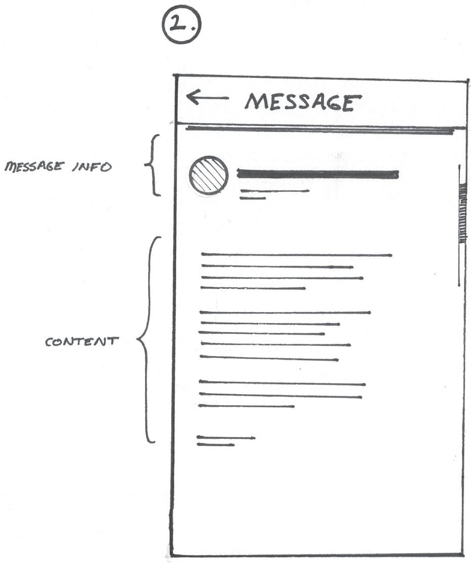
Now, let's move to step 2 and represent the next screen in the flow. To represent the actual message, we'll do a few things. First, we'll draw a new screen. Instead of using a standard menu icon, or hamburger, in the app bar, we'll draw a backward arrow. Also, be sure to add a label here as you see in Figure 7.8. That way we can show that we're now on a new screen and that there's a way for users to get back to the previous screen.
To start filling in content, let's draw a message header area. This will appear just beneath the app bar and above the actual message. This would include the avatar image of the message's sender, the subject line, time stamps, and so on. We'll use the same elements from our list item on the previous screen to represent this. The message info area is labeled in Figure 7.9.
Next, let's fill in some message content. To do this, we'll draw a series of lines to represent the message's content. All lines should be left aligned but may vary in length, as you see labeled in Figure 7.9.
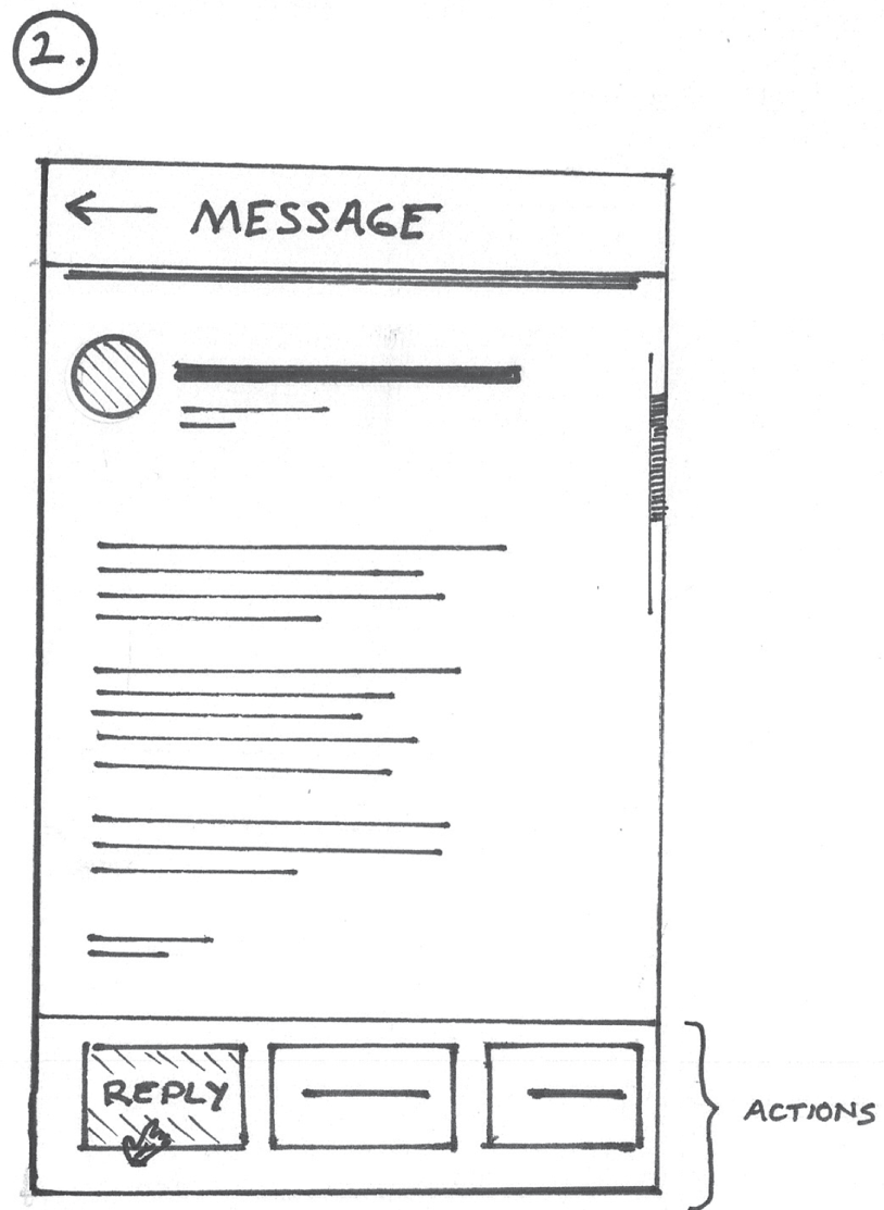
Finally, we'll add some buttons beneath the text block to suggest actions that can be taken. Be sure to draw a cursor hand pointing to the reply button. You may even consider using shading and writing out the word reply within the button, as drawn in Figure 7.10.
Finally, let's draw the third and last step. To do this, we'll draw a new screen, and we'll arrange a few symbols representing form controls. Let's start by drawing another app bar. We'll use an arrow and add a Reply label as highlighted in Figure 7.11.
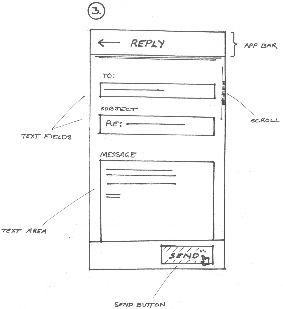
Next, we'll add some of the form controls covered previously in Chapter 4, “Building from Rectangles.” We'll add two text fields that represent the recipient's line and subject line, as pictured in Figure 7.11. Next, we'll add a text area. This represents the area where the reply will be crafted. Instead of using lines to represent form labels, I chose to write them out. This further describes the purpose of each field to the viewer.
Finally, as pictured in Figure 7.11, we'll add a send button beneath the text area. I even added a cursor hand pointing to the Send button so that we know how the illustrated task is completed.
Now, let's put it all together. If you didn't already, let's arrange the process diagram and corresponding screen designs into an organized flow as depicted in Figure 7.12.
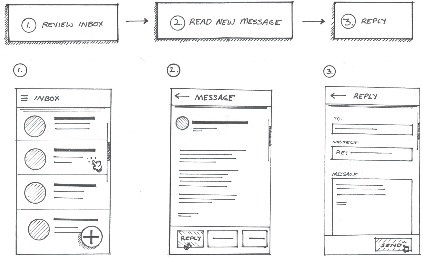
If you used separate papers to create your process diagrams and screen drawings, go ahead and cut them out. You can start with the process diagram and then paste each screen cutout beneath the corresponding step. Be sure to number the screens so they correspond with the steps in the process diagram as depicted in Figure 7.12. Instead of cutting and pasting, you can also redraw the diagram and screens arranged on the same paper. If you have a dedicated workspace or studio with a bare wall, you can hang all of your drawings up on the wall and take a photo.
That's it! We just created our first flow of screens. This is a rich UX drawing that describes the steps taken to reply to an urgent message within our pretend email app design. In this drawing, we get a sense of the overarching process as well as how each screen looks and behaves. We even highlighted key interaction points that moved us forward in the illustrated process. By showing the elevation of elements like the app bar on certain screens, we also provide additional details on how each screen behaves.
CREATING SOMETHING NEW
As you can see, the system of concepts and elements in your visual library is very versatile. It especially works well when drawing screens and UX elements that were popular at the time in which this book was written. As time goes on, and technology evolves, you're going to encounter situations where you may have to create a new symbol, element, or icon on your own. To do this, think about the basic shapes you can combine to draw new elements. Nearly everything you draw can be distilled down to a few basic shapes and marks. Think about how you can leverage the basic concepts covered in this book.
Recently, I was thinking of ways to visualize the effects of precipitation on a network of high altitude flight vehicles and satellites. I knew I'd want to create some sort of 3D weather visualization that highlighted the vehicles and their locations and ability to communicate with each other. I also knew I wanted to overlay weather information on the same visualization. This would include wind and precipitation information; I wasn't sure how I wanted to do it.
I turned to drawing to help me think through a few ideas. While brainstorming methods for visualizing weather systems and satellite networks, I turned to nature to provide inspiration for my end solution.
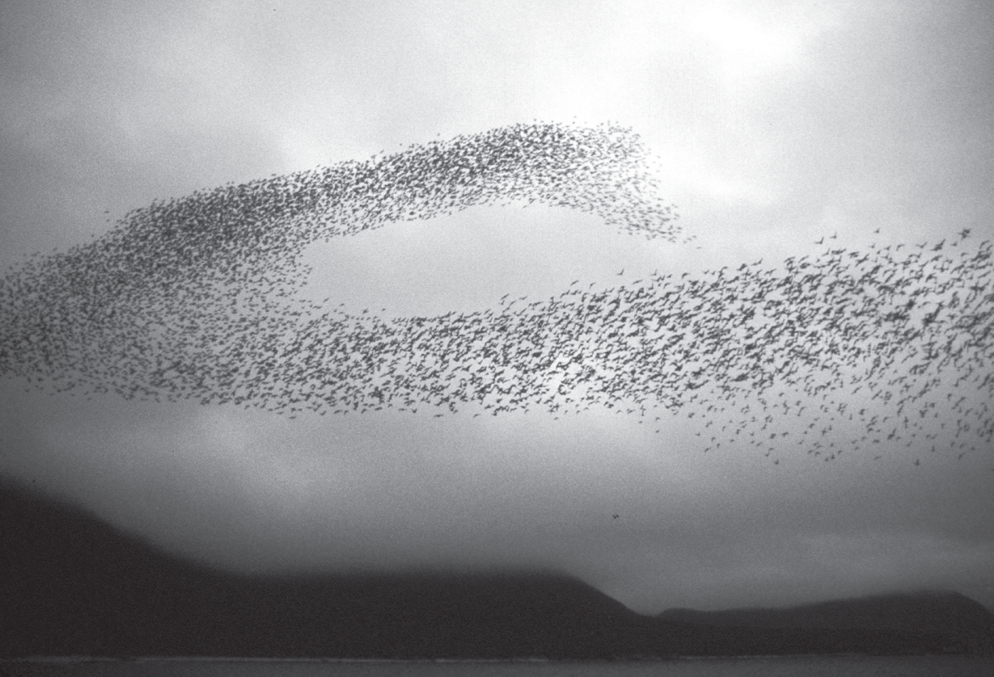
The murmuration of starlings in Figure 7.13 gave me the idea to represent precipitation and cloud moisture using a particle system. As far as I could think, this seemed like a promising start, but I needed to see it on paper. Now, looking at the image in Figure 7.13, you might recognize that the starlings look like dots. Some areas of the murmuration have higher concentrations of birds than others. This seemed to translate well into a weather visualization, where particles could be used to represent a storm system. The denser the particles, the higher the cloud moisture, precipitation rate, and so on. This could also work well in 3D.
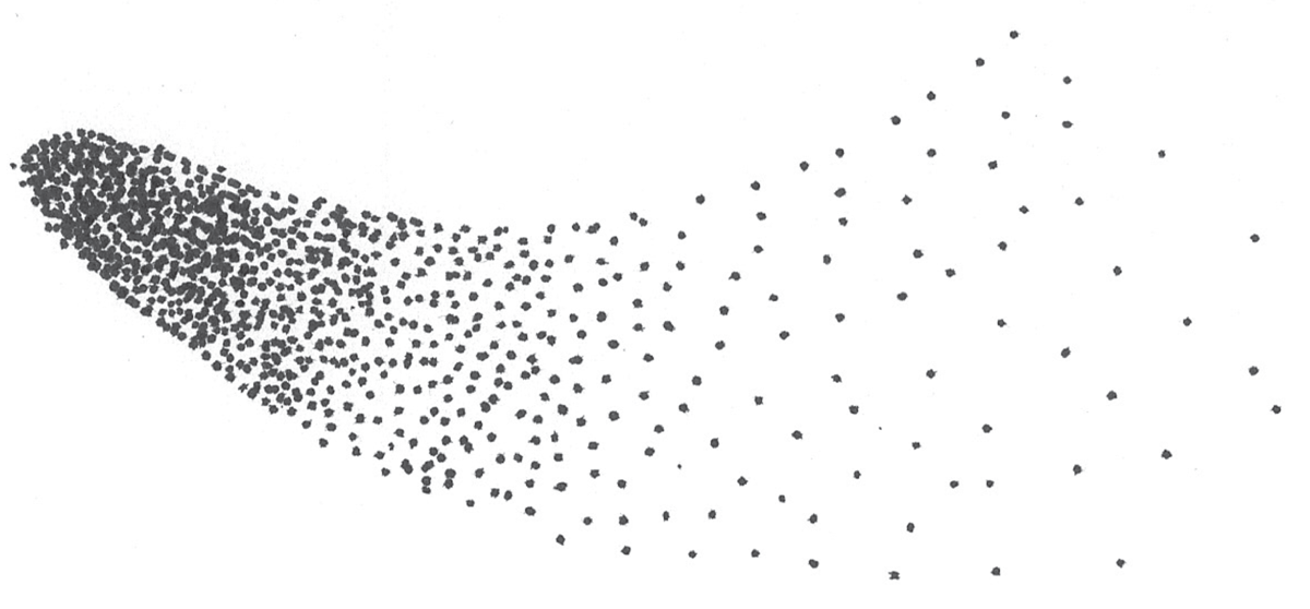
Now for the drawing part, let's imagine each starling as a point in a drawing, as highlighted in Figure 7.14. Does this remind you of a shading technique we discussed in the previous chapter?
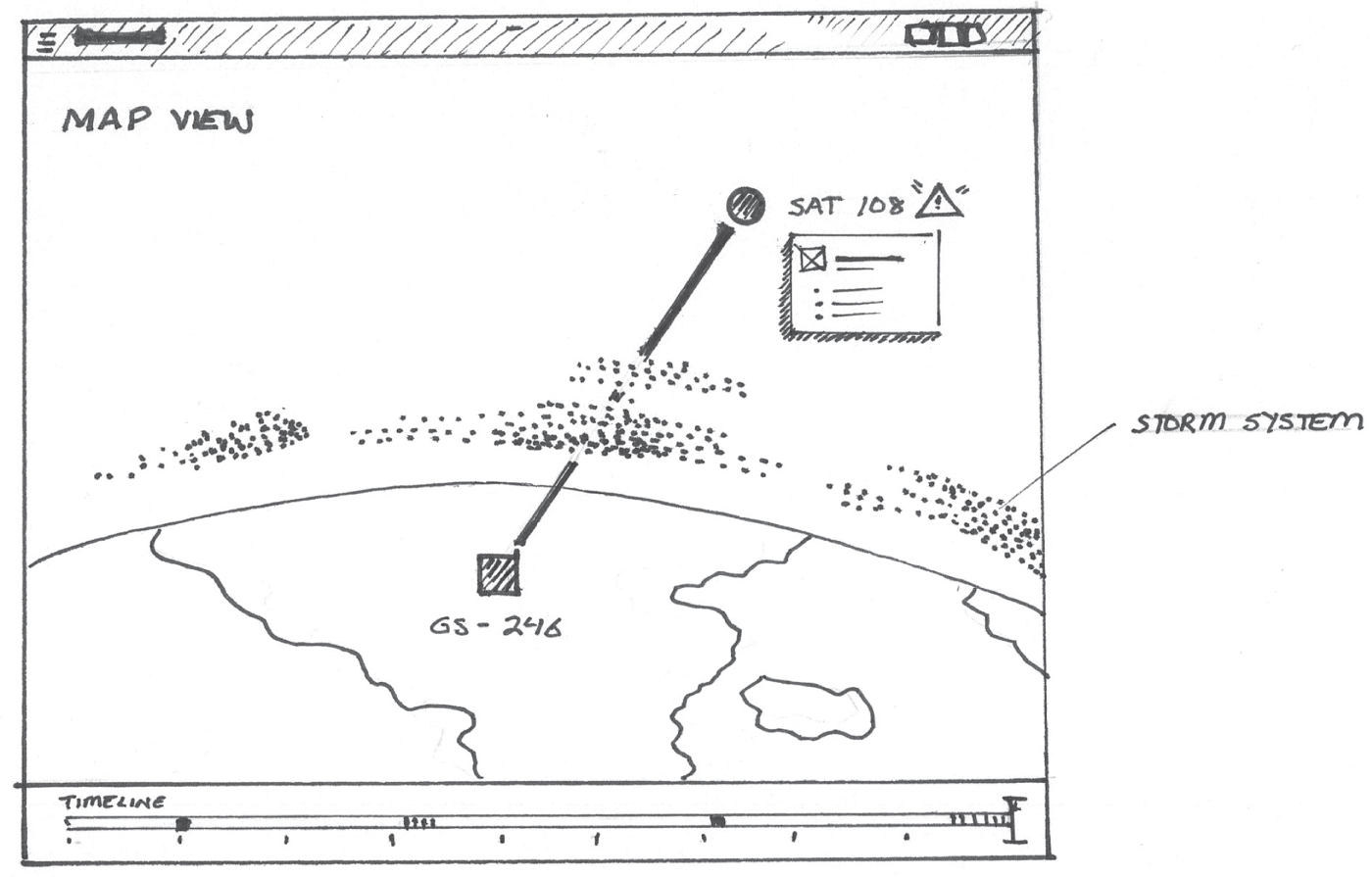
For my actual product drawing, which is featured in Figure 7.15, you can now see how I used pointillism to demonstrate my idea. The points represent the particle system, and you can see how it fits into the visualization of my satellite network. In this drawing, the storm is impacting a satellite's ability to communicate with a ground station.
This is a fine example of a time when I was working with a team on a completely new product with cutting-edge technology. One of my colleagues even referred to it as science fiction. When brainstorming solutions during this project, I turned to drawing to help me develop my ideas. I leveraged the basic shapes and marks covered earlier in this book to represent a new idea. While I didn't have a preset icon or symbol in mind for representing weather in a visualization, I turned to the basic marks I used to draw common shapes, and I applied them in a new way.
As time goes on, and you become more comfortable with drawing, think about how you can leverage marks, concepts, and the basic shapes and elements previously covered to create something completely new. Of course, if it works for you, this new drawing might become a core part of your library moving forward. In the next chapters, we're going to look at even more ways to apply your visual library in a systematic way to tell compelling stories.