
CHAPTER THREE
LINES AND POINTS
Now that we’ve reviewed some common drawings and broken them apart into their basic shape elements, or building blocks, we’re going to go a level deeper as metephorically illustrated in Figure 3.1.
Let's examine the lines and points we use to draw these shapes, be mindful of how these marks are constructed can make or break a drawing. Believe it or not, the very essence of your ideas and how they're perceived by your colleagues can be held within these marks.

TELLING STORIES WITH LINES
Simple lines can be used to tell a rich story, and the way in which they're drawn can communicate a lot of information. Let's take a look at the drawing by Vincent Van Gogh in Figure 3.2.
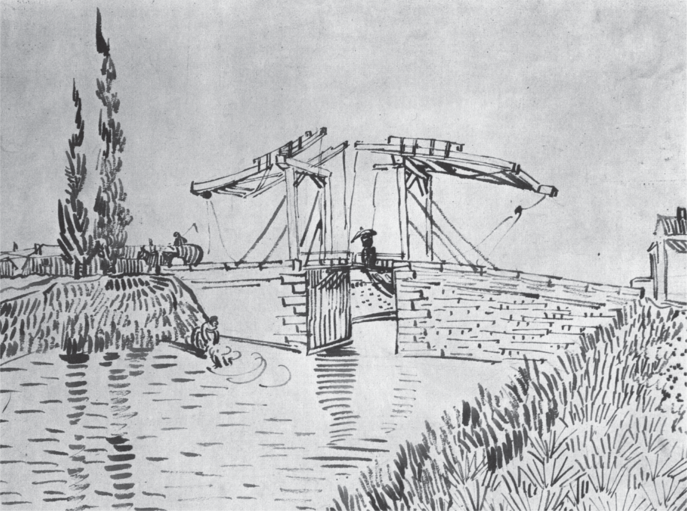
Source: Die Brücke von Arles, Vincent Willem Van Gogh
When we first look at this image, we can see that he obviously used lines to draw the structural elements in the composition. This includes outlines of the stones and the wooden beams that make up the drawbridge. For this, he used straight lines. It's when we take a closer look at this drawing that we notice the more interesting applications of lines.
Notice how Van Gogh uses lines to represent the grass on the right river bank (Figure 3.3). The direction of the line implies the growth of the grass. The exaggerated nature of each line gives the grass an organic and overgrown feel.
Growing up, I spent a lot of time painting landscapes and scenes from nature. I always found water to be one of the most difficult materials to represent in a drawing or painting. Van Gogh's use of lines to represent water is just brilliant (Figure 3.4). The direction of the repeating lines implies a stillness in the water. His use of stacked lines also implies a reflection and a light source in the scene.


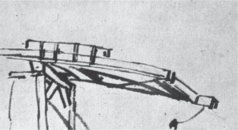
Finally, he used different line weights to represent light and shadows. Notice the diagonal cross braces that make up the underside of the drawbridge frame (Figure 3.5). The beams are represented with thicker lines, which implies that this portion of the bridge lies within a shadow.
As you can see from this example, the possibilities are endless. The direction, speed, and pressure applied when we draw our lines can tell a lot about the ideas we're trying to develop and share. Let's take a look at a few ways in which you can draw different types of lines in your UX drawings.
Straight Lines
Like the stones and wooden beams in the aforementioned Van Gogh drawing, our screen-based interface drawings will feature a lot of structured, geometric elements as highlighted in Figure 3.6. When you're drawing these elements, line quality can make the difference between a bad drawing, a good drawing, and a great drawing.
Using clean lines will enable viewers of the drawing to focus on the idea it represents rather than how it was drawn. Lines should be drawn with a single quick stroke of the pen.
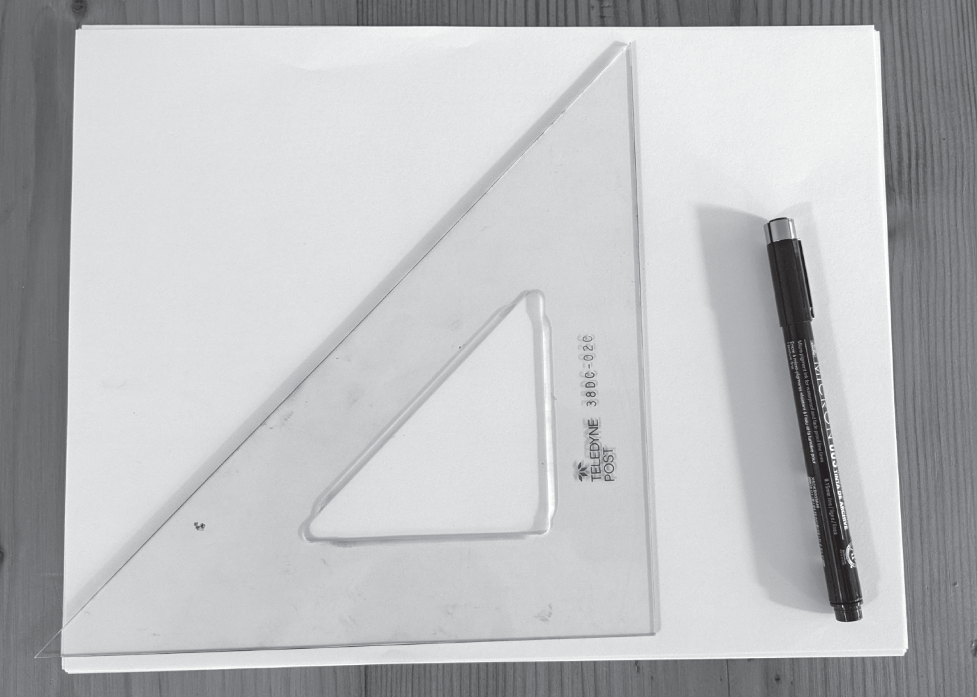
Because of this, there is no shame in using the proper tools, such as the straight edge pictured in Figure 3.7. If you don't have access to a ruler, triangle, or straight edge, you can even use the side of your smartphone. I've resorted to this while on the train, during my daily commute to New York City.
Remember, these are UX drawings. We're not trying to ace architecture school. It's okay to use tools. Poorly drawn shapes place extra cognitive load on a viewer. To prove this, let's do an A/B test with the sample sales dashboard drawing in Figure 3.8.

I drew the image on the left without a straightedge. I used a straightedge to draw the image on the right. I think we can all agree that the right image is much easier to read. It also has a more polished and professional look, which can inspire confidence in the author.
Circular Lines
Circles are one of the most difficult shapes to draw. There are several tools that will make your life easy here. For curved lines that will represent important structures and shapes, it doesn't hurt to use a protractor, compass, or circle template.
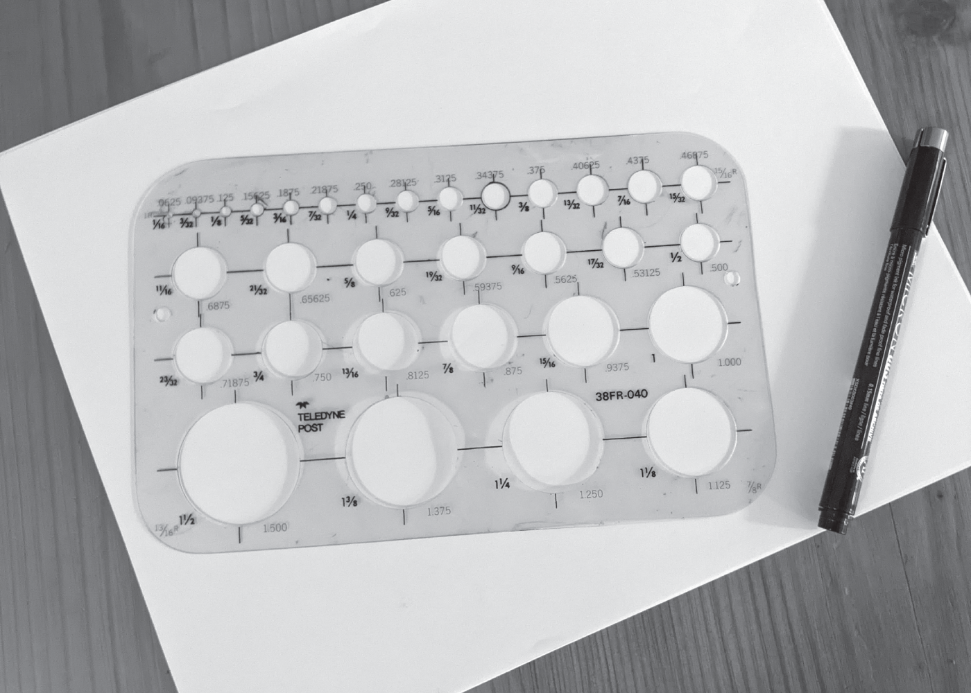
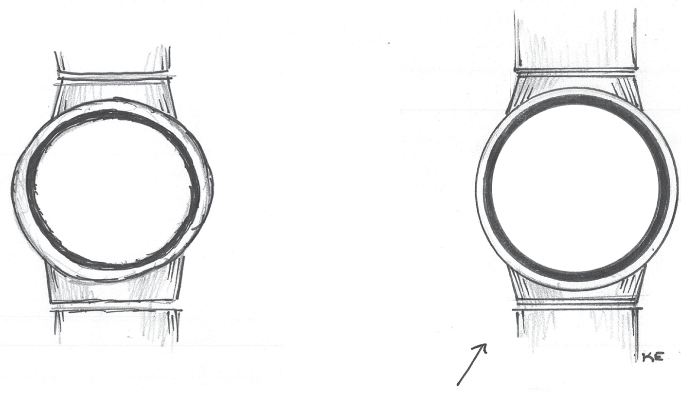
Take a look at the drawing of the watch face in Figure 3.10. The drawing on the left was drawn without a circle template. I used a circle template to draw the one on the right. Which is a clearer representation of a circular watch face?
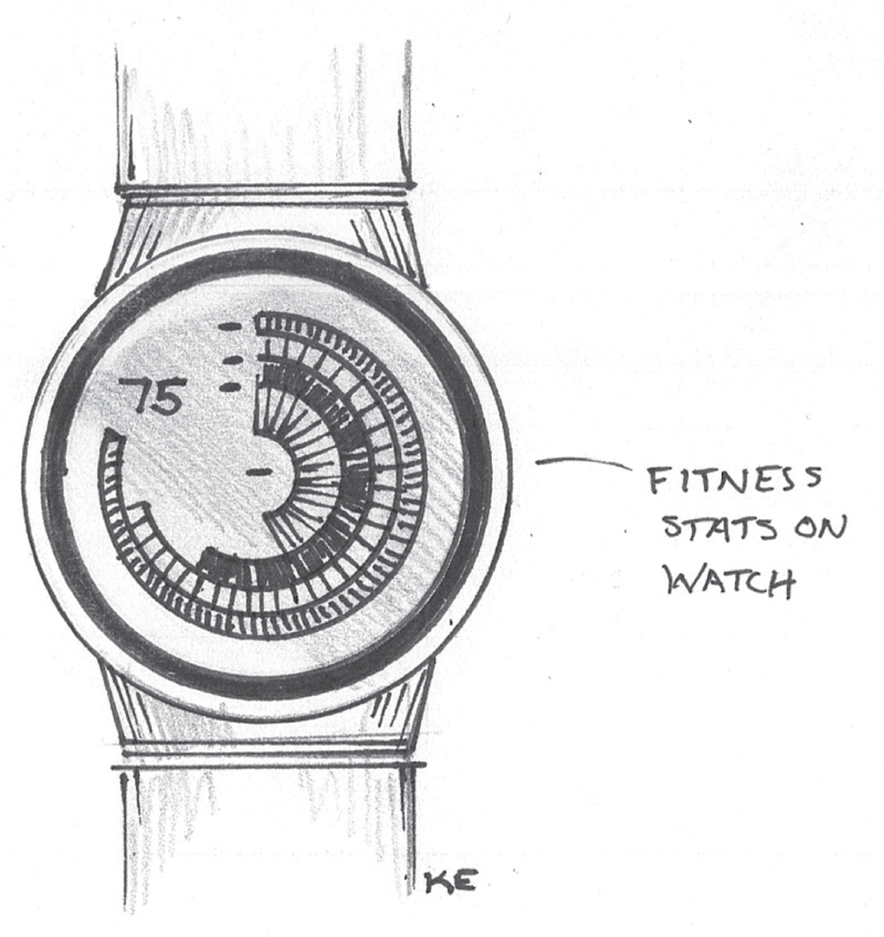
I'm fairly certain that if you're designing an experience on a circular watch face, most of the UI elements will also be circular. All of the underlying lines used to create the drawing in Figure 3.11 were drawn with a circle template. Because of this, the visualization becomes the focal point of the drawing.
Gestural Lines
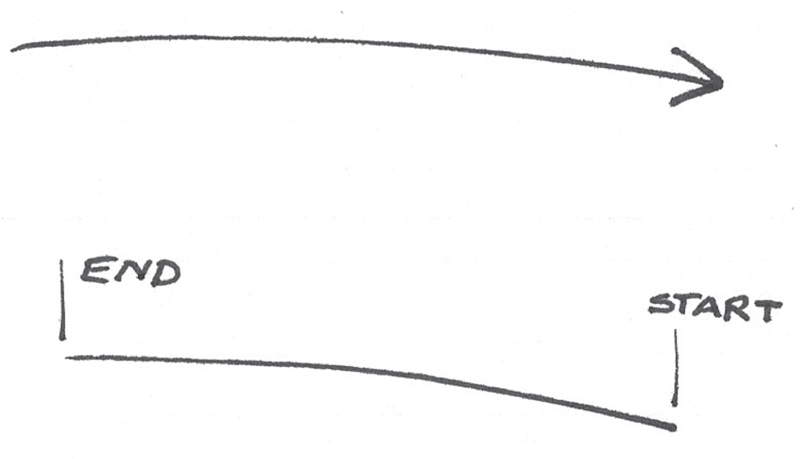
Just like Vincent Van Gogh, we can use lines to suggest direction. It's important to keep this in mind as you're drawing. When drawing a line, always think about where the line would logically originate and start there. End the line somewhere in the desired direction you want to go. Your line will most likely be thicker at its origin than at its end. This will give your line a gestural quality that implies direction and motion. It's a small detail that goes a long way in making a drawing look polished.
To bring this to life, let's take a look at the example coming up in Figure 3.12. If you're drawing grass growing out of the ground, you can use lines to represent blades of grass. Since grass grows from the ground up, start your lines at the ground level and work upward. We can add a nice curvy, gestural quality to each line to give the grass a lively, organic feel.

If you're drawing an arrow as depicted in Figure 3.13, start with the head end of the arrow. The arrowhead will be placed at the end of your line. The tail of the arrow will appear to trail off, giving it a nice gestural quality.
Here are a few other examples to consider: If you're drawing a tree diagram, the lines should start at each branch's origin and move outward. And if you're using lines to represent light, the radiating lines should start at the light's source and move outward, away from the source.
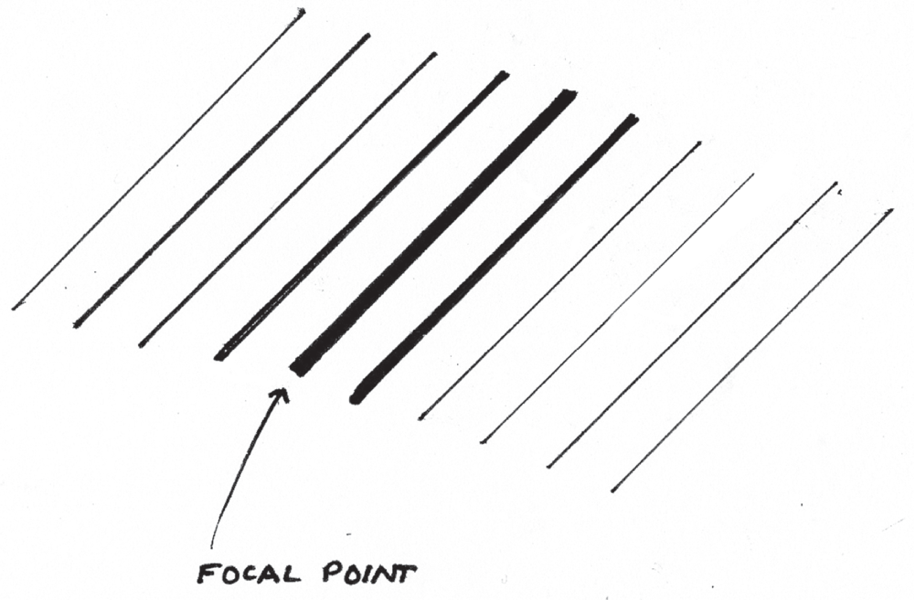
Line Weight
Just as Van Gogh used line weights to draw focus, you can do the same in your UX drawings. Thicker lines command more attention. You might use line thickness as a way to direct focus as suggested in Figure 3.14.
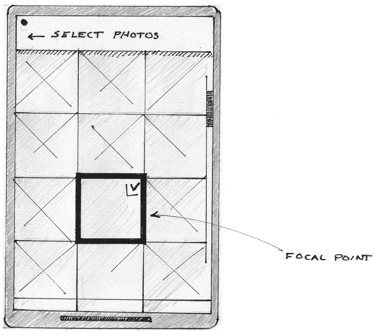
Let's take a look at an example in practice. In Figure 3.15, thick lines are used to create a focal point in the photos grid. This represents a photo that is selected for sharing.
Finally, just like in the earlier Van Gogh example, lines can be used to represent concepts like light and shadow within a drawing, as shown in Figure 3.16. We'll cover more on shading techniques later on in Chapter 6, “Illustrating Light, Motion, and Other Concepts.”
As you can see, lines play an essential role in describing the objects in our visual library. They can elevate the polish and quality of your drawing. Well-drawn lines can enable your colleagues to focus on the content of your drawings. These marks possess a lot of magical qualities, and the possibilities are exciting. When creating your next drawing, think about each line and what it represents.

MAKING MEANING WITH POINTS
Points are the most basic marks we use in our drawings. They are a tiny part of a much larger image that carries meaning. In his book Visual Grammar (Princeton Architectural Press, 2006), Christian Leborg describes the point as something you cannot see or feel. It is a place without area and its position is defined by its x-, y-, and z-coordinates. When we're drawing, we use a basic dot to represent a point. We often get this when we first touch the pen to a drawing surface (Figure 3.17).

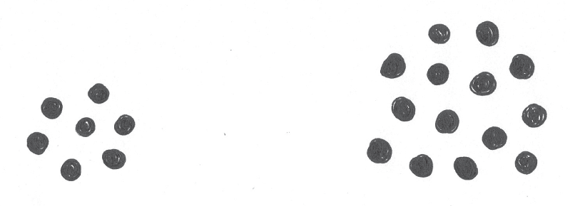
Simple points can carry a lot of meaning in our digital product drawings. To start, let's take a look at some of the drawings we already discussed in Chapter 2, “Reframing Our Thinking.” To refresh your memory, take a look at the images in Figure 3.18 and Figure 3.19. These were some ways in which we represented the two values through an arrangement of points.

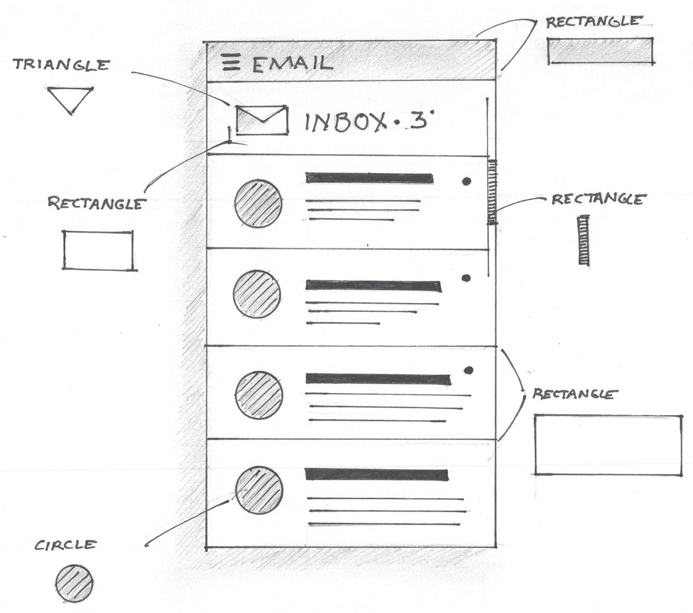
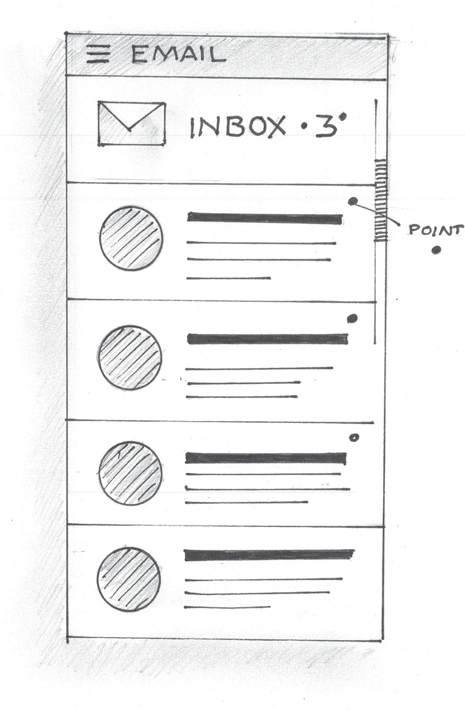
Points can be used to delineate marks in our interface drawings. In Figure 3.20, points were used to symbolize unread messages in the email inbox sketch.
In Figure 3.21, the navigational element used in the image carousel was created by drawing a set of points.
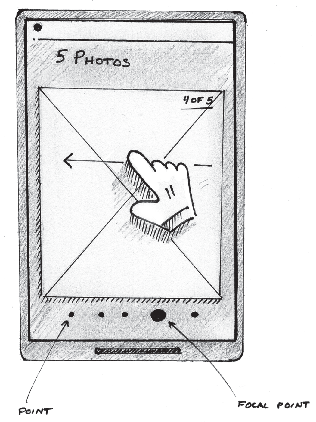
Just as we did with lines, we can use larger points to draw focus. Notice how the larger point in Figure 3.21 creates a focal point. In this case, the larger point, marked by the focal point label, indicates which photo we're looking at within the lineup of photos featured in the carousel.
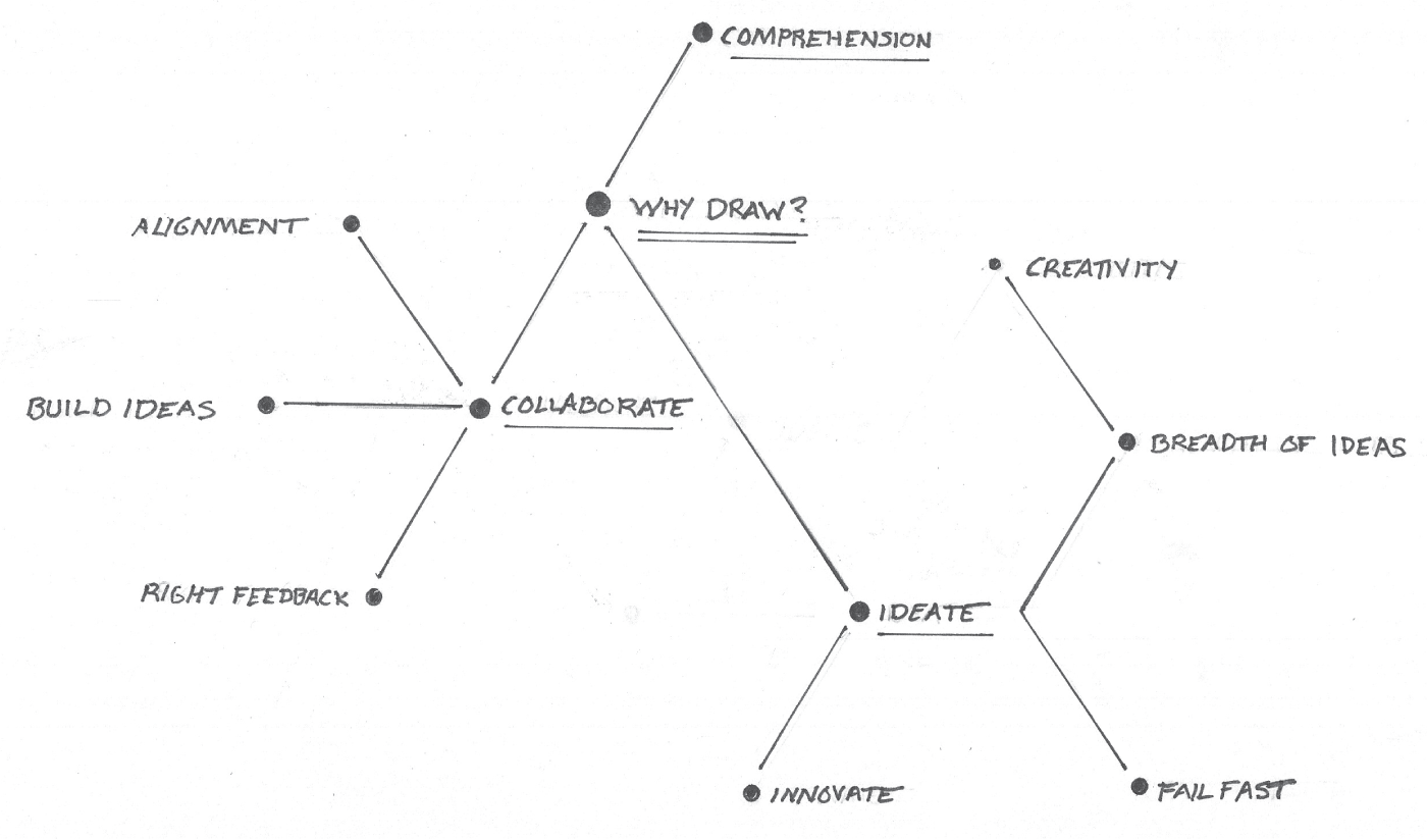
Remember the mind map we reviewed in Chapter 2? Here's yet another version drawn with points (Figure 3.22). In this example, each point acts as a node and the diagram shows the relationships and connections between each node.
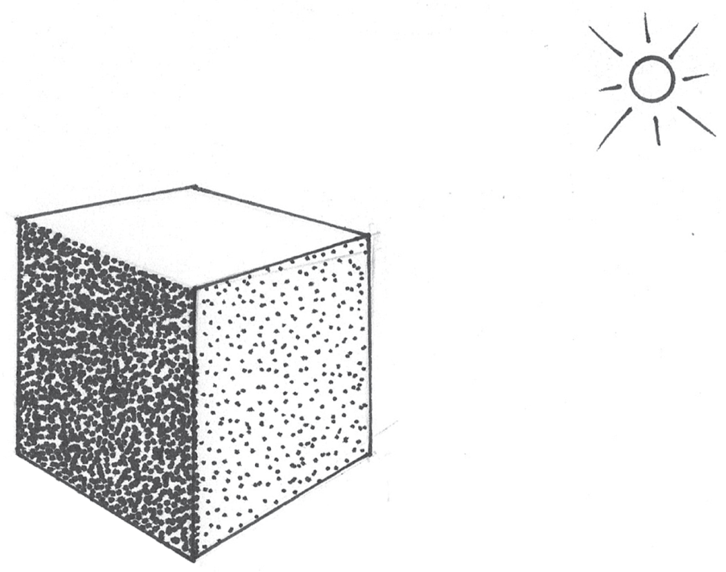
Figure 3.23 depicts how points can be used to represent the concept of light and shadows. I'll cover more on that later in Chapter 6.
These are just a few examples of how points can be used in your product drawings. Just like lines, points are another versatile mark in our collection. Being mindful of how and when we use points in our drawings can really enhance the way in which we communicate our ideas.
TOOLS AND MATERIALS
Tools and materials also make a difference in the quality of our drawings. In addition to the aforementioned circle templates and straightedges, a good set of pens and pencils and the right paper are equally important. For pens, I prefer Sakura's Pigma Micron pens. These are often sold in a set that includes multiple pens that can produce line weights of varying widths. The widths are measured in millimeters. This enables you to create thick lines for focal points and thinner lines for less important features. Medium pens can be used to create finer annotations and labels for your drawing. Some of the thin pens come in handy when creating shading and textures. Applying lines of varying thickness to your drawing will enable you to create drawings that look more polished and focused.
I also have a set of Faber-Castell graphite sketch pencils. I break them out when I'm creating higher quality drawings that I'll share with my colleagues. The degrees of softness of the graphite varies across the set. The harder pencils are nice for writing labels, annotations, and structural lines in the drawing. The softer pencils are nice for shading, creating focal points, and more gestural organic lines. The graphite also smudges nicely.
Finally, paper matters. Paper with more surface texture will enable you to create rougher, sketchier, and more ambiguous pencil lines. There are times when line ambiguity is key to communicating a feeling or the essence of your idea, as you learned from Professor Joe Biondo in Chapter 1, “Why Draw?” I'd suggest experimenting with pens, pencils, and various paper types to explore different styles. Then, find the right combination of tools and materials that works for you. It may take some time to do this, but it will make a difference, and it dramatically impacts the ways in which you make marks on the paper.
The way in which you draw your lines and points will affect people's focus, comprehension, and engagement with your drawing. Considerations like thickness, size, weight, and direction will enable you to start drawing with the finesse of a designer while enabling your shapes to carry rich meaning and allowing your greater drawing to convey a robust story about your idea.
Now, let's start using this knowledge to draw something. Let's start drawing some of the shapes, symbols, and elements that we'll reuse across all of our drawings. These are the elements of our visual library. We'll start building drawings out of rectangles, then we'll move on to other shapes like circles and triangles. We will also review some more complex symbols such as cursor hands and people.