Chapter 6. Similarity, Neighbors, and Clusters
Fundamental concepts: Calculating similarity of objects described by data; Using similarity for prediction; Clustering as similarity-based segmentation.
Exemplary techniques: Searching for similar entities; Nearest neighbor methods; Clustering methods; Distance metrics for calculating similarity.
Similarity underlies many data science methods and solutions to business problems. If two things (people, companies, products) are similar in some ways they often share other characteristics as well. Data mining procedures often are based on grouping things by similarity or searching for the “right” sort of similarity. We saw this implicitly in previous chapters where modeling procedures create boundaries for grouping instances together that have similar values for their target variables. In this chapter we will look at similarity directly, and show how it applies to a variety of different tasks. We include sections with some technical details, in order that the more mathematical reader can understand similarity in more depth; these sections can be skipped.
Different sorts of business tasks involve reasoning from similar examples:
- We may want to retrieve similar things directly. For example, IBM wants to find companies that are similar to their best business customers, in order to have the sales staff look at them as prospects. Hewlett-Packard maintains many high-performance servers for clients; this maintenance is aided by a tool that, given a server configuration, retrieves information on other similarly configured servers. Advertisers often want to serve online ads to consumers who are similar to their current good customers.
- Similarity can be used for doing classification and regression. Since we now know a good bit about classification, we will illustrate the use of similarity with a classification example below.
- We may want to group similar items together into clusters, for example to see whether our customer base contains groups of similar customers and what these groups have in common. Previously we discussed supervised segmentation; this is unsupervised segmentation. After discussing the use of similarity for classification, we will discuss its use for clustering.
- Modern retailers such as Amazon and Netflix use similarity to provide recommendations of similar products or from similar people. Whenever you see statements like “People who like X also like Y” or “Customers with your browsing history have also looked at …” similarity is being applied. In Chapter 12, we will discuss how a customer can be similar to a movie, if the two are described by the same “taste dimensions.” In this case, to make recommendations we can find the movies that are most similar to the customer (and which the customer has not already seen).
- Reasoning from similar cases of course extends beyond business applications; it is natural to fields such as medicine and law. A doctor may reason about a new difficult case by recalling a similar case (either treated personally or documented in a journal) and its diagnosis. A lawyer often argues cases by citing legal precedents, which are similar historical cases whose dispositions were previously judged and entered into the legal casebook. The field of Artificial Intelligence has a long history of building systems to help doctors and lawyers with such case-based reasoning. Similarity judgments are a key component.
In order to discuss these applications further, we need to take a minute to formalize similarity and its cousin, distance.
Similarity and Distance
Once an object can be represented as data, we can begin to talk more precisely about the similarity between objects, or alternatively the distance between objects. For example, let’s consider the data representation we have used throughout the book so far: represent each object as a feature vector. Then, the closer two objects are in the space defined by the features, the more similar they are.
Recall that when we build and apply predictive models, the goal is to determine the value of a target characteristic. In doing so, we’ve used the implicit similarity of objects already. Visualizing Segmentations discussed the geometric interpretation of some classification models and Classification via Mathematical Functions discussed how two different model types divide up an instance space into regions based on closeness of instances with similar class labels. Many methods in data science may be seen in this light: as methods for organizing the space of data instances (representations of important objects) so that instances near each other are treated similarly for some purpose. Both classification trees and linear classifiers establish boundaries between regions of differing classifications. They have in common the view that instances sharing a common region in space should be similar; what differs between the methods is how the regions are represented and discovered.
So why not reason about the similarity or distance between objects directly? To do so, we need a basic method for measuring similarity or distance. What does it mean that two companies or two consumers are similar? Let’s examine this carefully. Consider two instances from our simplified credit application domain:
| Attribute | Person A | Person B |
Age | 23 | 40 |
Years at current address | 2 | 10 |
Residential status (1=Owner, 2=Renter, 3=Other) | 2 | 1 |
These data items have multiple attributes, and there’s no single best method for reducing them to a single similarity or distance measurement. There are many different ways to measure the similarity or distance between Person A and Person B. A good place to begin is with measurements of distance from basic geometry.

Recall from our prior discussions of the geometric interpretation that if we
have two (numeric) features, then each object is a point in a two-dimensional
space. Figure 6-1 shows two data items, A and B, located on a
two-dimensional plane. Object A is at coordinates (xA, yA) and B is at
(xB, yB). At the risk of too much repetition, note that these
coordinates are just the values of the two features of the objects. We can
draw a right triangle between the two objects, as shown, whose base is the
difference in the x’s: (xA – xB) and whose height is the difference in the y’s: (yA – yB). The Pythagorean theorem tells us that the distance between A and B is given by the length of the hypotenuse, and is equal to the square root of the summed squares of the lengths of the other two sides of the triangle, which in this case is ![]() . Essentially, we can compute the overall distance by computing the distances of the individual dimensions—the individual features in our setting. This is called the Euclidean distance [34] between two points, and it’s probably the most common geometric distance measure.
. Essentially, we can compute the overall distance by computing the distances of the individual dimensions—the individual features in our setting. This is called the Euclidean distance [34] between two points, and it’s probably the most common geometric distance measure.
Euclidean distance is not limited to two dimensions. If A and B were objects described by three features, they could be represented by points in three-dimensional space and their positions would then be represented as (xA, yA, zA) and (xB, yB, zB). The distance between A and B would then include the term (zA–zB)2. We can add arbitrarily many features, each a new dimension. When an object is described by n features, n dimensions (d1, d2, …, dn), the general equation for Euclidean distance in n dimensions is shown in Equation 6-1:

We now have a metric for measuring the distance between any two objects described by vectors of numeric features—a simple formula based on the distances of the objects’ individual features. Recalling persons A and B, above, their Euclidean distance is:
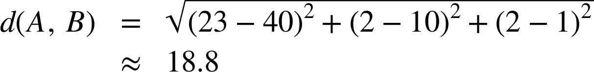
So the distance between these examples is about 19. This distance is just a number—it has no units, and no meaningful interpretation. It is only really useful for comparing the similarity of one pair of instances to that of another pair. It turns out that comparing similarities is extremely useful.
Nearest-Neighbor Reasoning
Now that we have a way to measure distance, we can use it for many different data-analysis tasks. Recalling examples from the beginning of the chapter, we could use this measure to find the companies most similar to our best corporate customers, or the online consumers most similar to our best retail customers. Once we have found these, we can take whatever action is appropriate in the business context. For corporate customers, IBM does this to help direct its sales force. Online advertisers do this to target ads. These most-similar instances are called nearest neighbors.
Example: Whiskey Analytics
Let’s talk about a fresh example. One of us (Foster) likes single malt Scotch whiskey. If you’ve had more than one or two, you realize that there is a lot of variation among the hundreds of different single malts. When Foster finds a single malt he really likes, he wants to find other similar ones—both because he likes to explore the “space” of single malts, but also because any given liquor store or restaurant only has a limited selection. He wants to be able to pick one he’ll really like. For example, the other evening a dining companion recommended trying the single malt “Bunnahabhain.”[35] It was unusual and very good. Out of all the many single malts, how could Foster find other ones like that?
Let’s take a data science approach. Recall from Chapter 2 that we first should think about the exact question we would like to answer, and what are the appropriate data to answer it. How can we describe single malt Scotch whiskeys as feature vectors, in such a way that we think similar whiskeys will have similar taste? This is exactly the project undertaken by François-Joseph Lapointe and Pierre Legendre (1994) of the University of Montréal. They were interested in several classification and organizational questions about Scotch whiskeys. We’ll adopt some of their approach here.[36]
It turns out that tasting notes are published for many whiskeys. For example, Michael Jackson is a well-known whiskey and beer connoisseur who has written Michael Jackson’s Malt Whisky Companion: A Connoisseur’s Guide to the Malt Whiskies of Scotland (Jackson, 1989), which describes 109 different single malt Scotches of Scotland. The descriptions are in the form of tasting notes on each Scotch, such as: “Appetizing aroma of peat smoke, almost incense-like, heather honey with a fruity softness.”
As data scientists, we are making progress. We have found a potentially useful source of data. However, we do not yet have whiskeys described by feature vectors, only by tasting notes. We need to press on with our data formulation. Following Lapointe and Legendre (1994), let’s create some numeric features that, for any whiskey, will summarize the information in the tasting notes. Define five general whiskey attributes, each with many possible values:
1. | Color: yellow, very pale, pale, pale gold, gold, old gold, full gold, amber, etc. | (14 values) |
2. | Nose: aromatic, peaty, sweet, light, fresh, dry, grassy, etc. | (12 values) |
3. | Body: soft, medium, full, round, smooth, light, firm, oily. | (8 values) |
4. | Palate: full, dry, sherry, big, fruity, grassy, smoky, salty, etc. | (15 values) |
5. | Finish: full, dry, warm, light, smooth, clean, fruity, grassy, smoky, etc. | (19 values) |
It is important to note that these category values are not mutually exclusive (e.g., Aberlour’s palate is described as medium, full, soft, round and smooth). In general, any of the values can co-occur (though some of them, like Color being both light and smoky, never do) but because they can co-occur, each value of each variable was coded as a separate feature by Lapointe and Legendre. Consequently there are 68 binary features of each whiskey.
Foster likes Bunnahabhain, so we can use Lapointe and Legendre’s representation of whiskeys with Euclidean distance to find similar ones for him. For reference, here is their description of Bunnahabhain:
- Color: gold
- Nose: fresh and sea
- Body: firm, medium, and light
- Palate: sweet, fruity, and clean
- Finish: full
Here is Bunnahabhain’s description and the five single-malt Scotches most similar to Bunnahabhain, by increasing distance:
| Whiskey | Distance | Descriptors |
Bunnahabhain | — | gold; firm,med,light; sweet,fruit,clean; fresh,sea; full |
Glenglassaugh | 0.643 | gold; firm,light,smooth; sweet,grass; fresh,grass |
Tullibardine | 0.647 | gold; firm,med,smooth; sweet,fruit,full,grass,clean; sweet; big,arome,sweet |
Ardbeg | 0.667 | sherry; firm,med,full,light; sweet; dry,peat,sea;salt |
Bruichladdich | 0.667 | pale; firm,light,smooth; dry,sweet,smoke,clean; light; full |
Glenmorangie | 0.667 | p.gold; med,oily,light; sweet,grass,spice; sweet,spicy,grass,sea,fresh; full,long |
Using this list we could find a Scotch similar to Bunnahabhain. At any particular shop we might have to go down the list a bit to find one they stock, but since the Scotches are ordered by similarity we can easily find the most similar Scotch (and also have a vague idea as to how similar the closest available Scotch is as compared to the alternatives that are not available).
Tip
If you’re interested in playing with the Scotch Whiskey dataset, Lapointe and Legendre have made their data and paper available at: http://adn.biol.umontreal.ca/~numericalecology/data/scotch.html .
This is an example of the direct application of similarity to solve a problem. Once we understand this fundamental notion, we have a powerful conceptual tool for approaching a variety of problems, such as those laid out above (finding similar companies, similar consumers, etc.). As we see in the whiskey example, the data scientist often still has work to do to actually define the data so that the similarity will be with respect to a useful set of characteristics. Later we will present some other notions of similarity and distance. Now, let’s move on to another very common use of similarity in data science.
Nearest Neighbors for Predictive Modeling
We also can use the idea of nearest neighbors to do predictive modeling in a different way. Take a minute to recall everything you now know about predictive modeling from prior chapters. To use similarity for predictive modeling, the basic procedure is beautifully simple: given a new example whose target variable we want to predict, we scan through all the training examples and choose several that are the most similar to the new example. Then we predict the new example’s target value, based on the nearest neighbors’ (known) target values. How to do that last step needs to be defined; for now, let’s just say that we have some combining function (like voting or averaging) operating on the neighbors’ known target values. The combining function will give us a prediction.
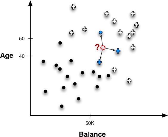
Classification
Since we have focused a great deal on classification tasks so far in the book, let’s begin by seeing how neighbors can be used to classify a new instance in a super-simple setting. Figure 6-2 shows a new example whose label we want to predict, indicated by a “?.” Following the basic procedure introduced above, the nearest neighbors (in this example, three of them) are retrieved and their known target variables (classes) are consulted. In this case, two examples are positive and one is negative. What should be our combining function? A simple combining function in this case would be majority vote, so the predicted class would be positive.
Adding just a little more complexity, consider a credit card marketing problem. The goal is to predict whether a new customer will respond to a credit card offer based on how other, similar customers have responded. The data (still oversimplified of course) are shown in Table 6-1.
| Customer | Age | Income (1000s) | Cards | Response (target) | Distance from David |
David | 37 | 50 | 2 | ? | 0 |
John | 35 | 35 | 3 | Yes |
|
Rachael | 22 | 50 | 2 | No |
|
Ruth | 63 | 200 | 1 | No |
|
Jefferson | 59 | 170 | 1 | No |
|
Norah | 25 | 40 | 4 | Yes |
|
In this example data, there are five existing customers we previously have contacted with a credit card offer. For each of them we have their name, age, income, the number of cards they already have, and whether they responded to the offer. For a new person, David, we want to predict whether he will respond to the offer or not.
The last column in Table 6-1 shows a distance calculation, using Equation 6-1, of how far each instance is from David. Three customers (John, Rachael, and Norah) are fairly similar to David, with a distance of about 15. The other two customers (Ruth and Jefferson) are much farther away. Therefore, David’s three nearest neighbors are Rachael, then John, then Norah. Their responses are No, Yes, and Yes, respectively. If we take a majority vote of these values, we predict Yes (David will respond). This touches upon some important issues with nearest-neighbor methods: how many neighbors should we use? Should they have equal weights in the combining function? We discuss these later in the chapter.
Probability Estimation
We’ve made the point that it’s usually important not just to classify a new example but to estimate its probability—to assign a score to it, because a score gives more information than just a Yes/No decision. Nearest neighbor classification can be used to do this fairly easily. Consider again the classification task of deciding whether David will be a responder or not. His nearest neighbors (Rachael, John, and Norah) have classes of No, Yes, and Yes, respectively. If we score for the Yes class, so that Yes=1 and No=0, we can average these into a score of 2/3 for David. If we were to do this in practice, we might want to use more than just three nearest neighbors to compute the probability estimates (and recall the discussion of estimating probabilities from small samples in Probability Estimation).
Regression
Once we can retrieve nearest neighbors, we can use them for any predictive mining task by combining them in different ways. We just saw how to do classification by taking a majority vote of a target. We can do regression in a similar way.
Assume we had the same dataset as in Table 6-1, but this time we want to predict David’s Income. We won’t redo the distance calculation, but assume that David’s three nearest neighbors were again Rachael, John, and Norah. Their respective incomes are 50, 35, and 40 (in thousands). We then use these values to generate a prediction for David’s income. We could use the average (about 42) or the median (40).
Note
It is important to note that in retrieving neighbors we do not use the target variable because we’re trying to predict it. Thus Income would not enter into the distance calculation as it does in Table 6-1. However, we’re free to use any other variables whose values are available to determine distance.
How Many Neighbors and How Much Influence?
In the course of explaining how classification, regression, and scoring may be done, we have used an example with only three neighbors. Several questions may have occurred to you. First, why three neighbors, instead of just one, or five, or one hundred? Second, should we treat all neighbors the same? Though all are called “nearest” neighbors, some are nearer than others, and shouldn’t this influence how they’re used?
There is no simple answer to how many neighbors should be used. Odd numbers are convenient for breaking ties for majority vote classification with two-class problems. Nearest neighbor algorithms are often referred to by the shorthand k-NN, where the k refers to the number of neighbors used, such as 3-NN.
In general, the greater k is the more the estimates are smoothed out among neighbors. If you have understood everything so far, with a little thought you should realize that if we increase k to the maximum possible (so that k = n) the entire dataset would be used for every prediction. Elegantly, this simply predicts the average over the entire dataset for any example. For classification, this would predict the majority class in the entire dataset; for regression, the average of all the target values; for class probability estimation, the “base rate” probability (see Note: Base rate in “Holdout Data and Fitting Graphs” in Chapter 5).
Even if we’re confident about the number of neighbor examples we should use, we may realize that neighbors have different similarity to the example we’re trying to predict. Shouldn’t this influence how they’re used?
For classification we started with a simple strategy of majority voting, retrieving an odd number of neighbors to break ties. However, this ignores an important piece of information: how close each neighbor is to the instance. For example, consider what would happen if we used k = 4 neighbors to classify David. We would retrieve the responses (Yes, No, Yes, No), causing the responses to be evenly mixed. But the first three are very close to David (distance ≈ 15) while the fourth is much further away (distance ≈ 122). Intuitively, this fourth instance shouldn’t contribute as much to the vote as the first three. To incorporate this concern, nearest-neighbor methods often use weighted voting or similarity moderated voting such that each neighbor’s contribution is scaled by its similarity.
Consider again the data in Table 6-1, involving predicting whether David will respond to a credit card offer. We showed that if we predict David’s class by majority vote it depends greatly on the number of neighbors we choose. Let’s redo the calculations, this time using all neighbors but scaling each by its similarity to David, using as the scaling weight the reciprocal of the square of the distance. Here are the neighbors ordered by their distance from David:
| Name | Distance | Similarity weight | Contribution | Class |
Rachael | 15.0 | 0.004444 | 0.344 | No |
John | 15.2 | 0.004348 | 0.336 | Yes |
Norah | 15.7 | 0.004032 | 0.312 | Yes |
Jefferson | 122.0 | 0.000067 | 0.005 | No |
Ruth | 152.2 | 0.000043 | 0.003 | No |
The Contribution column is the amount that each neighbor contributes to the final calculation of the target probability prediction (the contributions are proportional to the weights, but adding up to one). We see that distances greatly effect contributions: Rachael, John and Norah are most similar to David and effectively determine our prediction of his response, while Jefferson and Ruth are so far away that they contribute virtually nothing. Summing the contributions for the positive and negative classes, the final probability estimates for David are 0.65 for Yes and 0.35 for No.
This concept generalizes to other sorts of prediction tasks, for example regression and class probability estimation. Generally, we can think of the procedure as weighted scoring. Weighted scoring has a nice consequence in that it reduces the importance of deciding how many neighbors to use. Because the contribution of each neighbor is moderated by its distance, the influence of neighbors naturally drops off the farther they are from the instance. Consequently, when using weighted scoring the exact value of k is much less critical than with majority voting or unweighted averaging. Some methods avoiding committing to a k by retrieving a very large number of instances (e.g., all instances, k = n) and depend upon distance weighting to moderate the influences.
Geometric Interpretation, Overfitting, and Complexity Control
As with other models we’ve seen, it is instructive to visualize the classification regions created by a nearest-neighbor method. Although no explicit boundary is created, there are implicit regions created by instance neighborhoods. These regions can be calculated by systematically probing points in the instance space, determining each point’s classification, and constructing the boundary where classifications change.
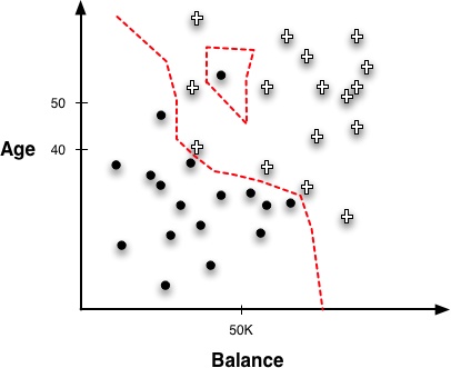
Figure 6-3 illustrates such a region created by a 1-NN classifier around the instances of our “Write-off” domain. Compare this with the classification tree regions from Figure 3-15 and the regions created by the linear boundary in Figure 4-3.
Notice that the boundaries are not lines, nor are they even any recognizable geometric shape; they are erratic and follow the frontiers between training instances of different classes. The nearest-neighbor classifier follows very specific boundaries around the training instances. Note also the one negative instance isolated inside the positive instances creates a “negative island” around itself. This point might be considered noise or an outlier, and another model type might smooth over it.
Some of this sensitivity to outliers is due to the use of a 1-NN classifier, which retrieves only single instances, and so has a more erratic boundary than one that averages multiple neighbors. We will return to that in a minute. More generally, irregular concept boundaries are characteristic of all nearest-neighbor classifiers, because they do not impose any particular geometric form on the classifier. Instead, they form boundaries in instance space tailored to the specific data used for training.
This should recall our discussions of overfitting and complexity control from Chapter 5. If you’re thinking that 1-NN must overfit very strongly, then you are correct. In fact, think about what would happen if you evaluated a 1-NN classifier on the training data. When classifying each training data point, any reasonable distance metric would lead to the retrieval of that training point itself as its own nearest neighbor! Then its own value for the target variable would be used to predict itself, and voilà, perfect classification. The same goes for regression. The 1-NN memorizes the training data. It does a little better than our strawman lookup table from the beginning of Chapter 5, though. Since the lookup table did not have any notion of similarity, it simply predicted perfectly for exact training examples, and gave some default prediction for all others. The 1-NN classifier predicts perfectly for training examples, but it also can make an often reasonable prediction on other examples: it uses the most similar training example.
Thus, in terms of overfitting and its avoidance, the k in a k-NN classifier is a complexity parameter. At one extreme, we can set k = n and we do not allow much complexity at all in our model. As described previously, the n-NN model (ignoring similarity weighting) simply predicts the average value in the dataset for each case. At the other extreme, we can set k = 1, and we will get an extremely complex model, which places complicated boundaries such that every training example will be in a region labeled by its own class.
Now let’s return to an earlier question: how should one choose k? We can use the same procedure discussed in A General Method for Avoiding Overfitting for setting other complexity parameters: we can conduct cross-validation or other nested holdout testing on the training set, for a variety of different values of k, searching for one that gives the best performance on the training data. Then when we have chosen a value of k, we build a k-NN model from the entire training set. As discussed in detail in Chapter 5, since this procedure only uses the training data, we can still evaluate it on the test data and get an unbiased estimate of its generalization performance. Data mining tools usually have the ability to do such nested cross-validation to set k automatically.
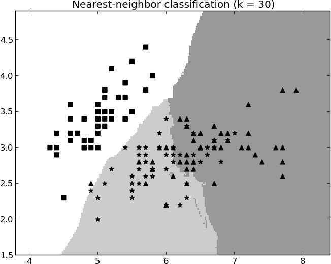
Figure 6-4 and Figure 6-5 show different boundaries created by nearest-neighbor classifiers. Here a simple three-class problem is classified using different numbers of neighbors. In Figure 6-4, only a single neighbor is used, and the boundaries are erratic and very specific to the training examples in the dataset. In Figure 6-5, 30 nearest neighbors are averaged to form a classification. The boundaries are obviously different from Figure 6-4 and are much less jagged. Note, however, that in neither case are the boundaries smooth curves or regular piecewise geometric regions that we would expect to see with a linear model or a tree-structured model. The boundaries for k-NN are more strongly defined by the data.

Issues with Nearest-Neighbor Methods
Before concluding a discussion of nearest-neighbor methods as predictive models, we should mention several issues regarding their use. These often come into play in real-world applications.
Intelligibility
Intelligibility of nearest-neighbor classifiers is a complex issue. As mentioned, in some fields such as medicine and law, reasoning about similar historical cases is a natural way of coming to a decision about a new case. In such fields, a nearest-neighbor method may be a good fit. In other areas, the lack of an explicit, interpretable model may pose a problem.
There are really two aspects to this issue of intelligibility: the justification of a specific decision and the intelligibility of an entire model.
With k-NN, it usually is easy to describe how a single instance is decided: the set of neighbors participating in the decision can be presented, along with their contributions. This was done for the example involving the prediction of whether David would respond, earlier in Table 6-1. Some careful phrasing and judicious presentation of nearest neighbors are useful. For example, Netflix uses a form of nearest-neighbor classification for their recommendations, and explains their movie recommendations with sentences like:
“The movie Billy Elliot was recommended based on your interest in Amadeus, The Constant Gardener and Little Miss Sunshine”
Amazon presents recommendations with phrases like: “Customers with similar searches purchased…” and “Related to Items You’ve Viewed.”
Whether such justifications are adequate depends on the application. An Amazon customer may be satisfied with such an explanation for why she got a recommendation. On the other hand, a mortgage applicant may not be satisfied with the explanation, “We declined your mortgage application because you remind us of the Smiths and the Mitchells, who both defaulted.” Indeed, some legal regulations restrict the sorts of models that can be used for credit scoring to models for which very simple explanations can be given based on specific, important variables. For example, with a linear model, one may be able to say: “all else being equal, if your income had been $20,000 higher you would have been granted this particular mortgage.”
It also is easy to explain how the entire nearest-neighbor model generally decides new cases. The idea of finding the most similar cases and looking at how they were classified, or what value they had, is intuitive to many.
What is difficult is to explain more deeply what “knowledge” has been mined from the data. If a stakeholder asks “What did your system learn from the data about my customers? On what basis does it make its decisions?” there may be no easy answer because there is no explicit model. Strictly speaking, the nearest-neighbor “model” consists of the entire case set (the database), the distance function, and the combining function. In two dimensions we can visualize this directly as we did in the prior figures. However, this is not possible when there are many dimensions. The knowledge embedded in this model is not usually understandable, so if model intelligibility and justification are critical, nearest-neighbor methods should be avoided.
Dimensionality and domain knowledge
Nearest-neighbor methods typically take into account all features when calculating the distance between two instances. Heterogeneous Attributes below discusses one of the difficulties with attributes: numeric attributes may have vastly different ranges, and unless they are scaled appropriately the effect of one attribute with a wide range can swamp the effect of another with a much smaller range. But apart from this, there is a problem with having too many attributes, or many that are irrelevant to the similarity judgment.
For example, in the credit card offer domain, a customer database could contain much incidental information such as number of children, length of time at job, house size, median income, make and model of car, average education level, and so on. Conceivably some of these could be relevant to whether the customer would accept the credit card offer, but probably most would be irrelevant. Such problems are said to be high-dimensional—they suffer from the so-called curse of dimensionality—and this poses problems for nearest neighbor methods. Much of the reason and effects are quite technical,[37] but roughly, since all of the attributes (dimensions) contribute to the distance calculations, instance similarity can be confused and misled by the presence of too many irrelevant attributes.
There are several ways to fix the problem of many, possibly irrelevant attributes. One is feature selection, the judicious determination of features that should be included in the data mining model. Feature selection can be done manually by the data miner, using background knowledge as what attributes are relevant. This is one of the main ways in which a data mining team injects domain knowledge into the data mining process. As discussed in Chapter 3 and Chapter 5 there are also automated feature selection methods that can process the data and make judgments about which attributes give information about the target.
Another way of injecting domain knowledge into similarity calculations is to tune the similarity/distance function manually. We may know, for example, that the attribute Number of Credit Cards should have a strong influence on whether a customer accepts an offer for another one. A data scientist can tune the distance function by assigning different weights to the different attributes (e.g., giving a larger weight to Number of Credit Cards). Domain knowledge can be added not only because we believe we know what will be more predictive, but more generally because we know something about the similar entities we want to find. When looking for similar whiskeys, I may know that “peatiness” is important to my judging a single malt as tasting similar, so I could give peaty a higher weight in the similarity calculation. If another taste variable is unimportant, I could remove it or simply give it a low weight.
Computational efficiency
One benefit of nearest-neighbor methods is that training is very fast because it usually involves only storing the instances. No effort is expended in creating a model. The main computational cost of a nearest neighbor method is borne by the prediction/classification step, when the database must be queried to find nearest neighbors of a new instance. This can be very expensive, and the classification expense should be a consideration. Some applications require extremely fast predictions; for example, in online advertisement targeting, decisions may need to be made in a few tens of milliseconds. For such applications, a nearest neighbor method may be impractical.
Note
There are techniques for speeding up neighbor retrievals. Specialized data structures like kd-trees and hashing methods (Shakhnarovich, Darrell, & Indyk, 2005; Papadopoulos & Manolopoulos, 2005) are employed in some commercial database and data mining systems to make nearest neighbor queries more efficient. However, be aware that many small-scale and research data mining tools usually do not employ such techniques, and still rely on naive brute-force retrieval.
Some Important Technical Details Relating to Similarities and Neighbors
Heterogeneous Attributes
Up to this point we have been using Euclidean distance, showing that it was easy to calculate. If attributes are numeric and are directly comparable, the distance calculation is indeed straightforward. When examples contain complex, heterogeneous attributes things become more complicated. Consider another example in the same domain but with a few more attributes:
| Attribute | Person A | Person B |
Sex | Male | Female |
Age | 23 | 40 |
Years at current address | 2 | 10 |
Residential status (1=Owner, 2=Renter, 3=Other) | 2 | 1 |
Income | 50,000 | 90,000 |
Several complications now arise. First, the equation for Euclidean distance is numeric, and Sex is a categorical (symbolic) attribute. It must be encoded numerically. For binary variables, a simple encoding like M=0, F=1 may be sufficient, but if there are multiple values for a categorical attribute this will not be good enough.
Also important, we have variables that, though numeric, have very different scales and ranges. Age might have a range from 18 to 100, while Income might have a range from $10 to $10,000,000. Without scaling, our distance metric would consider ten dollars of income difference to be as significant as ten years of age difference, and this is clearly wrong. For this reason nearest-neighbor-based systems often have variable-scaling front ends. They measure the ranges of variables and scale values accordingly, or they apportion values to a fixed number of bins. The general principle at work is that care must be taken that the similarity/distance computation is meaningful for the application.
* Other Distance Functions
Technical Details Ahead
For simplicity, up to this point we have used only a single metric, Euclidean distance. Here we include more details about distance functions and some alternatives.
It is important to note that the similarity measures presented here represent only a tiny fraction of all the similarity measures that have been used. These ones are particularly popular, but both the data scientist and the business analyst should keep in mind that it is important to use a meaningful similarity metric with respect to the business problem at hand. This section may be skipped without loss of continuity.
As noted previously, Euclidean distance is probably the most widely used distance metric in data science. It is general, intuitive and computationally very fast. Because it employs the squares of the distances along each individual dimension, it is sometimes called the L2 norm and sometimes represented by || · ||2. Equation 6-2 shows how it looks formally.

Though Euclidean distance is widely used, there are many other distance calculations. The Dictionary of Distances by Deza & Deza (Elsevier Science, 2006) lists several hundred, of which maybe a dozen or so are used regularly for mining data. The reason there are so many is that in a nearest-neighbor method the distance function is critical. It basically reduces a comparison of two (potentially complex) examples into a single number. The data types and specifics of the domain of application greatly influence how the differences in individual attributes should combine.
The Manhattan distance or L1-norm is the sum of the (unsquared) pairwise distances, as shown in Equation 6-3.

This simply sums the differences along the different dimensions between X and Y. It is called Manhattan (or taxicab) distance because it represents the total street distance you would have to travel in a place like midtown Manhattan (which is arranged in a grid) to get between two points—the total east-west distance traveled plus the total north-south distance traveled.
Researchers studying the whiskey analytics problem introduced above used another common distance metric.[38] Specifically, they used Jaccard distance. Jaccard distance treats the two objects as sets of characteristics. Thinking about the objects as sets allows one to think about the size of the union of all the characteristics of two objects X and Y, |X ∪ Y|, and the size of the set of characteristics shared by the two objects (the intersection), |X ∩ Y|. Given two objects, X and Y, the Jaccard distance is the proportion of all the characteristics (that either has) that are shared by the two. This is appropriate for problems where the possession of a common characteristic between two items is important, but the common absence of a characteristic is not. For example, in finding similar whiskeys it is significant if two whiskeys are both peaty, but it may not be significant that they are both not salty. In set notation, the Jaccard distance metric is shown in Equation 6-4.

Cosine distance is often used in text classification to measure the similarity of two documents. It is defined in Equation 6-5.
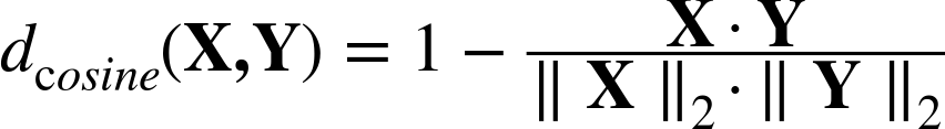
where ||·||2 again represents the L2 norm, or Euclidean length, of each feature vector (for a vector this is simply the distance from the origin).
Note
The information retrieval literature more commonly talks about cosine similarity, which is simply the fraction in Equation 6-5. Alternatively, it is 1 – cosine distance.
In text classification, each word or token corresponds to a dimension, and the location of a document along each dimension is the number of occurrences of the word in that document. For example, suppose document A contains seven occurrences of the word performance, three occurrences of transition, and two occurrences of monetary. Document B contains two occurrences of performance, three occurrences of transition, and no occurrences of monetary. The two documents would be represented as vectors of counts of these three words: A = <7,3,2> and B = <2,3,0>. The cosine distance of the two documents is:

Cosine distance is particularly useful when you want to ignore differences in scale across instances—technically, when you want to ignore the magnitude of the vectors. As a concrete example, in text classification you may want to ignore whether one document is much longer than another, and just concentrate on the textual content. So in our example above, suppose we have a third document, C, which has seventy occurrences of the word performance, thirty occurrences of transition, and twenty occurrences of monetary. The vector representing C would be C = <70, 30, 20>. If you work through the math you’ll find that the cosine distance between A and C is zero—because C is simply A multiplied by 10.
As a final example illustrating the variety of distance metrics, let’s again consider text but in a very different way. Sometimes you may want to measure the distance between two strings of characters. For example, often a business application needs to be able to judge when two data records correspond to the same person. Of course, there may be misspellings. We would want to be able to say how similar two text fields are. Let’s say we have two strings:
-
1113 Bleaker St. -
113 Bleecker St.
We want to determine how similar these are. For this purpose, another type of distance function is useful, called edit distance or the Levenshtein metric. This metric counts the minimum number of edit operations required to convert one string into the other, where an edit operation consists of either inserting, deleting, or replacing a character (one could choose other edit operators). In the case of our two strings, the first could be transformed into the second with this sequence of operations:
-
Delete a
1, -
Insert a
c, and -
Replace an
awith ane.
So these two strings have an edit distance of three. We might compute a similar edit distance calculation for other fields, such as name (thereby dealing with missing middle initials, for example), and then calculate a higher-level similarity that combines the various edit-distance similarities.
* Combining Functions: Calculating Scores from Neighbors
Technical Details Ahead
For completeness, let us also briefly discuss “combining functions”—the formulas used for calculating the prediction of an instance from a set of the instance’s nearest neighbors.
We began with majority voting, a simple strategy. This decision rule can be seen in Equation 6-6:

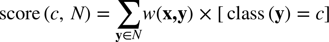
Here neighborsk(x) returns the k nearest neighbors of instance x, arg max returns the argument (c in this case) that maximizes the quantity that follows it, and the score function is defined as shown in Equation 6-7.

Here the expression [class(y)=c] has the value one if class(y) = c and zero otherwise.
Similarity-moderated voting, discussed in How Many Neighbors and How Much Influence?, can be accomplished by modifying Equation 6-6 to incorporate a weight, as shown in Equation 6-8.
where w is a weighting function based on the similarity between examples x and y. The inverse of the square of the distance is commonly used:
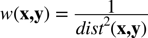
where dist is whatever distance function is being used in the domain.
It is straightforward to alter Equation 6-6 and Equation 6-8 to produce a score that can be used as a probability estimate. Equation 6-8 already produces a score so we just have to scale it by the total scores contributed by all neighbors so that it is between zero and one, as shown in Equation 6-9.

Finally, with one more step we can generalize this equation to do regression. Recall that in a regression problem, instead of trying to estimate the class of a new instance x we are trying to estimate some value f(x) given the f values of the neighbors of x. We can simply replace the bracketed class-specific part of Equation 6-9 with numeric values. This will estimate the regression value as the weighted average of the neighbors’ target values (although depending on the application, alternative combining functions might be sensible, such as the median).
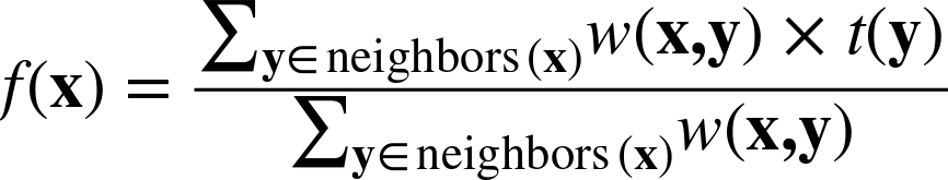
where t(y) is the target value for example y.
So, for example, for estimating the expected spending of a prospective customer with a particular set of characteristics, Equation 6-10 would estimate this amount as the distance-weighted average of the neighbors’ historical spending amounts.
Clustering
As noted at the beginning of the chapter, the notions of similarity and distance underpin much of data science. To increase our appreciation of this, let’s look at a very different sort of task. Recall the first application of data science that we looked at deeply: supervised segmentation—finding groups of objects that differ with respect to some target characteristic of interest. For example, find groups of customers that differ with respect to their propensity to leave the company when their contracts expire. Why, in talking about supervised segmentation, do we always use the modifier “supervised”?
In other applications we may want to find groups of objects, for example groups of customers, but not driven by some prespecified target characteristic. Do our customers naturally fall into different groups? This may be useful for many reasons. For example, we may want to step back and consider our marketing efforts more broadly. Do we understand who our customers are? Can we develop better products, better marketing campaigns, better sales methods, or better customer service by understanding the natural subgroups? This idea of finding natural groupings in the data may be called unsupervised segmentation, or more simply clustering.
Clustering is another application of our fundamental notion of similarity. The basic idea is that we want to find groups of objects (consumers, businesses, whiskeys, etc.), where the objects within groups are similar, but the objects in different groups are not so similar.
Note
Supervised modeling involves discovering patterns to predict the value of a specified target variable, based on data where we know the values of the target variable. Unsupervised modeling does not focus on a target variable. Instead it looks for other sorts of regularities in a set of data.
Example: Whiskey Analytics Revisited
Before getting into details, let’s revisit our example problem of whiskey analytics. We discussed using similarity measures to find similar single malt scotch whiskeys. Why might we want to take a step further and find clusters of similar whiskeys?
One reason we might want to find clusters of whiskeys is simply to understand the problem better. This is an example of exploratory data analysis, to which data-rich businesses should continually devote some energy and resources, as such exploration can lead to useful and profitable discoveries. In our example, if we are interested in Scotch whiskeys, we may simply want to understand the natural groupings by taste—because we want to understand our “business,” which might lead to a better product or service. Let’s say that we run a small shop in a well-to-do neighborhood, and as part of our business strategy we want to be known as the place to go for single-malt scotch whiskeys. We may not be able to have the largest selection, given our limited space and ability to invest in inventory, but we might choose a strategy of having a broad and eclectic collection. If we understood how the single malts grouped by taste, we could (for example) choose from each taste group a popular member and a lesser-known member. Or an expensive member and a more affordable member. Each of these is based on having a good understanding of how the whiskeys group by taste.
Let’s now talk about clustering more generally. We will present the two main sorts of clustering, illustrating the concept of similarity in action. In the process, we can examine actual clusters of whiskeys.
Hierarchical Clustering
Let’s start with a very simple example. At the top of Figure 6-6 we see six points, A-F, arranged on a plane (i.e., a two-dimensional instance space). Using Euclidean distance renders points more similar to each other if they are closer to each other in the plane. Circles labeled 1-5 are placed over the points to indicate clusters. This diagram shows the key aspects of what is called “hierarchical” clustering. It is a clustering because it groups the points by their similarity. Notice that the only overlap between clusters is when one cluster contains other clusters. Because of this structure, the circles actually represent a hierarchy of clusterings. The most general (highest-level) clustering is just the single cluster that contains everything—cluster 5 in the example. The lowest-level clustering is when we remove all the circles, and the points themselves are six (trivial) clusters. Removing circles in decreasing order of their numbers in the figure produces a collection of different clusterings, each with a larger number of clusters.
The graph on the bottom of the figure is called a dendrogram, and it shows explicitly the hierarchy of the clusters. Along the x axis are arranged (in no particular order except to avoid line crossings) the individual data points. The y axis represents the distance between the clusters (we’ll talk more about that presently). At the bottom (y = 0) each point is in a separate cluster. As y increases, different groupings of clusters fall within the distance constraint: first A and C are clustered together, then B and E are merged, then the BE cluster is merged with D, and so on, until all clusters are merged at the top. The numbers at the joins of the dendrograms correspond to the numbered circles in the top diagram.
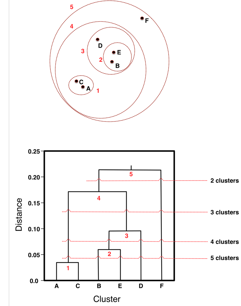
Both parts of Figure 6-6 show that hierarchical clustering doesn’t just create “a clustering,” or a single set of groups of objects. It creates a collection of ways to group the points. To see this clearly, consider “clipping” the dendrogram with a horizontal line, ignoring everything above the line. As the line moves downward, we get different clusterings with increasing numbers of clusters, as shown in the figure. Clip the dendrogram at the line labeled “2 clusters,” and below that we see two different groups; here, the singleton point F and the group containing all the other points. Referring back to the top part of the figure, we see that indeed F stands apart from the rest. Clipping the dendrogram at the 2-cluster point corresponds to removing circle 5. If we move down to the horizontal line labeled “3 clusters,” and clip the dendrogram there, we see that the dendrogram is left with three groups below the line (AC, BED, F), which corresponds in the plot to removing circles 5 and 4, and we then see the same three clusters. Intuitively, the clusters make sense. F is still off by itself. A and C form a close group. B, E, and D form a close group.
An advantage of hierarchical clustering is that it allows the data analyst to see the groupings—the “landscape” of data similarity—before deciding on the number of clusters to extract. As shown by the horizontal dashed lines, the diagram can be cut across at any point to give any desired number of clusters. Note also that once two clusters are joined at one level, they remain joined in all higher levels of the hierarchy.
Hierarchical clusterings generally are formed by starting with each node as its own cluster. Then clusters are merged iteratively until only a single cluster remains. The clusters are merged based on the similarity or distance function that is chosen. So far we have discussed distance between instances. For hierarchical clustering, we need a distance function between clusters, considering individual instances to be the smallest clusters. This is sometimes called the linkage function. So, for example, the linkage function could be “the Euclidean distance between the closest points in each of the clusters,” which would apply to any two clusters.
Note: Dendrograms
Two things can usually be noticed in a dendrogram. Because the y axis represents the distance between clusters, the dendrogram can give an idea of where natural clusters may occur. Notice in the dendrogram of Figure 6-6 there is a relatively long distance between cluster 3 (at about 0.10) and cluster 4 (at about 0.17). This suggests that this segmentation of the data, yielding three clusters, might be a good division. Also notice point F in the dendrogram. Whenever a single point merges high up in a dendrogram, this is an indication that it seems different from the rest, which we might call an “outlier,” and want to investigate it.
One of the best known uses of hierarchical clustering is in the “Tree of Life” (Sugden et al., 2003; Pennisi, 2003), a hierarchical phylogenetic chart of all life on earth. This chart is based on a hierarchical clustering of RNA sequences. A portion of a tree from the Interactive Tree of Life is shown in Figure 6-7 (Letunic & Bork, 2006). Large hierarchical trees are often displayed radially to conserve space, as is done here. This diagram shows a global phylogeny (taxonomy) of fully sequenced genomes, automatically reconstructed by Francesca Ciccarelli and colleagues (2006). The center is the “last universal ancestor” of all life on earth, from which branch the three domains of life (eukaryota, bacteria, and archaea). Figure 6-8 shows a magnified portion of this tree containing the particular bacterium Helicobacter pylori, which causes ulcers.


Returning to our example from the outset of the chapter, the top of Figure 6-9 shows, as a dendrogram, the 50 single malt Scotch whiskeys clustered using the methodology described by Lapointe and Legendre (1994). By clipping the dendrogram we can obtain any number of clusters we would like, so for example, removing the top-most 11 connecting segments leaves us with 12 clusters.
At the bottom of Figure 6-9 is a close up of a portion of the hierarchy, focusing on Foster’s new favorite, Bunnahabhain. Previously in Example: Whiskey Analytics we retrieved whiskeys similar to it. This excerpt shows that most of its nearest neighbors (Tullibardine, Glenglassaugh, etc.) do indeed cluster near it in the hierarchy. (You may wonder why the clusters don’t correspond exactly to the similarity ranking. The reason is that, while the five whiskeys we found are the most similar to Bunnahabhain, some of these five are more similar to other whiskeys in the dataset, so they are clustered with these closer neighbors before joining Bunnahabhain.)
Interestingly from the point of view of whiskey classification, the groups of single malts resulting from this taste-based clustering do not correspond neatly with regions of Scotland—the basis of the usual categorizations of Scotch whiskeys. There is a correlation, however, as Lapointe and Legendre (1994) point out.
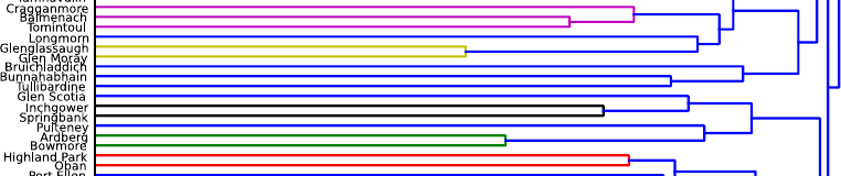
So instead of simply stocking the most recognizable Scotches, or a few Highland, Lowland, and Islay brands, our specialty shop owner could choose to stock single malts from the different clusters. Alternatively, one could create a guide to Scotch whiskeys that might help single malt lovers to choose whiskeys.[39] For example, since Foster loves the Bunnahabhain recommended to him by his friend at the restaurant the other night, the clustering suggests a set of other “most similar” whiskeys (Bruichladdich, Tullibardine, etc.) The most unusual tasting single malt in the data appears to be Aultmore, at the very top, which is the last whiskey to join any others.
Nearest Neighbors Revisited: Clustering Around Centroids
Hierarchical clustering focuses on the similarities between the individual instances and how similarities link them together. A different way of thinking about clustering data is to focus on the clusters themselves—the groups of instances. The most common method for focusing on the clusters themselves is to represent each cluster by its “cluster center,” or centroid. Figure 6-10 illustrates the idea in two dimensions: here we have three clusters, whose instances are represented by the circles. Each cluster has a centroid, represented by the solid-lined star. The star is not necessarily one of the instances; it is the geometric center of a group of instances. This same idea applies to any number of dimensions, as long as we have a numeric instance space and a distance measure (of course, we can’t visualize the clusters so nicely, if at all, in high-dimensional space).
The most popular centroid-based clustering algorithm is called k-means clustering (MacQueen, 1967; Lloyd, 1982; MacKay, 2003), and the main idea behind it deserves some discussion as k-means clustering is mentioned frequently in data science. In k-means the “means” are the centroids, represented by the arithmetic means (averages) of the values along each dimension for the instances in the cluster. So in Figure 6-10, to compute the centroid for each cluster, we would average all the x values of the points in the cluster to form the x coordinate of the centroid, and average all the y values to form the centroid’s y coordinate. Generally, the centroid is the average of the values for each feature of each example in the cluster. The result is shown in Figure 6-10.

The k in k-means is simply the number of clusters that one would like to find in the data. Unlike hierarchical clustering, k-means starts with a desired number of clusters k. So, in Figure 6-11, the analyst would have specified k=3, and the k-means clustering method would return (i) the three cluster centroids when cluster method terminates (the three solid-lined stars in Figure 6-10), plus (ii) information on which of the data points belongs to each cluster. This is sometimes referred to as nearest-neighbor clustering because the answer to (ii) is simply that each cluster contains those points that are nearest to its centroid (rather than to one of the other centroids).

The k-means algorithm for finding the clusters is simple and elegant, and therefore is worth mentioning. It is represented by Figure 6-11 and Figure 6-10. The algorithm starts by creating k initial cluster centers, usually randomly, but sometimes by choosing k of the actual data points, or by being given specific initial starting points by the user, or via a pre-processing of the data to determine a good set of starting centers (Arthur & Vassilvitskii, 2007). Think of the stars in Figure 6-11 as being these initial (k=3) cluster centers. Then the algorithm proceeds as follows. As shown in Figure 6-11, the clusters corresponding to these cluster centers are formed, by determining which is the closest center to each point.
Next, for each of these clusters, its center is recalculated by finding the actual centroid of the points in the cluster. As shown in Figure 6-10, the cluster centers typically shift; in the figure, we see that the new solid-lined stars are indeed closer to what intuitively seems to be the center of each cluster. And that’s pretty much it. The process simply iterates: since the cluster centers have shifted, we need to recalculate which points belong to each cluster (as in Figure 6-11). Once these are reassigned, we might have to shift the cluster centers again. The k-means procedure keeps iterating until there is no change in the clusters (or possibly until some other stopping criterion is met).
Figure 6-12 and Figure 6-13 show an example run of k-means on 90 data points with k=3. This dataset is a little more realistic in that it does not have such well-defined clusters as in the previous example. Figure 6-12 shows the initial data points before clustering. Figure 6-13 shows the final results of clustering after 16 iterations. The three (erratic) lines show the path from each centroid’s initial (random) location to its final location. The points in the three clusters are denoted by different symbols (circles, x’s, and triangles).

There is no guarantee that a single run of the k-means algorithm will result in a good clustering. The result of a single clustering run will find a local optimum—a locally best clustering—but this will be dependent upon the initial centroid locations. For this reason, k-means is usually run many times, starting with different random centroids each time. The results can be compared by examining the clusters (more on that in a minute), or by a numeric measure such as the clusters’ distortion, which is the sum of the squared differences between each data point and its corresponding centroid. In the latter case, the clustering with the lowest distortion value can be deemed the best clustering.

In terms of run time, the k-means algorithm is efficient. Even with multiple runs it is generally relatively fast, because it only computes the distances between each data point and the cluster centers on each iteration. Hierarchical clustering is generally slower, as it needs to know the distances between all pairs of clusters on each iteration, which at the start is all pairs of data points.
A common concern with centroid algorithms such as k-means is how to determine a good value for k. One answer is simply to experiment with different k values and see which ones generate good results. Since k-means is often used for exploratory data mining, the analyst must examine the clustering results anyway to determine whether the clusters make sense. Usually this can reveal whether the number of clusters is appropriate. The value for k can be decreased if some clusters are too small and overly specific, and increased if some clusters are too broad and diffuse.
For a more objective measure, the analyst can experiment with increasing values of k and graph various metrics (sometimes obliquely called indices) of the quality of the resulting clusterings. As k increases the quality metrics should eventually stabilize or plateau, either bottoming out if the metric is to be minimized or topping out if maximized. Some judgment will be required, but the minimum k where the stabilization begins is often a good choice. Wikipedia’s article Determining the number of clusters in a data set describes various metrics for evaluating sets of candidate clusters.
Example: Clustering Business News Stories
As a concrete example of centroid-based clustering, consider the task of identifying some natural groupings of business news stories released by a news aggregator. The objective of this example is to identify, informally, different groupings of news stories released about a particular company. This may be useful for a specific application, for example: to get a quick understanding of the news about a company without having to read every news story; to categorize forthcoming news stories for a news prioritization process; or simply to understand the data before undertaking a more focused data mining project, such as relating business news stories to stock performance.
For this example we chose a large collection of (text) news stories: the Thomson Reuters Text Research Collection (TRC2), a corpus of news stories created by the Reuters news agency, and made available to researchers. The entire corpus comprises 1,800,370 news stories from January of 2008 through February of 2009 (14 months). To make the example tractable but still realistic, we’re going to extract only those stories that mention a particular company—in this case, Apple (whose stock symbol is AAPL).
Data preparation
For this example, it is useful to discuss data preparation in a little detail, as we will be treating text as data, and we have not previously discussed that. See Chapter 10 for more details on mining text.
In this corpus, large companies are always mentioned when they are the primary subject of a story, such as in earnings reports and merger announcements; but they are often mentioned peripherally in weekly business summaries, lists of active stocks, and stories mentioning significant events within their industry sectors. For example, many stories about the personal computer industry mention how HP’s and Dell’s stock prices reacted on that day even if neither company was involved in the event. For this reason, we extracted stories whose headlines specifically mentioned Apple—thus assuring that the story is very likely news about Apple itself. There were 312 such stories but they covered a wide variety of topics, as we shall see.
Prior to clustering, the stories underwent basic web text preprocessing, with HTML and URLs stripped out and the text case-normalized. Words that occurred rarely (fewer than two documents) or too commonly (more than 50% documents) in the corpus were eliminated, and the rest formed the vocabulary for the next step. Then each document was represented by a numeric feature vector using “TFIDF scores” scoring for each vocabulary word in the document. TFIDF (Term Frequency times Inverse Document Frequency) scores represent the frequency of the word in the document, penalized by the frequency of the word in the corpus. TFIDF is explained in detail later in Chapter 10.
The similarity metric used was Cosine Similarity, introduced in * Other Distance Functions (Equation 6-5). It is commonly used in text applications to measure the similarity of documents.
The news story clusters
We chose to cluster the stories into nine groups (so k=9 for k-means). Here we present a description of the clusters, along with some headlines of the stories contained in that cluster. It is important to remember that the entire news story was used in the clustering, not just the headline.
Cluster 1. These stories are analysts’ announcements concerning ratings changes and price target adjustments:
-
RBC RAISES APPLE <AAPL.O> PRICE TARGET TO $200 FROM $190; KEEPS OUTPERFORM RATING -
THINKPANMURE ASSUMES APPLE <AAPL.O> WITH BUY RATING; $225 PRICE TARGET -
AMERICAN TECHNOLOGY RAISES APPLE <AAPL.O> TO BUY FROM NEUTRAL -
CARIS RAISES APPLE <AAPL.O> PRICE TARGET TO $200 FROM $170; RATING ABOVE AVERAGE -
CARIS CUTS APPLE <AAPL.O> PRICE TARGET TO $155 FROM $165; KEEPS ABOVE AVERAGE RATING
Cluster 2. This cluster contains stories about Apple’s stock price movements, during and after each day of trading:
-
Apple shares pare losses, still down 5 pct -
Apple rises 5 pct following strong results -
Apple shares rise on optimism over iPhone demand -
Apple shares decline ahead of Tuesday event -
Apple shares surge, investors like valuation
Cluster 3. In 2008, there were many stories about Steve Jobs, Apple’s charismatic CEO, and his struggle with pancreatic cancer. Jobs’ declining health was a topic of frequent discussion, and many business stories speculated on how well Apple would continue without him. Such stories clustered here:
-
ANALYSIS-Apple success linked to more than just Steve Jobs -
NEWSMAKER-Jobs used bravado, charisma as public face of Apple -
COLUMN-What Apple loses without Steve: Eric Auchard -
Apple could face lawsuits over Jobs' health -
INSTANT VIEW 1-Apple CEO Jobs to take medical leave -
ANALYSIS-Investors fear Jobs-less Apple
Cluster 4. This cluster contains various Apple announcements and releases. Superficially, these stories were similar, though the specific topics varied:
-
Apple introduces iPhone "push" e-mail software -
Apple CFO sees 2nd-qtr margin of about 32 pct -
Apple says confident in 2008 iPhone sales goal -
Apple CFO expects flat gross margin in 3rd-quarter -
Apple to talk iPhone software plans on March 6
Cluster 5. This cluster’s stories were about the iPhone and deals to sell iPhones in other countries:
-
MegaFon says to sell Apple iPhone in Russia -
Thai True Move in deal with Apple to sell 3G iPhone -
Russian retailers to start Apple iPhone sales Oct 3 -
Thai AIS in talks with Apple on iPhone launch -
Softbank says to sell Apple's iPhone in Japan
Cluster 6. One class of stories reports on stock price movements outside of normal trading hours (known as Before and After the Bell):
-
Before the Bell-Apple inches up on broker action -
Before the Bell-Apple shares up 1.6 pct before the bell -
BEFORE THE BELL-Apple slides on broker downgrades -
After the Bell-Apple shares slip -
After the Bell-Apple shares extend decline
Centroid 7. This cluster contained little thematic consistency:
-
ANALYSIS-Less cheer as Apple confronts an uncertain 2009 -
TAKE A LOOK - Apple Macworld Convention -
TAKE A LOOK-Apple Macworld Convention -
Apple eyed for slim laptop, online film rentals -
Apple's Jobs finishes speech announcing movie plan
Cluster 8. Stories on iTunes and Apple’s position in digital music sales formed this cluster:
-
PluggedIn-Nokia enters digital music battle with Apple -
Apple's iTunes grows to No. 2 U.S. music retailer -
Apple may be chilling iTunes competition -
Nokia to take on Apple in music, touch-screen phones -
Apple talking to labels about unlimited music
Cluster 9. A particular kind of Reuters news story is a News Brief, which is usually just a few itemized lines of very terse text (e.g. “• Says purchase new movies on itunes same day as dvd release”). The contents of these New Briefs varied, but because of their very similar form they clustered together:
-
BRIEF-Apple releases Safari 3.1 -
BRIEF-Apple introduces ilife 2009 -
BRIEF-Apple announces iPhone 2.0 software beta -
BRIEF-Apple to offer movies on iTunes same day as DVD release -
BRIEF-Apple says sold one million iPhone 3G's in first weekend
As we can see, some of these clusters are interesting and thematically consistent while others are not. Some are just collections of superficially similar text. There is an old cliché in statistics: Correlation is not causation, meaning that just because two things co-occur doesn’t mean that one causes another. A similar caveat in clustering could be: Syntactic similarity is not semantic similarity. Just because two things—particularly text passages—have common surface characteristics doesn’t mean they’re necessarily related semantically. We shouldn’t expect every cluster to be meaningful and interesting. Nevertheless, clustering is often a useful tool to uncover structure in our data that we did not foresee. Clusters can suggest new and interesting data mining opportunities.
Understanding the Results of Clustering
Once we have formulated the instances and clustered them, then what? As we mentioned above, the result of clustering is either a dendrogram or a set of cluster centers plus the corresponding data points for each cluster. How can we understand the clustering? This is particularly important because clustering often is used in exploratory analysis, so the whole point is to understand whether something was discovered, and if so, what?
How to understand clusterings and clusters depends on the sort of data being clustered and the domain of application, but there are several methods that apply broadly. We have seen some of them in action already.
Consider our whiskey example. Our whiskey researchers Lapointe and Legendre cut their dendrogram into 12 clusters; here are two of them:
Thus, to examine the clusters, we simply can look at the whiskeys in each cluster. That seems rather easy, but remember that this whiskey example was chosen as an illustration in a book. What is it about the application that allowed relatively easy examination of the clusters (and thereby made it a good example in the book)? We might think, well, there are only a small number of whiskeys in total; that allows us to actually look at them all. This is true, but it actually is not so critical. If we had had massive numbers of whiskeys, we still could have sampled whiskeys from each cluster to show the composition of each.
The more important factor to understanding these clusters—at least for someone who knows a little about single malts—is that the elements of the cluster can be represented by the names of the whiskeys. In this case, the names of the data points are meaningful in and of themselves, and convey meaning to an expert in the field.
This gives us a guideline that can be applied to other applications. For example, if we are clustering customers of a large retailer, probably a list of the names of the customers in a cluster would have little meaning, so this technique for understanding the result of clustering would not be useful. On the other hand, if IBM is clustering business customers it may be that the names of the businesses (or at least many of them) carry considerable meaning to a manager or member of the sales force.
What can we do in cases where we cannot simply show the names of our data points, or for which showing the names does not give sufficient understanding? Let’s look again at our whiskey clusters, but this time looking at more information on the clusters:
- Group A
- Scotches: Aberfeldy, Glenugie, Laphroaig, Scapa
- The best of its class: Laphroaig (Islay), 10 years, 86 points
- Average characteristics: full gold; fruity, salty; medium; oily, salty, sherry; dry
- Group H
- Scotches: Bruichladdich, Deanston, Fettercairn, Glenfiddich, Glen Mhor, Glen Spey, Glentauchers, Ladyburn, Tobermory
- The best of its class: Bruichladdich (Islay), 10 years, 76 points
- Average characteristics: white wyne, pale; sweet; smooth, light; sweet, dry, fruity, smoky; dry, light
Here we see two additional pieces of information useful for understanding the results of clustering. First, in addition to listing out the members, an “exemplar” member is listed. Here it is the “best of its class” whiskey, taken from Jackson (1989) (this additional information was not provided to the clustering algorithm). Alternatively, it could be the best known or highest-selling whiskey in the cluster. These techniques could be especially useful when there are massive numbers of instances in each cluster, so randomly sampling some may not be as telling as carefully selecting exemplars. However, this still presumes that the names of the instances are meaningful. Our other example, clustering the business news stories, shows a slight twist on this general idea: show exemplar stories and their headlines, because there the headlines can be meaningful summaries of the stories.
The example also illustrates a different way of understanding the result of the clustering: it shows the average characteristics of the members of the cluster—essentially, it shows the cluster centroid. Showing the centroid can be applied to any clustering; whether it is meaningful depends on whether the data values themselves are meaningful.
* Using Supervised Learning to Generate Cluster Descriptions
Technical Details Ahead
This section describes a way to automatically generate cluster descriptions. It is more complicated than the ones already discussed. It involves mixing unsupervised learning (the clustering) with supervised learning in order to create differential descriptions of the clusters. If this chapter is your first introduction to clustering and unsupervised learning, this may seem confusing to you, so we’ve made it a starred (advanced material) chapter. It may be skipped without loss of continuity.
However clustering was done, it provides us with a list of assignments indicating which examples belong to which cluster. A cluster centroid, in effect, describes the average cluster member. The problem is that these descriptions may be very detailed and they don’t tell us how the clusters differ. What we may want to know is, for each cluster, what differentiates this cluster from all the others? This is essentially what supervised learning methods do so we can use them here.
The general strategy is this: we use the cluster assignments to label examples. Each example will be given a label of the cluster it belongs to, and these can be treated as class labels. Once we have a labeled set of examples, we run a supervised learning algorithm on the example set to generate a classifier for each class/cluster. We can then inspect the classifier descriptions to get a (hopefully) intelligible and concise description of the corresponding cluster. The important thing to note is that these will be differential descriptions: for each cluster, what differentiates it from the others?
In this section, from this point on we equate clusters with classes. We will use the terms interchangeably.
In principle we could use any predictive (supervised) learning method for this, but what is important here is intelligibility: we’re going to use the learned classifier definition as a cluster description so we want a model that will serve this purpose. Trees as Sets of Rules showed how rules could be extracted from classification trees, so this is a useful method for the task.
There are two ways to set up the classification task. We have k clusters so we could set up a k-class task (one class per cluster). Alternatively, we could set up a k separate learning tasks, each trying to differentiate one cluster from all the other (k–1) clusters.
We’ll use the second approach on the whiskey-clustering task, using Lapointe and Legendre’s cluster assignments (Appendix A of A Classification of Pure Malt Scotch Whiskies). This gives us 12 whiskey clusters labeled A through L. We go back to our raw data and append each whiskey description with its cluster assignment. We’re going to use the binary approach: choose each cluster in turn to classify against the others. We’ll choose cluster J, which Lapointe and Legendre describe this way:
- Group J
You may recall from Example: Whiskey Analytics that each whiskey is described using 68 binary features. The dataset now has a label (J or not_J) for each whiskey indicating whether it belongs to the J cluster. An excerpt of the dataset looks like this:
0,0,0,...,0,0,0,0,0,1,0,0,0,0,0,0,1,0,0,0,0,0,0,0,0,0,0,J      % Glen Grant
0,0,0,...,0,0,0,0,0,1,1,0,0,0,0,0,0,0,0,0,0,0,0,0,1,0,0,not_J  % Glen Keith
0,0,0,...,0,0,0,0,0,0,0,0,1,0,0,0,0,0,0,0,0,0,1,0,0,0,0,not_J  % Glen Mhor
The text after the “%” is a comment indicating the name of the whiskey.
This dataset is passed to a classification tree learner.[40] The result is shown in Figure 6-14.
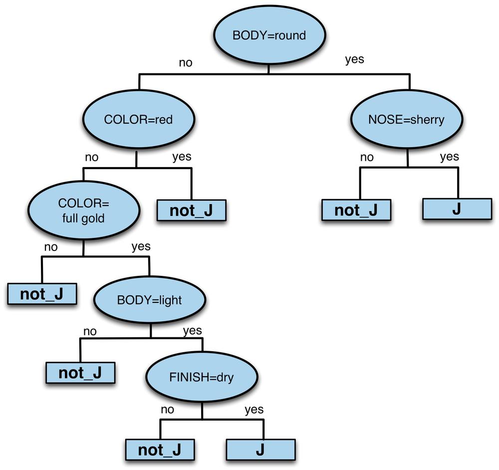
From this tree we concentrate only on the leaves labeled J (ignoring the ones labeled not_J). There are only two such leaves. Tracing paths from the root to these leaves, we can extract the two rules:
-
(BODY=round) AND (NOSE=sherry = 1)⇒J -
(BODY=round) AND (COLOR=red) AND (COLOR=full_gold) AND (BODY=light) AND (FINISH=dry)⇒J
Translating these loosely into English, the J cluster is distinguished by Scotches having either:
- A round body and a sherry nose, or
- A full gold (but not red) color with a light (but not round) body and a dry finish.
Is this description of cluster J better than the one given by Lapointe and Legendre, above? You can decide which you prefer, but it’s important to point out they are different types of descriptions. Lapointe and Legendre’s is a characteristic description; it describes what is typical or characteristic of the cluster, ignoring whether other clusters might share some of these characteristics. The one generated by the decision tree is a differential description; it describes only what differentiates this cluster from the others, ignoring the characteristics that may be shared by whiskeys within it. To put it another way: characteristic descriptions concentrate on intragroup commonalities, whereas differential descriptions concentrate on intergroup differences. Neither is inherently better—it depends on what you’re using it for.
Stepping Back: Solving a Business Problem Versus Data Exploration
We now have seen various examples of our fundamental concepts of data science in action. You may have realized that the clustering examples seem somehow different from the predictive modeling examples, and even the examples of finding similar objects. Let’s examine why.
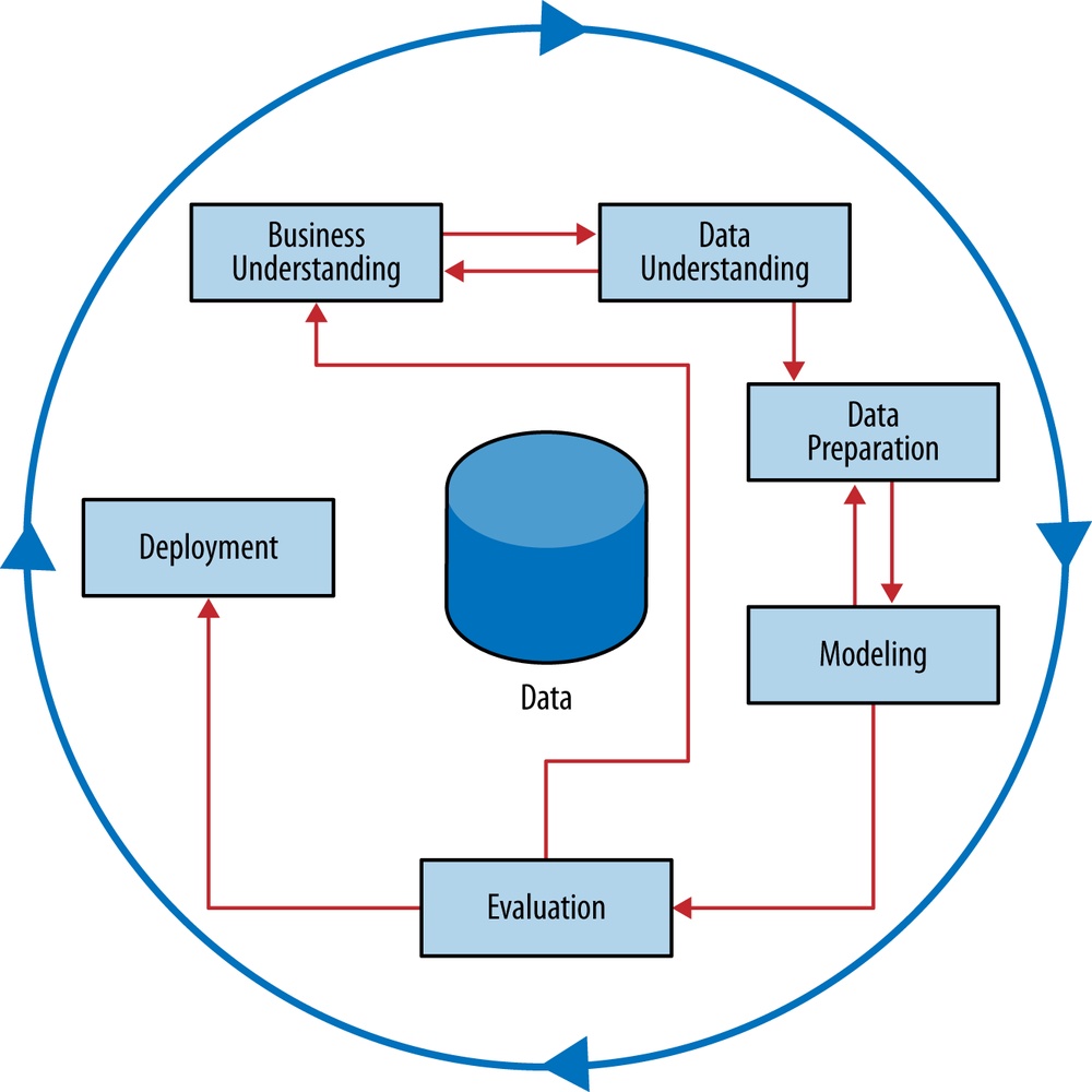
In our predictive modeling examples, as well as our examples of using similarity directly, we focused on solving a very specific business problem. As we have emphasized, one of the fundamental concepts of data science is that one should work to define as precisely as possible the goal of any data mining. Recall the CRISP data mining process, replicated in Figure 6-15. We should spend as much time as we can in the business understanding/data understanding mini-cycle, until we have a concrete, specific definition of the problem we are trying to solve. In predictive modeling applications, we are aided by our need to define the target variable precisely, and we will see in Chapter 7 that we can get more and more precise about defining the problem as we get more sophisticated in our understanding of data science. In our similarity-matching examples, again we had a very concrete notion of what exactly we were looking for: we want to find similar companies to optimize our efforts, and we will define specifically what it means to be similar. We want to find similar whiskeys—specifically in terms of taste—and we again work to gather and represent the data so that we can find exactly these. Later in the book we will discuss how we often expend considerable effort applying data science frameworks to decompose business problems into multiple, well-defined components, each of which we might apply data science methods to solve.
However, not all problems are so well defined. What do we do when in the business understanding phase we conclude: we would like to explore our data, possibly with only a vague notion of the exact problem we are solving? The problems to which we apply clustering often fall into this category. We want to perform unsupervised segmentation: finding groups that “naturally” occur (subject, of course, to how we define our similarity measures).
For the sake of discussion, let’s simplify by separating our problems into supervised (e.g., predictive modeling) and unsupervised (e.g., clustering). The world is not so cut-and-dried and just about any of the data mining techniques we have presented could be used for data exploration, but the discussion will be much clearer if we do simply separate into supervised versus unsupervised. There is a direct trade-off in where and how effort is expended in the data mining process. For the supervised problems, since we spent so much time defining precisely the problem we were going to solve, in the Evaluation stage of the data mining process we already have a clear-cut evaluation question: do the results of the modeling seem to solve the problem we have defined? For example, if we had defined our goal as improving prediction of defection when a customer’s contract is about to expire, we could assess whether our model has done this.
In contrast, unsupervised problems often are much more exploratory. We may have a notion that if we could cluster companies, news stories, or whiskeys, we would understand our business better, and therefore be able to improve something. However, we may not have a precise formulation. We should not let our desire to be concrete and precise keep us from making important discoveries from data. But there is a trade-off. The tradeoff is that for problems where we did not achieve a precise formulation of the problem in the early stages of the data mining process, we have to spend more time later in the process—in the Evaluation stage.
For clustering, specifically, it often is difficult even to understand what (if anything) the clustering reveals. Even when the clustering does seem to reveal interesting information, it often is not clear how to use that to make better decisions. Therefore, for clustering, additional creativity and business knowledge must be applied in the Evaluation stage of the data mining process.
Ira Haimowitz and Henry Schwarz (1997) show a concrete example of how clustering was used to improve decisions about how to set credit lines for new credit customers. They clustered existing GE Capital customers based on similarity in their use of their cards, payment of their bills, and profitability to the company. After some work, they settled on five clusters that represented very different consumer credit behavior (e.g., those who spend a lot but pay off their cards in full each month versus those who spend a lot and keep their balance near their credit limit). These different sorts of customers can tolerate very different credit lines (in the two examples, extra care must be taken with the latter to avoid default). The problem with using this clustering immediately for decision making is that the data are not available when the initial credit line is set. Briefly, Haimowitz and Schwarz took this new knowledge and cycled back to the beginning of the data mining process. They used the knowledge to define a precise predictive modeling problem: using data that are available at the time of credit approval, predict the probability that a customer will fall into each of these clusters. This predictive model then can be used to improve initial credit line decisions.
Summary
The fundamental concept of similarity between data items occurs throughout data mining. In this chapter we first discussed a wide variety of uses of similarity ranging from finding similar entities (or objects) based on their data descriptions, to predictive modeling, to clustering entities. We discussed these various uses and illustrated with examples.
A very common proxy for the similarity of two entities is the distance between them in the instance space defined by their feature vector representation. We presented similarity and distance computations, generally and in technical detail. We also introduced a family of methods, called nearest-neighbor methods, that perform prediction tasks by calculating explicitly the similarity between a new example and a set of training examples (with known values for the target). Once we can retrieve a set of nearest neighbors (most similar examples) we can use these for various data mining tasks: classification, regression and instance scoring. Finally, we showed how the same fundamental concept—similarity—also underlies the most common methods for unsupervised data mining: clustering.
We also discussed another important concept that raises its head once we begin to look seriously at methods (such as clustering) that are employed for more exploratory data analysis. When exploring the data, especially with unsupervised methods, we usually end up spending less time at the outset in the business understanding phase of the data mining process, but more time in the evaluation stage, and in iterating around the cycle. To illustrate, we discussed a variety of methodologies for understanding the results of clusterings.
[34] After Euclid, the 4th century B.C. Greek mathematician known as the Father of Geometry.
[35] No, he can’t pronounce it properly either.
[36] For a real business based on whiskey analytics, see: the website WhiskyClassified.com
[37] For example, it turns out that for technical reasons, with large numbers of features, certain particular instances appear extremely frequently in other instances’ sets of k nearest neighbors. These particular instances thereby have a very large influence on many classifications.
[38] See Lapointe and Legendre (1994), Section 3 (“Classification of Pure Malt Scotch Whiskies”), for a detailed discussion of how they engineered their problem formulation. Available online.
[39] This has been done: see David Wishart’s (2006) book Whisky Classified: Choosing Single Malts by Flavour.
[40] Specifically, the J48 procedure of Weka with pruning turned off.