Chapter 8. Visualizing Model Performance
Fundamental concepts: Visualization of model performance under various kinds of uncertainty; Further consideration of what is desired from data mining results.
Exemplary techniques: Profit curves; Cumulative response curves; Lift curves; ROC curves.
The previous chapter introduced basic issues of model evaluation and explored the question of what makes for a good model. We developed detailed calculations based on the expected value framework. That chapter was much more mathematical than previous ones, and if this is your first introduction to that material you may have felt overwhelmed by the equations. Though they form the basis for what comes next, by themselves they may not be very intuitive. In this chapter we will take a different view to increase our understanding of what they are revealing.
The expected profit calculation of Equation 7-2 takes a specific set of conditions and generates a single number, representing the expected profit in that scenario. Stakeholders outside of the data science team may have little patience for details, and will often want a higher-level, more intuitive view of model performance. Even data scientists who are comfortable with equations and dry calculations often find such single estimates to be impoverished and uninformative, because they rely on very stringent assumptions (e.g., of precise knowledge of the costs and benefits, or that the models’ estimates of probabilities are accurate). In short, it is often useful to present visualizations rather than just calculations, and this chapter presents some useful techniques.
Ranking Instead of Classifying
A Key Analytical Framework: Expected Value discussed how the score assigned by a model can be used to compute a decision for each individual case based on its expected value. A different strategy for making decisions is to rank a set of cases by these scores, and then take actions on the cases at the top of the ranked list. Instead of deciding each case separately, we may decide to take the top n cases (or, equivalently, all cases that score above a given threshold). There are several practical reasons for doing this.
It may be that the model gives a score that ranks cases by their likelihood of belonging to the class of interest, but which is not a true probability (recall our discussion in Chapter 4 of the distance from the separating boundary as a classifier score). More importantly, for some reason we may not be able to obtain accurate probability estimates from the classifier. This happens, for example, in targeted marketing applications when one cannot get a sufficiently representative training sample. The classifier scores may still be very useful for deciding which prospects are better than others, even if a 1% probability estimate doesn’t exactly correspond to a 1% probability of responding.
A common situation is where you have a budget for actions, such as a fixed marketing budget for a campaign, and so you want to target the most promising candidates. If one is going to target the highest expected value cases using costs and benefits that are constant for each class, then ranking cases by likelihood of the target class is sufficient. There is no great need to care about the precise probability estimates. The only caveat is that the budget be small enough so that the actions do not go into negative expected-value territory. For now, we will leave that as a business understanding task.
It also may be that costs and benefits cannot be specified precisely, but nevertheless we would like to take actions (and are happy to do so on the highest likelihood cases). We’ll return to this situation in the next section.
Note
If individual cases have different costs and benefits, then our expected value discussion in A Key Analytical Framework: Expected Value should make it clear that simply ranking by likelihood will not be sufficient.
When working with a classifier that gives scores to instances, in some situations the classifier decisions should be very conservative, corresponding to the fact that the classifier should have high certainty before taking the positive action. This corresponds to using a high threshold on the output score. Conversely, in some situations the classifier can be more permissive, which corresponds to lowering the threshold.[44]
This introduces a complication for which we need to extend our analytical framework for assessing and comparing models. The Confusion Matrix stated that a classifier produces a confusion matrix. With a ranking classifier, a classifier plus a threshold produces a single confusion matrix. Whenever the threshold changes, the confusion matrix may change as well because the numbers of true positives and false positives change.

Figure 8-1 illustrates this basic idea. As the threshold is lowered, instances move up from the N row into the Y row of the confusion matrix: an instance that was considered a negative is now classified as positive, so the counts change. Which counts change depends on the example’s true class. If the instance was a positive (in the “p” column) it moves up and becomes a true positive (Y,p). If it was a negative (n), it becomes a false positive (Y,n). Technically, each different threshold produces a different classifier, represented by its own confusion matrix.
This leaves us with two questions: how do we compare different rankings? And, how do we choose a proper threshold? If we have accurate probability estimates and a well-specified cost-benefit matrix, then we already answered the second question in our discussion of expected value: we determine the threshold where our expected profit is above a desired level (usually zero). Let’s explore and extend this idea.
Profit Curves
From A Key Analytical Framework: Expected Value, we know how to compute expected profit, and we’ve just introduced the idea of using a model to rank instances. We can combine these ideas to construct various performance visualizations in the form of curves. Each curve is based on the idea of examining the effect of thresholding the value of a classifier at successive points, implicitly dividing the list of instances into many successive sets of predicted positive and negative instances. As we move the threshold “down” the ranking, we get additional instances predicted as being positive rather than negative. Each threshold, i.e., each set of predicted positives and negatives, will have a corresponding confusion matrix. The previous chapter showed that once we have a confusion matrix, along with knowledge of the cost and benefits of decisions, we can generate an expected value corresponding to that confusion matrix.
More specifically, with a ranking classifier, we can produce a list of instances and their predicted scores, ranked by decreasing score, and then measure the expected profit that would result from choosing each successive cut-point in the list. Conceptually, this amounts to ranking the list of instances by score from highest to lowest and sweeping down through it, recording the expected profit after each instance. At each cut-point we record the percentage of the list predicted as positive and the corresponding estimated profit. Graphing these values gives us a profit curve. Three profit curves are shown in Figure 8-2.
This graph is based on a test set of 1,000 consumers—say, a small random population of people to whom you test-marketed earlier. (When interpreting results, we normally will talk about percentages of consumers, so as to generalize to the population as a whole.) For each curve, the consumers are ordered from highest to lowest probability of accepting an offer based on some model. For this example, let’s assume our profit margin is small: each offer costs $5 to make and market, and each accepted offer earns $9, for a profit of $4. The cost matrix is thus:
| p | n | |
Y | $4 | -$5 |
N | $0 | $0 |
The curves show that profit can go negative—not always, but sometimes they will, depending on the costs and the class ratio. In particular, this will happen when the profit margin is thin and the number of responders is small, because the curves show you “going into the red” by working too far down the list and making offers to too many people who won’t respond, thereby spending too much on the costs of the offers.[45]
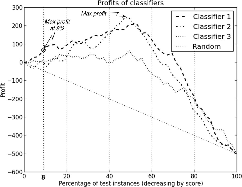
Notice that all four curves begin and end at the same point. This should make sense because, at the left side, when no customers are targeted there are no expenses and zero profit; at the right side everyone is targeted, so every classifier performs the same. In between, we’ll see some differences depending on how the classifiers order the customers. The random classifier performs worst because it has an even chance of choosing a responder or a nonresponder. Among the classifiers tested here, the one labeled Classifier 2 produces the maximum profit of $200 by targeting the top-ranked 50% of consumers. If your goal was simply to maximize profit and you had unlimited resources, you should choose Classifier 2, use it to score your population of customers, and target the top half (highest 50%) of customers on the list.
Now consider a slightly different but very common situation where you’re constrained by a budget. You have a fixed amount of money available and you must plan how to spend it before you see any profit. This is common in situations such as marketing campaigns. As before, you still want to target the highest-ranked people, but now you have a budgetary constraint[46] that may affect your strategy. Say you have 100,000 total customers and a budget of $40,000 for the marketing campaign. You want to use the modeling results (the profit curves in Figure 8-2) to figure out how best to spend your budget. What do you do in this case? Well, first you figure out how many offers you can afford to make. Each offer costs $5 so you can target at most $40,000/$5 = 8,000 customers. As before, you want to identify the customers most likely to respond, but each model ranks customers differently. Which model should you use for this campaign? 8,000 customers is 8% of your total customer base, so check the performance curves at x=8%. The best-performing model at this performance point is Classifier 1. You should use it to score the entire population, then send offers to the highest-ranked 8,000 customers.
In summary, from this scenario we see that adding a budgetary constraint causes not only a change in the operating point (targeting 8% of the population instead of 50%) but also a change in the choice of classifier to do the ranking.
ROC Graphs and Curves
Profit curves are appropriate when you know fairly certainly the conditions under which a classifier will be used. Specifically, there are two critical conditions underlying the profit calculation:
- The class priors; that is, the proportion of positive and negative instances in the target population, also known as the base rate (usually referring to the proportion of positives). Recall that Equation 7-2 is sensitive to p(p) and p(n).
- The costs and benefits. The expected profit is specifically sensitive to the relative levels of costs and benefits for the different cells of the cost-benefit matrix.
If both class priors and cost-benefit estimates are known and are expected to be stable, profit curves may be a good choice for visualizing model performance.
However, in many domains these conditions are uncertain or unstable. In fraud detection domains, for example, the amount of fraud changes from place to place, and from one month to the next (Leigh, 1995; Fawcett & Provost, 1997). The amount of fraud influences the priors. In the case of mobile phone churn management, marketing campaigns can have different budgets and offers may have different costs, which will change the expected costs.
One approach to handling uncertain conditions is to generate many different expected profit calculations for each model. This may not be very satisfactory: the sets of models, sets of class priors, and sets of decision costs multiply in complexity. This often leaves the analyst with a large stack of profit graphs that are difficult to manage, difficult to understand the implications of, and difficult to explain to a stakeholder.
Another approach is to use a method that can accommodate uncertainty by showing the entire space of performance possibilities. One such method is the Receiver Operating Characteristics (ROC) graph (Swets, 1988; Swets, Dawes, & Monahan, 2000; Fawcett, 2006). A ROC graph is a two-dimensional plot of a classifier with false positive rate on the x axis against true positive rate on the y axis. As such, a ROC graph depicts relative trade-offs that a classifier makes between benefits (true positives) and costs (false positives). Figure 8-3 shows a ROC graph with five classifiers labeled A through E.
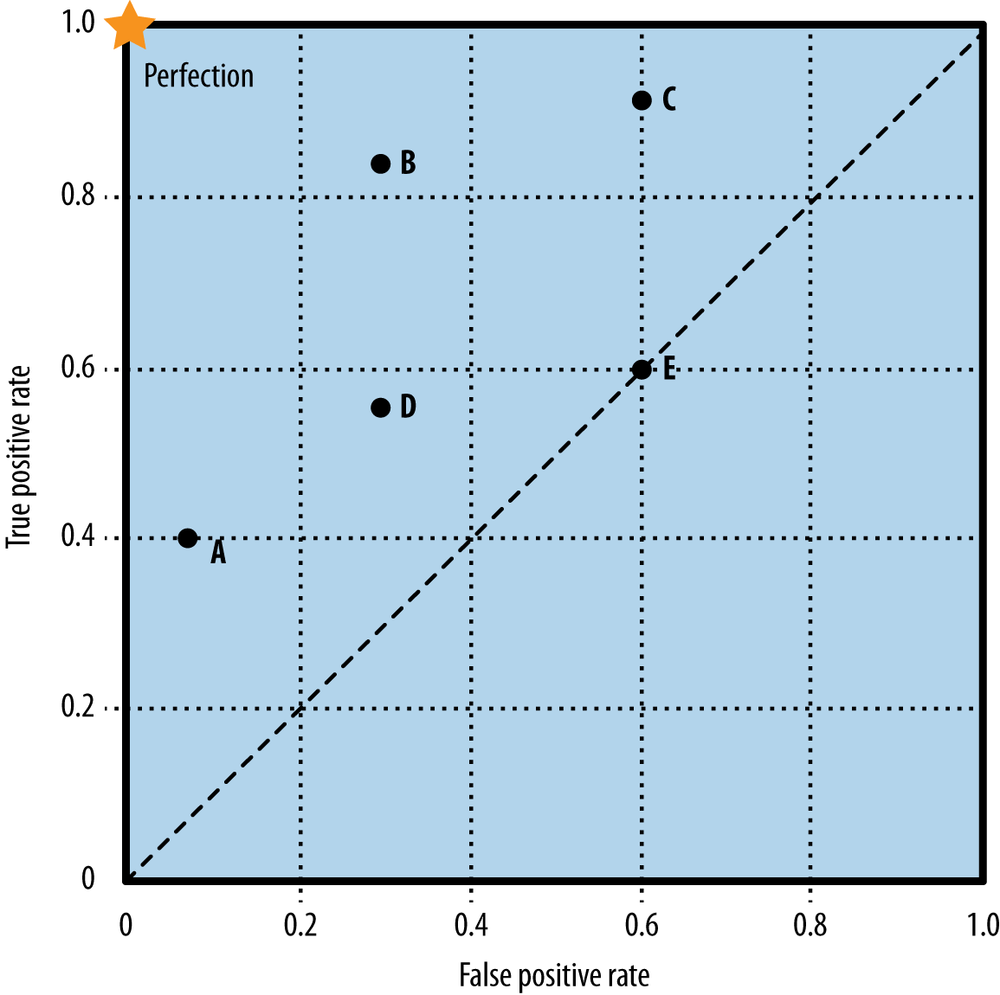
A discrete classifier is one that outputs only a class label (as opposed to a ranking). As already discussed, each such classifier produces a confusion matrix, which can be summarized by certain statistics regarding the numbers and rates of true positives, false positives, true negatives, and false negatives. Note that although the confusion matrix contains four numbers, we really only need two of the rates: either the true positive rate or the false negative rate, and either the false positive rate or the true negative rate. Given one from either pair the other can be derived since they sum to one. It is conventional to use the true positive rate (tp rate) and the false positive rate (fp rate), and we will keep to that convention so the ROC graph will make sense. Each discrete classifier produces an (fp rate, tp rate) pair corresponding to a single point in ROC space. The classifiers in Figure 8-3 are all discrete classifiers. Importantly for what follows, the tp rate is computed using only the actual positive examples, and the fp rate is computed using only the actual negative examples.
Note
Remembering exactly what statistics the tp rate and fp rate refer to can be confusing for someone who does not deal with such things on a daily basis. It can be easier to remember by using less formal but more intuitive names for the statistics: the tp rate is sometimes referred to as the hit rate—what percent of the actual positives does the classifier get right. The fp rate is sometimes referred to as the false alarm rate—what percent of the actual negative examples does the classifier get wrong (i.e., predict to be positive).
Several points in ROC space are important to note. The lower left point (0, 0) represents the strategy of never issuing a positive classification; such a classifier commits no false positive errors but also gains no true positives. The opposite strategy, of unconditionally issuing positive classifications, is represented by the upper right point (1, 1). The point (0, 1) represents perfect classification, represented by a star. The diagonal line connecting (0, 0) to (1, 1) represents the policy of guessing a class. For example, if a classifier randomly guesses the positive class half the time, it can be expected to get half the positives and half the negatives correct; this yields the point (0.5, 0.5) in ROC space. If it guesses the positive class 90% of the time, it can be expected to get 90% of the positives correct but its false positive rate will increase to 90% as well, yielding (0.9, 0.9) in ROC space. Thus a random classifier will produce a ROC point that moves back and forth on the diagonal based on the frequency with which it guesses the positive class. In order to get away from this diagonal into the upper triangular region, the classifier must exploit some information in the data. In Figure 8-3, E’s performance at (0.6, 0.6) is virtually random. E may be said to be guessing the positive class 60% of the time. Note that no classifier should be in the lower right triangle of a ROC graph. This represents performance that is worse than random guessing.
One point in ROC space is superior to another if it is to the northwest of the first (tp rate is higher and fp rate is no worse; fp rate is lower and tp rate is no worse, or both are better). Classifiers appearing on the lefthand side of a ROC graph, near the x axis, may be thought of as “conservative”: they raise alarms (make positive classifications) only with strong evidence so they make few false positive errors, but they often have low true positive rates as well. Classifiers on the upper righthand side of a ROC graph may be thought of as “permissive”: they make positive classifications with weak evidence so they classify nearly all positives correctly, but they often have high false positive rates. In Figure 8-3, A is more conservative than B, which in turn is more conservative than C. Many real-world domains are dominated by large numbers of negative instances (see the discussion in Sidebar: Bad Positives and Harmless Negatives), so performance in the far left-hand side of the ROC graph is often more interesting than elsewhere. If there are many negative examples, even a moderate false alarm rate can be unmanageable. A ranking model produces a set of points (a curve) in ROC space. As discussed previously, a ranking model can be used with a threshold to produce a discrete (binary) classifier: if the classifier output is above the threshold, the classifier produces a Y, else an N. Each threshold value produces a different point in ROC space, as shown in Figure 8-4.
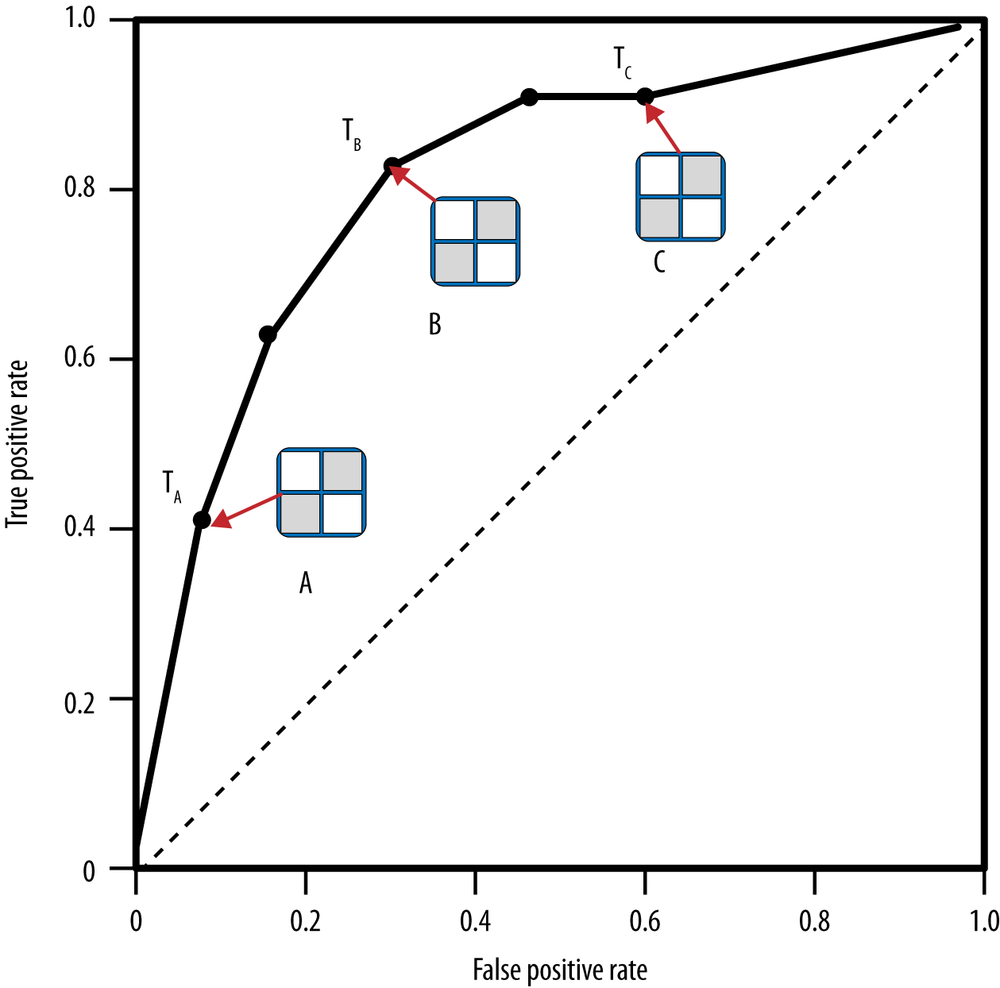
Conceptually, we may imagine sorting the instances by score and varying a threshold from –∞ to +∞ while tracing a curve through ROC space, as shown in Figure 8-5. Whenever we pass a positive instance, we take a step upward (increasing true positives); whenever we pass a negative instance, we take a step rightward (increasing false positives). Thus the “curve” is actually a step function for a single test set, but with enough instances it appears smooth.[47]

An advantage of ROC graphs is that they decouple classifier performance from the conditions under which the classifiers will be used. Specifically, they are independent of the class proportions as well as the costs and benefits. A data scientist can plot the performance of classifiers on a ROC graph as they are generated, knowing that the positions and relative performance of the classifiers will not change. The region(s) on the ROC graph that are of interest may change as costs, benefits, and class proportions change, but the curves themselves should not.
Both Stein (2005) and Provost & Fawcett (1997, 2001) show how the operating conditions of the classifier (the class priors and error costs) can be combined to identify the region of interest on its ROC curve. Briefly, knowledge about the range of possible class priors can be combined with knowledge about the cost and benefits of decisions; together these describe a family of tangent lines that can identify which classifier(s) should be used under those conditions. Stein (2005) presents an example from finance (loan defaulting) and shows how this technique can be used to choose models.
The Area Under the ROC Curve (AUC)
An important summary statistic is the area under the ROC curve (AUC). As the name implies, this is simply the area under a classifier’s curve expressed as a fraction of the unit square. Its value ranges from zero to one. Though a ROC curve provides more information than its area, the AUC is useful when a single number is needed to summarize performance, or when nothing is known about the operating conditions. Later, in Example: Performance Analytics for Churn Modeling, we will show a use of the AUC statistic. For now it is enough to realize that it’s a good general summary statistic of the predictiveness of a classifier.
Tip
As a technical note, the AUC is equivalent to the Mann-Whitney-Wilcoxon measure, a well-known ordering measure in Statistics (Wilcoxon, 1945). It is also equivalent to the Gini Coefficient, with a minor algebraic transformation (Adams & Hand, 1999; Stein, 2005). Both are equivalent to the probability that a randomly chosen positive instance will be ranked ahead of a randomly chosen negative instance.
Cumulative Response and Lift Curves
ROC curves are a common tool for visualizing model performance for classification, class probability estimation, and scoring. However, as you may have just experienced if you are new to all this, ROC curves are not the most intuitive visualization for many business stakeholders who really ought to understand the results. It is important for the data scientist to realize that clear communication with key stakeholders is not only a primary goal of her job, but also is essential for doing the right modeling (in addition to doing the modeling right). Therefore, it can be useful also to consider visualization frameworks that might not have all of the nice properties of ROC curves, but are more intuitive. (It is important for the business stakeholder to realize that the theoretical properties that are sacrificed sometimes are important, so it may be necessary in certain circumstances to pull out the more complex visualizations.)
One of the most common examples of the use of an alternate visualization is the use of the “cumulative response curve,” rather than the ROC curve. They are closely related, but the cumulative response curve is more intuitive. Cumulative response curves plot the hit rate (tp rate; y axis), i.e., the percentage of positives correctly classified, as a function of the percentage of the population that is targeted (x axis). So, conceptually as we move down the list of instances ranked by the model, we target increasingly larger proportions of all the instances. Hopefully in the process, if the model is any good, when we are at the top of the list we will target a larger proportion of the actual positives than actual negatives. As with ROC curves, the diagonal line x=y represents random performance. In this case, the intuition is clear: if you target 20% of all instances completely randomly, you should target 20% of the positives as well. Any classifier above the diagonal is providing some advantage.
Note
The cumulative response curve is sometimes called a lift curve, because one can see the increase over simply targeting randomly as how much the line representing the model performance is lifted up over the random performance diagonal. We will call these curves cumulative response curves, because “lift curve” also refers to a curve that specifically plots the numeric lift.
Intuitively, the lift of a classifier represents the advantage it provides over random guessing. The lift is the degree to which it “pushes up” the positive instances in a list above the negative instances. For example, consider a list of 100 customers, half of whom churn (positive instances) and half who do not (negative instances). If you scan down the list and stop halfway (representing 0.5 targeted), how many positives would you expect to have seen in the first half? If the list were sorted randomly, you would expect to have seen only half the positives (0.5), giving a lift of 0.5/0.5 = 1. If the list had been ordered by an effective ranking classifier, more than half the positives should appear in the top half of the list, producing a lift greater than 1. If the classifier were perfect, all positives would be ranked at the top of the list so by the midway point we would have seen all of them (1.0), giving a lift of 1.0/0.5 = 2.
Figure 8-6 shows four sample cumulative response curves, and Figure 8-7 shows the lift curves of the same four.

The lift curve is essentially the value of the cumulative response curve at a given x point divided by the diagonal line (y=x) value at that point. The diagonal line of a cumulative response curve becomes a horizontal line at y=1 on the lift curve.
Sometimes you will hear claims like “our model gives a two times (or a 2X) lift”; this means that at the chosen threshold (often not mentioned), the lift curve shows that the model’s targeting is twice as good as random. On the cumulative response curve, the corresponding tp rate for the model will be twice the tp rate for the random-performance diagonal. (You might also compute a version of lift with respect to some other baseline.) The lift curve plots this numeric lift on the y axis, against the percent of the population targeted on the x axis (the same x axis as the cumulative response curve).
Both lift curves and cumulative response curves must be used with care if the exact proportion of positives in the population is unknown or is not represented accurately in the test data. Unlike for ROC curves, these curves assume that the test set has exactly the same target class priors as the population to which the model will be applied. This is one of the simplifying assumptions that we mentioned at the outset, that can allow us to use a more intuitive visualization.
As an example, in online advertising the base rate of observed response to an advertisement may be very small. One in ten million (1:107) is not unusual. Modelers may not want to have to manage datasets that have ten million nonresponders for every responder, so they down-sample the nonresponders, and create a more balanced dataset for modeling and evaluation. When visualizing classifier performance with ROC curves, this will have no effect (because as mentioned above, the axes each correspond only to proportions of one class). However, lift and cumulative response curves will be different—the basic shapes of the curves may still be informative, but the relationships between the values on the axes will not be valid.
The last few chapters have covered a lot of territory in evaluation. We’ve introduced several important methods and issues in evaluating models. In this section we tie them together with a single application case study to show the results of different evaluation methods. The example we’ll use is our ongoing domain of cell phone churn. However, in this section we use a different (and more difficult) churn dataset than was used in previous chapters. It is a dataset from the 2009 KDD Cup data mining competition. We did not use this dataset in earlier examples, such as Table 3-2 and Figure 3-18, because these attribute names and values have been anonymized extensively to preserve customer privacy. This leaves very little meaning in the attributes and their values, which would have interfered with our discussions. However, we can demonstrate the model performance analytics with the sanitized data. From the website:
The KDD Cup 2009 offers the opportunity to work on large marketing databases from the French Telecom company Orange to predict the propensity of customers to switch provider (churn), buy new products or services (appetency), or buy upgrades or add-ons proposed to them to make the sale more profitable (up-selling). The most practical way, in a CRM system, to build knowledge on customer is to produce scores.
A score (the output of a model) is an evaluation for all instances of a target variable to explain (i.e., churn, appetency or up-selling). Tools which produce scores allow to project, on a given population, quantifiable information. The score is computed using input variables which describe instances. Scores are then used by the information system (IS), for example, to personalize the customer relationship.
Little of the dataset is worth describing because it has been thoroughly sanitized, but its class skew is worth mentioning. There are about 47,000 instances altogether, of which about 7% are marked as churn (positive examples) and the remaining 93% are not (negatives). This is not severe skew, but it’s worth noting for reasons that will become clear.
We emphasize that the intention is not to propose good solutions for this problem, or to suggest which models might work well, but simply to use the domain as a testbed to illustrate the ideas about evaluation we’ve been developing. Little effort has been done to tune performance. We will train and test several models: a classification tree, a logistic regression equation, and a nearest-neighbor model. We will also use a simple Bayesian classifier called Naive Bayes, not discussed until Chapter 9. For the purpose of this section, details of the models are unimportant; all the models are “black boxes” with different performance characteristics. We’re using the evaluation and visualization techniques introduced in the last chapters to understand their characteristics.
Let’s begin with a very naive evaluation. We’ll train on the complete dataset and then test on the same dataset we trained on. We’ll also measure simple classification accuracies. The results are shown in Table 8-1.
Several things are striking here. First, there appears to be a wide range of performance—from 76% to 100%. Also, since the dataset has a base rate of 93%, any classifier should be able to achieve at least this minimum accuracy. This makes the Naive Bayes result look strange since it’s significantly worse. Also, at 100% accuracy, the k-Nearest Neighbor classifier looks suspiciously good.[48]
But this test was performed on the training set, and by now (having read Chapter 5) you realize such numbers are unreliable, if not completely meaningless. They are more likely to be an indication of how well each classifier can memorize (overfit) the training set than anything else. So instead of investigating these numbers further, let’s redo the evaluation properly using separate training and test sets. We could just split the dataset in half, but instead we’ll use the cross-validation procedure discussed in From Holdout Evaluation to Cross-Validation. This will not only ensure proper separation of datasets but also provide a measure of variation in results. The results are shown in Table 8-2.
| Model | Accuracy (%) | AUC |
Classification Tree | 91.8 ± 0.0 | 0.614 ± 0.014 |
Logistic Regression | 93.0 ± 0.1 | 0.574 ± 0.023 |
k-Nearest Neighbor | 93.0 ± 0.0 | 0.537 ± 0.015 |
Naive Bayes | 76.5 ± 0.6 | 0.632 ± 0.019 |
Each number is an average of ten-fold cross validation followed by a “±” sign and the standard deviation of the measurements. Including a standard deviation may be regarded as a kind of “sanity check”: a large standard deviation indicates the test results are very erratic, which could be the source of various problems such as the dataset being too small or the model being a very poor match to a portion of the problem.
The accuracy numbers have all dropped considerably, except for Naive Bayes, which is still oddly low. The standard deviations are fairly small compared to the means so there is not a great deal of variation in the performance on the folds. This is good.
At the far right is a second value, the Area Under the ROC Curve (commonly abbreviated AUC). We briefly discussed this AUC measure back in The Area Under the ROC Curve (AUC), noting it as a good general summary statistic of the predictiveness of a classifier. It varies from zero to one. A value of 0.5 corresponds to randomness (the classifier cannot distinguish at all between positives and negatives) and a value of one means that it is perfect in distinguishing them. One of the reasons accuracy is a poor metric is that it is misleading when datasets are skewed, which this one is (93% negatives and 7% positives).
Recall that we introduced fitting curves back in Overfitting Examined as a way to detect when a model is overfitting. Figure 8-8 shows fitting curves for the classification tree model on this churn domain. The idea is that as a model is allowed to get more and more complex it typically fits the data more and more closely, but at some point it is simply memorizing idiosyncrasies of the particular training set rather than learning general characteristics of the population. A fitting curve plots model complexity (in this case, the number of nodes in the tree) against a performance measure (in this case, AUC) using two datasets: the set it was trained upon and a separate holdout set. When performance on the holdout set starts to decrease, overfitting is occurring, and Figure 8-8 does indeed follow this general pattern.[49] The classification tree definitely is overfitting, and the other models probably are too. The “sweet spot” where holdout performance is maximum is at about 100 tree nodes, beyond which the performance on the holdout data declines.

Let’s return to the model comparison figures in Table 8-2. These values are taken from a reasonably careful evaluation using holdout data, so they are less suspicious. However, they do raise some questions. There are two things to note about the AUC values. One is that they are all fairly modest. This is unsurprising with real-world domains: many datasets simply have little signal to be exploited, or the data science problem is formulated after the easier problems have already been solved. Customer churn is a difficult problem so we shouldn’t be too surprised by these modest AUC scores. Even modest AUC scores may lead to good business results.
The second interesting point is that Naive Bayes, which has the lowest accuracy of the group, has the highest AUC score in Table 8-2. What’s going on here? Let’s take a look at a sample confusion matrix of Naive Bayes, with the highest AUC and lowest accuracy, and compare it with the confusion matrix of k-NN (lowest AUC and high accuracy) on the same dataset. Here is the Naive Bayes confusion matrix:
| p | n | |
Y | 127 (3%) | 848 (18%) |
N | 200 (4%) | 3518 (75%) |
Here is the k-Nearest Neighbors confusion matrix on the same test data:
| p | n | |
Y | 3 (0%) | 15 (0%) |
N | 324 (7%) | 4351 (93%) |
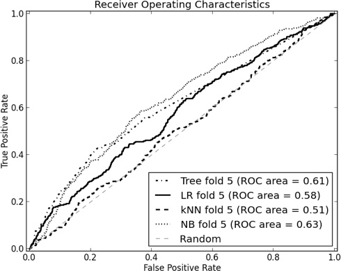
We see from the k-NN matrix that it rarely predicts churn—the Y row is almost empty. In other words, it is performing very much like a base-rate classifier, with a total accuracy of just about 93%. On the other hand, the Naive Bayes classifier makes more mistakes (so its accuracy is lower) but it identifies many more of the churners. Figure 8-9 shows the ROC curves of a typical fold of the cross-validation procedure. Note that the curves corresponding to Naive Bayes (NB) and Classification Tree (Tree) are somewhat more “bowed” than the others, indicating their predictive superiority.
As we said, ROC curves have a number of nice technical properties but they can be hard to read. The degree of “bowing” and the relative superiority of one curve to another can be difficult to judge by eye. Lift and profit curves are sometimes preferable, so let’s examine these.
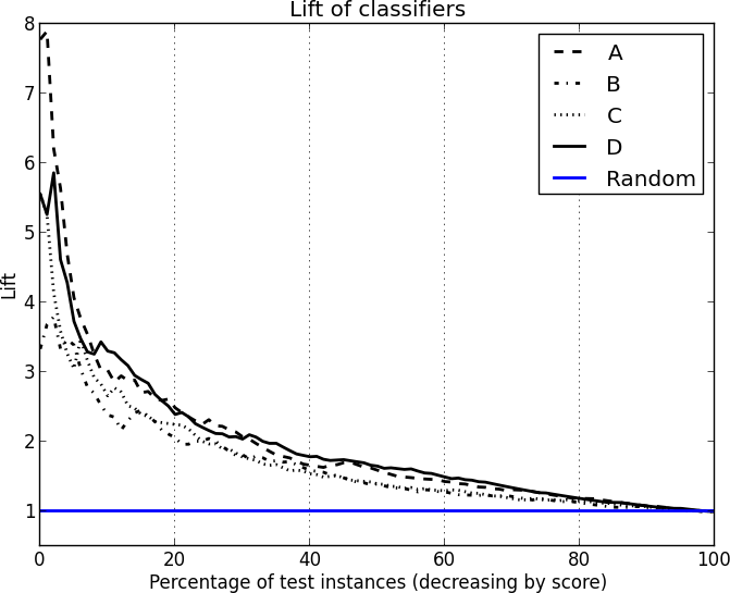
Lift curves have the advantage that they don’t require us to commit to any costs yet so we begin with those, shown in Figure 8-10.

These curves are averaged over the 10 test sets of the cross-validation. The classifiers generally peak very early then trail off down to random performance (Lift=1). Both Tree (Classification tree) and NB (Naive Bayes) perform very well. Tree is superior up through about the first 25% of the instances, after which it is dominated by NB. Both k-NN and Logistic Regression (LR) perform poorly here and have no regions of superiority. Looking at this graph, if you wanted to target the top 25% or less of customers, you’d choose the classification tree model; if you wanted to go further down the list you should choose NB. Lift curves are sensitive to the class proportions, so if the ratio of churners to nonchurners changed these curves would change also.
A note on combining classifiers
Looking at these curves, you might wonder, “If Tree is best for the top 25%, and NB is best for the remainder, why don’t we just use Tree’s top 25% then switch to NB’s list for the rest?” This is a clever idea, but you won’t necessarily get the best of both classifiers that way. The reason, in short, is that the two orderings are different and you can’t simply pick-and-choose segments from each and expect the result to be optimal. The evaluation curves are only valid for each model individually, and all bets are off when you start mixing orderings from each.
But classifiers can be combined in principled ways, such that the combination outperforms any individual classifier. Such combinations are called ensembles, and they are discussed in Bias, Variance, and Ensemble Methods.
Although the lift curve shows you the relative advantage of each model, it does not tell you how much profit you should expect to make—or even whether you’d make a profit at all. For that purpose we use a profit curve, which incorporates assumptions about costs and benefits and displays expected value.
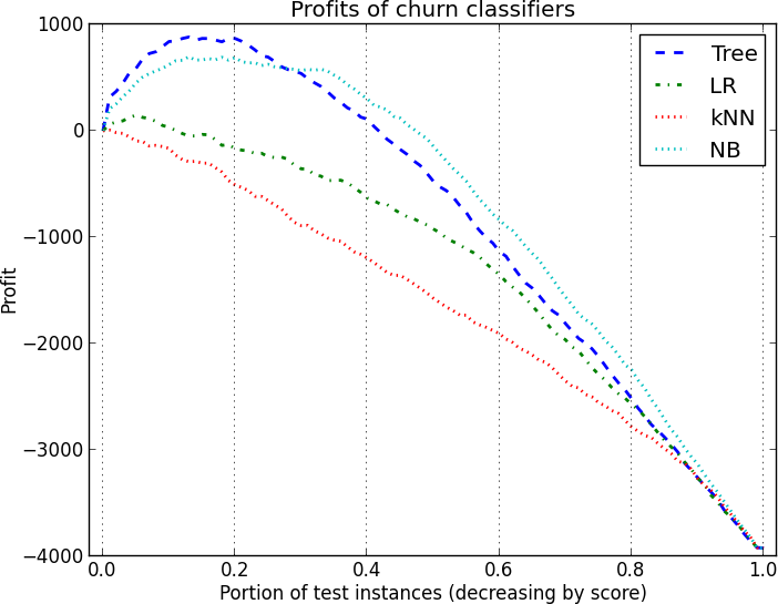
Let’s ignore the actual details of churn in wireless for the moment (we will return to these explicitly in Chapter 11). To make things interesting with this dataset, let’s make two sets of assumptions about costs and benefits. In the first scenario, let’s assume an expense of $3 for each offer and a gross benefit of $30, so a true positive gives us a net profit of $27 and a false positive gives a net loss of $3. This is a 9-to-1 profit ratio. The resulting profit curves are shown in Figure 8-11. The classification tree is superior for the highest cutoff thresholds, and Naive Bayes dominates for the remainder of the possible cutoff thresholds. Maximum profit would be achieved in this scenario by targeting roughly the first 20% of the population.
In the second scenario, we assume the same expense of $3 for each offer (so the false positive cost doesn’t change) but we assume a higher gross benefit ($39), so a true positive now nets us a profit of $36. This is a 12-to-1 profit ratio. The curves are shown in Figure 8-12. As you might expect, this scenario has much higher maximum profit than the previous scenario. More importantly it demonstrates different profit maxima. One peak is with the Classification Tree at about 20% of the population and the second peak, slightly higher, occurs when we target the top 35% of the population with NB. The crossover point between Tree and LR occurs at the same place on both graphs, however: at about 25% of the population. This illustrates the sensitivity of profit graphs to the particular assumptions about costs and benefits.

We conclude this section by reiterating that these graphs are just meant to illustrate the different techniques for model evaluation. Little effort was made to tune the induction methods to the problem, and no general conclusions should be drawn about the relative merits of these model types or their suitability for churn prediction. We deliberately produced a range of classifier performance to illustrate how the graphs could reveal their differences.
Summary
A critical part of the data scientist’s job is arranging for proper evaluation of models and conveying this information to stakeholders. Doing this well takes experience, but it is vital in order to reduce surprises and to manage expectations among all concerned. Visualization of results is an important piece of the evaluation task.
When building a model from data, adjusting the training sample in various ways may be useful or even necessary; but evaluation should use a sample reflecting the original, realistic population so that the results reflect what will actually be achieved.
When the costs and benefits of decisions can be specified, the data scientist can calculate an expected cost per instance for each model and simply choose whichever model produces the best value. In some cases a basic profit graph can be useful to compare models of interest under a range of conditions. These graphs may be easy to comprehend for stakeholders who are not data scientists, since they reduce model performance to their basic “bottom line” cost or profit.
The disadvantage of a profit graph is that it requires that operating conditions be known and specified exactly. With many real-world problems, the operating conditions are imprecise or change over time, and the data scientist must contend with uncertainty. In such cases other graphs may be more useful. When costs and benefits cannot be specified with confidence, but the class mix will likely not change, a cumulative response or lift graph is useful. Both show the relative advantages of classifiers, independent of the value (monetary or otherwise) of the advantages.
Finally, ROC curves are a valuable visualization tool for the data scientist. Though they take some practice to interpret readily, they separate out performance from operating conditions. In doing so they convey the fundamental trade-offs that each model is making.
A great deal of work in the Machine Learning and Data Mining communities involves comparing classifiers in order to support various claims about learning algorithm superiority. As a result, much has been written about the methodology of classifier comparison. For the interested reader a good place to start is Thomas Dietterich’s (1998) article “Approximate Statistical Tests for Comparing Supervised Classification Learning Algorithms,” and the book Evaluating Learning Algorithms: A Classification Perspective (Japkowicz & Shah, 2011).
[44] Indeed, in some applications, scores from the same model may be used in several places with different thresholds to make different decisions. For example, a model may be used first in a decision to grant or deny credit. The same model may be used later in setting a new customer’s credit line.
[45] For simplicity in the example we will ignore inventory and other realistic issues that would require a more complicated profit calculation.
[46] Another common situation is to have a workforce constraint. It’s the same idea: you have a fixed allocation of resources (money or personnel) available to address a problem and you want the most “bang for the buck.” An example might be that you have a fixed workforce of fraud analysts, and you want to give them the top-ranked cases of potential fraud to process.
[47] Technically, if there are runs of examples with the same score, we should count the positive and negatives across the entire run, and thus the ROC curve will have a sloping step rather than square step.
[48] Optimism can be a fine thing, but as a rule of thumb in data mining, any results that show perfect performance on a real-world problem should be mistrusted.
[49] Note that the x axis is log scale so the righthand side of the graph looks compressed.