
Ordinal Predictors |
|

5.3 Empirical ROC Curve for Ordinal Predictors
5.4 Area under the Empirical ROC Curve
5.6 Comparing ROC Curves for Ordinal Markers
5.1 Introduction
Chapter 3 addressed the single continuous predictor, probably the most natural and common setting for ROC curves. Nevertheless, the idea of an ROC curve applies equally well to an ordinal predictor. This chapter investigates how techniques from the previous chapter can be extended to accommodate an ordinal predictor.
Ordinal predictors can arise in a variety of ways. Sometimes, they are simply the result of categorization of an underlying continuous predictor. While this may result in the loss of information, and hence predictive accuracy, gains in having a simple and easy-to-communicate predictor may offset these losses. Rain forecasts might offer an example. Sometimes they are reported as low-medium-high, and other times they are reported in increments of 10%. Regardless of the terminology used to report the categorized predictors, data analysis can proceed using the predictors as ordinal.
Ordinal predictions also can arise through expert opinions. Most subjective opinion is hard to quantify, but it is relatively easier to offer a few scenarios ordered according to their probability—in effect, reporting ordinal predictions. Examples can be found in practically any field, such as medicine (diagnostic radiologists reporting their assessment of the chance or severity of disease), business (consultants opining on the likelihood of consumer preferences), or finance (stock picks, reported as buy, stay, or sell).
From the perspective of ROC curves, there is a duality between continuous and ordinal predictors. Both the empirical curve and the binormal model can accommodate ordinal predictors, either directly or with some modification. Sections 5.3 and 5.4 provide details.
5.2 Credit Rating Example
Consider the following data set collected and published by Güttler (2005) on the performance of the scoring systems of two of the most prominent credit evaluation agencies in the world: Moody's and Standard and Poor's. Table 5.1 reports the data on Moody's ratings, which use 17 categories on an ordinal scale ranging from Aaa (most favorable rating) to C (least favorable rating). The Rating row lists these 17 ratings, the Default row contains the number of companies that defaulted on their loans during the follow-up period of the study, and the Total row presents the total number of companies receiving the particular credit rating during the same period. The goal of this example is to evaluate the accuracy of Moody's ratings as predictors of the likelihood of default. For each of the 17 ratings, from Aaa to C, the total number in the sample and the number defaulting out of that total are provided.
Table 5.1 Moody's Ratings
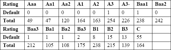
Note that Table 5.1 contains all the data. With ordinal predictors, you can display an entire data set with nearly 3,000 observations because the space requirement has more to do with the number of categories than with the actual sample size. This is in contrast with continuous data, where the original data are usually not reported due to space constraints.
5.3 Empirical ROC Curve for Ordinal Predictors
The empirical ROC curve for an ordinal predictor is built on the same principle as the empirical ROC curve for a continuous predictor. In fact, because the empirical ROC curve is based on the ranks of the data only, whether the predictor is ordinal or continuous has no bearing on the way the ROC curves are constructed. Thus, the methods from Chapter 3 can be used to construct and compare empirical ROC curves with ordinal predictors.
To briefly review, using each distinct observed value of the ordinal predictor as a possible threshold, you can compute the sensitivity and specificity of the resulting binary predictor. A scatter plot of sensitivity versus one minus specificity for each threshold constitutes the ROC points. Note that the following code is identical to the program used in Chapter 3 for continuous predictors:
Figure 5.1 ROC Points for Moody's Rating Data

Figure 5.1 contains the ROC points for Moody's ratings obtained using PROC LOGISTIC. Note that, for this work, the variable moody has to be numeric. Also note the use of the OFFSET= option of the AXIS statement to print some white space on the two edges of the two axes for improved display. Also note that none of the companies receiving one of the first five ratings (AAA through A2) defaulted, so all five ratings are represented by the same point in the upper right corner (100% sensitivity and 100% specificity).
The term ROC points is used intentionally. Figure 5.1 does not have an ROC curve, only points each of which is a feasible operating point for Moody's ratings. It is possible to connect these points, just as we did for a continuous predictor, ending up with an ROC curve. You could argue that because unobserved intermediate thresholds are not possible by definition of the ordinal predictor, the resulting curve is not meaningful. Imagine that you connected the dots in Figure 5.1. There is no Moody's score between B2 and C, so the points on the line segment connecting the two leftmost points in the figure represent the operating characteristic (i.e., sensitivity and specificity) of thresholds that do not exist. The counterargument holds that the levels of most ordinal scales are arbitrarily defined and can be changed. If the ordinal predictions are obtained by categorizing a continuous predictor, then it is possible to explicitly revisit the thresholds. In the case of subjective opinions, experts can be asked to refine their predictions by using a scale with more levels. In our example, Moody's might decide, after examining Figure 5.1, that the gap between Aa1 and Aa2 (the second and third points from the right) is too wide. This could be resolved by introducing a new threshold between these two.
There is also a practical consequence of connecting the points: It makes it possible to unambiguously define the area under the curve for an ordinal predictor. Thus, I recommend using the ROC curve rather than ROC points for an ordinal predictor.
5.4 Area under the Empirical ROC Curve
The area under the empirical ROC curve is computed using the trapezoidal rule, the same way it was done for a continuous marker. The %ROC macro can be used for this purpose since the empirical ROC curve and the area under it are rank-based functions. The macro call is identical to the ones used in Chapter 3:
The familiar %ROC output (see Output 5.1) indicates an AUC of 0.915 with a 95% confidence interval ranging from 0.891 to 0.940.
Output 5.1

Similar to using the %ROC macro, you can use the %BOOT1AUC macro to compute bootstrap-based estimates and standard errors for the area under the curve. Output 5.2 shows the results from the bootstrap, which are similar to those produced by the %ROC macro.
Output 5.2

5.5 Latent Variable Model
As is the case with continuous predictors, the empirical ROC curve makes minimal assumptions but does not extend easily for covariate adjustments. In Chapter 3, we developed the binormal model and demonstrated its use in covariate adjustments in Chapter 4.
It is possible to develop a binormal model for ordinal predictors, too. Imagine that you start with a continuous predictor but instead decide to categorize it and report only an ordinal predictor, such as none, low, medium, and high (as in some of the rain forecasts). The consumers of the forecast only observe the ordinal value. Even though these continuous predictions, called the latent variable, remain unobserved, the sensitivity and specificity at each of the ordinal values represent points on the ROC curve of the latent variable. The fundamental idea is given in Figure 5.2.
Figure 5.2 The Three ROC Points for the Ordinal Predictor

The horizontal line at the top portion of the figure represents the continuum of the latent variable. The three hash marks on the latent variable axis denote the thresholds that correspond to the observed ordinal predictor. The solid line at the lower part is the ROC curve for the latent variable and the hash marks on the curve are the ROC points. The important point is that the ROC points for the ordinal variable lie on the ROC curve for the latent variable.
Now examine Figure 5.3, which contains only the ROC points. Without knowing or supposing certain characteristics of the latent variable, you could not estimate the ROC curve of the latent variable by using only the ROC points. Connecting the points is unlikely to represent the true ROC curve of the latent variable because the true ROC curve is more likely to be smooth. You need to use information about the latent variable to interpolate between the ROC points. Of course, the latent variable is unobservable, so you can only make assumptions.
Figure 5.3 ROC Points for the Same Ordinal Predictor in Figure 5.2

The most common assumption is that the latent variable is normally distributed. This gives rise to the so-called latent binormal model. For now, we will distinguish the latent binormal model from the one in Chapter 3. The latent binormal model assumes that the latent variable follows a normal distribution with mean µ1 and variance σ12 when D=1, and a normal distribution with mean µ0 and variance σ02 when D=0. It is not possible to simultaneously estimate µ0, σ02, µ1, and σ12 using the observed frequencies of the ordinal marker (such as those in Table 5.1). Multiple (in fact, infinite) combinations of these four parameters can give rise to the same observed data, and it is not possible to distinguish between them. However, if we anchor one of the normal distributions by fixing µ0 and σ02, then we can estimate µ1 and σ12. For simplicity, suppose we choose µ0=0 σ02=1 and we get the estimates of µ1 and σ12, say ![]() and
and ![]() 2. Had we set µ0=m σ02=s, then the resulting estimates of µ1 and σ12 would have been
2. Had we set µ0=m σ02=s, then the resulting estimates of µ1 and σ12 would have been ![]() + m and s
+ m and s![]() 2. This can be proven because the normal distribution is a member of the so-called location-scale families. The implication is that, without loss of generality, we can always use the standard normal as the anchor and consider the resulting estimates as the difference of the two means and the ratio of the two variances.
2. This can be proven because the normal distribution is a member of the so-called location-scale families. The implication is that, without loss of generality, we can always use the standard normal as the anchor and consider the resulting estimates as the difference of the two means and the ratio of the two variances.
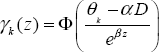
These considerations led to the development of the following special ordinal regression model for ROC curves, first considered by Tosteson and Begg (1988). In this model, D is an indicator variable for the gold standard, that is D=0 or D=1. The latent variable X has a normal distribution with mean αD and variance e2βD. This amounts to assuming a standard normal for D=0 and possibly a different normal density for D=1. Thus, this representation of X is consistent with the latent binormal model described previously.
Suppose that R is the ordinal predictor with k levels, created from X by applying the thresholds θ1…θk. Then the probability of R being equal to k is given by the following:

We saw in Chapter 3 that ROC curves are intimately connected to cumulative distributions. For this reason, using γk (D) = P(R ≤ k) instead of P(R=k) yields the following probit regression model:
Realize that 1 − γk (D) is the probability of the marker exceeding the threshold and, hence, predicting D=1. This represents the sensitivity when D=1 and one minus the specificity when D=0. Therefore, a plot of 1 − γk (0) versus 1 − γk (1) for all k produces the ROC curve of the latent variable. The resulting smooth curve, analogous to the case of the continuous predictor, is
![]()
where x is one minus the specificity and y is the sensitivity. Under this model, the area under the curve is given by

Setting a=α and b=e-β, you can see that the formula for the AUC is equivalent to the case of a single continuous predictor. This is not surprising because we have continuously observed in Sections 5.2 and 5.3 that there is a strong duality between continuous and ordinal predictors.
We will call this an ordinal-probit regression model. Other ordinal regression models can be obtained by assuming a different distribution for the latent variable, in which case the probit link in this derivation would be replaced by the cumulative distribution function of the chosen distribution. In practice, it is very rare that another distribution is used in the latent model setting.
Those familiar with the capabilities of the LOGISTIC, GENMOD, and PROBIT procedures might mistakenly conclude that these procedures can serve as the primary vehicles for analyses of ordinal predictors. In fact, these three procedures are not flexible enough to accommodate the parameter β. Use them only if you are willing to fix β in advance at 1 and estimate only α. These procedures were developed to estimate a class of models called generalized linear models, and the ordinal-probit regression model defined here belongs to this family if and only if β=1. Therefore, to fit the ordinal probit model as described previously in full generality, you need to use the capabilities of PROC NLMIXED.
We will use Moody's data as an example. Note that the first five categories (Aaa through A2) have no observed defaults and, thus, the same sensitivity and specificity. In the language of this chapter, γk(0) and γk(1) are the same for k=1,…, 5. Thus, we cannot estimate any of the four thresholds (θ1, θ2, θ3, θ4) because any of the points on the presumed latent variables distribution between −∞ and θ5 will be consistent with our data. To enable the ordinal regression to deal with all model parameters, we need to consolidate some of the categories. The consolidation in Table 5.2 was chosen for this analysis.
Table 5.2 Consolidated Version of Moody's Rating Data
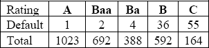
In the consolidated version, A represents Aaa through A3-, Baa represents Baa1 through Baa3, Ba represents Ba1 through Ba3, and B represents B1 through B3. C is not combined with another category.
Before we proceed with fitting this model it is important to emphasize the fact that the latent variable is not observed, so it is only the relative positions of the thresholds that can be estimated. In other words, two sets of thresholds with different absolute values but identical relative positions (i.e., the distance between them) will have the same likelihood. Hence we need to arbitrarily fix one of the thresholds so that others can be estimated. The following PROC NLMIXED code assumes the first threshold is 0 and fits the foregoing ordinal-probit regression model to the consolidated version of credit rating data.
The short introduction to PROC NLMIXED in the appendix might be helpful if you are not familiar with the syntax or the output. Output 5.3 shows the results.
Output 5.3
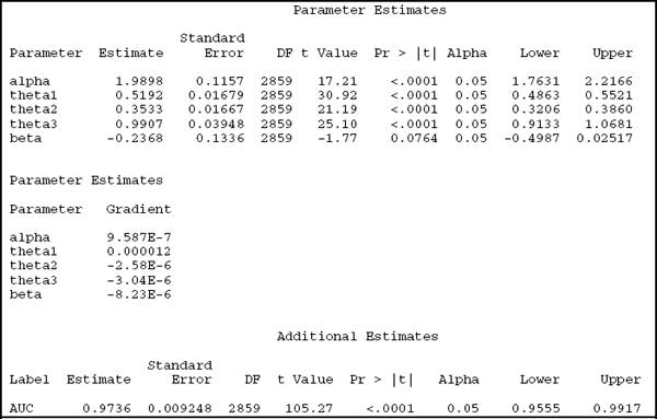
The iteration history and the gradient are not useful to us as long as the model fitting procedure converges. Estimates of the most relevant model parameters can be found in the Parameter Estimates output section, with ![]() = 1.99 and
= 1.99 and ![]() = –0.24. As discussed in Chapter 3, the ESTIMATE statement is a particularly convenient feature of PROC NLMIXED; it can compute the estimate and its standard error for any one-to-one function of the model parameters. Using this feature, we estimate the AUC to be 97%, with a standard error of 0.9% and a 95% confidence interval of 95.6% to 99.2%. By all accounts, Moody's ratings are excellent predictors of default.
= –0.24. As discussed in Chapter 3, the ESTIMATE statement is a particularly convenient feature of PROC NLMIXED; it can compute the estimate and its standard error for any one-to-one function of the model parameters. Using this feature, we estimate the AUC to be 97%, with a standard error of 0.9% and a 95% confidence interval of 95.6% to 99.2%. By all accounts, Moody's ratings are excellent predictors of default.
Although not directly useful, the three thresholds are also estimated by this model. Their estimated values (labeled as theta1, theta2, and theta3 in the Parameter Estimates section) are 0, 0.5192, 0.5192+0.3533=0.8725 and 0.8725+0.9907=1.8632. Remembering that the latent
variable is standard normal for D=0 and normal with mean 1.99 (![]() ) and variance 0.62 (e2
) and variance 0.62 (e2![]() ), we can exactly compute the expected proportions in each level of the ordinal predictor.
), we can exactly compute the expected proportions in each level of the ordinal predictor.
Alternatively, we can compute the estimate of the AUC by simply plugging in the estimates of α and β, but calculation of the standard error requires some analytical legwork using the Taylor approximation.
The resulting ROC points are given as black dots in Figure 5.4, overlaid with the smooth line from the binormal model. The fit is very good for high thresholds (low sensitivity), but there are some deviations from the empirical curve for the higher thresholds.
Figure 5.4 The ROC Curve Implied by the Latent Variable Binormal Model

5.6 Comparing ROC Curves for Ordinal Markers
Comparing ordinal ROC curves can either be based on the empirical curve or the latent binormal model. The %ROC macro can be used to compare the areas under the two empirical ROC curves. Alternatively, the latent binormal model can be used to compare the parameters of the two latent binormal curves.
5.6.1 Metastatic Colorectal Cancer Example
Some of the tumors in the colon and rectum spread to the liver, in which case they are called metastatic colorectal cancer. If the spread is limited to the liver, then it can be removed surgically. But if there are other sites of metastases, then a liver operation is not indicated. For this reason, all metastatic colorectal cancer patients who are candidates for liver surgery are carefully screened for tumors outside the liver. The example in this section compares two different methods for extrahepatic imaging: computed tomography (CT) and positron emission tomography (PET). Each patient underwent both scans and each image was evaluated using a three-point scale by a radiologist: positive (presence of cancer), equivocal, and negative (absence of cancer).
5.6.2 Comparing the Areas under the Empirical ROC Curves
Just as empirical curves for an ordinal predictor can be constructed using the %ROC macro, areas under multiple empirical ROC curves can also be compared. The following call to the %ROC macro generates the desired comparison:
Output 5.4 shows the results.
Output 5.4

The areas under the curve are 0.6744 for PET and 0.5526 for CT, with wide confidence intervals, in one case extending over 1. By definition, the AUC cannot exceed 1, so the upper limit of 1.1347 is a shortcoming of the asymptotic method that is used for confidence interval calculations. Generally, confidence intervals can be truncated from below at 0 and from above at 1. The difference between the empirical two areas under the ROC curves is 0.1218 and significant (p=0.003).
5.6.3 Comparing the Areas under the Latent Binormal ROC Curves
As an alternative to the empirical method, a latent binormal model might be assumed for both PET and CT. At this point, it is no surprise that the steps to compare the two latent binormal curves can be inspired by the binormal methods from Chapter 3. The key idea is to consider a regression model with the main effects of binary disease status (cancer/no cancer) and a binary indicator (PET/CT) as well their interaction. This leads to a model with a right-hand side identical to the models considered in Section 4.9. The coefficient of the interaction term is the key term again, representing the difference between the two ROC curves. The random term u represents the correlation between the two tests that is induced by the paired design.
The p-value for α3 from the following code can be used to compare the two binormal curves. The variable Test is the binary indicator CT/PET.
Covariate adjustments for ordinal markers can be done using the same representation in Chapter 4 by using an interaction term. There is no covariate of interest in the metastatic colorectal cancer example, but consider, hypothetically, that the age of the patient might have a bearing on the accuracy of CT scans. Then age-adjusted ROC curves for CT scans can be obtained using the following call to PROC NLMIXED:
Note the absence of a random effect from u in this model. As we reviewed in Chapter 4, a notable difference between marker comparisons and covariate adjustment is that marker comparisons usually involve paired data (each patient measured by each marker) while covariate adjustment does not have this feature.