

Chapter 7
SAS Web Report Studio
Quick and Easy Reports for Users
7.1 Getting Started
7.1.1 Quick Tour
7.1.2 Prerequisites
7.2 Understanding Report Data
7.2.1 Understanding Data Sources
7.2.2 Understanding Standard Data Items
7.3 Creating Your First Web Report
7.3.1 Using the Report Wizard with an OLAP Cube
7.3.2 Using a Template with an Information Map
7.3.3 Grouping the Data
7.3.4 Working with Bar Charts and Line Graphs
7.3.5 Working with Crosstabulation Tables
7.3.6 Creating a Template
7.4 Enhancing Your Web Reports
7.4.1 Adding Conditional Highlighting
7.4.2 Creating a Custom Sort Order
7.4.3 Selecting a Color Scheme
7.4.4 Customizing All Reports
7.4.5 Specify Preferences for Reports
7.5 Tips and Tricks
7.5.1 Creating Filters
7.5.2 Using Prompts from Information Maps
7.5.3 Linking Reports with Prompts
7.5.4 Adding Custom Measures
7.5.5 Scheduling Reports
7.5.6 Developing Reports for Wide Consumption
7.5.7 Using Group Breaks to Control Multiple Objects
7.6 SAS Administrator Tasks
7.6.1 Working with SAS Web Report Studio Roles and Responsibilities
7.6.2 Adding Images and Logos
Chapter 7
SAS Web Report Studio
Quick and Easy Reports for Users
Allowing a large group of users to access data and providing an easy way to do so is paramount to a successful BI deployment. SAS Web Report Studio fulfills the need with an interface and functionality that takes someone just a couple of minutes to understand and only a few more to become proficient in creating their own new reports.
Essentially, SAS Web Report Studio is a reporting tool; however, your organization will find that this is a data access tool with broad appeal. Querying data is usually relegated to programmers or analysts because this group has advanced experience with programming tools such as Base SAS software and SQL. While SAS Web Report Studio does not have the same level of flexibility and functionality as other SAS tools, it can act as a data access tool, allowing anyone to quickly query data and analyze results. The allure expands to anyone interested in making a decision based on data.
Broad appeal can increase the concern for security and training. It can take only a few hours to receive initial training on this product. There is no programming required because everything within the application is in a point-and-click interface. On the security side, administrators can control which data is available and to whom, whether users can view reports only, or they can also create reports and where reports can be stored.
7.1 Getting Started
To begin learning about this tool, here is a quick overview of what it takes to get started with SAS Web Report Studio.
7.1.1 Quick Tour
SAS Web Report Studio has two main modes that you can access from tabs on the main window, as shown in the following figure.
- Edit mode allows you to create or edit reports. This tab is available only if you have authorization.
- View mode displays the finished report.

Figure 7.1-1 Overview of the main window
7.1.2 Prerequisites
SAS Web Report Studio is a Web-based application. Your SAS administration can give you the specific server address. The URL address format is as follows. This address is case sensitive.
http://server name:port number/SASWebReportStudio
If you are creating or viewing reports, you must have a user ID and password identified in the SAS system. The SAS administrator sets permissions and determines which data libraries and sources are available. Section 7.6, “SAS Administrator Tasks,” contains more information about SAS Web Report Studio roles and responsibilities.
7.2 Understanding Report Data
To create a report, you need your data in a structure that SAS Web Report Studio can display. The following section defines data sources, icons, and data types. Refer to Chapter 5, “SAS OLAP Cube Studio,” and Chapter 6, “SAS Information Map Studio,” for more information about creating these sources.
7.2.1 Understanding Data Sources
There are three data sources available to SAS Web Report Studio: information maps, OLAP cubes, and relational data tables. By default, only information maps are initially available; however, relational data tables and OLAP cubes are accessible directly if enabled by the SAS administrator.
These data sources are identified as relational (two-dimensional) or multidimensional.
|
Icon |
Description |
|
Information Map
|
This is a generic information map icon. Refer to Chapter 6, “SAS Information Map Studio,” for more information on creating information maps. |
|
OLAP Cube
|
This icon identifies an OLAP cube, which is a set of data that is organized and structured in a hierarchical, multidimensional arrangement. Refer to Chapter 5, “SAS OLAP Cube Studio,” for more information about creating OLAP cubes. |
7.2.2 Understanding Standard Data Items
Each data source includes one or more standard data items. You decide which data items to use to define a query for a report section. You can use all the data items in the data source or a subset of data items. Each standard data item is classified as a category, a hierarchy, or a measure.
7.3 Creating Your First Web Report
SAS Web Report Studio provides many different ways to build a report. As you start, you can use the templates to create reports. However, it does not take long to create your own reports from a data source. The following table summarizes the different techniques for creating a new report.
 Even if you use
a quick-start method, you can make edits to the report until it meets your
needs.
Even if you use
a quick-start method, you can make edits to the report until it meets your
needs.
|
Method |
Description |
|
Report Wizard |
For brand new users, the Report wizard is the fastest way to generate a report. This feature guides you through the steps needed to use the application. |
|
Stored process as the template |
Stored processes can be opened directly from the Open Report interface or included as a part of an existing report. For more information about stored processes, refer to Chapter 3, “SAS Stored Processes.” |
|
Template with your data |
Standard layout designs with the same elements are saved to templates and used to create reports quickly. A common design is a report with a custom header and footer and one table. If another report element is needed, an alternative template must be selected, a new template created, or the report author must use a different method to create the reports. |
|
Create from a data source |
When you save a report based on a data source, you create a new report simply by selecting an information map, a table, or a cube. Because the resulting report is based on a data source, you have full access to all the report objects. |
|
Use an existing report |
Any existing reports can be opened and saved with a different name or within a different location. This new report can be edited to use a different data source or different report elements. |
7.3.1 Using the Report Wizard with an OLAP Cube
The Report Wizard guides you through five steps to create a one-section report quickly. After using the wizard, you can modify the report for any customizations you want. For this example, you work for a furniture company and need to create a regional report that evaluates the predicted and actual sales. This example uses an OLAP cube that allows the end user to see the regional performance and then expand the report to see the performance for each year.
Note: Information on how to build the FurnitureSales cube is in Chapter 5, “SAS OLAP Cube Studio.”
To use the Report Wizard to create a report, complete these steps:
- Select File> New> New Using Report Wizard.
- Use the Select Data Source button to locate a data source to create your report.
Select the data items that you want to use in the report. In the Available data items box, select one or more data items and click the arrow icon to move them to the Selected data items list box.Click the Next button to go to the next wizard page.
At this point, instead of clicking Next, you can click Finish to display the Edit tab. Defaults are used for any remaining unspecified required content. For example, if you are using a relational data source, a list table is automatically included.
- Step
2 of the wizard allows you to change the formatting on some data items. Typically,
the data formats are acceptable and you do not need to make any changes.
Click Preview data to see
the data.
- Click the Next button to go to the next wizard page.
- Step
3 of the wizard allows you to create group breaks for your report.
A group break is a way to
divide report sections by distinct category or hierarchy level values when you
are using a relational or multidimensional data source.
- From the first Break
by drop-down list, select a category or hierarchy to specify
the first group break.
If you want the report to display a new page for each value in the first break, select New page for each value. - Specify
up to two more breaks.
If you do not want labels to appear with each value, then clear the Label each value option.
- From the first Break
by drop-down list, select a category or hierarchy to specify
the first group break.
- Click the Next button to go to the next wizard page.
- Step
4 of the wizard allows you to select how you want the data displayed in the
report.
Add at least one view element to display the results of the query, either a table or a graph (a bar chart, a line graph, or a pie chart). The data items that you selected in Step 1 of the wizard are shown as selected to display. Either accept the default assignments or clear the Show check box to hide the data items that you do not want to display. - (Optional)
To add a header or a footer, complete these steps for each feature that you
want to include in your report:
From the Banner drop-down list, select an image to use for the banner. Available images are included into the server by your SAS administrator. If there are no images available, then your only selection choice is None. Refer to Section 7.6.2, “Adding Images and Logos,” for more information about adding artwork to SAS Web Report Studio. - Click
Finish
to display the report in the Edit
tab. The following figure shows how the report looks in the Edit and View tabs.
Click the View tab to see the results. In the following report, each product has an individual table and graph. This report is showing the regional sales for the Boots product line for all of Canada.


7.3.2 Using a Template with an Information Map
Another way to create a report is to start with a basic template that you can later customize.
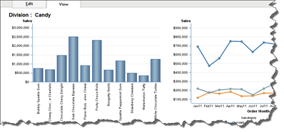
This example uses data from a candy sales company by using an information map. This report shows the sales by division, product lines, regions, and customers for the past year. This report is updated every month with the new sales data. The Sales department has requested this report so they can determine how accurate their sales predictions are for the various products and regions.
Note: Create this information map by following the example in Chapter 6, “SAS Information Map Studio.”
To create the report, do the following:
- Select File
> New
Using Template to start creating the report.
There are 12 templates available to help you get started. Your organization might also have templates made by others that you can select from Shared Templates. You can create templates, which are available from My templates. - From the General
templates tab, select
Two graphs over table, as shown in the following figure.

- This template has two bar charts above a general report. Above our new
template objects, several icons show sample report layouts. For instance, you
can choose to have a pie chart, scatter diagram, an image, or even just text in
the report.
For this report, you need a line graph and a crosstab to replace some existing elements. Right-click the bar chart called Graph2 and select Remove chart. Then drag the line graph icon into the empty area. Replace Table1 with the crosstab icon using the same method. After making the changes, the template now looks like the following figure.When the yellow
triangle icons appear, it is not an error but a warning to remind you that more
information is required for the object to display successfully.
- When you replaced the table with the crosstab object, the bottom row
became two cells. You can control the layout and alignment of your report using
the icons to the left of the report area. Select the
 two columns in the bottom row and select
  the Merge cells icon to create a single row.
Use the other
icons to add or remove cells or align an object within the cell.
the Merge cells icon to create a single row.
Use the other
icons to add or remove cells or align an object within the cell.
- To add data to the report, click Data
> Select
Data to
display the data source window. This example uses the Candy Customer Sales information map.

1
You can use the arrow in the middle of the window to move the data to the Selected data items column. For this example, the data source Candy Customer Sales, which is an information map, is selected. Move all desired data items to the Selected data items column. The icon next to each data item name indicates the data type.
2
The data items might not match what you want for your report. For instance, the data table uses the label Category but for this report, you need the name to reflect how the business is organized. In this case, Category should be Division.
To change the data item name, click the data item and select the icon in the lower right corner. In the window that appears, type the new name. For this example, change the name to Division.
- After adding the data source, SAS Web Report Studio assigns it to the
objects. Click View
to see the result, which is similar to the following figure.
Save the report
so if you do not like the changes you make, you can easily return to this view.
At this point, this report is not meaningful and it would be difficult to do any useful analysis with this information because it is hard to see any trends or understand the sales figures. In the following topics, you will learn how to make modifications to this report to further enhance the data and improve navigation.

7.3.3 Grouping the Data
The candy company has two categories of products, candy and nuts, and a division manager is assigned to each. You are creating this report for each divisional manager. It shows the sales trends by month and determines which products are selling the best.
Using the Group Break feature, you can create one report and then display the data for each division. If you need to make changes to the report, it is easy. Instead of creating separate reports, you can create one report, with a page for each category.
- To group the report data, select Options
> Group Breaks.

- For this example, select Division
and the New Page for
each value check box. The Sort radio buttons allow you
to determine how you want the Division names sorted.
You can also choose the formatting for this title in the window. Because this is heading text, select a 12 point or above size. You can also control the font type and color.
After you create the data grouping, the window changes. Division is now Section 1 in the Table of Contents pane. The Section Data area shows all categories and measures.
- It is a good practice to change the name of the section from Section 1 to something more meaningful, such as Division Reports.
To rename the section, select Options > Rename Section. In the Rename window, type the desired name, such as Division Reports. When you return to the window, the name has changed from Section 1 to Division Reports, as shown in the following figure.
7.3.4 Working with Bar Charts and Line Graphs
When adding data, SAS Web Report Studio automatically assigns the data items to existing elements in the report. The default assignments might not always suit your needs. You can change how the data appears in order to customize your report.
- To modify the chart object, right-click Graph1 and select Assign Data from the
pop-up menu.
 If you select Data source details on any
object within the report, you can view information on the type of data, its
description, and any applied filters.
If you select Data source details on any
object within the report, you can view information on the type of data, its
description, and any applied filters. - For this bar chart, you want to see sales for each product.
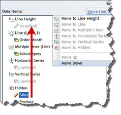
Each data item uses a specific value. For instance, Bar Height expects to have a measure assigned to it. The ruler icon appears.If the data item expects to have the categorized data assigned, the 3-box icon appears.
If an item is not available for assignment, it appears as gray font. In the figure, the Move to Bar Height appears in gray.
- Assign the Sales measures to the Bar Height data item. Place these items in the order you want them to appear in the chart.
- Assign Product to the Bars data item.
 You can use the
Move Items menu to help assign the data.
You can use the
Move Items menu to help assign the data. - For the line chart, you want to show the sales broken out by subcategory
per month. Right-click the line graph object and select Assign Data from the
pop-up window.
As with the Bar Chart object, each data item uses a specific value. Line Height expects to have a measure assigned and Line expects to have a category assigned. - Assign the Order Month to the Line data item. This is the horizontal
value on the chart. Assign Subcategory to the Multiple Lines data item so there
is a line for each subcategory.
If you peek at the report, the bar chart is crowded. It might be more interesting to just show the top five products sales for the year.
- To rank the data in the chart, use the following steps:
Rank is available
only when the Synchronize Objects feature is disabled.
- Right-click the bar chart and select Filter and Rank from the menu.
- From the Measure Filter or Rank tab, type 5 in the Top field.
- Select Sales
in the Measure
field. You could also select another measure, such as Units.

- The Properties window allows you to add titles, control the object size
and customize other object elements.
- Select the Edit tab to set the title.
- Right-click the graph and then select Properties from the pop-up menu.
- In the General pane, type the chart name in the Text field. You can change the look and placement of the title if you want.
- In the Graph size
area, click Fixed size
and select Custom
from the drop-down menu. Type the width and height values you want.

- After setting the titles and size for the other item, click the View tab to preview
the report.

7.3.5 Working with Crosstabulation Tables
Using crosstabulation tables, you can quickly summarize relational data. In the current report layout, the crosstabulate is displaying all data by default. Because these reports have a targeted audience, you need to select the fields that highlight the data.
- Right-click the crosstab object called Table1 and select Assign Data from the pop-up menu.
- The Assign Data window appears. This window allows you to control how
the table looks. You can drag and drop the items or use the Move Items drop-down
menu while selecting the item.
In the following figure, the finished table is on the left and the Assign Data window is on the right to demonstrate how the final table appears. The columns have the vertical headings and the rows are the horizontal items. Place the data in the order in which you want it to display.Any items
placed in the Hidden category do not display. These items are still available
to use in the report.
- You can add totals and subtotals to the table. Right-click the table and
then select Total
from the pop-up menu.
The following figure shows how the table looks after the Column totals and Column subtotals are applied. The arrows indicate how the check box choice generates the totals. The subtotals provide the summary for each state and year, while the total shows the value for entire column.If you select the row options, the totals appear horizontally.

- To create an overall report that shows the global results for the
divisions, you can copy this report to a new section and then delete the group
break.
To add a new section based on the report, do the following steps:- From the Table of Contents pane, select Options > Copy Section.
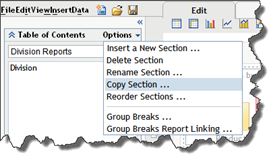
- Type the section name in the Section
name field. Then select where you want the section to appear. Because
this is summary data for the divisions, place this section before the division
reports.
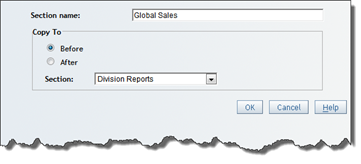
- This section is an exact copy of the other one but is independent of the
other section. Any changes made to this section do not affect the other
sections. To show the global sales, select Options > Group Breaks and change Break by values of
to None.

There are now two sections in the report. The first section shows the overall sales for both divisions. The following figure shows all categories.

- From the Table of Contents pane, select Options > Copy Section.
7.3.6 Creating a Template
You can create a template to use or to share with your team. Templates assist with keeping a consistent look among your department’s or company’s report. This is particularly important when all of your reports appear in the same area, such as a portal. The end user of the collective reports must quickly understand the reports structures so they can quickly get the needed information. When the reports have a common look and feel, this is much easier.
With the layout predetermined, it can also make report creation quicker and easier. This way the report creator does not have to focus on the format of the report, only the content. The report creator can then add the needed data and not worry about logos or footer material. Many organizations also use this area to place disclaimers or copyright information.
In the following example, you will create a template that uses dynamic text to capture the report name and the author information.
- Select New > Report.
- In Edit mode, design the layout to meet your needs. For instance, your team might decide that all reports will have a graph across the top with supporting data and analysis paragraphs at the bottom.
- To add a custom header, click Header
or Footer.
You can add dynamic text by selecting an item from the Dynamic Text drop-down menu. In this example, you want a graphic with the report name and data source. For this template, the logo appears in the upper left corner. In the Left content tab, enter 10% for Width and select an image for Content. When you limit the width of the image, you can control where it is on the page and leave room for a title or other information.You can add
artwork, such as logos, to SAS Web Report Studio using SAS Management Console. Refer
to Section 7.6.2, “Adding Images and Logos,” for more information about adding
artwork files.
The Middle content tab is given the remaining width of 90%. The default report name is added.

- For the footer, type
Report
Author
and select Report Author in the Dynamic text field. When viewing the report, the name of the report creator appears. This is useful in larger organizations so the report user would know whom to contact for questions.
Available dynamic text values include Data Source Name, Data Source Description, Date the data was last refreshed, Report Author, Date Modified, Report Description, and Report Name, as well as the selected value for each report prompt.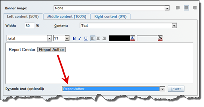
- To save the template, select File
> Save As.
When saving the template, select Template in the Type field. You can indicate that this template is for public use by selecting Shared templates.It is a good
practice to describe the template so others understand its purpose. When there
is a large list of templates, the description can better distinguish your
template.
The following figure shows how the template appears when another user wants to use it to create a report. The template is available on the Shared templates tab.

This following figure contains an example of the template when it is saved and when it is viewed. The header has the image and name, and the footer contains the report author name. When in View mode, the template has message boxes that indicate that no content has been assigned. When you add a data source to the report, the messages goes away.

7.4 Enhancing Your Web Reports
You can change the overall appearance of your report, highlight differences in the report values, or create a custom sort order for the categories.
7.4.1 Adding Conditional Highlighting
Conditional highlighting, also, called traffic lighting, is easy to add to the tables or charts in your report. For the conditional highlighting, you need to establish the business rules, or otherwise indicate what is important.
In the following example, you can see how to create three conditional formats. These rules cause the following highlights to appear on the report:
- When sales percentage difference is less than the difference 12 months ago, a red down arrow appears.
- When the sales percentage difference is greater than or equal to the difference 12 month ago, a green up arrow appears.
- When the current month’s sales are greater than the 3-month sales
average, text appears and the background changes to green. In this case “Yes!”
is the message, but you can choose any message that makes sense to your
organization.

Figure 7.4-1 Using conditional highlighting
To create a conditional highlight, do the following:
- Right-click the table where you want the filter and then select Conditional Highlighting from the pop-up menu. When the Conditional Formatting window appears, select New to create the rule.
- On
the next window, the Rule
tab allows you to select the Measure
and Condition
from the drop-down menus. For Value,
you can either type the amount or select from a list of measures.

- To add an icon to the chart, select the Highlight by adding an image or text
check box and select the Image
radio button. You can then select the position and icon you want to use. If you
prefer to add custom text, you can also add custom text by selecting the Text radio button.
In the following figure, you can see an example of how to create the Text and Image elements. In the example on the left, select the Image radio button and the star to indicate a positive condition. There are other icons available for negative and positive conditions. In the example on the right, select the Text radio button and add the Yes! text. You might want to place other messages, based on the condition.
7.4.2 Creating a Custom Sort Order
By default, SAS Web Report Studio sorts category data items in ascending alphabetical order. The columns appear in alphabetical, numerical, or date order. If you need the data sorted in an alternate way, create a custom format.
This example uses the SASHELP.SHOES table to demonstrate how you can reshape the data to define a custom sort order. In the following figure, there is a before and after table showing how the sort order changes. On the left, the products appear in alphabetical order. After the custom format is applied, the products appear so that the related products are alphabetized based on product type (casual, dress) instead of gender (Men’s, Women’s).

Figure 7.4-2 Applying a custom sort
You must have
appropriate authorization to create a custom format in the BI configuration
folder and the ability to create information maps. Contact your SAS
administrator for more help.
To create a custom sort order, do the following:
- In SAS Enterprise Guide, write a SAS program that creates a user-defined
format that places the Product variable values in a specified numeric order.
The code in the following example program creates a custom format.
SAS Business
Intelligence stores formats in a default location: <sas configuration directory>Lev1SASMainSASEnvironmentSASFormats.
/*Create a format with the preferred sort order for the values */
libname mylib ‘c:’;

proc format lib=mylib;
value fmt_product
 1= “Boot”
 2= “Men’s Casual”
 3= “Women’s Casual”
 4= “Men’s Dress”
 5= “Women’s Dress”
 6= “Sandal”
 7= “Slipper”
 8= “Sport Shoe” ;
run;

libname sasenv
 “<configuration directory>Lev1SASAppSASEnvironmentSASFormats”;

options fmtsearch=(sasenv);

/*register the format in the catalog */
proc catalog cat=exists.formats;
 copy out=sasenv.formats;
run;

/*Create a second version of dataset with new format */
libname sales meta library="Sales Data" metaout=data;

data sales.newshoes;
set sales.shoes;
    if PRODUCT = “Boot”              then NEWPRODUCT=1;
    if PRODUCT = “Men’s Casual”      then NEWPRODUCT=2;
    if PRODUCT = “Women’s Casual”    then NEWPRODUCT=3;
    if PRODUCT = “Men’s Dress”       then NEWPRODUCT=4;
    if PRODUCT = “Women’s Dress”     then NEWPRODUCT=5;
    if PRODUCT = “Sandal”            then NEWPRODUCT=6;
    if PRODUCT = “Slipper”           then NEWPRODUCT=7;
    if PRODUCT = “Sport Shoe”        then NEWPRODUCT=8;

format NEWPRODUCT fmt_product.;
run;
/*END OF PROGRAM */
Program 7.4-1 Create a custom format
- In SAS Management Console, register NEWSHOES.
- In SAS Information Map Studio, insert NEWSHOES into a new map.
Instead of adding the original Product variable as a data item, use the new data item NEWPRODUCT.Refer to Chapter 6, “SAS Information Map Studio,” for more detail on how to create information maps, add data items, and modify formats.
- Go into the properties for NEWPRODUCT and change the type from Numeric to Category. Check the bottom of the dialog box to see the user-defined format listed.
- In SAS Web Report Studio, select the NEWPRODUCT data item from the information map that is based on the NEWSHOES table.
- View the report and sort the NEWPRODUCT column in ascending order. You should see the sort results based on the custom order defined by the applied format.
7.4.3 Selecting a Color Scheme
There are four default color schemes available to use with the reports. You can change the style for the current report. In Edit or View mode, select View > Report Style.
After you select the new style, the next time you view the report the changes are applied.
Use the
Preferences area to change the default style for all reports. Refer to Section
7.4.5, “Specify Preferences for Reports,” for more information.

Figure 7.4-3
7.4.4 Customizing All Reports
You can use artwork such as your company logo or text such as disclaimer warnings in your reports. These images help your reports maintain organization branding.
7.4.4.1 Inserting Artwork into Your Report
You can add images to your reports. In some organizations, the users want to view the reports online and have the report in PDF format. Because the report has several sections, a title page and subsection title pages give the report a consistent look and match other report formats within the organization.
If you are able to save reports, you can select an image from your local machine to save with the report. However, if your organization uses the image across several publications, it might be more convenient to store the image on the server. The following example shows how to insert a title page that was previously saved as a JPG on the local machine.
To insert an image into your report, complete these steps:
- In Edit mode, insert a new row in the report.
- Click the tree icon on the horizontal toolbar and drag it to the new row. The image placeholder appears.
The yellow icon
with the exclamation mark indicates that there is not a data source for the
object. In the next step, you will add the image.
- Right-click in the image and then select Edit.
- From the Edit Image window, you can indicate the image location and upload it to the server.
Valid image types are TIF, JPG, and PNG.
- Select the Local Machine radio button and click the Browse button.
- Navigate to the image location and click Open.
- Click the Select a Folder button to select where you want to store the image on the server.
- You can adjust the image size if needed.
It is a good
idea to maintain the scale on images; otherwise, the final report might contain
a distorted image. - Select OK
to return to the report. In the following figure, you can see how the image
looks in the Edit
and View
tabs.


7.4.5 Specify Preferences for Reports
As you create more reports, you might find yourself in a pattern of adding the same header and footer information for each report. You can preset this information and control other settings using the Preferences window.
Use these steps to set your preferences:
- Click
Preferences
in the right corner of the display to open the Preferences window.

- On
the Report
Creation
tab, complete any of these items to setup your preferences:
- Select Preferred
data source.
Navigate to the folder that contains your data source and then select the information map, table, or cube that you want to use. The default is Last data source used. - From the Report
style
drop-down list, select the default style for creating new reports.
The style that you select affects the color and font text of report objects such as tables and graphs. SAS Web Report Studio has four styles available: Plateau (the default), Seaside, Festival, and Meadow. - For the Section
header
and Section
footer,
select one or both of the following options.
Changes made to the header and footer preferences affect all sections of a new report.- Banner
Select the name of the image that you want to include in the header or footer. The list contains images that your SAS administrator has made available. If you do not want to include an image in the header or footer, then select None. - Text
Type the static text that you want to include in the header or footer.
- Banner
- Select Preferred
data source.
- The next time you create a new report, the report uses these preferences.
7.5 Tips and Tricks
Creating standard reports typically does not address all reporting requirements. Included in this section are techniques that the authors commonly use and that require more explanation.
7.5.1 Creating Filters
Defining filters within SAS Web Report Studio allows the report developers to refine what results a final report contains. In the following example, a report is set up to filter on the year. The end user can change the filter based on the situation. Additionally, you can avoid having multiple copies of the same data or a single filter that is used by only a few people.
Do you have a
filter or prompt that users continually re-create for multiple reports? Create it
within one information map so everyone can use it when needed. Refer to Chapter
6, “SAS Information Map Studio,” for how to create filters in the map.
To create a filter in SAS Web Report Studio, do the following:
- In Edit Mode, select Data
> Section Filters from the menu.

- In the Filters window, you can create a new filter for the report, or
you can use a predefined filter. In the following figure, there are two predefined
filters available. For this example, you are creating a new filter. Click the New button to
display the Create Filter window.
In Section 7.5.3, “Linking Reports with Prompts,” you will learn to use the predefined filters or prompts.
- To create a filter for year, do the following:
- In the Filter Name field, type Year. This value appears in the Filters window.
- In the Data Item field, select the data item (Order Year) from the drop-down fields.
- In the Operator field, select is after or equal to. This filter causes one year to display at a time.
- Type the year in the Type the Value to Add field.
- Click Get
Values to generate all possible values dynamically.
To enable the Get Values button, refer
to Chapter 6, “SAS Information Map Studio,” for information about allowing
dynamic values.
- Any added or pre-selected values can be moved to the Selected values area.
The following figure shows an example for a year filter set up for 1994. Select the Prompt user to enter values
check box to prompt the users for the year they want to view.
Select the Prompt user to enter values
check box to prompt the users for the year they want to view.
- When you return to the Filter window, the Year choice is in the
list. When the check box is selected, this filter is used during report
generation, as shown in the following figure.

The final report has the filter applied.

7.5.2 Using Prompts from Information Maps
When using an information map as the source, there might be prompts available. In the following example, the report you created in Section 7.3.2, “Using a Template with an Information Map,” is copied to a new report and used as a foundation for the customer-based report. The cascading prompt shown in the example was created in Chapter 6, “SAS Information Map Studio.”
To use a prompt in the report, do the following steps:
- Open the report and select the Edit tab.
- In the Section Data section, select Options > Section Filters.

- In the Filters windows, the Apply
predefined filters area shows all of the prompts available for
the information map. For this example, select RegionCascadingFilter.

When you run the report, it prompts you for the region and customer. In the following filter, the report shows the results for the Toys 4 U customer in the East region.

7.5.3 Linking Reports with Prompts
SAS Web Report Studio enables you to link reports together. When you link reports, you have the option to associate data item values in the source report with prompts in the target report. In this way, the prompt window bypasses the target report, and the target report is automatically subset based on the values in the source report.
In SAS Web Report Studio, you must have the capability to link reports. If you do not see the menu option, contact your SAS administrator. In addition, you can link an OLAP report to a relational report but you cannot link an OLAP report to another OLAP report.
This example shows you how to link a graph and a crosstabulation table to another report. As the input table for both the source report (Regional Sales Main) and the target report (Regional Sales Detail), this example uses a version of the Candy information map created in Chapter 6, “SAS Information Map Studio.”
There are two reports you want to link, which are shown in the following figure. The first is the Show Sales (Main Report), which contains a summary chart of product sales by region. The second report is the Show Sales (Target Report), which contains specific information about the region and product.

Figure 7.5-1 Reports to link
Note: Before you can create the link, the target report must exist.
- Open the Regional Sales (Main Report) in Edit mode and right-click the object to select Report Linking from the pop-up menu.
- In the Report Linking window, navigate to the target report and select it. For this example, the target report is Regional Sales (Target Report).
- To associate the Product and Region data items in the Regional Sales
(Main Report) with the Product and Region prompts in target report, click the Set Up Destination Report
button.

For each prompt, select the data item that matches the prompt, as shown in the following figure.

- View the main report. In the graph, place your mouse pointer over a
point. Notice that the pop-up box displays some information about the segment,
as shown in the following figure.
Click the point to send the values associated with that point (Bubbly Sparkle Gum and Central) to the Product and Region prompts for the Regional Sales (Target Report). In the following figure, you can see that the Region Sales (Target Report) shows the information you chose from the main report.
Following are a few additional tips on linking reports using prompts.
- The target report must use relational data. Many companies use an OLAP cube for the summary report and a relational table for the target report.
- If you define a link to a report that is manually refreshed, the prompt values sent from the source report are not used for the target report. Instead, SAS Web Report Studio displays the results of the last query run for the target report.
7.5.4 Adding Custom Measures
You can create simple custom measures based on the measures in the data. You can add, subtract, multiply, and create percentages in the OLAP cube or information map.
- While in Edit mode, select Data
> Select Data. Then select the Custom tab.
For this measure, you want to see how close the actual sales were to the predicted sales figures. - Create
a name for the measure and then build the following expression in the
Expression window:
[Units] * [Retail Price]
You can type the expression or use the arrows to add measures to the Expression box. Type or click the operator icons to include within the Expression boxw. After entering your expression, click Add. The new custom item appears in the Custom item box. The following figure shows the added measurement along with the resulting report.

You can add as
many custom measures as you need. If you later want to remove or change the
measures, use this window.
7.5.5 Scheduling Reports
For large data tables or large reports, the response time to retrieve results can be much longer than acceptable to report viewers. Reports can be scheduled to run during non-peak hours and to manually refresh when viewed, so users can quickly access results during working hours.
7.5.5.1 Creating a New Schedule
In the following example, you are going to schedule a report to run twice a day on 4 days of the week. This might not be a typical schedule for reports, but the example shows the flexibility of the scheduling.
To schedule reports, do the following:
- In Edit mode, select File > Schedule to schedule the report. Save your report before scheduling it.
- To schedule a report to run multiple days of the week at multiple times,
do the following:
- Select Weekly from the Run report area.
- Select the interval from the Weekly interval drop-down menu. Because this report should run weekly, select Every 1 week(s).
- Select which days you want the report to run.
- Click the Multiple hours radio button because this report needs to run every 2 hours. Select the hours of the day during which you want the report to generate. The hours display in military time.
- Select the date you want the report to start and end. If you select No end date, the report will generate until someone changes this schedule.

- You can make previous instances of the output available to users. You can choose how many reports you want available. Because this is a weekly report, you should make several instances available in case the user wants to compare a report against the previous week. Because these reports use space on your server, you might want to consider the space available to you and the usage of the report by the users.
- Select Finish
when you finished. A summary window outlines your choices.
7.5.5.2 Editing a Report Schedule
You can easily make changes to your report schedule at any time. Use the following instructions as a guideline when modifying a scheduled report.
- Open the report and select File > Schedule.
- Select the report you want to change and select the middle icon with the
pencil.

- After the Schedule Report window appears, make the changes you want and select OK to save the changes.
7.5.5.3 Managing the Schedule and Report Distribution
From the Manage File window, you can quickly manage the report schedules across multiple reports.
- Select Manage Files from the File menu on the SAS Web Report Studio home page.

- Click View my
scheduled and distributed reports in the File Management pane.

7.5.5.4 Changing a Report to Refresh Manually
When scheduling a large report, you should consider changing the default behavior to refresh manually.
On the Save As window, the drop-down box for type is available. If this is an existing report, select Save As to get to this window and then save the report with the same name and location to save over the existing report.
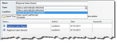
Figure 7.5-2 Controlling when reports refresh
7.5.6 Developing Reports for Wide Consumption
While developing reports, it is typical to store these in a folder structure that is not viewable by the general report-viewing audience. Some report authors place these reports in a folder under the My Folder structure. This ensures that no one other than the report author can view the report. However, many organizations have a team of individuals creating reports and another team that tests reports. In this structure, the site administrator might create separate folder structures with appropriate authorization levels for each group.
Use the Export/Import
wizard in SAS Management Console to migrate reports between environments, such
as between a development and production server.
7.5.7 Using Group Breaks to Control Multiple Objects
You can include output from a stored process and results from an information map in the same report section and have the output from both data sources share the same grouping criteria. You perform this task by assigning the group breaks in the report to the prompts in the stored process. Combining reports from multiple sources such as information maps and stored processes provides access to more data and allows you to display various details that might not be available from one source alone.
In the following report, each object provides a different viewpoint of the data.
- The bar chart object, built from an information map, shows sales for nuts in the East region for the current year. This chart focuses on the overall product sales in the region.
- The stored process object provides a data table showing all divisions and regions sales for the past 3 years. This table focuses on the customer trends within the region.
What you want is for both objects to respond to the group breaks established for the report; when the user views the report and selects Region, both objects automatically filter to show that information. In the following report, the bar chart does show the correct information, but the table shows the Candy division for the Central region.

Figure 7.5-3 Stored process does not use same filter as report
To design the report so both objects display correctly, do the following:
- In SAS Enterprise Guide, modify the stored process:
- Create the stored process with the prompts needed for the group breaks. The assumption is that the stored process is able to access or display data that is not available to the information map. For instance, the information map shows only the current year’s data and the stored process contains historical data.
- Register the stored process. For this example, the stored process has Region and Division data items for prompts.
This method
requires that you have registered the stored process to execute on the logical
SAS Workspace Server and to generate package results. For more information
about creating stored processes with prompts, refer to Chapter 3, “SAS Stored
Processes.”
- In SAS Web Report Studio, create a new report.
- Add an information map as a data source.
- Insert a bar chart object on the right. For this example, you want the sales amount by subcategory for each company.
- Insert a stored process object in the empty cell on the right.
- Right-click the stored process object, select Edit, and assign the
stored process you created in step 1.
The report looks similar to the following figure:
- From the Data menu, select Edit Group Breaks.
- In the Group Breaks window, select to break by Division and Region.
Choose to display a new page for each value.

- To associate the group breaks with the stored process prompts, right-click on the stored process and select Assign Group Breaks.
- Associate the Region prompt with the Region group break and the Division prompt with the Division group break.

- Click View to render the report. Because the group breaks provide the values for the prompts, the report bypasses the prompt window. In the following report, notice that all of the results are now based on the same criteria.

You can assign
group breaks to stored process prompts by adding compatible data items from an
information map to the report. You do not have to use the data items in a table
or graph. For example, if you remove the pie chart from the sample report, the
group breaks can still supply the prompt values for region and product.
7.6 SAS Administrator Tasks
Using SAS Management Console, the SAS administrator can set responsibilities and make system-wide changes that assist all users.
7.6.1 Working with SAS Web Report Studio Roles and Responsibilities
To enable the availability of specific capabilities provided by SAS Web Report Studio and SAS Web Report Viewer users, each user can be assigned to one or more predefined roles. SAS Management Console has three predefined roles for SAS Web Report Studio.
|
Role |
Purpose |
|
Web Report Studio: Report Viewing |
Allows a user to view reports. |
|
Web Report Studio: Report Creation |
Allows a user to create reports. |
|
Web Report Studio: Advanced |
Provides all capabilities in SAS Web Report Studio except the capability to manage report distribution. |
The following display of the Web Report Studio: Report Creation window shows some of the capabilities initially assigned. To modify the role, such as granting the capability to access tables directly or removing the ability to access OLAP cubes, select the associated check box.

Figure 7.6-1 SAS Web Report Studio permissions
7.6.2 Adding Images and Logos
Each report that is created in SAS Web Report Studio might include one or more images. Any report can include a banner image in the header and footer of the report. Banner images make it easier for end users to identify the report and to distinguish between reports.
Banner images are stored in the following metadata location. By default, the BannerImages folder is empty.
SAS Folders/System/Applications/SAS Web Report Studio/Common/BannerImages |
SAS Web Report Studio supports four image types: BMP, GIF, JPEG, and TIF.
To make a banner image or conditional highlighting image available to users of SAS Web Report Studio, follow these steps in SAS Management Console:
- Navigate to the images folder. The default location is shown above. To display a menu, right-click on the appropriate image folder.
- From the menu bar, select Add Content From External File(s) or Directories.
- Select the file (or files) that you want to import and then click Open.
Note: If you select a folder, the folder and its contents are recursively imported. In SAS Web Report Studio, banner images or conditional highlighting images that are stored in subfolders of the BannerImages and ConditionalHighlightingImages folders appear in a single drop-down list. - In the Enter
description text box, enter the image name that the report builder
will see in SAS Web Report Studio. Image descriptions should be fewer than 20
characters. Click OK
to close the Enter
Description text box.
The imported images are available in SAS Web Report Studio after a short delay. To make the images available immediately, restart the Web application server.

If you modify an
existing image, reimport the new image by using the preceding instructions. SAS
Web Report Studio uses the updated image.