
Contents
A Box-Behnken Design: The Tennis Ball Example
The Bounce Data.jmp sample data file has response surface data inspired by the tire tread data described in Derringer and Suich (1980). The objective of this experiment is to match a standardized target value (450) of tennis ball bounciness. The bounciness varies with amounts of Silica, Silane, and Sulfur used to manufacture the tennis balls. The experimenter wants to collect data over a wide range of values for these variables to see if a response surface can find a combination of factors that matches a specified bounce target. To follow this example:
1. Select DOE > Response Surface Design.
2. Load factors by clicking the red triangle icon on the Response Surface Design title bar and selecting Load Factors. Navigate to the Sample Data folder installed with JMP, and open Bounce Factors.jmp from the Design Experiment folder.
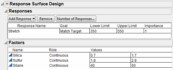
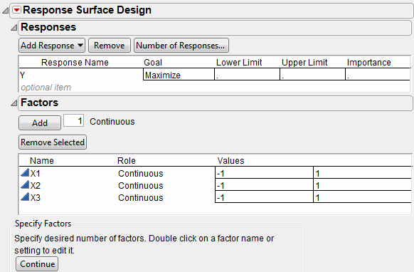
3. Load the responses by clicking the red triangle icon on the Response Surface Design title bar and selecting Load Responses. Navigate to the Sample Data folder, and open Bounce Response.jmp from the Design Experiment folder. Figure 6.2 shows the completed Response panel and Factors panel.
Figure 6.2 Response and Factors For Bounce Data
After the response data and factors data are loaded, the Response Surface Design Choice dialog lists the designs in Figure 6.3. (Click Continue to see the choices on the right.)
Figure 6.3 Response Surface Design Selection

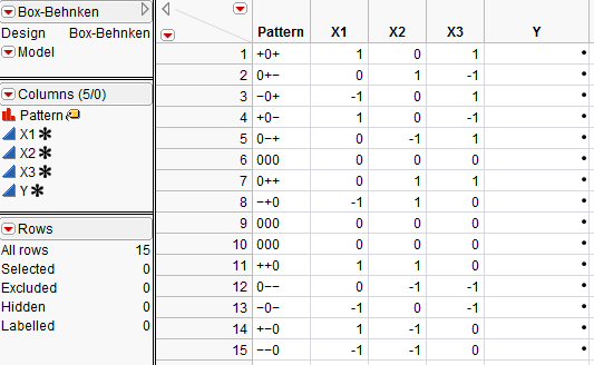
The Box-Behnken design selected for three effects generates the design table of 15 runs shown in Figure 6.4.
In real life, you would conduct the experiment and then enter the responses into the data table. Suppose you completed the experiment and the final data table is Bounce Data.jmp.
1. Open Bounce Data.jmp from the Design Experiment folder found in the sample data installed with JMP (Figure 6.4).
Figure 6.4 JMP Table for a Three-Factor Box-Behnken Design

After opening the Bounce Data.jmp data table, run a fit model analysis on the data. The data table contains a script labeled Model, showing in the upper left panel of the table.
2. Click the red triangle next to Model and select Run Script to start a fit model analysis.
3. When the Fit Model dialog appears, click Run.
The standard Fit Model analysis results appear in tables shown in Figure 6.5, with parameter estimates for all response surface and crossed effects in the model.
The prediction model is highly significant with no evidence of lack of fit. All main effect terms are significant as well as the two interaction effects involving Sulfur.
Figure 6.5 JMP Statistical Reports for a Response Surface Analysis of Bounce Data
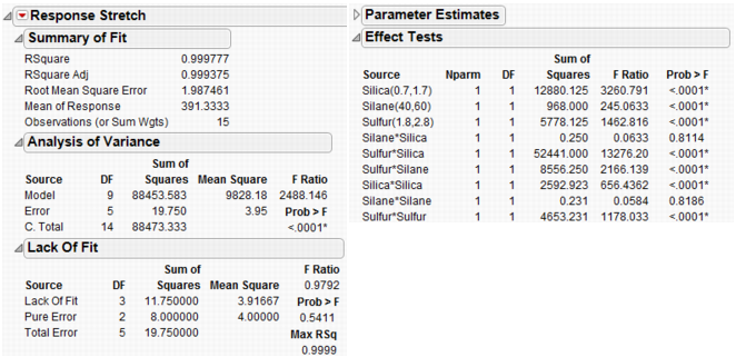
See Modeling and Multivariate Methods for more information about interpretation of the tables in Figure 6.5.
Note: DOE response surface designs are available for up to eight factors only. In the DOE Response Surface Design platform, an error message is generated if more than eight factors are specified with a response surface design. Response surface designs with more than eight factors can be generated using DOE > Custom Design, where either a D-optimal or an I-optimal design can be specified. See Creating Response Surface Experiments for how to use the custom designer to create response surface designs. Curvature analysis is not shown (no error or warning message is given) for response surface designs of more than 20 factors when using the custom designer or the Fit Model platform; all other analyses are valid and are shown.
The Response Surface report also has the tables shown in Figure 6.6.
Figure 6.6 Statistical Reports for a Response Surface Analysis

The Response Surface report shows a summary of the parameter estimates.
The Solution report lists the critical values of the surface factors and tells the kind of solution (maximum, minimum, or saddle point). The solution for this example is a saddle point. The table also warns that the critical values given by the solution are outside the range of data values.
The Canonical Curvature report shows eigenvalues and eigenvectors of the effects. The eigenvector values show that the dominant negative curvature (yielding a maximum) is mostly in the Sulfur direction. The dominant positive curvature (yielding a minimum) is mostly in the Silica direction. This is confirmed by the prediction profiler in Figure 6.8.
See Modeling and Multivariate Methods for details about the response surface analysis tables in Figure 6.6.
The Prediction Profiler
Next, use the response Prediction Profiler to get a closer look at the response surface and help find the settings that produce the best response target. The Prediction Profiler is a way to interactively change variables and look at the effects on the predicted response.
1. If the Prediction Profiler is not already open, click the red triangle on the Response Stretch title bar and select Factor Profiling > Profiler.
The first three plots in the top row of plots in the Prediction Profiler (Figure 6.7) display prediction traces for each x variable. A prediction trace is the predicted response as one variable is changed while the others are held constant at the current values (Jones 1991).
The current predicted value of Stretch, 396, is based on the default factor setting. It is represented by the horizontal dotted line that shows slightly below the desirability function target value (Figure 6.7). The profiler shows desirability settings for the factors Silica, Silane, and Sulfur that give a value for Stretch of 396, which is quite different from the specified target of 450.
The bottom row has a plot for each factor, showing its desirability trace. The profiler also contains a Desirability column, which graphs desirability on a scale from 0 to 1 and has an adjustable desirability function for each y variable. The overall desirability measure is on the left of the desirability traces.
Figure 6.7 The Prediction Profiler

2. To adjust the prediction traces of the factors and find a Stretch value that is closer to the target, click the red triangle on the Prediction Profiler title bar and select Maximize Desirability. This command adjusts the profile traces to produce the response value closest to the specified target (the target given by the desirability function). The range of acceptable values is determined by the positions of the upper and lower handles.
Figure 6.8 shows the result of the most desirable settings. Finding maximum desirability is an iterative process so your results may differ slightly from those shown below.
Figure 6.8 Prediction Profiler with Maximum Desirability Set for a Response Surface Analysis

See Modeling and Multivariate Methods for further discussion of the Prediction Profiler.
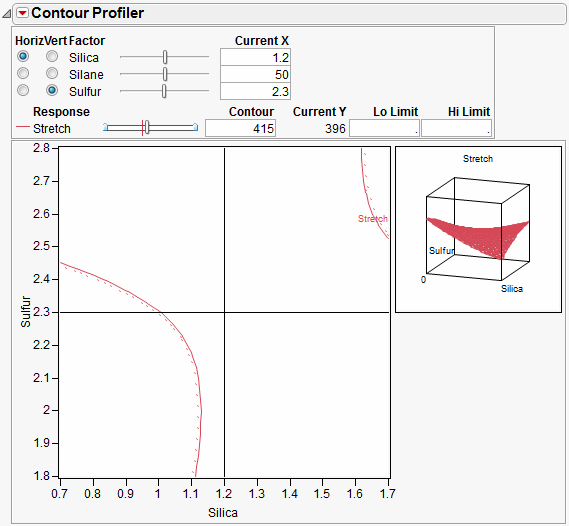
A Response Surface Plot (Contour Profiler)
Another way to look at the response surface is to use the Contour Profiler. Click the red triangle on the Response Stretch title bar and select Factor Profiling > Contour Profiler to display the interactive contour profiler, as shown in Figure 6.9.
The contour profiler is useful for viewing response surfaces graphically, especially when there are multiple responses. This example shows the profile to Silica and Sulfur for a fixed value of Silane.
Options on the Contour Profiler title bar can be used to set the grid density, request a surface plot (mesh plot), and add contours at specified intervals, like those shown in the contour plot in Figure 6.9. The sliders for each factor set values for Current X and Current Y.
Figure 6.9 Contour Profiler for a Response Surface Analysis
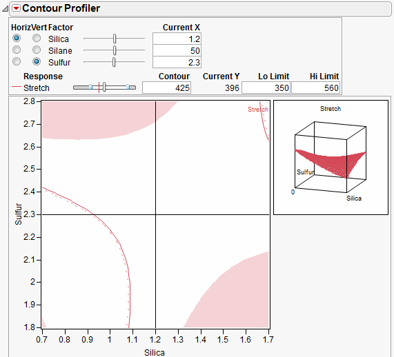
Enter the Lo limit and Hi limit values to shade the unacceptable regions in the contour plot.
Figure 6.10 Contour Profiler with High and Low Limits
The Prediction Profiler and the Contour Profiler are discussed in more detail in Modeling and Multivariate Methods.
Geometry of a Box-Behnken Design
The geometric structure of a design with three effects is seen by using the Scatterplot 3D platform. The plot shown in Figure 6.11 illustrates the three Box-Behnken design columns. You can clearly see the center points and the 12 points midway between the vertices. For details on how to use the Scatterplot 3D platform, see Basic Analysis and Graphing.
Figure 6.11 Scatterplot 3D Rendition of a Box-Behnken Design for Three Effects

Creating a Response Surface Design
Response Surface Methodology (RSM) is an experimental technique invented to find the optimal response within specified ranges of the factors. These designs are capable of fitting a second-order prediction equation for the response. The quadratic terms in these equations model the curvature in the true response function. If a maximum or minimum exists inside the factor region, RSM can estimate it. In industrial applications, RSM designs usually involve a small number of factors. This is because the required number of runs increases dramatically with the number of factors. Using the response surface designer, you choose to use well-known RSM designs for two to eight continuous factors. Some of these designs also allow blocking.
Response surface designs are useful for modeling and analyzing curved surfaces.
To start a response surface design, select DOE > Response Surface Design, or click the Response Surface Design button on the JMP Starter DOE page. Then, follow the steps described in the following sections.
Enter Responses and Factors
The steps for entering responses are the same in Screening Design, Space Filling Design, Mixture Design, Response Surface Design, Custom Design, and Full Factorial Design. These steps are outlined in Enter Responses and Factors into the Custom Designer
Factors in a response surface design can only be continuous. The Factors panel for a response surface design appears with two default continuous factors. To enter more factors, type the number you want in the Factors panel edit box and click Add, as shown in Figure 6.12.
Figure 6.12 Enter Factors into a Response Surface Design
Click Continue to proceed to the next step.
Choose a Design
Highlight the type of response surface design you want and click Continue. The next sections describe the types of response surface designs shown in Figure 6.13.
Figure 6.13 Choose a Design Type

Box-Behnken Designs
The Box-Behnken design has only three levels per factor and has no points at the vertices of the cube defined by the ranges of the factors. This is sometimes useful when it is desirable to avoid extreme points due to engineering considerations. The price of this characteristic is the higher uncertainty of prediction near the vertices compared to the central composite design.
Central Composite Designs
The response surface design list contains two types of central composite designs: uniform precision and orthogonal. These properties of central composite designs relate to the number of center points in the design and to the axial values:
• Uniform precision means that the number of center points is chosen so that the prediction variance near the center of the design space is very flat.
• For orthogonal designs, the number of center points is chosen so that the second order parameter estimates are minimally correlated with the other parameter estimates.
Specify Axial Value (Central Composite Designs Only)
When you select a central composite (CCD-Uniform Precision) design and then click Continue, you see the panel in Figure 6.14. It supplies default axial scaling information. Entering 1.0 in the text box instructs JMP to place the axial value on the face of the cube defined by the factors, which controls how far out the axial points are. You have the flexibility to enter the values you want to use.
Figure 6.14 Display and Modify the Central Composite Design

Rotatable
makes the variance of prediction depend only on the scaled distance from the center of the design. This causes the axial points to be more extreme than the range of the factor. If this factor range cannot be practically achieved, it is recommended that you choose On Face or specify your own value.
Orthogonal
makes the effects orthogonal in the analysis. This causes the axial points to be more extreme than the –1 or 1 representing the range of the factor. If this factor range cannot be practically achieved, it is recommended that you choose On Face or specify your own value.
On Face
leaves the axial points at the end of the -1 and 1 ranges.
User Specified
uses the value you enter in the Axial Value text box.
If you want to inscribe the design, click the box beside Inscribe. When checked, JMP rescales the whole design so that the axial points are at the low and high ends of the range (the axials are –1 and 1 and the factorials are shrunken based on that scaling).
Specify Output Options
Use the Output Options panel to specify how you want the output data table to appear. When the options are specified the way you want them, click Make Table. Note that the example shown in Figure 6.15 is for a Box-Behnken design. The Box-Behnken design from the design list and the Output Options request 3 center points and no replicates.
Figure 6.15 Select the Output Options

Run Order provides a menu with options for designating the order you want the runs to appear in the data table when it is created. Menu choices are:
Keep the Same
the rows (runs) in the output table will appear in the standard order.
Sort Left to Right
the rows (runs) in the output table will appear sorted from left to right.
Randomize
the rows (runs) in the output table will appear in a random order.
Sort Right to Left
the rows (runs) in the output table will appear sorted from right to left.
Randomize within Blocks
the rows (runs) in the output table will appear in random order within the blocks you set up.
Add additional points with options given by Make JMP Table from design plus:
Number of Center Points
Specifies additional runs placed at the center points.
Number of Replicates
Specify the number of times to replicate the entire design, including center points. Type the number of times you want to replicate the design in the associated text box. One replicate doubles the number of runs.
View the Design Table
Now you have a data table that outlines your experiment, as described in Figure 6.16.
Figure 6.16 The Design Data Table
The name of the table is the design type that generated it.
Run the Model script to fit a model using the values in the design table.
The column called Pattern identifies the coding of the factors. It shows all the codings with “+” for high, “–” for low factor, “a” and “A” for low and high axial values, and “0” for midrange. Pattern is suitable to use as a label variable in plots because when you hover over a point in a plot of the factors, the pattern value shows the factor coding of the point.The three rows whose values in the Pattern column are 000 are three center points.
The runs in the Pattern column are in the order you selected from the Run Order menu.
The Y column is for recording experimental results.
..................Content has been hidden....................
You can't read the all page of ebook, please click here login for view all page.