
Contents
Introduction to Space-Filling Designs
Space-filling designs are useful for modeling systems that are deterministic or near-deterministic. One example of a deterministic system is a computer simulation. Such simulations can be very complex involving many variables with complicated interrelationships. A goal of designed experiments on these systems is to find a simpler empirical model that adequately predicts the behavior of the system over limited ranges of the factors.
In experiments on systems where there is substantial random noise, the goal is to minimize the variance of prediction. In experiments on deterministic systems, there is no variance but there is bias. Bias is the difference between the approximation model and the true mathematical function. The goal of space-filling designs is to bound the bias.
There are two schools of thought on how to bound the bias. One approach is to spread the design points out as far from each other as possible consistent with staying inside the experimental boundaries. The other approach is to space the points out evenly over the region of interest.
The Space Filling designer supports the following design methods:
Sphere Packing
maximizes the minimum distance between pairs of design points.
Latin Hypercube
maximizes the minimum distance between design points but requires even spacing of the levels of each factor. This method produces designs that mimic the uniform distribution. The Latin Hypercube method is a compromise between the Sphere-Packing method and the Uniform design method.
Uniform
minimizes the discrepancy between the design points (which have an empirical uniform distribution) and a theoretical uniform distribution.
Minimum Potential
spreads points out inside a sphere around the center.
Maximum Entropy
measures the amount of information contained in the distribution of a set of data.
Gaussian Process IMSE Optimal
creates a design that minimizes the integrated mean squared error of the Gaussian process over the experimental region.
Sphere-Packing Designs
The Sphere-Packing design method maximizes the minimum distance between pairs of design points. The effect of this maximization is to spread the points out as much as possible inside the design region.
Creating a Sphere-Packing Design
1. Select DOE > Space Filling Design.
2. Enter responses and factors. (See Enter Responses and Factors into the Custom Designer.)
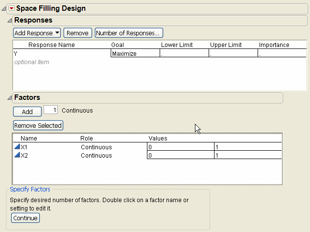
3. Alter the factor level values, if necessary. For example, Figure 10.2 shows the two existing factors, X1 and X2, with values that range from 0 to 1 (instead of the default –1 to 1).
Figure 10.2 Space-Filling Dialog for Two Factors
4. Click Continue.
5. In the design specification dialog, specify a sample size (Number of Runs). Figure 10.3 shows a sample size of eight.
Figure 10.3 Space-Filling Design Dialog
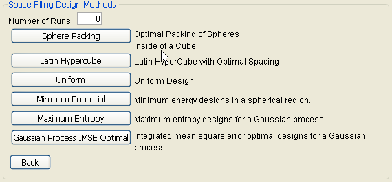
6. Click Sphere Packing.
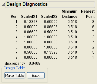
JMP creates the design and displays the design runs and the design diagnostics. Figure 10.4 shows the Design Diagnostics panel open with 0.518 as the Minimum Distance. Your results might differ slightly from the ones below, but the minimum distance will be the same.
Figure 10.4 Sphere-Packing Design Diagnostics
7. Click Make Table. Use this table to complete the visualization example, described next.
Visualizing the Sphere-Packing Design
To visualize the nature of the Sphere-Packing technique, create an overlay plot, adjust the plot’s frame size, and add circles using the minimum distance from the diagnostic report shown in Figure 10.4 as the radius for the circles. Using the table you just created:
1. Select Graph > Overlay Plot.
2. Specify X1 as X and X2 as Y, then click OK.
3. Adjust the frame size so that the frame is square by right-clicking the plot and selecting Size/Scale > Size to Isometric.
4. Right-click the plot and select Customize. When the Customize panel appears, click the plus sign to see a text edit area and enter the following script:
For Each Row(Circle({:X1, :X2}, 0.518/2))
where 0.518 is the minimum distance number you noted in the Design Diagnostics panel. This script draws a circle centered at each design point with radius 0.259 (half the diameter, 0.518), as shown on the left in Figure 10.5. This plot shows the efficient way JMP packs the design points.
5. Now repeat the procedure exactly as described in the previous section, but with a sample size of 10 instead of eight.
Remember to change 0.518 in the graphics script to the minimum distance produced by 10 runs. When the plot appears, again set the frame size and create a graphics script using the minimum distance from the diagnostic report as the diameter for the circle. You should see a graph similar to the one on the right in Figure 10.5. Note the irregular nature of the sphere packing. In fact, you can repeat the process a third time to get a slightly different picture because the arrangement is dependent on the random starting point.
Figure 10.5 Sphere-Packing Example with Eight Runs (left) and 10 Runs (right)

Latin Hypercube Designs
In a Latin Hypercube, each factor has as many levels as there are runs in the design. The levels are spaced evenly from the lower bound to the upper bound of the factor. Like the sphere-packing method, the Latin Hypercube method chooses points to maximize the minimum distance between design points, but with a constraint. The constraint maintains the even spacing between factor levels.
Creating a Latin Hypercube Design
To use the Latin Hypercube method:
1. Select DOE > Space Filling Design.
2. Enter responses, if necessary, and factors. (See Enter Responses and Factors into the Custom Designer.)
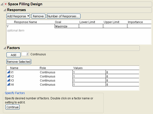
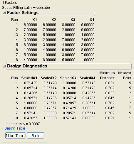
3. Alter the factor level values, if necessary. For example, Figure 10.6 shows adding two factors to the two existing factors and changing their values to 1 and 8 instead of the default –1 and 1.
Figure 10.6 Space-Filling Dialog for Four Factors
4. Click Continue.
5. In the design specification dialog, specify a sample size (Number of Runs). This example uses a sample size of eight.
6. Click Latin Hypercube (see Figure 10.3). Factor settings and design diagnostics results appear similar to those in Figure 10.7, which shows the Latin Hypercube design with four factors and eight runs.
Note: The purpose of this example is to show that each column (factor) is assigned each level only once, and each column is a different permutation of the levels.
Figure 10.7 Latin Hypercube Design for Four Factors and Eight Runs with Eight Levels
Visualizing the Latin Hypercube Design
To visualize the nature of the Latin Hypercube technique, create an overlay plot, adjust the plot’s frame size, and add circles using the minimum distance from the diagnostic report as the radius for the circle.
1. First, create another Latin Hypercube design using the default X1 and X2 factors.
2. Be sure to change the factor values so they are 0 and 1 instead of the default –1 and 1.
3. Click Continue.
4. Specify a sample size of eight (Number of Runs).
5. Click Latin Hypercube. Factor settings and design diagnostics are shown in Figure 10.8.
Figure 10.8 Latin Hypercube Design with two Factors and Eight Runs

6. Click Make Table.
7. Select Graph > Overlay Plot.
8. Specify X1 as X and X2 as Y, then click OK.
9. Right-click the plot and select Size/Scale > Size to Isometric to adjust the frame size so that the frame is square.
10. Right-click the plot, select Customize from the menu. In the Customize panel, click the large plus sign to see a text edit area, and enter the following script:
For Each Row(Circle({:X1, :X2}, 0.404/2))
where 0.404 is the minimum distance number you noted in the Design Diagnostics panel (Figure 10.8). This script draws a circle centered at each design point with radius 0.202 (half the diameter, 0.404), as shown on the left in Figure 10.9. This plot shows the efficient way JMP packs the design points.
11. Repeat the above procedure exactly, but with 10 runs instead of eight (step 5). Remember to change 0.404 in the graphics script to the minimum distance produced by 10 runs.
You should see a graph similar to the one on the right in Figure 10.9. Note the irregular nature of the sphere packing. In fact, you can repeat the process to get a slightly different picture because the arrangement is dependent on the random starting point.
Figure 10.9 Comparison of Latin Hypercube Designs with Eight Runs (left) and 10 Runs (right)

Note that the minimum distance between each pair of points in the Latin Hypercube design is smaller than that for the Sphere-Packing design. This is because the Latin Hypercube design constrains the levels of each factor to be evenly spaced. The Sphere-Packing design maximizes the minimum distance without any constraints.
Uniform Designs
The Uniform design minimizes the discrepancy between the design points (empirical uniform distribution) and a theoretical uniform distribution.
Note: These designs are most useful for getting a simple and precise estimate of the integral of an unknown function. The estimate is the average of the observed responses from the experiment.
1. Select DOE > Space Filling Design.
2. Enter responses, if necessary, and factors. (See Enter Responses and Factors into the Custom Designer.)
3. Alter the factor level values to 0 and 1.
4. Click Continue.
5. In the design specification dialog, specify a sample size. This example uses a sample size of eight (Number of Runs).
6. Click the Uniform button. JMP creates this design and displays the design runs and the design diagnostics as shown in Figure 10.10.
Note: The emphasis of the Uniform design method is not to spread out the points. The minimum distances in Figure 10.10 vary substantially.
Figure 10.10 Factor Settings and Diagnostics for Uniform Space-Filling Designs with Eight Runs

7. Click Make Table.
A Uniform design does not guarantee even spacing of the factor levels. However, increasing the number of runs and running a distribution on each factor (use Analyze > Distribution) shows flat histograms.
Figure 10.11 Histograms are Flat for each Factor when Number of Runs is Increased to 20

Comparing Sphere-Packing, Latin Hypercube, and Uniform Methods
To compare space-filling design methods, create the Sphere Packing, Latin Hypercube, and Uniform designs, as shown in the previous examples. The Design Diagnostics tables show the values for the factors scaled from zero to one. The minimum distance is based on these scaled values and is the minimum distance from each point to its closest neighbor. The discrepancy value is the integrated difference between the design points and the uniform distribution.
Figure 10.12 shows a comparison of the design diagnostics for three eight-run space-filling designs. Note that the discrepancy for the Uniform design is the smallest (best). The discrepancy for the Sphere-Packing design is the largest (worst). The discrepancy for the Latin Hypercube takes an intermediate value that is closer to the optimal value.
Also note that the minimum distance between pairs of points is largest (best) for the Sphere-Packing method. The Uniform design has pairs of points that are only about half as far apart. The Latin Hypercube design behaves more like the Sphere-Packing design in spreading the points out.
For both spread and discrepancy, the Latin Hypercube design represents a healthy compromise solution.
Figure 10.12 Comparison of Diagnostics for Three Eight-Run Space-Filling Methods

Another point of comparison is the time it takes to compute a design. The Uniform design method requires the most time to compute. Also, the time to compute the design increases rapidly with the number of runs. For comparable problems, all the space-filling design methods take longer to compute than the D-optimal designs in the Custom Designer.
Minimum Potential Designs
The Minimum Potential design spreads points out inside a sphere. To understand how this design is created, imagine the points as electrons with springs attached to every other point, as illustrated to the right. The coulomb force pushes the points apart, but the springs pull them together. The design is the spacing of points that minimizes the potential energy of the system.
Figure 10.13 Minimum Potential Design

Minimum Potential designs:
• have spherical symmetry
• are nearly orthogonal
• have uniform spacing
To see a Minimum Potential example:
1. Select DOE > Space Filling Design.
2. Add 1 continuous factor. (See Enter Responses and Factors into the Custom Designer.)
3. Alter the factor level values to 0 and 1, if necessary.
4. Click Continue.
5. In the design specification dialog (shown on the left in Figure 10.14), enter a sample size (Number of Runs). This example uses a sample size of 12.
6. Click the Minimum Potential button. JMP creates this design and displays the design runs (shown on the right in Figure 10.14) and the design diagnostics.
Figure 10.14 Space-Filling Methods and Design Diagnostics for Minimum Potential Design

7. Click Make Table.
You can see the spherical symmetry of the Minimum Potential design using the Scatterplot 3D graphics platform.
1. After you make the JMP design table, choose the Graph > Scatterplot 3D command.
2. In the Scatterplot 3D launch dialog, select X1, X2, and X3 as Y, Columns and click OK to see the initial three dimensional scatterplot of the design points.
3. To see the results similar to those in Figure 10.15, select the Normal Contour Ellipsoids option from the menu in the Scatterplot 3D title bar, and make the points larger by right-clicking on the plot and selecting Settings, then increasing the Marker Size slider.
Now it is easy to see the points spread evenly on the surface of the ellipsoid.
Figure 10.15 Minimum Potential Design Points on Sphere

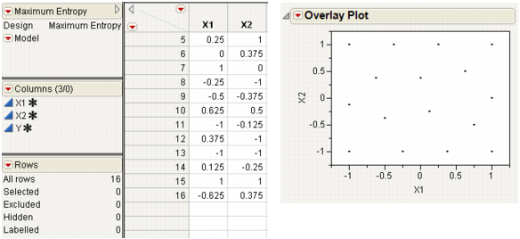
Maximum Entropy Designs
The Latin Hypercube design is currently the most popular design assuming you are going to analyze the data using a Gaussian-Process model. Computer simulation experts like to use the Latin Hypercube design because all projections onto the coordinate axes are uniform.
However, as the example at the top in Figure 10.16 shows, the Latin Hypercube design does not necessarily do a great job of space filling. This is a two-factor Latin Hypercube with 16 runs, with the factor level settings set between -1 and 1. Note that this design appears to leave a hole in the bottom right of the overlay plot.
Figure 10.16 Two-factor Latin Hypercube Design

The Maximum Entropy design is a competitor to the Latin Hypercube design for computer experiments because it optimizes a measure of the amount of information contained in an experiment. See the technical note below. With the factor levels set between -1 and 1, the two-factor Maximum Entropy design shown in Figure 10.17 covers the region better than the Latin hypercube design in Figure 10.16. The space-filling property generally improves as the number of runs increases without bound.
Figure 10.17 Two-Factor Maximum Entropy Design
Technical Maximum Entropy designs maximize the Shannon information (Shewry and Wynn (1987)) of an experiment, assuming that the data come from a normal (m, s2 R) distribution, where
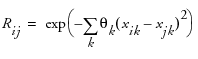
is the correlation of response values at two different design points, xi and xj. Computationally, these designs maximize |R|, the determinant of the correlation matrix of the sample. When xi and xj are far apart, then Rij approaches zero. When xi and xj are close together, then Rij is near one.
Gaussian Process IMSE Optimal Designs
The Gaussian process IMSE optimal design is also a competitor to the Latin Hypercube design because it minimizes the integrated mean squared error of the Gaussian process model over the experimental region.
You can compare the IMSE optimal design to the Latin Hypercube (shown previously in Figure 10.16). The table and overlay plot in Figure 10.18 show a Gaussian IMSE optimal design. You can see that the design provides uniform coverage of the factor region.
Figure 10.18 Comparison of Two-factor Latin Hypercube and Gaussian IMSE Optimal Designs

Note: Both the Maximum Entropy design and the Gaussian Process IMSE Optimal design were created using 100 random starts.
Borehole Model: A Sphere-Packing Example
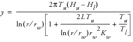
Worley (1987) presented a model of the flow of water through a borehole that is drilled from the ground surface through two aquifers. The response variable y is the flow rate through the borehole in m3/year and is determined by the following equation:
There are eight inputs to this model:
rw = radius of borehole, 0.05 to 0.15 m
r = radius of influence, 100 to 50,000 m
Tu = transmissivity of upper aquifier, 63,070 to 115,600 m2/year
Hu = potentiometric head of upper aquifier, 990 to 1100 m
Tl = transmissivity of lower aquifier, 63.1 to 116 m2/year
Hl = potentiometric head of lower aquifier, 700 to 820 m
L = length of borehole, 1120 to 1680 m
Kw = hydraulic conductivity of borehole, 9855 to 12,045 m/year
This example is atypical of most computer experiments because the response can be expressed as a simple, explicit function of the input variables. However, this simplicity is useful for explaining the design methods.
Create the Sphere-Packing Design for the Borehole Data
To create a Sphere-Packing design for the borehole problem:
1. Select DOE > Space Filling Design.
2. Click the red triangle icon on the Space Filling Design title bar and select Load Factors.
3. Open the Sample Data folder installed with JMP. In the Design Experiment folder, open Borehole Factors.jmp from the Design Experiment folder to load the factors (Figure 10.19).
Figure 10.19 Factors Panel with Factor Values Loaded for Borehole Example

Note: The logarithm of r and rw are used in the following discussion.
4. Click Continue.
5. Specify a sample size (Number of Runs) of 32 as shown in Figure 10.20.
Figure 10.20 Space-Filling Design Method Panel Showing 32 Runs

6. Click the Sphere Packing button to produce the design.
7. Click Make Table to make a table showing the design settings for the experiment. The factor settings in the example table might not have the same ones you see when generating the design because the designs are generated from a random seed.
8. To see a completed data table for this example, open Borehole Sphere Packing.jmp from the Design Experiment Sample Data folder installed with JMP. This table also has a table variable that contains a script to analyze the data. The results of the analysis are saved as columns in the table.
Guidelines for the Analysis of Deterministic Data
It is important to remember that deterministic data have no random component. As a result, p-values from fitted statistical models do not have their usual meanings. A large F statistic (low p-value) is an indication of an effect due to a model term. However, you cannot make valid confidence intervals about the size of the effects or about predictions made using the model.
Residuals from any model fit to deterministic data are not a measure of noise. Instead, a residual shows the model bias for the current model at the current point. Distinct patterns in the residuals indicate new terms to add to the model to reduce model bias.
Results of the Borehole Experiment
The example described in the previous sections produced the following results:
• A stepwise regression of the response, log y, versus the full quadratic model in the eight factors, led to the prediction formula column.
• The prediction bias column is the difference between the true model column and the prediction formula column.
• The prediction bias is relatively small for each of the experimental points. This indicates that the model fits the data well.
In real world examples, the true model is generally not available in a simple analytical form. As a result, it is impossible to know the prediction bias at points other than the observed data without doing additional runs.
In this case, the true model column contains a formula that allows profiling the prediction bias to find its value anywhere in the region of the data. To understand the prediction bias in this example:
1. Select Graph > Profiler.
2. Highlight the prediction bias column and click the Y, Prediction Formula button.
3. Check the Expand Intermediate Formulas box, as shown at the bottom on the Profiler dialog in Figure 10.21, because the prediction bias formula is a function of columns that are also created by formulas.
4. Click OK.
The profile plots at the bottom in Figure 10.21 show the prediction bias at the center of the design region. If there were no bias, the profile traces would be constant between the value ranges of each factor. In this example, the variables Hu and Hl show nonlinear effects.
Figure 10.21 Profiler Dialog and Profile of the Prediction Bias in the Borehole Sphere-Packing Data

The range of the prediction bias on the data is smaller than the range of the prediction bias over the entire domain of interest. To see this, look at the distribution analysis (Analyze > Distribution) of the prediction bias in Figure 10.22. Note that the maximum bias is 1.826 and the minimum is –0.684 (the range is 2.51).
Figure 10.22 Distribution of the Prediction Bias

The top plot in Figure 10.23 shows the maximum bias (2.91) over the entire domain of the factors. The plot at the bottom shows the comparable minimum bias (–4.84). This gives a range of 7.75. This is more than three times the size of the range over the observed data.
Figure 10.23 Prediction Plots showing Maximum and Minimum Bias Over Factor Domains

Keep in mind that, in this example, the true model is known. In any meaningful application, the response at any factor setting is unknown. The prediction bias over the experimental data underestimates the bias throughout the design domain.
There are two ways to assess the extent of this underestimation:
• Cross-validation refits the data to the model while holding back a subset of the points and looks at the error in estimating those points.
• Verification runs (new runs performed) at different settings to assess the lack of fit of the empirical model.
..................Content has been hidden....................
You can't read the all page of ebook, please click here login for view all page.