
JMP Analysis
Descriptive Analysis
In the case “Creatinine Levels
in Hospitalized Patients” we visualized each variable in the
data set individually using the JMP Distribution platform as shown
in Figure 6.5. The average length of stay for these patients is 14.1
days with a minimum of 0 and a maximum of 29. Of the 372 patients,
25% have acute kidney injury. The problem statement asks us to consider
inpatient length of stay. Patients having a length of stay of 0 would
have been treated at the hospital on an outpatient basis; their records
should not be included in this analysis. Select those rows with LOS
= 0 using the JMP data filter. Select Rows > Data Filter, highlight
LOS and click Add. Drag the right hand slider to 0. The completed
Data Filter dialog is shown in Figure 7.2 Completed Data Filter Dialog to Select Rows Where LOS=0.
Figure 7.2 Completed Data Filter Dialog to Select Rows Where LOS=0

The rows where LOS=0
will be highlighted in the data table. Right-click over one of the
highlighted rows and select the Exclude and Hide option. This will
exclude these observations from subsequent analyses and hide them
in subsequent graphs.
Since
this is a comparative analysis, it is beneficial to describe the data
separately for each group, those with AKI and those without AKI.
JMP Graph Builder can easily create two length of stay histograms,
one for those patients with AKI and one for those patients without
AKI. Drag LOS into the X drop zone and Outcome into the Y Group drop
zone. Select the histogram icon from the Control Panel. The resulting
data visualization is shown in Figure 7.3 Histograms of Length of Stay by Outcome.
Figure 7.3 Histograms of Length of Stay by Outcome

Notice that the resulting
chart includes the count of excluded rows.
Graph Builder uses the
same axis scales for both histograms allowing an accurate visual comparison.
This is an example of the use of small multiples, which are series
of graphs plotted on the same scale. This is a best practice in data
visualization.
An alternate data visualization that facilities
outlier identification is an outlier box plot which can be selected
from the Graph Builder Control Panel. The resulting plot is shown
in Figure 7.4 Outlier Box Plots for Length of Stay by Outcome.
Figure 7.4 Outlier Box Plots for Length of Stay by Outcome

The box indicates the
middle 50% of the data (the first quartile to the third quartile).
The first quartile corresponds the 25th percentile, where 25% of the
length of stays are below that value. For the AKI group, the 25th
percentile is 23 days. The vertical line inside the box is the median.
The “whiskers” are the first quartile minus 1.5 times
the interquartile range (third quartile – first quartile) and
the third quartile plus 1.5 times the interquartile range. Outliers
are indicated as dots that lie beyond the end of the whiskers. Box
plots are a compact way to visualize a data distribution including
its center, spread, skewness, and outliers.
In the No AKI box plot
we observe an outlier with a length of stay of 29 days. Click on the
dot to highlight the corresponding patient record in the JMP data
table. This is an example of JMP’s dynamic data linking feature,
where an observation or group of observations highlighted in either
a data table or graph will be highlighted in all other data tables
and graphs. The highlighted record is for Patient_ID = 7581, a 92
year old African-American man with no co-morbidities. Further investigation
should be conducted with the help of a subject matter expert to determine
if this outlier should be removed from the data set. Outliers are
removed, not based on their influence on the statistical results,
but on an understanding of the data in the domain context, and should
be dispositioned accordingly. For example, if investigation revealed
a data collection or recording error, then either a corrected value
should be entered or the observation removed. Exclusion of observations
should be documented in accordance with the practices of reproducible
research.
Finally, Figure 7.5 Descriptive Statistics for Length of Stay by Outcome shows a table
of descriptive statistics for length of stay by outcome. This can
be accomplished using Tabulate where LOS and the desired statistics
are placed in the drop zone for Rows and the nominal variable Outcome
is placed into the drop zone for Columns.
Figure 7.5 Descriptive Statistics for Length of Stay by Outcome

Research Question 1: Does length of stay differ between patients with and without AKI?
This research question can be answered
by conducting a two-independent samples t-test that will determine
if the mean length of stay for the AKI group differs from that of
the group without AKI. The two-independent samples t-test is an appropriate
statistical method to apply when the dependent variable is continuous
and the independent variable is nominal with two levels. This test
assumes that the lengths of stay for both groups are normally distributed.
The Normal quantile plots for these two groups do not show serious
departures from normality. In the problems at the end of this case,
you will be asked to create and assess these plots.
To begin, select Analyze > Fit
Y by X and enter LOS into the Y field and Outcome into the X field.
There are two different two-independent samples t-test available
in JMP. The test to apply depends on whether the length of stay variances
of the two groups (AKI and No AKI) are equal or unequal. Several equality
of variance tests are available from the Fit Y by X drop-down menu
option Unequal Variances. The JMP output is shown in Figure 7.6 Equality of Variance Tests.
Figure 7.6 Equality of Variance Tests
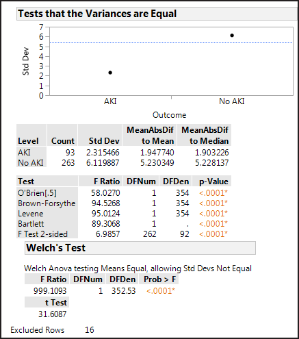
The Levene test is a good general equality of variance
test. The null hypothesis is that the variances of the two groups
are equal versus the alternative that they are not equal. Small p-values
(less than 0.05) cause the null hypothesis to be rejected. For this
data, the Levene test p-value is <0.0001 which is significant at
the 5% level, so the variance of the length of stay for the AKI group
is significantly different from the group without AKI.
Now we are ready to
perform the t-test. When the variances are not equal, the option to
select from the Fit Y by X drop-down menu is t Test. The null hypothesis
for the two sample t-test is that the means of the two groups are
equal with an alternative that the means are not equal. The results
for the length of stay data are shown in Figure 7.7 Two-independent sample t-test for Unequal Variances.
Figure 7.7 Two-independent sample t-test for Unequal Variances

In the plot showing
LOS by Outcome, the points have been “jittered” which
spreads out the markers to avoid overplotting and gives you a better
sense of the data density (From the Oneway Analysis of LOS by Outcome
drop-down, select Display Options > Points Jittered).
The length of stay for
patients without AKI is on average 14.1 days lower than for patients
with AKI. Is this difference statistically significant? The null hypothesis
for the t-test is that the length of stay means of the two patient
groups (with and without AKI) are equal. The p-value associated with
the t-test determines if the observed difference (-14.1) is statistically
significant. P-values less than the chosen significance level indicate
that the two patient groups are on average significantly different.
The JMP output for the t-test gives three possible p-values, two associated
with the one-sided alternatives (greater than and less than) and one
associated with the two-sided alternative (not equal). The correct
p-value depends on how the alternative hypothesis was specified and
is derived from the research question. For this research question
we want to see if there is a difference between the two patient groups
which corresponds to a two-sided (≠) alternative. The correct
p-value is Prob > |t| <0.0001 as shown in Figure 7.7 Two-independent sample t-test for Unequal Variances, which indicates
a statistically significant difference at the 5% level. This means
that on average patients without AKI have length of stay 14.1 days
shorter than patients with AKI.
Research Question 2: How does the likelihood of having AKI change with length of stay?
A statistical model
quantifying the relationship between length of stay and AKI diagnosis
will address this research question. When the dependent variable (Outcome)
is nominal and there is a continuous independent variable (LOS), a
logistic regression will yield such a statistical model. A logistic
regression expresses the natural log odds of the dependent variable
as a linear function of the independent variable. Odds expresses the
likelihood of an event occurring and is calculated as the ratio of
the number of occurrences of the event to the number of times the
event did not occur. For this data, the odds of having AKI are 93/263
= 0.354; the odds of not having AKI for hospitalized patients is 263/93
= 2.828. This means that a hospitalized patient is almost three times
more likely to not have AKI than to have AKI. It is easier to understand
the likelihood when expressed in the form that is greater than one.
Odds can be expressed in terms of probability as p/(1-p). The probability
of having AKI, p, is 93/356 = 0.261.
A logistic regression equation can
be estimated with the Fit Y by X platform by entering Outcome in the
Y field and LOS in the X field. The JMP output is shown in Figure 7.8 JMP Logistic Regression Output.
Figure 7.8 JMP Logistic Regression Output

The Whole
Model Test uses a Chi-square test to determine whether the logistic
regression model is significant in explaining the relationship between
the likelihood of AKI and length of stay. In this case, the Chi-square
test yields a p-value of <0.0001 which is significant at the 5%
level.
The fitted logistic
regression coefficients are given in the Parameter Estimates table.
The logistic regression equation relating LOS and log odds of having
AKI to not having AKI is:
ln odds(AKI/No AKI)
= −19.052 + 0.883*LOS
This is the estimated log odds
ratio of having AKI to not having AKI for a given length of stay.
A chi-square test is used to determine if the regression coefficient
for LOS is significantly different from zero. For this data, LOS is
a significant predictor of AKI (p<0.0001) at the 5% significance
level. The plot in Figure 7.8 JMP Logistic Regression Output shows
the logistic regression model as a blue curve. Notice that the y-axis
scale is in terms of the probability, not odds.
It is not intuitive
to think in terms of a log odds ratio. Exponentiating the regression
coefficient for LOS gives what is referred to as the unit odds ratio
which is the odds ratio associated with a one-unit increase in the
LOS.
The odds ratio can be
obtained from the drop-down menu associated Logistic Fit Outcome by
LOS as shown in Figure 7.9 Obtaining Odds Ratio Output for Logistic Regression.
Figure 7.9 Obtaining Odds Ratio Output for Logistic Regression

The odds ratio output
is added to the Parameter Estimates table as shown in Figure 7.10 Odds Ratio Output for Logistic Regression.
Figure 7.10 Odds Ratio Output for Logistic Regression

The odds ratio of AKI
to No AKI associated with an increase in one day of length of stay
is 2.42.
RSquare (U) gives a measure of goodness-of-fit on a scale
of 0 to 1. An RSquare (U) of 0 indicates that the model does not predict
the outcome (AKI) and an RSquare (U) of 1 indicates that the logistic
regression model is a perfect predictor of the outcome (AKI). For
this data the Rsquare (U) is 0.7924 indicating relatively good predictability.
Last updated: October 12, 2017
..................Content has been hidden....................
You can't read the all page of ebook, please click here login for view all page.