
JMP Analysis
Comparing States over Multiple Flu Seasons
We begin
by examining the variation in the total number of flu cases reported
each season for New York and Missouri. JMP’s Graph Builder
is a flexible platform that allows many different types of graphs
to be created.
Open flu_NY_MO.jmp and
invoke Graph > Graph Builder from the JMP Menu. Drag the variable,
Total Influenza to the Y drop zone, Season to the X drop zone, and
State to the Group Y drop zone. Choose the Bar chart icon in the
control panel and select Sum from the Summary Statistic drop-down
menu. The completed Graph Builder dialog is shown in Figure 8.1 Graph Builder Dialog to Create Bar Charts of Total Influenza Cases by State.
Figure 8.1 Graph Builder Dialog to Create Bar Charts of Total Influenza
Cases by State

This visualization shows
the total number of flu cases reported in each season by state. Notice
that the Y-axis is automatically scaled to the same range for both
bar charts. This facilitates comparison between the two states.
Showing More Detail for Each Flu Season
The flu activity data is given
weekly for each of the seven seasons. In the bar charts of Figure 8.1 Graph Builder Dialog to Create Bar Charts of Total Influenza Cases by State the Summary
Statistic chosen was Sum. This aggregated the total cases for a season
across all weeks. A more detailed comparison of the flu seasons can
be made by looking at the distributions of weekly flu activity. Histograms
are commonly used to display data distributions. With the Graph Builder
dialog set as in Figure 8.1 Graph Builder Dialog to Create Bar Charts of Total Influenza Cases by State,
choose the Histogram icon from the control panel. Figure 8.2 Histograms of Weekly Influenza Cases by Season and State shows the resulting
graph.
Figure 8.2 Histograms of Weekly Influenza Cases by Season and State

This matrix of histograms exemplifies the data visualization
technique of “small multiples” popularized by Edward
Tufte. This method of multivariate data display uses similar graphs
with the same axis scales sequenced over one or two other variables.
The advantage of small multiples is that the observer can focus on
changes in the data rather than changes in the graphical elements. Figure 8.2 Histograms of Weekly Influenza Cases by Season and State is an example
of a small multiple sequenced over Season and State.
Unfortunately, the skewness of the weekly
flu activity coupled with the display of 14 histograms makes it difficult
to discern differences across either seasons or states. Box plots
are an alternative way to visualize data distributions. In a box plot,
a data distribution is summarized by a box whose ends lie at the 25th
and 75th percentiles. The line inside the box shows the median. The
“whiskers” extend (1.5*Interquartile range) beyond the
ends of the box. Outliers beyond the whiskers are shown as dots. While
box plots have less detail about the distributional shape than histograms,
they are effective when comparing a relatively large number of groups
in a small space. To create a matrix of box plots, select the box
plot icon from the Graph Builder control panel. The result is shown
in Figure 8.3 Box Plots of Weekly Influenza Cases by Season and State.
Figure 8.3 Box Plots of Weekly Influenza Cases by Season and State

This visualization is
more effective for comparing the weekly distributions of flu activity
than the histograms shown in Figure 8.2 Histograms of Weekly Influenza Cases by Season and State. The choice
of graph type (e.g., box plot, histogram) that is most effective will
depend on the data distributions and the number of small multiples
to be displayed. Graph Builder’s control panel makes it easy
to evaluate different graphs.
Annotating Graphs
Data visualizations can be improved
by judiciously annotating graphs with problem domain information.
During the seven seasons being analyzed, the H1N1 pandemic occurred
in the 2009-2010 flu season and in 2012 the FDA approved the use of
cell-based technology for manufacturing flu vaccine. This new technology
allows vaccines to be produced more rapidly than the traditional egg-based
manufacturing process.
The JMP Annotate tool allows text
boxes to be added to graphs. Figure 8.4 Total Influenza Cases Bar Charts with Annotations Added shows the bar
charts for total influenza cases with the addition of two text boxes.
Figure 8.4 Total Influenza Cases Bar Charts with Annotations Added

When annotating graphs,
place text boxes on charts so that they do not obscure the graphical
elements. Avoid excessive annotation, which will detract from the
effectiveness of the graph. Annotations provide additional information
that improves the interpretation of the data in the context of the
problem domain.
Figure 8.4 Total Influenza Cases Bar Charts with Annotations Added allows us to
easily compare the Missouri and New York flu activity by season. Both
states experienced the highest level of flu activity during the 2014-2015
season. New York’s flu activity remained relatively high from
2012-2013 to 2015-2016 while Missouri only experienced the high level
in 2014-2015. Both states saw relatively low flu activity during the
2009 pandemic.
Comparing States by Week for the 2015-2016 Flu Season
During a flu season, activity
can be monitored on a weekly basis. Again, Graph Builder offers a
flexible platform for data visualization. In order to look at the
2015-2016 season for changes week-to-week, open the 2015-2016 flu
season JMP file, created in the Data Management section. This contains
weekly data for both New York and Missouri for the 2015-2016 flu season.
Select Graph Builder
from the JMP menu. Drag Total Influenza to the Y drop zone. Drag Week
Ending Date to the X drop zone. Notice that the dates are placed in
chronological order along the axis. In the control panel select the
line icon. Drag State to both the Overlay and Color drop zones. The
completed Graph Builder dialog is shown in Figure 8.5 Graph Builder Dialog to Create Line Graphs for Weekly Flu Activity for
the 2015-2016 Season.
Figure 8.5 Graph Builder Dialog to Create Line Graphs for Weekly Flu Activity
for the 2015-2016 Season

Each state’s
weekly flu activity is displayed as a separate line graph on the same
X and Y axes. Place the cursor anywhere over one of the lines and
right click. Click Add > Points to add markers to the line graphs
as shown in Figure 8.6 Graph Builder Dialog to Add Markers.
Figure 8.6 Graph Builder Dialog to Add Markers

Click Done to obtain
the final graph shown in Figure 8.7 Line Graphs of Weekly Influenza Cases by State.
Figure 8.7 Line Graphs of Weekly Influenza Cases by State

Different markers enable
the lines corresponding to each state to be distinguished when the
graph is reproduced in black-and-white.
When there are multiple
line graphs displayed on a single set of axes, the lines may be difficult
to distinguish. In these cases, creating a small multiple display
may be preferable. This can be accomplished in Graph Builder by dragging
State from the Overlay drop zone to the Y groups drop zone. The result
is shown in Figure 8.8 Line (Smooth) Graph for New York and Missouri for the Weeks of the 2015-2016
Flu Season, with Overlay by Color.
Figure 8.8 Line (Smooth) Graph for New York and Missouri for the Weeks
of the 2015-2016 Flu Season, with Overlay by Color
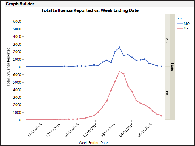
Both Figure 8.7 Line Graphs of Weekly Influenza Cases by State and Figure 8.8 Line (Smooth) Graph for New York and Missouri for the Weeks of the 2015-2016
Flu Season, with Overlay by Color show that at
the peak of the flu season, New York has more cases reported than
Missouri. This is to be expected as New York has a larger population
than Missouri. For both states flu peaks at roughly the same time
(early March).
Finally, we create a
small multiple display that shows the pattern of flu activity for
the two states for flu types A and B. In Graph Builder drag Influenza
A to the Y drop zone then drag Influenza B to the Y drop zone. This
will create two Y axes, one for each flu type. Drag State to the X
group drop zone and Week Ending Date into the X drop zone. Select
the line icon from the control panel and add markers as described
above. The resulting graph is shown in Figure 8.9 Small Multiple Display of Weekly Flu Activity by State and Flu Type for
the 2015-2016 Season.
Figure 8.9 Small Multiple Display of Weekly Flu Activity by State and
Flu Type for the 2015-2016 Season

In this display, we
see the differences between the two strains of flu with the peaks
occurring at the same time but lasting longer for Influenza B. This
pattern was consistent between both states.
Last updated: October 12, 2017
..................Content has been hidden....................
You can't read the all page of ebook, please click here login for view all page.