
CHAPTER 2
First, Understand the Data
Large amounts of data can be cumbersome and daunting, frustrating users and turning them away from rich information that can provide insight into the world. During, as well as long after the Great Recession of 2007 to 2009, anecdotes abounded about the weakness of the labor market: laid-off workers finding a new job only to be laid off again weeks later; job seekers unable to obtain employment for years; and workers taking pay cuts to help companies as they struggled to survive. How representative were these stories? Were they a few people's experience, or did they indicate broader labor market troubles? Moreover, who were these laid-off workers unable to find jobs for more than a year? Were they the least educated in our society, the oldest, or a member of a minority? How long was the average person out of work? How many people continued to look for work and how many just gave up? Were the employed immune from the downturn, or were they seeing their wages crumble in the weak economy? Were the employed working harder for fear of losing their job? All these questions can be answered, if an analyst dives into the wealth of economic information available on the economy and knows the techniques to filter though the noise of any data series. This chapter presents a review of the major economic indicators used in both public and private sectors. For the serious analyst, understanding the data is essential before attempting to apply any sophisticated statistical software. That is the focus of this chapter.
In October 2009, the unemployment rate in the United States reached 10 percent, a 26-year high (see Figure 2.1). Three months later, in January 2010, the unemployment rate had come off its cycle high and fallen to 9.7 percent, suggesting that the labor market was beginning to recover. But had it? Taking the unemployment rate at face value suggested it had, but other measures painted a different picture. Analysts needed to look deeper at the data to determine if the usual benchmarks were accurately portraying the economic environment, or if something had shifted, making traditional measures ineffective. Was this cyclical turn a real change in the trend? Or was there a new model for the labor market that was bringing the unemployment rate down? How can an analyst decide?

FIGURE 2.1 Unemployment Rate (Seasonally Adjusted)
Source: U.S. Bureau of Labor Statistics
Although the unemployment rate was falling in late 2009, firms still were reducing jobs and the number of workers being laid off or discharged was still running above the number of workers quitting jobs. What was helping to drive the unemployment rate down was that fewer people were looking for work—a sign that labor market conditions were not improving but instead so dire that many had given up hope of finding a new job (see Figure 2.2). The unemployment rate, in this case, was not comparable to the previous two decades when the labor force was consistently growing and participation in the economy—particularly among women—was rising. Was there a new structure in the labor market?
The discrepancy between the unemployment rate and other measures of the labor market back in late 2009 and early 2010 was observable to analysts familiar with other key indicators of the economy. However, graduates of college economics courses are exposed to very few of the data series they will later encounter in the business world, let alone the statistical means to test the observed data. Instead, college curriculum often emphasizes theory and elegant statistics—the foundation for the field of economics—but glosses over key data that many students actually will analyze in their professional careers. At the same time, economists in the workplace often interpret data without carefully examining the underlying structural models that generate the data. For new professionals to use this data effectively, they must have a basic working knowledge of its composition and an understanding of its historical relationship to the performance of the economy and their own organization. Therefore, in this chapter we introduce variables that serve as benchmarks for decision making at all levels to many professional analysts and offer an essential review of the character of these variables. For example, these benchmarks include economic series that are used at the federal level for budget projections by the Congressional Budget Office and by the Federal Reserve in providing guidance to the markets on policy.

FIGURE 2.2 Labor Force Participation Rate (16 Years and Over, Seasonally Adjusted)
Source: U.S. Bureau of Labor Statistics
In today's sophisticated economy, decision makers have available hundreds of economic indicators. Data encompasses all sectors of the economy, from financial, real estate, and labor markets to output and business conditions. Analysts and practitioners can drill down to detailed levels of information to gain insight into their fields of interest; but understanding a few key economic variables can help decision makers save time in analyzing market conditions. Both private and public organizations collect data series. Data collected by public institutions usually is available at no cost to users. Private industry and nonprofits fill gaps in government coverage as the need and opportunity for additional data has risen.
In this chapter, we discuss some of the key economic variables for decision makers across all areas of the economy. These variables provide insight into the five primary economic indicators that are the basis for good decision making: growth, inflation, interest rates, profits, and exchange rates.

FIGURE 2.3 Real GDP, Volume Growth (Year-over-Year Percentage Change)
Source: U.S. Bureau of Economic Analysis
GROWTH: HOW IS THE ECONOMY DOING OVERALL?
Gross domestic product (GDP) is the broadest measure of the economy's performance. The GDP report provides a snapshot of the total output in the economy, combining the performance measures of all major sectors in the economy into a single measure. GDP is the sum of the final value (price) of total goods and services produced within a given geography. It is similar to, but not to be confused with, gross national product (GNP), which is the sum of output produced by a nation's population and related capital, whether it was produced within the nation's borders or not. In order to avoid double counting, GDP does not include intermediate stages of production, but only the final value of finished goods and services within the economy.
Given the scope of GDP, it is a highly influential report for businesses, policy makers, and investors. It shows whether the economy is contracting or expanding, which can influence actions of business leaders and policy makers throughout the business cycle (see Figure 2.3). Moreover, the long-term trend in GDP can affect how much businesses can expect to grow, the ability of the federal government to spend, and a country's standard of living. Therefore, analysts should be familiar with the major components of GDP. For this we turn back to the equation first seen in introductory macroeconomics, where we learned that GDP = C + I + G + NX (see Figure 2.4),
where
| C = | personal consumption |
| I = | business investment |
| G = | Government |
| NX = | Net Exports |

FIGURE 2.4 GDP Share by Major Components
Source: U.S. Bureau of Economic Analysis
PERSONAL CONSUMPTION
The first, and largest, component of GDP is personal consumption or C in the basic GDP equation. Goods and services for personal consumption account for just over 70 percent of total output in the economy. Included are final sales of goods and services purchased by households as well as the operating expenses of nonprofit institutions and imputed value of in-kind services received by individuals.
Personal consumption spending is divided into three groupings that each act differently throughout the business cycle: durable goods, nondurable goods, and services. Analysts must be aware of where the economy is in a business cycle in order to separate the trend in these components from what is a typical cyclical change and what may point to a long-term shift in the trend of the economy. As shown in Figure 2.5, for example, durable goods are the most volatile component of personal consumption as households will delay big-ticket purchases (e.g., cars, furniture, and major appliances) when the economy is weak and consumer confidence in the future is quite low. In periods of recession, consumers increase saving to guard against a potential loss of income as personal income growth slows and layoffs mount. Nondurable goods, such as food and gasoline, are more difficult to do without and are a steadier base of spending throughout the business cycle. Spending in this category will still fluctuate as consumers substitute goods or pull back on some nondurable purchases, such as clothing, when times get tough. Services account for about two-thirds of consumer spending and about 45 percent of all spending in the economy. Many of these items, such as medical care, housing, and transportation, cannot be postponed during a downturn. They are less sensitive to phases of the business cycle and provide a certain base of support for spending during a recession.

FIGURE 2.5 Real Personal Consumption Expenditures (Year-over-Year Percentage Change, Durables 4Q Moving Average)
Source: U.S. Department of Commerce
The pace of personal consumption growth is based on households' ability and willingness to consume. That, in turn, is a function of income growth, the saving rate, and the availability of credit. While GDP is only released quarterly, numerous monthly measures on the state of the consumer can help businesses and policy makers track consumer spending. One such source is the monthly personal income and spending report, which details income growth from all sources—everything to wages and salaries from work to rental and dividend incomes—what consumers spent, and how much they saved. Monthly reports are also available for retail sales, which give an earlier look at how much goods consumers are buying, and consumer credit, which provides an additional source for consumer purchases outside income. In addition, numerous surveys of consumer confidence are available, which can illustrate households' propensity to spend in the months ahead based on their outlook on the economy. All of these reports can provide analysts with an early look at the largest component of GDP and help them anticipate turns in the market that will affect their business.
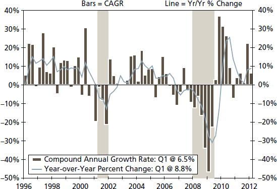
FIGURE 2.6 Real Private Domestic Investment
Source: U.S. Department of Commerce
GROSS PRIVATE DOMESTIC INVESTMENT
Investment by private businesses is a second major source of spending in the economy. Although much smaller than personal consumption expenditures—about 13 percent of GDP—business investment spending provides insight into how businesses assess the economic outlook as well as their own general health. Private investment is based on the cost and the expected return of capital. For an investment to be profitable, the return on capital must exceed the cost. Interest rates—a simple, first-step proxy for the cost of capital—fall when the economy weakens as the central bank tries to ease financial conditions. But this might not be enough to offset weakening demand in final sales which impacts the return on capital. Since businesses often hold off on investment when the economic outlook darkens, this series can be fairly volatile (see Figure 2.6).
Investment spending can be broken down between fixed investments and changes to private inventories. Fixed investment includes spending on equipment and software by businesses. Spending in this category can greatly improve productivity in the economy but is also extremely sensitive to interest rates, credit availability, and expected profits. Investment in structures is also included under fixed investment and can be divided between nonresidential and residential structures. Nonresidential structures include spending by businesses for new commercial space, such as offices, warehouses, and utility plants. Residential investment includes private purchases for residences, whether they are owned by the occupant or rented out. Residential structures historically have accounted for 30 percent of private investment, although this share increased to 35 percent between 2002 and 2006 as the housing sector became out of balance. Since the official end of the 2007 to 2009 recession, residential investment has averaged only 20 percent of private investment as the imbalance between current supply and demand in the housing market is reconciled.
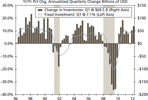
FIGURE 2.7 Real Inventory Change versus Business Investment (Year-over-Year Percentage Change)
Source: U.S. Bureau of Economic Analysis
The change to private inventories makes up the other major component of investment in the economy. As GDP measures everything produced in the economy over a given time period, not just what is sold, changes to inventory levels also must be accounted for to reflect total output in the economy. As the outlook for the economy changes, inventory levels also change. Here it is not the inventory level that matters in relation to GDP growth but rather the change throughout the quarter (see Figure 2.7).
The degree of these changes may be planned or forced, depending on how quickly the economic outlook and environment change. For example, inventories may decline if growth accelerated more quickly than businesses anticipated or if businesses lowered production under the expectation that future sales would slow. The inventory-to-sales ratio can be a helpful gauge of appropriate inventory levels. As the economy heats up, a lower inventory-to-sales ratio will signal the need for additional production in the near term to keep pace with demand; otherwise businesses may miss out on customer purchases. In contrast, the inventory-to-sales ratio will rise if sales slow more quickly than inventory building. Although there is a cyclical component to inventory building, this ratio has shifted down over time as technology and management methods have changed the amount of inventories needed and desired by firms, which analysts must consider when evaluating changes over the course of the business cycle (see Figure 2.8).
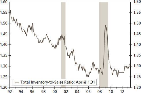
FIGURE 2.8 Business Inventories: Inventory-to-Sales Ratio
Source: U.S. Census Bureau
GOVERNMENT PURCHASES
Government consumption comprises the final large component of GDP at around 18 percent. This category reflects spending by the government at the federal, state, and local levels. Federal government spending consists of defense and nondefense spending, with defense spending including military equipment and salaries for military personnel and nondefense spending incorporating spending by other agencies. Not included, however, are transfer payments from the government, such as Social Security income, since transfer payments are a reallocation of income, not a final purchase in the economy and not income for current production.
State and local government spending historically accounts for about two-thirds of government spending. That said, the state and local component can fluctuate more due to the requirement for states and localities to run balanced budgets. As such, during economic expansions, state and local spending often will rise in response to increased tax revenues, generating a larger contribution to GDP. In contrast, during recessions and in times of weak growth, state and local spending will contract. This was the case in the wake of the 2007 to 2009 recession, where rainy day funds and federal government aid was not enough to shore up spending at the state and local level. State and local spending contracted in 14 out of 17 quarters between 2008 and the first quarter of 2012 (see Figure 2.9).

FIGURE 2.9 Real Estate and Local Government Expenditure
Source: U.S. Bureau of Economic Analysis
NET EXPORTS OF GOODS AND SERVICES
As globalization shows no signs of abating, trade is becoming increasingly important to the economy (see Figure 2.10). Exports are derived from foreign demand for products and services produced domestically. Demand can be affected by the strength of the receiving country's economy and currency. When a foreign country's economy slows, demand for products softens, reducing exports to that nation. The strength of a country's currency also will affect how much it imports or exports since that can change the relative cost of goods and services.
Exports must be included in GDP since production of those goods and services uses domestic resources, even if the products are not consumed within U.S. borders. Meanwhile, the United States imports more than it exports, and the sale of imported goods in the United States must be accounted for in other countries' GDP as imported goods were not produced domestically, and therefore cannot contribute to domestic production.
When factoring in the adjustments to GDP based on what is produced but not consumed domestically (exports) and what is consumed but not produced domestically (imports), we end up with net exports. Net exports are simply exports minus imports of goods and services. Since the United States is a net importer of goods and services—that is, domestic demand for foreign goods exceeds foreign demand for domestically produced goods—net exports tend to be a drag on GDP growth, although that is not always true on a quarterly basis.
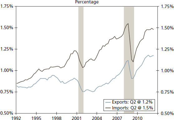
FIGURE 2.10 Imports and Exports as Percentage of GDP
Source: U.S. Census Bureau
REAL FINAL SALES AND GROSS DOMESTIC PURCHASES
A final number to watch within the GDP report is “real final sales.” As discussed earlier, inventories can jump around on a quarterly basis, and not always for the same reason. Therefore, real final sales can provide a more accurate picture of underlying final demand in the economy. Real final sales is GDP minus inventories. It includes exports, which reflect demand outside the United States. To get the best sense of final U.S. demand, we look at gross domestic purchases, which is GDP minus inventories and exports (see Figure 2.11). This measure helps businesses view the underlying trend in demand without adding the volatility of inventory building and it keeps separate outside markets which affect U.S. exports. This measure has trended lower over time, suggesting businesses cannot rely on the same pace of top-line sales growth as in prior economic cycles.
THE LABOR MARKET: ALWAYS A CORE ISSUE
Markets and policy makers closely watch the employment report. Indeed, in 2012, for many politicians, this report had become the measure of economic success or failure. This attention to the labor market is due to the effects it has on other areas of the economy. For example, employment is a means of income, and about half of income earned in the economy is derived from wages and salaries, with most households relying primarily on this source of income. As household spending accounts for more than two-thirds of total spending in the economy, the health of the labor market has great implications in regard to growth and the perceived success of the rest of the economy. Moreover, when households feel secure in their current source of income, they are more likely to purchase big-ticket items, such as autos and appliances. They are also apt to step up discretionary spending, such as going out to dinner and on vacation. Finally, households secure in their income prospects are more willing to buy a home, which generates business directly for those involved in the sale (real estate agents, appraisers, lenders, etc.) but also indirectly through retail purchases and contract work. Indeed, the labor market has been one of the major obstacles to the housing market's recovery following the 2007 to 2009 recession.

FIGURE 2.11 Real Final Sales to Domestic Purchasers (Year-over-Year Percentage Change)
Source: U.S. Bureau of Economic Analysis
In addition to a source of income, the labor market represents one of the major inputs to growth in an economy. At a given level of capital investment and technology, additional labor can generate growth. To get an estimate of how much labor is being used, the Bureau of Labor Statistics (BLS) produces a measure of the aggregate hours worked in the economy, which takes into account the total number of people working and the average number of hours each person works. Yet what happens when the needs of an economy shift, and labor is a less desirable input compared to earlier years? It appears that this is the case today. More goods and services are being produced than before the Great Recession, but it is being done with less labor. With so much labor available in the economy not employed, the gap between potential GDP and actual GDP—the output gap—increases, leaving standards of living lower than they would be if all productive resources in the economy were engaged.
ESTABLISHMENT SURVEY
Of the indicators on the labor market, the most widely watched is the “Employment Situation” report published by the BLS at the beginning of each month. Based on surveys, this report offers a high level of detail on the labor market and provides a timely look at hiring, as it is usually released just a few weeks after the surveys are taken.
Decision makers sometimes overlook the fact that data comes from two separate surveys: the establishment survey and the household survey. The establishment survey, also known as the payroll survey, is based on data collected directly from companies. The most important number to come out of this report is the monthly change in the number of jobs at all firms (i.e., how many jobs on net did the economy create or destroy over the past month). This number is widely watched as it sheds light on where we are in the business cycle and is one of the four main measures the National Bureau of Economic Research (NBER) uses in dating U.S. recessions.1 Typically when the number of jobs in the economy begins to fall on a sustained basis, the United States is entering a recession. However, firms tend to exhibit more caution in hiring when the economy comes out of a recession, as the scars of the past downturn are still fresh in the minds of management. Therefore, firms may be slower to add jobs than they were to cut jobs during a recession when companies go into survival mode. As a result, nonfarm payroll employment can be a coincident indicator when the economy falters and a lagging indicator of the economy healing (see Figure 2.12).
The details in this report are extremely rich. In addition to the headline figure of the number of jobs the economy has added, the payroll report provides a detailed breakdown by industry. This dissection can help analysts determine various points in the business cycle. Hiring in highly cyclical industries, such as manufacturing and temporary help services, can help determine turning points in the economy (see Figures 2.13 and 2.14). Details in hiring by industry can also show signs of structural shifts in the economy. In the 2007 to 2009 downturn, for example, losses in construction employment were outsized and protracted relative to other industries following the housing bust, suggesting a strong cyclical pattern (see Figure 2.15). Meanwhile, government employment declined for the longest stretch since the end of World War II as the Great Recession ushered in a new scale of fiscal challenges to state and local government, suggesting a structural break in the government employment trend (see Figure 2.16).

FIGURE 2.12 Nonfarm Employment Change (in Thousands)
Source: U.S. Bureau of Labor Statistics

FIGURE 2.13 Manufacturing Employment Growth
Source: U.S. Bureau of Labor Statistics
The establishment survey also provides data on the number of hours worked in all jobs and earnings of workers over the course of the month. Data on hours is provided both for the aggregate number of hours worked (by an index) and the average number of hours worked per employee. Average hours worked can provide useful insight on the headline number of labor market conditions beyond the net change in jobs added to the economy. Firms may be reluctant to shed jobs immediately upon a slowdown in business and instead may cut hours worked, thereby reducing company costs and employee income. On the flip side, given the time and financial costs of hiring new workers, employers may add hours to current workers' schedules before taking on new hires. This still would boost households' income from earnings but would not be reflected in the headline employment number. In addition, the data provided from the establishment survey on average earnings can be a useful indication of future price pressures and, when combined with the total level of employment, can supply a proxy for personal income growth (see Figure 2.17).
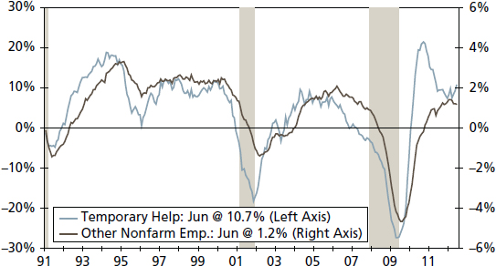
FIGURE 2.14 Temporary Help Employment (Year-over-Year Percentage Change)
Source: U.S. Bureau of Labor Statistics

FIGURE 2.15 Construction Employment (Year-over-Year Percentage Change)
Source: U.S. Bureau of Labor Statistics

FIGURE 2.16 Government Job Growth (Year-over-Year Percentage Change)
Source: U.S. Bureau of Labor Statistics

FIGURE 2.17 Income Proxy (Three-Month Annualized Rate of Three-Month Moving Average)
Source: U.S. Bureau of Labor Statistics
DATA REVISION: A SPECIAL CONSIDERATION
One noteworthy aspect of the payroll survey that creates a challenge for users of this data is that the headline number is often subject to substantial revisions in the months following the release of the survey. For example, revisions for a given month have averaged an absolute swing of 30,000 jobs in either direction in the second release of the data and 57,000 jobs between the first and third release since 1979, which is the first year available for data on revisions. This shift is due primarily to the survey collection period, where initially only 60 to 70 percent of firms surveyed submit their responses in time for the initial release of the data. As responses trickle in after the initial release, more accurate changes in the employment level of the economy can be obtained, which may paint a significantly different picture of the labor market. For example, in late summer of 2011, worries over whether the United States was headed back into a recession dominated markets. The first read of the August payroll survey showed that zero jobs were created over the month, a signal to markets that the economy was losing momentum. However, two months of revisions showed that employment had increased by 104,000 jobs, and subsequent annual revisions showed that employment increased by 200,000 jobs that month. Clearly, when conditions are even more uncertain than usual, users of the payroll survey data must be careful with how much weight to give a single month's payroll number upon its release.
THE HOUSEHOLD SURVEY
The second survey in the Employment Situation Summary is the household survey. As the name implies, the data derived from this survey is based on households' responses about their relationship to the labor market. Rather than measuring the number of jobs in the economy, this survey looks at the number of people working. Although the payroll survey's level of employment may capture the same person twice if he or she works two different jobs, the household survey does not double count these individuals. Moreover, in contrast to the payroll survey, the household survey also captures workers who are self-employed, work as domestic help, or work on farms. However, an individual's assessment of whether he or she is employed or not may be more subjective than a firm's assessment and therefore can lead to more volatility in the level of household employment—the number of people who report themselves as employed, as illustrated in Figure 2.18.
The most useful number to come out of the household survey report is the unemployment rate (see Figure 2.19). This measures the number of people who report themselves as unemployed as a percentage of the labor force. To be included in the labor force, an individual has to be either employed or actively seeking employment (i.e., applying for jobs). The unemployment rate is a useful measure in evaluating the overall health of the labor market. It provides a look at the slack in the labor market and is comparable across time periods since it is a rate, rather than a level, which accounts for level changes in the workforce. For example, an average monthly gain of 100,000 jobs in the 1950s would be more impactful on the labor market when the labor force was only about 65 million workers, compared to today when the labor force is approximately 154 million workers.

FIGURE 2.18 Household and Establishment Employment (Year-over-Year Percentage Change)
Source: U.S. Bureau of Labor Statistics
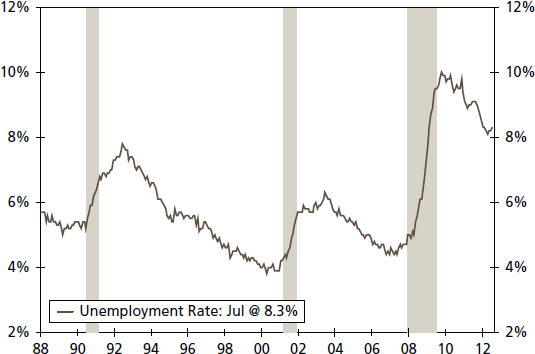
FIGURE 2.19 Unemployment Rate (Seasonally Adjusted)
Source: U.S. Bureau of Labor Statistics
The unemployment rate, however, can be greatly affected by changes within the labor force. During recessions or other periods of weakness within the labor market, unemployed persons may drop out of the labor force as they believe no jobs are currently available, go back to school, or decide their time is better spent working in the home. This would push down the most commonly reported measure of the unemployment rate—the U3 definition—as these workers are no longer counted in the labor force. Measures for such varying attachment to the labor force exist. The BLS calculates six measures of unemployment, ranging from vary narrow definitions of unemployment, such as the U1 calculation, which includes only persons unemployed 15 weeks or longer as a percentage of the labor force, to the U6 definition, which includes all persons unemployed, persons out of the labor force who are not looking for work but would take a job if it were available, and persons who are working part time because no full-time jobs are available (see Figure 2.20). Yet for each measure of unemployment, however narrow or wide, the rate remains well above the cyclical variations in prior business cycles. Is this merely the cyclical aftermath of the depth of the 2007 to 2009 recession, or does it represent a shift in the average unemployment rate?2 This is the type of question we address in this book.
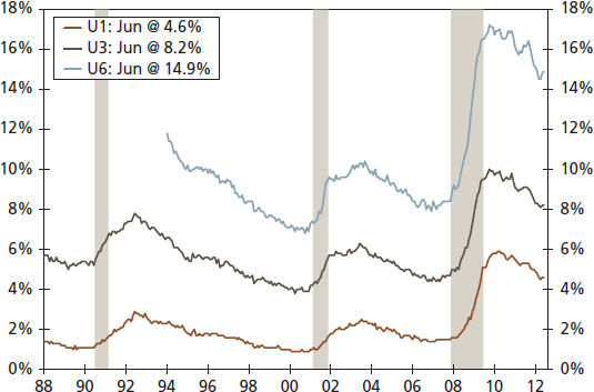
FIGURE 2.20 Unemployment Measures (Seasonally Adjusted)
Source: U.S. Bureau of Labor Statistics
In the most basic terms, production in the economy is based on capital and labor inputs. Therefore, the household survey is a rich data source on the supply of labor within the economy. The rate of labor force growth can greatly impact the total growth rate in the economy. In the post–World War II period, the secular shift to more women working outside the home boosted the pace of growth in the labor force, but in recent years this trend has slowed, as has the rate of labor force growth (see Figures 2.21 and 2.22)

FIGURE 2.21 Labor Force Participation Rate: Males versus Females, (Seasonally Adjusted)
Source: U.S. Bureau of Labor Statistics

FIGURE 2.22 Labor Force Growth (Year-over-Year Percentage Change)
Source: U.S. Bureau of Labor Statistics
Another useful measure derived from the household survey is the labor force participation rate (see Figure 2.23). The participation rate looks at the percentage of the civilian population age 16 and over that is in the labor force. Given the sharp decline illustrated below in Figure 2.23 from 2009 to the present, the question arises: Is there a structural change in the share of the population that is even interested in working? This is another question we address with our statistical analysis.

FIGURE 2.23 Labor Force Participation Rate: 16 Years or Over (Seasonally Adjusted)
Source: U.S. Bureau of Labor Statistics

FIGURE 2.24 Labor Force Participation Rate (Seasonally Adjusted)
Source: U.S. Bureau of Labor Statistics
Since most Americans earn the bulk of their income from wages and salaries, the percentage of the population engaged in the labor market can impact the current level of earnings and spending in the economy. The participation rate can also affect the future level of earnings and spending in the economy, depending on why people may not be participating. For example, since the early 1990s, the labor force participation rate for 16- to 24-year-olds has steadily declined as higher education has become more common for younger members of the population (see Figure 2.24). Although this lowers the current supply of labor, the investment in education for this group should lead to better-quality labor production in the future and potentially higher incomes. On the other side, a decline in the participation of 25- to 55-year-olds may signal something more ominous, such as people dropping out of the labor force due to few job prospects. This could lower future productivity and income growth as the skills of those out of the workforce deteriorate. It could lead to lower overall spending in the economy as more people are dependent on income from elsewhere, whether it is a spouse, family, the government, or charity. The questions become: Is a decline in the labor force participation rate due to something less impactful, like an aging population where a higher percentage of the population over 16 is moving into retirement? How can we test structural breaks in cyclical trends?
In addition to the data series and measures just highlighted, the household survey provides rich details on these measures through demographic break-downs, such as gender, age, race/ethnicity, and education. This data can help identify secular trends in the labor market, such as higher female participation rates, changes in educational attainment among the workforce, and labor market outcomes for certain target groups in business and marketing.
MARRYING THE LABOR MARKET INDICATORS TOGETHER
Confusing messages can arise between the data from the establishment and household surveys as they are based on measures from different surveys of the labor market, even if taken from the same month. Analysts need to decipher the noise stemming from these surveys by asking: Is the conflict between a decline in payrolls and a decline in the unemployment rate due to inconsistency between the household and establishment employment changes or due to a decline in the number of people looking for work, which also signals weakness in the economy? These are issues decision makers must be aware of when examining the employment situation.
JOBLESS CLAIMS
An issue with many economic indicators, including measures of the labor market, concerns the timely nature of their reporting. Although the monthly employment report offers a relatively timely look at the current state of the labor market, the weekly report on jobless claims can provide an even more up-to-date picture of labor market conditions and the broad economy. As seen in Figure 2.25, jobless claims are highly cyclical, and as such they can offer an early insight into whether an economy is shifting from one phase of the business cycle to another. But given the volatility of jobless claims, decision makers must ask: How can we tell when a rise in initial jobless claims is significant? Moreover, like any series, how much of the change is cyclical, and how much of the change might be due to a long-term shift in the data?

FIGURE 2.25 Initial Claims for Unemployment (Seasonally Adjusted, in Thousands)
Source: U.S. Bureau of Labor Statistics
In a dynamic economy such as the United States, thousands of people lose their job at the same time new jobs are created every week. During the last two economic expansions, initial jobless claims averaged 340,000 per week. However, when this series is consistently above a certain level, it is often an early warning sign of the distress in the labor market. Initial claims, therefore, also signal potential weakness ahead for personal income, spending, confidence, and business investment. Due to the frequency of the release of this information, this series can be volatile on a week-to-week basis. A moving average for this series is helpful in determining trends and turning points. With this series, analysts must ask: How else can we better distinguish the signals of movements in jobless claims over time?
INFLATION
Price changes can have far-reaching consequences across the economy. For consumers, a rise in prices, if unaccompanied by a commensurate rise in income, can mean diminished real purchasing power and therefore a lower standard of living. For businesses, a rise in input prices could challenge profitability if the business cannot pass on the increase in its output prices to its consumers. Although substitutions and adjustments can be made in the shopping cart and production process, balancing changes to costs with changes to income/revenue is a constant challenge for all actors in the economy.

FIGURE 2.26 CPI Disinflation (Year-over-Year Percentage Change)
Source: U.S. Bureau of Labor Statistics
Importantly, changes in price do not always mean inflation. In a dynamic economy, prices are constantly changing to reflect the supply and demand of individual products. Inflation reflects a broad rise in prices across the whole economy. Moreover, a distinction should be made between deflation and disinflation. Deflation is a decline in the aggregate price level of the economy. This can have detrimental and widespread effects across an economy as consumers and businesses hold back on spending in anticipation of lower prices in the future. In this environment, output and demand falls, putting further downward pressure on prices and creating the potential for a harmful spiral, which will not be altered unless there is fiscal or monetary policy intervention or other shocks to the economy. Disinflation, in contrast, is a slowdown in the pace of inflation. Aggregate price levels continue to rise, but the pace of growth is slower than previously (see Figure 2.26).
Multiple measures of inflation exist and range from prices of imports, employment costs, and end products to consumers. The three most important measures of inflation are: the consumer price index, the producer price index, and the personal consumption expenditure index.
CONSUMER PRICE INDEX: A SOCIETY'S INFLATION BENCHMARK
The consumer price index (CPI) measures the price of final goods and services to consumers. The CPI is the most broadly watched measure of inflation. This series has a lengthy history dating back to 1913. It is reported on a monthly basis, making it a timely gauge of broad price changes. Moreover, the CPI is widely used as a benchmark for inflation in many wage and benefit contracts, such as in collective bargaining and for indexing Social Security payments and tax brackets over time.

FIGURE 2.27 Consumer Price Index Weights, 2009–2010
Source: U.S. Bureau of Labor Statistics
Each month, the CPI is calculated by sampling the prices of a fixed basket of goods and services. The basket includes goods such as groceries, clothing, gasoline, and cars. Services account for a little over half the products measured in the CPI and encompass housing, medical, and education services, among others. These products are then weighted within the basket based on the proportion of household budgets they comprise for a benchmark period, which is currently 2009–2010. Housing costs make up the largest portion of the CPI at over 40 percent weighting, followed by transportation and food and beverages (see Figure 2.27).
Although timely and broad in coverage, the CPI can misstate the rise in prices over time for several reasons. The “fixed basket” concept streamlines the calculation of the index but does not allow for the substitution of goods and services within the basket. As prices of individual goods change, consumers are apt to substitute one good for another based on their relative price, which would make their “basket” of goods and services less costly. A second issue with the CPI is that its adjustments for quality can be somewhat arbitrary. If the quality of an item is perceived to have increased over time, actual price changes may not be fully reflected within the CPI. The improved quality offsets the price increase because consumers are getting more out of that good or service.3 Medical care illustrates the point. Nominal prices have increased rapidly, but so too has the quality of the service because of new scientific advancements and improved technology. Actual price increases may be adjusted downward by the CPI, but these quality enhancements are difficult to quantify precisely.

FIGURE 2.28 CPI versus Core CPI (Year-over-Year Percentage Change)
Source: U.S. Bureau of Labor Statistics
Changes in consumer prices are reported at the aggregate level (the headline) as well as for the index's subcomponents. Measures of inflation can be narrowed to categories such as food, transportation, shelter, apparel, recreation, and education and the subcomponents that feed into these broader categories—everything from white bread to women's dresses. In addition, the BLS computes a few special aggregates. Most important among these is the “core” CPI, which excludes food and energy items. The reasoning behind the core measure is that food and energy prices are historically much more volatile than other consumer prices, although this has changed over time. By leaving out these items, it is easier to determine the underlying trend in inflation (see Figure 2.28). Moreover, food and energy—particularly energy prices—feed into many of the other products in the CPI. Therefore, changes in these two components are at least partially reflected in the prices of other goods and services. Critics of the use of core inflation, particularly when used for determining monetary policy, argue that food and energy are consumer products. As such, the headline CPI should be used in decision making. This argument has some merit. Energy prices represent a growing share of consumer's disposable income, although food spending has declined as a share of total spending over the past two decades (see Figure 2.29).4
A casual examination of Figures 2.28 and 2.29 suggests a cyclical pattern for prices. It also demonstrates a shift in the long-term documented trend in core CPI and in the money spent on food at home. Meanwhile, overall CPI appears to be more volatile than core CPI. These patterns are tested in later chapters for structural significance as these data patterns give better guidance for good decision making.

FIGURE 2.29 Food and Energy Spending (Share of Total Consumption)
Source: U.S. Bureau of Labor Statistics
PRODUCER PRICE INDEX
The producer price index (PPI) is a measure of goods traded at the wholesale level or, in other words, goods prior to their purchase by end users. The PPI can provide early insight into cost pressures and whether these pressures are likely to reach the consumer. For businesses, the PPI is a measure of input costs as well as the prices of goods sold to the next level of production or on to the retail sector. The prices paid and received by producers and end use sellers will affect a company's revenue and profits, therefore making this a widely watched indicator by the business community.
The PPI report is broken into three sections representing different stages of production: crude goods, intermediate goods, and finished goods. The first stage, crude goods, measures the price of raw materials including food products, such as corn and livestock for slaughter, and nonfood products like cotton, timber, and crude petroleum. As shown in Figure 2.30, crude goods prices can swing dramatically. Supply of these goods can be influenced by weather, disease, and political factors (think petroleum) and therefore shift the market price. For decision makers, the difference in the volatility of prices at each stage of production is significant and offers a means of adding value that the analyst can bring to the discussion.
Changes at the crude stage of production will likely be felt at the intermediate stage, making price changes here still somewhat volatile. Intermediate goods are processed from raw materials one stage closer to their final component. An example here would be harvested wheat (a crude good) and grinding it so it can then be made into flour (an intermediate good).

FIGURE 2.30 Producer Prices by Stage of Processing (Year-over-Year Percentage Change)
Source: U.S. Bureau of Labor Statistics

FIGURE 2.31 Consumer Price Index versus Producer Price Index (Year-over-Year Percentage Change)
Source: U.S. Bureau of Labor Statistics
The final stage of production is for finished goods before they are sold onto the retail sector to be sold to consumers. These are products that have completed the manufacturing process and have the most bearing on consumer prices. Although not a perfect relationship because, as mentioned previously, more than half of the CPI is based on services, the finished goods component can signal changes ahead for the price of goods sold to consumers (see Figure 2.31). One hypothesis we can test is whether changes at the consumer price level lag changes at the finished goods wholesale level and by how long.

FIGURE 2.32 PCE Market Deflators (Year-over-Year Percentage Change)
Source: U.S. Bureau of Labor Statistics
Like the CPI, producer prices are broken into a few special aggregates. Among them is the “core” PPI, which like the core measure of CPI excludes food and energy prices. This measure helps identify the underlying trend in inflation, not just the movements of a few particular goods, as food and energy products are more likely to be affected by temporary changes in weather and political tensions. Other special groupings include crude materials less agricultural products and finished consumer goods less energy.
PERSONAL CONSUMPTION EXPENDITURE DEFLATOR: THE INFLATION BENCHMARK FOR MONETARY POLICY
The third measure of inflation worth noting is the personal consumption expenditure price deflator, or PCE deflator for short (see Figure 2.32). It is released monthly with the personal income and spending report and is used to adjust personal consumption for inflation, generating “real” personal spending. Although similar to the CPI in that it measures price changes for goods and services sold to consumers, the PCE deflator allows for ongoing substitution in consumer spending patterns, whereas the CPI relies on a fixed basket of goods that is adjusted only every few years. The PCE deflator provides a more accurate reading in the overall trend in inflation since it allows for the substitution effect, making it the preferred measure of inflation for the Federal Open Market Committee (FOMC) when developing monetary policy decisions. For this reason, the PCE can help gauge the path of interest rates and other monetary policy tools, such as asset purchases in recent years.5
INTEREST RATES: PRICE OF CREDIT
Interest rates and related risk measures are major factors in household and business finances. Although there are a vast number of fixed income instruments in the market, a few benchmark rates are telling of the interest rate environment across the yield curve.
Any discussion of interest rates begins with the federal funds target rate—the rate banks charge one another for overnight loans. This benchmark rate reflects the intentions of the FOMC and affects the movement of rates across the entire yield curve because it targets the shortest duration of loans. Since the Federal Reserve funds rate sets the benchmark for primary overnight bank credit, its impact extends outside the fixed income market and into loans for businesses, consumers, and nearly every other form of borrowing as the rate banks charge customers is dependent on their own borrowing costs. The 5- and 7-year Treasury rates are often used to benchmark corporate debt, while the 10-year Treasury acts as the benchmark for longer-term interest rates, such as residential mortgages in many cases.
Taken together, interest rates can indicate a great deal about the direction of the economy. Interest rates on securities of equal credit quality and different maturity dates are used in plotting yield curves (see Figure 2.33). The shape of the yield curve can indicate whether the economy is continuing to expand or likely to contract. A “normal” yield curve, the June 2009 and July 2012 curve, is upward sloping, as securities with a longer maturity date yield higher interest rates to compensate investors for the inflation risk they take and the love of liquidity. A relatively steep curve indicates that investors anticipate higher rates of inflation over their investment horizon. An inverted yield curve, when short-term interest rates are higher than long-term rates, signals that the economy is headed toward a recession and thereby the current economic/investment environment becomes relatively more risky in which to make a decision. When the yield curve begins to flatten and interest rates tend to become similar across maturity dates (the January 2008 series), the economy begins to head toward a recession/slower growth and inflation becomes less of a risk. However, depending on the current phase of the business cycle, a flat yield curve could indicate that the economy is headed toward more normal growth following a recession.6
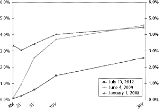
FIGURE 2.33 Yield Curve (U.S. Treasuries, Active Issues)
Source: Federal Reserve Board

FIGURE 2.34 TED Spread (Three-Month LIBOR Minus Treasury Bill Yield in Basis Points)
Source: Federal Reserve Board and British Bankers Association
Interest rates can provide a quick assessment of perceived credit risk in the market. The TED (an acronym for T-Bill and ED, the ticker symbol for the eurodollar futures contract) spread is a prime example of this, as evidenced in the 2008 financial crisis (see Figure 2.34). It is measured as the difference in three-month Treasury bills, which are considered risk-free of default, and three-month eurodollar contracts (represented by three-month London Interbank Offered Rate [LIBOR]), which reflect the credit risk of default in the market. During the 2008 financial crisis, the rate of interest financial institutions charged each other skyrocketed as demand for liquidity shot up and the credit risk of many financial institutions rose substantially due to the underlying value of assets on their balance sheet becoming highly unclear. Therefore, firms lending money demanded higher rates of interest in order to cover the heightened amount of risk they undertook when providing loans to other institutions. The Fed's provisions to insert additional liquidity in the market helped to bring down interest rates following the collapse of the investment bank Lehman Brothers, but risk in the market began to appear again in the spring of 2010, as the European sovereign debt crisis began to gain attention, and then again in late 2011, as interest rates rose to unsustainable levels on Greek debt payments and borrowing costs in Spain and Italy.
THE DOLLAR AND EXCHANGE RATES: THE UNITED STATES IN A GLOBAL ECONOMY
As the U.S. economy has become increasingly linked to international markets, the value of the dollar has taken on greater importance. A growing number of companies rely on inputs for their products that come from foreign countries, while many also look to foreign markets to sell their products. Many businesses are exposed to fluctuations in the value of the dollar—exchange rate risk—that can impact their bottom line.
Politicians and the media may discuss the value of the dollar, but in practice, there is no single value. Instead, the dollar is based on a series of bilateral relationships with other currencies, such as dollar/euro, dollar/pound, and dollar/peso. For many businesses, only a few of these exchange rates are pertinent to operations.
Most important, the value of the dollar is only a relative value as it represents the value of one currency, the dollar for example, expressed in units of another currency, for example the yen, subject to the laws of supply and demand based on the relative attractiveness of two currencies. That is, the dollar's value depends not only on factors originating in the United States but on factors occurring overseas. On the domestic front, an increasing appetite for imports in the United States will drive the dollar's value down as demand for foreign currencies to pay for the imports increases. U.S. importers buy foreign currency in order to buy foreign goods. As with any normal goods, the greater the demand for a product, the greater the price at a given supply. However, if the supply of a currency—the money supply—increases more rapidly than its demand, the expansion can drive down the price of the currency and therefore the currency's value. In contrast, increasing demand for products and services made in the United States will drive up the value of the dollar as overseas customers need to pay American companies in dollars, pushing up the demand for the currency.
However, since the dollar is perceived as a safe-haven relative to holding wealth in another currency, the value of the dollar is influenced by more than the demand for imported or exported goods and services. Financial turmoil abroad can influence the dollar's value, as investors move to it during times of uncertainty and drive up its value. On the flip side, more stable conditions internationally can drive down the value of the dollar as investors move into other currencies. This phenomenon can be seen in the wake of the 2008 financial crisis, when the depreciation of the dollar since the early 2000s was temporarily reversed as investors flocked to the greenback. When conditions calmed, the dollar continued its relative descent, but it crept upward again as the Eurozone crisis flared and investors again sought the safety of dollar assets (see Figure 2.35).
Although most businesses are interested in only a few specific relationships of the dollar, the Federal Reserve produces indexes of the dollar's value relative to other currencies. Among these indexes is the broad weighted index, shown in Figure 2.35, which includes the bilateral exchange rates for currencies of America's major trading partners, weighted by trading volume. This index can be helpful for companies that trade with many of the country's major trading partners. The Fed also produces two subindexes of the value of the dollar. The major currencies index reflects the value of the dollar relative to the value of currencies that are widely circulated outside their country of issuances, for example, the euro and yen. The other important trading partners (OITP) index reflects the value of the dollar relative to currencies in the broad index that do not circulate widely.

FIGURE 2.35 Trade-Weighted Dollar (January 1997 = 100)
Source: Federal Reserve Board

FIGURE 2.36 Brazilian Exchange Rate (USD per BRL)
Source: Federal Reserve Board
Policy in the United States lets the dollar float, but other countries may fix their exchange rates by restricting capital flows or relinquishing monetary policy independence and pegging their currency to the dollar, as in Hong Kong today. This may reduce exchange rate risk in the short term for businesses trading products in these currencies, but they run the risk of the peg being removed, as was the case in Argentina in 2001 and Brazil in 1999 (see Figure 2.36). In this graph we note the dollar and Brazil real by their market neumonics of USD and BRL respectively.
CORPORATE PROFITS
Of course, businesses exist to earn profits as a return to their investors. In addition to providing a return on previous investment, profits provide a source of funds for future investment. Moreover, they also represent income earned in the economy from production of goods and services. In today's economy, the major measures of profits include those reported for in the National Income and Product Accounts (NIPA) and profits reported to shareholders.
Profits reported in the NIPA accounts reflect the overall profitability of firms and are thus a barometer on how the economy is performing. Profit growth is highly cyclical, as downturns reduce revenues and force many companies to streamline costs, which increases profitability down the road, particularly when the economy heats back up and revenues rebound (see Figure 2.37). Profits as a share of GDP are also cyclical, with the greatest share typically occurring in the middle of an expansion (see Figure 2.38). A decline in profits as a share of GDP often can signal that the economy is losing momentum.

FIGURE 2.37 Corporate Profits Growth (Year-over-Year Percentage Change)
Source: U.S Bureau of Economic Analysis
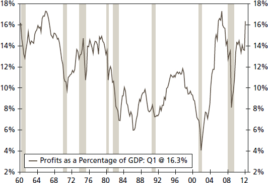
FIGURE 2.38 Profits as a Percentage of GDP (Pretax Profits Divided by Product of Nonfinancial Corporate Businesses)
Source: U.S Bureau of Economic Analysis
NIPA data on profits stems from corporate income tax returns and are adjusted to account for national income accounting standards. The Bureau of Economic Analysis (BEA) adjusts profits to account for the current period's cost rather than the historical costs of accumulating inventory. This process is known as the inventory valuation adjustment (IVA). Depreciation expenses are also captured in the BEA's measure under capital consumption adjustments. Profits are then reported before taxes as to separate current tax policy's impact on overall operating performance. The BEA does, however, also report after-tax profits as well as net dividends earned.
Profits are also expressed in reports to shareholders. Here data is derived from financial accounting rather than from the tax-accounting measures used in the NIPA calculation of corporate profits. This allows for a more timely estimate of profits, as the BEA's measure can lag and includes a number of assumptions because tax returns are reported only annually.
SUMMARY
With hundreds of economic variables published on our economy from both public and private sources, the thoughtful analyst will find it daunting to sort through which indicators are most useful. There are, however, a number of key variables that provide a baseline to the time-constrained analyst. In this chapter, we looked at the crucial elements of the economy that relate to businesses: growth, labor, inflation, interest rates, the dollar, and corporate profits. Knowing both the basics and key issues surrounding these series produces better analysis and therefore better decisions by businesses and policy makers. In the next chapter we review the financial side indicators for the U.S. economy.
1On December 1, 2008, the NBER's Business Cycle Dating Committee (BCDC) announced December 2007 as a peak (beginning of a recession) in the U.S. economy. The announcement mentioned that one of the determining factors, with several others, to identify a peak month was payroll employment. See the NBER Web site for more detail: www.nber.org/cycles/dec2008.html.
2For more on cyclical and structural unemployment, see John Silvia and Sarah Watt, “Long-Term Unemployment: Costs & Consequences,” September 8, 2011, or John Silvia, Azhar Iqbal, and Sarah Watt, “Three Measures of a Healthy Labor Market,” March 6, 2012, both of which are available from Wells Fargo Economics.
3See www.bls.gov/cpi/cpihqaitem.htm for more information on quality adjustment for the CPI.
4James Bullard, “Headline vs. Core Inflation: A Look at Some Issues,” Regional Economist (April 2011), p. 3
5See the FOMC Summary of Economic Projections at www.federalreserve.gov/monetarypolicy.
6James C. Van Horne, Function and Analysis of Capital Market Rates (Englewood Cliffs, NJ: Prentice-Hall, 1970).