
CHAPTER 8
Characterizing a Relationship Using SAS
A question that is essential to analysts in the economic and financial world is: To what extent are certain variables related to each other? This chapter provides methods for using SAS software to determine the statistical relationship between economic and financial variables and to interpret the results. First we share useful tips for an applied time series analysis and then we examine how to estimate the statistical relationship between two (or more) variables.
USEFUL TIPS FOR AN APPLIED TIME SERIES ANALYSIS
Helpful hints are the reliable servant of any good work. An analyst needs to be familiar with a few key guidelines for applied research. The guidelines include using economic and financial theories as a benchmark and testing the theory with econometric techniques by employing time series data (or cross-section/panel data).1 Most applied econometric analysis is now done by statistical software, which produces results quickly. Such speed can be a trap, however, because the software does not care what kind of data is inputted and whether it is the best basis for the statistical results.
For example, using any statistical software, an analyst can produce correlation coefficients between the population in Gambia and the gross domestic product (GDP) of the United States.2 The correlation coefficient may be statistically significant, yet any correlation is likely to reflect a third factor: a deterministic time trend (i.e., an upward or downward time trend over time). That is, both the U.S. GDP and the Gambian population are likely to have an upward trend over time, which also influences the correlation and produces a spurious relationship. Software uses whatever data is presented to it and produces results. An analyst's job is to ensure that the input data makes sense when examining a relationship. To conduct any effective applied time series (or any quantitative) analysis, an analyst should start with an economic or financial theory that suggests a hypothesis and then test that hypothesis with the help of data and relevant econometric techniques.
Next, an analyst must address several data issues: How long a time span should be included in the analysis? What functional form of the variables is appropriate? What is the number of observations to be tested? How will such a dataset match the statistical techniques and economic or financial perspectives of the study? For instance, is a monthly dataset of 10 years (120 observations) better than an annual dataset of 40 years (40 observations) for the relationship being tested? Statistical techniques require a large number of observations to preserve degrees of freedom,3 which ensure that results will be reliable. From a statistical point of view, a longer history means more reliable results. From an economic theory perspective, more information provides a basis for a deeper and more comprehensive analysis.4
That said, variables can behave differently during recessions than during expansions. The longer the time period covered, the greater the opportunity to identify how a relationship behaves over an economic cycle, its volatility and the probability of a structural break. Additionally, recessions and recoveries, and even midcycle expansions over time, are not alike. For example, some recessions are deeper than others. Recoveries also differ, as seen in Figure 8.1, where employment is displayed following its cycle peak. An analyst should include at least several business cycles, if possible, to increase the credibility of the results for any time series analysis.
Another practical question arises: Over what functional form (e.g., level versus growth rate) of the variables should be used in a time series analysis. Although the answer depends on the objective of the study, the log-difference form of variables generally provides a better statistical outlook than the level form of the variables. Why? Usually the log-difference form of a variable solves nonstationary issues; therefore, statistical results can be interpreted outside of a deterministic time trend.5

FIGURE 8.1 Employment Cycles: Percentage Change from Cycle Peak
For instance, in equation 8.1, Yt is the Standard & Poor's (S&P) 500 index (indexed to 1941–1943), and Xt is the U.S. GDP (in billions of dollars). If an analyst used the level form of these variables, it would be difficult to interpret the estimated coefficient (β), because GDP is in billions of dollars and the S&P 500 index is an index. Let us assume β = 0.67 and is statistically significant. We can assert that a 1-unit increase in GDP, which is $1 billion, is associated with a 0.67-unit increase in the S&P 500 index. This is an odd assertion because each variable is in a different scale.
![]()
However, the log-difference form will convert these variables into growth rates, and then both variables will share the same scale: percent form. We can now explain β = 0.67 as a 1 percent increase in GDP growth rate associated with an 0.67 percent increase in the S&P 500 index. A similar point about the dataset would be to use a consistent form for dependent and independent variables in an analysis. That is, if the dependent variable is a month-over-month (MoM) percentage change, then it would be better to use a MoM percentage change in the independent variable instead of a year-over-year (YoY) percentage change.
Next, the statistical properties of the dataset can be tested by utilizing the appropriate SAS techniques. Correlation, regressions, and cointegration tests determine statistical associations between two or more variables. It is very important to distinguish between statistical correlation and statistical causality.6 Although a correlation tells us that two variables move together over time, it does not indicate which variable leads and which variable lags. The Granger causality test, however, does identify statistical causality between variables of interest, identifying which variable is a leading variable and which is a lagging.
Often an analyst has to select one model among several and determine which model is better among its competitors. We strongly recommend selecting a model based on criteria such as the Akaike information criterion (AIC) and the Schwarz information criterion (SIC), where a model with the lowest AIC/SIC would be better than others. Furthermore, an analyst should not choose a model based primarily on the R2 value.7
Finally, an analyst should review the statistical results carefully and ask whether these results make economic sense. For example, are the signs and magnitudes of the estimated coefficients consistent with the theoretical views? In addition, the analyst always should plot the actual and fitted values of the dependent variable, along with the residuals, for visual inspection, and check whether they make sense with respect to economic theory.
CONVERTING A DATASET FROM ONE FREQUENCY TO ANOTHER
An important issue an analyst may face when estimating a statistical relationship between two or more variables is that the variables may not be available in the same frequency. For a statistical analysis, the data series must share the same frequency to run a correlation or regression analysis. If one series has monthly data points and another has quarterly data points, then there would be an uneven number of observations in the analysis, or the series would cover different time periods. SAS code S8.1 shows how to convert a time series from one frequency to another. In this example, monthly employment data is converted into a quarterly series using the PROC EXPAND command.


Assume that the employment data is imported and sorted in the SAS system and the data file name is monthly_data. The second line of code S8.1 starts with Out = qtr_data, which creates a data file name qtr_data in the SAS system, and from = month to = qtr indicates a monthly data series is being converted into a quarterly series. The third line of the code indicates which series to covert (employment) and what values or calculations to use. In this case, we use observed = average to take the average of the three observations to create a quarterly series.8 The ID date in the code shows the date variable is used as an ID variable to convert the employment data series. The code is ended with Run.

Monthly employment data has now been converted into a quarterly frequency and can be merged with quarterly GDP data to assess the relationship between employment and output. Let us assume that the data file “data_GDP” is already imported and sorted into the SAS system and that the file contains quarterly GDP data along with the date variable. SAS code S8.2 is an example of how to merge two data files into one.9 The combined_data is the name of the newly created data file. The second line of code S8.2 is Merge data_GDP qtr_data, which indicates that these two data files are being merged into one file, combined_data. The By date part of the code specifies to merge the files by their date variable. Whenever we merge two or more data files, the files being merged must share a common variable that match the data together.
The Correlation Analysis
A first step of a quantitative analysis could be to run a correlation analysis between variables of interest and to test whether these variables are statistically associated with each other and the direction of the association (i.e., whether GDP is positively or negatively correlated with employment and the S&P 500 index). A correlation analysis is simple but more precise than a plot of two series over time because it quantifies to what extent, if any, two series are statistically related to each other. We use U.S. GDP, employment, and S&P 500 index as a case study and run a correlation analysis between these variables.

SAS code S8.3 shows the PROC CORR command utilizing the data file correlation_data to run a correlation analysis among GDP, employment, and the S&P 500 index. In the second line of the code, Var is a SAS keyword after which we provide the list of variables to be included in the correlation analysis: GDP, employment, and SP500 (S&P 500 index). The results based on code S8.3 are reported in Table 8.1. The dataset covers the Q1-1975 to Q2-2012 time period, using the level form of the variables.10 Furthermore, the employment and S&P 500 index series are converted into a quarterly frequency using the S8.1 code and then the quarterly series are used in the correlation analysis.
The first part of Table 8.1 shows descriptive statistics, which are useful to characterize a time series. The mean, standard deviation (Std Dev), sum of the series (Sum), and minimum and maximum values of the three series are presented in the table. One quick check of the data reliability is that these series do not contain a negative or zero value, as the minimum value of each of these series is positive. This indicates that an unusual value (such as a zero or negative value) is not presented in the test variables. Because we use the level form of GDP, employment, and the S&P 500 index, there should not be any negative values. The standard deviations of all three series are smaller than the mean of that series, which indicates these series are generally stable over time.
The second part of Table 8.1 reports the correlation matrix based on the Pearson correlation coefficient. The Pearson correlation coefficient shows a linear statistical association between two variables.11 The correlation coefficients range between −1 and 1, where 1 represents a perfect positive linear association between the two variables (i.e., a rise in one variable is associated with a rise of the exact magnitude in the other variable). A coefficient of −1 shows a perfectly negative linear association (i.e., an increase in one variable is correlated with a decline in the other variable of the same magnitude). The correlation coefficient is also tested for statistical significance. The null hypothesis is H0: Rho = 0, where Rho is the correlation coefficient and Rho = 0 means the coefficient is not statistically significant. The alternative hypothesis is that the coefficient is statistically significant. The p-value attached to the correlation coefficient is also reported. The variables' names are listed both vertically and horizontally. The diagonal values are 1 because a variable always has a perfect correlation with itself.
TABLE 8.1 The Correlation Analysis Using Level Form of the Variables
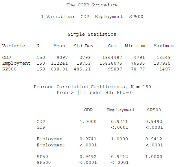
The correlation coefficient between GDP and employment is 0.9741, indicating that GDP and employment are positively correlated. The p-value for that coefficient is less than 0.05; thus, at a 5 percent level of significance, we can reject the null hypothesis that the correlation coefficient between GDP and employment is not statistically significant. Therefore, we find that GDP and employment are statistically correlated. The correlation coefficient between GDP and the S&P 500 index is 0.9492 and is statistically significant. Employment and the S&P 500 index is also statistically positively correlated with a coefficient of 0.9412.
The correlation analysis found a very strong statistical association among GDP, employment, and the S&P 500 index. However, the strong statistical association among GDP, employment, and the S&P 500 index could be due to a third factor, such as a time trend. Because we use the level form of these variables and all have an upward trend over time, the correlation analysis likely captured an upward time trend. One possible solution to remove a potential time trend is to use a growth rate of these series, such as the year-over-year percentage change, and rerun the correlation analysis.

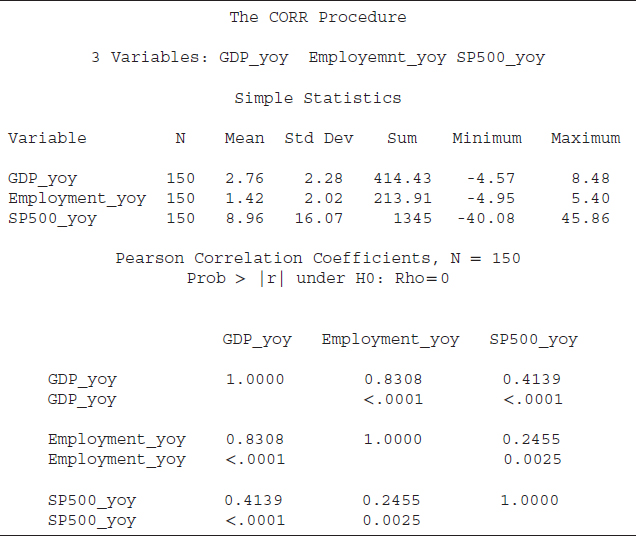
Code S8.4 is used to run a correlation analysis using the growth rates of GDP, employment, and the S&P 500 index. The only difference between codes S8.4 and S8.3 is that in the second line of the S8.4 we listed GDP_yoy (year-overyear percentage change of GDP), employment_yoy (year-over-year percentage change of employment), and SP500_yoy (year-over-year percentage change of S&P500 index). The results based on code S8.4 are reported in Table 8.2.
From Table 8.2, the descriptive statistics based on the growth rates of the three series show that both employment and the S&P 500 index growth rates are more volatile than the GDP growth rate because the standard deviations of both series are higher than their respective means. The standard deviation of the GDP growth rate is smaller than the mean. The correlation coefficients are positive and statistically significant at the 5 percent level of significance. However, the magnitude of the coefficients is smaller compared to the ones based on the level form of the variables. That is, the correlation coefficient between GDP and employment growth is 0.8308 compared to a correlation coefficient of 0.9714 based on the level form. The coefficient between the growth rates of GDP and the S&P 500 index is 0.4139 compared to 0.9492 in level terms. The correlation coefficient between growth in employment and the S&P 500 index growth rate also dropped significantly to 0.2455 from 0.9412.
Summing up, we suggest using growth rates of the variables of interest in correlation analysis instead of the level form since many variables may contain a deterministic trend that affects the correlation analysis. The correlation coefficients based on the growth rates are smaller than those based on the level form; however, the smaller coefficients are more realistic. For instance, the correlation coefficient between growth in employment and the S&P 500 index is 0.2455, indicating that 25 percent of the time, employment and the S&P 500 index growth rates move together. The level form of these variables has a correlation coefficient of 0.9412, meaning that 94 percent of time, these variables move in the same direction, which is overly strong. Because there are many determinants of the S&P 500 index other than employment, 94 percent seems too good to be true, and 25 percent co-movement is more believable. The objective should be to identify an accurate correlation, not a higher correlation. A higher correlation sometimes may be spurious because of a third factor, such as a deterministic time trend.
TABLE 8.2 The Correlation Analysis Using Difference Form of the Variables
The Regression Analysis
A regression analysis is more precise than a correlation analysis. In regression analysis, we specify a dependent variable and one or more independent variables (also known as left-hand- or right-hand-side variables, respectively). With the help of different tests we can identify the individual variable's statistical significance along with overall goodness of fit of a model.
The PROC AUTOREG command is used to run a regression analysis in SAS. We use the U.S. money supply (M2) and inflation rate (CPI) data series as a case study. The relationship between the money supply and inflation rate is also known as money neutrality. That is, inflation is often considered a product of excessive growth in the money supply relative to actual economic output. Put simply, an increase in the money supply may boost the general price level of a country. The question is: How might we quantify that?

FIGURE 8.2 M2 Money Supply Growth versus CPI Growth (Year-over-Year Percentage Change)
SAS code S8.5 indicates how to run a regression analysis. The SAS data file MI_data contains the U.S. consumer price index (CPI), with the SAS name PCIU_M, and the money supply, measured by M2 and given the SAS name of MNY2_M. The second line of the code starts with Model, a SAS keyword that instructs SAS to run a regression using the listed variable. After Model we list the dependent variable (PCIU_M in the present case), an = (equals sign), and then the list of the independent variable (MNY2_M here). The results based on code S8.5 are reported in Table 8.3.
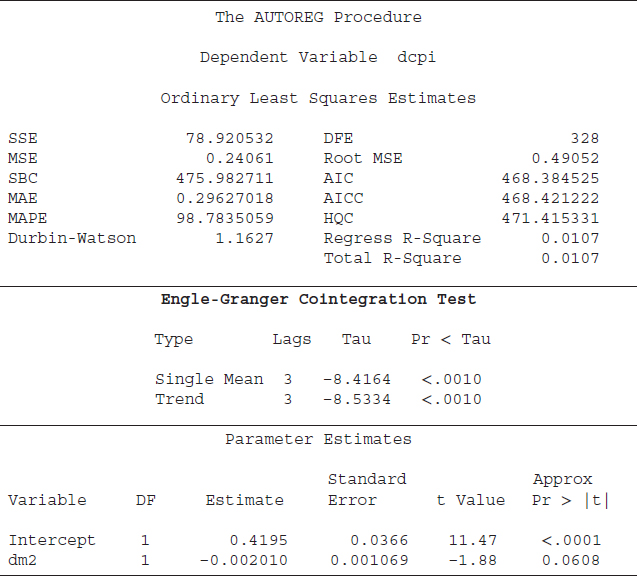
The first part of Table 8.3 reports several statistics that are important measures to determine a model's goodness of fit. The sum of square (SSE) is 91789.45896, and SSE is a key input to several important measures of a model's goodness of fit (i.e., R2, mean square error, etc.). “DFE” indicates the number of observations (sample size) minus the number of parameters in the model. The mean square error (MSE = 203.52430) is the estimated variance of the error term. The “Root MSE” is 14.26619, and it is the square root of the MSE. The MSE is the estimated variance, and the Root MSE is the estimated standard deviation of the error term. The Root MSE shows the average deviation of the estimated CPI from the actual CPI (our dependent variable).
TABLE 8.3 The Regression Analysis Using the Level Form of the M2 and CPI
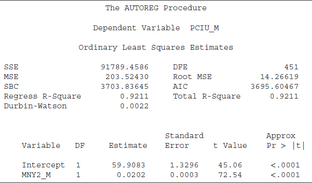
The SBC and AIC values are helpful information criteria used to select a model among its competitors. There are two R2 statistics reported in Table 8.3, which are “Total R-Square” and “Regress (Regression) R-Square.” The total R2 is a measure of how well the next value of a dependent variable can be predicted using the structural part (right-hand-side variables including the intercept) and the past value of the residuals (estimated error term). The regression R2 is also a measure of the fit of the structural part of the model after transforming for the autocorrelation and thereby is the R2 for the transformed regression. Furthermore, if no correction for autocorrelation is employed, then the values of the total R2 and regression R2 would be identical, as in our case. Another important statistic shown in Table 8.3 is the Durbin-Watson value. A Durbin-Watson statistic close to 2 is an indication of no autocorrelation; a value close to zero, as in the present case, is strong evidence of autocorrelation.
The last part of Table 8.3 reports measures of statistical significance for the right-hand-side variables, or the independent variables, along with an intercept. Column “DF” represents degrees of freedom, and shows one degree of freedom for each parameter. The next column, “Estimate,” shows the estimated coefficients for the intercept (59.9083) and for “MNY2_M” (0.0202).
The next column exhibits the standard error of the estimated coefficient and is important for several reasons. First, the standard error of a coefficient shows the likely sampling variability of a coefficient and hence its reliability. A larger standard error relative to its coefficient value indicates higher variability and less reliability of the estimated coefficient. Second, the standard error is an important input in estimating a confidence interval for a coefficient. A larger standard error relative to its coefficient would provide a wider confidence interval. Last, a coefficient-to-standard error ratio helps to determine the value of a t-statistic. A t-value is an important test to determine the statistical level of significance of a variable including the intercept. An absolute t-value of 2 or greater is an indication that the variable is statistically useful to explain variation in the dependent variables. Both t-values, in absolute terms, are greater than 2 (45.06 for intercept and 72.54 for MNY2_M), suggesting that both the intercept and MNY2_M are statistically significant.
Finally, the last column, “Approx Pr > |t|,” represents the probability level of significance of a t-value. Essentially, the last column indicates at what level of significance we can reject (or fail to reject) the null hypothesis that a variable is statistically significant. The standard level of significance is 5 percent; an Approx Pr > |t| value of 0.05 or less will be an indication of statistical significance. The values for both t-values are smaller than 0.05 (both are 0.0001); hence the intercept and MNY2_M are statistically meaningful to explain variation in the CPI. The positive sign of the MNY2_M coefficient indicates that an increase in the money supply is associated with a higher value of the CPI. As the t-value is greater than 2, the relationship between CPI and M2 is statistically significant.
The Spurious Regression
The results reported in Table 8.3 seem to indicate the CPI-M2 model is robust because the R2 value is high (0.9211), the t-value is greater than 2, and the MNY2_M estimate has a positive sign, which is consistent with economic theory. The R2 shows around 92 percent variation in the CPI is explained by M2, which seems too good to be true because there are several determinants of inflation other than the money supply. Furthermore, these results may be spurious because the Durbin-Watson statistic is very low, which is an indication of autocorrelation. The R2 is significantly greater than the Durbin-Watson statistics (R2 = 0.9211; Durbin-Watson = 0.0022), which also indicates possible spurious results.
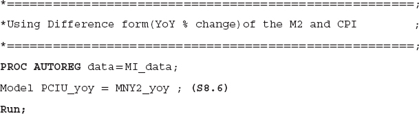
One major reason for the spurious results is that we used the level form of the CPI and M2 series, which seem to have deterministic time trends. The regression analysis may have captured the time trend and shows higher R2 and t-values. One possible solution is to use the growth rates of the CPI and M2 instead of the level form.12 The next SAS code, S8.6, can be employed to run a regression analysis using the growth rates (YoY percentage change) of the CPI (PCIU_yoy) and money supply (MNY2_yoy). The results based on code S8.6 are reported in Table 8.4.
TABLE 8.4 Regression Analysis Using Difference Form of the Variables

One noticeable change we observe is a significant reduction in the R2, which dropped from 0.9211 to just 0.0750. In other words, the growth rate of the money supply only explains around 8 percent of the variation in the CPI growth rate, which is a more realistic number. The t-value shows the growth rate of the money supply is statistically significant in explaining variation in the CPI growth rate and both move in the same direction. The Durbin-Watson statistic is still close to zero (0.0263) and is a sign of autocorrelation in the error term. Therefore, the next step is to solve the autocorrelation problem.
Autocorrelation Test: The Durbin ‘h’ Test
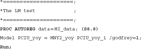
The Durbin-Watson test detects first-order autocorrelation in the CPI–money supply model. A standard practice to solve a first-order autocorrelation issue is to include a lag of the dependent variable as a right-hand-side variable in the test equation.13 In SAS code S8.7, we include a lag of the CPI growth data as a right-hand-side variable. We reestimate the equation and test for autocorrelation again for the possibility of higher-order autocorrelation. However, with the lag of the dependent variable included as a right-hand-side variable, the Durbin-Watson test would not be reliable because it assumes there is not a lag-dependent variable included as a regressor. The Durbin ‘h’ test is a better tool to detect autocorrelation in the current case. The null hypothesis of the Durbin ‘h’ test is that the errors are white noise (there is no autocorrelation) and the alternative is autocorrelation. SAS code S8.7 performs the Durbin ‘h’ test. The PCIU_yoy_1 is the first lag of the CPI growth rate, and the lagdep is the SAS keyword to perform the Durbin ‘h’ test. After lagdep, we specify the lag of the dependent variable, which is PCIU_yoy_1.

Results presented in Table 8.5 indicate one noticeable change is the drop in both the SBC and AIC values. The drop indicates that this model is better than the previously estimated models, which are reported in Tables 8.3 and 8.4. The R2 increases to 0.9805 when we include a lag-dependent variable as a regressor, which is expected. A variable usually is highly correlated with its lag. This is captured by a higher R2. The t-value attached to the PCIU_yoy_1 is greater than 2, and, at a 5 percent level of significance, the lag of the CPI growth rate is statistically significant. An interesting observation is that the money supply growth rate is not statistically significant at a 5 percent level of significance, and it also has a negative sign, which is contrary to the economic theory.
The Durbin ‘h’ statistic is 9.3864 and the p-value (“Pr > h”) is 0.0001, which indicates that, at a 5 percent level of significance, we reject the null hypothesis of no autocorrelation. In other words, the Durbin ‘h’ test detects the presence of autocorrelation and that indicates there is higher-order autocorrelation because we have already included the lag of the dependent variable to solve first-order autocorrelation. That is, we need to find the order of autocorrelation and then solve that issue. Before we move to that phase, let us introduce another test of autocorrelation, which is known as the LM test.
TABLE 8.5 Autocorrelation Test: The Durbin ‘h’ Test

Autocorrelation Test: The LM Test
Godfrey's test for serial correlation is known as the LM test of autocorrelation. The null hypothesis of the LM test is that the errors are white noise, or there is no autocorrelation, and the alternative is that there is autocorrelation. SAS code S8.8 is employed to perform the LM test. The term godfrey = 1 indicates the LM uses a lag of one period, where godfrey is the SAS keyword to perform the LM test of autocorrelation. The results based on code S8.8 are reported in Table 8.6.
SAS codes S8.7 and S8.8 essentially estimate the same model. The only difference is that code S8.8 performs the LM test instead of the Durbin ‘h’ test, which was shown in code S8.7. Therefore, the R2, SBC, AIC, and t-values reported in Table 8.6 are similar to those shown in Table 8.5. The Godfrey's LM test result is 88.8901 and the p-value (“Pr > LM”) attached to the LM test result is 0.0001, indicating that the null hypothesis of no autocorrelation should be rejected and we suspect the errors are autocorrelated. Table 8.6 also shows the Durbin-Watson statistics, but due to the presence of the lag-dependent variable, that statistic is not reliable. The Durbin ‘h’ and the LM tests both agree on the presence of higher-order autocorrelation in the errors.
Autocorrelation Test: Finding the Appropriate Lag Order
Both the Durbin ‘h’ and LM tests found a higher-order autocorrelation for the CPI–money supply model. We next have to find the appropriate order of the autocorrelation and solve that issue. We suggest using the SBC and AIC information criteria to determine the appropriate autocorrelation order. That is, the model with the lowest SBC and AIC values is the best model. SAS code S8.9 performs the LM test by including up to three lags of the dependent variable as right-hand-side variables.
TABLE 8.6 Autocorrelation Test: The LM Test

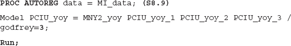
We start by including the second lag of the dependent variable as a right-hand-side variable and run the regression. Then we add the third lag of the dependent variable and rerun the model. If the model with a fourth lag shows an uptick in both the SBC and AIC values, there is no need to test more lags since the model with the third lag of the dependent variable is the one with the lowest SBC and AIC values. The appropriate order of the autocorrelation suggested by SBC/AIC is three. We include up to three lags of the CPI growth rate (our dependent variable) as regressors and estimate the model. Furthermore, to confirm the appropriate order, we test for autocorrelation using the LM test. The results based on code S8.9 are reported in Table 8.7.
SBC and AIC values based on code S8.9 are smaller than those reported in Tables 8.3 to 8.6. The t-values of all three lag regressors are greater than 2, which suggests these variables are statistically significant. The money supply growth rate is not statistically significant, indicating there is no statistical relationship between CPI growth and growth in the money supply over our sample period.
TABLE 8.7 Finding the Appropriate Lag-Order Using the LM Test

The LM test values are much smaller, and the p-values attached to those values are higher than 0.05, meaning we fail to reject the null hypothesis of white noise, or no autocorrelation. That suggests the appropriate lag order is three to address the autocorrelation issue.
This concludes our discussion of how to run a simple correlation and regression analysis. We expect that an analyst can use the SAS codes provided above to improve his or her skills. One way to do that would be to pick some variables as a case study and apply these tools.
The Cointegration and ECM Analysis
Regression analysis is a simple way to identify a statistical relationship between variables. In time series analysis, many variables are nonstationary at the level form, and the ordinary least squares (OLS) results using nonstationary variables would be spurious. That is, due to the nonstationary issue, a regression analysis using OLS may not provide reliable information about a statistical relationship between variables of interest. A better way to characterize a statistical relationship between time series variables is to employ cointegration and error correction model (ECM) techniques. A cointegration method identifies a long-run, statistically significant relationship between variables. The ECM determines how much deviation is possible in each period from the long-run relationship.14
The first step in an applied time series analysis is to test for a unit root in the variables of interest.15 If the series are nonstationary, then the second step is to apply cointegration and ECM to determine a statistically significant relationship between the variables. This section discusses how to employ cointegration tests, both Engle-Granger and Johansen approaches, in the SAS system. We use the U.S. CPI and money supply (M2) variables as a case study and characterize the statistical relationship. The dataset is monthly and covers the January 1985 to June 2012 time period since inflation in the 1970s and early 1980s was very high and not reflective of today's environment. We apply the augmented Dickey-Fuller (ADF) unit root test on the CPI and money supply and find both series are nonstationary at their level form. The first difference of both series is stationary. It confirms we should not apply OLS but rather use cointegration and ECM techniques to determine the relationship between the CPI and money supply.
The Engle-Granger Cointegration Test
The first cointegration technique applied to the CPI and money supply data is the Engle-Granger (E-G) cointegration test. This is a single-equation approach, with one dependent variable and one or more independent variables. SAS code S8.10 is performed to apply the E-G test on the CPI–money supply data. In the SAS software, when we include independent variable(s) in the equation, the “ADF” option performs the E-G cointegration test. For example, the second line of the code, Model dcpi = dm2 / STATIONARITY= (ADF), indicates that the dcpi (first difference of the CPI) is our dependent variable and dm2 (first difference of the money supply) is the independent variable. The SAS keyword STATIONARITY= (ADF), which usually performs the ADF unit root test, in this case will apply the E-G cointegration test on the data series because we have included dm2 as an independent variable. In the present case, the ADF option will follow the two-step estimation and testing procedure of the E-G approach. In the first step, the OLS residuals of the regression in the Model statement are estimated. The second step applies the ADF unit root test on these residual series. The null hypothesis of the E-G cointegration test is no cointegration (no statistically significant relationship between the CPI and money supply); the alternative hypothesis is cointegration. The results based on S8.10 code are reported in Table 8.8.

The first part of Table 8.8 shows the measures of a model's goodness of fit, such as the R2 and the root mean square error. The last part exhibits the estimated coefficients and their measures of statistical significance, such as the t-value and its corresponding p-value. The middle section of Table 8.8 presents the results based on the E-G cointegration test.16
Two types of test equations are estimated for the E-G cointegration test, which are reported under the label “Type.” The first type is “Single Mean,” which indicates that an intercept term is included in the test equation. The second type is “Trend,” which shows that the test equation contains an intercept and a linear time trend. The concept behind the Single Mean and Trend types is similar to those of the unit root test (ADF).17 That is, the E-G cointegration approach employs the ADF test to determine whether the two variables are cointegrated. The difference between the E-G approach and the ADF test is that we test for cointegration between two or more variables and, in the case of unit root testing, we characterize whether one variable is stationary or not. The “Lags” column indicates that up to three lags are included in the test equations. The “Tau” column represents the estimated statistics, and the “Pr < Tau” column provides p-values corresponding to the tau value. In both cases, the p-values are smaller than 0.05. Therefore, we reject the null hypothesis of no cointegration at a 5 percent level of significance—the CPI and money supply have a statistically significant relationship.
TABLE 8.8 Results Based on the Engle-Granger Cointegration Test
A cointegration test examines whether the CPI and money supply have a statistical relationship over the sample period. Furthermore, it is well known that the CPI and money supply have a long-run relationship. However, sometimes these series deviate from this long-run relationship. Therefore, the next step is to determine (1) whether the deviation from the long-run link is statistically significant and (2) what the magnitude of the deviation is. The ECM method provides answers of these questions.
The Error Correction Model
In applied time series analysis, the process to characterize a statistical relationship between variables consists of two steps. The first step is to decide whether the series have a statistical relationship over the entire sample period. That is determined by the cointegration test, which examines the series for a long-run relationship. If the two variables have a long-run relationship, then the second step is to quantify how much deviation from the long-run relationship is possible in each period. That is estimated by the ECM. If the series are not cointegrated then we will not apply the ECM method. Therefore, the existence of a long-run relationship between series of interest is the precondition for the ECM.
Application of the ECM consists of two steps. The first step is to run an OLS regression using the level form of the variables, which in this case is the level of the CPI (the dependent variable) and the money supply (the independent variable), and save the estimated residuals, or the error term, which we call error_ECM. In the next step, Equation 8.2 will be estimated using the OLS method. DCPIt and DM2t are the first difference forms of the CPI and money supply, respectively. The lerror_ECMt is the lag of the error_ECM. The first lag of the error_ECM, instead of the current form, is utilized because the current form of the error_ECM may be correlated with εt, which is the error term of Equation 8.2. One OLS assumption is that the value of the independent variable should not be correlated with the error term. If the assumption is violated, then the OLS results would not be reliable.18
![]()

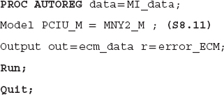
SAS code S8.11 is employed to perform the first step of the ECM procedure. A regression is estimated using the level form of the CPI and money supply, and the error term is saved. The third line of the code creates and saves the estimated residual from this regression, which is the objective of this step. Output is a SAS keyword to create and save a data file from the results. out = ecm_data saves the newly created data file ecm_data; out is a SAS keyword used to assign the file name. The r = error_ECM saves the estimated residuals and assigns error_ECM as a SAS name to that series. The SAS keyword r indicates the estimated residuals of the test equation are being saved.
SAS code S8.12 creates the lag of the error_ECM, and we assign lerror_CM as a SAS name. The lag of the error_ECM will be used as an independent variable in step 2 of the ECM procedure.

SAS code S8.13 completes the ECM procedure. The data file ecm_data is used to run the regression analysis. The results based on code S8.13 are reported in Table 8.9.
TABLE 8.9 Results Based on Step 2 of ECM

The R2 values (both “Regress” and “Total”) are 0.0112, which are too low; that is, the independent variables are explaining only 1 percent of variation in the dependent variable. Both “dm2” and “lerror_ECM” are statistically insignificant at the 5 percent level of significance.
We expect a negative and statistically significant estimated coefficient of the lerror_ECM. A negative value of the error_ECM's coefficient would adjust the co-movements of the CPI and money supply variables toward the long-run path. For instance, the error_ECM is the difference between the actual and estimated values of a dependent variable; hence it is the deviation from the long-run path of the CPI. Furthermore, the values of the error_ECM series can be negative, positive, or zero. If the value of the error_ECM is zero, then the actual and estimated values of the CPI are identical. A negative (positive) value of the error_ECM indicates that the actual value is higher (smaller) than the estimated value. In the case of smaller estimated values of the CPI, a negative coefficient value of the error_ECM will adjust the estimated values upward and toward the actual values, and vice versa.19
A statistically significant coefficient of the lerror_ECM implies that the short-run deviation from the long-run path is statistically significant. In Table 8.9, the lerror_ECM coefficient is negative (–0.001179), but it is not statistically significant at the 5 percent level. Interestingly, the money supply coefficient has a negative sign, which is inconsistent with the theory of money neutrality, and it is statically insignificant at 5 percent significance level.
Summing up, the results are not in favor of a money supply–inflation link. This is because, in practice, several other factors influence the rate of inflation besides the money supply. Other useful variables to include in the money neutrality theory would be the GDP growth rate to capture overall economic growth and the unemployment rate or nonfarm employment data to capture the strength of labor market. The objective here has been to show how to employ the E-G cointegration test and ECM approach in SAS software.
One essential lesson is that whenever characterizing a statistical relationship between variables, an analyst's objective is to determine whether the relationship suggested by a prevailing theory is supported by the data during a particular sample period. That is, do the data and statistical techniques support the theoretical relationship? If we could not establish a statistical relationship between the CPI and money supply, it simply means the data during the period studied do not support the relationship. Then we look at why that might be. In the present case, we think it is necessary to include a few more variables to represent other factors in the economy to isolate the money/inflation link.
The Johansen Cointegration Approach: The Trace Test
E-G cointegration test and ECM are single-equation approaches—that is, one dependent variable with one or more right-hand-side variables. In contrast, the Johansen cointegration approach is a multivariate approach—more than one dependent variable and more than one right-hand-side variable. The Johansen approach can be more flexible than the E-G cointegration test.20
The Johansen cointegration test quantifies whether the variables contain a long-run relationship. The vector error correction model (VECM) determines the short-run dynamics. The VECM is also a multivariate approach where two or more dependent variables with two or more right-hand-side variables estimated through a system of equations.21 SAS software provides the varmax procedure to employ the Johansen cointegration test as well as the VECM on variables of interest.
Using the same dataset as in the E-G and ECM approaches, both the Trace and Maximum tests of cointegration are applied to the relationship between the CPI and money supply. SAS code S8.14 shows how to employ the Trace test.
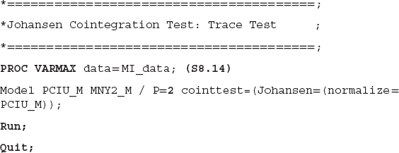
PROC VARMAX is used to employ cointegration, VECM, the Granger causality test, and other techniques. After the Model statement, a list of variables is provided—in the present case, the CPI (PCIU_M) and money supply (MNY2_M). The term P = 2 indicates the lag order of 2 is selected for the model. Since the Johansen cointegration approach employs a VAR (P) method, where P is standard for lag order, we must select a lag order. cointtest is a SAS keyword for a cointegration test, and we specify Johansen, for the Johansen cointegration test. If we do not specify the Johansen test, the SAS software will default to the Trace test. The normalize = PCIU_M instructs the SAS system to normalize the CPI-estimated coefficient to 1 because the CPI is our target variable and we are interested in finding the estimated coefficient of the money supply, which is our right-hand-side variable.
Results based on code S8.14 are reported in Table 8.10. The null hypothesis of both the Trace and Maximum tests is that there is no cointegration, and the alternative is that there is cointegration. If we reject the null hypothesis of no cointegration in favor of the alternative hypothesis of cointegration, then in the next step, we will estimate a VECM (P) model to quantify the short-run dynamics. Furthermore, it will be essential to determine whether to include a deterministic trend to capture the time trend in the series, a constant if a series follows a random walk with drift, or both.22 We construct the VECM (P) based on the information provided by the VAR (P) model (i.e., the cointegration test will determine the VECM (P) functional form).
SAS provides five different functional form options for a VECM (P):
- There is no separate drift in the VECM (P) form.
- There is no separate drift in the VECM (P) form, but a constant enters only via the error correction term.
- There is a separate drift and no separate linear trend in the VECM (P) form.
TABLE 8.10 The Johansen Cointegration Approach: The Trace Test

- There is a separate drift and no separate linear trend in the VECM (P) form, but a linear trend enters only via the error correction term.
- There is a separate linear trend in the VECM (P) form.23
In Table 8.10 under the label “Cointegration Rank Test Using Trace,” the column “H0: Rank = r” contains a value of “0,” which indicates that the maximum cointegration rank is zero—that is, no cointegration. The “H1: Rank > r” is also “0”—that is, the cointegration rank is greater than zero, which implies cointegration. The “Eigenvalue” and “Trace” columns provide the values of the Eigenvalue and Trace test statistics, respectively. The level of significance is 5 percent. The last two columns, “Drift in ECM” and “Drift in Process,” indicate the option (from 1 to 5) for the VECM (P). The first row indicates that the Trace test value (45.3478) is greater than the 5 percent critical value (15.34); that implies we reject the null hypothesis of a zero cointegration rank. From the second row, the Trace value 0.5106 is smaller than the critical value (3.84), which indicates we reject the null hypothesis of cointegration rank of “1.” That is, the results confirm that the CPI and money supply are cointegrated and the cointegration rank is 1. The last two columns show the “Constant” in the “Drift in ECM” and a “Linear” in the “Drift in Process.” This implies that there is no separate drift in the error correction model, and the column “Drift in Process” means the process has a constant drift before differencing.
The second part of table reports the “Cointegration Rank Test Using Trace Under Restriction.” The results also favor a cointegration Rank 1 between the CPI and money supply. Because the value of the Trace test (131.0457) in the first row is greater than the 5 percent critical value (19.99) and thereby we reject the null hypothesis of cointegration rank is 0 in favor of the alternative hypothesis which is the rank is greater than 0. However, we fail to reject the null hypothesis that the rank is greater than 1 at the 5 percent level of significance. Therefore, the cointegration rank is 1. The last two columns show option 2 for the VECM (P) as a “Constant” in the “Drift in ECM” and “Drift in Process” is identified. That is, there is no separate drift in the VECM (P) form, but a constant enters via the error correction model.
In sum, the results based on the cointegration Trace test suggest that the CPI and money supply are cointegrated—have a statistically significant relationship. Furthermore, two options, Case 2 and Case 3, are identified for the VECM (P), to quantify the short-run dynamics. The next step is to decide which case is more appropriate. The last part of Table 8.10 shows the results and the null hypothesis (H0) in Case 2 is more appropriate; the alternative is that Case 3 is a better form of the VECM (P). The cointegration rank 1 is selected from the first two parts of the table; therefore, we look at the last row, and under the label “Pr > ChiSq” (p-value of the Chi-square test), which is 0.054 and greater than 0.05. Therefore, at the 5 percent level of significance, we fail to reject the null hypothesis and suggest that Case 2 is a better form for the VECM (P).
The Johansen Cointegration Approach: The Maximum Test
SAS code S8.15 explains how to employ the Maximum test of cointegration. The only difference between code S8.14 (the Trace test) and S8.15 is that S8.15 specifies the Maximum test under the Type = Max.

TABLE 8.11 Johansen Cointegration Approach: Maximum Test

The results based on code S8.15 are displayed in Table 8.11. The “H0: Rank = r” explains cointegration rank of zero (in the first row), no cointegration. The second row indicates the cointegration rank is 1 (under “H0”), and “H1” suggests a rank of 2. At a 5 percent level of significance, we reject the null hypothesis of zero cointegration in favor of the rank of 1. That is, the Maximum test results also suggest a cointegration rank of 1 for the CPI and money supply.
The Vector Error Correction Model
The Johansen tests results indicate a cointegration rank of 1 for the CPI and money series, and Case 2 is selected for the VECM (P) form. SAS code S8.16 is employed to run a VECM of order 2—that is, VECM (2) and P=2 shows the lag order is 2. ECM is a SAS keyword for the error correction model and rank = 1 specifies a cointegration rank of 1. The keyword ectrend means Case 2 is followed for the fitted model. The option Print=(estimates) asks SAS to print the results. The results based on code S8.16 are displayed in Table 8.12.

The first part of Table 8.12 presents the summary of the estimation process—that is, the model type is VECM (2) and restriction on the deterministic term indicates that Case 2 is estimated. The estimation method is Maximum Likelihood, and a cointegration rank of 1 is included in the estimation process.
TABLE 8.12 Results Based on VECM: Case 2

Before we discuss the rest of Table 8.12, we explain the estimation process behind the VECM (2), which will help readers to interpret the estimated coefficients in the table. The VECM (2) estimates this set of equations:
![]()
![]()
| D = | the first difference of a series (i.e., D_PCIU_Mt represents the first difference form of the CPI) |
| t–1 = | a lag of one period is used (i.e., MNY2_Y(t–1) is the lag-1 of the money supply). |
In equation 8.3, we use the first difference of the CPI as a dependent variable. The independent variables include a lag of the dependent variable. Equation 8.4 contains the same right-hand-side variables, and the difference is the dependent variable, which is the first difference of money supply, D_MNY2_Mt. The error terms of the equation are εt and νt. Both equations include level and difference forms of the variables because the level form captures short-run dynamics and the difference form represents long-run fluctuations.
The second part of Table 8.12 shows the estimated coefficients of the CPI and money supply along with the intercept under the label “Parameter Alpha * Beta'Estimates.” The “Variable” represents variable names included in the estimated process, which are “PCIU_M” and “MNY2_M.” The estimated coefficients under “PCIU_M” are attached to the lag-1 of “PCIU_M” (which is the one-period lag of the CPI) in both equations. Since “MNY2_M(t–1),” which is the lag-1 of the level form of money supply, is also present in both equations, two estimated coefficients are reported under the label “MNY2_M.” The “1” shows constants (const1 and const2) of both equations.
The third part of Table 8.12 provides estimated coefficients corresponding to the lag of the dependent variables, which are the difference forms of the CPI and money supply. The last part of the table reports the estimated coefficients, standard error, t-value, and p-value. The first column on the right labeled “Variable” provides the names of the variables included in the equations. “EC” represents the ECTREND option, which is employed in Case 2. The “Equation” label names the dependent variables, and the SAS names of the right hand-side variables are reported under “Parameter.” The columns “Estimates” and “Standard Error” display estimated coefficients and their standard errors. The “t Value” and “Pr > |t|” columns provide t-values and p-values of estimated parameters.
An important note here is that the t-values and p-values are missing for the level form of the variables as well as for the constants. The reason is that the level form of the CPI and money supply are nonstationary; thus, their t-values are not reliable. However, the first differences of both series are stationary, hence t-values are reliable. The p-value of D_PCIU_M(t–1) is smaller than 0.05, which implies that, at a 5 percent level of significance, D_PCIU_M(t–1) is statistically significant and may help explain variation in the D_PCIU_Mt. The p-value attached to the D_MNY2_M(t–1) is greater than 0.05; that is, D_MNY2_M(t–1) is not statistically significant in explaining variation in the D_PCIU_Mt.
In Case 2, where D_MNY2_M is the dependent variable, both D_PCIU_M(t–1) and D_MNY2_M(t–1) are statistically associated with the dependent variable, evidenced by the p-values for both variables being smaller than 0.05.
The Granger Causality Test
Both the cointegration and ECM tests determine whether two (or more) variables are statistically associated with each other. Still, neither technique shows the direction of the relationship. That is, which is the leading variable and which is the lagging variable? For instance, the cointegration tests reveal that the U.S. CPI and money supply are cointegrated. In other words, the tests show that the CPI and money supply have a statistically significant relationship, but they do not indicate whether changes in the money supply lead changes in consumer prices. The Granger causality test, however, determines which variable leads and which variable lags; in other words, it shows whether changes in money supply Granger-causes changes in the CPI.
Although the level form of the CPI and money supply are nonstationary, the first difference forms of both series are stationary, as we discussed earlier in this chapter. Furthermore, a nonstationary dataset may produce spurious results. So we may need to test Granger causality analysis using the difference form of the variables because the first difference form is stationary and may provide reliable results. SAS code S8.17 is employed to run Granger causality analysis for money supply and CPI using the first difference form of both variables; dcpi represents the first difference of CPI and dm2 shows the difference form of the money supply. The two Causal statements are employed to test bidirectional Granger-causality. We use the same CPI and money supply dataset that we used for the cointegration and ECM models to identify whether the money supply Granger-causes CPI.
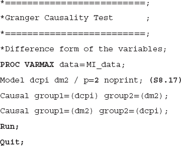
PROC VARMAX also provides a Granger causality test option. The Model statement fits the regression equations for the listed variables, dcpi and dm2 in the present case. The P = 2 option indicates a lag order of 2 is utilized in the regression equations. The VARMAX procedure runs a VAR(P) model to test Granger causality between the variables of interest, and the p = 2 indicates a VAR(2) model is estimated for the CPI and money supply data.24 The NOPRINT option suppresses output from the MODEL statement so no estimation results are printed and only results from the CAUSAL statement are printed.
TABLE 8.13 The Granger Causality Test Results, Using Difference Form of the Variables

Causal is a SAS keyword to run the Granger causality test. The term group1 specifies the dependent variable, and the right-hand-side variable(s) can be listed in the group2 option. Moreover, we state two Causal statements. The first considers the CPI (dcpi) as a dependent variable and money supply (dm2) as an independent variable. The second Causal statement treats money supply as dependent variable and the CPI as the independent variable. The null hypothesis of the test is that group2 does not Granger-cause the group1. In the present case, the first Causal statement, money supply, does not Granger-cause CPI. The alternative hypothesis is that money supply does Granger-cause CPI. It is important to note that we can assign more than one independent variable in the group2 option, in case we are interested in testing the causality of more than one variable.
The results based on code S8.17 are summarized in Table 8.13. Since we stated two Causal statements in the SAS code, two tests are performed. “Test1” determines whether money supply Granger-causes CPI, and “Test2” examines whether CPI Granger-causes money supply. In other words, a bidirectional Granger causality is tested between money supply and CPI.
The “Test1” results are reported in the first row, and the second row shows results for “Test2.” The column labeled “DF” provides information about the degrees of freedom. The Chi-square test results are shown under the label “Chi-Square,” and p-value for the Chi-Square test are presented in the column “Pr > ChiSq.” The first row provides the results for the null hypothesis, money supply does not Granger-cause CPI, and the p-value for the Chi-Square test is 0.6094, which is larger than 0.05. Therefore, at the 5 percent level of significance, we fail to reject the null hypothesis and suggest that money supply does not Granger-cause CPI.
As mentioned earlier, “Test 2” determines whether CPI Granger-causes money supply. The p-value for the Chi-square is 0.0004, which is smaller than 0.05. This indicates that, at a 5 percent level of significance, we reject the null hypothesis and conclude that CPI Granger-causes money supply.
Granger causality test results are sometimes sensitive to the lag orders. That is, different lag orders may produce different concluding results. That raises the question: Which lag order should be used? We suggest choosing the lag order using AIC and SIC criteria. The model with the smallest SIC/AIC would be the most appropriate.25
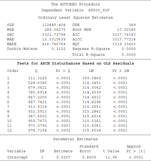
The ARCH/GARCH Model
Volatility in a time series may create challenges for decision makers. A volatile series can generate issues in the modeling and estimation process that lead to a spurious analysis; that is, we may find a statistical relationship between variables of interest due to volatility when, in fact, there is no relationship. What issues are created by the volatility of a series? Typically, financial data series are more volatile than economic time series, and the volatility often violates some fundamental OLS assumptions (i.e., variance is not constant and/or there is volatility clustering, known as heteroskedasticity). In either case, hypothesis testing based on OLS statistical results are not valid.26 In addition, in the presence of heteroskedasticity, the upper and lower limit of the forecast band based on the OLS would not be accurate.
Volatility has serious implications for a financial investor or planner. Typically a financial analyst would use the variance or standard deviation of returns as a proxy for risk to the average return from a purchase of an asset or portfolio. The variance is assumed constant, implying that the level of risk does not vary over time, which seems to be a strong assumption. In practice, however, returns from a portfolio fluctuate, and some periods are more risky than others for an investment. Yearly changes in the S&P 500 index are, for example, larger in some periods than others, indicating volatility (see Figure 8.3).
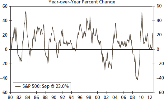
FIGURE 8.3 The S&P 500 Index (YoY)

The detection and correction of the volatility of a time series is important, and that is the focus of this section. The ARCH/GARCH approach helps to solve the volatility issue. SAS software offers options to estimate the ARCH/GARCH effect through the PROC AUTOREG command.
SAS code S8.18 is employed to test whether the S&P 500 (year-over-year percent change) has an ARCH effect; that is, whether the variance of the S&P 500 series is constant or not—whether the series has a volatility cluster. The ARCHtest option instructs SAS to perform the ARCH test on the series. The results based on code S8.18 are displayed in Table 8.14. The first part of the table shows statistics such as the sum of squared errors (SSE), mean square error (MSE), and Schwarz Bayesian Criterion (SBC), and the last part of the table provides estimated coefficients of the S&P 500 series.27 The ARCH test results are presented in the middle part of Table 8.14. Two different test results are presented: the LM test proposed by Engle (1982) and the Q test of Mcleod and Li (1983). The null hypothesis of both the LM and Q tests is that there is no ARCH effect (the variance is constant over time); the alternative is the presence of the ARCH effect (variance is not constant over time). SAS by default produces statistics for LM and Q tests. The p-values of both tests indicate that we reject the null hypothesis of no ARCH effect at the 5 percent level of significance. Put differently, the LM and Q tests support the idea that the S&P 500 series contains the ARCH effect. Implying that the variance is not constant over time and OLS results may provide a spurious conclusion about a statistical analysis using the S&P 500 series.
TABLE 8.14 Testing an ARCH Effect for the S&P 500 Index
The results presented in Table 8.14 suggest that the SP500_YoY series has an ARCH effect. In this section we show how the ARCH effect will influence the OLS results. We run a regression equation between the S&P 500 (YoY) and nonfarm employment (YoY) using SAS code S8.19. The results are summarized in Table 8.15.
TABLE 8.15 Testing Employment–S&P500 Relationship Using ARCH/GARCH


The first half of Table 8.15 shows results based on OLS not correcting for the ARCH effect. The estimated coefficient for “Employment_YoY” is 3.0705, the “Standard Error” is 0.4360, and the “t-value” is 7.04. The last part of the table provides results corrected for the ARCH effect and thereby more reliable results. The estimated coefficient for the employment series dropped to 1.0075, and the “Standard Error” and t-value are also smaller at 0.2420 and 4.16, respectively.
One key difference is that the magnitude of the relationship between the S&P 500 and the employment data series is smaller when we corrected the estimates for ARCH effect compared to the standard OLS results. For instance, in the case of the OLS results (first half of Table 8.15), the estimated coefficient for employment is 3.0705. That is statistically significant and implies that a 1 percent increase in employment growth may boost the S&P 500 index by 3.0705 percent.28 When we corrected estimates for the ARCH effect, the employment coefficient (1.0075) is much smaller and indicates that a 1 percent increase in the employment growth rate is associated with 1 percent growth in the S&P 500 index. The basic idea here is that in the presence of the ARCH effect, the estimated coefficients, and their standard errors/t-values tend to get larger than those that are corrected for an ARCH effect.
APPLICATION: DID THE GREAT RECESSION ALTER CREDIT BENCHMARKS?
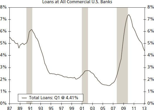
Despite the Federal Reserve's efforts to spur economic growth through extensive monetary policy, the current recovery has proceeded at a sluggish pace.29 Reviewing previous recoveries, the pattern of credit and lending has been an essential node in the transmission process of monetary policy. Here we take a statistical approach to review the patterns of bank loan delinquencies, chargeoffs, and the loan-to-deposit ratio. We find that in some instances, the pattern of these credit benchmarks has been altered, explaining some of the weakness in monetary policy transmission.
Delinquency Rates: Identifying Change Post-Great Recession
The ability to repay loans is influenced by the economic environment and therefore, as illustrated in Figure 8.4, loan delinquencies follow a predictable pattern over the business cycle. As would be expected, there is a sharp rise in delinquencies at commercial banks associated with the recessions of 1990– 1991, 2000–2001, and 2008–2009. Yet, beyond the typical cyclical pattern, there is a question about the sharp rise in delinquencies through the Great Recession. Was the change in delinquency rates across loan types significantly different? To anticipate, the answer is yes.
Source: Federal Reserve Board and Wells Fargo Securities, LLC
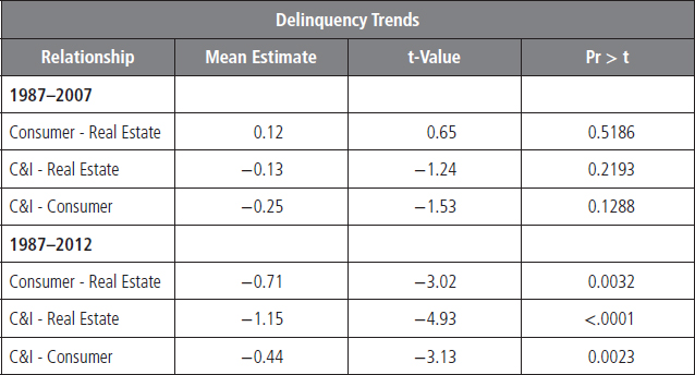
Broken down by loan category, data begins in 1987. We split the data sample into two periods: first, the period from 1987 to 2007, and then the entire sample period of 1987 to 2012 to see if the Great Recession had a significant effect on credit patterns. We can test whether there is a behavioral difference between credit categories—such as the degree to which delinquencies rise due to a recession or whether loan delinquencies vary by category in their reaction timing to recessions—by running a regression of the delinquency rates of varying loan types.
Our analysis shows that there was no statistically significant difference in the trends between loan categories from 1987 to 2007, see Table 8.16 for results. However, outcomes differ dramatically when 2007 to 2012 is included in the sample period. The past recession was driven by an imbalance in real estate markets, the residential market in particular. Therefore, the pattern between real estate and other loan types has been significantly altered and suggests that credit in these sectors may now function differently. Real estate delinquencies are now statistically different from consumer and commercial and industrial (C&I) loan delinquencies.
TABLE 8.16 Testing Delinquency Rates behavior over Two Different Time Periods
It is a simple regression analysis and an earlier part of this chapter discusses about a regression analysis.

FIGURE 8.5 Delinquency and Charge-offs
Source: Federal Reserve Board and Wells Fargo Securities, LLC
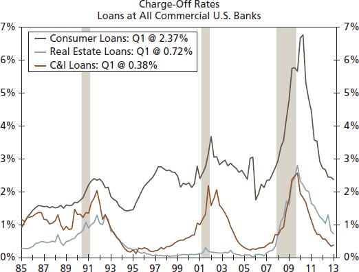
In addition, the relationship between C&I and consumer loan delinquencies has changed over time as C&I delinquency rates have tracked lower than consumer loans since the mid-2000s (see Figure 8.5). This difference is statistically significant and would support the view that C&I portfolios are stronger at this stage of the business cycle.
Source: Federal Reserve Board and Wells Fargo Securities, LLC
For the credit officer as well as the investor, there is a new playing field here in credit—at least for the time being. This would be a good time to evaluate our credit benchmarks in recognition of the difference in delinquency rates and perhaps adjust our credit criteria.
Patterns in Charge-off Rates: Identifying Differences in the Character of Trends
Similarly, some patterns in charge-off rates have also changed. While charge-offs also exhibit a distinct cyclical pattern, charge-offs for consumer loans appear to also have a gentle upward slope over time (see Figure 8.6). Are these patterns statistically significant and, if so, should we incorporate this information in our credit modeling? Yes, on both counts, see Table 8.17 for results.
For details about a time trend estimation, see chapter 6.
The uptrend in consumer loan charge-offs through the past three business cycles is consistent with the impression that over the past 30 years, credit availability has improved for many households (see Figure 8.7). However, with that availability, credit quality appears to have declined, therefore leading to higher charge-offs—particularly for consumer loans.
Breakdown of the Monetary Policy Transmission Mechanism
Recent years have brought forth a debate on the effectiveness of monetary policy. This debate focuses on the substantial increase in the Federal Reserve's balance sheet, the commensurate increase in excess bank reserves and yet only a modest rise in bank lending (see Figure 8.8). Bank lending has indeed risen since the recession ended—up 11 percent at commercial banks since bottoming three years ago. Yet the extent of the rise compared to the rise in bank reserves appears modest. This reflects a greater degree of caution on the part of many banks, evidenced by still tight credit standards, as well as regulatory uncertainty with respect to future capital requirements. This is not unusual as this reflects the pattern of the money multiplier concept. This multiplier varies over the business cycle as lenders and borrowers alternate between periods of caution and exuberance.30
TABLE 8.17 Identifying a Time Trend in Charge-off Rates


FIGURE 8.7 Banks' Willingness to Make Loans
Source: Federal Reserve Board and Wells Fargo Securities, LLC

FIGURE 8.8 Federal Reserve Balance Sheet
Source: Federal Reserve Board and Wells Fargo Securities, LLC
Figure 8.9 provides an illustration of the breakdown in the money multiplier process associated with the Great Recession of 2008–2009. Here the banking system witnessed a sharp drop in the ratio of loans to deposits, thereby reducing the money multiplier as banks are not turning over deposits into loans at a pace that was associated with the 1985 to 2007 period. Is this latest period a statistical break with the past?
It is clear from Figure 8.9 that the loan-to-deposit ratio in the current economic expansion is distinct from previous expansionary periods. Testing for a structural break confirms that this period is indeed different, see Table 8.18 for results. The loan-to-deposit ratio experienced a significant shift downward between the second and fourth quarter of 2009. This change has likely diminished the effectiveness of monetary policy since 2010 and would help explain the simultaneous existence of a very large Fed balance sheet, a large pool of bank excess reserves, and yet only a modest increase in bank loans. Such is the price of uncertainty in a post–Great Recession economy.

FIGURE 8.9 Loan-to-Deposit Ratio
Source: Federal Reserve Board and Wells Fargo Securities, LLC
TABLE 8.18 Identifying Structural Break(s) in the Loan-to-Ratio

SUMMARY
This chapter provides applications of several econometric techniques, including useful tips for an applied time series analysis and econometric techniques to determine a statistical relationship between variables of interest.
An analyst can start with a simple econometric analysis by estimating correlation and regression analysis for the underlying variables. In the next step, cointegration and ECM tests should be utilized to determine a statistical relationship between variables of interest. One reason is that most time series data are nonstationary at level form and regression and correlation results are not reliable in the case of nonstationary. Cointegration and ECM provide reliable results. For decision makers, it is important to determine the direction of the relationship, particularly which variable is leading and which one is lagging. Financial data series mostly suffer with the volatility cluster. To obtain meaningful results, we suggest utilizing the ARCH approach.
The final point we stress here is that the decision of what econometric techniques to utilize is dependent on the objective of the study. Therefore, familiarity with all of these techniques would be helpful in determining which technique is more suitable to fulfill the requirement.
1The focus of this book is applied time series analysis. Therefore, examples of time series data are used throughout in the book.
2Gambia is the smallest country on the African mainland, and the United States is the largest economy in the world. These two nations should not have a statistically significant correlation coefficient.
3The degrees of freedom indicate the number of observations included in the final estimation process.
4See G. S. Maddala and In-Moo Kim (1998), Unit Roots, Cointegration, and Structural Change (Cambridge, U.K.: Cambridge University Press).
5See William H.Greene, (2011), Econometric Analysis, 7th ed. (Upper Saddle River, NJ: Prentice Hall).
6See Chapter 5 for more details about this issue.
7See Chapter 5 for more details about model selection criteria.
8There are other options besides the average when converting monthly data into quarterly data, such as using the first (or last) monthly value for the quarter.
9It is possible to merge several different data files into one.
10Interestingly, all three variables are in different measurement scales (GDP is in billions of dollars, employment is in thousands of persons, and the S&P 500 index is an index of value 10 = 1941–1943).
11For more details about the correlation and Pearson correlation coefficient, see Chapters 8 and 9 of D. Freedman, R. Pisani, and R. Purves (1998), Statistics, 3rd ed. (New York: Norton).
12A better solution is to employ cointegration and the ECM approach, which we discuss in the next section of this chapter. For now, we just explain a simple way to run a regression analysis, which is to use growth rates of the variables of interest instead of the level form.
13For more details about autocorrelation issue and how to solve it, see Chapter 6 of G. S. Maddala and K. Lahiri (2010), Introduction to Econometrics, 4th ed. (Hoboken, NJ: John Wiley & Sons).
14For more details about nonstationary, spurious regression, cointegration, and ECM, see Maddala and Kim (1998).
15Chapter 6 of this book provides a detailed discussion about how to test for a unit root in a time series.
16The first and last parts of the Table 8.8 are similar to those of Table 8.3. We have discussed those parts in great detail in the regression analysis section of this chapter. See discussion under Table 8.3 for more details about measures of a model's goodness of fit as well as statistical significance measures of individual variables.
17For more detail about the “Single Mean” and “Trend” types, see the unit root test section of the Chapter 7 of this book.
18For more details, see Chapter 3 of D. N. Gujarati and D. C. Porter (2009), Basic Econometrics, 5th ed. (New York: McGraw-Hill Irwin).
19If estimated values are smaller than actual values, the error-ECM will contain negative values and the negative coefficient will adjust the estimated CPI upward and toward the actual CPI because a negative value multiplied by a negative value produces a positive value: that is, (–3) × (–4) = 12. Following the same logic, in the case of a positive error-ECM value, the coefficient will adjust the estimated CPI downward and toward the actual values.
20For more details about the cointegration approach, see Maddala and Kim (1998).
21See Maddala and Kim (1998) for more detail about the multivariate and VECM approaches.
22We strongly suggest consulting with the SAS user manual of SAS/ETS 9.3, chapter 35, the VARMAX Procedure, for technical details about the Johansen cointegration, Trace and Maximum tests, VAR(P), and five different options for a VECM(P). The manual is available at SAS web site: www.sas.com/.
23See the VARMAX procedure for more details about these cases.
24Since we select p = 2 for Johansen cointegration tests as well as for the VECM model, for consistency, we keep the same “p” for the Granger causality test.
25For more details about the lag selection in a model, see Chapter 14 of James H. Stock and Mark Watson (2007), Introduction to Econometrics, 2nd ed. (New York: Pearson, Addison Wesley).
26See Chapter 5 of this book for more details about the volatility issue and ARCH/GARCH.
27We have discussed these statistics in detail earlier in this chapter; see “The Regression Analysis.”
28Since both series are in growth rate (i.e., year-over-year percentage change), and that why we can interpret results, estimated coefficient, in term of growth rates. That is, a one percentage change in the employment growth is associated with a 1.0075 percentage change in the S&P 500 growth
29This section is adapted with permission from John E. Silvia, Azhar Iqbal, and Sarah Watt, “Identifying Change: Did the Great Recession Alter Credit Benchmarks?” Wells Fargo Securities, LLC, March 25, 2013. https://wellsfargoresearch.wachovia.net/Economics/Pages/default.aspx.
30See N. Gregory Mankiw (2010), Macroeconomics, 7th ed. (New York: Worth), pp. 551–553, and especially his discussion on the money multiplier experience during the 1930s.