
CHAPTER 4
Characterizing a Time Series
In decision making, many rules of thumb are employed in economics and finance—for example, the relationship between gross domestic product (GDP) and the unemployment rate (Okun's law), the unemployment rate and the job vacancy rate (Beveridge curve), and the inflation rate and money supply (money neutrality).1 In practice, however, these relationships need to be tested with the help of econometric techniques using real-world data. Why? Typically, economic theory suggests the direction of a relationship; for example, Okun's law suggests that a rise in GDP is associated with a decline in the unemployment rate. But how much? As a country's economy evolves, so do economic relationships. Furthermore, it is important to know the estimated magnitude of these economic relationships and how these relationships change over the business cycle and over time.
Knowledge of the magnitude of the relationship between GDP growth and the unemployment rate will help decision makers assess how jobs, income and thereby personal consumption follow the pace of GDP growth. For instance, during 2008 to 2010 of the Great Recession and early phase of the recovery, the Federal Reserve Board (monetary) and Presidents Bush and Obama (fiscal) introduced stimuli to boost the U.S. economy. U.S. GDP growth turned positive during 2009:Q3,2 and real GDP surpassed its prerecession peak in 2011:Q4. But as of August 2012, the unemployment rate remained well above its prerecession level, with around 4.7 million fewer workers on payrolls compared to January 2008, the previous peak of employment. The divergence in the recovery period of output and the labor market suggest that these two parts of the economy do not move hand and hand and such a difference remains essential to estimating consumer spending.
Two different paths for the unemployment rate (labor market) and GDP (output) raise the question whether Okun's law is still valid for the United States. If it is still valid, what is the precise linkage in this relationship? That is, how much of an increase in GDP is needed to reduce unemployment rate? How long does it take an increase in GDP to affect the labor market and help bring down unemployment? Would a rise in GDP help reduce unemployment in the same quarter, the following quarter, or even later? And why has the unemployment rate behaved differently in terms of recovery time from GDP during the recovery from the Great Recession?
Econometric techniques using real-world data help to answer these questions and quantify any economic or financial relationship. This chapter centers on the characteristics of a time series: how do we identify and define trends, cyclicality, structural breaks, and other pertinent features of a data series? Before an analyst can fit an individual data series into a bigger picture, he or she must understand how certain characteristics of the data might influence the outcome and the reliability of a regression analysis. Chapter 5 explains how to analyze relationships between two or more time series and how to fit the series into a regression framework. Chapters 6 through 8 discuss how to employ these techniques in SAS as well as how to analyze the econometric results.
WHY CHARACTERIZE A TIME SERIES?
For any time series, the first step is to characterize the behavior of that series. Once the behavior of a series is understood, an analyst can determine the appropriate model to test for a statistical relationship between that variable and any other variables of interest. Why is the behavior of a time series important? Time series do not all act in the same way, and characterizing a time series helps an analyst to understand the behavior of a variable of interest. Some variables may have a dominant time trend, like the upward trend of U.S. GDP over time. Other variables have a dominant cyclical trend, like the upward trend of the U.S. unemployment rate during recessions followed by the downward trend during expansions.
For any time series, consider the next questions to determine its behavior. First, how does the variable of interest behave over time (e.g., does the variable show evidence of an explicit time trend and does the series have a cyclical pattern over the business cycle)? If the series has explicit trend over time, is the trend linear or nonlinear? What is the behavior of the series during a particular phase of a business cycle? Does the series act differently during varying phases of the business cycle? For example, does the unemployment rate increase (decrease) at the same rate during each of the last four recessions (recoveries)?
There are several ways to identify and test for such characteristics, the first being a simple plot of the data versus time. A plot allows an analyst to see if there are any explicit patterns that could cause problems later on, such as outliers, an explicit time trend, or a cyclical pattern. If an analyst observes such characteristics, statistical tests described in detail throughout the chapter can identify the precise mathematical pattern. Additionally, an analyst should observe the descriptive statistics of the data. The mean, the standard deviation, and the stability ratio—which is the standard deviation as percentage of the mean—are of particular interest, enabling an analyst to identify the data's basic behavior and how it changes over time.
Another question an analyst should examine is whether the data varies in a predictable pattern, such as over the course of a business cycle? This question can be answered by identifying the presence of autocorrelation, in which case the error terms are correlated and each observation is related to its prior observation in some way. Such correlation causes underestimation of the standard errors, thereby violating ordinary least squares (OLS) assumptions as well. We demonstrate how to test for cyclical behavior of a series using autocorrelation functions (ACFs) and partial autocorrelation functions (PACFs). In addition, we use the Hodrick Prescott (HP) filter to separate the long-run trend components from the cyclical components of a series.
Other time series characteristics an analyst should understand relate to the basic assumptions of simple regression analysis. For example, we demonstrate how to test for a unit root using the Dickey-Fuller test; the Phillips-Perron test; and the Kwiatkowski, Phillips, Schmidt, and Shin test. Testing for a unit root determines whether the data series is stationary and if the series has a constant mean and variance over time. A basic OLS analysis assumes that data are stationary.
Last, we identify whether the data series contains a structural break using the Chow test and state space approach. One of the most important assumptions of any time series model is that the underlying process is the same across all observations in the sample. Therefore, if a time series includes periods of violent change, the series has acted differently during varying periods of its long-term trend. Forecasting future data points becomes difficult when there is a structural break in the data.
HOW TO CHARACTERIZE A TIME SERIES
A simple, but important, way to begin the analysis of any economic or financial variable is to plot the data against time. For instance, Figure 4.1 compares the year-over-year changes in productivity growth against its long-run average. A plot of a time series provides a visual look at the data. This should be the first step of any applied time series analysis because this step allows the analyst to identify any unusual aspects of the data series.
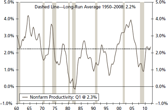
FIGURE 4.1 Productivity—Total Nonfarm (Year-over-Year Percentage Change, Three-Year Moving Average)
We define productivity growth as real nonfarm business output per hour of all persons, seasonally adjusted, and a year-over-year percentage change is used in the analysis. Shaded areas represent recessions declared by the National Bureau of Economic Research.
First, a plot shows whether the series contains one or more extreme values in the time series, an outlier, which impacts calculations (e.g., mean, standard deviation) done on any series. An analyst should attempt to understand the reason for such an extreme value, such as an unusual event or simply a misprinted value that should be corrected in subsequent releases.
Second, a plot suggests whether the variable of interest contains an explicit time trend or an indication that the series may have a cyclical pattern. Finally, a plot may also provide visible signal of a structural break in the time series. A structural break suggests that the model defining the behavior of the variable of interest, such as the unemployment rate, is different before and after the break.3
Figure 4.1 indicates that the rate of U.S. productivity growth does not contain an outlier or an explicit time trend. However, a cyclical pattern is evident in the productivity growth rate, as it tends to fall during recessions and rise rapidly during the early phase of recoveries. By adding the long-run average growth rate—2.2 percent during the 1950 to 2008 period—as a dotted line, we can surmise that there is some evidence of a structural shift that should be tested. For instance, during the 1960s to early 1970s, productivity growth stays persistently above the average long-run growth rate, while during the mid-1970s to mid-1990s, average growth turns to less than 2.2 percent. Finally, the post–mid-1990s era appears to have a higher average growth rate than 2.2 percent.4
TABLE 4.1 Three Eras of U.S. Productivity

Putting Simple Statistical Measures to Work
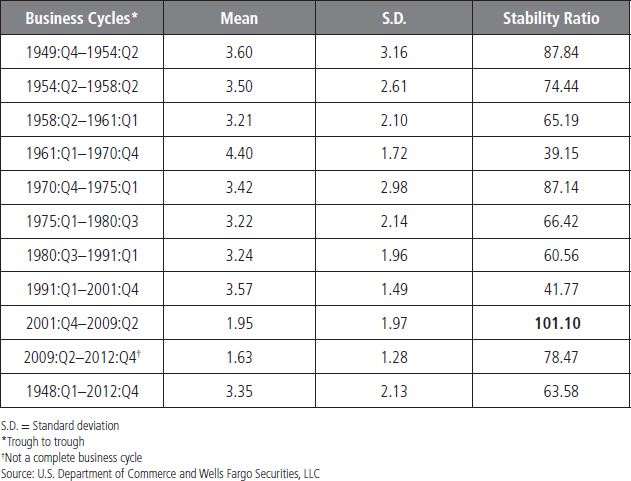
Another way to characterize an economic or financial variable is to estimate its mean (represents central tendency of a data series), standard deviation (shows how much deviation exists from the mean), and stability ratio—the standard deviation as percentage of the mean. Moreover, a time series can be divided into different periods when it appears that the series has changed and then the mean, standard deviation, and stability ratio can be estimated for each subsample. We can also test if the mean is statistically significantly different between periods.5 The data series can be divided between different business cycles, different decades, or even different eras, such as pre– and post–World War II.
So by what criteria, such as business cycles or decades, would an analyst divide a data series? The answer depends on the question he or she wants to answer. For instance, if an analyst wants to compare the real GDP growth rates between different business cycles, he or she separates the data into the dates corresponding with those business cycles, as in Chapter 1, Table 1.1. For productivity, the series has been split into three different eras (see Table 4.1 for results), following past work on productivity. The eras are: (1) the 1948 to 1973 era of strong productivity growth, (2) the 1974 to mid-1990s era of slow productivity growth, and (3) the post–mid-1990s era of “productivity resurgence.”6 These three eras are obvious in Figure 4.1.7 One major benefit of dividing this data into different eras and then calculating the mean, standard deviation, and stability ratio for each era is that it reveals how differently the rate of productivity growth behaved during these three eras, thereby suggesting possible structural shifts in the series.
From Table 4.1, the mean for the complete sample period is 2.23 percent with a standard deviation of 1.86, while the stability ratio is 83 (standard deviation is 83 percent of the mean). The stability ratio represents the volatility of productivity growth in each era, where a higher value of the stability ratio is an indication of higher volatility. One benefit of the stability ratio compared to the standard deviation is that it identifies the magnitude of the difference in volatility of productivity growth by era. For instance, if we set the standard deviation instead of the stability ratio as the volatility criterion, then the 1948:Q1–1973:Q4 period has highest standard deviation and the 1996:Q1–2011:Q4 has lowest. If we link the analysis to the standard deviation criterion, then the 1948:Q1–1973:Q4 is most volatile and 1996:Q1–2011:Q4 is least volatile. But the problem with this standard deviation criterion is that the 1948:Q1–1973:Q4 period also has the highest mean. Therefore, the standard deviation alone is not the best measure of volatility, especially when comparing different eras or different sub-samples, when the means of the series are also different. The stability ratio includes both the mean and standard deviation and gives us information about which subsample has a higher standard deviation relative to the mean for productivity growth. Therefore, the stability ratio better identifies which time series is more volatile.
Our results here indicate that productivity growth during the 1974:Q1–1995:Q4 period acts quite differently compared to the complete sample (1948:Q1–2011:Q4) and to other two sub-samples (1948:Q1–1973:Q4 and 1996:Q1–2011:Q4). The 1974:Q1–1995:Q4 period is associated with an average productivity growth rate of 1.38 percent, which is the lowest in our analysis. The standard deviation is higher than the mean for that period, and so the stability ratio is 122 percent. As a result, we would judge the 1974:Q1–1995:Q4 era to be the most volatile and the 1996:Q1–2011:Q4 to be the most stable era for productivity growth in our analysis.
In sum, these simple and easily applied techniques provide useful information and enable an analyst to observe the basic behavior of a time series over different periods or business cycles. An analyst can use SAS software to estimate a mean, standard deviation, and stability ratio.

FIGURE 4.2 10-Year Treasury Yield
Source: Federal Reserve Board
Identifying a Time Trend in a Series
Another important feature of any economic series, such as GDP, the consumer price index (CPI), and industrial production, is its time trend.8 In other words, if we plot a data series against time, does the series exhibit an explicit (upward or downward) trend over time? Using Figure 4.2, the U.S. 10-year Treasury note yield has a decreasing and, to some extent, linear trend since the mid-1980s. Many time series follow either a linear or a nonlinear trend. The existence of that trend influences the reliability of any forecast and statistical significance using that trended series. A linear trend implies that the series has a constant growth rate; a nonlinear trend exhibits a growth rate that is not constant over time. It is very important for an analyst to characterize a time trend in a time series, since the type of time trend reflects a different pattern of behavior over time and affects the statistical reliability of any measure of the behavior of that series. For instance, due to its constant growth rate, a linear time trend makes it easier to extrapolate future values compared to a series with a nonlinear time trend. However, the linear trend also creates nonstationarity (also known as trend stationary) in the data series, which makes OLS results unreliable, as we see later.
Testing for a Time Trend
We start by estimating a time trend in a data series by running a regression against time.
![]()
where
yt = variable of interest (e.g., GDP)
Time = time variable or time dummy
Time is generated artificially by setting Time equal to 1 for the first observation of the sample, to 2 for the second observation, and so on, up to T time periods. If the coefficient of Time, β1, is statistically significant, we can hypothesize that the series has a linear trend. Moreover, at some level we can interpret the sign of the β1 coefficient as to signal either an increasing (if positive) or decreasing (if negative) trend.
Some data series may not have a linear trend. Instead, a nonlinear trend may characterize the series better, or perhaps there is no trend at all. Using Figure 4.1, the U.S. productivity growth rate does not seem to follow a linear trend over time; thus a nonlinear trend may be a better fit for the data series. We employ a quadratic trend model to capture the nonlinearity and thereby will include a variable defined as Time2, time squared.
If β1 and β2 in Equation 4.2 are both statistically significant, then the series appears to follow a nonlinear trend. Note, a t-value indicates the statistical significance of a variable. In addition, the signs of β1 and β2 will determine the shape of the curve, either U shaped (for employment) or inverted U shaped (for industrial production).9 Figure 4.3 provides an idea of a U-shaped trend, and Figure 4.4 shows an inverted U-shaped trend.
![]()
Sometimes another type of nonlinear trend, other than the quadratic trend, may better fit a time series. A time series may be nonlinear in level form but linear in its growth rate. In another approach, we can take a logarithm of a time series, and the plot of that logged series may look like a linear trend. This case may be true for financial, business, and, sometimes, economic data series. This type of trend is known as exponential trend or log-linear trend.
![]()

FIGURE 4.3 U-Shaped Trend Between 2008 and 2012: Nonfarm Employment (Millions)
Source: U.S. Bureau of Labor Statistics

FIGURE 4.4 Inverted U-Shaped Trend Between 2003 and 2009: Industrial Production (2007 = 100, Seasonally Adjusted)
Source: Federal Reserve Board
A simple way to estimate an exponential or log-linear trend is to use the log form of a variable instead of the level form, shown in Figures 4.5 and 4.6. Since many variables are nonstationary at their level form, the growth rate of a series would provide not only a better fit of the trend but also provide more reliable statistical results. In the case of a nonstationary dataset, however, OLS results would be unreliable.

FIGURE 4.5 Exponential Trend, the S&P 500 Index
Source: Standard & Poor's

FIGURE 4.6 Log of the S&P 500 Index
Source: Standard & Poor's
Estimating a Time Trend
How can an analyst estimate a time trend? How can he or she determine whether the type of trend is linear or non-linear? Which trend type fits the data series best? The answer to these questions is that, with the help of SAS software, we can estimate an appropriate type of a time trend for any variable of interest. In the SAS framework, we generate a time trend variable and then test whether the time dummy is statistically significant. Furthermore, we utilize a number of statistical tests, including t-value, Akaike information criterion (AIC), and Schwarz information criterion (SIC), to determine what type of a trend is best fit for a particular variable.10
Identifying the Cycle in a Time Series
Another step for an analyst who wants to better understand a time series would be to determine whether an economic, financial, or business data series contains a cyclical pattern. For instance, a simple plot of the year-over-year percentage change in U.S. real GDP (see Figure 4.7) shows that GDP growth plunges during recessions, surges during the early years of recoveries, and then slows as the economic expansion ages. Therefore, the plot suggests that real GDP growth rate has a cyclical pattern.
Identifying cyclical behavior of a time series provides two major benefits for an analyst. Many economic, financial, and business variables evolve over time, and their growth rates usually fluctuate—or at least they do not follow a constant growth rate over time. Furthermore, the cyclical behavior of a series implies that changes in the growth rate of the series are temporary and that business cycle developments may be responsible for changes in values. Stated another way, the cyclical pattern of a series identifies the movements of that series around a long-run trend over time. The movements, the mean, and the standard deviation of any time series move away and then toward the trend growth, creating a cyclical (temporary) pattern as the series moves about its long-run trend growth rate. In contrast, if a change in a series is permanent and long lasting, then the series probably is characterized by a structural shift or a structural break in its growth rate.11 In this case, the mean and/or standard deviation of the series would move away from the long-run trend either permanently or for at least an extended period.
Another major benefit to identifying the cyclical pattern of any time series is that it would help predict the values of that series during a specific phase of a business cycle. In this sense, the use of econometrics can identify changes in the values of a series over an economic cycle, allowing decision makers to anticipate those changes and alter their business plans if necessary. Looking at Figure 4.7, the real GDP growth rate dropped during recessions and picked up during recoveries and expansions, while the long-run trend value of real GDP growth moves around its long-run average rate of 2.63 percent for the period 1980 to 2011. Within the current business cycle, the ability to distinguish acceleration and deceleration in economic growth has been highly beneficial to avoid the extreme forecasts of a recession or boom that many analysts have mistakenly, and frequently, made.

FIGURE 4.7 Real GDP (Year-over-Year Percentage Change)
Source: U.S. Bureau of Economic Analysis
Identify the Cycle
How does SAS software help identify the cycle in an economic, financial, or business time series? It is important to recognize that many, but not all, macroeconomic time series follow a predictable pattern over the business cycle and as such can be characterized by certain statistical properties. Two techniques will be employed to identify and characterize the cycle: (1) autocorrelation and partial autocorrelation functions and (2) Q-statistics and white noise.12
One key benefit, among many others, of the SAS software is that just one SAS command will produce ACFs and PACFs. An ACF is basically the ratio between the autocovariance and variance (i.e., the autocovariance divided by the variance). Because we are interested in autocorrelations at different displacements, we will generate ACFs for a time series for different lags (i.e., we can postulate the ACFs for the rate of U.S. employment growth up to 24 lags). Therefore, the ACFs for up to 24 lags would be:
![]()
The formula for the ACFs is just the usual correlation formula; the only difference in the ACFs is that we generate a series of correlations between a variable, yt, and it lags at a later distance, yτ. In correlation analysis, we generate a correlation coefficient between two different variables, let us say, xt and yt. The ACFs formula is:13

Note: We consider ACFs from τ = 114 because ACFs = 1 at τ = 0 at the current value of a variable always has a perfect correlation (which is 1) with itself.
Essentially, both PACF and ACF represent an association between yt and yt−τ, but the key difference is that the PACF represents a correlation between yt and yt−τ after controlling for the effects of yt−1, . . ., yt−τ+1. The ACF, however, indicates a simple correlation with yt and yt−τ and does not control the effects for yt−1, . . . . . ., yt−τ+1.
Analyze the Output: What Do We Learn from ACFs and PACFs?
Now, how can an analyst produce the plots of the ACFs and PACFs to determine whether a time series has cyclical pattern? How can an analyst know whether the ACFs and PACFs are indicating a cyclical pattern in a time series? Several techniques in SAS can produce the ACFs and PACFs plotted against the τ and generate the ACF and PACF plots up to 24 lags. Three rules of thumb determine whether a series exhibits a pattern of cyclical behavior: (1) ACFs are large relative to their standard errors; (2) ACFs have a slow decay; and (3) PACFs have a spike and are large compared to their standard errors.
Here, we characterize the U.S. nonfarm payrolls growth year-to-year percentage change using ACFs and PACFs. A plot of the payrolls growth (see Figure 4.8) suggests that it does not contain an explicit (linear) time trend, but it does suggest cyclical behavior. During expansions, employment growth tends to stay well above zero (positive) and then turns negative during recessions.
To confirm the cyclical behavior of the payroll growth series, we display the ACFs (see Table 4.2) and PACFs (see Table 4.3) along with two standard error bands (Std Error) in the far right column of the table. The ACFs for nonfarm payrolls growth are large compared to their standard errors and display slow one-sided decay. The PACFs show a spike at lag 1, and it is large, at least for the first four lags relative to their standard errors, but then values drop off sharply. Both the ACFs and PACFs of employment growth are indicating cyclical behavior (i.e., ACFs are large relative to their standard errors; ACFs have a slow decay; and PACFs have a spike and are large compared to their standard errors). In sum, based on the ACFs and PACFs, nonfarm payroll growth has a strong cyclical behavior consistent with our expectations of its behavior in economic cycles.

FIGURE 4.8 Nonfarm Employment Growth (Year-over-Year Percentage Change)
Source: U.S. Bureau of Labor Statistics
The two standard errors band provide an initial good rule of thumb to judge whether ACFs and PACFs are large relative to the standard error, but the analysis can be strengthened by testing whether a series has white noise or no serial correlation.15 If a series has white noise, it does not have a persistent behavior over time. If a series does not have white noise, also known as serial correlation or autocorrelation, we judge that the series follows a persistent pattern, in this case, a cyclical behavior for employment growth.
Two reliable statistical procedures can test the hypothesis whether the employment series displays white noise: Box-Pierce Q-statistic (Q_BP) and Ljung-Box Q-Statistic (Q_LB).16 Essentially, the null hypothesis of both Q_BP and Q_LB tests is H0: The series is white noise. The alternative hypothesis is HA: The series is not white noise. The consensus is that the Q_LB test, in small samples, performs better than the Q_BP.17 If we reject the null hypothesis, then the series does not display white noise and hence possibly follows a cyclical pattern. SAS software produces both Q_BP and Q_LB tests along with ACFs and PACFs.
TABLE 4.2 Employment Growth Autocorrelations (ACFs)

Testing for a Unit Root
One of the most important elements of time series analysis is to test whether a series is stationary or not, which is also known as testing for a unit root. A stationary time series implies the mean and variance of the series are constant over time. If the mean and/or the variance are not constant over time, then the series is characterized as nonstationary or as containing a unit root. Moreover, a stationary series fluctuates around a constant, long-run mean with a finite (constant) variance that does not depend on time; it is therefore mean reverting. If a series is nonstationary, then it has no tendency to return to its long-run mean, and the variance of the series may be time dependent.18 Furthermore, if one or more time series are non-stationary, the OLS method cannot be employed because it assumes the underlying data series are stationary. If the data series are nonstationary (often the case for many time series), then the OLS results will be spurious since the stationary assumption is violated and any perceived relationship between economic time series will not reflect the true relationship.
TABLE 4.3 Employment Growth Partial Autocorrelations (PACFs)

Dickey and Fuller (1979, 1981)19 proposed a standard unit root testing procedure that was first known as DF (Dickey-Fuller) test. In 1981 they extended the DF test into the ADF (augmented Dickey-Fuller) test of a unit root. Unit root testing became popular in economics, especially among macroeconomists, after the publication of the seminal paper by Nelson and Plosser (1982).20 They employed unit root methodology on 14 U.S. macroeconomic time series. They rejected the null hypothesis of a unit root for only one time series, which was the unemployment rate. Nelson and Plosser concluded that many macroeconomic series are nonstationary, which implies that many macroeconomic series exhibit trending behavior or a nonstationary mean and therefore are not mean reverting. Using such a series, often in level form, will produce unreliable results.
There are two major types of nonstationary behavior: difference stationary (DS) and trend stationary (TS).21 It is important for an analyst to identify whether the series follows DS or TS patterns because both sources of nonstationarity have different implications and solutions. If a series follows the DS pattern, then the effect of any shock will be permanent. To convert the series into a stationary process, an analyst would have to generate the difference of the series.22 A common source of nonstationarity is TS behavior, which implies that the series has a deterministic trend (upward or downward) over time. In this case, the analyst will regress the series on a time trend, using a time-dummy variable, in order to remove the trend. This is also known as detrending the series.
During the past 25 years, extensive research has been done in the area of unit root testing, and the results can be seen in the dozen of unit root tests available. Almost every unit root test has some advantages and some shortcomings. Dickey and Fuller (1979, 1981) introduced the eminent and first standard process for unit root testing, the ADF unit root test. Other unit root tests also have benefits. For instance, Phillips and Perron (1988)23 proposed an alternative to the ADF test, called the PP test, while Kwiatkowski, Phillips, Schmidt, and Shin (1992) introduced the KPSS test.24 The ADF and PP tests use the null hypothesis of a unit root (a time series contains a unit root) while the KPSS test has a stationary null hypothesis (i.e., a time series is stationary). ADF and PP tests are known as nonstationary tests; KPSS is known as a stationary test. We focus here on the ADF, PP, and the KPSS tests of unit root.
The Dickey-Fuller Tests
Let yt be a time series and consider a simple autoregressive of order 1 (AR (1)) process
![]()
where
ρ = parameter to be estimated
εt = error term and assumed to be white noise, which implies a zero mean and constant variance
Then the hypothesis of interest is
The test statistic is
![]()
where
![]() = least square estimate
= least square estimate
SE(![]() ) = usual standard error estimate
) = usual standard error estimate
Dickey and Fuller (1979) showed that under the null hypothesis of a unit root (ρ = 1), this statistic, tρ=1, does not follow the conventional student's t-distribution.26 They first considered the unit root tests and derived the asymptotic distribution of tρ=1, which is called a DF distribution. The standard DF test has the following form, after subtracting yt−1 from both side of Equation 4.6:
![]()
where
α = ρ − 1
The null and alternative hypothesis may be written as:
![]()
The key difference is that we will use the DF statistic, τ(tau) statistic, instead of the conventional t-distribution. In addition, the distribution of the corresponding DF statistic, ![]() , has been tabulated under the null hypothesis of α = 0.27
, has been tabulated under the null hypothesis of α = 0.27
As mentioned earlier, the two major sources of nonstationary are difference-stationary and trend stationary. Difference stationary is divided into two categories: random walk and random walk with drift. A random walk model implies that the current value of the y (yt) is equal to the lag of y (yt−1) plus an error term (εt). Equation 4.7 is an example of the random walk model. A random walk model is also known as a zero-mean model because it implies that a series has a mean of zero. But in practice, an economic series rarely has a zero mean. When we allow for a nonzero mean, it is known as a random walk with drift, and can be tested under Equation 4.8:
![]()
Random walk with drift and random walk (without drift) are both cases of difference stationary because the difference of the series must be generated in order to convert it into a stationary series. We can include a deterministic linear trend in the unit root test (Equation 4.8) such as:
![]()
where
time = dummy variable and artificially generated as time = 1 for the first sample observation, time = 2 for the second observation, and so on
Dickey and Fuller (1979) provided different tabulated values for all three cases: random walk, random walk with drift and deterministic trend and a constant.
One important issue related with the DF test of unit root is that it is valid only if the series yt follows an AR(1) process. If the series is correlated at a higher-order lag and follows an AR (p) process, where AR (p) > AR (1), then the assumption of a white noise error term is violated. The ADF offers a parametric correction for higher-order correlation by assuming that yt follows an AR(p) process and adding up to p lags differenced terms of the dependent variable, Δyt in this case, to the right-hand side of the test regression where p is lag order.
![]()
The standard ADF unit root test contains three different equations to be tested: the random walk case, the random walk with drift case, and the linear deterministic trend and a constant. The ADF test is a useful tool to identify stationarity of the series as well as the source of nonstationarity, if the series is not stationary.
The Phillips-Perron Test
Phillips and Perron (1988) proposed an alternative test of the unit root, which is known as the PP (Phillips-Perron) test. The PP test also has the null hypothesis of a unit root (nonstationary) and the alternative of no unit root (stationary). The major difference between the ADF and PP tests is how they control for serial correlation when testing for a unit root. The PP test estimates Equation 4.7 (of course, we can include drift, Equation 4.8, and a linear time trend, Equation 4.9), and then the PP test modifies the t-ratio of the α coefficient so that serial correlation does not affect the asymptotic distribution of the test statistic. The PP test is based on the statistic

where
tα = t-ratio of the α
γ0 = consistent estimate of the error variance of Equation 4.7 and calculated as ![]() , where K is the number of regressors in the equation
, where K is the number of regressors in the equation
f0 = estimator of the residual spectrum at zero frequency
T = sample size
SE(![]() ) = coefficient's standard error
) = coefficient's standard error
![]() = estimate of the α (α is from Equation 4.7)
= estimate of the α (α is from Equation 4.7)
S = standard error of the test regression
The standard DF test assumes that the error term is white noise, or no autocorrelation; if there is autocorrelation, then the ADF test will be used. The ADF test includes lag-dependent variables as a right-hand-side variable in the test equation to solve the autocorrelation issue. The greater the number of lags of the dependent variable, the fewer number of observations available for the estimation process, which is known as size distortion. The PP test, however, takes care of the autocorrelation issue through nonparametric statistics and does not include a lag-dependent variable as a right-hand-side variable.28
The Kwiatkowski, Phillips, Schmidt, and Shin Test
Kwiatkowski, Phillips, Schmidt, and Shin (1992) introduced the so-called KPSS test of a unit root. The KPSS test differs from the ADF and PP in that the null hypothesis is stationary (no unit root) and the alternative is nonstationary (unit root). The KPSS statistic is based on the residual from the OLS regression of yt on the exogenous variables x′t:
![]()
where
x′t = optional exogenous variables that may consist of constant, or a constant and a trend, and δ parameters to be estimated
εt error term = white noise
The Lagrange Multiplier (LM) statistic is defined as:
![]()
where
S(t) = cumulative residual function and can be estimated using the following:
![]()
based on the residuals ![]() .
.
f0 = estimator of the residual spectrum at zero frequency
One benefit of the KPSS test is that it can be used to confirm the conclusion from the ADF and PP tests since the KPSS test has a different null hypothesis. Overall, we recommend applying all three tests to statistically determine whether a series is stationary. Testing for a unit root in a series is a much better approach than simply assuming a series is stationary or nonstationary even when a visual interpretation of the data would suggest no unit root.
An analyst should know the concept of unit root testing. In Chapter 7 we show how to implement ADF, PP, and KPSS in SAS as well as how to determine whether a time series is stationary or nonstationary.
Structural Change: A New Normal?
Another important feature of applied econometric analysis is to identify whether a time series contains a structural break. The most important assumption of any time series model is that the underlying process is the same across all observations in the sample. All time series data, therefore, should be analyzed and tested for periods of an abrupt change in the time series pattern. Furthermore, if an economic, financial, or business data series contains a structural break, then the series acts differently during different time periods; therefore, any estimated relationship in one time period does not work in another time period—recall our discussion of Okun's law. As mentioned earlier in this chapter, the U.S. productivity growth rate between 1974 and 2011 had two different eras in terms of growth rates: the era of slow productivity growth from 1974 to 1995 and strong productivity growth from 1996 to 2011. The post–mid-1990s is known as the era of the productivity resurgence. Econometrically, the U.S. productivity growth rate experienced a structural break during the mid-1990s, “shifting” the growth rate of productivity upward.29
Why the break? One hypothesis is that it was caused by the information technology revolution. If a time series has a break in the trend growth rate—that is, if the trend growth shifted up or down and continued at this level for an extended period—then the time series will behave differently compared to the pre-break era. In the case of productivity growth, trend growth had shifted upward and stayed there for 15 to 20 years, signifying a break from the 1974 to 1995 period.
Why is it important for an analyst to identify a structural break in a time series? Typically, businesses and policy makers make decisions based on past behavior and currently available information and, as a result, simply extrapolate a time series. In reality, a time series may have a break in the trend and/or average growth rate. Therefore, decisions based on past rules of thumb can be misleading in the future. Consider again the breakdown in the money growth and inflation link after 1982.
Another example of a possible structural break is U.S. home prices. The S&P/Case-Shiller home price index, a measure for U.S. home prices, grew consistently during the period from 1997:Q1 to 2006:Q2 period (see Figure 4.9). This time period contained the 2001 recession, which did not appear to break the growth pattern of home prices. An analyst in 2005 who extrapolated home prices for the 2006 to 2010 time period would feel safe in not anticipating any structural break in the growth rate of home prices due to business cycles.
With the benefit of hindsight, this assumption proved to be disastrously wrong. Home prices fell continuously during the period from 2006:Q3 to 2009:Q1 throughout the United States. In addition, at least since 2009, the home price index had shifted downward. The average value for the S&P/Case-Shiller index for the 2009 to 2011 period is 132 compared to 167 for the 2004 to 2005 period, as can be seen in Figure 4.9.
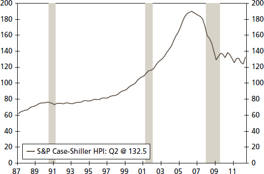
FIGURE 4.9 S&P Case-Shiller Home Price Index (not seasonally adjusted)
Source: S&P/Case-Shiller
Key factors behind the structural change in home prices and the housing boom/bust were a large number of foreclosures, credit tightening, significant job losses, and a fundamental change in the expectations of buyers that home prices would appreciate continuously. Moreover, legitimate buyers who assumed that home prices would not fall during the period from 2006 to 2010 faced serious financial challenges due to the structural change in the home prices.
As the two previous examples illustrate, an analyst should always test the possibility of a structural break in any time series in order to identify a change in the underlying pattern of economic fundamentals. In this section, we present three different ways to test for a structural break in an economic, financial, or business time series, all of which are made easy with the SAS software. First, we can run a regression against a dummy variable to test for a structural break where yt is the variable of interest.

Dummy is a break dummy, and it is generated artificially by assuming that TB is the break date, values for the dummy variable before the break are zero and, after the break, they take a value of 1. For instance, say yt is the U.S. home price index, and we are interested to test 2006:Q3 (the first quarter when home prices fell) as a break date. Then the TB is 2006:Q3 and the dummy equals 1 after 2006:Q2 and zero before and for 2006:Q2. If the coefficient, β1, is statistically significant, its t-value will allow a test of significance, and then we can assume the series has a structural break. Moreover, if the sign of the β1 coefficient is positive (negative), then the trend has shifted upward (downward).
Second, we can employ the Chow test,30 which enlists an F-test criterion, to determine whether the series has a break or not. The null hypothesis of the Chow test is that the series does not contain a structural break; the alternative hypothesis is that the series does contain a structural break. SAS software offers the Chow test, so an analyst only needs to know how to use the SAS procedure and interpret the results.
Both the break dummy and the Chow test are standard ways to test for a structural break. However, one limitation is that both approaches assume that an analyst can identify a break date prior to running these tests. This is known as an exogenous break date. What happens if an analyst does not suspect a particular break date? An unknown break date is called an endogenous break date. The state space approach considers an endogenous break and is explained in Chapter 7.
Separating Cycle and Trend in a Time Series: The Hodrick-Prescott Filter
How can the components of trend growth and the cycles around that trend for any given time series be distinguished? The method we have adopted here is the Hodrick and Prescott (1997)31 filter approach. This approach begins with the recognition that aggregate economic variables experience repeated fluctuations around their long-term growth path.32 Moreover, we can hypothesize that the growth or trend component of any economic series itself varies smoothly over time. That is, the trend in most variables is not a constant number but varies over time, as would be noticeable, for example, with productivity and real interest rates.
The HP filter has two justifications, one theoretical and one statistical. The theoretical part of the HP filter is connected with real business cycle (RBC) literature. In the RBC world, the trend of a time series is not intrinsic to the data but reflects prior outcomes of the researcher and depends on the economic question being investigated. The HP filter's popularity among applied macroeconomists results from its flexibility to accommodate these priors since the implied trend line resembles what an analyst would draw by hand through the plot of the data (see Kydland and Prescott, 1990).33
The selection mechanism that economic theory imposes on the data via the HP filter can be justified using the statistical literature on curve fitting. The conceptual framework presented by Hodrick and Prescott (1997) can be summarized as follows, and our text closely follows their work:

where
T = sample size
A given series yt is the sum of a growth component gt and a cyclical component ct. There is also a seasonal component, but as the data we often use are seasonally adjusted, this component has already been removed by those preparing the data series.
In this framework, the HP filter optimally extracts a trend (gt), which is stochastic but moves smoothly over time and is uncorrelated with a cyclical component (ct). The assumption that the trend is smooth is imposed by assuming that the sum of squares of the second differences of gt is small.
An estimate of the growth component (gt) is obtained by minimizing
![]()
where ct = yt − gt is the cyclical component, which is the deviation from the long-run path (expected to be near zero, on average, over long a time period) and the smoothness of the growth component is measured by the sum of squares of its second difference:
![]()
where L = lag operator (e.g., Lxt = xt−1)
The parameter λ (in Equation 4.17) is a positive number that penalizes the variability in the growth component (gt). That is, the larger the value of λ, the smoother the solution to the series. The parameter λ helps us to reduce variability and smooth the series gt and provides a deterministic trend. Note here the role of the prior knowledge of the researcher and the fact that those priors could be biased and therefore lead to biased results. For a sufficiently large λ, at the optimum all the gt+1 − gt must be arbitrarily near some constant β, and therefore the gt is arbitrarily near g0 + βt. This implies that the limit of solutions to Equation 4.17 as λ approaches infinity is the least squares fit of a linear time trend model. In this context, the “optimal” value of λ is ![]() where δg and δc are the standard deviations of the innovations in the growth component (gt) and in the cyclical component (ct), respectively.
where δg and δc are the standard deviations of the innovations in the growth component (gt) and in the cyclical component (ct), respectively.
For an analyst, it is important to determine the value of the λ in order to apply the HP filter on any time series. Fortunately, past research has determined different values of λ for different types of data frequency. A low-frequency economic data series, such as an annual time series, is usually less volatile than a quarterly time series. For instance, Hodrick and Prescott (1997) suggested the value of λ = 1,600 for quarterly data and for annual observations; Baxter and King (1999) have used a λ value of 100.34 For a monthly time series, Zarnowitz and Ozyildirim (2006) used a value of λ = 14,400.35
There are several issues related to the cyclical component (ct). By definition, ct = yt − gt, and yt is the natural logarithm of a given time series. This is one advantage of using log form instead of level form, since the change in the growth component (gt), gt − gt−1, corresponds to a growth rate. Nelson and Plosser (1982) concluded that many macroeconomics series contain a unit root in their level form. The yt naturally may be one of them (nonstationary at level), and we can test this in our application. The growth component (gt) should be nonstationary, as it is a trend (long-run trend growth) component of a given series and should be smooth, but this will also need to be tested.
Since the cyclical component (ct) is a deviation from the growth component, and it is expected to be stationary, the economy's output should exhibit reversion to trend growth, and the effect of shocks, though they may persist over time, should decline and eventually die out. In other words, the stationarity of ct implies that no matter what kind of fluctuations occur in the series, deviations from its long-run growth component (gt) are temporary and the series will move, on average, smoothly over time toward trend.
One key advantage (among many others) of the HP filter is that once we estimate the gt and ct, we can identify, at any point of time, whether the current value of a series is below trend growth or above trend. This feature of the HP filter presents, therefore, a useful policy guideline that may help policy makers in their decision-making process. For instance, let yt represent real GDP (log form) and gt its long-run growth path if the economy continuously grew, but at a rate less than gt, for a period of three years (2010–2012). In this case, the economy is experiencing subpar growth, not in level terms, but in growth terms. That will require an adjustment in the behavior of producers, consumers, and policy makers without adopting more radical policy changes associated with recessions since the economy continues to grow, just at a slower pace. It is certainly possible to conceive of a severe and long period of below-trend growth that causes more hardship on a cumulative basis than a mild and short recession, as persistent underperformance will alter, over time, incentives and expectations of economic agents. In fact, long slowdowns in employment and demand growth have occurred repeatedly in recent times (1992–1994, 2002–2004) even while output and supply growth held up well, supported by the process of technology and productivity (Zarnowitz and Ozyildirim, 2006). So, with the help of the HP filter, we can judge where the economy stands relative to trend and adjust our policies and objectives accordingly, rather than reverting to policies typically used to respond to a recession. An economic slowdown requires some serious considerations and adjustments by both public and private decision makers. Yet such adjustments must be made in the context of our assessment of the economic behavior relative to trend as we judge by using the HP filter.
APPLICATION: JUDGING ECONOMIC VOLATILITY
For many economic series, volatility is often cited but seldom quantified. Over the years, we have sought to provide a perspective on this concept in many investment decisions. One primary lesson we have learned is that when we provide a context for the concept of volatility, decision making is improved.
Look at the Data
A simple but important way to begin the analysis of any economic or financial variable is to plot the data against time. For instance, Figure 4.10 compares the year-over-year change in GDP growth against its long-run average.36 A plot of a time series provides a visual look at the data. This should be the first step of any applied time series analysis because this step allows the analyst to identify any unusual aspects of the data series. A plot shows whether the series contains an outlier—one or more extreme values in the time series—which impacts calculations, such as the mean or standard deviation. An analyst should attempt to understand the reason for such an extreme value, such as an unusual event or simply a misprinted value that should be corrected in subsequent releases.

Source: U.S. Department of Commerce and Wells Fargo Securities, LLC
Second, a plot may also provide evidence to suggest whether the variable of interest contains an explicit time trend or a cyclical pattern. Third, a plot may also provide a visible indication of a structural break in the time series. A structural break suggests that the model defining the behavior of the variable of interest, such as the unemployment rate, is different before and after the break.
Figure 4.10 indicates that the real rate of U.S. economic growth does not contain a substantial outlier or an explicit time trend. However, a cyclical pattern is evident in the real GDP growth rate, as it tends to fall during recessions and rise during the early phase of recoveries. By adding the long-run average growth rate—3.4 percent during the period from 1950 to 2008—as a dotted line, it is clear that the pace of growth in this expansion has changed markedly. For instance, during the 1960s and 1970s, real growth during expansions tracks above the average long-run growth rate, while since the mid-1980s, growth has trended lower than the long-run average.
Putting Simple Statistical Measures to Work
Another way to characterize an economic or financial variable is to estimate its mean (the central tendency of a data series), standard deviation (how much deviation exits from the mean), and stability ratio—the standard deviation as a percentage of the mean. A time series can be divided into different periods when it appears that the series has changed. Then the mean, standard deviation, and stability ratio can be estimated for each subsample. We can also test if the mean is statistically different between periods. The data series can be divided between different business cycles, different decades, or even different eras, such as pre– and post–World War II.
TABLE 4.4 Real GDP (Annualized Rate)

Here we compare the real rate of GDP growth during different business cycles. We separate the data into the dates corresponding with those business cycles, as seen in Table 4.4. For real GDP, the mean (average) growth rate varies significantly over different business cycles, with fairly rapid growth in the 1958 to 1980 period and then a much more modest growth rate in the period since 2001. Yet the standard deviation, one measure of variability in the series, also moves quite a bit during these decades. One major benefit of dividing this data into different eras and then calculating the mean, standard deviation, and stability ratio for each era is that it reveals how differently the rate of economic growth behaved during each of these economic cycles. Thereby it assists us in putting growth into some context for assessing volatility.
As shown in Table 4.4, the mean growth rate for GDP between 1948 and 2012 period is 3.22 percent, with a standard deviation of 2.72 and a stability ratio of 84.41. (The standard deviation is 84 percent of the mean.) The stability ratio represents the volatility of real GDP growth in each era, where a higher value of the stability ratio is an indication of more volatility. One benefit of the stability ratio compared to the standard deviation is that it identifies the magnitude of the difference in volatility of real growth by era compared to a benchmark average growth rate. For instance, if we set the stability ratio as the volatility criterion, then the period from 2001:Q4 to 2009:Q2 stands out as a period of low but relatively volatile growth. In contrast, the decades of the 1960s through 1980s were a period of better growth and more stable economic performance. From our viewpoint, the standard deviation alone is not the best measure of volatility. We would prefer the stability ratio to give us a sense of balance between growth and its relative variability. The stability ratio includes the mean and standard deviation and gives us information about which subsample has a higher standard deviation relative to the mean for growth. Therefore, it better identifies which time series is more volatile.
TABLE 4.5 Real Final Sales (Year-over-Year Percentage Change)

Tables 4.5 and 4.6 provide detail on the behavior of two other aggregate economic series, real final sales and real personal consumption. In both cases, we find that the 2001 to 2009 business cycle is the most volatile, and the average growth rates of real final sales and real personal consumption were both below their long-run average. These results reinforce the view that households and businesses are less confident today than in prior economic periods. Unease at the household level is reinforced by the observations we can quantify with the data.
TABLE 4.6 Real Personal Consumption (Year-over-Year Percentage Change)
Corporate Profits
Recent commentaries have noted corporate profits as recording outsize performance compared to the past, and the analysis here suggests that profits growth has indeed been stronger than the long-run average. However, note that the current cycle has not yet been completed, and profits growth tends to moderate further into the business cycle. As illustrated in Table 4.7, corporate profits growth in the 2001 to 2009 cycle averaged 6.40 percent, which was below the average of 7.95 percent in the period from 1948 to 2012. Moreover, the volatility of these profits, measured by the stability ratio, is above that of the average of the long-run average. The fastest pace of growth for profits appeared in the period of high inflation from 1975 to1980, while the most volatile period appeared to be the period from 1954 to 1958.
Focus on the Labor Market Using Monthly Data
Tables 4.8 and 4.9 provide details on the behavior of two measures of the labor market that are highlighted in private strategic planning and in public policy, employment growth, and the unemployment rate. For employment, the most recently completed business cycle of 2001 to 2009 has been the weakest period of average job growth as well as the most volatile, based on the stability ratio. Moreover, by both labor market measures, we can appreciate the challenges to household confidence and public policy in that today's labor market is truly different from in the past. These results reinforce the view that careful analysis of the data provides value in our evaluation of the economy and helps explain the disappointing sentiment expressed by many in the current environment.
TABLE 4.7 Corporate Profits (Year-over-Year Percentage Change)
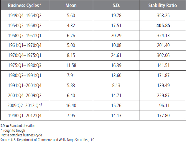
TABLE 4.8 Employment Growth (Year-over-Year Percentage Change)


Financial Market Volatility: Assessing Risk
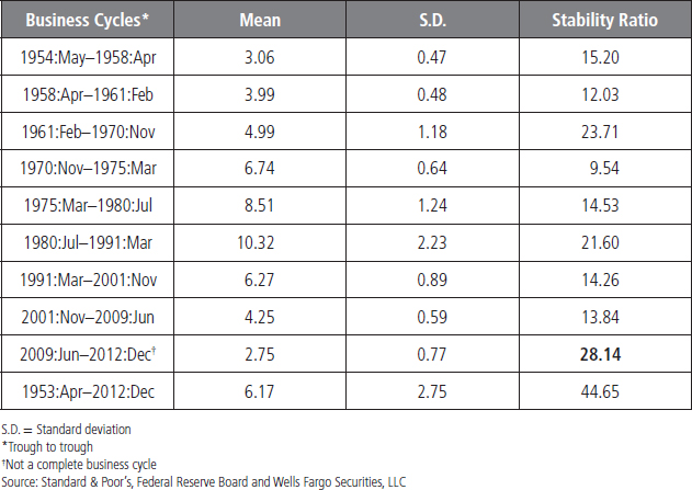
For financial markets, risk is often measured by volatility. Tables 4.10 and 4.11 show calculations for volatility in the S&P 500 Index and 10-year Treasury yield, two financial benchmarks. For the S&P 500, we find that the previously completed business cycle of 2001 to 2009 has been the worst period for average S&P performance since the early 1970s, when rising oil prices, rapid inflation, and high interest rates plagued the economy. Moreover, the volatility of the 2001 to 2009 period is also quite high. The 1970 to 1975 period, however, remains the most volatile period for the S&P 500 Index. The 1970 to 1975 and the 2001 to 2009 periods were characterized by disappointing performance relative to the average gain of 8.4 percent over the 1948 to 2012 period as well as a much higher level of volatility. Both were periods of weak equity market performance and a difficult time for household wealth and confidence.
TABLE 4.10 S&P 500 (Year-over-Year Percentage Change)

TABLE 4.11 10-Year Treasury Yield
SUMMARY
These simple and easily applied techniques provide useful information and enable an analyst to observe the basic behavior of a time series over different periods or business cycles. An analyst can use SAS to plot the series and to calculate the mean, standard deviation, and stability ratio. SAS software can also help to estimate a mean, standard deviation, and stability ratio.
1For more detail about these relationships see, Gregory N. Mankiw, (2010), Macroeconomics, 7th ed. (New York, NY: Worth).
2The Federal Reserve Board reduced the Fed funds target rate to the 0 to 0.25 percent range on December 2008. In addition, the Fed implemented a large number of programs to support the financial markets (i.e., the Term Auction Facility and Term Securities Lending Facility, etc). In terms of fiscal stimulus, the 2008 tax stimulus and the American Recovery and Reinvestment Act of 2009, along with several others, were introduced to combat the Great Recession and to stimulate the recovery.
3Detailed discussions about a time trend, cyclical pattern, and a structural break are provided in the next sections.
4Many studies confirm the idea of structural breaks in the U.S. productivity growth rate since the 1947. For more details, see John B. Taylor (2008), “A Review the Productivity Resurgence,” paper presented at the American Economic Association Annual Meeting, January 8, New Orleans, Louisiana.
5See for more detail, D. Freedman, R. Pisani, and R. Purves (1997), Statistics, 3rd ed. (New York, NY: W. W. Norton).
6The post–mid-1990s era experienced a strong productivity growth compared to last couple of decades and thereby is known as the era of productivity resurgence; see Taylor (2008) for more detail.
7Basically, we use prior knowledge from other studies to divide the data series—productivity growth rate in this case—into three different eras.
8Broadly speaking, a trend has two types: deterministic and stochastic. Here we discuss and characterize a deterministic trend into a linear and/or a nonlinear time trend. In the unit root section, we talk about a stochastic trend.
9For more detail, see Francis X. Diebold (2007), Elements of Forecasting, 4th ed. (Mason, OH: Thomson), Chapter 5.
10We provide detailed explanations of AIC and SIC in Chapter 5.
11We provide a detailed discussion about a structural break later in this chapter.
12For more detail, see William H. Greene (2011), Econometric Analysis, 7th ed. (Upper Saddle River, NJ: Prentice Hall).
13We present this ACF formula only so the reader can understand only how to calculate ACFs; we expect the reader to generate ACFs by using the SAS software.
14Note: We use τ (tau) for lag order and t for time period.
15White noise and autocorrelation are very important concepts. We provide a detailed discussion of both concepts in chapter 5.
16For more details, see Greene (2011).
17For more details, see Diebold (2007), Chapter 7.
18For a detailed discussion about the unit root concept, see G. S. Maddala and In-Moo Kim (1998), Unit Roots, Cointegration, and Structural Change (Cambridge, UK: Cambridge University Press).
19D. Dickey and W. Fuller (1979), “Distribution of the Estimators for Autoregressive Time Series with a Unit Root,” Journal of American Statistical Association 74: 427–4311; D. Dickey and W. Fuller (1981), “Likelihood Ratio Tests for Autoregressive Time Series with a Unit Root,” Econometrica 49: 1057–1072.
20Charles R. Nelson and Charles Plosser, (1982), “Trends and Random Walks in Macroeconomic Time Series: Some Evidence and Implications,” Journal of Monetary Economics 10, no. 2, 139–162.
21It is important to note that if a series is DS, then it may contain a stochastic trend. A stochastic trend implies the trend is driven by random shocks and there is no particular trend to which it returns, see Maddala and Kim (1998) for more detail about stochastic trend.
22If the first difference of the series is stationary, then the series is called first-order stationary or the order of integration is 1. We can write first-order stationary as I(1), general form is I(d), where “I” stands for integration and “d” is order of integration.
23P. Phillips and P. Perron (1988), “Testing for Unit Roots in Time Series Regression.” Biometrika 75, 335–346.
24D. Kwiatkowski, P. Phillips, P. Schmidt, and Y. Shin (1992), “Testing the Null Hypothesis of Stationarity Against the Alternative of a Unit Root,” Journal of Econometrics 54, 159–178.
25Here stationary means “weak stationary,” also known as covariance stationary. For strict stationary, one must employ conditional probability on the series, which is not an easy task in applied econometrics. Therefore, we are following the weak stationary approach. We use the terms stationary and mean reversion interchangeably throughout the book.
26Since the time series under consideration does not have a constant mean and variance, the traditional student's t-distribution cannot be employed as the t-distribution assumes a constant mean and variance.
27Tables are available in Fuller (1976). The SAS software automatically produces the table value along with estimated ![]() values.
values.
28The nonparametric statistics discussion is beyond the scope of this book, but interested readers can consult Maddala and Kim (1998).
29See for a detailed discussion, Mark Vitner and Azhar Iqbal (2013), “Is Productivity Growth Too Strong for Our Own Good?” Business Economics 48, 29–41.
30Gregory C. Chow (1960), “Tests of Equality between Sets of Coefficients in Two Linear Regressions,” Econometrica 28, no. 3, 591–605.
31R. Hodrick and E. P. Prescott, (1997). “Postwar U.S. Business Cycles: An Empirical Investigation,” Journal of Money Credit and Banking 29, 1–16.
32Robert E. Lucas Jr. (1981), Studies in Business Cycle Theory (Cambridge, MA: MIT Press).
33Finn E. Kydland and E. C. Prescott, (1990). “Business Cycles: Real Facts and a Monetary Myth,” Federal Reserve Bank of Minneapolis Quarterly Review 14, no 2, pp. 3–18.
34M. Baxter and R. G. King (1999), “Measuring Business Cycles: Approximate Band-Pass Filters for Economic Time Series,” Review of Economics and Statistics 81, 573–593.
35V. Zarnowitz and A. Ozyildirim (2006), “Time Series Decomposition and Measurement of Business Cycles, Trends and Growth Cycles,” Journal of Monetary Economics 53, 1717–1739.
36We examine the real GDP series here since it is the primary measure of economic success and a benchmark. The series is seasonally adjusted and an annualized quarterly growth rate is employed here in the analysis. Shaded areas represent recessions declared by the National Bureau of Economic Research.