We cannot emphasize enough how important it is to understand the underlying dataset. In the current scenario, we are dealing with a visual dataset consisting of over 10,000 samples spread across 120 classes (dog breeds). Readers can refer to all the steps related to exploratory analysis in the IPython Notebook titled dog_breed_eda.ipynb.
Since this is a visual dataset, let's first visualize a few samples from the dataset. There are multiple ways to ingest and visualize image data in Python; we will be relying on SciPy and matplotlib-related utilities to do so. The following snippet imports the required libraries:
In [1]: import os
   ...: import scipy as sp
   ...: import numpy as np
   ...: import pandas as pd
   ...:
   ...: import PIL
   ...: import scipy.ndimage as spi
   ...:
   ...: import matplotlib.pyplot as plt
   ...: import seaborn as sns
   ...:
   ...:np.random.seed(42)
Since the dataset is huge, we prepare a couple of utilities to load a random batch of images and to display the selected batch. The utility functions are titled load_batch() and plot_batch(); details of these are available in the IPython Notebook. The following snippet plots the random batch for reference:
In [7]:batch_df = load_batch(dataset_df,
   ...:                       batch_size=36)

In [8]:plot_batch(batch_df, grid_width=6, grid_height=6
   ...:           ,im_scale_x=64, im_scale_y=64)
The generated output is as shown in the grid as follows:

From the preceding grid, we can see that there is a lot of variation, in terms of resolution, lighting, zoom levels, and so on, available along with the fact that images do not just contain just a single dog but other dogs and surrounding items as well. We also need to understand how different the image dimensions are. Using the following snippet, we generate a scatter plot to understand them:
 In [12]: plt.plot(file_dimension_list[:, 0],
                   file_dimension_list[:, 1], "ro")
    ...: plt.title("Image sizes")
    ...: plt.xlabel("width")
    ...: plt.ylabel("height")
The generated scatter plot is as shown as follows. We can clearly see that the maximum number of images fall within 500 x 500 dimension, but we do have variations in shapes:

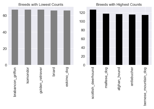
The dog breed distribution also needs to be checked to understand what we are dealing with. Since we have a labeled dataset, we can easily check. The following snippet uses pandas to plot the breed distribution:
 In [13]: fig = plt.figure(figsize = (12,5))
    ...:
    ...: ax1 = fig.add_subplot(1,2, 1)
    ...:dataset_df.breed.value_counts().tail().plot('bar',
    ...:                   ax=ax1,color='gray',
    ...:                      title="Breeds with Lowest Counts")
    ...:
    ...: ax2 = fig.add_subplot(1,2, 2)
    ...:dataset_df.breed.value_counts().head().plot('bar',
    ...:                ax=ax2,color='black',
    ...:                   title="Breeds with Highest Counts")
The dataset is not evenly split; certain breeds have more samples compared to others. This is evident from the plot in the following diagram:

Such a dataset requires a thorough exploration. We have covered a few of the exploratory steps in this section. Further steps are listed/performed in the referred IPython Notebook. Readers are encouraged to go through the steps to understand the impact of image resizing, how different layers detect different features, grayscaling, and so on.
