
3
Understanding the New User Interface
WHAT'S IN THIS CHAPTER?
- Becoming familiar with web navigation
- Understanding the new approach to layout
- Identifying the different types of views
- Become familiar with the new ribbon
- Explore the backstage
- Getting acquainted with SharePoint and Office365
- Understanding layout in mobile devices
In this chapter, you become familiar with the new approach to the user interface introduced in Access 2013 web apps. As you learned in previous chapters, almost everything about web apps is a departure from prior versions of Access. This clean break from the past permitted Microsoft to refocus on how users interact with their apps in the browser and create an experience more in line with their expectations for web apps. You analyze the elements of the web interface, including both the surface and control elements in the web page, and the working surface. You see how the approach to layout in an Access web app adheres to design patterns and restrictions in the web interface. Along the way, you learn how web navigation is supported by the new elements and features of the user interface.
This chapter provides an introduction to the types of views available and how they relate to user interface requirements, although a more in-depth discussion of designing those views is reserved for Chapter 4. In the final sections of this chapter, you see how the backstage has changed from the previous version of Access. You learn how to exploit the tools and features it offers. And we end with a review of the Access 2013 ribbon, with special emphasis on the reduced elements for Access web apps.
WEB NAVIGATION
Although there are significant differences between navigation on the web and navigation in a client database, it is worth starting out with an acknowledgement that, in at least one way, they share common features, which you'll leverage from your Access experience. First, of course, the objective of all navigation is to enable a smooth flow between working functions in the database, with a minimum of mouse-clicks. Second, a good navigation framework helps users stay “grounded” within the application, so they know where they are at any point and how to get back to a prior place when they need to. Third, navigation should reinforce the overall structure and organization of the application. And finally, the navigation framework should follow well known, or at least intuitive, patterns so that users don't need to spend precious time trying to work out how to do their tasks. As you look at the navigation framework for Access web apps, try to keep these features in mind.
Navigation Tools
Design patterns for navigation in a web environment include the following elements. We list them first, then discuss the ones found in Access web apps, and then give you a chance to see how they are implemented in Access web apps.
- Navigation bar
- Top horizontal
- Side vertical
- Search navigation
- Tab navigation
- Breadcrumb navigation
- Tags navigation
- Fly-out menu and drop-down menu navigation
- Faceted or guided navigation
- Footer navigation
- Combined navigation
You'll notice that none of the web navigation methods resemble the kind of switchboard with multiple command buttons for which Access is infamous. Many experienced developers moved away from the switchboard approach some time ago, but again, the web environment makes it more important to use navigation tools that both support your workflows and present users with a navigation system consistent with their other web experiences.
Also, as we discuss each navigation tool, keep in mind that Access web apps are data-driven and primarily transactional. In that context, some navigation tools, such as a tag cloud, offer less utility than other tools. So, although we've included them for completeness, and to help you get a broader perspective of the art of web navigation, we don't think you'll implement tag clouds very often.
Navigation Bars
Although modern websites have adopted more sophisticated designs and graphics, much website navigation is still based on navigations bars, either horizontal or vertical. Consider the examples highlighted in Figures 3-1 and 3-2.

FIGURE 3-1: Horizontal navigation bar

FIGURE 3-2: Vertical navigation bar
Now compare these navigation features to those in an Access web app, as shown in Figure 3-3. Note that these navigation features are “out-of-the-box” with web apps. Although you'll determine the specific content within them, you don't have to do anything to create them.
Although it is fair to say that the design element you'll use to develop the vertical menu is not the same as you would find in a standard page, the visual and functional impact is very much in line with most users' experience and expectations for the web. The horizontal links are closer to the hyperlinks they resemble, but they are still unique to web apps. We talk more about the vertical menu in the next section. You learn how to manage the vertical and horizontal navigation pieces in your web app views later in this chapter.

FIGURE 3-3: Horizontal and vertical navigation bars in a web app
Search Navigation
Search navigation is a very powerful way to navigate within a website (or even outside it, depending on the implementation), without having to build a structured menu system to enumerate all of the possible linked pages and sections. In most cases, it works by entering a key word or phrase in a text box and clicking the associated search button. This returns a list of all potentially matching locations or words within the site. It can be structured in different ways on different websites. Figure 3-4 shows one popular search tool.

FIGURE 3-4: Search navigation in a typical web implementation
Notice that the search box begins to offer suggested matches as you type into it. Clicking one of those links takes you to that page within the site. The concept is one you should be comfortable with from using this type of search on other sites, such as Bing or Google. If you click the magnifying glass icon at any point, the currently highlighted list item becomes the search term.
Search Navigation in an Access Web App
Within an Access web app, search navigation serves a narrower purpose and is implemented in a somewhat different way, but the overall process is similar. In addition, as mentioned previously, search navigation is built into certain web app views.
Consider the search box in Figure 3-5 as implemented for an Access web app's List view. One of the items in the list can be searched for and selected by clicking. Clicking the selection moves focus to that item in the current view. Note that the page itself doesn't change, only the content within it updates. The controls on the page are also static. That's another important navigation element, which we return to in a later section.

FIGURE 3-5: Search navigation in an Access web app
Search navigation in an Access web app has the following features, which you can see are similar to search in other web contexts, but different in ways specific to the web app context.
- Most obvious is the fact that the list pane which supports searching is limited to a closed domain of possible matches. The list pane is based on a table or a query that includes the items to be searched.
- The list pane is structured, giving the user strong cues about possible selections. There is both a primary and secondary element in each search term, giving the user additional information on which to make a selection. In Figure 3-5, that is the name of the customer with his or her company affiliation below.
- The search is not prefiltered as you type. Because the list is being filtered from a table in the database, interactive filtering would initiate a series of round-trips to the database to update the list on each keystroke, a potentially very expensive method. Instead, the search is run when the user clicks the magnifying glass.
- The filtered list pane offers the “x,” which you click to remove the current filter and restore the full list. See Figure 3-6.
You have, no doubt, used combo boxes in your client applications to create functionality similar to the search navigation in an Access web app. One thing you should appreciate about the search in web apps is that it requires no work to create. When you create a List view or Summary view, the list pane for searching is already included and then automatically configured based on Access's best guess as to what you'd want to search on from the linked table. Of course, you can edit it if you need to.

FIGURE 3-6: Clear the filter on a web app search
We are confident that you'll find the search navigation in web apps to be one of the more useful new features. You learn more about creating and updating them in later chapters, when we focus on building interfaces.
Tabbed Navigation
You're familiar with tabbed navigation from tab controls you have used in your client databases. It is a set of buttons, or tabs, usually horizontal. Because such tabs have a border or container, they often feature a background color or even icons that complement the color scheme and graphic design of a web page. A tab set usually is attached to or slightly protrudes from a container. Typically, the selected button in a tab set is shaded darker or lighter than the unselected buttons. Refer to the highlighted areas in Figure 3-3, which share these tab features. The vertical Tile Pane functions like a vertical menu, while the horizontal View Selector functions like a horizontal menu.
The Tile Pane in Figure 3-3 resembles a vertical navigation bar in one way, with text links to different sections of the web app, and also a tabbed navigation bar, although the presence of the icons tends to suggest the latter is a closer match. In either case, the key lesson is that navigation in an Access web app adheres to good web design practice and the default design patterns support that without additional work on your part.
Breadcrumb Navigation
Named for the Hansel and Gretel fable, breadcrumb navigation usually refers to the trail of previously visited links displayed at the top of a page. It shows the path followed by the user within the site to get to the current page. It can also be based on a page hierarchy leading from the current page back up through the parent page to the highest page level. In either case, it is a good way to keep the user oriented to where they are within the site. Clicking any crumb in the string takes the user back to that page. Because the general path through a transaction within a web app follows a regular workflow, and because the tiles are always present to orient the user, breadcrumbs are not standard in Access web apps themselves, although they do appear in SharePoint navigation.
Tags, Fly-Out and Drop-Down Menus, Faceted or Guided Searches, and Footer Navigation
In this section, we consider the next group of web navigation tools as a group; they are more useful in large content-driven websites, where navigation between pages or sections is not likely to be as structured as a workflow in an Access web app, which is data-centric and transactional type of application type of application. And, of course, we don't implement most of them, at least not in the sense you do so in an Access web app. Again, for the sake of completeness of coverage, and to help you grasp the larger context in which web navigation occurs, we briefly comment on them.
Many sites have so much content scattered across dozens or even hundreds of pages that it would be hard to construct a menu to navigate it. A “tag cloud” is a visual representation of the possible links to other content. Usually the font size or color of a tag is an indication of its relative importance. It should be clear that relatively unstructured tag navigation would probably not be as useful in a transactional app as it would be elsewhere.
Fly-out and drop-down menus are useful in more deeply layered websites, where drill-down to a lower content level is desirable. As we illustrate in a later chapter, the drill-down functionality is available through other elements of the interface.
Faceted or guided searches are typically found on e-commerce sites, where the user selects from a number of “facets” of a product in order to navigate through a catalog to a smaller number of products. It can be thought of as a custom search. We show you the method by which you can create similar searches in your web apps in Chapter 8, when we show you how to create Query by Form functionality in an interface.
Footer Navigation
Essentially, this means navigation is incorporated into the footer in addition to, or instead of, the main navigation within a website. While there are good reasons for doing so in many websites, it doesn't serve a useful purpose in an Access web app; we don't need to consider it further.
Combined Navigation
As the name indicates, you can combine two or more of the navigation methods described in the previous section in a website. And, as you saw in Figure 3-3, Access web apps almost always incorporate both vertical and horizontal navigation. The point to take away from this observation is that, in order to take the best advantage of the navigation possibilities with Access web apps, you need to pay attention to how Access provides the topmost levels of navigation for you while you design your own navigation functions to correlate with the overall approach to navigation in web apps. Thus, planning your application design around the navigation design established by Access will make a big difference in the development experience. You can add your own elements on top of the framework provided by Access, of course, as needed.
In the next section of this chapter we look at the new approach to layout introduced for forms with Access web apps.
The New Approach to Layout
We've mentioned this before, and will repeat it again — Access web apps are, in many ways, a clean break from the past. Layout in views is one place you can see this quite well. You can think of layout in web apps as a macro design task, as opposed to a micro design task. In other words, micro control over pixel placement for individual controls is not possible in views in a web app. On the other hand, what you get in return for working at a more comprehensive level is assisted rapid design capability, where Access automatically manages the positioning and size of elements on a view to accommodate existing controls. Consider the layout of the editing surface in Figure 3-7.
First, you can see the list pane on the left, and the horizontal Action Bar, with command buttons, along the top of the page, both of which are automatically added to a List Detail view like this one, as you have learned. However, we want you to pay most attention to the controls in the body of the view. As you can see, there's no grid and no HTML table. Controls are not randomly placed, however, as Figure 3-7 indicates. Access maintains the column and row orientation of controls on the view to keep the overall layout in shape.
That frees you from trying to nudge elements into place or having to alter grids or cells in a table to get decent layout. Instead, elements slide smoothly into place when you drag them into position.

FIGURE 3-7: Controls on the layout surface
Layout also honors relative vertical and horizontal positions, so you no longer need to worry about alignment at the micro scale. You can also increase or decrease the size of most controls relative to others on the view. As you can see in Figure 3-7, for example, MiddleInitial has been narrowed, compared to the FirstName and LastName fields. Compare that to what happens when the MiddleInitial field is widened, as illustrated in Figure 3-8. Controls to the right are moved to accommodate the increased width.

FIGURE 3-8: Controls self-adjust to accommodate changes
Figure 3-8 also shows the impact of increasing a control height vertically. Controls below it are smoothly moved to make room for it. As you can see, Access automatically changes the layout of each view as it reacts to your modifications, speeding the task of designing the layout while giving you considerable freedom in creating an effective overall layout.
In later chapters, you have a chance to try working with controls in layouts on views and also learn how to add controls to the view, using the redesigned ribbon.
Types of Views Available
Let's review the types of views available. There are four, and each serves a specific purpose.
List View
List views can be considered the workhorses in most situations. The views you've seen in this chapter are List views. They include the list pane which supports search. It's the richest and most flexible view. The name may be a bit confusing at first because the view itself is closer in appearance to the standard “single view form” of client databases. It takes its name from the list pane that appears on the left side of the view. The list pane is used to filter and navigate the records contained in the view. You learned about this feature earlier in this chapter. We often refer to the functionality it provides as search rather than list, which seems a bit too generic, but it is the same thing.
Another feature of List views you will find useful, in addition to the layout support mentioned earlier, is the existence of a built-in action bar. Again, you get some standard actions for free on the Action Bar whenever you create a list view (see Figure 3-9).

FIGURE 3-9: Action bar with both default and custom buttons
The default buttons, on the left in Figure 3-9, are quite intuitive: add a new record, delete a record, edit a record, save edits, and cancel. The four buttons on the right side are custom actions. They were created to perform additional tasks needed by the application. We show you how to create and use them in Chapter 8, on interface design, later in this book.
One significant change you will discover is that unlike past Access behaviors, you cannot just edit away on a record in a web app. You must click the Edit button to enable editing of a record and, once you're finished, explicitly save the record. This can be good in the sense that you have more control over how the record may be edited and whether the record is in a consistent state before allowing saving.
Blank View
The blank view, as its name suggests, is an empty canvas on which you can place controls, including images. Blank views offer the most flexible layout choices, and they can be unbound. On the other hand, they have no built-in filtering. They are a good choice for views where you need to present static information or when you need to present only a single record. The range of functionality a blank view has to offer is basically identical to the list view, sans the search functionality.
Datasheet View
In some ways, the Datasheet view is most similar to its counterpart in the client database. It should, therefore, be the most familiar to Access developers. It has more filtering options, which can include multiple columns in a filter, than a List view. However, it is not as rich or flexible as a List view. They lend themselves well to reporting situations where you need to give users a set of records which they can filter and sort as they need.
Another thing to note is that the Datasheet view is not as picky in restricting editing as List view and Blank views. You do not need to explicitly initiate an edit and commit changes with a save operation. That makes updates to several records very easy but presents you with less control over the workflow.
Summary View
Summary view supports summary and drill-through information, which can be filtered but it is very limited in layout design. It has a list pane that works similarly to the one on the List view, but unlike List view, which displays a single record at a time, the Summary view's list pane lists each group with aggregate statistics. For each group entry in the list pane, you can then see the individual records that make up the group listed on the body of the Summary view. You can additionally click a record to open a popup view that provides the full detail of that single record.
To put it in more concrete terms, suppose you have a group of orders, and you want to know the total dollar value of each order. Each single order appears in the Summary view's list pane, along with a dollar total. When you click an order, you are presented with a list of the products in that order which contribute to the order's total. You can click an individual product to open a popup form showing full details on that product. This gives you a drill-through capability that has not been built in to Access up to now.
Choosing a View Type
In thinking about the four view options, you can probably see where you'd use one over the others in an app. For example, many of the data entry tasks in an app would probably work best in a List view, which supports the search function via the list pane, and which can be tailored to present information the user is most likely to be interested in. You'd most likely use the Blank view as the basis for a splash screen, popups exposing a single record, or a dialog box to accept inputs. Datasheet view would be good for tasks in which you want to show the user a set of records, which they can filter in multiple ways to get the information they need. As you will learn in Chapter 8, you can modify the standard elements of the views you just learned about to create a rich, custom app.
The New Ribbon
The new ribbon in web apps also reflects the fact that layout and design are exclusively web oriented. Elements of the ribbon that pertain to client databases are not needed when we open a web app. For example, there is no icon to open VBA, no icon to relink tables, and no icon to switch between design and form view of an object. Those actions would pertain only to a client app. The ribbon is trimmed down to present only actions that matter in designing a web app. Although you'll have a chance to learn to use the ribbon in designing views in later chapters, we'll show it to you here, in a close-up view (see Figures 3-10 and 3-11).

FIGURE 3-10: Context-sensitive ribbon with single tab

FIGURE 3-11: Context-sensitive ribbon with two tabs
As you can see, the number of tabs is smaller in the ribbon for a web app, they are context sensitive, and the actions available are all directly based on tasks needed to create and publish your web apps.
As you work through the book, you'll get a more hands-on view of all of the ribbon and layout choices now available, and you'll also learn how to use them.
The Backstage
The concept of the backstage is familiar to everyone from Access 2010, but as you'd expect, when you create a web app, the options become more focused on the tasks appropriate to the web app. The initial view of the backstage has familiar functions, such as the option to create a new database or open an existing database. Clicking the Options button takes you to the Options pane, which applies to client databases. However, we are interested in the options to create a new web app. As you'll see shortly, the options for web apps are limited.
As you can see in Figure 3-12, there are templates for both web apps and client apps. Web app templates are clearly indicated by the wire-frame globe in the icon. Clicking Custom Web App opens the dialog box shown in Figure 3-13. In Chapter 2, you learned how to proceed from here to create a new web app.

FIGURE 3-12: Backstage offering templates for web apps and client databases

FIGURE 3-13: Dialog box after selecting Custom web app
Info Page
Once you have created a web app, the backstage opens. Figure 3-14 shows the Info tab where you find connection information for the SQL Azure or SQL Server database.

FIGURE 3-14: Backstage for a web app
Later in this book, when we talk about external connections in Chapter 11, you learn more about using the data connection information exposed in the backstage. However, to give you an idea of the significance of the connection information shown in Figure 3-14, it means that you can connect to the SQL Server database or the SQL Azure database behind your web app from a local Access desktop database. That, in turn, means you can create a hybrid application with both web and client interfaces. We're sure you'll be excited by that possibility. You learn more about the details in Chapter 11.
Let's walk through the other elements of the backstage for a web app. Where the element is unchanged from previous versions, or intuitive, such as the New link, we'll just give it a quick mention for completeness.
New
New opens the opening page where you can create a new database or app.
Open
As in other versions of Access, Open presents a page with options for selecting and opening an existing app or database. There are some additional choices here, however, as shown in Figure 3-15.
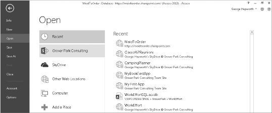
FIGURE 3-15: Open page in the backstage
First, note that the list of locations available to search includes both the local computer — including network locations when available — and cloud options, including the user's SkyDrive and Office 365 account, if available. In addition, the user can select Other Web Locations. That would include different Office 365 accounts to which the user has permissions. Figure 3-15 shows several such locations in the Recent list on the right side of the page.
Save and Save As
Save works as it has in all prior Access versions. Save As, however, offers two choices, one of which, Save As Package, is unique to Access web apps (see Figure 3-16).

FIGURE 3-16: Save Database as App Package
Save As Package allows you to make a local app package containing the components of the web app, which can include the data. There are a couple of reasons for doing so. First, it can be seen as a backup mechanism. During development, you'll want to make regular app packages, just as you do now with your client databases. Second, it can be used as a mechanism to transfer an existing web app to a new database. You learn more about app packages in Chapter 14.
Save Object As works very similarly to the way it does in Access client; provided you have a focus on an opened object such as a table, a query, a view, or a macro, you can use Save As to make a copy of the object.
NOTE This is the only place where you can make copies of objects within web apps. You cannot customize the ribbon to display a Save As action, nor is it available via a right-click context menu. Thus, it may appear that you cannot save a copy of existing objects but in actuality it's available in the backstage.
Close
As you'd expect, Close closes an open database.
Account
New to Access 2013, you will use the Account page, shown in Figure 3-17, to manage your Office 365 account(s). We dig more deeply into the use of the Account page in later chapters, when you learn how to set up and use your Office 365 account.

Options
The Options dialog is another place where you'll see how the web app environment has freed us to work with the reduced set of elements appropriate to the task at hand. Consider, for example, Figure 3-18, which shows the three options available, and the reduced list of settings under the General page.

FIGURE 3-18: Reduced option list for web apps
Language and Trust Center pages, now shown, are very similar to those you are familiar with. The remaining properties on the General page are those that pertain to the Access container itself.
At this point, you've surveyed the new ribbon for web apps and the changes to the backstage for web apps. In the next section, we turn our attention to the layout features important to mobile devices.
MOBILE DEVICES SUPPORT
Another factor driving the need to build Access applications that are accessible on the web is the proliferation of mobile devices. Microsoft is actively building the foundation within Office to work with mobile devices, notably with a touch screen interface. Within Office 2013, a new Touch mode is exposed to support using Office with mobile devices. Contrast Figure 3-19 with Figure 3-20, which shows Access with a Northwind application open in default mode and touch mode, respectively.

FIGURE 3-19: Access in default mode

FIGURE 3-20: Access in touch mode
Office 2013 makes it possible to work with applications on a touch screen device that can run Windows. As you can see in Figure 3-20, this mode primarily works for the application's chrome. It will not affect the existing Access forms. Controls within the form remain unchanged. Although the touch mode is a client feature, it should illustrate the steps Microsoft is taking to make Office accessible on mobile devices.
NOTE Chrome means the surface surrounding the area that users directly interact with. Chrome is where you have your back, forward, refresh buttons, and address bar as well as status bar. You'll learn more about it in Chapter 10.
As such, it is the first Office to try and move beyond traditional PCs. It goes without saying that Microsoft has invested considerable resources to ensure that a typical Access web app will run well on any mobile device. To run on different devices with different operating systems, browsers, and form factors is a monumental challenge and is not without its hazards.
To help you be informed when designing your first web app, we want to demonstrate some mobile devices to illustrate the experiences and help form realistic expectations when you are writing down design specifications.
Generally speaking, you can expect to have fairly good experiences using tablets with 4-inch screens or larger. Figures 3-21 and 3-22 illustrate the space available and a drop-down displayed on an iOS and an Android tablet, respectively.

FIGURE 3-21: Maid To Order application on an iOS tablet with drop-down

FIGURE 3-22: Maid To Order application on Android tablet with drop-down
If you look at the right side of Figure 3-21, you can see that the view is slightly too wide and requires some horizontal scrolling. Also, take into account the space that may be taken by an on-screen keyboard, as shown in Figure 3-23 (an iOS tablet) and Figure 3-24 (an Android tablet).

FIGURE 3-23: Maid To Order application on iOS tablet with keyboard displayed

FIGURE 3-24: Maid To Order application on Android tablet with keyboard displayed
You can see that the user can continue to use features such as AutoComplete to select from a list of users. AutoComplete is partially obscured by the on-screen keyboard, which the user can hide once he is finished typing and ready to make a selection.
Therefore, when you plan to develop a web application that will target people using tablet forms, you have a reasonable expectation that it will be functional, provided you are conservative in how much space you use. One other major consideration is keyboard entry. Using an on-screen keyboard on a touch device is much slower in comparison to selecting from a list. Therefore, a well-designed web app would likely make more use of AutoComplete, Combobox, and Date Calendar popups to aid in data entry via a touch screen device. You may want to ensure that your buttons are sized similarly to the size of tiles and links on the web apps to accommodate the larger target area required by a finger compared to a mouse pointer.
You may find that not all browsers in different tablets will support the full range of functionalities required by the web app. In fact, you may find the design experience reminiscent of the days when inability to agree on standards led to compromises like the label on websites, “Best viewed in Internet Explorer,” which nobody really liked. The frontier has now moved into browsers on tablets and, consequently, you may need to take additional time to plan the scope with your end users to determine what devices the web app should work for, and then design specifically for the selected device(s). You may need to consider alternatives to using the web app in a mobile device.
For smartphones or any other mobile devices of similar form factor, compare Figures 3-25 and 3-26.

FIGURE 3-25: Maid To Order application on iOS smartphone

FIGURE 3-26: Maid To Order application on Android smartphone
As you can see, the smaller form factor makes it quite a challenge to deploy a web app targeting those devices. Views designed to work well with PC layouts are unlikely to work well on mobile devices. At any rate, the use of smartphones with the web app for the present will be a niche, although not for too long. As you may recall, the web app is based on the same architecture used broadly with SharePoint and there is considerable interest in using mobile devices.
In later chapters, you learn how the Maid To Order application is developed. Also, you will recall that one of our design goals is to enable maids to use their tablets or other mobile devices to maintain immediate records at the job site.
For the rest of the web app part of this book, we will look at designs that work well on any desktop PC and on any tablet. We consider additional components that we may be able to use with mobile devices in Chapter 10.
SHAREPOINT AND OFFICE 365
So far, we've looked at the Access client and how the design experience changes for web apps. To work effectively with web apps, it is necessary to have some familiarity with the SharePoint site where the web apps will be hosted. In Chapter 1, you learned how to create a new Office 365 account. When you log into your Office 365 account via your favorite web browser, you usually will land on the team site, illustrated in Figure 3-27.

FIGURE 3-27: Maid To Order Team Site
The team site is not only a great place to publish your web apps but it also provides a place for you to share documents, different kind of SharePoint apps, and lists. You also can customize web pages with additional content as appropriate for your specific needs. A full discussion of SharePoint's many features is beyond the scope of the book. However, we want to point out a few that will be relevant for building apps.
If you've already tried to create a new web app from the Access client, you may have noticed that you had a choice between a team site and a creating a Personal App that will be available from your SkyDrive site associated with the Office 365 account, as in Figure 3-28.
You may wonder how to choose between a team site and a personal site. The short answer is that the team site by default makes an object available to any other member of the site who has sufficient permissions. On the other hand, a personal site is private by default unless you explicitly share it out to others. Because the intention of creating an Access web app is typically to allow for other people to use it, it usually makes sense to use a team site rather than a personal site to host your web apps.

FIGURE 3-28: Dialog box listing sites available for creating a web app
WARNING Be aware that Office 365 plans provide SkyDrive as part of their offerings, which also includes additional features that are not available when you have only a SkyDrive account without an associated Office 365 plan. Thus, having a freestanding SkyDrive account will not enable you to create a web app to this account. You still need an Office 365 plan. Of course, you might have another site available to you, depending on what kind of plan you have chosen and whether you've created additional sites. In those cases, you are, of course, free to use different sites or maybe designate a specific subsite as the sole repository for hosting your web apps. So, a team site is an excellent choice for a simple deployment but is not the only choice available to you.
Regardless of where you actually plan to deploy the web app, you may want to note that all apps will be easily found via the Site Contents link, which is typically listed on the left sidebar, as shown in Figure 3-29.
This provides you with a list of all installed apps, lists, and any subsites associated with the team site. It also provides the ability to add new apps or subsites, as illustrated in Figure 3-30.

FIGURE 3-29: Site contents link

FIGURE 3-30: Site Contents page
Creating a Web App via Team Site
Because Access web apps are just SharePoint apps, you can also use this page to create an Access web app from the app store, rather than create it via the Access client. When you click the “add an app” link shown in Figure 3-30, you are presented with a popup listing different kinds of apps that may be built into a default SharePoint or Office 365 installation in addition to any other custom apps that may be available. Figure 3-31 shows a blank Access web app for you to add to a site.

FIGURE 3-31: Adding Access web app
As Figure 3-32 demonstrates, you simply provide a new name for the app, which is then processed, as shown in Figure 3-33.

FIGURE 3-32: Providing a name for the new app

FIGURE 3-33: App being added to the site
WARNING Note that unlike the Windows filesystem, you are not prevented from creating multiple apps with the same name within the same site, which can quickly lead to confusion over which is the correct version. Therefore, you should be diligent in how you name your Access web apps so that they are unique, at least within that site.
Once the app is ready to be used, you can click the newly added icon to open the placeholder page in Figure 3-34, which will enable you to then open Access to further customize the blank app.

FIGURE 3-34: Placeholder page for blank Access web app
So you now have an alternative approach for creating new Access web apps outside of the Access client. Note that the process we discussed can also be used to deploy a developed web app, a topic we delve into in more detail when we get to Chapter 14, on deploying web apps.
Note that even after you've customized your new Access web apps, the gear button on the right side of the ribbon remains available, providing you with an easy way to launch the Access client if you want to further customize the web app, as illustrated in Figure 3-35.

FIGURE 3-35: Gear button to customize Access web app
Deleting Web Apps
Sometimes you need to delete a web app. Because the web app is not a file that simply needs to be trashed, as was the case with an .accdb file, you must perform the deletion via the delete function on the site hosting the web app. When you click the ellipsis shown to the right of an app (see Figure 3-36), you are provided with a dialog box to manage the app, Delete being one of the options.

FIGURE 3-36: Open the App Properties dialog
You only need to click Delete to remove it. The deletion will be handled asynchronously; while the process continues, you may see the message indicating that the app is being deleted, as shown in Figure 3-37.
Once the deletion is complete, the app will be removed from the Site Contents page. Though SharePoint provides a Recycle Bin functionality, it does not help recover a deleted app. Therefore, you might want to make a backup via the Access client, as discussed earlier in the chapter before you perform the deletion.

FIGURE 3-37: Deleting an app message
Sharing Web Apps with Others
Access web apps are not always restricted to single users, so it naturally follows that you would want to share the app with others, particularly people who may not necessarily be a member of the team site. When you set up an Office 365 account, you set up an arrangement to pay for a specific number of users who will get access to the same team site, in addition to their personal site among other things, depending on the particulars of the Office 365 account you choose.
However, at times you may want to make your Access web app available to additional people who aren't a part of your Office 365 account. This could include customers, group members, and so forth. Unlike the first version of Office 365, you are allowed to share up to a certain number of external users without having to pay a subscription fee for those users. They can access your Access web app.
To share the web app with such users, use the Share link, which may be available to members of the site but will require approval of the owner, as shown in Figure 3-38.

FIGURE 3-38: Share link on Team Site
Clicking Share opens a dialog box where you can enter a list of e-mail addresses to invite people, along with a message that will be included in the e-mail invitation sent to those users, as shown in Figure 3-39.
You typically will want to specify a certain level of permissions for the invited users to define a set of allowable actions. Note in Figure 3-39 that the default permission is displayed as Edit, and if you hover the cursor over the permission, you can get a control tip listing permissions given, as in Figure 3-40.
You can choose a different permission by clicking Show Options, shown in Figure 3-39, which then exposes the permission drop-down shown in Figure 3-40. Figure 3-41 lists groups that are included by default in a typical SharePoint or Office 365 installation.


FIGURE 3-40: Permissions listed in a control tip

FIGURE 3-41: Default SharePoint groups
You delve into more details about the permissions and the various ramifications of each choice when you learn about security in Chapter 13.
SUMMARY
In this chapter you had your first close look at the layout and navigation principles that make Access web apps work well in the browser environment. We started by orienting you to the principles of web navigation, showing you how built-in web app features support good web navigation using both vertical and horizontal navigation elements.
We looked at one of the key new features in Access web apps, search navigation using the list pane on List views. Search navigation is customized for the data-driven web app by delaying the “match” feature until the user clicks the search icon, which preserves resources consumed by round-trips to the database.
Next, we identified the different types of views used in web apps and briefly previewed their appropriateness for different tasks such as data entry or rapid filtering and sorting. We then learned about the web-specific characteristics of the new ribbon, primarily the fact that it is trimmed down to the icons appropriate to web app design.
After that, we toured the backstage and took note of the pages within it that you will use to create new web apps and open existing web apps from whatever location holds them. You also got your first look at the tools for managing data connections to the web app database from a local .accdb or other file.
Finally, we took a quick look at layout in mobile devices. You saw that the limited form factors make designing web apps for mobile devices a bit more challenging.
Looking forward to Chapter 4, you'll dive deeper into the task of creating views for a web app.