
Chapter 6. Basic graphs
- Bar, box, and dot plots
- Pie and fan charts
- Histograms and kernel density plots
Whenever we analyze data, the first thing that we should do is look at it. For each variable, what are the most common values? How much variability is present? Are there any unusual observations? R provides a wealth of functions for visualizing data. In this chapter, we’ll look at graphs that help you understand a single categorical or continuous variable. This topic includes
- Visualizing the distribution of variable
- Comparing groups on an outcome variable
In both cases, the variable could be continuous (for example, car mileage as miles per gallon) or categorical (for example, treatment outcome as none, some, or marked). In later chapters, we’ll explore graphs that display bivariate and multivariate relationships among variables.
In the following sections, we’ll explore the use of bar plots, pie charts, fan charts, histograms, kernel density plots, box plots, violin plots, and dot plots. Some of these may be familiar to you, whereas others (such as fan plots or violin plots) may be new to you. Our goal, as always, is to understand your data better and to communicate this understanding to others.
Let’s start with bar plots.
6.1. Bar plots
Bar plots display the distribution (frequencies) of a categorical variable through vertical or horizontal bars. In its simplest form, the format of the barplot() function is
barplot(height)
where height is a vector or matrix.
In the following examples, we’ll plot the outcome of a study investigating a new treatment for rheumatoid arthritis. The data are contained in the Arthritis data frame distributed with the vcd package. Because the vcd package isn’t included in the default R installation, be sure to download and install it before first use (install.packages("vcd")).
Note that the vcd package isn’t needed to create bar plots. We’re loading it in order to gain access to the Arthritis dataset. But we’ll need the vcd package when creating spinogram, which are described in section 6.1.5.
6.1.1. Simple bar plots
If height is a vector, the values determine the heights of the bars in the plot and a vertical bar plot is produced. Including the option horiz=TRUE produces a horizontal bar chart instead. You can also add annotating options. The main option adds a plot title, whereas the xlab and ylab options add x-axis and y-axis labels, respectively.
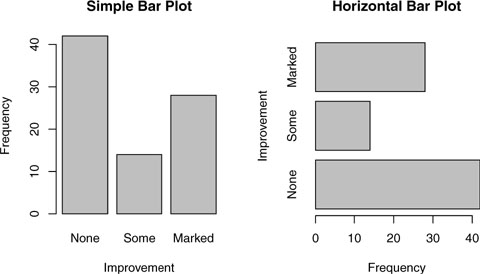
In the Arthritis study, the variable Improved records the patient outcomes for individuals receiving a placebo or drug.
> library(vcd)
> counts <- table(Arthritis$Improved)
> counts
  None   Some Marked
    42     14     28
Here, we see that 28 patients showed marked improvement, 14 showed some improvement, and 42 showed no improvement. We’ll discuss the use of the table() function to obtain cell counts more fully in chapter 7.
You can graph the variable counts using a vertical or horizontal bar plot. The code is provided in the following listing and the resulting graphs are displayed in figure 6.1.
Figure 6.1. Simple vertical and horizontal bar charts
Listing 6.1. Simple bar plots

Tip
If the categorical variable to be plotted is a factor or ordered factor, you can create a vertical bar plot quickly with the plot() function. Because Arthritis$Improved is a factor, the code
plot(Arthritis$Improved, main="Simple Bar Plot",
     xlab="Improved", ylab="Frequency")
plot(Arthritis$Improved, horiz=TRUE, main="Horizontal Bar Plot",
     xlab="Frequency", ylab="Improved")
will generate the same bar plots as those in listing 6.1, but without the need to tabulate values with the table() function.
What happens if you have long labels? In section 6.1.4, you’ll see how to tweak labels so that they don’t overlap.
6.1.2. Stacked and grouped bar plots
If height is a matrix rather than a vector, the resulting graph will be a stacked or grouped bar plot. If beside=FALSE (the default), then each column of the matrix produces a bar in the plot, with the values in the column giving the heights of stacked “sub-bars.” If beside=TRUE, each column of the matrix represents a group, and the values in each column are juxtaposed rather than stacked.
Consider the cross-tabulation of treatment type and improvement status:
> library(vcd)
> counts <- table(Arthritis$Improved, Arthritis$Treatment)
> counts
        Treatment
Improved Placebo Treated
  None        29      13
  Some         7       7
  Marked       7      21
You can graph the results as either a stacked or a grouped bar plot (see the next listing). The resulting graphs are displayed in figure 6.2.
Figure 6.2. Stacked and grouped bar plots

Listing 6.2. Stacked and grouped bar plotsw

The first barplot function produces a stacked bar plot, whereas the second produces a grouped bar plot. We’ve also added the col option to add color to the bars plotted. The legend.text parameter provides bar labels for the legend (which are only useful when height is a matrix).
In chapter 3, we covered ways to format and place the legend to maximum benefit. See if you can rearrange the legend to avoid overlap with the bars.
6.1.3. Mean bar plots
Bar plots needn’t be based on counts or frequencies. You can create bar plots that represent means, medians, standard deviations, and so forth by using the aggregate function and passing the results to the barplot() function. The following listing shows an example, which is displayed in figure 6.3.
Figure 6.3. Bar plot of mean illiteracy rates for US regions sorted by rate

Listing 6.3. Bar plot for sorted mean values
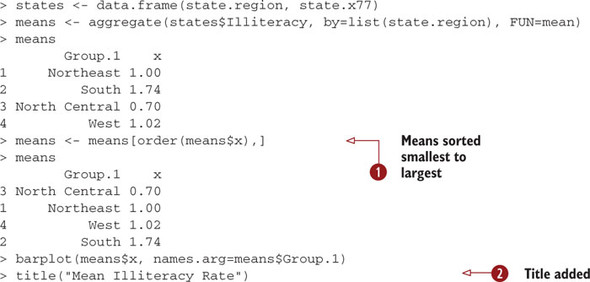
Listing 6.3 sorts the means from smallest to largest ![]() . Also note that use of the title() function
. Also note that use of the title() function ![]() is equivalent to adding the main option in the plot call. means$x is the vector containing the heights of the bars, and the option names.arg=means$Group.1 is added to provide labels.
is equivalent to adding the main option in the plot call. means$x is the vector containing the heights of the bars, and the option names.arg=means$Group.1 is added to provide labels.
You can take this example further. The bars can be connected with straight line segments using the lines() function. You can also create mean bar plots with superimposed confidence intervals using the barplot2() function in the gplots package. See “barplot2: Enhanced Bar Plots” on the R Graph Gallery website (http://addictedtor.free.fr/graphiques) for an example.
6.1.4. Tweaking bar plots
There are several ways to tweak the appearance of a bar plot. For example, with many bars, bar labels may start to overlap. You can decrease the font size using the cex.names option. Specifying values smaller than 1 will shrink the size of the labels. Optionally, the names.arg argument allows you to specify a character vector of names used to label the bars. You can also use graphical parameters to help text spacing. An example is given in the following listing with the output displayed in figure 6.4.
Figure 6.4. Horizontal bar plot with tweaked labels

Listing 6.4. Fitting labels in a bar plot
par(mar=c(5,8,4,2))
par(las=2)
counts <- table(Arthritis$Improved)

barplot(counts,
           main="Treatment Outcome",
           horiz=TRUE, cex.names=0.8,
        names.arg=c("No Improvement", "Some Improvement",
                    "Marked Improvement"))
In this example, we’ve rotated the bar labels (with las=2), changed the label text, and both increased the size of the y margin (with mar) and decreased the font size in order to fit the labels comfortably (using cex.names=0.8). The par() function allows you to make extensive modifications to the graphs that R produces by default. See chapter 3 for more details.
6.1.5. Spinograms
Before finishing our discussion of bar plots, let’s take a look at a specialized version called a spinogram. In a spinogram, a stacked bar plot is rescaled so that the height of each bar is 1 and the segment heights represent proportions. Spinograms are created through the spine() function of the vcd package. The following code produces a simple spinogram:
library(vcd)
attach(Arthritis)
counts <- table(Treatment, Improved)
spine(counts, main="Spinogram Example")
detach(Arthritis)
The output is provided in figure 6.5. The larger percentage of patients with marked improvement in the Treated condition is quite evident when compared with the Placebo condition.
Figure 6.5. Spinogram of arthritis treatment outcome

In addition to bar plots, pie charts are a popular vehicle for displaying the distribution of a categorical variable. We consider them next.
6.2. Pie charts
Whereas pie charts are ubiquitous in the business world, they’re denigrated by most statisticians, including the authors of the R documentation. They recommend bar or dot plots over pie charts because people are able to judge length more accurately than volume. Perhaps for this reason, the pie chart options in R are quite limited when compared with other statistical software.
Pie charts are created with the function
pie(x, labels)
where x is a non-negative numeric vector indicating the area of each slice and labels provides a character vector of slice labels. Four examples are given in the next listing; the resulting plots are provided in figure 6.6.
Figure 6.6. Pie chart examples

Listing 6.5. Pie charts

First you set up the plot so that four graphs are combined into one ![]() . (Combining multiple graphs is covered in chapter 3.) Then you input the data that will be used for the first three graphs.
. (Combining multiple graphs is covered in chapter 3.) Then you input the data that will be used for the first three graphs.
For the second pie chart ![]() , you convert the sample sizes to percentages and add the information to the slice labels. The second pie chart also defines
the colors of the slices using the rainbow() function, described in chapter 3. Here rainbow(length(lbls2)) resolves to rainbow(5), providing five colors for the graph.
, you convert the sample sizes to percentages and add the information to the slice labels. The second pie chart also defines
the colors of the slices using the rainbow() function, described in chapter 3. Here rainbow(length(lbls2)) resolves to rainbow(5), providing five colors for the graph.
The third pie chart is a 3D chart created using the pie3D() function from the plotrix package. Be sure to download and install this package before using it for the first time. If statisticians dislike pie charts, they positively despise 3D pie charts (although they may secretly find them pretty). This is because the 3D effect adds no additional insight into the data and is considered distracting eye candy.
The fourth pie chart demonstrates how to create a chart from a table ![]() . In this case, you count the number of states by US region, and append the information to the labels before producing the
plot.
. In this case, you count the number of states by US region, and append the information to the labels before producing the
plot.
Pie charts make it difficult to compare the values of the slices (unless the values are appended to the labels). For example, looking at the simple pie chart, can you tell how the US compares to Germany? (If you can, you’re more perceptive than I am.) In an attempt to improve on this situation, a variation of the pie chart, called a fan plot, has been developed. The fan plot (Lemon & Tyagi, 2009) provides the user with a way to display both relative quantities and differences. In R, it’s implemented through the fan.plot() function in the plotrix package.
Consider the following code and the resulting graph (figure 6.7):
library(plotrix)
slices <- c(10, 12,4, 16, 8)
lbls <- c("US", "UK", "Australia", "Germany", "France")
fan.plot(slices, labels = lbls, main="Fan Plot")
Figure 6.7. A fan plot of the country data

In a fan plot, the slices are rearranged to overlap each other and the radii have been modified so that each slice is visible. Here you can see that Germany is the largest slice and that the US slice is roughly 60 percent as large. France appears to be half as large as Germany and twice as large as Australia. Remember that the width of the slice and not the radius is what’s important here.
As you can see, it’s much easier to determine the relative sizes of the slice in a fan plot than in a pie chart. Fan plots haven’t caught on yet, but they’re new. Now that we’ve covered pie and fan charts, let’s move on to histograms. Unlike bar plots and pie charts, histograms describe the distribution of a continuous variable.
6.3. Histograms
Histograms display the distribution of a continuous variable by dividing up the range of scores into a specified number of bins on the x-axis and displaying the frequency of scores in each bin on the y-axis. You can create histograms with the function
hist(x)
where x is a numeric vector of values. The option freq=FALSE creates a plot based on probability densities rather than frequencies. The breaks option controls the number of bins. The default produces equally spaced breaks when defining the cells of the histogram. Listing 6.6 provides the code for four variations of a histogram; the results are plotted in figure 6.8.
Figure 6.8. Histograms examples

Listing 6.6. Histograms

The first histogram ![]() demonstrates the default plot when no options are specified. In this case, five bins are created, and the default axis labels
and titles are printed. For the second histogram
demonstrates the default plot when no options are specified. In this case, five bins are created, and the default axis labels
and titles are printed. For the second histogram ![]() , you’ve specified 12 bins, a red fill for the bars, and more attractive and informative labels and title.
, you’ve specified 12 bins, a red fill for the bars, and more attractive and informative labels and title.
The third histogram ![]() maintains the colors, bins, labels, and titles as the previous plot, but adds a density curve and rug plot overlay. The density
curve is a kernel density estimate and is described in the next section. It provides a smoother description of the distribution
of scores. You use the lines() function to overlay this curve in a blue color and a width that’s twice the default thickness for lines. Finally, a rug plot
is a one-dimensional representation of the actual data values. If there are many tied values, you can jitter the data on the
rug plot using code like the following:
maintains the colors, bins, labels, and titles as the previous plot, but adds a density curve and rug plot overlay. The density
curve is a kernel density estimate and is described in the next section. It provides a smoother description of the distribution
of scores. You use the lines() function to overlay this curve in a blue color and a width that’s twice the default thickness for lines. Finally, a rug plot
is a one-dimensional representation of the actual data values. If there are many tied values, you can jitter the data on the
rug plot using code like the following:
rug(jitter(mtcars$mpag, amount=0.01))
This will add a small random value to each data point (a uniform random variate between ±amount), in order to avoid overlapping points.
The fourth histogram ![]() is similar to the second but has a superimposed normal curve and a box around the figure. The code for superimposing the
normal curve comes from a suggestion posted to the R-help mailing list by Peter Dalgaard. The surrounding box is produced
by the box() function.
is similar to the second but has a superimposed normal curve and a box around the figure. The code for superimposing the
normal curve comes from a suggestion posted to the R-help mailing list by Peter Dalgaard. The surrounding box is produced
by the box() function.
6.4. Kernel density plots
In the previous section, you saw a kernel density plot superimposed on a histogram. Technically, kernel density estimation is a nonparametric method for estimating the probability density function of a random variable. Although the mathematics are beyond the scope of this text, in general kernel density plots can be an effective way to view the distribution of a continuous variable. The format for a density plot (that’s not being superimposed on another graph) is
plot(density(x))
where x is a numeric vector. Because the plot() function begins a new graph, use the lines() function (listing 6.6) when superimposing a density curve on an existing graph.
Two kernel density examples are given in the next listing, and the results are plotted in figure 6.9.
Figure 6.9. Kernel density plots

Listing 6.7. Kernel density plots
par(mfrow=c(2,1))
d <- density(mtcars$mpg)

plot(d)

d <- density(mtcars$mpg)
plot(d, main="Kernel Density of Miles Per Gallon")
polygon(d, col="red", border="blue")
rug(mtcars$mpg, col="brown")
In the first plot, you see the minimal graph created with all the defaults in place. In the second plot, you add a title, color the curve blue, fill the area under the curve with solid red, and add a brown rug. The polygon() function draws a polygon whose vertices are given by x and y (provided by the density() function in this case).
Kernel density plots can be used to compare groups. This is a highly underutilized approach, probably due to a general lack of easily accessible software. Fortunately, the sm package fills this gap nicely.
The sm.density.compare() function in the sm package allows you to superimpose the kernel density plots of two or more groups. The format is
sm.density.compare(x, factor)
where x is a numeric vector and factor is a grouping variable. Be sure to install the sm package before first use. An example comparing the mpg of cars with 4, 6, or 8 cylinders is provided in listing 6.8.
Listing 6.8. Comparative kernel density plots

The par() function is used to double the width of the plotted lines (lwd=2) so that they’d be more readable in this book ![]() . The sm packages is loaded and the mtcars data frame is attached.
. The sm packages is loaded and the mtcars data frame is attached.
In the mtcars data frame ![]() , the variable cyl is a numeric variable coded 4, 6, or 8. cyl is transformed into a factor, named cyl.f, in order to provide value labels for the plot. The sm.density.compare() function creates the plot
, the variable cyl is a numeric variable coded 4, 6, or 8. cyl is transformed into a factor, named cyl.f, in order to provide value labels for the plot. The sm.density.compare() function creates the plot ![]() and a title() statement adds a main title.
and a title() statement adds a main title.
Finally, you add a legend to improve interpretability ![]() . (Legends are covered in chapter 3.) First, a vector of colors is created. Here colfill is c(2, 3, 4). Then a legend is added to the plot via the legend() function. The locator(1) option indicates that you’ll place the legend interactively by clicking on the graph where you want the legend to appear.
The second option provides a character vector of the labels. The third option assigns a color from the vector colfill to each level of cyl.f. The results are displayed in figure 6.10.
. (Legends are covered in chapter 3.) First, a vector of colors is created. Here colfill is c(2, 3, 4). Then a legend is added to the plot via the legend() function. The locator(1) option indicates that you’ll place the legend interactively by clicking on the graph where you want the legend to appear.
The second option provides a character vector of the labels. The third option assigns a color from the vector colfill to each level of cyl.f. The results are displayed in figure 6.10.
Figure 6.10. Kernel density plots of mpg by number of cylinders

As you can see, overlapping kernel density plots can be a powerful way to compare groups of observations on an outcome variable. Here you can see both the shapes of the distribution of scores for each group and the amount of overlap between groups. (The moral of the story is that my next car will have four cylinders—or a battery.)
Box plots are also a wonderful (and more commonly used) graphical approach to visualizing distributions and differences among groups. We’ll discuss them next.
6.5. Box plots
A “box-and-whiskers” plot describes the distribution of a continuous variable by plotting its five-number summary: the minimum, lower quartile (25th percentile), median (50th percentile), upper quartile (75th percentile), and maximum. It can also display observations that may be outliers (values outside the range of ± 1.5*IQR, where IQR is the interquartile range defined as the upper quartile minus the lower quartile). For example:
boxplot(mtcars$mpg, main="Box plot", ylab="Miles per Gallon")
produces the plot shown in figure 6.11. I added annotations by hand to illustrate the components.
Figure 6.11. Box plot with annotations added by hand

By default, each whisker extends to the most extreme data point, which is no more than the 1.5 times the interquartile range for the box. Values outside this range are depicted as dots (not shown here).
For example, in our sample of cars the median mpg is 19.2, 50 percent of the scores fall between 15.3 and 22.8, the smallest value is 10.4, and the largest value is 33.9. How did I read this so precisely from the graph? Issuing boxplot.stats(mtcars$mpg) prints the statistics used to build the graph (in other words, I cheated). There doesn’t appear to be any outliers, and there is a mild positive skew (the upper whisker is longer than the lower whisker).
6.5.1. Using parallel box plots to compare groups
Box plots can be created for individual variables or for variables by group. The format is
boxplot(formula, data=dataframe)
where formula is a formula and dataframe denotes the data frame (or list) providing the data. An example of a formula is y ~ A, where a separate box plot for numeric variable y is generated for each value of categorical variable A. The formula y ~ A*B would produce a box plot of numeric variable y, for each combination of levels in categorical variables A and B.
Adding the option varwidth=TRUE will make the box plot widths proportional to the square root of their sample sizes. Add horizontal=TRUE to reverse the axis orientation.
In the following code, we revisit the impact of four, six, and eight cylinders on auto mpg with parallel box plots. The plot is provided in figure 6.12.
Figure 6.12. Box plots of car mileage versus number of cylinders

boxplot(mpg ~ cyl, data=mtcars,
        main="Car Mileage Data",
        xlab="Number of Cylinders",
        ylab="Miles Per Gallon")
You can see in figure 6.12 that there’s a good separation of groups based on gas mileage. You can also see that the distribution of mpg for six-cylinder cars is more symmetrical than for the other two car types. Cars with four cylinders show the greatest spread (and positive skew) of mpg scores, when compared with six- and eight-cylinder cars. There’s also an outlier in the eight-cylinder group.
Box plots are very versatile. By adding notch=TRUE, you get notched box plots. If two boxes’ notches don’t overlap, there’s strong evidence that their medians differ (Chambers et al., 1983, p. 62). The following code will create notched box plots for our mpg example:
 boxplot(mpg ~ cyl, data=mtcars,
         notch=TRUE,
         varwidth=TRUE,
         col="red",
         main="Car Mileage Data",
         xlab="Number of Cylinders",
         ylab="Miles Per Gallon")
The col option fills the box plots with a red color, and varwidth=TRUE produces box plots with widths that are proportional to their sample sizes.
You can see in figure 6.13 that the median car mileage for four-, six-, and eight-cylinder cars differ. Mileage clearly decreases with number of cylinders.
Figure 6.13. Notched box plots for car mileage versus number of cylinders

Finally, you can produce box plots for more than one grouping factor. Listing 6.9 provides box plots for mpg versus the number of cylinders and transmission type in an automobile. Again, you use the col option to fill the box plots with color. Note that colors recycle. In this case, there are six box plots and only two specified colors, so the colors repeat three times.
Listing 6.9. Box plots for two crossed factors

The plot is provided in figure 6.14.
Figure 6.14. Box plots for car mileage versus transmission type and number of cylinders

From figure 6.14 it’s again clear that median mileage decreases with cylinder number. For four- and six-cylinder cars, mileage is higher for standard transmissions. But for eight-cylinder cars there doesn’t appear to be a difference. You can also see from the widths of the box plots that standard four-cylinder and automatic eight-cylinder cars are the most common in this dataset.
6.5.2. Violin plots
Before we end our discussion of box plots, it’s worth examining a variation called a violin plot. A violin plot is a combination of a box plot and a kernel density plot. You can create one using the vioplot() function from the vioplot package. Be sure to install the vioplot package before first use.
The format for the vioplot() function is
vioplot(x1, x2, ..., names=, col=)
where x1, x2, ... represent one or more numeric vectors to be plotted (one violin plot will be produced for each vector). The names parameter provides a character vector of labels for the violin plots, and col is a vector specifying the colors for each violin plot. An example is given in the following listing.
Listing 6.10. Violin plots
library(vioplot)
x1 <- mtcars$mpg[mtcars$cyl==4]
x2 <- mtcars$mpg[mtcars$cyl==6]
x3 <- mtcars$mpg[mtcars$cyl==8]
vioplot(x1, x2, x3,
        names=c("4 cyl", "6 cyl", "8 cyl"),
        col="gold")
title("Violin Plots of Miles Per Gallon")
Note that the vioplot() function requires you to separate the groups to be plotted into separate variables. The results are displayed in figure 6.15.
Figure 6.15. Violin plots of mpg versus number of cylinders

Violin plots are basically kernel density plots superimposed in a mirror image fashion over box plots. Here, the white dot is the median, the black boxes range from the lower to the upper quartile, and the thin black lines represent the whiskers. The outer shape provides the kernel density plots. Violin plots haven’t really caught on yet. Again, this may be due to a lack of easily accessible software. Time will tell.
We’ll end this chapter with a look at dot plots. Unlike the graphs you’ve seen previously, dot plots plot every value for a variable.
6.6. Dot plots
Dot plots provide a method of plotting a large number of labeled values on a simple horizontal scale. You create them with the dotchart() function, using the format
dotchart(x, labels=)
where x is a numeric vector and labels specifies a vector that labels each point. You can add a groups option to designate a factor specifying how the elements of x are grouped. If so, the option gcolor controls the color of the groups label and cex controls the size of the labels. Here’s an example with the mtcars dataset:
dotchart(mtcars$mpg, labels=row.names(mtcars), cex=.7,
         main="Gas Mileage for Car Models",
         xlab="Miles Per Gallon")
The resulting plot is given in figure 6.16.
Figure 6.16. Dot plot of mpg for each car model

The graph in figure 6.16 allows you to see the mpg for each make of car on the same horizontal axis. Dot plots typically become most interesting when they’re sorted and grouping factors are distinguished by symbol and color. An example is given in the following listing.
Listing 6.11. Dot plot grouped, sorted, and colored
x <- mtcars[order(mtcars$mpg),]
x$cyl <- factor(x$cyl)
x$color[x$cyl==4] <- "red"
x$color[x$cyl==6] <- "blue"
x$color[x$cyl==8] <- "darkgreen"
dotchart(x$mpg,
         labels = row.names(x),
         cex=.7,
         groups = x$cyl,
         gcolor = "black",
         color = x$color,
         pch=19,
         main = "Gas Mileage for Car Models
grouped by cylinder",
         xlab = "Miles Per Gallon")
In this example, the data frame mtcars is sorted by mpg (lowest to highest) and saved as data frame x. The numeric vector cyl is transformed into a factor. A character vector (color) is added to data frame x and contains the values "red", "blue", or "dark-green" depending on the value of cyl. In addition, the labels for the data points are taken from the row names of the data frame (car makes). Data points are grouped by number of cylinders. The numbers 4, 6, and 8 are printed in black. The color of the points and labels are derived from the color vector, and points are represented by filled circles. The code produces the graph in figure 6.17.
Figure 6.17. Dot plot of mpg for car models grouped by number of cylinders

In figure 6.17, a number of features become evident for the first time. Again, you see an increase in gas mileage as the number of cylinders decrease. But you also see exceptions. For example, the Pontiac Firebird, with eight cylinders, gets higher gas mileage than the Mercury 280C and the Valiant, each with six cylinders. The Hornet 4 Drive, with six cylinders, gets the same miles per gallon as the Volvo 142E, which has four cylinders. It’s also clear that the Toyota Corolla gets the best gas mileage by far, whereas the Lincoln Continental and Cadillac Fleetwood are outliers on the low end.
You can gain significant insight from a dot plot in this example because each point is labeled, the value of each point is inherently meaningful, and the points are arranged in a manner that promotes comparisons. But as the number of data points increase, the utility of the dot plot decreases.
Note
There are many variations of the dot plot. Jacoby (2006) provides a very informative discussion of the dot plot and provides R code for innovative applications. Additionally, the Hmisc package offers a dot plot function (aptly named dotchart2) with a number of additional features.
6.7. Summary
In this chapter, we learned how to describe continuous and categorical variables. We saw how bar plots and (to a lesser extent) pie charts can be used to gain insight into the distribution of a categorical variable, and how stacked and grouped bar charts can help us understand how groups differ on a categorical outcome. We also explored how histograms, kernel density plots, box plots, rug plots, and dot plots can help us visualize the distribution of continuous variables. Finally, we explored how overlapping kernel density plots, parallel box plots, and grouped dot plots can help you visualize group differences on a continuous outcome variable.
In later chapters, we’ll extend this univariate focus to include bivariate and multivariate graphical methods. You’ll see how to visually depict relationships among many variables at once, using such methods as scatter plots, multigroup line plots, mosaic plots, correlograms, lattice graphs, and more.
In the next chapter, we’ll look at basic statistical methods for describing distributions and bivariate relationships numerically, as well as inferential methods for evaluating whether relationships among variables exist or are due to sampling error.