
Chapter 11. Intermediate graphs
In chapter 6 (basic graphs), we considered a wide range of graph types for displaying the distribution of single categorical or continuous variables. Chapter 8 (regression) reviewed graphical methods that are useful when predicting a continuous outcome variable from a set of predictor variables. In chapter 9 (analysis of variance), we considered techniques that are particularly useful for visualizing how groups differ on a continuous outcome variable. In many ways, the current chapter is a continuation and extension of the topics covered so far.
In this chapter, we’ll focus on graphical methods for displaying relationships between two variables (bivariate relationships) and between many variables (multivariate relationships). For example:
- What’s the relationship between automobile mileage and car weight? Does it vary by the number of cylinders the car has?
- How can you picture the relationships among an automobile’s mileage, weight, displacement, and rear axle ratio in a single graph?
- When plotting the relationship between two variables drawn from a large dataset (say 10,000 observations), how can you deal with the massive overlap of data points you’re likely to see? In other words, what do you do when your graph is one big smudge?
- How can you visualize the multivariate relationships among three variables at once (given a 2D computer screen or sheet of paper, and a budget slightly less than that for Avatar)?
- How can you display the growth of several trees over time?
- How can you visualize the correlations among a dozen variables in a single graph? How does it help you to understand the structure of your data?
- How can you visualize the relationship of class, gender, and age with passenger survival on the Titanic? What can you learn from such a graph?
These are the types of questions that can be answered with the methods described in this chapter. The datasets that we’ll use are examples of what’s possible. It’s the general techniques that are most important. If the topic of automobile characteristics or tree growth isn’t interesting to you, plug in your own data!
We’ll start with scatter plots and scatter plot matrices. Then, we’ll explore line charts of various types. These approaches are well known and widely used in research. Next, we’ll review the use of correlograms for visualizing correlations and mosaic plots for visualizing multivariate relationships among categorical variables. These approaches are also useful but much less well known among researchers and data analysts. You’ll see examples of how you can use each of these approaches to gain a better understanding of your data and communicate these findings to others.
11.1. Scatter plots
As you’ve seen in previous chapters, scatter plots describe the relationship between two continuous variables. In this section, we’ll start with a depiction of a single bivariate relationship (x versus y). We’ll then explore ways to enhance this plot by superimposing additional information. Next, we’ll learn how to combine several scatter plots into a scatter plot matrix so that you can view many bivariate relationships at once. We’ll also review the special case where many data points overlap, limiting our ability to picture the data, and we’ll discuss a number of ways around this difficulty. Finally, we’ll extend the two-dimensional graph to three dimensions, with the addition of a third continuous variable. This will include 3D scatter plots and bubble plots. Each can help you understand the multivariate relationship among three variables at once.
The basic function for creating a scatter plot in R is plot(x, y), where x and y are numeric vectors denoting the (x, y) points to plot. Listing 11.1 presents an example.
Listing 11.1. A scatter plot with best fit lines
attach(mtcars)
plot(wt, mpg,
     main="Basic Scatter plot of MPG vs. Weight",
     xlab="Car Weight (lbs/1000)",
     ylab="Miles Per Gallon ", pch=19)

abline(lm(mpg~wt), col="red", lwd=2, lty=1)

lines(lowess(wt,mpg), col="blue", lwd=2, lty=2)
The resulting graph is provided in figure 11.1.
Figure 11.1. Scatter plot of car mileage versus weight, with superimposed linear and lowess fit lines.

The code in listing 11.1 attaches the mtcars data frame and creates a basic scatter plot using filled circles for the plotting symbol. As expected, as car weight increases, miles per gallon decreases, though the relationship isn’t perfectly linear. The abline() function is used to add a linear line of best fit, while the lowess() function is used to add a smoothed line. This smoothed line is a nonparametric fit line based on locally weighted polynomial regression. See Cleveland (1981) for details on the algorithm.
Note
R has two functions for producing lowess fits: lowess() and loess(). The loess() function is a newer, formula-based version of lowess() and is more powerful. The two functions have different defaults, so be careful not to confuse them.
The scatterplot() function in the car package offers many enhanced features and convenience functions for producing scatter plots, including fit lines, marginal box plots, confidence ellipses, plotting by subgroups, and interactive point identification. For example, a more complex version of the previous plot is produced by the following code:
library(car)
scatterplot(mpg ~ wt | cyl, data=mtcars, lwd=2,
            main="Scatter Plot of MPG vs. Weight by # Cylinders",
            xlab="Weight of Car (lbs/1000)",
            ylab="Miles Per Gallon",
            legend.plot=TRUE,
            id.method="identify",
            labels=row.names(mtcars),
            boxplots="xy"
)
Here, the scatterplot() function is used to plot miles per gallon versus weight for automobiles that have four, six, or eight cylinders. The formula mpg ~ wt | cyl indicates conditioning (that is, separate plots between mpg and wt for each level of cyl). The graph is provided in figure 11.2.
Figure 11.2. Scatter plot with subgroups and separately estimated fit lines

By default, subgroups are differentiated by color and plotting symbol, and separate linear and loess lines are fit. By default, the loess fit requires five unique data points, so no smoothed fit is plotted for six-cylinder cars. The id.method option indicates that points will be identified interactively by mouse clicks, until the user selects Stop (via the Graphics or context-sensitive menu) or the Esc key. The labels option indicates that points will be identified with their row names. Here you see that the Toyota Corolla and Fiat 128 have unusually good gas mileage, given their weights. The legend.plot option adds a legend to the upper-left margin and marginal box plots for mpg and weight are requested with the boxplots option. The scatterplot() function has many features worth investigating, including robust options and data concentration ellipses not covered here. See help(scatterplot) for more details.
Scatter plots help you visualize relationships between quantitative variables, two at a time. But what if you wanted to look at the bivariate relationships between automobile mileage, weight, displacement (cubic inch), and rear axle ratio? One way is to arrange these six scatter plots in a matrix. When there are several quantitative variables, you can represent their relationships in a scatter plot matrix, which is covered next.
11.1.1. Scatter plot matrices
There are at least four useful functions for creating scatter plot matrices in R. Analysts must love scatter plot matrices! A basic scatter plot matrix can be created with the pairs() function. The following code produces a scatter plot matrix for the variables mpg, disp, drat, and wt:
pairs(~mpg+disp+drat+wt, data=mtcars,
      main="Basic Scatter Plot Matrix")
All the variables on the right of the ~ are included in the plot. The graph is provided in figure 11.3.
Figure 11.3. Scatter plot matrix created by the pairs() function

Here you can see the bivariate relationship among all the variables specified. For example, the scatter plot between mpg and disp is found at the row and column intersection of those two variables. Note that the six scatter plots below the principal diagonal are the same as those above the diagonal. This arrangement is a matter of convenience. By adjusting the options, you could display just the lower or upper triangle. For example, the option upper.panel=NULL would produce a graph with just the lower triangle of plots.
The scatterplotMatrix() function in the car package can also produce scatter plot matrices and can optionally do the following:
- Condition the scatter plot matrix on a factor
- Include linear and loess fit lines
- Place box plots, densities, or histograms in the principal diagonal
- Add rug plots in the margins of the cells
Here’s an example:
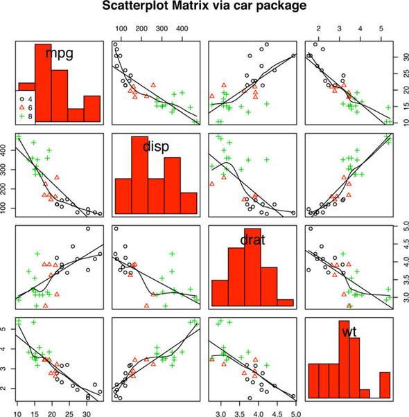
library(car)
scatterplotMatrix(~ mpg + disp + drat + wt, data=mtcars, spread=FALSE,
                  lty.smooth=2, main="Scatter Plot Matrix via car Package")
The graph is provided in figure 11.4. Here you can see that linear and smoothed (loess) fit lines are added by default and that kernel density and rug plots are added to the principal diagonal. The spread=FALSE option suppresses lines showing spread and asymmetry, and the lty.smooth=2 option displays the loess fit lines using dashed rather than solid lines.
Figure 11.4. Scatter plot matrix created with the scatterplotMatrix() function. The graph includes kernel density and rug plots in the principal diagonal and linear and loess fit lines.

As a second example of the scatterplotMatrix() function, consider the following code:
library(car)
scatterplotMatrix(~ mpg + disp + drat + wt | cyl, data=mtcars,
                  spread=FALSE, diagonal="histogram",
                  main="Scatter Plot Matrix via car Package")
Here, you change the kernel density plots to histograms and condition the results on the number of cylinders for each car. The results are displayed in figure 11.5.
Figure 11.5. Scatter plot matrix produced by the scatterplot.Matrix() function. The graph includes histograms in the principal diagonal and linear and loess fit lines. Additionally, subgroups (defined by number of cylinders) are indicated by symbol type and color.
By default, the regression lines are fit for the entire sample. Including the option by.groups = TRUE would have produced separate fit lines by subgroup.
An interesting variation on the scatter plot matrix is provided by the cpairs() function in the gclus package. The cpairs() function provides options to rearrange variables in the matrix so that variable pairs with higher correlations are closer to the principal diagonal. The function can also color-code the cells to reflect the size of these correlations. Consider the correlations among mpg, wt, disp, and drat:
> cor(mtcars[c("mpg", "wt", "disp", "drat")])

        mpg     wt   disp   drat
mpg   1.000 -0.868 -0.848  0.681
wt   -0.868  1.000  0.888 -0.712
disp -0.848  0.888  1.000 -0.710
drat  0.681 -0.712 -0.710  1.000
You can see that the highest correlations are between weight and displacement (0.89) and between weight and miles per gallon (–0.87). The lowest correlation is between miles per gallon and rear axle ratio (0.68). You can reorder and color the scatter plot matrix among these variables using the code in the following listing.
Listing 11.2. Scatter plot matrix produced with the gclus package
library(gclus)
mydata <- mtcars[c(1, 3, 5, 6)]
mydata.corr <- abs(cor(mydata))

mycolors <- dmat.color(mydata.corr)

myorder <- order.single(mydata.corr)

cpairs(mydata,
       myorder,
       panel.colors=mycolors,
       gap=.5,
       main="Variables Ordered and Colored by Correlation"
)
The code in listing 11.2 uses the dmat.color(), order.single(), and cpairs() functions from the gclus package. First, you select the desired variables from the mtcars data frame and calculate the absolute values of the correlations among them. Next, you obtain the colors to plot using the dmat.color() function. Given a symmetric matrix (a correlation matrix in this case), dmat.color() returns a matrix of colors. You also sort the variables for plotting. The order.single() function sorts objects so that similar object pairs are adjacent. In this case, the variable ordering is based on the similarity of the correlations. Finally, the scatter plot matrix is plotted and colored using the new ordering (myorder) and the color list (mycolors). The gap option adds a small space between cells of the matrix. The resulting graph is provided in figure 11.6.
Figure 11.6. Scatter plot matrix produced with the cpairs() function in the gclus package. Variables closer to the principal diagonal are more highly correlated.

You can see from the figure that the highest correlations are between weight and displacement and weight and miles per gallon (red and closest to the principal diagonal). The lowest correlation is between rear axle ratio and miles per gallon (yellow and far from the principal diagonal). This method is particularly useful when many variables, with widely varying inter-correlations, are considered. You’ll see other examples of scatter plot matrices in chapter 16.
11.1.2. High-density scatter plots
When there’s a significant overlap among data points, scatter plots become less useful for observing relationships. Consider the following contrived example with 10,000 observations falling into two overlapping clusters of data:
set.seed(1234)

n <- 10000
c1 <- matrix(rnorm(n, mean=0, sd=.5), ncol=2)
c2 <- matrix(rnorm(n, mean=3, sd=2), ncol=2)
mydata <- rbind(c1, c2)
mydata <- as.data.frame(mydata)
names(mydata) <- c("x", "y")
If you generate a standard scatter plot between these variables using the following code
with(mydata,
     plot(x, y, pch=19, main="Scatter Plot with 10,000 Observations"))
you’ll obtain a graph like the one in figure 11.7.
Figure 11.7. Scatter plot with 10,000 observations and significant overlap of data points. Note that the overlap of data points makes it difficult to discern where the concentration of data is greatest.

The overlap of data points in figure 11.7 makes it difficult to discern the relationship between x and y. R provides several graphical approaches that can be used when this occurs. They include the use of binning, color, and transparency to indicate the number of overprinted data points at any point on the graph.
The smoothScatter() function uses a kernel density estimate to produce smoothed color density representations of the scatterplot. The following code
with(mydata,
     smoothScatter(x, y, main="Scatterplot Colored by Smoothed Densities"))
produces the graph in figure 11.8.
Figure 11.8. Scatterplot using smoothScatter() to plot smoothed density estimates. Densities are easy to read from the graph.

Using a different approach, the hexbin() function in the hexbin package provides bivariate binning into hexagonal cells (it looks better than it sounds). Applying this function to the dataset
library(hexbin)
with(mydata, {
     bin <- hexbin(x, y, xbins=50)
     plot(bin, main="Hexagonal Binning with 10,000 Observations")
     })
you get the scatter plot in figure 11.9.
Figure 11.9. Scatter plot using hexagonal binning to display the number of observations at each point. Data concentrations are easy to see and counts can be read from the legend.

Finally, the iplot() function in the IDPmisc package can be used to display density (the number of data points at a specific spot) using color. The code
library(IDPmisc)
with(mydata,
     iplot(x, y, main="Image Scatter Plot with Color Indicating Density"))
produces the graph in figure 11.10.
Figure 11.10. Scatter plot of 10,000 observations, where density is indicated by color. The data concentrations are easily discernable.

It’s useful to note that the smoothScatter() function in the base package, along with the ipairs() function in the IDPmisc package, can be used to create readable scatter plot matrices for large datasets as well. See ?smoothScatter and ?ipairs for examples.
11.1.3. 3D scatter plots
Scatter plots and scatter plot matrices display bivariate relationships. What if you want to visualize the interaction of three quantitative variables at once? In this case, you can use a 3D scatter plot.
For example, say that you’re interested in the relationship between automobile mileage, weight, and displacement. You can use the scatterplot3d() function in the scatterplot3d package to picture their relationship. The format is
scatterplot3d(x, y, z)
where x is plotted on the horizontal axis, y is plotted on the vertical axis, and z is plotted in perspective. Continuing our example
library(scatterplot3d)
attach(mtcars)
scatterplot3d(wt, disp, mpg,
    main="Basic 3D Scatter Plot")
produces the 3D scatter plot in figure 11.11.
Figure 11.11. 3D scatter plot of miles per gallon, auto weight, and displacement

The scatterplot3d() function offers many options, including the ability to specify symbols, axes, colors, lines, grids, highlighting, and angles. For example, the code
library(scatterplot3d)
attach(mtcars)
scatterplot3d(wt, disp, mpg,
              pch=16,
              highlight.3d=TRUE,
              type="h",
              main="3D Scatter Plot with Vertical Lines")
produces a 3D scatter plot with highlighting to enhance the impression of depth, and vertical lines connecting points to the horizontal plane (see figure 11.12).
Figure 11.12. 3D scatter plot with vertical lines and shading

As a final example, let’s take the previous graph and add a regression plane. The necessary code is:
library(scatterplot3d)
attach(mtcars)
s3d <-scatterplot3d(wt, disp, mpg,
      pch=16,
      highlight.3d=TRUE,
      type="h",
      main="3D Scatter Plot with Vertical Lines and Regression Plane")
fit <- lm(mpg ~ wt+disp)
s3d$plane3d(fit)
The resulting graph is provided in figure 11.13.
Figure 11.13. 3D scatter plot with vertical lines, shading, and overlaid regression plane

The graph allows you to visualize the prediction of miles per gallon from automobile weight and displacement using a multiple regression equation. The plane represents the predicted values, and the points are the actual values. The vertical distances from the plane to the points are the residuals. Points that lie above the plane are under-predicted, while points that lie below the line are over-predicted. Multiple regression is covered in chapter 8.
Spinning 3D Scatter Plots
Three-dimensional scatter plots are much easier to interpret if you can interact with them. R provides several mechanisms for rotating graphs so that you can see the plotted points from more than one angle.
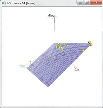
For example, you can create an interactive 3D scatter plot using the plot3d() function in the rgl package. It creates a spinning 3D scatter plot that can be rotated with the mouse. The format is
plot3d(x, y, z)
where x, y, and z are numeric vectors representing points. You can also add options like col and size to control the color and size of the points, respectively. Continuing our example, try the code
library(rgl)
attach(mtcars)
plot3d(wt, disp, mpg, col="red", size=5)
You should get a graph like the one depicted in figure 11.14. Use the mouse to rotate the axes. I think that you’ll find that being able to rotate the scatter plot in three dimensions makes the graph much easier to understand.
Figure 11.14. Rotating 3D scatter plot produced by the plot3d() function in the rgl package

You can perform a similar function with the scatter3d() in the Rcmdr package:
library(Rcmdr)
attach(mtcars)
scatter3d(wt, disp, mpg)
The results are displayed in figure 11.15.
Figure 11.15. Spinning 3D scatter plot produced by the scatter3d() function in the Rcmdr package
The scatter3d() function can include a variety of regression surfaces, such as linear, quadratic, smooth, and additive. The linear surface depicted is the default. Additionally, there are options for interactively identifying points. See help(scatter3d) for more details. I’ll have more to say about the Rcmdr package in appendix A.
11.1.4. Bubble plots
In the previous section, you displayed the relationship between three quantitative variables using a 3D scatter plot. Another approach is to create a 2D scatter plot and use the size of the plotted point to represent the value of the third variable. This approach is referred to as a bubble plot.
You can create a bubble plot using the symbols() function. This function can be used to draw circles, squares, stars, thermometers, and box plots at a specified set of (x, y) coordinates. For plotting circles, the format is
symbols(x, y, circle=radius)
where x and y and radius are vectors specifying the x and y coordinates and circle radiuses, respectively.
You want the areas, rather than the radiuses of the circles, to be proportional to the values of a third variable. Given the
formula for the radius of a circle ![]() the proper call is
the proper call is
symbols(x, y, circle=sqrt(z/pi))
where z is the third variable to be plotted.
Let’s apply this to the mtcars data, plotting car weight on the x-axis, miles per gallon on the y-axis, and engine displacement as the bubble size. The following code
attach(mtcars)
r <- sqrt(disp/pi)
symbols(wt, mpg, circle=r, inches=0.30,
        fg="white", bg="lightblue",
        main="Bubble Plot with point size proportional to displacement",
        ylab="Miles Per Gallon",
        xlab="Weight of Car (lbs/1000)")
text(wt, mpg, rownames(mtcars), cex=0.6)
detach(mtcars)
produces the graph in figure 11.16. The option inches is a scaling factor that can be used to control the size of the circles (the default is to make the largest circle 1 inch). The text() function is optional. Here it is used to add the names of the cars to the plot. From the figure, you can see that increased gas mileage is associated with both decreased car weight and engine displacement.
Figure 11.16. Bubble plot of car weight versus mpg where point size is proportional to engine displacement

In general, statisticians involved in the R project tend to avoid bubble plots for the same reason they avoid pie charts. Humans typically have a harder time making judgments about volume than distance. But bubble charts are certainly popular in the business world, so I’m including them here for completeness.
I’ve certainly had a lot to say about scatter plots. This attention to detail is due, in part, to the central place that scatter plots hold in data analysis. While simple, they can help you visualize your data in an immediate and straightforward manner, uncovering relationships that might otherwise be missed.
11.2. Line charts
If you connect the points in a scatter plot moving from left to right, you have a line plot. The dataset Orange that come with the base installation contains age and circumference data for five orange trees. Consider the growth of the first orange tree, depicted in figure 11.17. The plot on the left is a scatter plot, and the plot on the right is a line chart. As you can see, line charts are particularly good vehicles for conveying change.
Figure 11.17. Comparison of a scatter plot and a line plot

The graphs in figure 11.17 were created with the code in the following listing.
Listing 11.3. Creating side-by-side scatter and line plots
opar <- par(no.readonly=TRUE)
par(mfrow=c(1,2))
t1 <- subset(Orange, Tree==1)
plot(t1$age, t1$circumference,
     xlab="Age (days)",
     ylab="Circumference (mm)",
     main="Orange Tree 1 Growth")
plot(t1$age, t1$circumference,
     xlab="Age (days)",
     ylab="Circumference (mm)",
     main="Orange Tree 1 Growth",
     type="b")
par(opar)
You’ve seen the elements that make up this code in chapter 3, so I won’t go into details here. The main difference between the two plots in figure 11.17 is produced by the option type="b". In general, line charts are created with one of the following two functions
plot(x, y, type=)
lines(x, y, type=)
where x and y are numeric vectors of (x, y) points to connect. The option type= can take the values described in table 11.1.
Table 11.1. Line chart options
|
Type |
What is plotted |
|---|---|
| p | Points only |
| l | Lines only |
| o | Over-plotted points (that is, lines overlaid on top of points) |
| b, c | Points (empty if c) joined by lines |
| s, S | Stair steps |
| h | Histogram-line vertical lines |
| n | Doesn’t produce any points or lines (used to set up the axes for later commands) |
Examples of each type are given in figure 11.18. As you can see, type="p" produces the typical scatter plot. The option type="b" is the most common for line charts. The difference between b and c is whether the points appear or gaps are left instead. Both type="s" and type="S" produce stair steps (step functions). The first runs, then rises, whereas the second rises, then runs.
Figure 11.18. type=options in the plot() and lines() functions

There’s an important difference between the plot() and lines() functions. The plot() function will create a new graph when invoked. The lines() function adds information to an existing graph but can’t produce a graph on its own.
Because of this, the lines() function is typically used after a plot() command has produced a graph. If desired, you can use the type="n" option in the plot() function to set up the axes, titles, and other graph features, and then use the lines() function to add various lines to the plot.
To demonstrate the creation of a more complex line chart, let’s plot the growth of all five orange trees over time. Each tree will have its own distinctive line. The code is shown in the next listing and the results in figure 11.19.
Figure 11.19. Line chart displaying the growth of five orange trees

Listing 11.4. Line chart displaying the growth of five orange trees over time


In listing 11.4, the plot() function is used to set up the graph and specify the axis labels and ranges but plots no actual data. The lines() function is then used to add a separate line and set of points for each orange tree. You can see that tree 4 and tree 5 demonstrated the greatest growth across the range of days measured, and that tree 5 overtakes tree 4 at around 664 days.
Many of the programming conventions in R that I discussed in chapters 2, 3, and 4 are used in listing 11.4. You may want to test your understanding by working through each line of code and visualizing what it’s doing. If you can, you are on your way to becoming a serious R programmer (and fame and fortune is near at hand)! In the next section, you’ll explore ways of examining a number of correlation coefficients at once.
11.3. Correlograms
Correlation matrices are a fundamental aspect of multivariate statistics. Which variables under consideration are strongly related to each other and which aren’t? Are there clusters of variables that relate in specific ways? As the number of variables grow, such questions can be harder to answer. Correlograms are a relatively recent tool for visualizing the data in correlation matrices.
It’s easier to explain a correlogram once you’ve seen one. Consider the correlations among the variables in the mtcars data frame. Here you have 11 variables, each measuring some aspect of 32 automobiles. You can get the correlations using the following code:
> options(digits=2)
> cor(mtcars)
       mpg   cyl  disp    hp   drat    wt   qsec    vs     am  gear   carb
mpg   1.00 -0.85 -0.85 -0.78  0.681 -0.87  0.419  0.66  0.600  0.48 -0.551
cyl  -0.85  1.00  0.90  0.83 -0.700  0.78 -0.591 -0.81 -0.523 -0.49  0.527
disp -0.85  0.90  1.00  0.79 -0.710  0.89 -0.434 -0.71 -0.591 -0.56  0.395
hp   -0.78  0.83  0.79  1.00 -0.449  0.66 -0.708 -0.72 -0.243 -0.13  0.750
drat  0.68 -0.70 -0.71 -0.45  1.000 -0.71  0.091  0.44  0.713  0.70 -0.091
wt   -0.87  0.78  0.89  0.66 -0.712  1.00 -0.175 -0.55 -0.692 -0.58  0.428
qsec  0.42 -0.59 -0.43 -0.71  0.091 -0.17  1.000  0.74 -0.230 -0.21 -0.656
vs    0.66 -0.81 -0.71 -0.72  0.440 -0.55  0.745  1.00  0.168  0.21 -0.570
am    0.60 -0.52 -0.59 -0.24  0.713 -0.69 -0.230  0.17  1.000  0.79  0.058
gear  0.48 -0.49 -0.56 -0.13  0.700 -0.58 -0.213  0.21  0.794  1.00  0.274
carb -0.55  0.53  0.39  0.75 -0.091  0.43 -0.656 -0.57  0.058  0.27  1.000
Which variables are most related? Which variables are relatively independent? Are there any patterns? It isn’t that easy to tell from the correlation matrix without significant time and effort (and probably a set of colored pens to make notations).
You can display that same correlation matrix using the corrgram() function in the corrgram package (see figure 11.20). The code is:
library(corrgram)
corrgram(mtcars, order=TRUE, lower.panel=panel.shade,
         upper.panel=panel.pie, text.panel=panel.txt,
         main="Correlogram of mtcars intercorrelations")
Figure 11.20. Correlogram of the correlations among the variables in the mtcars data frame. Rows and columns have been reordered using principal components analysis.

To interpret this graph, start with the lower triangle of cells (the cells below the principal diagonal). By default, a blue color and hashing that goes from lower left to upper right represents a positive correlation between the two variables that meet at that cell. Conversely, a red color and hashing that goes from the upper left to the lower right represents a negative correlation. The darker and more saturated the color, the greater the magnitude of the correlation. Weak correlations, near zero, will appear washed out. In the current graph, the rows and columns have been reordered (using principal components analysis) to cluster variables together that have similar correlation patterns.
You can see from shaded cells that gear, am, drat, and mpg are positively correlated with one another. You can also see that wt, disp, cyl, hp, and carb are positively correlated with one another. But the first group of variables is negatively correlated with the second group of variables. You can also see that the correlation between carb and am is weak, as is the correlation between vs and gear, vs and am, and drat and qsec.
The upper triangle of cells displays the same information using pies. Here, color plays the same role, but the strength of the correlation is displayed by the size of the filled pie slice. Positive correlations fill the pie starting at 12 o’clock and moving in a clockwise direction. Negative correlations fill the pie by moving in a counterclockwise direction. The format of the corrgram() function is
corrgram(x, order=, panel=, text.panel=, diag.panel=)
where x is a data frame with one observation per row. When order=TRUE, the variables are reordered using a principal component analysis of the correlation matrix. Reordering can help make patterns of bivariate relationships more obvious.
The option panel specifies the type of off-diagonal panels to use. Alternatively, you can use the options lower.panel and upper.panel to choose different options below and above the main diagonal. The text.panel and diag.panel options refer to the main diagonal. Allowable values for panel are described in table 11.2.
Table 11.2. Panel options for the corrgram() function
|
Placement |
Panel Option |
Description |
|---|---|---|
| Off diagonal | panel.pie | The filled portion of the pie indicates the magnitude of the correlation. |
| panel.shade | The depth of the shading indicates the magnitude of the correlation. | |
| panel.ellipse | A confidence ellipse and smoothed line are plotted. | |
| panel.pts | A scatter plot is plotted. | |
| Main diagonal | panel.minmax | The minimum and maximum values of the variable are printed. |
| panel.txt | The variable name is printed. |
Let’s try a second example. The code
library(corrgram)
corrgram(mtcars, order=TRUE, lower.panel=panel.ellipse,
         upper.panel=panel.pts, text.panel=panel.txt,
         diag.panel=panel.minmax,
         main="Correlogram of mtcars data using scatter plots and ellipses")
produces the graph in figure 11.21. Here you’re using smoothed fit lines and confidence ellipses in the lower triangle and scatter plots in the upper triangle.
Several of the variables that are plotted in figure 11.21 have limited allowable values. For example, the number of gears is 3, 4, or 5. The number of cylinders is 4, 6, or 8. Both am (transmission type) and vs (V/S) are dichotomous. This explains the odd-looking scatter plots in the upper diagonal.
Always be careful that the statistical methods you choose are appropriate to the form of the data. Specifying these variables as ordered or unordered factors can serve as a useful check. When R knows that a variable is categorical or ordinal, it attempts to apply statistical methods that are appropriate to that level of measurement.
Figure 11.21. Correlogram of the correlations among the variables in the mtcars data frame. The lower triangle contains smoothed best fit lines and confidence ellipses, and the upper triangle contains scatter plots. The diagonal panel contains minimum and maximum values. Rows and columns have been reordered using principal components analysis.

We’ll finish with one more example. The code
library(corrgram)
corrgram(mtcars, lower.panel=panel.shade,
         upper.panel=NULL, text.panel=panel.txt,
         main="Car Mileage Data (unsorted)")
produces the graph in figure 11.22. Here we’re using shading in the lower triangle, keeping the original variable order, and leaving the upper triangle blank.
Figure 11.22. Correlogram of the correlations among the variables in the mtcars data frame. The lower triangle is shaded to represent the magnitude and direction of the correlations. The variables are plotted in their original order.

Before moving on, I should point out that you can control the colors used by the corrgram() function. To do so, specify four colors in the colorRampPalette() function within the col.corrgram() function. Here’s an example:
library(corrgram)
col.corrgram <- function(ncol){
                colorRampPalette(c("darkgoldenrod4", "burlywood1",
                                   "darkkhaki", "darkgreen"))(ncol)}
corrgram(mtcars, order=TRUE, lower.panel=panel.shade,
         upper.panel=panel.pie, text.panel=panel.txt,
         main="A Corrgram (or Horse) of a Different Color")
Try it and see what you get.
Correlograms can be a useful way to examine large numbers of bivariate relationships among quantitative variables. Because they’re relatively new, the greatest challenge is to educate the recipient on how to interpret them.
To learn more, see Michael Friendly’s article “Corrgrams: Exploratory Displays for Correlation Matrices,” available at http://www.math.yorku.ca/SCS/Papers/corrgram.pdf.
11.4. Mosaic plots
Up to this point, we’ve been exploring methods of visualizing relationships among quantitative/continuous variables. But what if your variables are categorical? When you’re looking at a single categorical variable, you can use a bar or pie chart. If there are two categorical variables, you can look at a 3D bar chart (which, by the way, is not so easy to do in R). But what do you do if there are more than two categorical variables?
One approach is to use mosaic plots. In a mosaic plot, the frequencies in a multidimensional contingency table are represented by nested rectangular regions that are proportional to their cell frequency. Color and or shading can be used to represent residuals from a fitted model. For details, see Meyer, Zeileis and Hornick (2006), or Michael Friendly’s Statistical Graphics page (http://datavis.ca). Steve Simon has created a good conceptual tutorial on how mosaic plots are created, available at http://www.childrensmercy.org/stats/definitions/mosaic.htm.
Mosaic plots can be created with the mosaic() function from the vcd library (there’s a mosaicplot() function in the basic installation of R, but I recommend you use the vcd package for its more extensive features). As an example, consider the Titanic dataset available in the base installation. It describes the number of passengers who survived or died, cross-classified by their class (1st, 2nd, 3rd, Crew), sex (Male, Female), and age (Child, Adult). This is a well-studied dataset. You can see the cross-classification using the following code:
> ftable(Titanic)
                    Survived  No Yes
Class Sex    Age
1st   Male   Child             0   5
             Adult           118  57
      Female Child             0   1
             Adult             4 140
2nd   Male   Child             0  11
             Adult           154  14
      Female Child             0  13
             Adult            13  80
3rd   Male   Child            35  13
             Adult           387  75
      Female Child            17  14
             Adult            89  76
Crew  Male   Child             0   0
             Adult           670 192
      Female Child             0   0
             Adult             3  20
The mosaic() function can be invoked as
mosaic(table)
where table is a contingency table in array form, or
mosaic(formula, data=)
where formula is a standard R formula, and data specifies either a data frame or table. Adding the option shade=TRUE will color the figure based on Pearson residuals from a fitted model (independence by default) and the option legend=TRUE will display a legend for these residuals.
For example, both
library(vcd)
mosaic(Titanic, shade=TRUE, legend=TRUE)
and
library(vcd)
mosaic(~Class+Sex+Age+Survived, data=Titanic, shade=TRUE, legend=TRUE)
will produce the graph shown in figure 11.23. The formula version gives you greater control over the selection and placement of variables in the graph.
Figure 11.23. Mosaic plot describing Titanic survivors by class, sex, and age

There’s a great deal of information packed into this one picture. For example, as one moves from crew to first class, the survival rate increases precipitously. Most children were in third and second class. Most females in first class survived, whereas only about half the females in third class survived. There were few females in the crew, causing the Survived labels (No, Yes at the bottom of the chart) to overlap for this group. Keep looking and you’ll see many more interesting facts. Remember to look at the relative widths and heights of the rectangles. What else can you learn about that night?
Extended mosaic plots add color and shading to represent the residuals from a fitted model. In this example, the blue shading indicates cross-classifications that occur more often than expected, assuming that survival is unrelated to class, gender, and age. Red shading indicates cross-classifications that occur less often than expected under the independence model. Be sure to run the example so that you can see the results in color. The graph indicates that more first-class women survived and more male crew members died than would be expected under an independence model. Fewer third-class men survived than would be expected if survival was independent of class, gender, and age. If you would like to explore mosaic plots in greater detail, try running example(mosaic).
11.5. Summary
In this chapter, we considered a wide range of techniques for displaying relationships among two or more variables. This included the use of 2D and 3D scatter plots, scatter plot matrices, bubble plots, line plots, correlograms, and mosaic plots. Some of these methods are standard techniques, while some are relatively new.
Taken together with methods that allow you to customize graphs (chapter 3), display univariate distributions (chapter 6), explore regression models (chapter 8), and visualize group differences (chapter 9), you now have a comprehensive toolbox for visualizing and extracting meaning from your data.
In later chapters, you’ll expand your skills with additional specialized techniques, including graphics for latent variable models (chapter 14), methods for visualizing missing data patterns (chapter 15), and techniques for creating graphs that are conditioned on one or more variables (chapter 16).
In the next chapter, we’ll explore resampling statistics and bootstrapping. These are computer intensive methods that allow you to analyze data in new and unique ways.