
By the end of this chapter, you will be able to explain the key steps involved in performing exploratory data analysis; identify the types of data contained in the dataset; summarize the dataset and at a detailed level for each variable; visualize the data distribution in each column; find relationships between variables and analyze missing values and outliers for each variable
This chapter will introduce you to the art of performing exploratory data analysis and visualizing the data in order to identify quality issues, potential data transformations, and interesting patterns.
Introduction
In the previous chapter, which was all about improving our machine learning model, tune its hyperparameters, and interpret its results and parameters to provide meaningful insights back to the business. This chapter opens the third part of this book: enhancing your dataset. In the next three chapters, we are taking a step back and will be focusing on the key input of any machine learning model: the dataset. We will learn how to explore a new dataset, prepare it for the modeling stage, and create new variables (also called feature engineering). These are very exciting and important topics to learn about, so let's jump in.
When we mention data science, most people think about building fancy machine learning algorithms for predicting future outcomes. They usually do not think about all the other critical tasks involved in a data science project. In reality, the modeling step covers only a small part of such a project. You may have already heard about the rule of thumb stating that data scientists spend only 20% of their time fitting a model and the other 80% on understanding and preparing the data. This is actually quite close to reality.
A very popular methodology that's used in the industry for running data science projects is CRISP-DM.
Note
We will not go into too much detail about this methodology as it is out of the scope of this book. But if you are interested in learning more about it, you can find the description of CRISP-DM here: https://packt.live/2QMRepG.
This methodology breaks down a data science project into six different stages:
- Business understanding
- Data understanding
- Data preparation
- Modeling
- Evaluation
- Deployment
As you can see, modeling represents only one phase out of the six and it happens quite close toward the end of the project. In this chapter, we will mainly focus on the second step of CRISP-DM: the data understanding stage.
You may wonder why it is so important to understand the data and why we shouldn't spend more time on modeling. Some researchers have actually shown that training very simple models on high-quality data outperformed extremely complex models with bad data.
If your data is not right, even the most advanced model will not be able to find the relevant patterns and predict the right outcome. This is garbage in, garbage out, which means that the wrong input will lead to the wrong output. Therefore, we need to have a good grasp of the limitations and issues of our dataset and fix them before fitting it into a model.
The second reason why it is so important to understand the input data is because it will also help us to define the right approach and shortlist the relevant algorithms accordingly. For instance, if you see that a specific class is less represented compared to other ones in your dataset, you may want to use specific algorithms that can handle imbalanced data or use some resampling techniques beforehand to make the classes more evenly distributed.
In this chapter, you will learn about some of the key concepts and techniques for getting a deep and good understanding of your data.
Exploring Your Data
If you are running your project by following the CRISP-DM methodology, the first step will be to discuss the project with the stakeholders and clearly define their requirements and expectations. Only once this is clear can you start having a look at the data and see whether you will be able to achieve these objectives.
After receiving a dataset, you may want to make sure that the dataset contains the information you need for your project. For instance, if you are working on a supervised project, you will check whether this dataset contains the target variable you need and whether there are any missing or incorrect values for this field. You may also check how many observations (rows) and variables (columns) there are. These are the kind of questions you will have initially with a new dataset. This section will introduce you to some techniques you can use to get the answers to these questions.
For the rest of this section, we will be working with a dataset containing transactions from an online retail store.
Note
This dataset is in our GitHub repository: https://packt. live/36s4XIN.
It was sourced from https://packt.live/2Qu5XqC, courtesy of Daqing Chen, Sai Liang Sain, and Kun Guo, Data mining for the online retail industry, UCI Machine Learning Repository.
Our dataset is an Excel spreadsheet. Luckily, the pandas package provides a method we can use to load this type of file: read_excel().
Let's read the data using the .read_excel() method and store it in a pandas DataFrame, as shown in the following code snippet:
import pandas as pd
file_url = 'https://github.com/PacktWorkshops/The-Data-Science-Workshop/blob/master/Chapter10/dataset/Online%20Retail.xlsx?raw=true'
df = pd.read_excel(file_url)
After loading the data into a DataFrame, we want to know the size of this dataset, that is, its number of rows and columns. To get this information, we just need to call the .shape attribute from pandas:
df.shape
You should get the following output:
(541909, 8)
This attribute returns a tuple containing the number of rows as the first element and the number of columns as the second element. The loaded dataset contains 541909 rows and 8 different columns.
Since this attribute returns a tuple, we can access each of its elements independently by providing the relevant index. Let's extract the number of rows (index 0):
df.shape[0]
You should get the following output:
541909
Similarly, we can get the number of columns with the second index:
df.shape[1]
You should get the following output:
8
Usually, the first row of a dataset is the header. It contains the name of each column. By default, the read_excel() method assumes that the first row of the file is the header. If the header is stored in a different row, you can specify a different index for the header with the parameter header from read_excel(), such as pd.read_excel(header=1) for specifying the header column is the second row.
Once loaded into a pandas DataFrame, you can print out its content by calling it directly:
df
You should get the following output:

Figure 10.1: First few rows of the loaded online retail DataFrame
To access the names of the columns for this DataFrame, we can call the .columns attribute:
df.columns
You should get the following output:

Figure 10.2: List of the column names for the online retail DataFrame
The columns from this dataset are InvoiceNo, StockCode, Description, Quantity, InvoiceDate, UnitPrice, CustomerID, and Country. We can infer that a row from this dataset represents the sale of an article for a given quantity and price for a specific customer at a particular date.
Looking at these names, we can potentially guess what types of information are contained in these columns, however, to be sure, we can use the dtypes attribute, as shown in the following code snippet:
df.dtypes
You should get the following output:

Figure 10.3: Description of the data type for each column of the DataFrame
From this output, we can see that the InvoiceDate column is a date type (datetime64[ns]), Quantity is an integer (int64), and that UnitPrice and CustmerID are decimal numbers (float64). The remaining columns are text (object).
The pandas package provides a single method that can display all the information we have seen so far, that is, the info() method:
df.info()
You should get the following output:

Figure 10.4: Output of the info() method
In just a few lines of code, we learned some high-level information about this dataset, such as its size, the column names, and their types.
In the next section, we will analyze the content of a dataset.
Analyzing Your Dataset
Previously, we learned about the overall structure of a dataset and the kind of information it contains. Now, it is time to really dig into it and look at the values of each column.
First, we need to import the pandas package:
import pandas as pd
Then, we'll load the data into a pandas DataFrame:
file_url = 'https://github.com/PacktWorkshops/The-Data-Science-Workshop/blob/master/Chapter10/dataset/Online%20Retail.xlsx?raw=true'
df = pd.read_excel(file_url)
The pandas package provides several methods so that you can display a snapshot of your dataset. The most popular ones are head(), tail(), and sample().
The head() method will show the top rows of your dataset. By default, pandas will display the first five rows:
df.head()
You should get the following output:

Figure 10.5: Displaying the first five rows using the head() method
The output of the head() method shows that the InvoiceNo, StockCode, and CustomerID columns are unique identifier fields for each purchasing invoice, item sold, and customer. The Description field is text describing the item sold. Quantity and UnitPrice are the number of items sold and their unit price, respectively. Country is a text field that can be used for specifying where the customer or the item is located or from which country version of the online store the order has been made. In a real project, you may reach out to the team who provided this dataset and confirm what the meaning of the Country column is, or any other column details that you may need, for that matter.
With pandas, you can specify the number of top rows to be displayed with the head() method by providing an integer as its parameter. Let's try this by displaying the first 10 rows:
df.head(10)
You should get the following output:

Figure 10.6: Displaying the first 10 rows using the head() method
Looking at this output, we can assume that the data is sorted by the InvoiceDate column and grouped by CustomerID and InvoiceNo. We can only see one value in the Country column: United Kingdom. Let's check whether this is really the case by looking at the last rows of the dataset. This can be achieved by calling the tail() method. Like head(), this method, by default, will display only five rows, but you can specify the number of rows you want as a parameter. Here, we will display the last eight rows:
df.tail(8)
You should get the following output:

Figure 10.7: Displaying the last eight rows using the tail() method
It seems that we were right in assuming that the data is sorted in ascending order by the InvoiceDate column. We can also confirm that there is actually more than one value in the Country column.
We can also use the sample() method to randomly pick a given number of rows from the dataset with the n parameter. You can also specify a seed (which we covered in Chapter 5, Performing Your First Cluster Analysis) in order to get reproducible results if you run the same code again with the random_state parameter:
df.sample(n=5, random_state=1)
You should get the following output:

Figure 10.8: Displaying five random sampled rows using the sample() method
In this output, we can see an additional value in the Country column: Germany. We can also notice a few interesting points:
- InvoiceNo can also contain alphabetical letters (row 94,801 starts with a C, which may have a special meaning).
- Quantity can have negative values: -2 (row 94801).
- CustomerID contains missing values: NaN (row 210111).
Exercise 10.01: Exploring the Ames Housing Dataset with Descriptive Statistics
In this exercise, we will explore the Ames Housing dataset in order to get a good understanding of it by analyzing its structure and looking at some of its rows.
The dataset we will be using in this exercise is the Ames Housing dataset, which can be found on our GitHub repository: https://packt.live/35kRKAo.
Note
This dataset was compiled by Dean De Cock.
This dataset contains a list of residential house sales in the city of Ames, Iowa, between 2016 and 2010.
More information about each variable can be found at https://packt.live/2sT88L4.
The following steps will help you to complete this exercise:
- Open a new Colab notebook.
- Import the pandas package:
import pandas as pd
- Assign the link to the AMES dataset to a variable called file_url:
file_url = 'https://raw.githubusercontent.com/PacktWorkshops/The-Data-Science-Workshop/master/Chapter10/dataset/ames_iowa_housing.csv'
Note
The file URL is the raw dataset URL, which can be found on GitHub.
- Use the .read_csv() method from the pandas package and load the dataset into a new variable called df:
df = pd.read_csv(file_url)
- Print the number of rows and columns of the DataFrame using the shape attribute from the pandas package:
df.shape
You should get the following output:
(1460, 81)
We can see that this dataset contains 1460 rows and 81 different columns.
- Print the names of the variables contained in this DataFrame using the columns attribute from the pandas package:
df.columns
You should get the following output:

Figure 10.9: List of columns in the housing dataset
We can infer the type of information contained in some of the variables by looking at their names, such as LotArea (property size), YearBuilt (year of construction), and SalePrice (property sale price).
- Print out the type of each variable contained in this DataFrame using the dtypes attribute from the pandas package:
df.dtypes
You should get the following output:

Figure 10.10: List of columns and their type from the housing dataset
We can see that the variables are either numerical or text types. There is no date column in this dataset.
- Display the top rows of the DataFrame using the head() method from pandas:
df.head()
You should get the following output:

Figure 10.11: First five rows of the housing dataset
- Display the last five rows of the DataFrame using the tail() method from pandas:
df.tail()
You should get the following output:

Figure 10.12: Last five rows of the housing dataset
It seems that the Alley column has a lot of missing values, which are represented by the NaN value (which stands for Not a Number). The Street and Utilities columns seem to have only one value.
- Now, display 5 random sampled rows of the DataFrame using the sample() method from pandas and pass it a 'random_state' of 8:
df.sample(n=5, random_state=8)
You should get the following output:

Figure 10.13: Five randomly sampled rows of the housing dataset
With these random samples, we can see that the LotFrontage column also has some missing values. We can also see that this dataset contains both numerical and text data (object types). We will analyze them more in detail in Exercise 10.02, Analyzing the Categorical Variables from the Ames Housing Dataset, and Exercise 10.03, Analyzing Numerical Variables from the Ames Housing Dataset.
We learned quite a lot about this dataset in just a few lines of code, such as the number of rows and columns, the data type of each variable, and their information. We also identified some issues with missing values.
Analyzing the Content of a Categorical Variable
Now that we've got a good feel for the kind of information contained in the online retail dataset, we want to dig a little deeper into each of its columns:
import pandas as pd
file_url = 'https://github.com/PacktWorkshops/The-Data-Science-Workshop/blob/master/Chapter10/dataset/Online%20Retail.xlsx?raw=true'
df = pd.read_excel(file_url)
For instance, we would like to know how many different values are contained in each of the variables by calling the nunique() method. This is particularly useful for a categorical variable with a limited number of values, such as Country:
df['Country'].nunique()
You should get the following output:
38
We can see that there are 38 different countries in this dataset. It would be great if we could get a list of all the values in this column. Thankfully, the pandas package provides a method to get these results: unique():
df['Country'].unique()
You should get the following output:

Figure 10.14: List of unique values for the 'Country' column
We can see that there are multiple countries from different continents, but most of them come from Europe. We can also see that there is a value called Unspecified and another one for European Community, which may be for all the countries of the eurozone that are not listed separately.
Another very useful method from pandas is value_counts(). This method lists all the values from a given column but also their occurrence. By providing the dropna=False and normalise=True parameters, this method will include the missing value in the listing and calculate the number of occurrences as a ratio, respectively:
df['Country'].value_counts(dropna=False, normalize=True)
You should get the following output:

Figure 10.15: List of unique values and their occurrence percentage for the 'Country' column
From this output, we can see that the United Kingdom value is totally dominating this column as it represents over 91% of the rows and that other values such as Austria and Denmark are quite rare as they represent less than 1% of this dataset.
Exercise 10.02: Analyzing the Categorical Variables from the Ames Housing Dataset
In this exercise, we will continue our dataset exploration by analyzing the categorical variables of this dataset. To do so, we will implement our own describe functions.
The dataset we will be using in this exercise is the Ames Housing dataset, which can be found on our GitHub repository: https://packt.live/35kRKAo. Let's get started:
- Open a new Colab notebook.
- Import the pandas package:
import pandas as pd
- Assign the following link to the AMES dataset to a variable called file_url:
file_url = 'https://raw.githubusercontent.com/PacktWorkshops/The-Data-Science-Workshop/master/Chapter10/dataset/ames_iowa_housing.csv'
Note
The file URL is the raw dataset URL, which can be found on GitHub.
- Use the .read_csv() method from the pandas package and load the dataset into a new variable called df:
df = pd.read_csv(file_url)
- Create a new DataFrame called obj_df with only the columns that are of numerical types using the select_dtypes method from pandas package. Then, pass in the object value to the include parameter:
obj_df = df.select_dtypes(include='object')
- Using the columns attribute from pandas, extract the list of columns of this DataFrame, obj_df, assign it to a new variable called obj_cols, and print its content:
obj_cols = obj_df.columns
obj_cols
You should get the following output:

Figure 10.16: List of categorical variables
- Create a function called describe_object that takes a pandas DataFrame and a column name as input parameters. Then, inside the function, print out the name of the given column, its number of unique values using the nunique() method, and the list of values and their occurrence using the value_counts() method, as shown in the following code snippet:
def describe_object(df, col_name):
print(f" COLUMN: {col_name}")
print(f"{df[col_name].nunique()} different values")
print(f"List of values:")
print(df[col_name].value_counts(dropna=False, normalize=True))
- Test this function by providing the df DataFrame and the 'MSZoning' column:
describe_object(df, 'MSZoning')
You should get the following output:

Figure 10.17: Display of the created function for the MSZoning column
For the MSZoning column, the RL value represents almost 79% of the values, while C (all) is only present in less than 1% of the rows.
- Create a for loop that will call the created function for every element from the obj_cols list:
for col_name in obj_cols:
describe_object(df, col_name)
You should get the following output:

Figure 10.18: Display of the created function for the first columns contained in obj_cols
We can confirm that the Street column is almost constant as 99.6% of the rows contain the same value: Pave. For the column, that is, Alley, almost 94% of the rows have missing values.
We just analyzed all the categorical variables from this dataset. We saw how to look at the distribution of all the values contained in any feature. We also found that some of them are dominated by a single value and others have mainly missing values in them.
Summarizing Numerical Variables
Now, let's have a look at a numerical column and get a good understanding of its content. We will use some statistical measures that summarize a variable. All of these measures are referred to as descriptive statistics. In this chapter, we will introduce you to the most popular ones.
With the pandas package, a lot of these measures have been implemented as methods. For instance, if we want to know what the highest value contained in the 'Quantity' column is, we can use the .max() method:
df['Quantity'].max()
You should get the following output:
80995
We can see that the maximum quantity of an item sold in this dataset is 80995, which seems extremely high for a retail business. In a real project, this kind of unexpected value will have to be discussed and confirmed with the data owner or key stakeholders to see whether this is a genuine or an incorrect value. Now, let's have a look at the lowest value for 'Quantity' using the .min() method:
df['Quantity'].min()
You should get the following output:
-80995
The lowest value in this variable is extremely low. We can think that having negative values is possible for returned items, but here, the minimum (-80995) is very low. This, again, will be something to be confirmed with the relevant people in your organization.
Now, we are going to have a look at the central tendency of this column. Central tendency is a statistical term referring to the central point where the data will cluster around. The most famous central tendency measure is the average (or mean). The average is calculated by summing all the values of a column and dividing them by the number of values.
If we plot the Quantity column on a graph with its average, we will get the following output:

Figure 10.19: Average value for the 'Quantity' column
We can see the average for the Quantity column is very close to 0 and most of the data is between -50 and +50.
We can get the average value of a feature by using the mean() method from pandas:
df['Quantity'].mean()
You should get the following output:
9.55224954743324
In this dataset, the average quantity of items sold is around 9.55. The average measure is very sensitive to outliers and, as we saw previously, the minimum and maximum values of the Quantity column are quite extreme (-80995 to +80995).
We can use the median instead as another measure of central tendency. The median is calculated by splitting the column into two groups of equal lengths and getting the value of the middle point by separating these two groups, as shown in the following example:

Figure 10.20: Sample median example
In pandas, you can call the median() method to get this value:
df['Quantity'].median()
You should get the following output:
3.0
The median value for this column is 3, which is quite different from the mean (9.55) we found earlier. This tells us that there are some outliers in this dataset and we will have to decide on how to handle them after we've done more investigation (this will be covered in Chapter 11, Preparing the Data).
We can also evaluate the spread of this column (how much the data points vary from the central point). A common measure of spread is the standard deviation. The smaller this measure is, the closer the data is to its mean. On the other hand, if the standard deviation is high, this means there are some observations that are far from the average. We will use the std() method from pandas to calculate this measure:
df['Quantity'].std()
You should get the following output:
218.08115784986612
As expected, the standard deviation for this column is quite high, so the data is quite spread from the average, which is 9.55 in this example.
In the pandas package, there is a method that can display most of these descriptive statistics with one single line of code: describe():
df.describe()
You should get the following output:

Figure 10.21: Output of the describe() method
We got the exact same values for the Quantity column as we saw previously. This method has calculated the descriptive statistics for the three numerical columns (Quantity, UnitPrice, and CustomerID).
Even though the CustomerID column contains only numerical data, we know these values are used to identify each customer and have no mathematical meaning. For instance, it will not make sense to add customer ID 12680 to 17850 in the table or calculate the mean of these identifiers. This column is not actually numerical but categorical.
The describe() method doesn't know this information and just noticed there are numbers, so it assumed this is a numerical variable. This is the perfect example of why you should understand your dataset perfectly and identify the issues to be fixed before feeding the data to an algorithm. In this case, we will have to change the type of this column to categorical. In Chapter 11, Preparing the Data, we will see how we can handle this kind of issue, but for now, we will look at some graphical tools and techniques that will help us have an even better understanding of the data.
Exercise 10.03: Analyzing Numerical Variables from the Ames Housing Dataset
In this exercise, we will continue our dataset exploration by analyzing the numerical variables of this dataset. To do so, we will implement our own describe functions.
The dataset we will be using in this exercise is the Ames Housing dataset, which can be found on our GitHub repository: https://packt.live/35kRKAo. Let's get started:
- Open a new Colab notebook.
- Import the pandas package:
import pandas as pd
- Assign the link to the AMES dataset to a variable called file_url:
file_url = 'https://raw.githubusercontent.com/PacktWorkshops/The-Data-Science-Workshop/master/Chapter10/dataset/ames_iowa_housing.csv'
Note
The file URL is the raw dataset URL, which can be found on GitHub.
- Use the .read_csv() method from the pandas package and load the dataset into a new variable called df:
df = pd.read_csv(file_url)
- Create a new DataFrame called num_df with only the columns that are numerical using the select_dtypes method from the pandas package and pass in the 'number' value to the include parameter:
num_df = df.select_dtypes(include='number')
- Using the columns attribute from pandas, extract the list of columns of this DataFrame, num_df, assign it to a new variable called num_cols, and print its content:
num_cols = num_df.columns
num_cols
You should get the following output:

Figure 10.22: List of numerical columns
- Create a function called describe_numeric that takes a pandas DataFrame and a column name as input parameters. Then, inside the function, print out the name of the given column, its minimum value using min(), its maximum value using max(), its average value using mean(), its standard deviation using std(), and its median using median():
def describe_numeric(df, col_name):
print(f" COLUMN: {col_name}")
print(f"Minimum: {df[col_name].min()}")
print(f"Maximum: {df[col_name].max()}")
print(f"Average: {df[col_name].mean()}")
print(f"Standard Deviation: {df[col_name].std()}")
print(f"Median: {df[col_name].median()}")
You should get the following output:

Figure 10.23: Output showing the Min, Max, Avg, Std Deviation, and the Median
- Now, test this function by providing the df DataFrame and the SalePrice column:
describe_numeric(df, 'SalePrice')
You should get the following output:

Figure 10.24: The display of the created function for the 'SalePrice' column
The sale price ranges from 34,900 to 755,000 with an average of 180,921. The median is slightly lower than the average, which tells us there are some outliers with high sales prices.
- Create a for loop that will call the created function for every element from the num_cols list:
for col_name in num_cols:
describe_numeric(df, col_name)
You should get the following output:

Figure 10.25: Display of the created function for the first few columns contained in 'num_cols'
The Id column ranges from 1 to 1460, which is the exact value as the number of rows in this dataset. This means this column is definitely a unique identifier of the property that was sold. It appears the values from the MSSubClass are all rounded. This may indicate that the information contained in this column has either been clustered into groups of 10 or categorical variable.
We saw how to explore a newly received dataset with just a few lines of code. This helped us to understand its structure, the type of information contained in each variable, and also helped us identify some potential data quality issues, such as missing values or incorrect values.
Visualizing Your Data
In the previous section, we saw how to explore a new dataset and calculate some simple descriptive statistics. These measures helped summarize the dataset into interpretable metrics, such as the average or maximum values. Now it is time to dive even deeper and get a more granular view of each column using data visualization.
In a data science project, data visualization can be used either for data analysis or communicating gained insights. Presenting results in a visual way that stakeholders can easily understand and interpret them in is definitely a must-have skill for any good data scientist.
However, in this chapter, we will be focusing on using data visualization for analyzing data. Most people tend to interpret information more easily on a graph than reading written information. For example, when looking at the following descriptive statistics and the scatter plot for the same variable, which one do you think is easier to interpret? Let's take a look:

Figure 10.26: Sample visual data analysis
Even though the information shown with the descriptive statistics are more detailed, by looking at the graph, you have already seen that the data is stretched and mainly concentrated around the value 0. It probably took you less than 1 or 2 seconds to come up with this conclusion, that is, there is a cluster of points near the 0 value and that it gets reduced while moving away from it. Coming to this conclusion would have taken you more time if you were interpreting the descriptive statistics. This is the reason why data visualization is a very powerful tool for effectively analyzing data.
How to use the Altair API
We will be using a package called altair (if you recall, we already briefly used it in Chapter 5, Performing Your First Cluster Analysis). There are quite a lot of Python packages for data visualization on the market, such as matplotlib, seaborn, or Bokeh, and compared to them, altair is relatively new, but its community of users is growing fast thanks to its simple API syntax.
Let's see how we can display a bar chart step by step on the online retail dataset.
First, import the pandas and altair packages:
import pandas as pd
import altair as alt
Then, load the data into a pandas DataFrame:
file_url = 'https://github.com/PacktWorkshops/The-Data-Science-Workshop/blob/master/Chapter10/dataset/Online%20Retail.xlsx?raw=true'
df = pd.read_excel(file_url)
We will randomly sample 5,000 rows of this DataFrame using the sample() method (altair requires additional steps in order to display a larger dataset):
sample_df = df.sample(n=5000, random_state=8)
Now instantiate a Chart object from altair with the pandas DataFrame as its input parameter:
base = alt.Chart(sample_df)
Next, we call the mark_circle() method to specify the type of graph we want to plot: a scatter plot:
chart = base.mark_circle()
Finally, we specify the names of the columns that will be displayed on the x and y axes using the encode() method:
chart.encode(x='Quantity', y='UnitPrice')
We just plotted a scatter plot in seven lines of code:

Figure 10.27: Output of the scatter plot
Altair provides the option for combining its methods all together into one single line of code, like this:
alt.Chart(sample_df).mark_circle().encode(x='Quantity', y='UnitPrice')
You should get the following output:

Figure 10.28: Output of the scatter plot with combined altair methods
We can see that we got the exact same output as before. This graph shows us that there are a lot of outliers (extreme values) for both variables: most of the values of UnitPrice are below 100, but there are some over 300, and Quantity ranges from -200 to 800, while most of the observations are between -50 to 150. We can also notice a pattern where items with a high unit price have lower quantity (items over 50 in terms of unit price have a quantity close to 0) and the opposite is also true (items with a quantity over 100 have a unit price close to 0).
Now, let's say we want to visualize the same plot while adding the Country column's information. One easy way to do this is to use the color parameter from the encode() method. This will color all the data points according to their value in the Country column:
alt.Chart(sample_df).mark_circle().encode(x='Quantity', y='UnitPrice', color='Country')
You should get the following output:

Figure 10.29: Scatter plot with colors based on the 'Country' column
We added the information from the Country column into the graph, but as we can see, there are too many values and it is hard to differentiate between countries: there are a lot of blue points, but it is hard to tell which countries they are representing.
With altair, we can easily add some interactions on the graph in order to display more information for each observation; we just need to use the tooltip parameter from the encode() method and specify the list of columns to be displayed and then call the interactive() method to make the whole thing interactive (as seen previously in Chapter 5, Performing Your First Cluster Analysis):
alt.Chart(sample_df).mark_circle().encode(x='Quantity', y='UnitPrice', color='Country', tooltip=['InvoiceNo','StockCode','Description','InvoiceDate','CustomerID']).interactive()
You should get the following output:

Figure 10.30: Interactive scatter plot with tooltip
Now, if we hover on the observation with the highest UnitPrice value (the one near 600), we can see the information displayed by the tooltip: this observation doesn't have any value for StockCode and its Description is Manual. So, it seems that this is not a normal transaction to happen on the website. It may be a special order that has been manually entered into the system. This is something you will have to discuss with your stakeholder and confirm.
Histogram for Numerical Variables
Now that we are familiar with the altair API, let's have a look at some specific type of charts that will help us analyze and understand each variable. First, let's focus on numerical variables such as UnitPrice or Quantity in the online retail dataset.
For this type of variable, a histogram is usually used to show the distribution of a given variable. The x axis of a histogram will show the possible values in this column and the y axis will plot the number of observations that fall under each value. Since the number of possible values can be very high for a numerical variable (potentially an infinite number of potential values), it is better to group these values by chunks (also called bins). For instance, we can group prices into bins of 10 steps (that is, groups of 10 items each) such as 0 to 10, 11 to 20, 21 to 30, and so on.
Let's look at this by using a real example. We will plot a histogram for 'UnitPrice' using the mark_bar() and encode() methods with the following parameters:
- alt.X("UnitPrice:Q", bin=True): This is another altair API syntax that allows you to tune some of the parameters for the x axis. Here, we are telling altair to use the 'UnitPrice' column as the axis. ':Q' specifies that this column is quantitative data (that is, numerical) and bin=True forces the grouping of the possible values into bins.
- y='count()': This is used for calculating the number of observations and plotting them on the y axis, like so:
alt.Chart(sample_df).mark_bar().encode(
alt.X("UnitPrice:Q", bin=True),
y='count()'
)
You should get the following output:

Figure 10.31: Histogram for UnitPrice with the default bin step size
By default, altair grouped the observations by bins of 100 steps: 0 to 100, then 100 to 200, and so on. The step size that was chosen is not optimal as almost all the observations fell under the first bin (0 to 100) and we can't see any other bin. With altair, we can specify the values of the parameter bin and we will try this with 5, that is, alt.Bin(step=5):
alt.Chart(sample_df).mark_bar().encode(
alt.X("UnitPrice:Q", bin=alt.Bin(step=5)),
y='count()'
)
You should get the following output:

Figure 10.32: Histogram for UnitPrice with a bin step size of 5
This is much better. With this step size, we can see that most of the observations have a unit price under 5 (almost 4,200 observations). We can also see that a bit more than 500 data points have a unit price under 10. The count of records keeps decreasing as the unit price increases.
Let's plot the histogram for the Quantity column with a bin step size of 10:
alt.Chart(sample_df).mark_bar().encode(
alt.X("Quantity:Q", bin=alt.Bin(step=10)),
y='count()'
)
You should get the following output:

Figure 10.33: Histogram for Quantity with a bin step size of 10
In this histogram, most of the records have a positive quantity between 0 and 30 (first three highest bins). There is also a bin with around 50 observations that have a negative quantity from -10 to 0. As we mentioned earlier, these may be returned items from customers.
Bar Chart for Categorical Variables
Now, we are going to have a look at categorical variables. For such variables, there is no need to group the values into bins as, by definition, they have a limited number of potential values. We can still plot the distribution of such columns using a simple bar chart. In altair, this is very simple – it is similar to plotting a histogram but without the bin parameter. Let's try this on the Country column and look at the number of records for each of its values:
alt.Chart(sample_df).mark_bar().encode(x='Country',y='count()')
You should get the following output:

Figure 10.34: Bar chart of the Country column's occurrence
We can confirm that United Kingdom is the most represented country in this dataset (and by far), followed by Germany, France, and EIRE. We clearly have imbalanced data that may affect the performance of a predictive model. In Chapter 13, Imbalanced Datasets, we will look at how we can handle this situation.
Now, let's analyze the datetime column, that is, InvoiceDate. The altair package provides some functionality that we can use to group datetime information by period, such as day, day of week, month, and so on. For instance, if we want to have a monthly view of the distribution of a variable, we can use the yearmonth function to group datetimes. We also need to specify that the type of this variable is ordinal (there is an order between the values) by adding :O to the column name:
alt.Chart(sample_df).mark_bar().encode(
alt.X('yearmonth(InvoiceDate):O'),
y='count()'
)
You should get the following output:

Figure 10.35: Distribution of InvoiceDate by month
This graph tells us that there was a huge spike of items sold in November 2011. It peaked to 800 items sold in this month, while the average is around 300. Was there a promotion or an advertising campaign run at that time that can explain this increase? These are the questions you may want to ask your stakeholders so that they can confirm this sudden increase of sales.
Boxplots
Now, we will have a look at another specific type of chart called a boxplot. This kind of graph is used to display the distribution of a variable based on its quartiles. Quartiles are the values that split a dataset into quarters. Each quarter contains exactly 25% of the observations. For example, in the following sample data, the quartiles will be as follows:

Figure 10.36: Example of quartiles for the given data
So, the first quartile (usually referred to as Q1) is 4; the second one (Q2), which is also the median, is 5; and the third quartile (Q3) is 8.
A boxplot will show these quartiles but also additional information, such as the following:
- The interquartile range (or IQR), which corresponds to Q3 - Q1
- The lowest value, which corresponds to Q1 - (1.5 * IQR)
- The highest value, which corresponds to Q3 + (1.5 * IQR)
- Outliers, that is, any point outside of the lowest and highest points:

Figure 10.37: Example of a boxplot
With a boxplot, it is quite easy to see the central point (median), where 50% of the data falls under (IQR), and the outliers.
Another benefit of using a boxplot is to plot the distribution of categorical variables against a numerical variable and compare them. Let's try it with the Country and Quantity columns using the mark_boxplot() method:
alt.Chart(sample_df).mark_boxplot().encode(
x='Country:O',
y='Quantity:Q'
)
You should receive the following output:

Figure 10.38: Boxplot of the 'Country' and 'Quantity' columns
This chart shows us how the Quantity variable is distributed across the different countries for this dataset. We can see that United Kingdom has a lot of outliers, especially in the negative values. Eire is another country that has negative outliers. Most of the countries have very low value quantities except for Japan, Netherlands, and Sweden, who sold more items.
In this section, we saw how to use the altair package to generate graphs that helped us get additional insights about the dataset and identify some potential issues.
Exercise 10.04: Visualizing the Ames Housing Dataset with Altair
In this exercise, we will learn how to get a better understanding of a dataset and the relationship between variables using data visualization features such as histograms, scatter plots, or boxplots.
Note
You will be using the same Ames housing dataset that was used in the previous exercises.
- Open a new Colab notebook.
- Import the pandas and altair packages:
import pandas as pd
import altair as alt
- Assign the link to the AMES dataset to a variable called file_url:
file_url = 'https://raw.githubusercontent.com/PacktWorkshops/The-Data-Science-Workshop/master/Chapter10/dataset/ames_iowa_housing.csv'
- Using the read_csv method from the pandas package, load the dataset into a new variable called 'df':
df = pd.read_csv(file_url)
Plot the histogram for the SalePrice variable using the mark_bar() and encode() methods from the altair package. Use the alt.X and alt.Bin APIs to specify the number of bin steps, that is, 50000:
alt.Chart(df).mark_bar().encode(
alt.X("SalePrice:Q", bin=alt.Bin(step=50000)),
y='count()'
)
You should get the following output:

Figure 10.39: Histogram of SalePrice
This chart shows that most of the properties have a sale price centered around 100,000 – 150,000. There are also a few outliers with a high sale price over 500,000.
- Now, let's plot the histogram for LotArea but this time with a bin step size of 10000:
alt.Chart(df).mark_bar().encode(
alt.X("LotArea:Q", bin=alt.Bin(step=10000)),
y='count()'
)
You should get the following output:

Figure 10.40: Histogram of LotArea
LotArea has a totally different distribution compared to SalePrice. Most of the observations are between 0 and 20,000. The rest of the observations represent a small portion of the dataset. We can also notice some extreme outliers over 150,000.
- Now, plot a scatter plot with LotArea as the x axis and SalePrice as the y axis to understand the interactions between these two variables:
alt.Chart(df).mark_circle().encode(
x='LotArea:Q',
y='SalePrice:Q'
)
You should get the following output:

Figure 10.41: Scatter plot of SalePrice and LotArea
There is clearly a correlation between the size of the property and the sale price. If we look only at the properties with LotArea under 50,000, we can see a linear relationship: if we draw a straight line from the (0,0) coordinates to the (20000,800000) coordinates, we can say that SalePrice increases by 40,000 for each additional increase of 1,000 for LotArea. The formula of this straight line (or regression line) will be SalePrice = 40000 * LotArea / 1000. We can also see that, for some properties, although their size is quite high, their price didn't follow this pattern. For instance, the property with a size of 160,000 has been sold for less than 300,000.
- Now, let's plot the histogram for OverallCond, but this time with the default bin step size, that is, (bin=True):
alt.Chart(df).mark_bar().encode(
alt.X("OverallCond", bin=True),
y='count()'
)
You should get the following output:

Figure 10.42: Histogram of OverallCond
We can see that the values contained in this column are discrete: they can only take a finite number of values (any integer between 1 and 9). This variable is not numerical, but ordinal: the order matters, but you can't perform some mathematical operations on it such as adding value 2 to value 8. This column is an arbitrary mapping to assess the overall quality of the property. In the next chapter, we will look at how we can change the type of such a column.
- Build a boxplot with OverallCond:O (':O' is for specifying that this column is ordinal) on the x axis and SalePrice on the y axis using the mark_boxplot() method, as shown in the following code snippet:
alt.Chart(df).mark_boxplot().encode(
x='OverallCond:O',
y='SalePrice:Q'
)
You should get the following output:

Figure 10.43: Boxplot of OverallCond
It seems that the OverallCond variable is in ascending order: the sales price is higher if the condition value is high. However, we will notice that SalePrice is quite high for the value 5, which seems to represent a medium condition. There may be other factors impacting the sales price for this category, such as higher competition between buyers for such types of properties.
- Now, let's plot a bar chart for YrSold as its x axis and count() as its y axis. Don't forget to specify that YrSold is an ordinal variable and not numerical using ':O':
alt.Chart(df).mark_bar().encode(
alt.X('YrSold:O'),
y='count()'
)
You should get the following output:
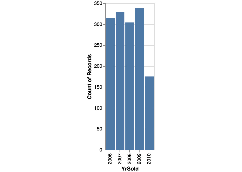
Figure 10.44: Bar chart of YrSold
We can see that, roughly, the same number of properties are sold every year, except for 2010. From 2006 to 2009, there was, on average, 310 properties sold per year, while there were only 170 in 2010.
- Plot a boxplot similar to the one shown in Step 8 but for YrSold as its x axis:
alt.Chart(df).mark_boxplot().encode(
x='YrSold:O',
y='SalePrice:Q'
)
You should get the following output:

Figure 10.45: Boxplot of YrSold and SalePrice
Overall, the median sale price is quite stable across the years, with a slight decrease in 2010.
- Let's analyze the relationship between SalePrice and Neighborhood by plotting a bar chart, similar to the one shown in Step 9:
alt.Chart(df).mark_bar().encode(
x='Neighborhood',
y='count()'
)
You should get the following output:

Figure 10.46: Bar chart of Neighborhood
The number of sold properties differs, depending on their location. The 'Names' neighborhood has the higher number of properties sold: over 220. On the other hand, neighborhoods such as 'Blueste' or 'NPkVill' only had a few properties sold.
- Let's analyze the relationship between SalePrice and Neighborhood by plotting a boxplot chart similar to the one in Step 10:
alt.Chart(df).mark_boxplot().encode(
x='Neighborhood:O',
y='SalePrice:Q'
)
You should get the following output:

Figure 10.47: Boxplot of Neighborhood and SalePrice
The location of the properties that were sold has a significant impact on the sale price. The noRidge, NridgHt, and StoneBr neighborhoods have a higher price overall. It is also worth noting that there are some extreme outliers for NoRidge where some properties have been sold with a price that's much higher than other properties in this neighborhood.
With this analysis, we've completed this exercise. We saw that, by using data visualization, we can get some valuable insights about the dataset. For instance, using a scatter plot, we identified a linear relationship between SalePrice and LotArea, where the price tends to increase as the size of the property gets bigger. Histograms helped us to understand the distribution of the numerical variables and bar charts gave us a similar view for categorical variables. For example, we saw that there are more sold properties in some neighborhoods compared to others. Finally, we were able to analyze and compare the impact of different values of a variable on SalePrice through the use of a boxplot. We saw that the better condition a property is in, the higher the sale price will be. Data visualization is a very important tool for data scientists so that they can explore and analyze datasets.
Activity 10.01: Analyzing Churn Data Using Visual Data Analysis Techniques
You are working for a major telecommunications company. The marketing department has noticed a recent spike of customer churn (customers that stopped using or canceled their service from the company).
You have been asked to analyze the customer profiles and predict future customer churn. Before building the predictive model, your first task is to analyze the data the marketing department has shared with you and assess its overall quality.
Note
The dataset to be used in this activity can be found on our GitHub repository: https://packt.live/2s1yquq.
The dataset we are going to be using was has originally shared by Eduardo Arino De La Rubia on Data.World: https://packt.live/2s1ynie.
The following steps will help you complete this activity:
- Download and load the dataset into Python using .read_csv().
- Explore the structure and content of the dataset by using .shape, .dtypes, .head(), .tail(), or .sample().
- Calculate and interpret descriptive statistics with .describe().
- Analyze each variable using data visualization with bar charts, histograms, or boxplots.
- Identify areas that need clarification from the marketing department and potential data quality issues.
Expected Output
Here is the expected bar chart output:
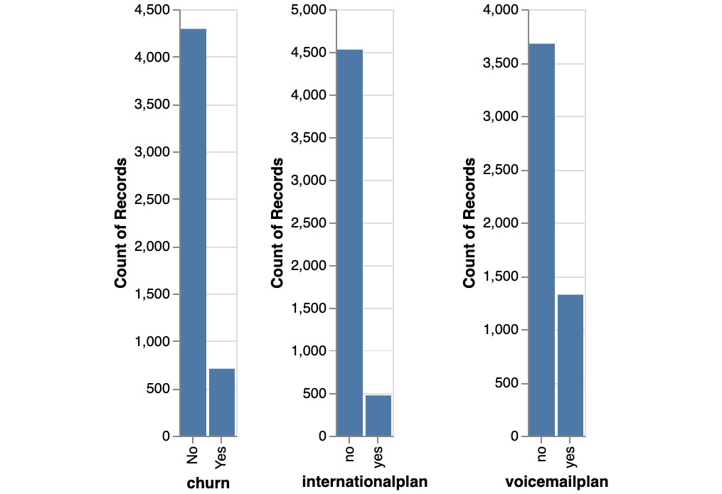
Figure 10.48: Expected bar chart output
Here is the expected histogram output:

Figure 10.49: Expected histogram output
Here is the expected boxplot output:

Figure 10.50: Expected boxplot output
Note
The solution to this activity can be found here: https://packt.live/2GbJloz.
You just completed the activity for this chapter. You have analyzed the dataset related to customer churn. You learned a lot about this dataset using descriptive statistics and data visualization. In a few lines of codes, you understood the structure of the DataFrame (number of rows and columns) and the type of information contained in each variable. By plotting the distribution of some columns, we learned there are specific charges for day, evening, or international calls. We also saw that the churn variable is imbalanced: there are roughly only 10% of customers who churn. Finally, we saw that one of the variables, numbervmailmessages, has a very different distribution for customers who churned or not. This may be a strong predictor for customer churn.
Summary
You just learned a lot regarding how to analyze a dataset. This a very critical step in any data science project. Getting a deep understanding of the dataset will help you to better assess the feasibility of achieving the requirements from the business.
Getting the right data in the right format at the right level of quality is key for getting good predictive performance for any machine learning algorithm. This is why it is so important to take the time analyzing the data before proceeding to the next stage. This task is referred to as the data understanding phase in the CRISP-DM methodology and can also be called Exploratory Data Analysis (EDA).
You learned how to use descriptive statistics to summarize key attributes of the dataset such as the average value of a numerical column, its spread with standard deviation or its range (minimum and maximum values), the unique values of a categorical variable, and its most frequent values. You also saw how to use data visualization to get valuable insights for each variable. Now, you know how to use scatter plots, bar charts, histograms, and boxplots to understand the distribution of a column.
While analyzing the data, we came across additional questions that, in a normal project, need to be addressed with the business. We also spotted some potential data quality issues, such as missing values, outliers, or incorrect values that need to be fixed. This is the topic we will cover in the next chapter: preparing the data. Stay tuned.