By the end of this chapter, you will be able to load and visualize data and clusters with scatter plots; prepare data for cluster analysis; perform centroid clustering with k-means; interpret clustering results and determine the optimal number of clusters for a given dataset.
This chapter will introduce you to unsupervised learning tasks, where algorithms have to automatically learn patterns from data by themselves as no target variables are defined beforehand.
Introduction
The previous chapters introduced you to very popular and extremely powerful machine learning algorithms. They all have one thing in common, which is that they belong to the same category of algorithms: supervised learning. This kind of algorithm tries to learn patterns based on a specified outcome column (target variable) such as sales, employee churn, or class of customer.
But what if you don't have such a variable in your dataset or you don't want to specify a target variable? Will you still be able to run some machine learning algorithms on it and find interesting patterns? The answer is yes, with the use of clustering algorithms that belong to the unsupervised learning category.
Clustering algorithms are very popular in the data science industry for grouping similar data points and detecting outliers. For instance, clustering algorithms can be used by banks for fraud detection by identifying unusual clusters from the data. They can also be used by e-commerce companies to identify groups of users with similar browsing behaviors, as in the following figures:

Figure 5.1: Example of data on customers with similar browsing behaviors without clustering analysis performed
Clustering analysis performed on this data would uncover natural patterns by grouping similar data points such that you may get the following result:

Figure 5.2: Clustering analysis performed on the data on customers with similar browsing behaviors
The data is now segmented into three customer groups depending on their recurring visits and time spent on the website, and different marketing plans can then be used for each of these groups in order to maximize sales.
In this chapter, you will learn how to perform such analysis using a very famous clustering algorithm called k-means.
Clustering with k-means
k-means is one of the most popular clustering algorithms (if not the most popular) among data scientists due to its simplicity and high performance. Its origins date back as early as 1956, when a famous mathematician named Hugo Steinhaus laid its foundations, but it was a decade later that another researcher called James MacQueen named this approach k-means.
The objective of k-means is to group similar data points (or observations) together that will form a cluster. Think of it as grouping elements close to each other (we will define how to measure closeness later in this chapter). For example, if you were manually analyzing user behavior on a mobile app, you might end up grouping customers who log in quite frequently, or users who make bigger in-app purchases, together. This is the kind of grouping that clustering algorithms such as k-means will automatically find for you from the data.
In this chapter, we will be working with an open source dataset shared publicly by the Australian Taxation Office (ATO). The dataset contains statistics about each postcode (also known as a zip code, which is an identification code used for sorting mail by area) in Australia during the financial year of 2014-15.
Note
The Australian Taxation Office (ATO) dataset can be found in the Packt GitHub repository here: https://packt.live/340xO5t.
The source of the dataset can be found here: https://packt.live/361i1p3.
We will perform cluster analysis on this dataset for two specific variables (or columns): Average net tax and Average total deductions. Our objective is to find groups (or clusters) of postcodes sharing similar patterns in terms of tax received and money deducted. Here is a scatter plot of these two variables:

Figure 5.3: Scatter plot of the ATO dataset
As part of being a data scientist, you need to analyze the graphs achieved from this dataset and come to conclusions. Let's say you have to analyze manually potential groupings of observations from this dataset. One potential result could be as follows:
- All the data points in the bottom-left corner could be grouped together (average net tax from 0 to 40,000).
- A second group could be all the data points in the center area (average net tax from 40,000 to 60,000 and average total deductions below 10,000).
- Finally, all the remaining data points could be grouped together.
But rather having you to manually guess these groupings, it will be better if we can use an algorithm to do it for us. This is what we are going to see in practice in the following exercise, where we'll perform clustering analysis on this dataset.
Exercise 5.01: Performing Your First Clustering Analysis on the ATO Dataset
In this exercise, we will be using k-means clustering on the ATO dataset and observing the different clusters that the dataset divides itself into, after which we will conclude by analyzing the output:
- Open a new Colab notebook.
- Next, load the required Python packages: pandas and KMeans from sklearn.cluster.
We will be using the import function from Python:
Note
You can create short aliases for the packages you will be calling quite often in your script with the function mentioned in the following code snippet.
import pandas as pd
from sklearn.cluster import KMeans
Note
We will be looking into KMeans (from sklearn.cluster), which you have used in the code here, later in the chapter for a more detailed explanation of it.
- Next, create a variable containing the link to the file. We will call this variable file_url:
file_url = 'https://raw.githubusercontent.com/PacktWorkshops/The-Data-Science-Workshop/master/Chapter05/DataSet/taxstats2015.csv'
In the next step, we will use the pandas package to load our data into a DataFrame (think of it as a table, like on an Excel spreadsheet, with a row index and column names).
Our input file is in CSV format, and pandas has a method that can directly read this format, which is .read_csv().
- Use the usecols parameter to subset only the columns we need rather than loading the entire dataset. We just need to provide a list of the column names we are interested in, which are mentioned in the following code snippet:
df = pd.read_csv(file_url, usecols=['Postcode', 'Average net tax', 'Average total deductions'])
Now we have loaded the data into a pandas DataFrame.
- Next, let's display the first 5 rows of this DataFrame , using the method .head():
df.head()
You should get the following output:

Figure 5.4: The first five rows of the ATO DataFrame
- Now, to output the last 5 rows, we use .tail():
df.tail()
You should get the following output:

Figure 5.5: The last five rows of the ATO DataFrame
Now that we have our data, let's jump straight to what we want to do: find clusters.
As you saw in the previous chapters, sklearn provides the exact same APIs for training different machine learning algorithms, such as:
- Instantiate an algorithm with the specified hyperparameters (here it will be KMeans(hyperparameters)).
- Fit the model with the training data with the method .fit().
- Predict the result with the given input data with the method .predict().
Note
Here, we will use all the default values for the k-means hyperparameters except for the random_state one. Specifying a fixed random state (also called a seed) will help us to get reproducible results every time we have to rerun our code.
- Instantiate k-means with a random state of 42 and save it into a variable called kmeans:
kmeans = KMeans(random_state=42)
- Now feed k-means with our training data. To do so, we need to get only the variables (or columns) used for fitting the model. In our case, the variables are 'Average net tax' and 'Average total deductions', and they are saved in a new variable called X:
X = df[['Average net tax', 'Average total deductions']]
- Now fit kmeans with this training data:
kmeans.fit(X)
You should get the following output:

Figure 5.6: Summary of the fitted kmeans and its hyperparameters
We just ran our first clustering algorithm in just a few lines of code.
- See which cluster each data point belongs to by using the .predict() method:
y_preds = kmeans.predict(X)
y_preds
You should get the following output:

Figure 5.7: Output of the k-means predictions
- Now, add these predictions into the original DataFrame and take a look at the first five postcodes:
df['cluster'] = y_preds
df.head()
Note
The predictions from the sklearn predict() method are in the exact same order as the input data. So, the first prediction will correspond to the first row of your DataFrame.
You should get the following output:

Figure 5.8: Cluster number assigned to the first five postcodes
Our k-means model has grouped the first two rows into the same cluster, 1. We can see these two observations both have average net tax values around 28,000. The last three data points have been assigned to different clusters (2, 3, and 7, respectively) and we can see their values for both average total deductions and average net tax are very different from each other. It seems that lower values are grouped into cluster 2 while higher values are classified into cluster 3. We are starting to build our understanding of how k-means has decided to group the observations from this dataset.
This is a great start. You have learned how to train (or fit) a k-means model in a few lines of code. Now we can start diving deeper into the magic behind k-means.
Interpreting k-means Results
After training our k-means algorithm, we will likely be interested in analyzing its results in more detail. Remember, the objective of cluster analysis is to group observations with similar patterns together. But how can we see whether the groupings found by the algorithm are meaningful? We will be looking at this in this section by using the dataset results we just generated.
One way of investigating this is to analyze the dataset row by row with the assigned cluster for each observation. This can be quite tedious, especially if the size of your dataset is quite big, so it would be better to have a kind of summary of the cluster results.
If you are familiar with Excel spreadsheets, you are probably thinking about using a pivot table to get the average of the variables for each cluster. In SQL, you would have probably used a GROUP BY statement. If you are not familiar with either of these, you may think of grouping each cluster together and then calculating the average for each of them. The good news is that this can be easily achieved with the pandas package in Python. Let's see how this can be done with an example.
To create a pivot table similar to an Excel one, we will be using the pivot_table() method from pandas. We need to specify the following parameters for this method:
- values: This parameter corresponds to the numerical columns you want to calculate summaries for (or aggregations), such as getting averages or counts. In an Excel pivot table, it is also called values. In our dataset, we will use the Average net tax and Average total deductions variables.
- index: This parameter is used to specify the columns you want to see summaries for. In our case, it will be the cluster column. In a pivot table in Excel, this corresponds with the Rows field.
- aggfunc: This is where you will specify the aggregation functions you want to summarize the data with, such as getting averages or counts. In Excel, this is the Summarize by option in the values field:
import numpy as np
df.pivot_table(values=['Average net tax', 'Average total deductions'], index='cluster', aggfunc=np.mean)
Note
We will be using the numpy implementation of mean() as it is more optimized for pandas DataFrames.

Figure 5.9: Output of the pivot_table function
In this summary, we can see that the algorithm has grouped the data into eight clusters (clusters 0 to 7). Cluster 0 has the lowest average net tax and total deductions amounts among all the clusters, while cluster 4 has the highest values. With this pivot table, we are able to compare clusters between them using their summarised values.
Using an aggregated view of clusters is a good way of seeing the difference between them, but it is not the only way. Another possibility is to visualize clusters in a graph. This is exactly what we are going to do now.
You may have heard of different visualization packages, such as matplotlib, seaborn, and bokeh, but in this chapter, we will be using the altair package because it is quite simple to use (its API is very similar to sklearn). Let's import it first:
import altair as alt
Then, we will instantiate a Chart() object with our DataFrame and save it into a variable called chart:
chart = alt.Chart(df)
Now we will specify the type of graph we want, a scatter plot, with the .mark_circle() method and will save it into a new variable called scatter_plot:
scatter_plot = chart.mark_circle()
Finally, we need to configure our scatter plot by specifying the names of the columns that will be our x- and y-axes on the graph. We also tell the scatter plot to color each point according to its cluster value with the color option:
scatter_plot.encode(x='Average net tax', y='Average total deductions', color='cluster:N')
Note
You may have noticed that we added :N at the end of the cluster column name. This extra parameter is used in altair to specify the type of value for this column. :N means the information contained in this column is categorical. altair automatically defines the color scheme to be used depending on the type of a column.
You should get the following output:

Figure 5.10: Scatter plot of the clusters
We can now easily see what the clusters in this graph are and how they differ from each other. We can clearly see that k-means assigned data points to each cluster mainly based on the x-axis variable, which is Average net tax. The boundaries of the clusters are vertical straight lines. For instance, the boundary separating the red and purple clusters is roughly around 18,000. Observations below this limit are assigned to the red cluster (2) and those above to the purple cluster (6).
If you have used visualization tools such as Tableau or PowerBI, you might feel a bit frustrated as this graph is static, you can't hover over each data point to get more information and find, for instance, what is the limit separating the orange cluster from the pink one. But this can be easily achieved with altair and this is one of the reasons we chose to use it We can add some interactions to your chart with minimal code changes.
Let's say we want to add a tooltip that will display the values for the two columns of interest: the postcode and the assigned cluster. With altair, we just need to add a parameter called tooltip in the encode() method with a list of corresponding column names and call the interactive() method just after, as seen in the following code snippet:
scatter_plot.encode(x='Average net tax', y='Average total deductions',color='cluster:N', tooltip=['Postcode', 'cluster', 'Average net tax', 'Average total deductions']).interactive()
You should get the following output:

Figure 5.11: Interactive scatter plot of the clusters with tooltip
Now we can easily look at the data points near the cluster boundaries and find out that the threshold used to differentiate the orange cluster (1) from the pink one (7) is close to 32,000 in 'Average Net Tax'. We can also see that postcode 3146 is near this boundary and its average net tax is precisely 31992, and its 'average total deductions' is 4276.
Exercise 5.02: Clustering Australian Postcodes by Business Income and Expenses
In this exercise, we will learn how to perform clustering analysis with k-means and visualize its results based on postcode values sorted by business income and expenses. The following steps will help you complete this exercise:
- Open a new Colab notebook.
- Now import the required packages (pandas, sklearn, altair, and numpy):
import pandas as pd
from sklearn.cluster import KMeans
import altair as alt
import numpy as np
- Assign the link to the ATO dataset to a variable called file_url:
file_url = 'https://raw.githubusercontent.com/PacktWorkshops/The-Data-Science-Workshop/master/Chapter05/DataSet/taxstats2015.csv'
- Using the read_csv method from the pandas package, load the dataset with only the following columns with the use_cols parameter: 'Postcode', 'Average total business income', and 'Average total business expenses':
df = pd.read_csv(file_url, usecols=['Postcode', 'Average total business income', 'Average total business expenses'])
- Display the last 10 rows from the ATO dataset using the .tail() method from pandas:
df.tail(10)
You should get the following output:
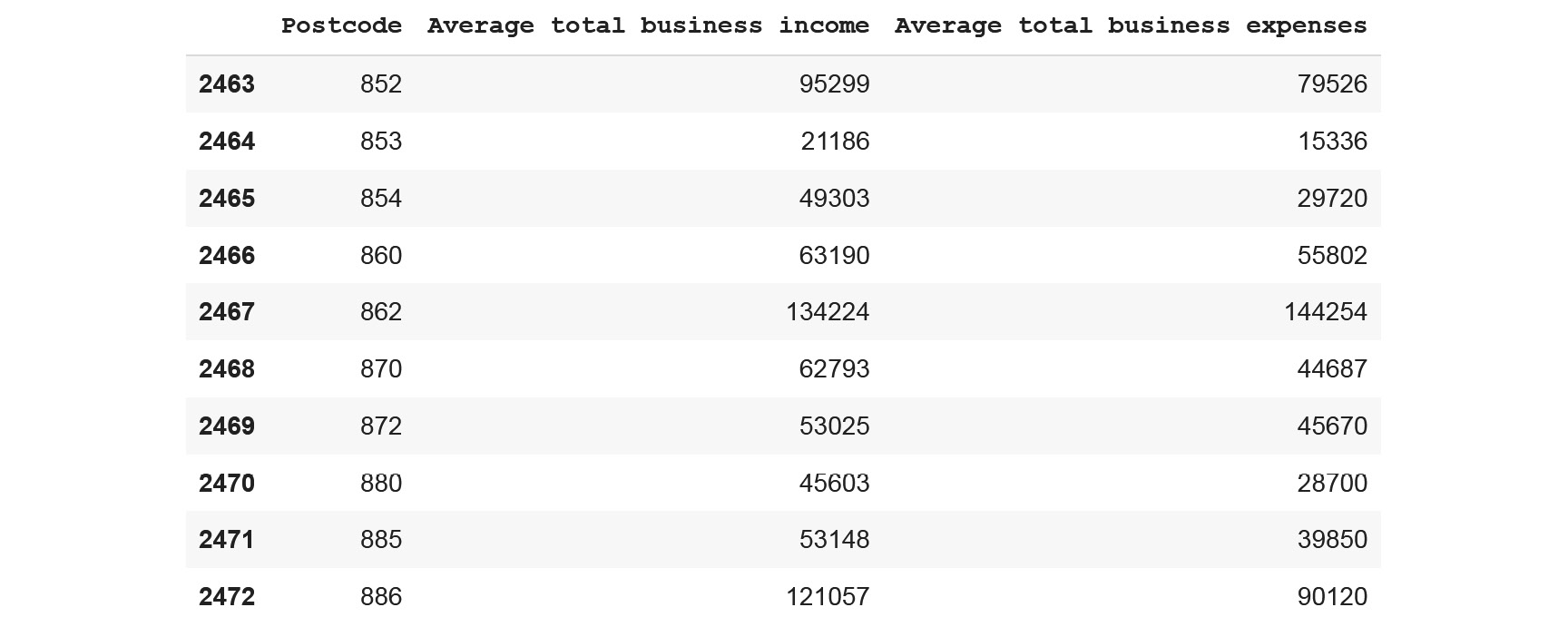
Figure 5.12: The last 10 rows of the ATO dataset
- Extract the 'Average total business income' and 'Average total business expenses' columns using the following pandas column subsetting syntax: dataframe_name[<list_of_columns>]. Then, save them into a new variable called X:
X = df[['Average total business income', 'Average total business expenses']]
- Now fit kmeans with this new variable using a value of 8 for the random_state hyperparameter:
kmeans = KMeans(random_state=8)
kmeans.fit(X)
You should get the following output:

Figure 5.13: Summary of the fitted kmeans and its hyperparameters
- Using the predict method from the sklearn package, predict the clustering assignment from the input variable, (X), save the results into a new variable called y_preds, and display the last 10 predictions:
y_preds = kmeans.predict(X)
y_preds[-10:]
You should get the following output:

Figure 5.14: Results of the clusters assigned to the last 10 observations
- Save the predicted clusters back to the DataFrame by creating a new column called 'cluster' and print the last 10 rows of the DataFrame using the .tail() method from the pandas package:
df['cluster'] = y_preds
df.tail(10)
You should get the following output:

Figure 5.15: The last 10 rows of the ATO dataset with the added cluster column
- Generate a pivot table with the averages of the two columns for each cluster value using the pivot_table method from the pandas package with the following parameters:
- Provide the names of the columns to be aggregated, 'Average total business income' and 'Average total business expenses', to the parameter values.
- Provide the name of the column to be grouped, 'cluster', to the parameter index.
- Use the .mean method from NumPy (np) as the aggregation function for the aggfunc parameter:
df.pivot_table(values=['Average total business income', 'Average total business expenses'], index='cluster', aggfunc=np.mean)
You should get the following output:

Figure 5.16: Output of the pivot_table function
- Now let's plot the clusters using an interactive scatter plot. First, use Chart() and mark_circle() from the altair package to instantiate a scatter plot graph:
scatter_plot = alt.Chart(df).mark_circle()
- Use the encode and interactive methods from altair to specify the display of the scatter plot and its interactivity options with the following parameters:
- Provide the name of the 'Average total business income' column to the x parameter (the x-axis).
- Provide the name of the 'Average total business expenses' column to the y parameter (the y-axis).
- Provide the name of the cluster:N column to the color parameter (providing a different color for each group).
- Provide these column names – 'Postcode', 'cluster', 'Average total business income', and 'Average total business expenses' – to the 'tooltip' parameter (this being the information displayed by the tooltip):
scatter_plot.encode(x='Average total business income', y='Average total business expenses', color='cluster:N', tooltip=['Postcode', 'cluster', 'Average total business income', 'Average total business expenses']).interactive()
You should get the following output:

Figure 5.17: Interactive scatter plot of the clusters
We can see that k-means has grouped the observations into eight different clusters based on the value of the two variables ('Average total business income' and 'Average total business expense'). For instance, all the low-value data points have been assigned to cluster 7, while the ones with extremely high values belong to cluster 2. So, k-means has grouped the data points that share similar behaviors.
You just successfully completed a cluster analysis and visualized its results. You learned how to load a real-world dataset, fit k-means, and display a scatter plot. This is a great start, and we will be delving into more details on how to improve the performance of your model in the sections to come in this chapter.
Choosing the Number of Clusters
In the previous sections, we saw how easy it is to fit the k-means algorithm on a given dataset. In our ATO dataset, we found 8 different clusters that were mainly defined by the values of the Average net tax variable.
But you may have asked yourself: "Why 8 clusters? Why not 3 or 15 clusters?" These are indeed excellent questions. The short answer is that we used k-means' default value for the hyperparameter n_cluster, defining the number of clusters to be found, as 8.
As you will recall from Chapter 2, Regression, and Chapter 4, Multiclass Classification (NLP), the value of a hyperparameter isn't learned by the algorithm but has to be set arbitrarily by you prior to training. For k-means, n_cluster is one of the most important hyperparameters you will have to tune. Choosing a low value will lead k-means to group many data points together, even though they are very different from each other. On the other hand, choosing a high value may force the algorithm to split close observations into multiple ones, even though they are very similar.
Looking at the scatter plot from the ATO dataset, eight clusters seems to be a lot. On the graph, some of the clusters look very close to each other and have similar values. Intuitively, just by looking at the plot, you could have said that there were between two and four different clusters. As you can see, this is quite suggestive, and it would be great if there was a function that could help us to define the right number of clusters for a dataset. Such a method does indeed exist, and it is called the Elbow method.
This method assesses the compactness of clusters, the objective being to minimize a value known as inertia. More details and an explanation about this will be provided later in this chapter. For now, think of inertia as a value that says, for a group of data points, how far from each other or how close to each other they are.
Let's apply this method to our ATO dataset. First, we will define the range of cluster numbers we want to evaluate (between 1 and 10) and save them in a DataFrame called clusters. We will also create an empty list called inertia, where we will store our calculated values:
clusters = pd.DataFrame()
clusters['cluster_range'] = range(1, 10)
inertia = []
Next, we will create a for loop that will iterate over the range, fit a k-means model with the specified number of clusters, extract the inertia value, and store it in our list, as in the following code snippet:
for k in clusters['cluster_range']:
kmeans = KMeans(n_clusters=k, random_state=8).fit(X)
inertia.append(kmeans.inertia_)
Now we can use our list of inertia values in the clusters DataFrame:
clusters['inertia'] = inertia
clusters
You should get the following output:
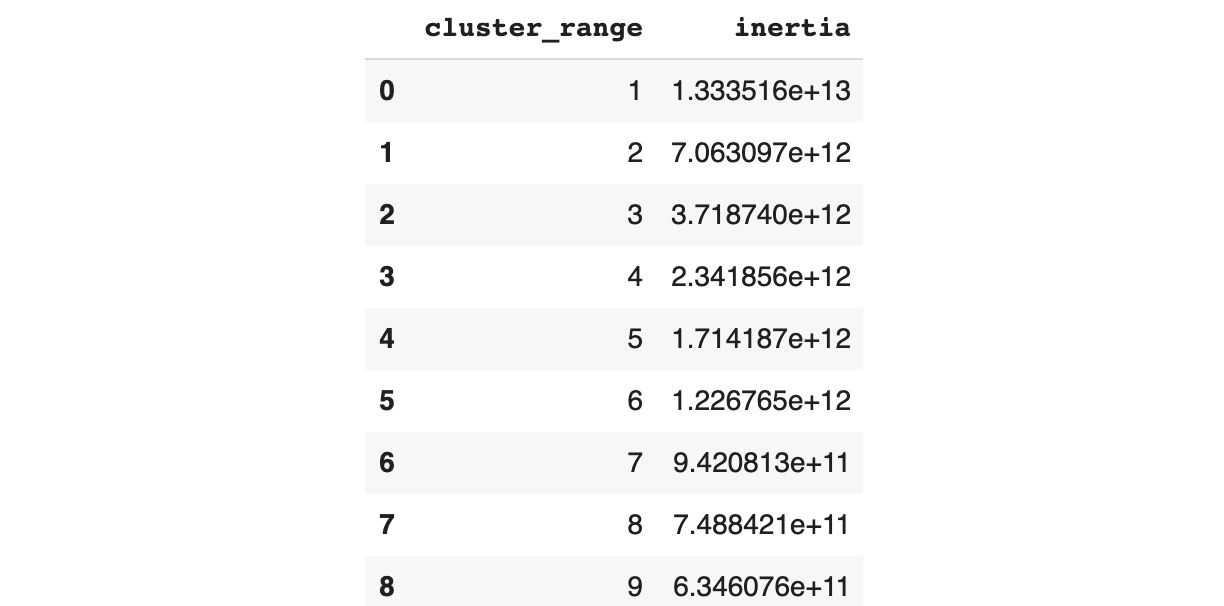
Figure 5.18: Dataframe containing inertia values for our clusters
Then, we need to plot a line chart using altair with the mark_line() method. We will specify the 'cluster_range' column as our x-axis and 'inertia' as our y-axis, as in the following code snippet:
alt.Chart(clusters).mark_line().encode(x='cluster_range', y='inertia')
You should get the following output:

Figure 5.19: Plotting the Elbow method
Note
You don't have to save each of the altair objects in a separate variable; you can just append the methods one after the other with ".".
Now that we have plotted the inertia value against the number of clusters, we need to find the optimal number of clusters. What we need to do is to find the inflection point in the graph, where the inertia value starts to decrease more slowly (that is, where the slope of the line almost reaches a 45-degree angle). Finding the right inflection point can be a bit tricky. If you picture this line chart as an arm, what we want is to find the center of the Elbow (now you know where the name for this method comes from). So, looking at our example, we will say that the optimal number of clusters is three. If we kept adding more clusters, the inertia would not decrease drastically and add any value. This is the reason why we want to find the middle of the Elbow as the inflection point.
Now let's retrain our Kmeans with this hyperparameter and plot the clusters as shown in the following code snippet:
kmeans = KMeans(random_state=42, n_clusters=3)
kmeans.fit(X)
df['cluster2'] = kmeans.predict(X)
scatter_plot.encode(x='Average net tax', y='Average total deductions',color='cluster2:N',
tooltip=['Postcode', 'cluster', 'Average net tax', 'Average total deductions']
).interactive()
You should get the following output:

Figure 5.20: Scatter plot of the three clusters
This is very different compared to our initial results. Looking at the three clusters, we can see that:
- The first cluster (blue) represents postcodes with low values for both average net tax and total deductions.
- The second cluster (orange) is for medium average net tax and low average total deductions.
- The third cluster (red) is grouping all postcodes with average net tax values above 35,000.
Note
It is worth noticing that the data points are more spread in the third cluster; this may indicate that there are some outliers in this group.
This example showed us how important it is to define the right number of clusters before training a k-means algorithm if we want to get meaningful groups from data. We used a method called the Elbow method to find this optimal number.
Exercise 5.03: Finding the Optimal Number of Clusters
In this exercise, we will apply the Elbow method to the same data as in Exercise 5.02, Clustering Australian Postcodes by Business Income and Expenses, to find the optimal number of clusters, before fitting a k-means model:
- Open a new Colab notebook.
- Now import the required packages (pandas, sklearn, and altair):
import pandas as pd
from sklearn.cluster import KMeans
import altair as alt
Next, we will load the dataset and select the same columns as in Exercise 5.02, Clustering Australian Postcodes by Business Income and Expenses, and print the first five rows.
- Assign the link to the ATO dataset to a variable called file_url:
file_url = 'https://raw.githubusercontent.com/PacktWorkshops/The-Data-Science-Workshop/master/Chapter05/DataSet/taxstats2015.csv'
- Using the .read_csv() method from the pandas package, load the dataset with only the following columns using the use_cols parameter: 'Postcode', 'Average total business income', and 'Average total business expenses':
df = pd.read_csv(file_url, usecols=['Postcode', 'Average total business income', 'Average total business expenses'])
- Display the first five rows of the DataFrame with the .head() method from the pandas package:
df.head()
You should get the following output:

- Assign the 'Average total business income' and 'Average total business expenses' columns to a new variable called X:
X = df[['Average total business income', 'Average total business expenses']]
- Create an empty pandas DataFrame called clusters and an empty list called inertia:
clusters = pd.DataFrame()
inertia = []
Now, use the range function to generate a list containing the range of cluster numbers, from 1 to 15, and assign it to a new column called 'cluster_range' from the 'clusters' DataFrame:
clusters['cluster_range'] = range(1, 15)
- Create a for loop to go through each cluster number and fit a k-means model accordingly, then append the inertia values using the 'inertia_' parameter with the 'inertia' list:
for k in clusters['cluster_range']:
kmeans = KMeans(n_clusters=k).fit(X)
inertia.append(kmeans.inertia_)
- Assign the inertia list to a new column called 'inertia' from the clusters DataFrame and display its content:
clusters['inertia'] = inertia
clusters
You should get the following output:

Figure 5.22: Plotting the Elbow method
- Now use mark_line() and encode() from the altair package to plot the Elbow graph with 'cluster_range' as the x-axis and 'inertia' as the y-axis:
alt.Chart(clusters).mark_line().encode(alt.X('cluster_range'), alt.Y('inertia'))
You should get the following output:

Figure 5.23: Plotting the Elbow method
- Looking at the Elbow plot, identify the optimal number of clusters, and assign this value to a variable called optim_cluster:
optim_cluster = 4
- Train a k-means model with this number of clusters and a random_state value of 42 using the fit method from sklearn:
kmeans = KMeans(random_state=42, n_clusters=optim_cluster)
kmeans.fit(X)
- Now, using the predict method from sklearn, get the predicted assigned cluster for each data point contained in the X variable and save the results into a new column called 'cluster2' from the df DataFrame:
df['cluster2'] = kmeans.predict(X)
- Display the first five rows of the df DataFrame using the head method from the pandas package:
df.head()
You should get the following output:

Figure 5.24: The first five rows with the cluster predictions
- Now plot the scatter plot using the mark_circle() and encode() methods from the altair package. Also, to add interactiveness, use the tooltip parameter and the interactive() method from the altair package as shown in the following code snippet:
alt.Chart(df).mark_circle().encode(x='Average total business income', y='Average total business expenses',color='cluster2:N', tooltip=['Postcode', 'cluster2', 'Average total business income', 'Average total business expenses']).interactive()
You should get the following output:

Figure 5.25: Scatter plot of the four clusters
You just learned how to find the optimal number of clusters before fitting a k-means model. The data points are grouped into four different clusters in our output here:
- Cluster 0 (blue) is for all the observations with average total business income values lower than 100,000 and average total business expense values lower than 80,000.
- Cluster 3 (cyan) is grouping data points that have an average total business income value lower than 180,000 and average total business expense values lower than 160,000.
- Cluster 1 (orange) is for data points that have an average total business income value lower than 370,000 and average total business expense values lower than 330,000.
- Cluster 2 (red) is for data points with extreme values – those with average total business income values higher than 370,000 and average total business expense values higher than 330,000.
The results from Exercise 5.02, Clustering Australian Postcodes by Business Income and Expenses, have eight different clusters, and some of them are very similar to each other. Here, you saw that having the optimal number of clusters provides better differentiation between the groups, and this is why it is one of the most important hyperparameters to be tuned for k-means. In the next section, we will look at two other important hyperparameters for initializing k-means.
Initializing Clusters
Since the beginning of this chapter, we've been referring to k-means every time we've fitted our clustering algorithms. But you may have noticed in each model summary that there was a hyperparameter called init with the default value as k-means++. We were, in fact, using k-means++ all this time.
The difference between k-means and k-means++ is in how they initialize clusters at the start of the training. k-means randomly chooses the center of each cluster (called the centroid) and then assigns each data point to its nearest cluster. If this cluster initialization is chosen incorrectly, this may lead to non-optimal grouping at the end of the training process. For example, in the following graph, we can clearly see the three natural groupings of the data, but the algorithm didn't succeed in identifying them properly:

Figure 5.26: Example of non-optimal clusters being found
k-means++ is an attempt to find better clusters at initialization time. The idea behind it is to choose the first cluster randomly and then pick the next ones, those further away, using a probability distribution from the remaining data points. Even though k-means++ tends to get better results compared to the original k-means, in some cases, it can still lead to non-optimal clustering.
Another hyperparameter data scientists can use to lower the risk of incorrect clusters is n_init. This corresponds to the number of times k-means is run with different initializations, the final model being the best run. So, if you have a high number for this hyperparameter, you will have a higher chance of finding the optimal clusters, but the downside is that the training time will be longer. So, you have to choose this value carefully, especially if you have a large dataset.
Let's try this out on our ATO dataset by having a look at the following example.
First, let's run only one iteration using random initialization:
kmeans = KMeans(random_state=14, n_clusters=3, init='random', n_init=1)
kmeans.fit(X)
As usual, we want to visualize our clusters with a scatter plot, as defined in the following code snippet:
df['cluster3'] = kmeans.predict(X)
alt.Chart(df).mark_circle().encode(x='Average net tax', y='Average total deductions',color='cluster3:N',
tooltip=['Postcode', 'cluster', 'Average net tax', 'Average total deductions']
).interactive()
You should get the following output:

Figure 5.27: Clustering results with n_init as 1 and init as random
Overall, the result is very close to that of our previous run. It is worth noticing that the orange and red clusters have swapped positions due to the different initializations. Also, their boundaries are slightly different: now the value on the plot is around 31,000 while previously the threshold was around 34,000.
Now let's try with five iterations (using the n_init hyperparameter) and k-means++ initialization (using the init hyperparameter):
kmeans = KMeans(random_state=14, n_clusters=3, init='k-means++', n_init=5)
kmeans.fit(X)
df['cluster4'] = kmeans.predict(X)
alt.Chart(df).mark_circle().encode(x='Average net tax', y='Average total deductions',color='cluster4:N',
tooltip=['Postcode', 'cluster', 'Average net tax', 'Average total deductions']
).interactive()
You should get the following output:

Figure 5.28: Clustering results with n_init as 5 and init as k-means++
Here, the results are very close to the original run with 10 iterations. This means that we didn't have to run so many iterations for k-means to converge and could have saved some time with a lower number.
Exercise 5.04: Using Different Initialization Parameters to Achieve a Suitable Outcome
In this exercise, we will use the same data as in Exercise 5.02, Clustering Australian Postcodes by Business Income and Expenses, and try different values for the init and n_init hyperparameters and see how they affect the final clustering result:
- Open a new Colab notebook.
- Import the required packages, which are pandas, sklearn, and altair:
import pandas as pd
from sklearn.cluster import KMeans
import altair as alt
- Assign the link to the ATO dataset to a variable called file_url:
file_url = 'https://raw.githubusercontent.com/PacktWorkshops/The-Data-Science-Workshop/master/Chapter05/DataSet/taxstats2015.csv'
- Load the dataset and select the same columns as in Exercise 5.02, Clustering Australian Postcodes by Business Income and Expenses, and Exercise 5.03, Finding the Optimal Number of Clusters, using the read_csv() method from the pandas package:
df = pd.read_csv(file_url, usecols=['Postcode', 'Average total business income', 'Average total business expenses'])
- Assign the 'Average total business income' and 'Average total business expenses' columns to a new variable called X:
X = df[['Average total business income', 'Average total business expenses']]
- Fit a k-means model with n_init equal to 1 and a random init:
kmeans = KMeans(random_state=1, n_clusters=4, init='random', n_init=1)
kmeans.fit(X)
- Using the predict method from the sklearn package, predict the clustering assignment from the input variable, (X), and save the results into a new column called 'cluster3' in the DataFrame:
df['cluster3'] = kmeans.predict(X)
- Plot the clusters using an interactive scatter plot. First, use Chart() and mark_circle() from the altair package to instantiate a scatter plot graph, as shown in the following code snippet:
scatter_plot = alt.Chart(df).mark_circle()
- Use the encode and interactive methods from altair to specify the display of the scatter plot and its interactivity options with the following parameters:
- Provide the name of the 'Average total business income' column to the x parameter (x-axis).
- Provide the name of the 'Average total business expenses' column to the y parameter (y-axis).
- Provide the name of the 'cluster3:N' column to the color parameter (which defines the different colors for each group).
- Provide these column names – 'Postcode', 'cluster3', 'Average total business income', and 'Average total business expenses' – to the tooltip parameter:
scatter_plot.encode(x='Average total business income', y='Average total business expenses',color='cluster3:N',
tooltip=['Postcode', 'cluster3', 'Average total business income', 'Average total business expenses']
).interactive()
You should get the following output:

Figure 5.29: Clustering results with n_init as 1 and init as random
- Repeat Steps 5 to 8 but with different k-means hyperparameters, n_init=10 and random init, as shown in the following code snippet:
kmeans = KMeans(random_state=1, n_clusters=4, init='random', n_init=10)
kmeans.fit(X)
df['cluster4'] = kmeans.predict(X)
scatter_plot = alt.Chart(df).mark_circle()
scatter_plot.encode(x='Average total business income', y='Average total business expenses',color='cluster4:N',
tooltip=['Postcode', 'cluster4', 'Average total business income', 'Average total business expenses']
).interactive()
You should get the following output:
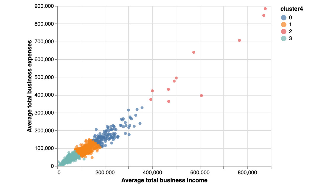
Figure 5.30: Clustering results with n_init as 10 and init as random
- Again, repeat Steps 5 to 8 but with different k-means hyperparameters – n_init=100 and random init:
kmeans = KMeans(random_state=1, n_clusters=4, init='random', n_init=100)
kmeans.fit(X)
df['cluster5'] = kmeans.predict(X)
scatter_plot = alt.Chart(df).mark_circle()
scatter_plot.encode(x='Average total business income', y='Average total business expenses',color='cluster5:N',
tooltip=['Postcode', 'cluster5', 'Average total business income', 'Average total business expenses']
).interactive()
You should get the following output:

Figure 5.31: Clustering results with n_init as 10 and init as random
You just learned how to tune the two main hyperparameters responsible for initializing k-means clusters. You have seen in this exercise that increasing the number of iterations with n_init didn't have much impact on the clustering result for this dataset.
In this case, it is better to use a lower value for this hyperparameter as it will speed up the training time. But for a different dataset, you may face a case where the results differ drastically depending on the n_init value. In such a case, you will have to find a value of n_init that is not too small but also not too big. You want to find the sweet spot where the results do not change much compared to the last result obtained with a different value.
Calculating the Distance to the Centroid
We've talked a lot about similarities between data points in the previous sections, but we haven't really defined what this means. You have probably guessed that it has something to do with how close or how far observations are from each other. You are heading in the right direction. It has to do with some sort of distance measure between two points. The one used by k-means is called squared Euclidean distance and its formula is:

Figure 5.32: The squared Euclidean distance formula
If you don't have a statistical background, this formula may look intimidating, but it is actually very simple. It is the sum of the squared difference between the data coordinates. Here, x and y are two data points and the index, i, represents the number of coordinates. If the data has two dimensions, i equals 2. Similarly, if there are three dimensions, then i will be 3.
Let's apply this formula to the ATO dataset.
First, we will grab the values needed – that is, the coordinates from the first two observations – and print them:
Note
In pandas, the iloc method is used to subset the rows or columns of a DataFrame by index. For instance, if we wanted to grab row number 888 and column number 6, we would use the following syntax: dataframe.iloc[888, 6].
x = X.iloc[0,].values
y = X.iloc[1,].values
print(x)
print(y)
You should get the following output:

Figure 5.33: Extracting the first two observations from the ATO dataset
The coordinates for x are (27555, 2071) and the coordinates for y are (28142, 3804). Here, the formula is telling us to calculate the squared difference between each axis of the two data points and sum them:
squared_euclidean = (x[0] - y[0])**2 + (x[1] - y[1])**2
print(squared_euclidean)
You should get the following output:
3347858
k-means uses this metric to calculate the distance between each data point and the center of its assigned cluster (also called the centroid). Here is the basic logic behind this algorithm:
- Choose the centers of the clusters (the centroids) randomly.
- Assign each data point to the nearest centroid using the squared Euclidean distance.
- Update each centroid's coordinates to the newly calculated center of the data points assigned to it.
- Repeat Steps 2 and 3 until the clusters converge (that is, until the cluster assignment doesn't change anymore) or until the maximum number of iterations has been reached.
That's it. The k-means algorithm is as simple as that. We can extract the centroids after fitting a k-means model with cluster_centers_.
Let's see how we can plot the centroids in an example.
First, we fit a k-means model as shown in the following code snippet:
kmeans = KMeans(random_state=42, n_clusters=3, init='k-means++', n_init=5)
kmeans.fit(X)
df['cluster6'] = kmeans.predict(X)
Now extract the centroids into a DataFrame and print them:
centroids = kmeans.cluster_centers_
centroids = pd.DataFrame(centroids, columns=['Average net tax', 'Average total deductions'])
print(centroids)
You should get the following output:

Figure 5.34: Coordinates of the three centroids
We will plot the usual scatter plot but will assign it to a variable called chart1:
chart1 = alt.Chart(df).mark_circle().encode(x='Average net tax', y='Average total deductions',color='cluster6:N',
tooltip=['Postcode', 'cluster6', 'Average net tax', 'Average total deductions']
).interactive()
chart1
You should get the following output:
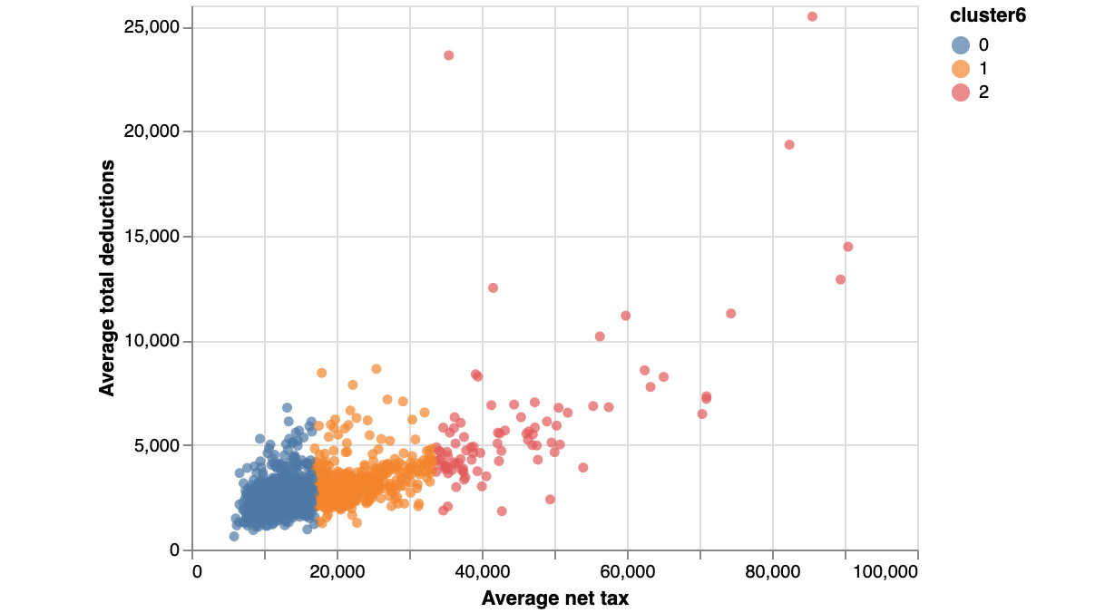
Figure 5.35: Scatter plot of the clusters
Now, to create a second scatter plot only for the centroids called chart2:
chart2 = alt.Chart(centroids).mark_circle(size=100).encode(x='Average net tax', y='Average total deductions', color=alt.value('black'),
tooltip=['Average net tax', 'Average total deductions']).interactive()
chart2
You should get the following output:

Figure 5.36: Scatter plot of the centroids
And now we combine the two charts, which is extremely easy with altair:
chart1 + chart2
You should get the following output:

Figure 5.37: Scatter plot of the clusters and their centroids
Now we can easily see which centroids the observations are closest to.
Exercise 5.05: Finding the Closest Centroids in Our Dataset
In this exercise, we will be coding the first iteration of k-means in order to assign data points to their closest cluster centroids. The following steps will help you complete the exercise:
- Open a new Colab notebook.
- Now import the required packages, which are pandas, sklearn, and altair:
import pandas as pd
from sklearn.cluster import KMeans
import altair as alt
- Load the dataset and select the same columns as in Exercise 5.02, Clustering Australian Postcodes by Business Income and Expenses, using the read_csv() method from the pandas package:
file_url = 'https://raw.githubusercontent.com/PacktWorkshops/The-Data-Science-Workshop/master/Chapter05/DataSet/taxstats2015.csv'
df = pd.read_csv(file_url, usecols=['Postcode', 'Average total business income', 'Average total business expenses'])
- Assign the 'Average total business income' and 'Average total business expenses' columns to a new variable called X:
X = df[['Average total business income', 'Average total business expenses']]
- Now, calculate the minimum and maximum using the min() and max() values of the 'Average total business income' and 'Average total business income' variables, as shown in the following code snippet:
business_income_min = df['Average total business income'].min()
business_income_max = df['Average total business income'].max()
business_expenses_min = df['Average total business expenses'].min()
business_expenses_max = df['Average total business expenses'].max()
- Print the values of these four variables, which are the minimum and maximum values of the two variables:
print(business_income_min)
print(business_income_max)
print(business_expenses_min)
print(business_expenses_max)
You should get the following output:
0
876324
0
884659
- Now import the random package and use the seed() method to set a seed of 42, as shown in the following code snippet:
import random
random.seed(42)
- Create an empty pandas DataFrame and assign it to a variable called centroids:
centroids = pd.DataFrame()
- Generate four random values using the sample() method from the random package with possible values between the minimum and maximum values of the 'Average total business expenses' column using range() and store the results in a new column called 'Average total business income' from the centroids DataFrame:
centroids['Average total business income'] = random.sample(range(business_income_min, business_income_max), 4)
- Repeat the same process to generate 4 random values for 'Average total business expenses':
centroids['Average total business expenses'] = random.sample(range(business_expenses_min, business_expenses_max), 4)
- Create a new column called 'cluster' from the centroids DataFrame using the .index attributes from the pandas package and print this DataFrame:
centroids['cluster'] = centroids.index
centroids
You should get the following output:

Figure 5.38: Coordinates of the four random centroids
- Create a scatter plot with the altair package to display the data contained in the df DataFrame and save it in a variable called 'chart1':
chart1 = alt.Chart(df.head()).mark_circle().encode(x='Average total business income', y='Average total business expenses',
color=alt.value('orange'),
tooltip=['Postcode', 'Average total business income', 'Average total business expenses']
).interactive()
- Now create a second scatter plot using the altair package to display the centroids and save it in a variable called 'chart2':
chart2 = alt.Chart(centroids).mark_circle(size=100).encode(x='Average total business income', y='Average total business expenses',
color=alt.value('black'),
tooltip=['cluster', 'Average total business income', 'Average total business expenses']
).interactive()
- Display the two charts together using the altair syntax: <chart> + <chart>:
chart1 + chart2
You should get the following output:

Figure 5.39: Scatter plot of the random centroids and the first five observations
- Define a function that will calculate the squared_euclidean distance and return its value. This function will take the x and y coordinates of a data point and a centroid:
def squared_euclidean(data_x, data_y, centroid_x, centroid_y, ):
return (data_x - centroid_x)**2 + (data_y - centroid_y)**2
- Using the .at method from the pandas package, extract the first row's x and y coordinates and save them in two variables called data_x and data_y:
data_x = df.at[0, 'Average total business income']
data_y = df.at[0, 'Average total business expenses']
- Using a for loop or list comprehension, calculate the squared_euclidean distance of the first observation (using its data_x and data_y coordinates) against the 4 different centroids contained in centroids, save the result in a variable called distance, and display it:
distances = [squared_euclidean(data_x, data_y, centroids.at[i, 'Average total business income'], centroids.at[i, 'Average total business expenses']) for i in range(4)]
distances
You should get the following output:
[215601466600, 10063365460, 34245932020, 326873037866]
- Use the index method from the list containing the squared_euclidean distances to find the cluster with the shortest distance, as shown in the following code snippet:
cluster_index = distances.index(min(distances))
- Save the cluster index in a column called 'cluster' from the df DataFrame for the first observation using the .at method from the pandas package:
df.at[0, 'cluster'] = cluster_index
- Display the first five rows of df using the head() method from the pandas package:
df.head()
You should get the following output:

Figure 5.40: The first five rows of the ATO DataFrame with the assigned cluster number for the first row
- Repeat Steps 15 to 19 for the next 4 rows to calculate their distances from the centroids and find the cluster with the smallest distance value:
distances = [squared_euclidean(df.at[1, 'Average total business income'], df.at[1, 'Average total business expenses'], centroids.at[i, 'Average total business income'], centroids.at[i, 'Average total business expenses']) for i in range(4)]
df.at[1, 'cluster'] = distances.index(min(distances))
distances = [squared_euclidean(df.at[2, 'Average total business income'], df.at[2, 'Average total business expenses'], centroids.at[i, 'Average total business income'], centroids.at[i, 'Average total business expenses']) for i in range(4)]
df.at[2, 'cluster'] = distances.index(min(distances))
distances = [squared_euclidean(df.at[3, 'Average total business income'], df.at[3, 'Average total business expenses'], centroids.at[i, 'Average total business income'], centroids.at[i, 'Average total business expenses']) for i in range(4)]
df.at[3, 'cluster'] = distances.index(min(distances))
distances = [squared_euclidean(df.at[4, 'Average total business income'], df.at[4, 'Average total business expenses'], centroids.at[i, 'Average total business income'], centroids.at[i, 'Average total business expenses']) for i in range(4)]
df.at[4, 'cluster'] = distances.index(min(distances))
df.head()
You should get the following output:

Figure 5.41: The first five rows of the ATO DataFrame and their assigned clusters
- Finally, plot the centroids and the first 5 rows of the dataset using the altair package as in Steps 12 to 13:
chart1 = alt.Chart(df.head()).mark_circle().encode(x='Average total business income', y='Average total business expenses',
color='cluster:N',
tooltip=['Postcode', 'cluster', 'Average total business income', 'Average total business expenses']
).interactive()
chart2 = alt.Chart(centroids).mark_circle(size=100).encode(x='Average total business income', y='Average total business expenses',
color=alt.value('black'),
tooltip=['cluster', 'Average total business income', 'Average total business expenses']
).interactive()
chart1 + chart2
You should get the following output:

Figure 5.42: Scatter plot of the random centroids and the first five observations
In this final result, we can see where the four clusters have been placed in the graph and which cluster the five data points have been assigned to:
- The two data points in the bottom-left corner have been assigned to cluster 2, which corresponds to the one with a centroid of coordinates of 26,000 (average total business income) and 234,000 (average total business expense). It is the closest centroid for these two points.
- The two observations in the middle are very close to the centroid with coordinates of 116,000 (average total business income) and 256,000 (average total business expense), which corresponds to cluster 1.
- The observation at the top has been assigned to cluster 0, whose centroid has coordinates of 670,000 (average total business income) and 288,000 (average total business expense).
You just re-implemented a big part of the k-means algorithm from scratch. You went through how to randomly initialize centroids (cluster centers), calculate the squared Euclidean distance for some data points, find their closest centroid, and assign them to the corresponding cluster. This wasn't easy, but you made it.
Standardizing Data
You've already learned a lot about the k-means algorithm, and we are close to the end of this chapter. In this final section, we will not talk about another hyperparameter (you've already been through the main ones) but a very important topic: data processing.
Fitting a k-means algorithm is extremely easy. The trickiest part is making sure the resulting clusters are meaningful for your project, and we have seen how we can tune some hyperparameters to ensure this. But handling input data is as important as all the steps you have learned about so far. If your dataset is not well prepared, even if you find the best hyperparameters, you will still get some bad results.
Let's have another look at our ATO dataset. In the previous section, Calculating the Distance to the Centroid, we found three different clusters, and they were mainly defined by the 'Average net tax' variable. It was as if k-means didn't take into account the second variable, 'Average total deductions', at all. This is in fact due to these two variables having very different ranges of values and the way that squared Euclidean distance is calculated.
Squared Euclidean distance is weighted more toward high-value variables. Let's take an example to illustrate this point with two data points called A and B with respective x and y coordinates of (1, 50000) and (100, 100000). The squared Euclidean distance between A and B will be (100000 - 50000)^2 + (100 - 1)^2. We can clearly see that the result will be mainly driven by the difference between 100,000 and 50,000: 50,000^2. The difference of 100 minus 1 (99^2) will account for very little in the final result.
But if you look at the ratio between 100,000 and 50,000, it is a factor of 2 (100,000 / 50,000 = 2), while the ratio between 100 and 1 is a factor of 100 (100 / 1 = 100). Does it make sense for the higher-value variable to "dominate" the clustering result? It really depends on your project, and this situation may be intended. But if you want things to be fair between the different axes, it's preferable to bring them all into a similar range of values before fitting a k-means model. This is the reason why you should always consider standardizing your data before running your k-means algorithm.
There are multiple ways to standardize data, and we will have a look at the two most popular ones: min-max scaling and z-score. Luckily for us, the sklearn package has an implementation for both methods.
The formula for min-max scaling is very simple: on each axis, you need to remove the minimum value for each data point and divide the result by the difference between the maximum and minimum values. The scaled data will have values ranging between 0 and 1:

Figure 5.43: Min-max scaling formula
Let's look at min-max scaling with sklearn in the following example.
First, we import the relevant class and instantiate an object:
from sklearn.preprocessing import MinMaxScaler
min_max_scaler = MinMaxScaler()
Then, we fit it to our dataset:
min_max_scaler.fit(X)
You should get the following output:

Figure 5.44: Min-max scaling summary
And finally, call the transform() method to standardize the data:
X_min_max = min_max_scaler.transform(X)
X_min_max
You should get the following output:

Figure 5.45: Min-max-scaled data
Now we print the minimum and maximum values of the min-max-scaled data for both axes:
X_min_max[:,0].min(), X_min_max[:,0].max(), X_min_max[:,1].min(), X_min_max[:,1].max()
You should get the following output:

Figure 5.46: Minimum and maximum values of the min-max-scaled data
We can see that both axes now have their values sitting between 0 and 1.
The z-score is calculated by removing the overall average from the data point and dividing the result by the standard deviation for each axis. The distribution of the standardized data will have a mean of 0 and a standard deviation of 1:

Figure 5.47: Z-score formula
To apply it with sklearn, first, we have to import the relevant StandardScaler class and instantiate an object:
from sklearn.preprocessing import StandardScaler
standard_scaler = StandardScaler()
This time, instead of calling fit() and then transform(), we use the fit_transform() method:
X_scaled = standard_scaler.fit_transform(X)
X_scaled
You should get the following output:

Figure 5.48: Z-score-standardized data
Now we'll look at the minimum and maximum values for each axis:
X_scaled[:,0].min(), X_scaled[:,0].max(), X_scaled[:,1].min(), X_scaled[:,1].max()
You should get the following output:

Figure 5.49: Minimum and maximum values of the z-score-standardized data
The value ranges for both axes are much lower now and we can see that their maximum values are around 9 and 18, which indicates that there are some extreme outliers in the data.
Now, to fit a k-means model and plot a scatter plot on the z-score-standardized data with the following code snippet:
kmeans = KMeans(random_state=42, n_clusters=3, init='k-means++', n_init=5)
kmeans.fit(X_scaled)
df['cluster7'] = kmeans.predict(X_scaled)
alt.Chart(df).mark_circle().encode(x='Average net tax', y='Average total deductions',color='cluster7:N',
tooltip=['Postcode', 'cluster7', 'Average net tax', 'Average total deductions']
).interactive()
You should get the following output:

Figure 5.50: Scatter plot of the standardized data
k-means results are very different from the standardized data. Now we can see that there are two main clusters (blue and orange) and their boundaries are not straight vertical lines anymore but diagonal. So, k-means is actually taking into consideration both axes now. The red cluster contains much fewer data points compared to previous iterations, and it seems it is grouping all the extreme outliers with high values together. If your project was about detecting anomalies, you would have found a way here to easily separate outliers from "normal" observations.
Exercise 5.06: Standardizing the Data from Our Dataset
In this final exercise, we will standardize the data using min-max scaling and the z-score and fit a k-means model for each method and see their impact on k-means:
- Open a new Colab notebook.
- Now import the required pandas, sklearn, and altair packages:
import pandas as pd
from sklearn.cluster import KMeans
import altair as alt
- Load the dataset and select the same columns as in Exercise 5.02, Clustering Australian Postcodes by Business Income and Expenses, using the read_csv() method from the pandas package:
file_url = 'https://raw.githubusercontent.com/PacktWorkshops/The-Data-Science-Workshop/master/Chapter05/DataSet/taxstats2015.csv'
df = pd.read_csv(file_url, usecols=['Postcode', 'Average total business income', 'Average total business expenses'])
- Assign the 'Average total business income' and 'Average total business expenses' columns to a new variable called X:
X = df[['Average total business income', 'Average total business expenses']]
- Import the MinMaxScaler and StandardScaler classes from sklearn:
from sklearn.preprocessing import MinMaxScaler
from sklearn.preprocessing import StandardScaler
- Instantiate and fit MinMaxScaler with the data:
min_max_scaler = MinMaxScaler()
min_max_scaler.fit(X)
You should get the following output:

Figure 5.51: Summary of the min-max scaler
- Perform the min-max scaling transformation and save the data into a new variable called X_min_max:
X_min_max = min_max_scaler.transform(X)
X_min_max
You should get the following output:

Figure 5.52: Min-max-scaled data
- Fit a k-means model on the scaled data with the following hyperparameters: random_state=1, n_clusters=4, init='k-means++', n_init=5, as shown in the following code snippet:
kmeans = KMeans(random_state=1, n_clusters=4, init='k-means++', n_init=5)
kmeans.fit(X_min_max)
- Assign the k-means predictions of each value of X in a new column called 'cluster8' in the df DataFrame:
df['cluster8'] = kmeans.predict(X_min_max)
- Plot the k-means results into a scatter plot using the altair package:
scatter_plot = alt.Chart(df).mark_circle()
scatter_plot.encode(x='Average total business income', y='Average total business expenses',color='cluster8:N',
tooltip=['Postcode', 'cluster8', 'Average total business income', 'Average total business expenses']
).interactive()
You should get the following output:

Figure 5.53: Scatter plot of k-means results using the min-max-scaled data
- Re-train the k-means model but on the z-score-standardized data with the same hyperparameter values, random_state=1, n_clusters=4, init='k-means++', n_init=5:
standard_scaler = StandardScaler()
X_scaled = standard_scaler.fit_transform(X)
kmeans = KMeans(random_state=1, n_clusters=4, init='k-means++', n_init=5)
kmeans.fit(X_scaled)
- Assign the k-means predictions of each value of X_scaled in a new column called 'cluster9' in the df DataFrame:
df['cluster9'] = kmeans.predict(X_scaled)
- Plot the k-means results in a scatter plot using the altair package:
scatter_plot = alt.Chart(df).mark_circle()
scatter_plot.encode(x='Average total business income', y='Average total business expenses',color='cluster9:N',
tooltip=['Postcode', 'cluster9', 'Average total business income', 'Average total business expenses']
).interactive()
You should get the following output:

Figure 5.54: Scatter plot of k-means results using the z-score-standardized data
The k-means clustering results are very similar between min-max and z-score standardization, which are the outputs for Steps 10 and 13. Compared to the results in Exercise 5.04, Using Different Initialization Parameters to Achieve a Suitable Outcome, we can see that the boundaries between clusters 1 and 2 are slightly lower after standardization; indeed, the blue cluster has switched places in the output. If you look at Figure 5.31 of Exercise 5.04, Using Different Initialization Parameters to Achieve a Suitable Outcome, you will notice the switch in cluster 0 (blue) when compared to Figure 5.54 of Exercise 5.05, Finding the Closest Centroids in Our Dataset. The reason why these results are very close to each other is due to the fact that the range of values for the two variables (average total business income and average total business expenses) are almost identical: between 0 and 900,000. Therefore, k-means is not putting more weight toward one of these variables.
You've completed the final exercise of this chapter. You have learned how to preprocess data before fitting a k-means model with two very popular methods: min-max scaling and z-score.
Activity 5.01: Perform Customer Segmentation Analysis in a Bank Using k-means
You are working for an international bank. The credit department is reviewing its offerings and wants to get a better understanding of its current customers. You have been tasked with performing customer segmentation analysis. You will perform cluster analysis with k-means to identify groups of similar customers.
The following steps will help you complete this activity:
- Download the dataset and load it into Python.
- Read the CSV file using the read_csv() method.
- Perform data standardization by instantiating a StandardScaler object.
- Analyze and define the optimal number of clusters.
- Fit k-means with the default hyperparameters.
- Plot the clusters and their centroids.
- Tune the hyperparameters and re-train k-means.
- Analyze and interpret the clusters found.
Note
This is the German Credit Dataset from the UCI Machine Learning Repository.
It is available from the Packt repository at https://packt.live/31L2c2b.
This dataset is in the .dat file format. You can still load the file using read_csv() but you will need to specify the following parameter: header=None, sep= 'ss+' and prefix='X'.
Even though all the columns in this dataset are integers, most of them are actually categorical variables. The data in these columns is not continuous. Only two variables are really numeric. Find and use them for your clustering.
You should get the following output:

Figure 5.55: Scatter plot of the four clusters found
Note
The solution to this activity can be found at the following address: https://packt.live/2GbJloz.
Summary
You are now ready to perform cluster analysis with the k-means algorithm on your own dataset. This type of analysis is very popular in the industry for segmenting customer profiles as well as detecting suspicious transactions or anomalies.
We learned about a lot of different concepts, such as centroids and squared Euclidean distance. We went through the main k-means hyperparameters: init (initialization method), n_init (number of initialization runs), n_clusters (number of clusters), and random_state (specified seed). We also discussed the importance of choosing the optimal number of clusters, initializing centroids properly, and standardizing data. You have learned how to use the following Python packages: pandas, altair, sklearn, and KMeans.
In this chapter, we only looked at k-means, but it is not the only clustering algorithm. There are quite a lot of algorithms that use different approaches, such as hierarchical clustering, principal component analysis, and the Gaussian mixture model, to name a few. If you are interested in this field, you now have all the basic knowledge you need to explore these other algorithms on your own.
Next, you will see how we can assess the performance of these models and what tools can be used to make them even better.