
Chapter 2
Was the Bull Market Sensible?
We can only assume that investors and money managers with bearish sentiments sitting in cash must have been baffled by the market advances. By no measure could the bull market have been considered sensible to these doubters, because it behaved against all of their expectations. Was it unusual? Actually not. This chapter will show that it was very typical regarding annual returns, sector returns, and in rewarding volatility tolerance. It was sensible based on fundamentals such as earnings and value. Even its daily behavior in terms of up days and down days was typical of bull markets, and it had the usual big day surges.
Annual Returns
Originally assembled by Ibbotson & Associates, we have data on the S&P 500 Index back to 1926. Figure 2.1 shows annual returns in a frequency distribution. For example, twenty-one years the return was between 10% and 20% (tall column in the middle). The annual return is positive 74% of the years. Returns are fairly normally distributed (bell-shaped curve) with a slight skew. The average annual return has been 12.4%, and the compounded annual return has been 10.6%.
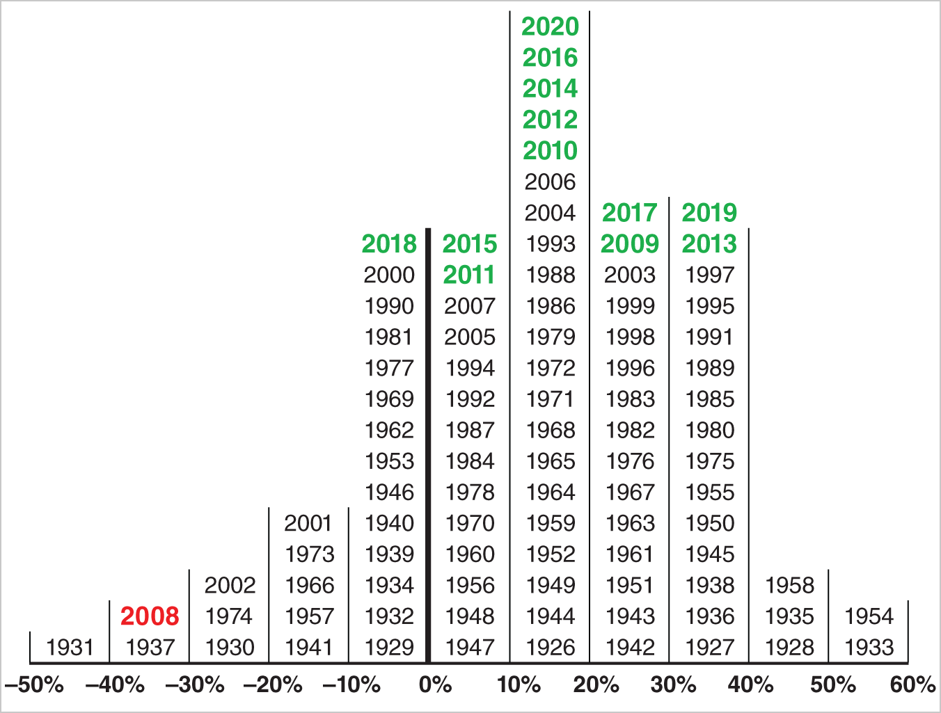
Figure 2.1 S&P 500 Annual Returns (1926–2020)
Before looking at the returns during the bull market, 2008 stands out as a very unusual year with its negative 37% return being second lowest out of ninety-five years. The twelve years since 2008 are very normal with five being the most frequently seen return of +10% to +20%, two each in the 0% to 10% and 20% to 30%, one in the −10% to 0%, and two in the 30% to 40% ranges. It appears that during the last twelve years the stock market was just being the stock market, doing what it has done for ninety-five years.
Sectors and Volatility
Table 2.1 shows the rates of returns from the market low March 9, 2009, through the then all-time high February 19, 2020. Over this time period, the S&P 1500 Index gained 530.1%, meaning $1.00 invested at the low would be worth $6.30 on February 19, 2020. Impressive, but far behind the 932.9% return on the S&P 1500 Information Technology Index over the same time period, meaning $1.00 invested in that index at the bottom would have grown to $10.32. Three other S&P 1500 sector indexes beat the broad market: the S&P 1500 Consumer Discretionary Index, up 839.5%; the S&P 1500 Financials Index, up 625.8%; and the S&P 1500 Industrials Index, up 584.5%.
Table 2.1 Rates of Return from the Market Low, 3/9/2009–2/19/2020
| Sector | S&P 1500 Sector Index Return: 3/9/09 through 2/19/20 (%) | Average Beta vs. S&P 1500 Index (stocks within ICON database) |
|---|---|---|
| Information Technology | 932.9 | 1.16 |
| Consumer Discretionary | 839.5 | 1.02 |
| Financials | 625.8 | 1.09 |
| Industrials | 584.5 | 1.15 |
| S&P 1500 Index | 530.1 | 1.00 |
| Health Care | 520.0 | 1.01 |
| Real Estate | 482.7 | 0.81 |
| Utilities | 395.6 | 0.66 |
| Materials | 365.3 | 1.15 |
| Consumer Staples | 359.4 | 0.85 |
| Telecommunication Services | 261.9 | 0.90 |
| Energy | 67.9 | 1.26 |
What ought to stand out immediately is that the leaders were either cyclical or economically sensitive, and some of the laggards were the defensive, so-called recession-proof sectors: telecommunication services, utilities, and consumer staples. The returns in the table suggest that a rewarding strategy during this eleven-year run was to believe in, and invest in, the economic recovery and expansion through sectors like consumer discretionary, information technology, and industrials. Looking back, one of the most frequently touted concerns during this period was that the consumer would stop shopping and buying, a concern that, based on the performance of the consumer discretionary sector, appears misguided. In addition, it appears believing that financials would right the ship and recover from the financial crisis of 2008 was rewarded. At the other end, investors who doubted the recovery and expansion and preferred defensive sectors would have missed out on higher returns.
Before addressing the right column, a little background on beta can be useful. It was introduced by William Sharpe in the 1960s as a measure of volatility. A stock with a beta greater than 1.00 is more volatile than the broad market and a stock with a beta less than 1.00 is less volatile than the market. When first introduced, scholars suggested it made managing money easy because managers should simply hold high beta stocks in bull (rising) markets and low beta stocks in bear (declining) markets. A portfolio correctly following this practice would beat indexes during both bull markets (going up more) and bear markets (going down less). This sounds good in theory. A problem, however, as we have seen with the eleven-year bull market, is that mangers are not good at knowing whether they are in a bull or bear market.
The right column in the table is the average beta for the stocks in each sector in the ICON database versus the S&P 1500 Index. As for the eleven-year bull market, the table shows that the top five performing sectors have average betas greater than 1.00 and, generally, the sectors with low betas lagged. So the scholars’ textbook recommendation was in effect as it was rewarding to hold high beta stocks in a bull market. (As exceptions, energy and materials were two high-beta sectors that lagged, but we believe these sectors have added volatility and higher betas because of commodity price influences.)
Buying and holding these leading sectors was not easy. During market declines the cyclical, economically sensitive sectors dropped more than the market, and the defensive, recession-proof sectors held up better. These were complete reversals of the long-term theme. Table 2.2 shows how sectors ranked during the sharp declines of 2010, 2011, and 2018, the three most severe setbacks during the bull market. The first two were the European debt crisis rounds one and two when the S&P 1500 dropped 15.8% and 19.4%, respectively. During the sharp drop of 19.8% in 2018, investors worried about the Federal Reserve potentially tightening monetary policy in 2019. We have labeled all three “volatility events” and discuss them in more detail in Chapter 9. In all three cases, long-term leaders like consumer discretionary, information technology, financials, and industrials ranked an average of 6.3 or worse, which means they dropped more than average. Sticking with those long-term leaders would have taken fortitude and long-term vision.
Table 2.2 Sector Ranked During Market Declines in 2010, 2011, and 2018
| 4/23/10– 7/2/10 | 7/7/11–10/3/11 | 9/20/18–12/24/18 | ||
|---|---|---|---|---|
| Sector | Rank | Rank | Rank | Average |
| Communication Services | 1 | 3 | 5 | 3.0 |
| Utilities | 2 | 1 | 1 | 1.3 |
| Consumer Staples | 3 | 2 | 3 | 2.7 |
| Health Care | 4 | 5 | 4 | 4.3 |
| Real Estate | 5 | 7 | 2 | 4.7 |
| Information Technology | 6 | 4 | 9 | 6.3 |
| Industrials | 7 | 9 | 10 | 8.7 |
| Consumer Discretionary | 8 | 6 | 7 | 7.0 |
| Financials | 9 | 10 | 6 | 8.3 |
| Materials | 10 | 11 | 8 | 9.7 |
| Energy | 11 | 8 | 11 | 10.0 |
To summarize sector and volatility behavior in the eleven-year bull market, investors were rewarded for seeking and tolerating volatility by buying and holding high-beta stocks in economically sensitive, cyclical sectors. To get the full benefit of the eleven-year bull market they had to ride through some severe reversals. To that extent, it was a fairly normal, classic bull market. Investors who believed in the economy and tolerated volatility got rewarded. Textbook bull market.
Earnings
Was the bull market sensible from a corporate earnings perspective? In other words, did earnings grow and support higher valuations? Figure 2.2 shows earnings per share for the S&P 1500 Index, which includes companies in the S&P 500 (large-cap), S&P Mid-Cap 400, and the S&P Small-Cap 600. It shows the drop in earnings for 2008 and 2009 during the recession. Although some banks posted losses, overall, the 1500 companies had positive earnings in 2008 and 2009, just lower than in 2006 and 2007. Although there was growth during the eleven-year bull market, there was a pause in 2015 and 2016, a result of the drop in the price of oil and the gains in the value of the US dollar. As of this writing, 2021, 2022, and 2023 shown in the graph are estimates from a survey of analysts. From 2009 through 2019, coinciding with the bull market, earnings grew at a compounded annual rate of 9.9% per year. Earnings in the best two performing sectors, information technology and consumer discretionary, grew at 14.3% and 13.8% per year, respectively. Based on earnings, the bull market appears sensible. Although some investors worried about various uncertainties at the macroeconomic level, companies went about their business of growing profits, and stock prices responded.
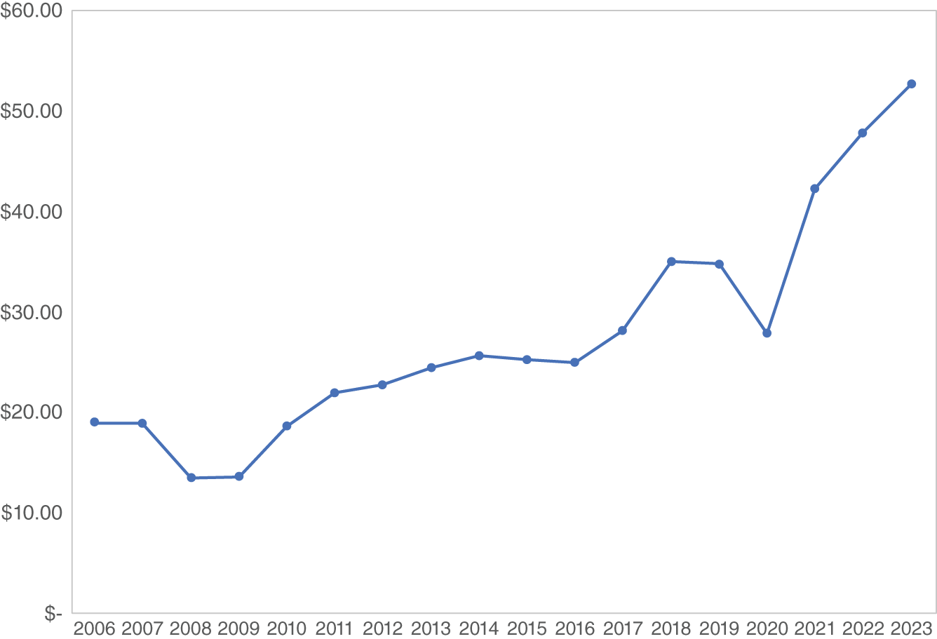
Figure 2.2 S&P 1500 Earnings Per Share 2006–2023
Value
At ICON, we compute intrinsic value for stocks. We never use simplistic ratios like price/earnings (P/E) or price-to-book value. To compute value, we take average earnings and project earnings growing out into the future at growth rates forecasted by analysts. Then we discount those future earnings back to their present value considering risk and interest rates. Fundamentally it is very similar to the theory of the dividend discount model, just building off of earnings rather than dividends. The equation is applied to approximately 1,700 domestic stocks. Value is divided by price for a value/price (V/P) ratio.
Figure 2.3 shows the S&P 1500 Index in gray from February 1, 2009, just before the market bottom in early March, the then-all-time high in February 2020. The black line is ICON's estimate of fair value based on the average V/P ratio of the 1700 stocks.
What stands out is that prices grew but fair value also grew. In other words, fair value was an upwardly moving target for prices. Prices just tried to keep up with value.
This figure illustrates the very foundation of a “value” manager's view of the stock market. As earnings grow, value grows, and prices just try to keep up. When the news is good, investors get optimistic and prices get ahead of value. When the news is bad, investors get concerned and prices lag behind value. Price tries to keep up with value. News and emotions just get in the way sometimes.
There is a big gap between value and price during both of the European Debt Crises in 2010 and 2011 when investors worried that potential sovereign debt defaults would cause a recession. From this perspective those two rapid sell-offs appear very irrational and fear based, an overreaction to economic conditions. Also noteworthy is how close value and price were during the second half of this bull market. Other than a couple of times when price and value were 10% to 15% apart (pre-election 2016 and December 2018) we don't see extreme optimism reflected in overpricing nor the extreme fear that accompanies underpricing. Overall, based on value, the great bull market of 2009–2020 was rational and sensible. During that bull market we were frequently in disagreement with analysts who incorrectly thought stocks were expensive.
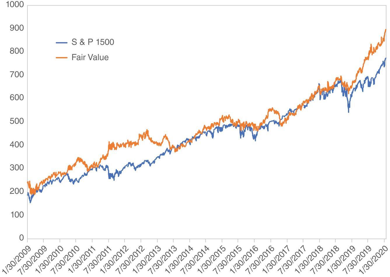
Figure 2.3 S&P 1500 Index and Fair Value
Down Days
Naturally, in multiyear bull markets the market does not go up every day. There are down days for a variety of reasons such as profit taking, negative news, or some economic data released that fall short of estimates. When the market experiences a down day it can be frustrating to those invested who believe the market should be advancing. Just the opposite, down days can serve as confirmation to those on the sidelines holding cash. Let's compare multiyear bull markets to see their “down-day” behavior.
Since 1982 we have identified five multiyear bull markets; 8/82–8/87, 12/87–2/94, 12/94–3/00, 9/02–10/07, and the recent one 3/09–2/20. We chose to split the advance from 1987 to 2000 into two bull markets because there was a sideways move in 1994. The S&P 1500 came into existence 1/1/1995 so the last two bull markets use it for counting days and the earlier two markets use the S&P 500. For the 12/94 to 3/2000 bull market, we used mostly the 1500 Index but patched in the 500 for the one month of 1994.
Table 2.3 shows the total number of days from the bottom to the top and how many days the market dropped. As a percentage, all five bull markets are pretty similar in terms of percent of days that the market goes down, generally between 44% and 46%. The recent bull market appears quite average at 44.8%. In fact, it is right in the middle. Based on the percentage of down days, there is no reason for this bull market to have been unloved. It was actually pretty typical.
Notice what the percentage of down days means for a bullish investor who has correctly assessed that we are in a bull market and is in a buy-and-hold mode. Almost half the time the market goes against that position. Buying and holding, the correct posture in a multiyear bull market, takes some fortitude and discipline when the market goes down almost half the days. Now, for the investor with the incorrect view that the market is in a bear market and is on the sidelines holding cash, he or she gets confirmation that the incorrect view is correct 2 to 2.5 days per week on average. ICON put out a paper entitled “Rallies Don't Look Like Rallies!” in late 2009 pointing this out to investors. In other words, rallies don't go straight up like an investor may want. It was an attempt to get investors to overlook the down days and get invested for the long term.
Table 2.3 Bull Markets
| Dates | Total Days | Down Days | % Down Days | % Total Return | % Best Days |
|---|---|---|---|---|---|
| 8/1982–8/1987 | 1274 | 589 | 46.2 | 304 | 5.1 |
| 12/1987–2/1994 | 1559 | 723 | 46.4 | 163 | 2.7 |
| 12/1994–3/2000 | 1335 | 595 | 44.6 | 261 | 4.2 |
| 9/2002–10/2007 | 1258 | 557 | 44.3 | 125 | 2.7 |
| 3/2009–2/2020 | 2758 | 1236 | 44.8 | 530 | 2.3 |
How can you gain 530% in eleven years if the market goes down almost half the time? Well, there are some really big up (surge) days. What if an investor could only be invested on the really good, best days? Impossible we believe, but it is worth computing to illustrate the personality of multiyear bull markets. We ranked the days from best to worst and then went down the list, compounding daily returns. The column on the far right shows what percentage of the total days an investor would need to be invested to obtain the return of the entire bull market. For example, in the recent bull market, if an investor could have been in the very best days, it would have meant being invested in just 2.3% of the 2,758 days to earn 530%.
This recent bull market has been typical of multiyear bull markets in that a large part of the total return was concentrated in the large surge days. The fact that this recent bull market is in the low end in terms of best days required suggests it has experienced more big surge days than normal for a bull market, which may have contributed to some observations. Momentum investors did not excel during this eleven-year advance. Perhaps by the time their momentum-driven buy threshold was registered, the big gains were already recorded. The active management versus passive (indexing) investing will be covered later, but the surge nature of this bull market may have hurt active managers. If cash came into a mutual fund and was not immediately invested it could have missed important big days. Finally, you may have heard the phrase “risk on, risk off,” which we believe is a synonym for short-term market timing. Similar to the momentum investors, investors practicing this approach may have missed big days and spotted the market a head start during short-term advances. We believe the buy-and-hold approach beat the timers because it was likely to participate in the big days.
Similar Crashes, Similar Recoveries
The “crash” of October 1987 happened in a day. In October 2008, the market dropped a similar amount but over the course of a week. It wasn't labeled a crash, but if you graph the S&P 500 Index on a weekly basis the drops are almost duplicates. The market actions immediately after those two events were different because there actually was a recession following the 2008 crash, whereas the recession feared in late 1987 never occurred. Nevertheless, the long-term market recoveries were remarkably similar.
Figure 2.4 was shown to an office of Merrill Lynch advisors January 2009. Using weekly data the crashes of 1987 and 2008 appear similar. It was suggested to the audience that over the next couple of years the market could recover from the 2008 crash like it did following 1987. In other words, we had a post-crash recovery road map.
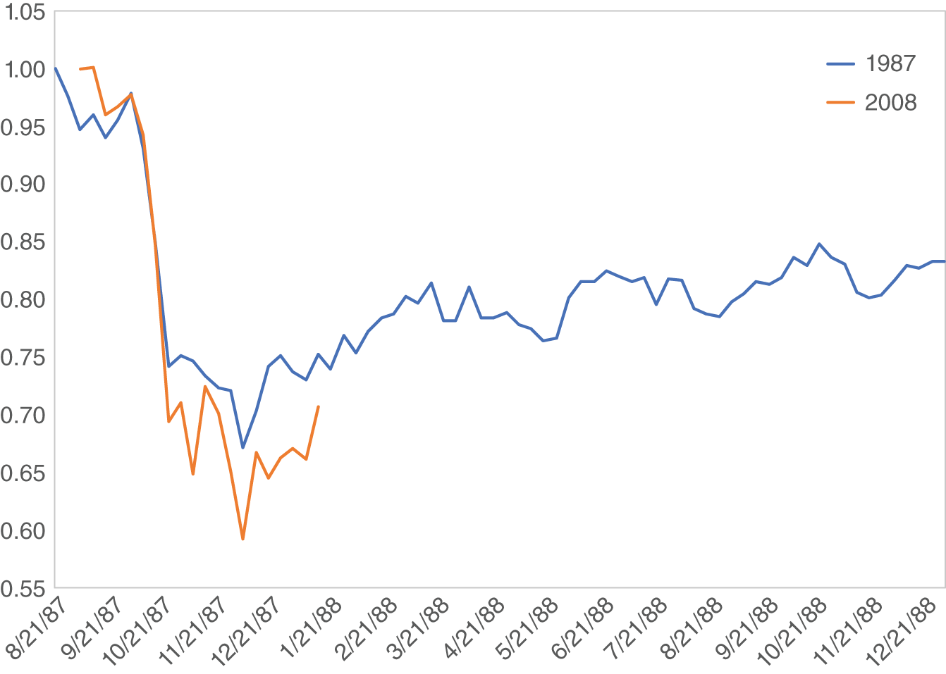
Figure 2.4 October Crashes of 1987 and 2008
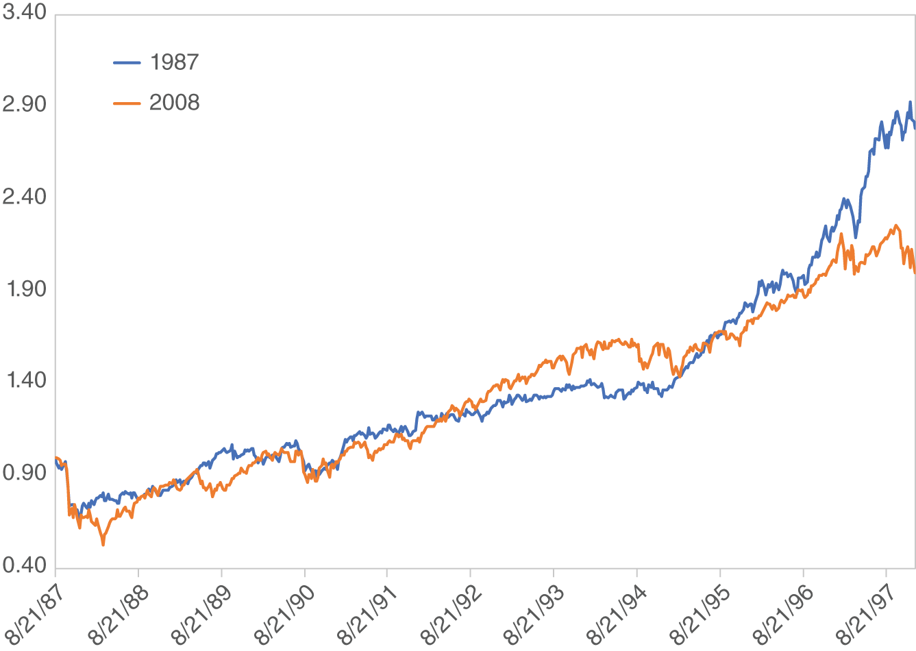
Figure 2.5 S&P 500 Index, Crashes of 1987 and 2008 Nine Years Later
Figure 2.5 is an update ten years later that shows that the post-crash 1987 recovery was a good road map for the post-crash 2008 recovery. Many times the market got to the same place at the same time after 2008 as it did following 1987.
Summary
This multiyear bull market was sensible and similar to previous bull markets in many aspects. Its annual returns were in line with, and pretty typical of, ninety-five years of returns dating back to 1926. The sector leadership was economically sensitive and cyclical along with a recovery in financials. Volatility was rewarded as high beta stocks were among the leaders. Earnings, and therefore fair value, grew and prices just followed. Typical of previous bull markets, the market dropped about 45% of the trading days. Also, like previous bull markets, big surge days were important contributors. Finally, its recovery from the crash of 2008 was similar to the recovery from the crash of 1987. So as shown in Chapter 1, why did many investors not participate? Why was the multiyear bull market referred to as unloved? The following chapters will address those issues.
Keys to Maximizing Performance from 2009 through 2020
- Believe in the economy.
- Hold cyclical and economically sensitive sectors.
- Believe financials would “right the ship” following the financial crisis.
- Tolerate volatility and hold high beta stocks.
- Participate in surge days.
- Recognize growth in corporate earnings.