Chapter 6. Input Events: Keyboard, Mouse, Stylus, and Multi-Touch
Now that you know how to arrange a WPF user interface, it’s time see how to make it interactive. This chapter covers two pieces of important plumbing in WPF—routed events and commands. It also examines the events you can handle for each category of input device: keyboard, mouse, stylus, and multi-touch.
Routed Events
Chapter 3, “WPF Fundamentals,” demonstrates how WPF adds more infrastructure on top of the simple notion of .NET properties with its dependency properties. WPF also adds more infrastructure on top of the simple notion of .NET events. Routed events are events that are designed to work well with a tree of elements. When a routed event is raised, it can travel up or down the visual and logical tree, getting raised on each element in a simple and consistent fashion, without the need for any custom code.
Event routing helps most applications remain oblivious to details of the visual tree (which is good for restyling) and is crucial to the success of WPF’s element composition. For example, Button exposes a Click event based on handling lower-level MouseLeftButtonDown and KeyDown events. When a user presses the left mouse button with the mouse pointer over a standard Button, however, he or she is really interacting with its ButtonChrome or TextBlock visual child. Because the event travels up the visual tree, the Button eventually sees the event and can handle it. Similarly, for the media-player-style Stop Button in Chapter 2, “XAML Demystified,” a user might press the left mouse button directly over the Rectangle logical child. Because the event travels up the logical tree, the Button still sees the event and can handle it as well. (Yet if you really wish to distinguish between an event on the Rectangle and the outer Button, you have the freedom to do so.)
Therefore, you can embed arbitrarily complex content inside an element such as a Button or give it an arbitrarily complex visual tree (using the techniques in Chapter 14, “Styles, Templates, Skins, and Themes”), and a mouse left-click on any of the internal elements still results in a Click event raised by the parent Button. Without routed events, producers of the inner content or consumers of the Button would have to write code to patch everything together.
The implementation and behavior of routed events have many parallels to dependency properties. As with the dependency property discussion, we’ll first look at how a simple routed event is implemented to make things more concrete. Then we’ll examine some of the features of routed events and apply them to the About dialog from Chapter 3.
A Routed Event Implementation
In most cases, routed events don’t look very different from normal .NET events. As with dependency properties, no .NET languages (other than XAML) have an intrinsic understanding of the routed designation. The extra support is based on a handful of WPF APIs.
Listing 6.1 demonstrates how Button effectively implements its Click routed event. (Click is actually implemented by Button’s base class, but that’s not important for this discussion.)
Just as dependency properties are represented as public static DependencyProperty fields with a conventional Property suffix, routed events are represented as public static RoutedEvent fields with a conventional Event suffix. The routed event is registered much like a dependency property in the static constructor, and a normal .NET event—or event wrapper—is defined to enable more familiar use from procedural code and adding a handler in XAML with event attribute syntax. As with a property wrapper, an event wrapper must not do anything in its accessors other than call AddHandler and RemoveHandler.
Listing 6.1 A Standard Routed Event Implementation

These AddHandler and RemoveHandler methods are not inherited from DependencyObject but rather UIElement. These methods attach and remove a delegate to the appropriate routed event. Inside OnMouseLeftButtonDown, RaiseEvent (also defined on the base UIElement class) is called with the appropriate RoutedEvent field to raise the Click event. The current Button instance (this) is passed as the source element of the event. It’s not shown in this listing, but Button’s Click event is also raised in response to a KeyDown event to support clicking with the spacebar or sometimes the Enter key.
Routing Strategies and Event Handlers
When registered, every routed event chooses one of three routing strategies—the way in which the event raising travels through the element tree. These strategies are exposed as values of a RoutingStrategy enumeration:
• Tunneling—The event is first raised on the root, then on each element down the tree until the source element is reached (or until a handler halts the tunneling by marking the event as handled).
• Bubbling—The event is first raised on the source element and then on each element up the tree until the root is reached (or until a handler halts the bubbling by marking the event as handled).
• Direct—The event is raised only on the source element. This is the same behavior as a plain .NET event, except that such events can still participate in mechanisms specific to routed events such as event triggers.
Handlers for routed events have a signature matching the pattern for general .NET event handlers: The first parameter is a System.Object typically named sender, and the second parameter (typically named e) is a class that derives from System.EventArgs. The sender parameter passed to a handler is always the element to which the handler was attached. The e parameter is (or derives from) an instance of RoutedEventArgs, a subclass of EventArgs that exposes four useful properties:
• Source—The element in the logical tree that originally raised the event.
• OriginalSource—The element in the visual tree that originally raised the event (for example, the TextBlock or ButtonChrome child of a standard Button).
• Handled—A Boolean that can be set to true to mark the event as handled. This is precisely what halts any tunneling or bubbling.
• RoutedEvent—The actual routed event object (such as Button.ClickEvent), which can be helpful for identifying the raised event when the same handler is used for multiple routed events.
The presence of both Source and OriginalSource enable you to work with the higher-level logical tree or the lower-level visual tree. This distinction applies only to physical events such as mouse events, however. For more abstract events that don’t necessarily have a direct relationship with an element in the visual tree (for example, Click due to its keyboard support), the same object is passed for both Source and OriginalSource.
Routed Events in Action
The UIElement class defines many routed events for keyboard, mouse, multi-touch, and stylus input. Most of these are bubbling events, but many of them are paired with a tunneling event. Tunneling events can be easily identified because, by convention, they are named with a Preview prefix. These events, also by convention, are raised immediately before their bubbling counterpart. For example, PreviewMouseMove is a tunneling event raised before the MouseMove bubbling event.
The idea behind having a pair of events for various activities is to give elements a chance to effectively cancel or otherwise modify an event that’s about to occur. By convention, WPF’s built-in elements take action only in response to a bubbling event (when a bubbling and tunneling pair is defined), ensuring that the tunneling event lives up to its “preview” name. For example, imagine that you want to implement a TextBox that restricts its input to a certain pattern or regular expression (such as a phone number or zip code). If you handle TextBox’s KeyDown event, the best you can do is remove text that has already been displayed inside the TextBox. But if you handle TextBox’s PreviewKeyDown event instead, you can mark it as “handled” to not only stop the tunneling but also stop the bubbling KeyDown event from being raised. In this case, the TextBox will never receive the KeyDown notification, and the current character will not get displayed.
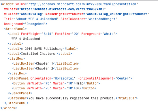
To demonstrate the use of a simple bubbling event, Listing 6.2 updates the original About dialog from Chapter 3 by attaching an event handler to Window’s MouseRightButtonDown event. Listing 6.3 contains the C# code-behind file with the event handler implementation.
Listing 6.2 The About Dialog with an Event Handler on the Root Window
Listing 6.3 The Code-Behind File for Listing 6.2

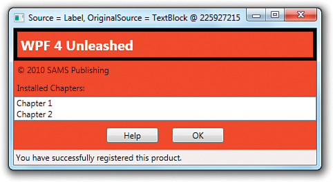
The AboutDialog_MouseRightButtonDown handler performs two actions whenever a right-click bubbles up to the Window: It prints information about the event to the Window’s title bar, and it adds (then subsequently removes) a thick black border around the specific element in the logical tree that was right-clicked. Figure 6.1 shows the result. Notice that right-clicking the Label reveals Source set to the Label but OriginalSource set to its TextBlock visual child.
Figure 6.1 The modified About dialog, after the first Label control is right-clicked.
If you run this example and right-click everything, you’ll notice two interesting behaviors:
• Window never receives the MouseRightButtonDown event when you right-click on either ListBoxItem. That’s because ListBoxItem internally handles this event as well as the MouseLeftButtonDown event (halting the bubbling) to implement item selection.
• Window receives the MouseRightButtonDown event when you right-click on a Button, but setting Button’s Border property has no visual effect. This is due to Button’s default visual tree, which was shown back in Figure 3.3. Unlike Window, Label, ListBox, ListBoxItem, and StatusBar, the visual tree for Button has no Border element.
Digging Deeper: Halting a Routed Event Is an Illusion
Although setting the RoutedEventArgs parameter’s Handled property to true in a routed event handler appears to stop the tunneling or bubbling, individual handlers further up or down the tree can opt to receive the events anyway! This can only be done from procedural code, using an overload of AddHandler that adds a Boolean handledEventsToo parameter.
For example, the event attribute could be removed from Listing 6.2 and replaced with the following AddHandler call in AboutDialog’s constructor:
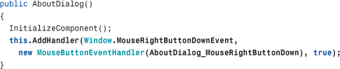
With true passed as a third parameter, AboutDialog_MouseRightButtonDown now receives events when you right-click a ListBoxItem and adds the black border!
You should avoid processing handled events whenever possible, because there is likely a reason the event is handled in the first place. Attaching a handler to the Preview version of an event is the preferred alternative.
The bottom line, however, is that the halting of tunneling or bubbling is really just an illusion. Tunneling and bubbling still continue when a routed event is marked as handled, but event handlers see only unhandled events by default.
Attached Events
The tunneling and bubbling of a routed event is natural when every element in the tree exposes that event. But WPF supports tunneling and bubbling of routed events through elements that don’t even define that event! This is possible thanks to the notion of attached events.
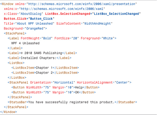
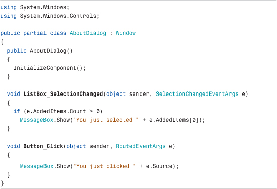
Attached events operate much like attached properties (and their use with tunneling or bubbling is very similar to using attached properties with property value inheritance). Listing 6.4 changes the About dialog again by handing the bubbling SelectionChanged event raised by its ListBox and the bubbling Click event raised by both of its Buttons directly on the root Window. Because Window doesn’t define its own SelectionChanged or Click events, the event attribute names must be prefixed with the class name defining these events. Listing 6.5 contains the corresponding code-behind file that implements the two event handlers. Both event handlers simply show a MessageBox with information about what just happened.
Listing 6.4 The About Dialog with Two Attached Event Handlers on the Root Window
Listing 6.5 The Code-Behind File for Listing 6.4
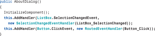
Every routed event can be used as an attached event. The attached event syntax used in Listing 6.4 is valid because the XAML compiler sees the SelectionChanged .NET event defined on ListBox and the Click .NET event defined on Button. At runtime, however, AddHandler is directly called to attach these two events to the Window. Therefore, the two event attributes are equivalent to placing the following code inside the Window’s constructor:
Digging Deeper: Consolidating Routed Event Handlers
Because of the rich information passed to routed events, you could handle every event that tunnels or bubbles with one top-level “megahandler” if you really wanted to. This handler could examine the RoutedEvent object to determine which event got raised, cast the RoutedEventArgs parameter to an appropriate subclass (such as KeyEventArgs, MouseButtonEventArgs, and so on), and go from there.
For example, Listing 6.5 could be changed to assign both ListBox.SelectionChanged and Button.Click to the same GenericHandler method, defined as follows:

This is also made possible by the delegate contravariance feature in the .NET Framework, enabling a delegate to be used with a method whose signature uses a base class of an expected parameter (for example, RoutedEventArgs instead of SelectionChangedEventArgs). GenericHandler simply casts the RoutedEventArgs parameter when necessary to get the extra information specific to the SelectionChanged event.
Keyboard Events
The basic keyboard events supported by all UIElements are the bubbling KeyDown and KeyUp events and their tunneling counterparts, PreviewKeyDown and PreviewKeyUp. The EventArgs parameter passed to keyboard event handlers is a KeyEventArgs that contains a number of properties, such as the following:
• Key, ImeProcessedKey, DeadCharProcessedKey, and SystemKey—Four properties of type Key, a large enumeration of every possible key. The Key property identifies what key the event is about. If the key is or will be processed by an Input Method Editor (IME), you can check the value of ImeProcessedKey. If the key is part of a dead key composition, the value of Key will be DeadCharProcessed, with the actual key revealed by the DeadCharProcessedKey property. When a system key is pressed, such as Alt, the value of Key will be System, with the key pressed with it revealed by the SystemKey property.
• IsUp, IsDown, and IsToggled—Boolean properties that reveal more information about the key event, although in some cases this information is redundant. (If you’re handling a KeyDown event, you know the key is down!) IsToggled pertains to keys with toggle states, such as Caps Lock and Scroll Lock.
• KeyStates—A property of type KeyStates, a bit-flags enumeration whose value is the combination of None, Down, or Toggled. These values map to IsUp, IsDown, and IsToggled, respectively. Because Toggled will sometimes be combined with Down, you need to be careful not to check the value of KeyStates with a simple equality expression. It’s easiest just to use the IsXXX methods instead.
• IsRepeat—A Boolean property that is true when the key is being repeated. This is the case of holding down the spacebar, for example, and getting a flurry of KeyDown events. IsRepeat would be true for all but the first KeyDown event.
• KeyboardDevice—A property of type KeyboardDevice that enables you to interact with the keyboard in more depth, such as asking about what keys are down or requesting focus to be moved to a specific element.
Tip
The static System.Windows.Input.Keyboard class and its PrimaryDevice property (of type KeyboardDevice) can be used to obtain information about the keyboard at any time, not just inside keyboard event handlers.
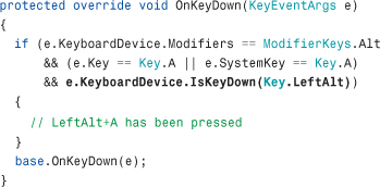
One important reason to access KeyboardDevice is for its Modifiers property of type ModifierKeys, another enumeration. It reveals whether certain keys are pressed in combination with the primary key. Its values are None, Alt, Control, Shift, and Windows. This is a bit-flags enumeration, so you won’t want to check for equality unless you care about the state of every modifier key. For example, the following code checks whether Alt and A are being pressed but doesn’t rule out Alt+Shift+A or Alt+Ctrl+A, and so on:
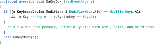
On the other hand, the following code checks for Alt+A and nothing else:

FAQ
 How do I find out whether the left or right
 Alt, Ctrl, or Shift key was pressed?
The Key enumeration has separate values for LeftAlt versus RightAlt, LeftCtrl versus RightCtrl, and LeftShift versus RightShift. However, because the Alt key is usually the “system key,” it can show up as System, hiding which Alt key was actually pressed. Fortunately, you can use KeyboardDevice’s IsKeyDown method (or IsKeyUp or IsKeyToggled) to ask about specific keys, such as LeftAlt or RightAlt. For example, the following code checks specifically for LeftAlt+A being pressed:
These keyboard events can get a little bit complicated in certain scenarios, but usually the most difficulty anybody has with keyboard handling revolves around keyboard focus. (This is further complicated when interoperating with non-WPF technologies, covered in Chapter 19, “Interoperability with Non-WPF Technologies.”) A UIElement receives keyboard events only if it has keyboard focus. You can control whether an element is eligible for focus by setting its Boolean Focusable property, which is true by default. A FocusableChanged event is raised whenever its value changes.
UIElements define many more properties and events related to keyboard focus. The relevant properties are IsKeyboardFocused, which reports whether the current element has keyboard focus, and IsKeyboardFocusWithin, which reports the same thing but for the current element and any child elements. (These properties are read-only; to attempt to set keyboard focus, you can call the Focus or MoveFocus methods.) The events that report changes in these properties are IsKeyboardFocusedChanged, IsKeyboardFocusWithinChanged, GotKeyboardFocus, LostKeyboardFocus, PreviewGotKeyboardFocus, and PreviewLostKeyboardFocus.
Mouse Events
All UIElements support the following basic mouse events:
• MouseEnter and MouseLeave
• MouseMove and PreviewMouseMove
• MouseLeftButtonDown, MouseRightButtonDown, MouseLeftButtonUp, MouseRightButtonUp, and the more generic MouseDown and MouseUp, as well as the PreviewXXX versions of all six of these events
• MouseWheel and PreviewMouseWheel
FAQ
Where is the event for handling the pressing of a mouse’s middle button?
This information can be retrieved via the generic MouseDown and MouseUp events (or their Preview counterparts). The EventArgs object passed to such event handlers include properties that reveal which of the following buttons have been pressed or released: LeftButton, RightButton, MiddleButton, XButton1, or XButton2.
The MouseEnter and MouseLeave events can be used to create “rollover” effects, although the preferred approach is to use a trigger with the IsMouseOver property. UIElements also have an IsMouseDirectlyOver property (and corresponding IsMouseDirectlyOverChanged event) that exclude child elements, for advanced scenarios in which you know exactly what visual tree you are working with.
Tip
If you don’t want an element to raise any mouse events (or block mouse events underneath), you can set its IsHitTestVisible property to false.
Warning: Transparent regions raise mouse events, but null regions do not!
Although you can count on IsHitTestVisible suppressing mouse events when set to false, the conditions for raising mouse events in the first place are a bit subtle. Setting an element’s Visibility to Collapsed suppresses its mouse events, whereas setting an element’s Opacity to 0 does not affect its event-related behavior. One more subtlety is that areas with a null Background, Fill, or Stroke produce areas that don’t raise mouse events. However, explicitly setting the Background, Fill, or Stroke to Transparent (or any other color) produces areas that do raise mouse events. (A null brush looks like a Transparent brush but differs in its hit-testability.)
MouseEventArgs
The handlers for all of the previously mentioned mouse events (other than IsMouseDirectlyOverChanged) are passed an instance of MouseEventArgs. This object exposes five properties of type MouseButtonState that provide information about each potential mouse button: LeftButton, RightButton, MiddleButton, XButton1, and XButton2. MouseButtonState is an enumeration whose values are Pressed and Released. It also defines a GetPosition function that returns a Point with X and Y properties, revealing the exact coordinates of the mouse pointer.
GetPosition is a function rather than a simple property because it enables you to get the mouse pointer position in more than one way. You can get the position relative to the top-left corner of the screen, or you can get the position relative to the top-left corner of any rendered UIElement. To get the screen-relative position, you can pass null as the single parameter to GetPosition. To get an element-relative position, you pass the desired element as the parameter.
Handlers for MouseWheel and PreviewMouseWheel are given an instance of MouseWheelEventArgs, which derives from MouseEventArgs and adds an integer Delta property that indicates how much the wheel has moved since the last event. Handlers for the 12 events in the MouseUp/MouseDown family are given an instance of MouseButtonEventArgs, another subclass of MouseEventArgs. MouseButtonEventArgs adds a ChangedButton property that tells exactly which button changed (a value from the MouseButton enumeration), a ButtonState property that tells whether ChangedButton was pressed or released, and a ClickCount property.
ClickCount reveals the number of consecutive clicks of the relevant mouse button, where the time between each click is less than or equal to the system’s double-click speed (configurable in Control Panel). The same way Button raises a Click event by handling MouseLeftButtonDown, its base Control class raises a MouseDoubleClick event by checking for a ClickCount of 2 inside MouseLeftButtonDown and raises a PreviewMouseDoubleClick event by doing the same thing inside PreviewMouseLeftButtonDown. With this support, you could easily react to other gestures, such as a triple-click, double-middle-button-click, and so on.
Warning: Canvas raises its own mouse events only within the area defined by its Width and Height!
It’s easy to forget that Canvas has a Width and Height of 0 by default because its children get rendered outside the Canvas’s bounds. But mouse events for Canvas itself (ignoring events bubbled up from any children) get raised only within the bounding box defined by its Width and Height (and only then when it has a non-null Background). Therefore, by default, Canvas-level mouse events are raised only for its children.
Drag and Drop
UIElements expose events for working with drag-and-drop:
• DragEnter, DragOver, DragLeave, with PreviewDragEnter, PreviewDragOver, and PreviewDragLeave
• Drop and PreviewDrop
• QueryContinueDrag and PreviewQueryContinueDrag
This is Win32-style dragging and dropping of clipboard content to/from elements, not dragging/dropping of elements themselves. Elements can opt in to participating in drag-and-drop by setting their AllowDrop property to true.
The first two sets of events give their handlers an instance of DragEventArgs, which contains the following:
• GetPosition—The same method exposed by MouseEventArgs
• Data—A property of type IDataObject that represents the Win32 clipboard object being dragged or dropped
• Effects and AllowedEffects—Bit-flags DragDropEffects enumeration values that can be any combination of Copy, Move, Link, Scroll, All, or None
• KeyStates—Another bit-flags enumeration (DragDropKeyStates) that reveals which of the following are pressed during the drag or drop: LeftMouseButton, RightMouseButton, MiddleMouseButton, ShiftKey, ControlKey, AltKey, or None
The QueryContinueDrag and PreviewQueryContinueDrag events are raised when the keyboard state or the state of a mouse button has changed during a drag. They allow handlers to easily cancel the whole operation. Their handlers are given an instance of QueryContinueDragEventArgs, which contains the following:
• KeyStates—The same property that DragEventArgs exposes
• EscapePressed—A separate Boolean property that tells whether the Esc key has been pressed
• Action—A property that handlers can set to determine the fate of the drag-and-drop operation; it can be set to a value from the DragAction enumeration: Continue, Drop, or Cancel
Tip
The static System.Windows.Input.Mouse class can be used to obtain information about the mouse at almost any time, not just inside mouse event handlers. What you can’t do is get the correct position of the mouse from the static Mouse.GetPosition during drag-and-drop. Instead, you must either call GetPosition from the DragEventArgs instance passed to the relevant event handler or, if you must do this outside the context of an event handler, make a PInvoke call to the GetCursorPos Win32 API, which will give you the correct location.
Capturing the Mouse
Suppose you wanted to support dragging and dropping of UIElements rather than clipboard objects. It’s easy to imagine using the MouseLeftButtonDown, MouseMove, and MouseLeftButtonUp events to implement drag-and-drop. You could start a drag action by setting a Boolean variable inside an element’s MouseLeftButtonDown handler, move the element to remain under the mouse pointer if the Boolean is true inside its MouseMove handler, and then clear the Boolean inside its MouseLeftButtonUp event to end the dragging. It turns out that this simple scheme isn’t quite good enough, however, because it’s easy to move the mouse too fast or under another element, causing the mouse pointer to separate from the element you’re trying to drag.
Fortunately, WPF enables any UIElement to capture and release the mouse at any time. When an element captures the mouse, it receives all mouse events, even if the mouse pointer is not within its bounds. When an element releases the mouse, the event behavior returns to normal. Capture and release can be done with two functions defined on UIElements—CaptureMouse and ReleaseMouseCapture. (And of course, there are a number of corresponding properties and events that reveal the state of mouse capture. The properties are IsMouseCaptured and IsMouseCaptureWithin, and the events are GotMouseCapture, LostMouseCapture, IsMouseCaptureChanged, and IsMouseCaptureWithinChanged.)
Therefore, for a drag-and-drop implementation, you should capture the mouse inside MouseLeftButtonDown and release it inside MouseLeftButtonUp. The only tricky thing, then, is deciding the best way to actually move the element inside MouseMove. The best approach depends on the layout being used in the application, but this likely involves applying a RenderTransform or LayoutTransform to the element being dragged.
Stylus Events
WPF has special support for a pen digitizer, also known as a stylus, found on devices such as a Tablet PC. (This is sometimes referred to as “ink” support.) If you don’t add any special support for a stylus in your application, it appears to act just like a mouse, raising all the relevant mouse events, such as MouseDown, MouseMove, and MouseUp. This behavior is essential for a stylus to be usable with programs that aren’t designed specifically for a Tablet PC.
However, if you want to provide an experience that is optimized for a stylus, you can interact with an instance of System.Windows.Input.StylusDevice. There are three ways to get an instance of StylusDevice:
• You can use a StylusDevice property on MouseEventArgs to get an instance inside mouse event handlers. (This property will be null if there is no stylus.)
• You can use the static System.Windows.Input.Stylus class and its CurrentStylusDevice property to interact with the stylus at any time. (This will also be null if there is no stylus.)
• You can handle a number of events specific to the stylus.
This support also applies to devices with a touch digitizer rather than a pen digitizer.
FAQ
I can already get stylus data by pretending it is a mouse, so what good is the stylus-specific information?
A pen digitizer or touch digitizer can give you two things that a normal mouse cannot (ignoring multi-touch, which is covered in the next section): pressure sensitivity and higher resolution.
For a handwriting or drawing application, both of these things can make the writing or drawing much more natural than the result you would get with a mouse. A stylus can also do more “tricks” than a mouse, as evidenced by some of the properties and events discussed in this section. In addition, because multiple styluses can be detected at the same time, this support provides a way to write multi-touch-capable code with only WPF 3.5 SP1 on Windows 7.
StylusDevice
StylusDevice contains a number of properties, including the following:
• Inverted—A Boolean that reveals whether the stylus is being used as an eraser (with its back end against the screen).
• InAir—A Boolean that indicates whether the stylus is in contact with the screen, because on some devices its movement can still be registered as long as it is close enough.
• StylusButtons—A collection of StylusButton objects. Unlike with a mouse, there is no fixed list of possible buttons. Each StylusButton has a string Name and a Guid identifier, along with a StylusButtonState of Up or Down.
• TabletDevice—A property of type System.Windows.Input.TabletDevice that provides detailed information about the current hardware and which stylus capabilities it provides (such as pressure-sensitivity or in-air movement). Its Type property is Stylus for a pen digitizer or Touch for a touch digitizer.
StylusDevice has a GetPosition method that acts like the version for the mouse, but it also has a richer GetStylusPoints method that returns a collection of StylusPoint objects. Each StylusPoint object has properties such as the following:
• X—The horizontal coordinate of the stylus point relative to the passed-in element.
• Y—The vertical coordinate of the stylus point relative to the passed-in element.
• PressureFactor—A value between 0 and 1 that indicates how much pressure was applied to the stylus when the point was registered. The higher the value, the more pressure was applied, if the hardware supports pressure sensitivity. If pressure sensitivity is not supported, PressureFactor is set to 0.5.
The high resolution of a stylus explains why GetStylusPoints returns a collection of points (and pressures). In the time between two MouseMove events, for example, a lot of rich motion might have been detected and recorded.
Events
The stylus-specific events are as follows:
• StylusEnter and StylusLeave
• StylusMove and PreviewStylusMove
• StylusInAirMove and PreviewStylusInAirMove
• StylusDown, StylusUp, PreviewStylusDown, and PreviewStylusUp
• StylusButtonDown, StylusButtonUp, PreviewStylusButtonDown, and PreviewStylusButtonUp
• StylusSystemGesture and PreviewStylusSystemGesture
• StylusInRange, StylusOutOfRange, PreviewStylusInRange, and PreviewStylusOutOfRange
• GotStylusCapture and LostStylusCapture
The handlers for these events are given a StylusEventArgs instance that gives you access to the StylusDevice via a StylusDevice property. For convenience, it also defines InAir, Inverted, GetPosition, and GetStylusPoints members that wrap the same members from the StylusDevice.
Some handlers are given a StylusEventArgs subclass:
• StylusDownEventArgs—StylusDown and PreviewStylusDown are given a StylusDownEventArgs instance, which adds an integer TapCount property that is analogous to ClickCount for mouse events.
• StylusButtonEventArgs—StylusButtonDown, StylusButtonUp, and the corresponding Preview events are given a StylusButtonEventArgs instance, which adds a StylusButton property set to the relevant button.
• StylusSystemGestureEventArgs—StylusSystemGesture and PreviewStylusSystemGesture are given a StylusSystemGestureEventArgs instance, which adds a SystemGesture property set to one of the values from the SystemGesture enumeration: Tap, RightTap, TwoFingerTap, Drag, RightDrag, Flick, HoldEnter, HoldLeave, HoverEnter, HoverLeave, or None.
Tip
WPF defines a Stroke object that can be used to visually represent the information in a collection of StylusPoints, and an InkPresenter element that holds a collection of Strokes. For many drawing and handwriting scenarios, you could alternatively use the InkCanvas element, described in Chapter 11, “Images, Text, and Other Controls,” that internally uses an InkPresenter. InkCanvas has built-in support for exploiting a stylus, if one is present, and collecting/displaying strokes. With this, you don’t need to handle any Stylus events yourself!
Multi-Touch Events
When running on Windows 7 or later with hardware that supports multi-touch, you can take advantage of rich events introduced in WPF 4. These events can be separated into two categories—basic touch events and higher-level manipulation events.
Although multi-touch events, like stylus events, are exposed as mouse events, the reverse is not true. You cannot receive single-point touch events from the mouse, as if it were a finger on a touch device, without doing extra work to simulate a touch device.
Tip
If you want to simulate multi-touch (or even single-touch) on a “normal” computer, you can leverage the MultiPoint Mouse SDK (http://microsoft.com/multipoint/mouse-sdk), which enables up to 25 mice to be used simultaneously on the same computer! But that’s not enough; you need to expose MultiPoint’s functionality as a custom touch device by using the techniques described at http://blogs.msdn.com/ansont/archive/2010/01/30/custom-touch-devices.aspx.
Basic Touch Events
The basic touch events look and act a lot like mouse events:
• TouchEnter and TouchLeave
• TouchMove and PreviewTouchMove
• TouchDown, TouchUp, PreviewTouchDown and PreviewTouchUp
• GotTouchCapture and LostTouchCapture
When multiple fingers are touching simultaneously, these events get raised for each finger independently. Equivalent mouse events get raised as well for the first finger, thanks to the stylus support described earlier.
Handlers for the touch events are given an instance of TouchEventArgs, which contains the following:
• GetTouchPoint—A method that returns a TouchPoint instance relative to the passed-in element. This is analogous to the GetPosition method for mouse events.
• GetIntermediateTouchPoints—A method that returns a collection of TouchPoint instances relative to the passed-in element that got accumulated between the current and previous touch events. This is analogous to the GetStylusPoints method for stylus events.
• TouchDevice—A property that returns an instance of TouchDevice.
TouchPoint has not only a Position property but a Size property that reveals how much of the finger is in contact with the screen and a Bounds property that gives the exact contact area. It also exposes information that you already know in the context of one of these event handlers but can be handy at other times: the TouchDevice and an Action whose value can be Down, Move, or Up (from the TouchAction enumeration).
Each finger press is associated with its own TouchDevice, identified by an integer Id property. You can use this Id (or the TouchDevice instance itself) to keep track of which finger is which when handling events.
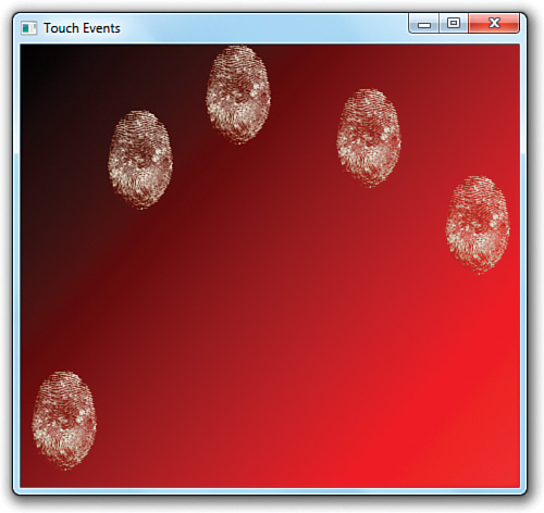
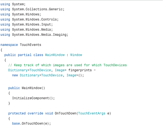
Listing 6.6 leverages TouchDown, TouchMove, and TouchUp to show fingerprint clipart images (not actual fingerprints!) whenever and wherever a finger is in contact with the screen. It is the code-behind file for the following simple Window that contains a Canvas named canvas:

The result is shown in Figure 6.2.
Figure 6.2 Pressing five fingers on the screen shows five fingerprint images at the right locations.
Listing 6.6 MainWindow.xaml.cs—Handling TouchDown, TouchMove, and TouchUp


This scheme works very much like dragging and dropping elements, as described in the “Mouse Events” section, except that the element is created on TouchDown and removed on TouchUp. Rather than attaching event handlers directly to the three events, this listing overrides the corresponding OnXXX methods on Window.
In OnTouchDown, the code captures the touch device to make the dragging operation work reliably. Unlike with the keyboard, mouse, or stylus, a single element can capture multiple touch devices. In this case, the same Canvas captures each device. The Image is created from an embedded resource using syntax covered in Chapter 12, “Resources,” placed appropriately using a TranslateTransform, then added to the Canvas and a dictionary used by the other events. In this dictionary, the TouchDevice itself is used as the key.
OnTouchMove retrieves the appropriate Image for the current TouchDevice and then moves it to the current TouchPoint. It makes sure that the event belongs to one of the TouchDevices captured by the Canvas. OnTouchUp releases touch capture then removes the Image from the Canvas and the dictionary.
How well this sample runs depends on your hardware. My multi-touch netbook supports only two simultaneous touch points, so I can’t get any more than two fingerprints to appear at once.
Tip
As of version 4, Silverlight does not have any of these touch events. If you want to write multi-touch code that works with both WPF and Silverlight, you can use a lower-level FrameReported event supported by both. FrameReported is defined on a static System.Windows.Input.Touch class and reports TouchPoints for the entire application. This is not a routed event; you’re responsible for doing hit-testing and figuring out which elements are being touched.
Manipulation Events for Panning, Rotating, and Zooming
Often, people want to leverage multi-touch for panning, rotating, and zooming elements. These actions are straightforward, as these concepts map exactly to applying a TranslateTransform, RotateTransform, and/or ScaleTransform. Detecting when you should apply these transforms and with what values is an entirely different story.
The one-finger swipe typically used for panning is a relatively simple gesture to detect, but trying to figure out if the user performed the two-finger rotation or zoom gesture would be difficult with the previously discussed events. Furthermore, the lack of consistency that would result in developers performing their own gesture recognition would result in frustrating user interfaces.
Fortunately, WPF provides higher-level manipulation events that make it easy to support panning, rotating, and zooming. These are the main manipulation events:
• ManipulationStarting and ManipulationStarted
• ManipulationDelta
• ManipulationCompleted
These events combine the information from independent touch devices updating simultaneously and package the data in an easy-to-consume form. For an element to receive these events, the IsManipulationEnabled property must be set to true on itself or a parent, and the relevant basic touch events must be left unhandled.
Using Manipulation Events
ManipulationStarting, followed by ManipulationStarted, gets raised when TouchDown happens for the first finger. ManipulationDelta gets raised for each TouchMove, and ManipulationCompleted gets raised after TouchUp is raised for all fingers. ManipulationStarting and ManipulationStarted give you the opportunity to customize aspects of the manipulation, restrict which manipulations are allowed, or cancel it.
The ManipulationDelta event gives you rich information about how the element is expected to be translated/rotated/scaled that can be applied directly to the relevant transforms. It gives you this data in a ManipulationDelta class that has the following properties:
• Translation—A Vector property with X and Y values
• Scale—Another Vector property
• Rotation—A double property that specifies the angle in degrees
• Expansion—A Vector property that is redundant with Scale but reports the size difference in terms of absolute device-independent pixels rather than in terms of a multiplier
Furthermore, the ManipulationDeltaEventArgs instance passed to handlers of the ManipulationDelta event has two properties of type ManipulationDelta—DeltaManipulation, which reports the changes compared to the last time the event was raised, and CumulativeManipulation, which reports the changes compared to when ManipulationStarted was raised. So no matter how you prefer to consume the data, there should be a way that pleases you!
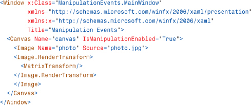
Listing 6.7 contains the code-behind file for the following Window, making it possible to move, rotate, and zoom the contained photo with standard swipe, spin, and pinch gestures:
The result is shown in Figure 6.3.
Figure 6.3 Enabling panning, rotating, and zooming on an Image by handling the ManipulationDelta event.

Listing 6.7 MainWindow.xaml.cs—Handling ManipulationDelta to Enable Panning, Rotating, and Zooming
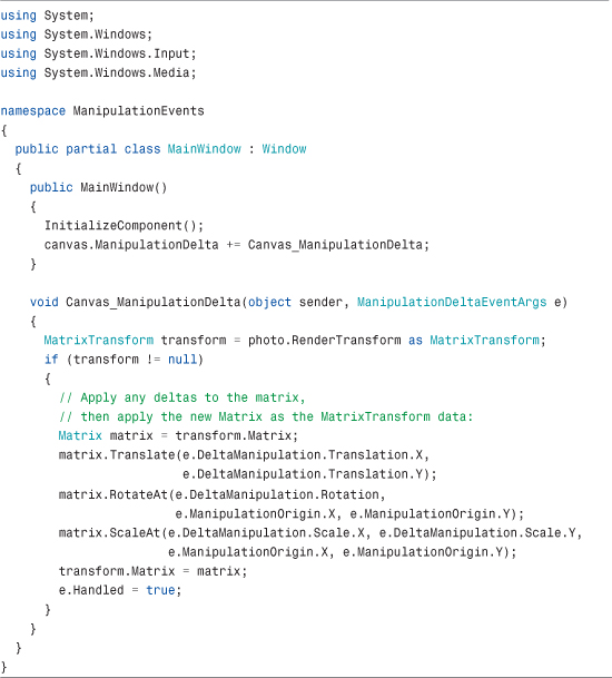
The Image named photo conveniently has a MatrixTransform applied as its RenderTransform, so all the code inside the ManipulationDelta handler needs to do is update the transform’s Matrix with data from the ManipulationDeltaEventArgs instance. The RotateAt and ScaleAt methods are used so the proper origin of rotation and scaling can be applied (e.ManipulationOrigin).
Manipulations are always done relative to a manipulation container. By default, this is the element marked with IsManipulationEnabled=True, which is why the XAML for this example sets it on the Canvas rather than the Image. You can set any element as the manipulation container by handling the ManipulationStarting event and setting ManipulationStartingEventArgs.ManipulationContainer to the element.
Adding Inertia
Manipulation events include support for giving objects inertia, so they can gradually slow to a stop when a gesture is done rather than stopping instantly. This makes the gestures feel more realistic and make it easy to support things like “flicking” an object to make it move a distance based on the speed of the flick.
To enable inertia, you can handle the ManipulationInertiaStarting event in addition to any other manipulation events. ManipulationInertiaStarting—not ManipulationCompleted—is actually the first manipulation event raised after all fingers lose contact with the screen. In the handler for ManipulationInertiaStarting, you can opt in to the support by setting properties on ManipulationInertiaStartingEventArgs.TranslationBehavior, ManipulationInertiaStartingEventArgs.RotationBehavior, and/or ManipulationInertiaStartingEventArgs.ExpansionBehavior. This causes the ManipulationDelta event to continue getting raised (with ManipulationDeltaEventArgs.IsInertial set to true) until friction causes it to stop, at which point ManipulationCompleted is raised. (If you do nothing inside the ManipulationInertiaStarting event, ManipulationCompleted will get raised right after.)
Here are the properties you can set to enable inertia on position, rotation, and/or scale:
• TranslationBehavior—DesiredDisplacement, DesiredDeceleration, and InitialVelocity
• RotationBehavior—DesiredRotation, DesiredDeceleration, and InitialVelocity
• ExpansionBehavior—DesiredExpansion, DesiredDeceleration, InitialRadius, and InitialVelocity
Typically you only need to set DesiredDeceleration or the behavior-specific DesiredDisplacement, DesiredRotation, or DesiredExpansion. The latter properties are useful for ensuring that the element doesn’t go too far. By default, InitialVelocity and InitialRadius are initialized with the current values to ensure a smooth transition. You can get the various velocities at the time of the ManipulationInertiaStarting event by checking ManipulationInertiaStartingEventArgs.InitialVelocities, which has LinearVelocity, AngularVelocity, and ExpansionVelocity properties.
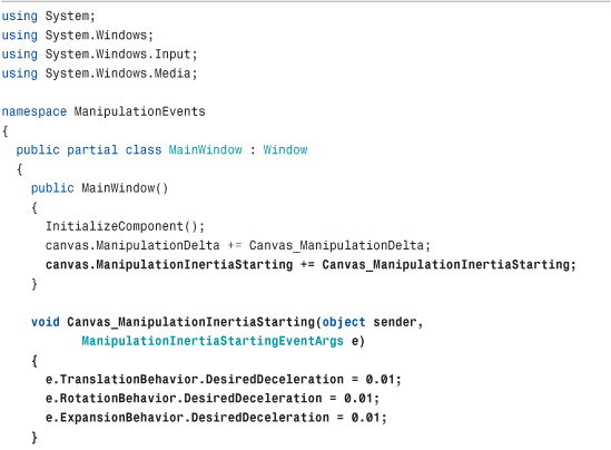
Listing 6.8 updates Listing 6.7 with support for inertia.
Listing 6.8 MainWindow.xaml.cs—Handling ManipulationDelta and ManipulationInertiaStarting to Enable Panning, Rotating, and Zooming with Inertia

You need to be careful about elements getting moved completely offscreen, especially when inertia is involved. You can use the ManipulationBoundaryFeedback event to be notified when an element reaches the boundary of the manipulation container so that you can take steps to prevent its escape.
Tip
WPF provides an easy way to make your application’s window bounce when something has been pushed past a boundary, similar to the scroll-past-the-end-of-a-list effect made popular by iPhone. Inside a ManipulationDelta event handler, you can call the ReportBoundaryFeedback method on the passed-in ManipulationDeltaEventArgs instance to make this happen. This raises the ManipulationBoundaryFeedback event, which is handled by WPF’s Window in order to provide this effect.
FAQ
ManipulationDeltaEventArgs contains a Complete method and a Cancel method. What’s the difference between them?
Complete halts the manipulation (both direct and inertial). Cancel also halts the manipulation, but it promotes the touch input data to mouse events, where some of the behavior can continue for elements that are mouse aware but not touch aware.
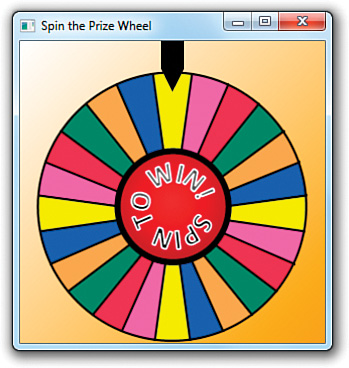
Listing 6.9 leverages rotation inertia to provide the “spin the prize wheel” user interface pictured in Figure 6.4. This listing is the code-behind file for the following Window:

Figure 6.4 Rotation inertia enables the wheel to keep spinning after you let go, as on some game shows.
Listing 6.9 MainWindow.xaml.cs—Implementation of a Spinning Prize Wheel with Inertia
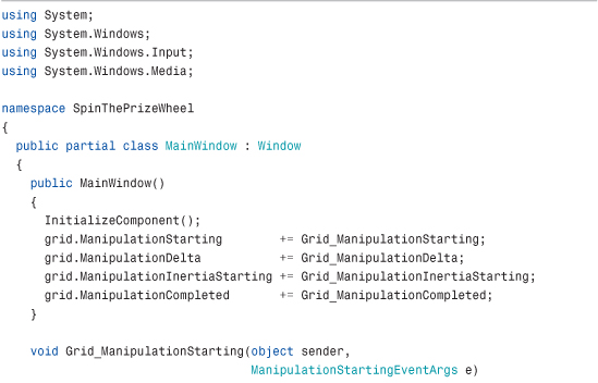

Listing 6.9 handles the ManipulationStarting event to tell the manipulation processing that it only cares about rotation. This is optional because it only pays attention to the rotation data inside the ManipulationDelta event handler, but it’s good practice (and good for performance). The ManipulationDelta handler updates the Image’s RotateTransform, incrementing its Angle by e.DeltaManipulation.Rotation. Alternatively, it could just assign the value e.CumulativeManipulation.Rotation to the Angle property, but then any subsequent spins would cause the wheel to jump back to 0° at the beginning of the spin, which would be jarring and unnatural.
The handler for ManipulationInertiaStarting gives the wheel a very small deceleration, so it spins for a while after contact has ended. Finally, the handler for ManipulationCompleted is the perfect spot to determine the final state of the wheel and award the user a prize.
Tip
You can take advantage of panning support built into ScrollViewer by setting its PanningMode property to HorizontalOnly, VerticalOnly, HorizontalFirst, VerticalFirst, or Both. ScrollViewer also exposes PanningDeceleration and PanningRatio properties. The latter is used as a multiplier when applying the manipulation distance to the underlying TranslateTransform.
Although the default value for PanningMode is None, several WPF controls set their internal ScrollViewer to a different, appropriate value in their default styles to make them multi-touch aware without any explicit work for developers.
Tip
You can download the Surface Toolkit for Windows Touch to get numerous slick Microsoft Surface WPF controls that are optimized for multi-touch. This includes “surface versions” of most common controls (such as SurfaceButton and SurfaceCheckBox) and brand-new controls (such as ScatterView and LibraryStack).
Commands
Although this chapter focuses on events, it’s important to be aware of WPF’s built-in support for commands, a more abstract and loosely coupled version of events. Whereas events are tied to details about specific user actions (such as a Button being clicked or a ListBoxItem being selected), commands represent actions independent from their user interface exposure. Canonical examples of commands are Cut, Copy, and Paste. Applications often expose these actions through many mechanisms simultaneously: MenuItems in a Menu, MenuItems on a ContextMenu, Buttons on a ToolBar, keyboard shortcuts, and so on.
You could handle the multiple exposures of commands such as Cut, Copy, and Paste with events fairly well. For example, you could define a generic event handler for each of the three actions and then attach each handler to the appropriate events on the relevant elements (the Click event on a Button, the KeyDown event on the main Window, and so on). In addition, you’d probably want to enable and disable the appropriate controls whenever the corresponding actions are invalid (for example, disabling any user interface for Paste when there is nothing on the clipboard). This two-way communication gets a bit more cumbersome, especially if you don’t want to hard-code a list of controls that need to be updated.
Fortunately, WPF’s support for commands is designed to make such scenarios very easy. The support reduces the amount of code you need to write (and in some cases eliminates all procedural code), and it gives you more flexibility to change your user interface without breaking the underlying logic. Commands are not a new invention of WPF; older technologies such as the Microsoft Foundation Class Library (MFC) have a similar mechanism. Of course, even if you’re familiar with MFC, you need to learn about the unique traits of commands in WPF.
Much of the power of commands comes from the following three features:
• WPF defines a number of built-in commands.
• Commands have automatic support for input gestures (such as keyboard shortcuts).
• Some of WPF’s controls have built-in behavior tied to various commands.
Built-In Commands
A command is any object implementing the ICommand interface (from System.Windows.Input), which defines three simple members:
• Execute—The method that executes the command-specific logic
• CanExecute—A method that returns true if the command is enabled or false if it is disabled
• CanExecuteChanged—An event that is raised whenever the value of CanExecute changes
If you wanted to create Cut, Copy, and Paste commands, you could define and implement three classes implementing ICommand, find a place to store them (perhaps as static fields of the main Window), call Execute from relevant event handlers (when CanExecute returns true), and handle the CanExecuteChanged event to toggle the IsEnabled property on the relevant pieces of user interface. This doesn’t sound much better than simply using events, however.
Fortunately, controls such as Button, CheckBox, and MenuItem have logic to interact with any command on your behalf. They expose a simple Command property (of type ICommand). When set, these controls automatically call the command’s Execute method (when CanExecute returns true) whenever their Click event is raised. In addition, they automatically keep their value for IsEnabled synchronized with the value of CanExecute by leveraging the CanExecuteChanged event. By supporting all this via a simple property assignment, all this logic is available from XAML.
Even more fortunately, WPF defines a bunch of commands, so you don’t have to implement ICommand objects for commands such as Cut, Copy, and Paste and worry about where to store them. WPF’s built-in commands are exposed as static properties of five different classes:
• ApplicationCommands—Close, Copy, Cut, Delete, Find, Help, New, Open, Paste, Print, PrintPreview, Properties, Redo, Replace, Save, SaveAs, SelectAll, Stop, Undo, and more
• ComponentCommands—MoveDown, MoveLeft, MoveRight, MoveUp, ScrollByLine, ScrollPageDown, ScrollPageLeft, ScrollPageRight, ScrollPageUp, SelectToEnd, SelectToHome, SelectToPageDown, SelectToPageUp, and more
• MediaCommands—ChannelDown, ChannelUp, DecreaseVolume, FastForward, IncreaseVolume, MuteVolume, NextTrack, Pause, Play, PreviousTrack, Record, Rewind, Select, Stop, and more
• NavigationCommands—BrowseBack, BrowseForward, BrowseHome, BrowseStop, Favorites, FirstPage, GoToPage, LastPage, NextPage, PreviousPage, Refresh, Search, Zoom, and more
• EditingCommands—AlignCenter, AlignJustify, AlignLeft, AlignRight, CorrectSpellingError, DecreaseFontSize, DecreaseIndentation, EnterLineBreak, EnterParagraphBreak, IgnoreSpellingError, IncreaseFontSize, IncreaseIndentation, MoveDownByLine, MoveDownByPage, MoveDownByParagraph, MoveLeftByCharacter, MoveLeftByWord, MoveRightByCharacter, MoveRightByWord, and more
Each of these properties does not return a unique type implementing ICommand. Instead, they are all instances of RoutedUICommand, a class that not only implements ICommand but supports bubbling just like a routed event.
The About dialog revisited earlier in this chapter has a Help Button that currently does nothing, so let’s demonstrate how these built-in commands work by attaching some logic with the Help command defined in ApplicationCommands. Assuming that the Button is named helpButton, you can associate it with the Help command in C# as follows:
All RoutedUICommand objects define a Text property that contains a name for the command that’s appropriate to show in a user interface. (This property is the only difference between RoutedUICommand and its base RoutedCommand class.) For example, the Help command’s Text property is (unsurprisingly) set to the string Help. The hard-coded Content on this Button could therefore be replaced as follows:
Tip
The Text string defined by all RoutedUICommands is automatically localized into every language supported by WPF! This means that a Button whose Content is assigned to ApplicationCommands.Help.Text automatically displays “Ayuda” rather than “Help” when the thread’s current user interface culture represents Spanish rather than English. Even in a context where you want to expose images rather than text (perhaps on a ToolBar), you can still leverage this localized string elsewhere, such as in a ToolTip.
Of course, you’re still responsible for localizing any of your own strings that get displayed in your user interface. Leveraging Text on commands can simply cut down on the number of terms you need to translate.
If you were to run the About dialog with this change, you would see that the Button is now permanently disabled. That’s because the built-in commands can’t possibly know when they should be enabled or disabled, or even what action to take when they are executed. They delegate this logic to consumers of the commands.
To plug in custom logic, you need to add a CommandBinding to the element that will execute the command or any parent element (thanks to the bubbling behavior of routed commands). All classes deriving from UIElement (and ContentElement) contain a CommandBindings collection that can hold one or more CommandBinding objects. Therefore, you can add a CommandBinding for Help to the About dialog’s root Window as follows in its code-behind file:
This assumes that methods called HelpExecuted and HelpCanExecute have been defined. These methods will be called back at appropriate times in order to plug in an implementation for the Help command’s CanExecute and Execute methods.
Listings 6.10 and 6.11 change the About dialog again, binding the Help Button to the Help command entirely in XAML (although the two handlers must be defined in the code-behind file).
Listing 6.10 The About Dialog Supporting the Help Command

Listing 6.11 The Code-Behind File for Listing 6.10

The Window’s CommandBinding can be set in XAML because it defines a default constructor and enables its data to be set with properties. The Button’s Content can even be set to the chosen command’s Text property in XAML, thanks to a popular data binding technique discussed in Chapter 13, “Data Binding.” In addition, notice that a type converter simplifies specifying the Help command in XAML. A CommandConverter class knows about all the built-in commands, so the Command property can be set to Help in both places rather than using the more verbose {x:Static ApplicationCommands.Help}. (Custom commands don’t get the same special treatment.) In the code-behind file, HelpCanExecute keeps the command enabled at all times, and HelpExecuted launches a web browser with an appropriate help URL.
Executing Commands with Input Gestures
Using the Help command in a simple About dialog might seem like overkill when a simple event handler for Click would do, but the command has provided an extra benefit besides localized text: automatic binding to a keyboard shortcut.
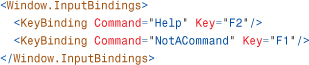
Applications typically invoke their version of help when the user presses the F1 key. Sure enough, if you press F1 while displaying the dialog defined in Listing 6.10, the Help command is automatically launched, as if you clicked the Help Button! That’s because commands such as Help define a default input gesture that executes the command. You can bind your own input gestures to a command by adding KeyBinding and/or MouseBinding objects to the relevant element’s InputBindings collection. (There’s no support for stylus or touch bindings.) For example, to assign F2 as a keyboard shortcut that executes Help, you could add the following statement to AboutDialog’s constructor:
This would make both F1 and F2 execute Help, however. You could additionally suppress the default F1 behavior by binding F1 to a special NotACommand command as follows:
Both of these statements could alternatively be represented in XAML as follows:
Controls with Built-In Command Bindings
It can seem almost magical when you encounter it, but some controls in WPF contain their own command bindings. The simplest example of this is the TextBox control, which has its own built-in bindings for the Cut, Copy, and Paste commands that interact with the clipboard, as well as Undo and Redo commands. This not only means that TextBox responds to the standard Ctrl+X, Ctrl+C, Ctrl+V, Ctrl+Z, and Ctrl+Y keyboard shortcuts but that it’s easy for additional elements to participate in these actions.
The following standalone XAML demonstrates the power of these built-in command bindings:

You can paste this content into a XAML viewer or save it as a .xaml file to view in Internet Explorer, because no procedural code is necessary. Each of the five Buttons is associated with one of the commands and sets its Content to the string returned by each command’s Text property. The only new thing here is the setting of each Button’s CommandTarget property to the instance of the TextBox (using data binding rather than x:Reference to make this work with all versions of WPF). This causes the command to be executed from the TextBox rather than the Button, which is necessary in order for it to react to the commands.
This XAML produces the result in Figure 6.5. The first two Buttons are automatically disabled when no text in the TextBox is selected, and they are automatically enabled when there is a selection. Similarly, the Paste Button is automatically enabled whenever there is text content on the clipboard, and it is disabled otherwise.
Figure 6.5 The five Buttons work as expected without any procedural code, thanks to TextBox’s built-in bindings.
Button and TextBox have no direct knowledge of each other, but through commands they can achieve rich interaction. This is why WPF’s long list of built-in commands is so important. The more that third-party controls standardize on WPF’s built-in commands, the more seamless (and declarative) interaction can be achieved among controls that have no direct knowledge of each other.
Summary
WPF’s input events make it possible to create interactive content that leverages the full richness of any input device. Although routed events and commands are more complex than simple .NET events, they provide a great deal of functionality and make otherwise-difficult tasks much easier.
This chapter focuses on UIElement, but the same input events can also be used with ContentElement, described in Chapter 11, and UIElement3D, discussed in Chapter 16, “3D Graphics.”