
Chapter 13. Data Binding
In WPF, the term data is generally used to describe an arbitrary .NET object. You can see this naming pattern in terms such as data binding, data templates, and data triggers, covered in this chapter and the next chapter. A piece of data could be a collection object, an XML file, a web service, a database table, a custom object, or even a WPF element such as a Button.
Therefore, data binding is about tying together arbitrary .NET objects. The classic scenario is providing a visual representation (for example, in a ListBox or DataGrid) of items in an XML file, a database, or an in-memory collection. For example, instead of iterating through a data source and manually adding a ListBoxItem to a ListBox for each one, it would be nice to just say, “Hey, ListBox! Get your items from over here. And keep them up to date, please. Oh yeah, and format them to look like this.” Data binding enables this and much more.
Introducing the Binding Object
The key to data binding is a System.Windows.Data.Binding object that “glues” two properties together and keeps a channel of communication open between them. You can set up a Binding once and then have it do all the synchronization work for the remainder of the application’s lifetime.
Using Binding in Procedural Code
Imagine that you want to add a TextBlock to the Photo Gallery application used in earlier chapters that displays the current folder above the ListBox:
You could update this TextBlock’s text manually whenever the TreeView’s SelectedItem changes:

By using a Binding object, you can remove this line of code and replace it with the following one-time initialization inside MainWindow’s constructor:
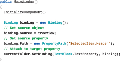
With this change, currentFolder.Text updates automatically as treeView.SelectedItem.Header changes. If an item in the TreeView is ever selected that doesn’t have a Header property (which doesn’t happen in Photo Gallery), the data binding silently fails and returns a default value for the property (an empty string in this case). There are ways to get diagnostics, however, discussed later in this chapter.
This code change doesn’t appear to be an improvement, because you’ve exchanged one line of code for four! Keep in mind, however, that this is a very simple use of data binding! In later examples, the use of data binding greatly reduces the amount of code you would have to write to achieve the same results.
Binding has the notion of a source property and a target property. The source property (treeView.SelectedItem.Header, in this case) is set in two steps—assigning the source object to Source and the name of its relevant property (or chain of property and subproperties) to Path via an instance of PropertyPath. To associate the Binding with the target property (currentFolder.Text, in this case), you can call SetBinding (which is inherited by all FrameworkElements and FrameworkContentElements) with the relevant dependency property and the Binding instance.
Tip
There are actually two ways to set Binding in procedural code. One is to call the SetBinding instance method on the relevant FrameworkElement or FrameworkContentElement, as done previously. The other is to call the SetBinding static method on a class called BindingOperations. You pass this method the same objects you would pass to the instance method, but it has an additional first parameter that represents the target object:
The benefit of the static method is that the first parameter is defined as a DependencyObject, so it enables data binding on objects that don’t derive from FrameworkElement or FrameworkContentElement (such as Freezables).
Digging Deeper: Removing a Binding
If you don’t want a Binding to exist for the remainder of an application’s lifespan, you can “disconnect” it at any time with the static BindingOperations.ClearBinding method. (This is rarely done, however.) You pass it the target object and its dependency property. Here’s an example:
If a target object has more than one Binding attached to it, you can clear them all in one fell swoop by calling BindingOperations.ClearAllBindings, like so:
Another way to clear a Binding is simply to directly set the target property to a new value, as follows:
This only clears one-way Bindings, however. (The different types of Bindings are discussed in the “Customizing the Data Flow” section toward the end of this chapter.) The ClearBinding approach is more flexible anyway, as it still enables the dependency property to receive values from sources with a lower precedence (style triggers, property value inheritance, and so on). Recall the order of precedence for determining a base property value in Chapter 3, “WPF Fundamentals.” A Binding set via SetBinding has the same precedence as a local value, and ClearBinding removes the value from the property value equation, just like ClearValue does for any local value. (In fact, all ClearBinding does internally is call ClearValue on the target object!)
Using Binding in XAML
Because you can’t call an element’s SetBinding method from XAML, WPF contains a markup extension to make declarative use of Binding possible. In fact, Binding itself is a markup extension class (despite the nonstandard name without the Extension suffix).
To use Binding in XAML, you directly set the target property to a Binding instance and then use the standard markup extension syntax to set its properties. Therefore, the preceding Binding code could be replaced with the following addition to currentFolder’s declaration:
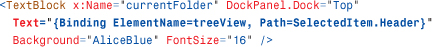
Data binding is now starting to look more attractive than the manual approach! The connection between the source and target properties is not only expressed succinctly, but it’s also abstracted away from all procedural code.
Tip
Besides its default constructor, Binding has a constructor that accepts Path as its single argument. Therefore, you can use alternative markup extension syntax to pass Path to the constructor rather than explicitly set the property. In other words, the preceding XAML snippet could also be expressed as follows:
These two approaches are identical except for subtle differences in how namespace prefixes in the property paths are resolved. Explicitly setting the Path property is the more reliable approach.
Notice that the XAML snippet uses Binding’s ElementName property to set the source object rather than Source, which was used in the preceding section. Both are valid in either context, but ElementName is easier to use from XAML because you only need to give it the source element’s name. However, with the introduction of the x:Reference markup extension in WPF 4, you could set Source as follows:
Tip
You can use Binding’s TargetNullValue property to swap in a pseudo-source value to use for data binding when the real source value is null. For example, this TextBlock shows the message “Nothing is selected.” rather than an empty string when the source value is null:
Using TargetNullValue can also help in more advanced scenarios where objects do not tolerate having their properties set to null.
Digging Deeper: Binding’s RelativeSource
Another way to specify a data source is by using Binding’s RelativeSource property, which refers to an element by its relationship to the target element. The property is of type RelativeSource, which also happens to be a markup extension. Here are some of the ways RelativeSource can be used:
To make the source element equal the target element:
To make the source element equal the target element’s TemplatedParent (a property discussed in the next chapter):
To make the source element equal the closest parent of a given type:
To make the source element equal the nth closest parent of a given type:
To make the source element equal the previous data item in a data-bound collection:
RelativeSource is especially useful for control templates, discussed in the next chapter. But using RelativeSource with the mode Self is handy for binding one property of an element to another without having to give the element a name. An interesting example is the following Slider, whose ToolTip is bound to its own value:
Binding to Plain .NET Properties
The example with the TreeView and the Label works because both the target and source properties are dependency properties. As discussed in Chapter 3, dependency properties have plumbing for change notification built in. This facility is the key to WPF’s ability to keep the target property and source property in sync.
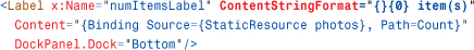
However, WPF supports any .NET property on any .NET object as a data-binding source. For example, imagine that you want to add to the Photo Gallery application a Label that displays the number of photos in the current folder. Rather than manually update the Label with the Count property from the photos collection (of type Photos), you can use data binding to connect the Label’s Content with the collection’s Count property:
(Here, the collection is assumed to be defined as a resource so it can be set in XAML via Source. ElementName is not an option because the collection is not a FrameworkElement or FrameworkContentElement!) Figure 13.1 shows the result of this addition. Notice that the label says “54” when you really want it to say “54 item(s).” This could be fixed with an adjacent label with a static “item(s)” string as its content or with better approaches, covered later in this chapter.
Figure 13.1 Displaying the value of photos.Count via data binding in the bottom-left corner of Photo Gallery’s main Window.
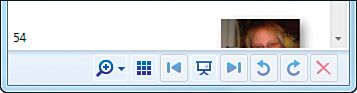
There’s a big caveat to using a plain .NET property as a data-binding source, however. Because such properties have no automatic plumbing for change notification, the target is not kept up to date as the source property value changes without doing a little extra work. Therefore, the value displayed in Figure 13.1 does not change as the current folder changes, which is clearly incorrect.
To keep the target and source properties synchronized, the source object must do one of the following:
• Implement the System.ComponentModel.INotifyPropertyChanged interface, which has a single PropertyChanged event.
• Implement an XXXChanged event, where XXX is the name of the property whose value changed.
The first technique is recommended, as WPF is optimized for this approach. (WPF only supports XXXChanged events for backward compatibility with older classes.) You could fix Photo Gallery by having the photos collection implement INotifyPropertyChanged. This would involve intercepting the relevant operations (such as Add, Remove, Clear, and Insert) and raising the PropertyChanged event. Fortunately, the .NET Framework already has a built-in class that does this work for you! It’s called ObservableCollection. Therefore, making the binding to photos.Count synchronized is a one-line change from this:
to this:
Warning: Data sources and data targets aren’t treated equally!
Although the source property can be any .NET property on any .NET object, the same is not true for the data-binding target. The target property must be a dependency property. Also note that the source member must be a real (and public) property, not just a simple field.
Binding to an Entire Object
Although every example so far has used source objects and source properties, it turns out that the source property (that is, the Path in Binding) is optional! You can bind a target property to the entire source object.
But what does it mean to bind to an entire object? Figure 13.2 shows what the Label from Figure 13.1 would look like if the Path were omitted:
Figure 13.2 Displaying the entire photos object via data binding in the bottom-left corner of Photo Gallery’s main Window.

Because the photos object is not a UIElement, it gets rendered as the string returned from its ToString method. Binding to the whole object is not very useful in this case, but it’s essential for elements that can take better advantage of the object, such as the ListBox that we’ll examine next.
Tip
Binding to an entire object is a handy technique for setting a property from XAML that requires an instance of an object that can’t be obtained via a type converter or markup extension.
For example, Photo Gallery contains a Popup that, when shown, is centered over a Button called zoomButton. Popup enables this with its Placement and PlacementTarget properties, the latter of which must be set to a UIElement. This could easily be done in C# as follows:

But instead, Photo Gallery uses the following XAML to accomplish this:

This technique has been used in previous chapters. Of course, using x:Reference in WPF 4 is another way to accomplish this assignment without using Binding.
Warning: Be careful when binding to an entire UIElement!
When binding certain target properties to an entire UIElement, you might inadvertently be attempting to place the same element in multiple places on the visual tree. For example, the following XAML results in an InvalidOperationException explaining, "Specified element is already the logical child of another element."
However, you get no exception if you change the first Label to a TextBlock (and, therefore, the Content property to Text):
Whereas Label.Content is of type Object, TextBlock.Text is a string. Therefore, the Label undergoes type conversion when assigned to a string and its ToString method is called. In this case, the TextBlock is rendered with a "System.Windows.Controls.Label: text" string, which is still not very useful. To copy the text from one Label or TextBlock to another, you should really be binding to the specific property (Label or Content).
Binding to a Collection
Binding a Label to photos.Count is nice, but it would be even better to bind the ListBox (the Window’s main piece of user interface) to the photos collection. This is the part of the Photo Gallery application that screams the loudest for data binding. The application, as presented in previous chapters, manually maintained the relationship between the collection of photos stored in the ListBox and the physical photos. When a new directory is selected, it clears the ListBox and creates a new ListBoxItem for each photo. If the user decides to delete or rename a photo, the change raises an event on the source collection (because it’s internally using FileSystemWatcher), and an event handler manually refreshes the ListBox contents.
Fortunately, the procedure for replacing such logic with data binding is exactly the same as what we’ve already seen.
The Raw Binding
It would make sense to create a Binding with ListBox.Items as the target property, but, alas, Items is not a dependency property. But ListBox and all other items controls have an ItemsSource dependency property that exists specifically for this data-binding scenario. ItemsSource is of type IEnumerable, so you can use the entire photos object as the source and set up the Binding as follows:

For the target property to stay updated with changes to the source collection (that is, the addition and removal of elements), the source collection must implement an interface called INotifyCollectionChanged. Indeed, ObservableCollection implements both INotifyPropertyChanged and INotifyCollectionChanged, so the earlier change to make Photos derive from ObservableCollection<Photo> is sufficient for making this binding work correctly.
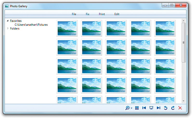
Figure 13.3 shows the result of this data binding.
Figure 13.3 Binding the ListBox to the entire photos object shows the data in raw form.

Improving the Display
Clearly, the default display of the photos collection—a ToString rendering—is not acceptable. One way to improve this is to leverage the DisplayMemberPath property present on all items controls, introduced in Chapter 10, “Items Controls.” This property works hand in hand with ItemsSource. If you set it to an appropriate property path, the corresponding property value gets rendered for each item.
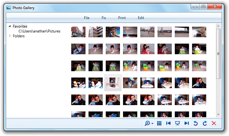
The collection in Photo Gallery consists of application-specific Photo objects, which have properties like Name, DateTime, and Size. Therefore, the following XAML produces the results in Figure 13.4, which is a slightly better rendering than Figure 13.3:

Figure 13.4 DisplayMemberPath is a simple mechanism for customizing the display of items in a data-bound collection.

However, because we’re defining the Photo class ourselves, we could have just changed Photo’s implementation of ToString to return Name instead of the full path to get the same results.
For getting the actual images to display in the ListBox, you could add an Image property to the Photo class and use that as the DisplayMemberPath. But there are more flexible ways to control the presentation of bound data—ways that don’t require changes to the source object. (This is important because you might not be the one defining the source object. Also, don’t forget that one of the tenets of WPF is to separate look from logic!) One way (not specific to data binding) is to use a data template, and another way is to use a value converter. The upcoming “Controlling Rendering” section looks at both of these options.
Warning: ItemsControl’s Items and ItemsSource properties can’t be modified simultaneously!
You must decide whether you want to populate an items control manually via Items or with data binding via ItemsSource, and you must not mix these techniques. ItemsSource can be set only when the Items collection is empty, and Items can be modified only when ItemsSource is null (otherwise, you’ll get an InvalidOperationException). Therefore, if you want to add or remove items to/from a data-bound ListBox, you must do this to the underlying collection (ItemsSource) rather than at the user interface level (Items). Note that regardless of which method is used to set items in an items control, you can always retrieve items via the Items collection.
Managing the Selected Item
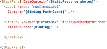
As explained in Chapter 10, Selectors such as ListBox have a notion of a selected item or items. When binding a Selector to a collection (anything that implements IEnumerable), WPF keeps track of the selected item(s) so that other targets binding to the same source can make use of this information without the need for custom logic. This support can be used for creating master/detail user interfaces (as done in the final example in this chapter) or for synchronizing multiple Selectors, which we’ll look at now.
To opt in to this support, set the IsSynchronizedWithCurrentItem property (inherited by all Selectors) to true. The following XAML sets this property on three ListBoxes that each displays a single property per item from the same photos collection:

Because each is marked with IsSynchronizedWithCurrentItem="True" and each is pointing to the same source collection, changing the selected item in any of them changes the selected item in the other two to match. (Although note that the scrolling of the ListBoxes is not synchronized automatically!) Figure 13.5 gives an idea of what this looks like. If any one of the ListBoxes omitted IsSynchronizedWithCurrentItem or set it to false, changing its own selected item would not impact the other two ListBoxes, nor would changing the selected item in the other two ListBoxes impact its own selection.
Figure 13.5 Three synchronized ListBoxes, thanks to data binding.

Warning: IsSynchronizedWithCurrentItem does not support multiple selections!
When a Selector has multiple selected items (as with ListBox’s SelectionMode of Multiple or Extended), only the first selected item is seen by other synchronized elements, even if they also support multiple selections!
Sharing the Source with DataContext
You’ve now applied data binding to several target properties, and all but one of them used the same source object (the photos collection). It’s quite common for many elements in the same user interface to bind to the same source object (different source properties, but the same source object). For this reason, WPF supports specifying an implicit data source rather than explicitly marking every Binding with a Source, RelativeSource, or ElementName. This implicit data source is also known as a data context.
To designate a source object such as the photos collection as a data context, you simply find a common parent element and set its DataContext property to the source object. (All FrameworkElements and FrameworkContentElements have this DataContext property of type Object.) When encountering a Binding without an explicit source object, WPF traverses up the logical tree until it finds a non-null DataContext.
Therefore, you can use DataContext as follows to make the Label and ListBox use it as the source object:
Because DataContext is a simple property, it’s also really easy to set from procedural code, eliminating the need to store the source object as a resource:
parent.DataContext = photos;
Tip
Encountering a property set to just {Binding} in XAML might look confusing, but it simply means that the source object is specified somewhere up the tree as a data context and that the entire object is being bound rather than a single property on it.
FAQ
 When should I specify a source object using a data context versus specifying it explicitly with
 Binding?
It’s mostly just a matter of personal preference. If a source object is being used by only one target property, using a data context might be a bit of overkill and less readable. But if you are sharing a source object, using a data context to specify the object in only one place makes development less error-prone if you change the source.
One case where the use of a data context is really helpful is when plugging in resources defined elsewhere. Resources can contain Bindings with no explicit source or data context, enabling the binding to be resolved in each usage context rather than in the declaration context. Each usage context would be the place in the logical tree that the resource is plugged into, which could provide a different data context. (Although using RelativeSource to specify an explicit yet relative source also can provide this kind of flexibility.)
Controlling Rendering
Data binding is pretty simple when the source and target properties are compatible data types and the default rendering of the source is all you need to display. But often a bit of customization is required. The need for this in the previous section is obvious, as you want to display Images, not raw strings, in Photo Gallery’s ListBox!
These types of customizations would be easy without data binding because you’re writing all the code to retrieve the data on your own (as done in the original version of Photo Gallery). But WPF provides three mechanisms for customizing how the source value is received and displayed, so you don’t need to give up the benefits of data binding to get the desired results in more customized scenarios. These mechanisms are string formatting, data templates, and value converters.
String Formatting
When you want to display a string as a result of data binding, Binding’s StringFormat property makes it easy to customize the display. When this is set, WPF will call String.Format with the value of StringFormat as the first parameter (format) and the raw target object as the second parameter (args[0]). Therefore, {0} represents the raw target object, and a variety of format specifiers are supported, such as {0:C} for currency formatting, {0:P} for percent formatting, and {0:X} for hexadecimal formatting.
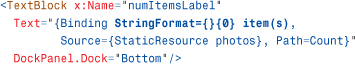
The Label shown in Figure 13.1 can therefore be changed to say “54 item(s)” instead of just “54” by changing it to a TextBlock and making this simple StringFormat addition to the Binding:
Warning: Binding’s StringFormat only works if the target property is defined as a string!
A major shortcoming of Binding’s StringFormat property is that Binding completely ignores it unless the target property is of type string. Attempting to use it with Label’s Content property doesn’t have any effect because Content is of type Object:
In contrast, TextBlock’s Text property is of type string, so the same Binding works just fine when applied to Text. This is why the examples in this section change Label to TextBlock. An alternate workaround is to use Label’s ContentStringFormat property, discussed later in this section.
The funky {} at the beginning of the value is there to escape the { at the beginning of the string. Recall from Chapter 2, “XAML Demystified,” that without this, the string would be incorrectly interpreted as a markup extension. The {} is not necessary if you use the property element form of Binding:

It is also not necessary if the string doesn’t begin with a {:
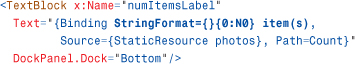
You could also enhance the formatting with the N0 specifier, which adds thousands-separators without adding any decimal places. So the following Label displays “54 item(s)” when Count is 54 and “1,001 item(s)” when Count is 1,001—at least for the en-US culture:
Warning: System.Xaml doesn’t process the {} escape sequence correctly!
The System.Xaml library that is new in WPF 4 has a flaw that breaks the processing of the {} escape sequence inside of a markup extension. When processed by System.Xaml, the {} escape sequence can still be used to escape the entire string value of a property (preventing it from being interpreted as a markup extension), but not within a markup extension. For example, the following XAML snippet is not correctly parsed by System.Xaml:
Fortunately, System.Xaml is not yet used in mainstream scenarios (such as XAML compilation), which limits this bug’s impact. The workaround is to use an alternate escape sequence within a markup extension. You can use a backslash to escape individual characters. For example:
Many controls have a XXXStringFormat property as well, where XXX represents the piece that you are formatting. For example, content controls have a ContentStringFormat property that applies to the Content property, and items controls have an ItemStringFormat property that apply to each item in a collection. Table 13.1 lists all the string format properties that are read/write.
Table 13.1 String Format Properties Throughout WPF

Rather than being forced to change Label to a TextBlock in order to take advantage of Binding’s StringFormat property, you can instead leverage Label’s own ContentStringFormat because Label is a content control:
You can take advantage of this functionality with or without data binding. Figure 13.6 shows the rendered result of the following ListBox for both U.S. English and Korean:
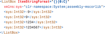
Figure 13.6 Numbers in a ListBox taking advantage of declarative string formatting.

Using Data Templates
A data template is a piece of user interface that you’d like to apply to an arbitrary .NET object when it is rendered. Many WPF controls have properties (of type DataTemplate) for attaching a data template appropriately. For example, ContentControl has a ContentTemplate property for controlling the rendering of its Content object, and ItemsControl has an ItemTemplate that applies to each of its items. Table 13.2 lists them all. As you can see, WPF defines more XXXTemplate properties than XXXStringFormat properties.
Table 13.2 Properties of Type DataTemplate Throughout WPF

By setting one of these properties to an instance of a DataTemplate, you can swap in a completely new visual tree. DataTemplate, like ItemsPanelTemplate introduced in Chapter 10, derives from FrameworkTemplate. Therefore, it has a VisualTree content property that can be set to an arbitrary tree of FrameworkElements. This is easy to set in XAML but cumbersome to set in procedural code.
Let’s try using a DataTemplate with Photo Gallery’s ListBox, which in Figure 13.4 shows raw strings rather than Images. The following snippet adds a simple DataTemplate by setting ListBox’s ItemTemplate property inline:

Figure 13.7 shows that this is a good start. Although a generic placeholder.jpg image is shown for each item, at least the items are now Images!
Figure 13.7 A simple data template makes each item in the ListBox appear as a placeholder Image.
With an Image data template in place, how do you set its Source property to the current Photo item’s FullPath property? With data binding, of course! When you apply a data template, it is implicitly given an appropriate data context (that is, a source object). When applied as an ItemTemplate, the data context is implicitly the current item in ItemsSource. So, you can simply update the data template as follows to get the result shown in Figure 13.8:

Figure 13.8 The updated data template gives the desired results—the right photo displayed for each item in the ListBox.
Of course, a DataTemplate doesn’t have to be declared inline. DataTemplates are most commonly exposed as resources, so they can be shared by multiple elements. You can even get DataTemplate to be automatically applied to a specific type wherever it might appear by setting its DataType property to the desired type. If you place such a DataTemplate in a Window’s Resources collection, for example, it automatically gets applied anywhere an item of that data type is rendered inside the Window: inside items controls, inside content controls, and so on. If you place such a DataTemplate in an Application’s Resources collection, the same is true for the entire application.
Tip
Although data templates can be used on non-data-bound objects (such as a ListBox with a manually constructed set of items), you’ll almost always want to use data binding inside the template to customize the appearance of the visual tree based on the underlying object(s).
A special subclass of DataTemplate exists for working with hierarchical data, such as XML or a file system. This class is called HierarchicalDataTemplate. It not only enables you to change the presentation of such data but enables you to directly bind a hierarchy of objects to an element that intrinsically understands hierarchies, such as a TreeView or Menu control. The “XmlDataProvider” section later in this chapter shows an example of using HierarchicalDataTemplate with XML data.
Digging Deeper: Template Selectors
Sometimes it can be desirable to heavily customize a data template based on the input data. Although a lot can be done inside a single data template, WPF also provides a mechanism to plug in procedural code that can select any template (or create a new one on-the-fly) at runtime when it is time for the data to be rendered. To do this, you create a class that derives from DataTemplateSelector and override its virtual SelectTemplate method. You can then associate an instance with the appropriate element by setting that element’s XXXTemplateSelector property. Every XXXTemplate property shown in Table 13.2 has a corresponding XXXTemplateSelector property, as shown in Table 13.3.
Table 13.3 Data Template Selector Properties Throughout WPF

Using Value Converters
Whereas data templates can customize the way certain target values are rendered, value converters can morph a source value into a completely different target value. They enable you to plug in custom logic without giving up the benefits of data binding.
Value converters are often used to reconcile a source and target that are different data types. For example, you could change the background or foreground color of an element based on the value of some non-Brush data source, much like conditional formatting in Microsoft Excel. Or you could use it to simply enhance the information being displayed, without the need for separate elements. The following two sections explore examples of each of these.
Bridging Incompatible Data Types
Imagine that you want to change the Label’s Background based on the number of items in the photos collection (the value of its Count property). The following Binding makes no sense because it tries to assign Background to a number rather than to a Brush:
To fix this, you can plug in a value converter using Binding’s Converter property:
This assumes that you’ve written a custom class that can convert an integer into a Brush and defined it as a resource:
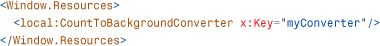
To create this class called CountToBackgroundConverter, you must implement a simple interface called IValueConverter (in the System.Windows.Data namespace). This interface has two simple methods—Convert, which is passed the source instance that must be converted to the target instance, and ConvertBack, which does the opposite.
Therefore, CountToBackgroundConverter could be implemented in C# as follows:

The Convert method is called every time the source value changes. It’s given the integral value and returns Brushes.Yellow if the value is zero, or Brushes.Transparent otherwise. (The idea is to highlight the Label’s background when an empty folder is displayed.) The ConvertBack method is not needed, so CountToBackgroundConverter simply returns a dummy value if it’s ever called. Part VI, “Advanced Topics,” discusses situations in which ConvertBack is used. Figure 13.9 shows CountToBackgroundConverter in action.
Figure 13.9 The value converter makes the Label’s Background yellow when there are no items in the photos collection, seen in the bottom-left corner of Photo Gallery’s main Window.

Tip
To avoid confusion, it’s a good idea to capture the semantics of a value converter in its name. I could have named CountToBackgroundConverter something like IntegerToBrushConverter because technically it can be used anyplace where the source data type is an integer and the target data type is a Brush. But it might make sense only when the source integer represents a count of items and when the Brush represents a Background. (For example, it’s unlikely that you’d ever want to set an element’s Foreground to Transparent!) You might also want to define additional Integer-to-Brush converters with alternate semantics.
The methods of IValueConverter are passed a parameter and a culture. By default, parameter is set to null and culture is set to the value of the target element’s Language property. This Language property (defined on FrameworkElement and FrameworkContentElement, whose value is often inherited from the root element, if set at all) uses "en-US" (U.S. English) as its default value. However, the consumer of Bindings can control these two values via Binding.ConverterParameter and Binding.ConverterCulture. For example, rather than hard-code Brushes.Yellow inside CountToBackgroundConverter.Convert, you could set it to the user-supplied parameter:
This assumes that parameter is always set as follows:
Setting ConverterParameter to the simple "Yellow" string works, but the reason is subtle. Like all markup extension parameters, "Yellow" undergoes type conversion, but only to the type of the ConverterParameter property (Object). Therefore, Convert receives parameter as the raw "Yellow" string rather than a Brush. Because Convert does nothing with parameter other than return it when num is not zero, it ends up returning a string. At this point, the binding engine does the type conversion in order to make the assignment to Label’s Background property work.
ConverterCulture could be set to an Internet Engineering Task Force (IETF) language tag (for example, "ko-KR"), and the converter would receive the appropriate CultureInfo object.
Tip
WPF ships with a handful of value converters to handle a few very common data-binding scenarios. One of these is BooleanToVisibilityConverter, which converts between the three-state Visibility enumeration (which can be Visible, Hidden, or Collapsed) and a Boolean or nullable Boolean. In one direction, true is mapped to Visible, whereas false and null are mapped to Collapsed. In the other direction, Visible is mapped to true, whereas Hidden and Collapsed are mapped to false.
This is useful for toggling the visibility of elements based on the state of an otherwise unrelated element. For example, the following snippet of XAML implements a Show Status Bar CheckBox without requiring any procedural code:

In this case, the StatusBar is visible when (and only when) the CheckBox’s IsChecked property is true.
Warning: Data-binding errors don’t appear as unhandled exceptions!
Instead of throwing exceptions on data-binding errors, WPF dumps explanatory text via debug traces that can be seen only with an attached debugger (or other trace listeners). Therefore, when data binding doesn’t work as expected, try running it under a debugger and be sure to check for traces. In Visual Studio, these can be found in the Output window. In Visual Studio 2010 Ultimate, these can also be integrated into the handy IntelliTrace window.
The previous example of a nonsensical binding (hooking up Background directly to photos.Count) produces the following debug trace:

Even exceptions thrown by the source object (or value converter) get swallowed and displayed as debug traces by default!
Because the tracing is implemented with System.Diagnostics.TraceSource objects, there are several standard options for capturing these same traces outside the debugger. Mike Hillberg, a WPF architect, shares details at http://blogs.msdn.com/mikehillberg/archive/2006/09/14/WpfTraceSources.aspx. You can capture traces WPF emits in a number of areas (that aren’t even enabled by default under a debugger), such as information about event routing, dependency property registration, resource retrieval, and much more.
You can also use the PresentationTraceSources.TraceLevel attached property (from the System.Diagnostics namespace in the WindowsBase assembly) on any Binding to increase or remove the trace information emitted for that specific binding. It can be set to a value from the PresentationTraceLevel enumeration: None, Low, Medium, or High.
Customizing Data Display
Sometimes, value converters are useful in cases where the source and target data types are already compatible. Earlier, when we set the Content of numItemsLabel to the Count property of the photos collection (shown in Figure 13.1), it displayed just fine but required some additional text for the user to not be confused by what that number means. The use of StringFormat fixed that problem, but we can do better than a static “item(s)” suffix. (I don’t know about you, but when I see a user interface report something like “1 item(s),” it just looks lazy to me.)
A value converter enables us to customize the text based on the value, so we can display “1 item” (singular) versus “2 items” (plural). The following RawCountToDescriptionConverter does just that:

Tip
Value converters are the key to plugging in any kind of custom logic into the data-binding process that goes beyond basic formatting. Whether you want to apply some sort of transformation to the source value before displaying it or change how the target gets updated based on the value of the source, you can easily accomplish this with a class that implements IValueConverter.
Note that this uses hard-coded English strings, whereas a production-quality converter would use a localizable resource (or at least make use of the passed-in culture parameter).
Tip
You can make a value converter temporarily cancel a data binding by returning the sentinel value Binding.DoNothing. This is different from returning null, as null might be a perfectly valid value for the target property.
Binding.DoNothing effectively means, “I don’t want to bind right now; pretend the Binding doesn’t exist.” In this case, the value of the target property doesn’t change from its current value unless there’s some other entity that happens to be influencing its value (an animation, a trigger, and so on). This only affects the current call to Convert or ConvertBack, so unless the Binding is cleared (via a call to ClearBinding, for example), the value converter will continue to be called every time the source value changes.
FAQ
How do I use a value converter to perform a conversion on each item when binding to a collection?
You can apply a data template to the ItemsControl’s ItemTemplate property and then apply value converters to any Bindings done inside the data template. If you were to apply the value converter to the ItemsControl’s Binding instead, an update to the source collection would prompt the Convert method to be called once for the entire collection (not on a per-item basis). You could implement such a converter that accepts a collection and returns a morphed collection, but that would not be a very efficient approach.
Customizing the View of a Collection
In the previous “Binding to a Collection” section, you saw that with the flip of a switch (setting IsSynchronizedWithCurrentItem to true), multiple Selectors pointing to the same source collection can see the same selected item. This behavior seems almost magical, at least when you’re watching it in person. (It’s hard to capture the synchronized motion in a static screenshot!) The source collection has no notion of a current item, so where is this information coming from, and where is the state being maintained?
It turns out that whenever you bind to a collection (anything that implements IEnumerable), a default view is implicitly inserted between the source and target objects. This view (which is an object implementing the ICollectionView interface) stores the notion of a current item, but it also has support for sorting, grouping, filtering, and navigating items. This section digs into these four topics as well as working with multiple views for the same source object.
Tip
Views are automatically associated with each source collection, not with the targets consuming the source. The result is that changes to the view (such as sorting or filtering it) are automatically seen by all targets.
Sorting
ICollectionView has a SortDescriptions property that provides a way to control how the view’s items are sorted. The basic idea is that you choose a property on the collection items to sort by (such as Name, DateTime, or Size on the Photo object) and you choose whether you want that property to be sorted in ascending or descending order. This choice is captured by a SortDescription object, which you can construct with a property name and a ListSortDirection. Here’s an example:
The SortDescriptions property, however, is a collection of SortDescription objects. It was designed this way so you can sort by multiple properties simultaneously. The first SortDescription in the collection represents the most significant property, and the last SortDescription represents the least significant property. For example, if you add the following two SortDescriptions to the collection, the items get sorted in descending order by DateTime, but if there are any ties, the Name (in ascending order) is used as the tiebreaker:
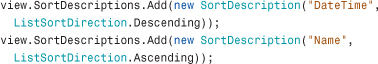
The SortDescriptions collection has a Clear method for returning the view to the default sort. A view’s default sort is simply the order in which items are placed in the source collection, which might not be sorted at all!
Listing 13.1 demonstrates how Photo Gallery could implement logic to sort its photos by Name, DateTime, or Size when the user clicks a corresponding Button. As in Windows Explorer, a repeated click toggles the sort between ascending and descending.
Listing 13.1 Sorting by Three Different Properties
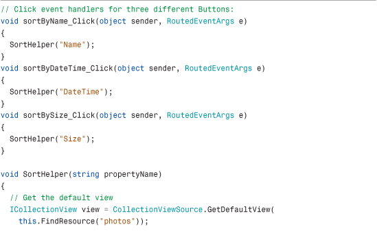

Notice that this code has no explicit relationship with the ListBox displaying the photos. The view being operated on is associated with the source photos collection and is retrieved by a simple call to the static CollectionViewSource.GetDefaultView method. Indeed, if additional items controls were bound to the same photos collection, they would pick up the same view by default and would all sort together.
Grouping
ICollectionView has a GroupDescriptions property that works much like SortDescriptions. You can add any number of PropertyGroupDescription objects to it to arrange the source collection’s items into groups and potential subgroups.
For example, the following code groups items in the photos collection by the value of their DateTime property:
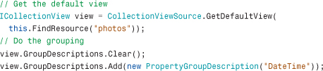
Unlike with sorting, however, the effects of grouping are not noticeable unless you modify the items control displaying the data. To get grouping to behave properly, you must set the items control’s GroupStyle property to an instance of a GroupStyle object. This object has a HeaderTemplate property that should be set to a data template defining the look of the grouping header.
Photo Gallery’s ListBox could be given the following GroupStyle to support the preceding grouping code:
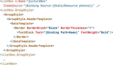
Notice the use of data binding inside the data template. In this case, the data template is given a data context of a special CollectionViewGroup object that’s instantiated behind the scenes. The details of this class aren’t important aside from the fact that it has a Name property representing the value defining each group. Therefore, the data template uses data binding to display this Name in the grouping header. Figure 13.10 shows the result of running the preceding code with the updated XAML.
Figure 13.10 A first attempt at grouping items in the ListBox.

Tip
If you want to group items of an items control but don’t care about creating a fancy GroupStyle, you can use a built-in GroupStyle that ships with WPF. It’s exposed as a static GroupStyle.Default property. Therefore, you can reference it in XAML as follows:

After doing this, you see that perhaps grouping by Photo.DateTime is not a great idea. Because DateTime includes both a date and a time, each Photo tends to have a unique value, leaving many groups of one!
To fix this, you can leverage an overloaded constructor of the PropertyGroupDescription class that enables you to tweak the property value before using it as the basis for grouping. To do this, the constructor allows you to pass in a value converter. Therefore, you can write a DateTimeToDateConverter class that converts the raw DateTime into a string more suitable for grouping:

In this case, the returned string simply strips out the time component of the input DateTime. Group names don’t have to be strings, however, so Convert could alternatively strip out the time as follows and return the DateTime instance directly:
You could imagine supporting much fancier groupings with this mechanism, such as calculating date ranges and returning strings such as "Last Week", "Last Month", and so on. (Again, you should use the passed-in culture to tweak the formatting of the returned string.)
With this value converter defined, you can use it for grouping as follows:

The result of this change is shown in Figure 13.11.
Figure 13.11 Improved grouping, based on the date component of Photo.DateTime.

To sort groups, you can use the same mechanism described in the preceding section. Sorting is always applied before grouping. The result is that the primary SortDescription applies to the groups, and any remaining SortDescriptions apply to items within each group. Just make sure that the property (or custom logic) used to do the sorting matches the property (or custom logic) used to do the grouping; otherwise, the resulting arrangement of items is not intuitive.
Tip
Perhaps you want to implement custom grouping based on the values of several properties. You can accomplish this by constructing PropertyGroupDescription with a null property name. When you do this, the value parameter passed to your value converter is the entire source item (a Photo object, in the Photo Gallery example) rather than a single property value.
Filtering
As with sorting and grouping, ICollectionView has a property that enables filtering—selective removal of items based on an arbitrary condition. This property is called Filter, and it is a Predicate<Object> type (in other words, a delegate that accepts a single Object parameter and returns a Boolean).
When Filter is null (which it is by default), all items in the source collection are shown in the view. But when it’s set to a delegate, the delegate is instantly called back for every item in the source collection. The delegate’s job is to determine whether each item should be shown (by returning true) or hidden (by returning false).
By using an anonymous delegate in C#, you can specify a filter pretty compactly. For example, the following code filters out all Photo items whose DateTime is older than 7 days ago:

Although it can be hard for people to parse, you can express this even more compactly with a C# lambda expression:
To remove the filter, you simply set view.Filter back to null.
Navigating
In this context, navigating a view refers to managing the current item—not the kind of navigation discussed in Chapter 7, “Structuring and Deploying an Application.” ICollectionView not only has a CurrentItem property (and a corresponding CurrentPosition property that exposes the current item’s zero-based index), but it also has a handful of methods for programmatically changing the CurrentItem. The data-binding version of Photo Gallery uses these methods to implement handlers for the Next Photo/Previous Photo Buttons, as follows:
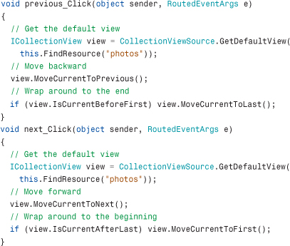
Although a bit wordy, these navigation methods are straightforward to use. These handlers not only update the selected item in the ListBox without explicitly referencing it, but any additional elements that wish to display information about the current item can be automatically updated as well, as long as they bind to the same source. Note that until an item is selected on the source collection, CurrentItem is null and CurrentPosition is -1. However, this is only true because the ListBox made it so. On its own, the collection view initializes CurrentPosition to 0 and CurrentItem to the first item.
Tip
Property paths used in Bindings support referencing a collection’s current item with special forward-slash syntax. For example, the following Binding binds to the current item, assuming that the data source is a collection:
The following binds to the DateTime property on the current item:
The following binds to the current item of a collection exposed by a property called Photos on a different data source that isn’t a collection itself:
Finally, the following binds to the DateTime property on the current item from the preceding example:
This functionality is incredibly useful for implementing master/detail user interfaces without any procedural code.
Warning: Default view navigation isn’t exposed automatically!
Unlike sorting, grouping, and filtering, the effects of navigation on the default view can be seen only on a Selector that has IsSynchronizedWithCurrentItem set to true. Without this setting, Selector’s SelectedItem and the default view’s CurrentItem are detached; they can be updated independently without affecting one another. The WPF team wanted synchronization of the selected item to be an explicit choice to expose developers to the concept of a view and avoid potentially confusing behavior. But frankly, I find the inconsistency with the other “automatic” aspects of the default view to be confusing.
Working with Additional Views
The previous examples of sorting, grouping, filtering, and navigating always operated on the default view associated with the source collection. But it’s conceivable that you might want elements to have different views of the same source collection. It turns out that the CollectionViewSource class has more uses than just returning the default view; it can also construct a brand-new view over any source. This view can then be selectively applied to any target, overriding the default view.
To create a new view over Photo Gallery’s photos collection, you could do the following:
CollectionViewSource is designed to make it easy to create custom views declaratively, so you can use the following XAML instead:

To apply the custom view to a target property, simply bind to the CollectionViewSource rather than the underlying source object:

Note that although the original source is now wrapped by a CollectionViewSource, WPF special-cases the CollectionViewSource class so that you don’t have to change any Binding Paths. Binding to the Count property, for example, still refers to the property of the underlying Photos object rather than the CollectionViewSource object.
Such a ListBox is now exempt from any sorting, grouping, filtering, or navigating being done on the default view. If you want to perform any of these actions on the custom view, you can follow all the same techniques outlined previously using the ICollectionView returned by the CollectionViewSource.View instance property rather than the CollectionViewSource.GetDefaultView static method.
To enable a custom view to be configured with sorting and grouping entirely within XAML, CollectionViewSource has its own SortDescriptions and GroupDescriptions properties that work just like the corresponding properties on ICollectionView. It also has its own Filter member, but it’s defined as an event rather than a delegate property so it can also be set inside XAML. (Of course, it must be set to an event handler written in procedural code.) Sorting, grouping, and filtering can, therefore, all be expressed in XAML as follows:
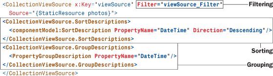
The SortDescription class happens to live in a .NET namespace not included in the standard XML namespace, so the following directive is needed:
The viewSource_Filter method referenced by the XAML could be implemented as follows, which is a translation of the previous filtering delegate that excludes all photos older than seven days from today’s date:
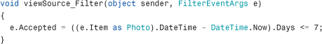
Rather than getting the source item passed in directly, the event handler receives it as e.Item. Rather than return a Boolean, it must set the Boolean e.Accepted property to communicate whether the item is in or out.
Tip
Even if you don’t require multiple views of the same source collection, you can opt to create and apply a custom view with the explicit CollectionViewSource simply so you can sort and group items without any procedural code!
FAQ
If my application contains a collection, and nobody ever data binds directly to it (but rather to a CollectionViewSource), does the default view still exist?
No. For performance reasons, the default view is created on demand. This is unlike a tree falling in a forest, which I’m told still makes a sound even if nobody is around to hear it.
Warning: Navigation works differently in a custom view!
Changing the current item on a custom view automatically impacts any Selectors binding to that view by default; the Selector’s IsSynchronizedWithCurrentItem property must be explicitly set to false in order to opt out of the synchronized navigation. This is opposite the behavior of the default view!
Although the default value for IsSynchronizedWithCurrentItem is false, WPF automatically sets it to true when a Selector’s ItemsSource is set to a custom view unless it has been given an explicit value (or the Selector’s SelectionMode isn’t Single). The idea is that using a custom view is an explicit acknowledgment of the view’s existence, so you should get the expected view navigation behavior by default. (These shenanigans are yet another reason I wish that IsSynchronizedWithCurrentItem defaulted to true for all views.)
Data Providers
Because the source object can be any arbitrary .NET object, you can perform just about any data binding imaginable with enough code. You could bind to a database, the Windows Registry, an Excel spreadsheet, and so on. All you need is an appropriate .NET object that exposes the right set of properties and notifications and handles all the messy implementation details! (That said, the work involved in creating such code might outweigh the benefits of data binding if you’re writing everything yourself!)
Tip
Starting with WPF 3.5 SP1, data binding works really well with Language Integrated Query (LINQ). You can set a Binding’s Source (or an element’s DataContext) to a LINQ query, and the enumerable result can be used just like any other collection. Therefore, with the existence of LINQ to SQL, LINQ to XML, and more, using LINQ—rather than WPF’s data provider classes—is an easy way to bind to database tables, XML content, and more.
To cut down on the need for custom code, WPF ships with two classes that provide a generic “data binding–friendly” way to expose common items: XmlDataProvider and ObjectDataProvider.
XmlDataProvider
The XmlDataProvider class provides an easy way to bind data to a chunk of XML, whether it’s an in-memory fragment or a complete file. Listing 13.2 shows an example of using XmlDataProvider to bind to an embedded data island.
Listing 13.2 Binding to an Embedded XML Data Island

The XML data island is set as XmlDataProvider’s content property and contained within the XData element, which is a requirement to distinguish it from the surrounding XAML. (You get a compiler error if you omit the XData tags.) The XmlDataProvider’s XPath property is set to an XPath query that tells it where the relevant data resides inside the XML tree. XPath, short for XML Path Language, is a W3C Recommendation published at http://www.w3.org/TR/xpath.
Tip
When embedding an XML data island inside XAML, you should mark its root node with an empty xmlns attribute, as done in Listing 13.2. Otherwise, the elements get polluted with the default namespace (http://schemas.microsoft.com/winfx/2006/xaml/presentation in this example), preventing XPath queries from working as expected.
The consumption of the XmlDataProvider looks like the consumption of any source object, except that Binding’s XPath property is used rather than Path to extract the relevant pieces of the source. This listing uses XPath to display the content of each HighScore node as an item in the ListBox, as shown in Figure 13.12.
Figure 13.12 The result of the XML data binding performed in Listing 13.2.

If the XML resides in a separate file (which is usually the case), you can simply set XmlDataProvider’s Source property to the appropriate uniform resource identifier (URI) rather than setting its content property. Just like other URIs, this could refer to a local file, a file from the Internet, an embedded resource, and so on. For Listing 13.2, you could replace the XmlDataProvider with the following:
XPath is a powerful query language—much more powerful than the property paths used in previous bindings. For example, Listing 13.2 could set XPath to "GameStat/@Type" to fill the ListBox with the values of each GameStat’s Type attribute (Beginner, Intermediate, and Advanced). It could even use the expression "comment()" to show the contents of the first XML comment!
Digging Deeper: Interactions Between XPath and Path
You can use XPath XPath and Path simultaneously on the same Binding. The XML data provided by XmlDataProvider is in the form of objects defined in System.Xml.dll (in the System.Xml namespace), such as XmlNode. This is important to know if you’re interacting with the data programmatically, and it also means that you can give Binding a Path that refers to the current XmlNode or XmlNodeList instance retrieved. For example, the following Label uses XmlNode’s OuterXml property to display <HighScore>1203</HighScore> rather than simply 1203 when used with the previously defined data provider:
In addition to this support, ItemsControl’s DisplayMemberPath property supports both Path and XPath syntax.
If you want to bind the entire set of XML data to an element that understands hierarchies (TreeView or Menu) without custom code, you must use one or more HierarchicalDataTemplates. Listing 13.3 is an update to Listing 13.2 that adds three data templates (two HierarchicalDataTemplates and one plain DataTemplate) and changes the ListBox to a TreeView with an updated XPath that includes all the XML content.
Listing 13.3 Binding to a Hierarchy Using HierarchicalDataTemplate
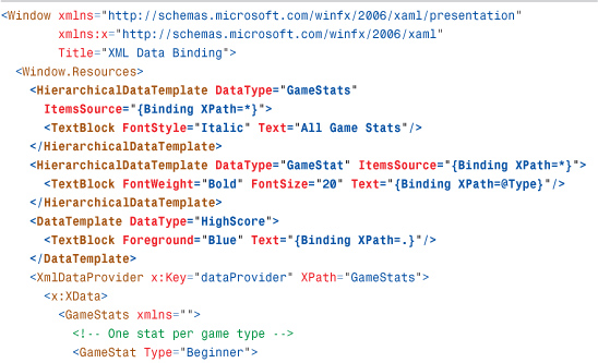
The idea is to use a HierarchicalDataTemplate for every data type in the hierarchy but then use a simple DataTemplate for any leaf nodes. Each data template gives you the option to customize the rendering of the data type, but HierarchicalDataTemplate also enables you to specify its children in the hierarchy by setting its ItemsSource property. Both HierarchicalDataTemplates in Listing 13.3 bind ItemsSource to the XPath expression * to include all children in the XML data source.
The DataType value on each data template makes each one automatically affect any instances of the specified type within its scope (the Window in this example). When used with XmlDataProvider, the value of DataType corresponds to an XML element name. Note that the three data templates are not given explicit keys, despite being in a ResourceDictionary. This works because internally the value of DataType is used for the template’s key.
Figure 13.13 shows the rendered XAML from Listing 13.3. It also shows what happens if you replace the single occurrence of TreeView with Menu and leave the rest of the listing alone.
Figure 13.13 The use of HierarchicalDataTemplates can automatically fill TreeView and Menu with a hierarchy of data-bound objects.

Tip
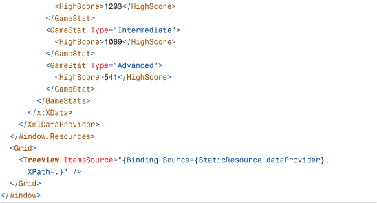
Often, XML data defines its own namespace for its elements. For example, Really Simple Syndication (RSS) feeds from Twitter define two:

To reference elements in these namespaces (for example, atom:link) in an XPath, you can set an XmlNamespaceManager property on the XmlDataProvider or on individual Bindings. Here’s an example:
The typical way to get an instance of an XmlNamespaceManager is to use the derived XmlNamespaceMappingCollection class, which assigns a prefix to each namespace. Here’s an example:
Although it’s natural to choose prefixes that match the ones in the XML, you can choose any prefixes you want. The prefixes you choose can be used in XPath expressions, such as:
Whenever an XPath value has no prefix, the empty namespace is assumed to be the namespace URI. Therefore, even if your XML source has a default namespace, you must assign an XmlNamespaceManager for the queries to work.
ObjectDataProvider
Whereas XmlDataProvider exposes XML as a data source, ObjectDataProvider exposes a .NET object as a data source. “But that doesn’t make any sense,” you’re probably thinking to yourself! “I can already use any arbitrary .NET object as a data source. What good does ObjectDataProvider do?” It opens up a few additional capabilities that you don’t get by binding to the raw object. For example, it enables you to do the following:
• Declaratively instantiate the source object with a parameterized constructor
• Bind to a method on the source object
• Have more options for asynchronous data binding
Using a Parameterized Constructor in XAML
Most data sources that you’d use probably have a default constructor, such as the photos collection used earlier in the chapter. The following XAML “wraps” this collection in an ObjectDataProvider:

In this case, whether you bind to photos or dataProvider, you get exactly the same results. Even the Binding Path to use is identical because Binding automatically “unwraps” objects inside data providers such as ObjectDataProvider.
ObjectDataProvider also can be given the desired type of its object to wrap (rather than an instance) and construct it on your behalf:

When using ObjectDataProvider in this fashion, you can get it to instantiate an object via its parameterized constructor by setting its ConstructorParameters property to a collection of objects. For example, if the Photos constructor required a capacity to be passed in, you could use ObjectDataProvider as follows:

This mechanism is just like the x:Arguments keyword in XAML2009, except this works in XAML2006 as well. Therefore, this is useful for data sources whose definition you don’t control. (If you did control the definition of the data source, presumably you’d add an appropriate default constructor to it.) Of course, if declaring the source in XAML isn’t important to you, you could always construct it programmatically and easily set it as a data context for any XAML-defined elements.
Binding to a Method
One scenario that ObjectDataProvider enables that you otherwise can’t easily achieve declaratively or programmatically is binding to a method. As with support for parameterized constructors, this is mostly useful for existing classes that aren’t data binding friendly and can’t be changed. For your own types, you might as well expose potential data sources as properties. But imagine that the photos collection exposed a method called GetFolderName that returned a string representing the folder containing all the current items. You could expose this method as a data source as follows:
If parameters need to be passed to the method, you can use ObjectDataProvider’s MethodParameters property (which works just like its ConstructorParameters property). To bind to this method, you simply bind to the entire ObjectDataProvider:
Specifying a Path in this case would apply to the instance returned by the method.
Advanced Topics
The final section of this chapter outlines some of the more esoteric but incredibly useful features of data binding. This includes customizing the flow of data between the source and target, plugging in custom validation logic, and combining disjoint sources into a single bindable entity.
Customizing the Data Flow
In all the data-binding examples you’ve seen so far, data updates flow from the source to the target. But, in some cases, the target property can be directly changed by users, and it would be useful to support the flowing of such changes back to the source. Indeed, Binding supports this (and more) via its Mode property, which can be set to one of the following values of the BindingMode enumeration:
• OneWay—The target is updated whenever the source changes.
• TwoWay—A change to either the target or source updates the other.
• OneWayToSource—This is the opposite of OneWay. The source is updated whenever the target changes.
• OneTime—This works just like OneWay, except changes to the source are not reflected at the target. The target retains a snapshot of the source at the time the Binding is initiated.
TwoWay binding is appropriate for editable DataGrids or other data-bound forms, where you might have TextBoxes that get filled with data that the user is allowed to change. In fact, whereas most dependency properties default to OneWay binding, dependency properties such as TextBox.Text default to TwoWay binding. (Although this section claims to be about relatively esoteric features, TwoWay binding is actually quite common. It’s used in almost any application that reacts to user input and properly separates its user interface from its data.)
Warning: Watch Out for Different Default BindingModes!
The fact that different dependency properties have different default BindingModes can easily trip you up. For example, unlike with Label.Content, binding TextBox.Text to a collection’s Count property fails unless you explicitly set BindingMode to OneWay (or OneTime) because the Count property is read-only. TwoWay and OneWayToSource require a writable source property.
These different modes are the reason that value converters have both a Convert and a ConvertBack method. Both are called when performing TwoWay binding, and only ConvertBack is called when doing OneWayToSource binding.
FAQ
Why would I ever use a Binding with a Mode of OneWayToSource? In such a case, it sounds like the target should really be the source, and the source should really be the target.
One reason could be that you’re using multiple Bindings, some with data flowing from the source to the target and others with data flowing from the target to the source. For example, you might want to share a source among many data-bound targets but want one of these target elements to update that source via data binding.
OneWayToSource can also be used as a sneaky way to get around the restriction that a Binding’s target property must be a dependency property. If you want to bind a source dependency property to a target property that is not a dependency property, OneWayToSource enables you to accomplish this by marking your “real source” as the target and your “real target” as the source!
When using TwoWay or OneWayToSource binding, you might want different behaviors for when and how the source gets updated. For example, if a user types in a TwoWay data-bound TextBox, do you want the source to be updated with each keystroke, or only when the user is done typing? Binding enables you to control such behavior with its UpdateSourceTrigger property.
UpdateSourceTrigger can be set to a member of the UpdateSourceTrigger enumeration, which has the following values:
• PropertyChanged—The source is updated whenever the target property value changes.
• LostFocus—When the target property value changes, the source is updated only after the target element loses focus.
• Explicit—The source is updated only when you make an explicit call to BindingExpression.UpdateSource. You can get an instance of BindingExpression by calling the static BindingOperations.GetBindingExpression method or calling GetBindingExpression on any FrameworkElement or FrameworkContentElement.
Just as different properties have different default Mode settings, they also have different default UpdateSourceTrigger settings. TextBox.Text defaults to LostFocus.
Tip
Although the source and/or target data gets updated automatically when using data binding, you might want to take additional actions when a data update occurs. Perhaps you want to write some data to a log or show a visual effect to indicate the data change.
Fortunately, FrameworkElement and FrameworkContentElement have SourceUpdated and TargetUpdated events that you can handle. But for performance reasons, they only get raised for Bindings that have their NotifyOnSourceUpdated and/or NotifyOnTargetUpdated Boolean properties set to true.
Adding Validation Rules to Binding
When you accept user input, it’s a good idea to reject invalid data and give feedback to the user in a timely fashion. The early days of form filling on the Web were accompanied by horror stories of inappropriate validation, such as detecting errors only after everything was submitted and then requiring the user to type in everything again from scratch! Fortunately, data binding has a built-in validation mechanism that makes it relatively easy to create a rich and interactive experience. There are so many different ways to accomplish this and so many different knobs to configure, however, that it’s more confusing than it should be.
Imagine that you want the user to type the name of an existing .jpg file into a data-bound TextBox. There are two obvious error conditions here: The user could enter a nonexistent filename or a non-.jpg filename. If the TextBox weren’t data bound, you could insert custom validation logic that checks for these two conditions in the code that updates the data source. But when data binding propagates updates automatically, you need a way to inject validation logic into the process. You could write a value converter that performs the logic and throws an exception for bad data. But besides the fact that value converters aren’t meant for that purpose, this still doesn’t solve the part about displaying the error to the user.
Tip
The techniques described in this section apply only to propagating changes from the target to the source. Therefore, these features work only with a BindingMode of OneWayToSource or TwoWay.
You can handle this situation in a few different ways. One way is to write your own validation rule, and another is to take advantage of exceptions that might already be thrown from attempts to update the source incorrectly.
Writing Your Own Validation Rule
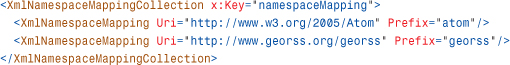
Binding has a ValidationRules property that can be set to one or more ValidationRule-derived objects. Each rule can check for specific conditions and mark the data as invalid. We could write the following JpgValidationRule class that enforces our requirements by deriving from ValidationRule and overriding its abstract Validate method:
Invalid data is reported by returning a false ValidationResult, and valid data is reported by returning a true ValidationResult. (The check for the ".jpg" suffix is not a good way to check that the file is a JPEG image, but it still gets the point across.)
With this class in place, it can be applied to a Binding as follows:

The validation check is invoked during any attempt to update the underlying data (which, in this case, is when the TextBox loses focus because of the LostFocus default for UpdateSourceTrigger). This happens before a value converter is called (if present), and only one rule is needed to veto the update and mark the data as invalid.
So, what happens when data is marked as invalid? An error adorner is rendered on top of the element with the target property. By default, this adorner looks like a thin red border. But you can assign a custom control template to be used in such conditions by setting the Validation.ErrorTemplate attached property on the target element. (Control templates are covered in the next chapter.) If you use validation, you’ll want to assign a custom template because the default one is not very satisfactory.
In addition, when data is marked as invalid, the target element’s Validation.HasError attached property becomes true, and its Validation.Error attached event is raised (but only if Binding’s NotifyOnValidationError property is set to true). Therefore, you could implement rich error notification logic with an appropriate trigger or event handler. You can get detailed information about the validation failures, such as the strings returned by the JpgValidationRule class, by checking the target element’s Validation.Errors attached property. These properties are automatically cleared when a subsequent successful bind occurs.
Sending Existing Error Handling Through the Validation System
Writing a custom validation rule might duplicate error-checking logic that is already performed by the data source (or a value converter). If either of these already throws an exception for the same conditions you want to treat as invalid, you can use a built-in ExceptionValidationRule object. Here’s an example:
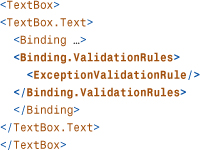
ExceptionValidationRule simply marks the data as invalid if any exception is thrown when attempting to update the source property. Therefore, this mechanism enables you to react properly to the exception rather than have it swallowed and emitted as a debug trace.
Similarly, if the data source provides error information by implementing System.ComponentModel.IDataErrorInfo, a simple interface used by several data sources (and also consumed by Windows Forms), you can use a built-in DataErrorValidationRule object to mark the corresponding data as invalid. The following TextBox takes advantage of both:

Although it’s nice to see built-in validation behavior leverage the same mechanisms as custom code you would write, the WPF team realized that the syntax is pretty verbose and awkward. Therefore, in WPF 3.5 SP1, Binding was given two new Boolean properties—ValidatesOnExceptions and ValidatesOnDataErrors—that provide a shortcut to adding these validation rules to the ValidationRules collection. Therefore, the preceding XAML can be rewritten as follows:

To summarize, if the data source or a value converter in use already has logic to throw an exception on bad data, you can do one of the following:
• Use UpdateSourceExceptionFilter to plug in custom notification logic
• Set ValidatesOnExceptions or use ExceptionValidationRule, defining an ErrorTemplate and/or plugging in additional notification logic by monitoring Validation.HasError or Validation.Error (when NotifyOnValidationError is true)
If the data source uses IDataErrorInfo, you can set ValidatesOnDataErrors or use DataErrorValidationRule instead, and if the data source or value converter doesn’t have either kind of error handling, you still use a custom validation rule.
Validation for a Group of Bindings
The validation mechanism described thus far is applied on a Binding-by-Binding basis, but sometimes it’s useful to apply validation in bulk, such as for all cells in a DataGrid row or any kind of form in which multiple values are dependent on each other.
This kind of bulk validation is supported by an object known as BindingGroup. BindingGroup, like Binding, can be given a set of ValidationRules that are meant to apply to a group of Bindings. A BindingGroup instance can be assigned to any FrameworkElement (or FrameworkContentElement) as the value of its BindingGroup property. (ItemsControl also defines an ItemBindingGroup property that applies the BindingGroup to each item rather than the ItemsControl itself.) This automatically “fills” the BindingGroup with all Bindings that share the same DataContext as the host element. If you give the BindingGroup a Name, you can then add any other Bindings to the group—regardless of their source data—by setting each Binding’s BindingGroupName to the Name of the BindingGroup.
When each BindingGroup’s ValidationRule is invoked, the value passed to Validate is the instance of the BindingGroup. Because BindingGroup contains a number of useful methods and properties, such as an Items collection that contains the values for each Binding that ended up in the group, the ValidationRule can contain arbitrary logic that determines whether the result is valid, based on the entire group of values. BindingGroup also enables transactional editing (leveraged by DataGrid) when the data source implements the IEditableObject interface.
Working with Disjoint Sources
WPF provides a few interesting ways to combine multiple sources of data. The key to these approaches is the following classes:
CompositeCollection
The CompositeCollection class provides an easy way to expose separate collections and/or arbitrary items as a single collection. This can be useful when you want to bind to a collection of items that come from more than one source. The following XAML defines a CompositeCollection with all the contents of the photos collection plus two more items:
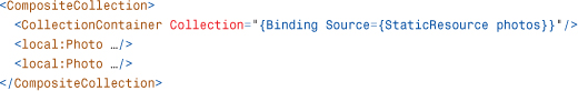
The photos collection is wrapped in a CollectionContainer object so that its items are considered part of the CompositeCollection rather than the collection itself. If the photos collection were added directly to the CompositeCollection instead, the CompositeCollection would contain only three items!
MultiBinding
MultiBinding enables you to aggregate multiple Bindings together and spit out a single target value. It requires that you use a value converter because otherwise WPF would have no idea how to combine the multiple input values. The following XAML shows how MultiBinding could be used to calculate a ProgressBar’s value by adding together the progress values of three independent data-bound sources, assuming the presence of a value converter and three source objects as resources:

Value converters used in MultiBinding are a little different than ones used in Binding, however. They must implement the IMultiValueConverter interface, whose methods accept/return an array of values rather than just one. Therefore, the following is an appropriate definition of the value converter used in the previous XAML snippet:

PriorityBinding
PriorityBinding looks a lot like MultiBinding, in that it encapsulates multiple Binding objects. But rather than aggregating Bindings together, the idea of PriorityBinding is to let multiple Bindings compete for setting the target value!
Tip
StringFormat can be used with MultiBinding. When it is used this way, {0} represents the first Binding, {1} represents the second Binding, and so on.
If you are data binding to a slow data source (and you can’t make it faster), you might want to allow faster sources to provide a “rough” version of the data while you wait. This technique can be seen in lots of software. For example, if you open a large document in Microsoft Word, you might first see something like “77,257 characters (an approximate value)” display in the lower-left corner for a few seconds, then something like “Page: 1 of 3,” which is still not the correct page count, then finally the expected “Page: 1 of 46.” For the Photo Gallery application, this technique could be used to quickly bind to a collection of thumbnail images and then replace that with a collection of full-fidelity images after that slower bind completes.
The following XAML demonstrates a typical declaration of PriorityBinding:

The Bindings are processed from beginning to end, so the first Binding listed has the highest priority (and, therefore, should be the slowest one to complete), and the last Binding listed has the lowest priority (and should be the quickest one). As different values get returned, higher-priority values overwrite the lower-priority ones.
Tip
When using PriorityBinding, all but the last Bindings should set IsAsync to true so they are processed in the background. Without this setting, the highest-priority Binding would execute synchronously (probably freezing the user interface), and after it returned, there would be no reason to consult the lower-priority Bindings!
Putting It All Together: The Pure-XAML Twitter Client
The canonical example of the power of WPF data binding is a fully functioning RSS reader written without any procedural code. Listing 13.4 provides my version of such an implementation, pointed at my Twitter RSS feed. The result is a decent “Twitter client,” shown in Figure 13.14. I pasted the XAML into the wonderful Kaxaml tool (http://kaxaml.com), hence the Kaxaml icon inherited by the Window.
Figure 13.14 The all-XAML RSS reader/Twitter client implemented in Listing 13.4.

Listing 13.4 The Entire Implementation of an RSS Reader/Twitter Client
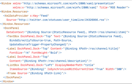
As expected, XmlDataProvider is used to retrieve the RSS feed.
Here are some of the interesting points about this application:
• The default TwoWay binding of TextBox.Text is leveraged to initially fill the TextBox with the XmlDataProvider’s Source and also enable the user to change the Source at runtime.
• To enable the XmlDataProvider’s Source to be bound, the TextBox’s Binding has BindsDirectlyToSource set to true. Otherwise, its Path would incorrectly refer to the RSS feed.
• The TextBox’s Binding uses an UpdateSourceTrigger of PropertyChanged, so an attempt to refresh the data is made with each keystroke. The best solution would probably be to use an UpdateSourceTrigger of Explicit instead and provide a Go button that can be used to manually refresh the source. But that would require a line of procedural code, which goes against the point of this example!
• The value of ListBox’s DisplayMemberPath is an XPath expression to extract the title element for each item in the XML source.
• The ListBox and Frame provide a master/detail view simply by sharing the same data source.
• Rather than use Frame, the raw content of each RSS item could have been displayed in something like a TextBlock. But that would give you raw HTML that would be difficult to read. And there’s no declarative way to render HTML properly other than using a Frame or WebBrowser with a persisted file (which the feed’s link element conveniently provides).
• As different RSS items (or whole RSS feeds) are selected, Frame’s navigation buttons keep track of your actions automatically.
Summary
Data binding is a very powerful feature, although its use is also completely optional. After all, it’s not hard to write code that ties two objects together. But writing such code can be tedious, error prone, and a maintenance hassle, especially when managing multiple data sources that might need to be synchronized as items are added, removed, and changed. Such code also tends to tightly couple business logic with the user interface, which makes the software more brittle.
XmlDataProvider could be considered a “killer app” for data binding, as it makes retrieving, parsing, navigating, and displaying remote XML data incredibly easy. The ability to get asynchronous behavior on any Binding or data provider simply by setting a Boolean property also makes data binding a compelling alternative to performing such work manually.
But there’s more to data binding than cutting down on the amount of code you need to write. Much of the appeal of WPF’s data binding comes from the fact that the majority of it can be done declaratively. This has some important implications. Design tools such as Expression Blend can (and do) surface data-binding functionality, so nonprogrammers can add sophisticated functionality to any user interface. With this support, Blend also enables designers to specify easily-removable dummy data for testing data-bound user interfaces. Data binding also enables loose XAML pages, which can’t use procedural code, to take advantage of functionality that makes them feel less like documents and more like miniature applications.