Chapter 10. Items Controls
Besides content controls, the other major category of WPF controls is items controls, which can contain an unbounded collection of items rather than just a single piece of content. All items controls derive from the abstract ItemsControl class, which, like ContentControl, is a direct subclass of Control.
ItemsControl stores its content in an Items property (of type ItemCollection). Each item can be an arbitrary object that by default gets rendered just as it would inside a content control. In other words, any UIElement is rendered as expected, and (ignoring data templates) any other type is rendered as a TextBlock containing the string returned by its ToString method.
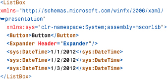
The ListBox control used in earlier chapters is an items control. Whereas those chapters always added ListBoxItems to the Items collection, the following example adds arbitrary objects to Items:
(This snippet uses sys:DateTime instead of x:DateTime so it works as both loose XAML and compiled XAML.)
The child elements are implicitly added to the Items collection because Items is a content property. This ListBox is shown in Figure 10.1. The two UIElements (Button and Expander) are rendered normally and are fully interactive. The three DateTime objects are rendered according to their ToString method.
Figure 10.1 A ListBox containing arbitrary objects.
As mentioned in Chapter 2, “XAML Demystified,” the Items property is read-only. This means that you can add objects to the initially empty collection or remove objects, but you can’t point Items to an entirely different collection. ItemsControl has a separate property—ItemsSource—that supports filling its items with an existing arbitrary collection. The use of ItemsSource is examined further in Chapter 13, “Data Binding.”
Tip
To keep things simple, examples in this chapter fill items controls with visual elements. However, the preferred approach is to give items controls nonvisual items (for example, custom business objects) and use data templates to define how each item gets rendered. Chapter 13 discusses data templates in depth.
Common Functionality
Besides Items and ItemsSource, ItemsControl has a few additional interesting properties, including the following:
• HasItems—A read-only Boolean property that makes it easy to act on the control’s empty state from declarative XAML. From C#, you can either use this property or simply check the value of Items.Count.
• IsGrouping—Another read-only Boolean property that tells if the control’s items are divided into top-level groups. This grouping is done directly within the ItemsCollection class, which contains several properties for managing and naming groups of items. You’ll learn more about grouping in Chapter 13.
• AlternationCount and AlternationIndex—This pair of properties makes it easy to vary the style of items based on their index. For example, an AlternationCount of 2 can be used to give even-indexed items one style and odd-indexed items another style. Chapter 14, “Styles, Templates, Skins, and Themes,” shows an example of using these properties.
• DisplayMemberPath—A string property that can be set to the name of a property on each item (or a more complicated expression) that changes how each object is rendered.
• ItemsPanel—A property that can be used to customize how the control’s items are arranged without replacing the entire control template.
The next two sections provide further explanation of the last two properties in this list.
DisplayMemberPath
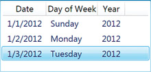
Figure 10.2 demonstrates what happens when DisplayMemberPath is applied to the preceding ListBox, as follows:
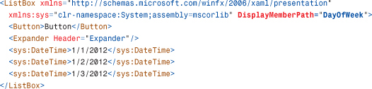
Figure 10.2 The ListBox from Figure 10.1 with DisplayMemberPath set to DayOfWeek.

Setting DisplayMemberPath to DayOfWeek tells WPF to render the value of each item’s DayOfWeek property rather than each item itself. That is why the three DateTime objects render as Sunday, Monday, and Tuesday in Figure 10.2. (This is the ToString-based rendering of each DayOfWeek enumeration value returned by the DayOfWeek property.) Because Button and Expander don’t have a DayOfWeek property, they are rendered as empty TextBlocks.
ItemsPanel
Like all other WPF controls, the essence of items controls is not their visual appearance but their storage of multiple items and, in many cases, the ways in which their items are logically selected. Although all WPF controls can be visually altered by applying a new control template, items controls have a shortcut for replacing just the piece of the control template responsible for arranging its items. This mini-template, called an items panel, enables you to swap out the panel used to arrange items while leaving everything else about the control intact.
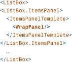
You can use any of the panels discussed in Chapter 5, “Layout with Panels” (or any Panel-derived custom panel) as an items panel. For example, a ListBox stacks its items vertically by default, but the following XAML replaces this arrangement with a WrapPanel, as done with Photo Gallery in Chapter 7, “Structuring and Deploying an Application”:
The translation of this XAML to procedural code is not straightforward, but here’s how you can accomplish the same task in C#:
Here’s an example with a custom FanCanvas that will be implemented in Chapter 21, “Layout with Custom Panels”:

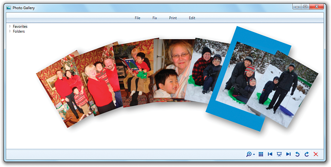
Figure 10.3 shows the result of applying this to Photo Gallery (and wrapping the ListBox in a Viewbox) and selecting one item. The ListBox retains all its behaviors with item selection despite the custom inner layout.
Figure 10.3 ListBox with a custom FanCanvas used as its ItemsPanel.
FAQ
 How can I make
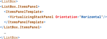
 ListBox arrange its items horizontally instead of vertically?
By default, ListBox uses a panel called VirtualizingStackPanel to arrange its items vertically. The following code replaces it with a new VirtualizingStackPanel that explicitly sets its Orientation to Horizontal:
Tip
Many items controls use VirtualizingStackPanel as their default ItemsPanel to get good performance. In WPF 4, this panel supports a new mode that improves scrolling performance even further, but you need to turn it on explicitly. To do so, you set the VirtualizingStackPanel.VirtualizationMode attached property to Recycling. When this is done, the panel reuses (“recycles”) the containers that hold each onscreen item rather than constructing a new container for each item.
If you look at the default control template for an items control such as ListBox, you can see an ItemsPresenter, which does the work of picking up the appropriate ItemsPanel:
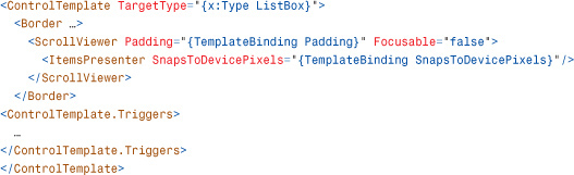
The presence of ScrollViewer in the default control template explains where the default scrolling behavior comes from. You can control an items control’s scrolling behavior with various ScrollViewer attached properties.
Controlling Scrolling Behavior
Using ListBox as an example, the following properties have the following values by default:
• ScrollViewer.HorizontalScrollBarVisibility—Auto
• ScrollViewer.VerticalScrollBarVisibility—Auto
• ScrollViewer.CanContentScroll—true
• ScrollViewer.IsDeferredScrollingEnabled—false
When CanContentScroll is true, scrolling is done in item-by-item chunks. When it is false, the pixel-by-pixel scrolling is smooth but doesn’t do anything to ensure that the first item is “snapped” to the edge.
When IsDeferredScrollingEnabled is false, scrolling happens in real-time while the scrollbar thumb is dragged. When it is true, the ScrollViewer’s contents do not update until the scrollbar thumb is released. When an items control is using a virtualizing panel and it contains a large number of complex items, setting IsDeferredScrollingEnabled to true can result in a significant performance improvement by avoiding the rendering of intermediate states. Applications such as Microsoft Outlook scroll through long lists in this fashion.
Here is an example of a ListBox that sets all four of these ScrollViewer attached properties to affect the ScrollViewer’s behavior in its default control template:

ListBox is not the only items control, of course. Items controls can be divided into three main groups, as discussed in the following sections: selectors, menus, and others.
Selectors
Selectors are items controls whose items can be indexed and, most importantly, selected. The abstract Selector class, which derives from ItemsControl, adds a few properties to handle selection. For example, the following are three similar properties for getting or setting the current selection:
• SelectedIndex—A zero-based integer that indicates what item is selected or -1 if nothing is selected. Items are numbered in the order in which they are added to the collection.
• SelectedItem—The actual item instance that is currently selected.
• SelectedValue—The value of the currently selected item. By default this value is the item itself, making SelectedValue identical to SelectedItem. You can set SelectedValuePath, however, to choose an arbitrary property or expression that should represent each item’s value. (SelectedValuePath works just like DisplayMemberPath.)
All three properties are read/write, so you can use them to change the current selection as well as retrieve it.
Selector also supports two attached properties that can be applied to individual items:
• IsSelected—A Boolean that can be used to select or unselect an item (or to retrieve its current selection state)
• IsSelectionActive—A read-only Boolean that tells whether the selection has focus
Selector also defines an event—SelectionChanged—that makes it possible to listen for changes to the current selection. Chapter 6, “Input Events: Keyboard, Mouse, Stylus, and Multi-Touch,” uses this with a ListBox when demonstrating attached events.
WPF ships five Selector-derived controls, described in the following sections:
• ComboBox
• ListBox
• ListView
• DataGrid
ComboBox
The ComboBox control, shown in Figure 10.4, enables users to select one item from a list. ComboBox is a popular control because it doesn’t occupy much space. It displays only the current selection in a selection box, with the rest of the list shown on demand in a drop-down. The drop-down can be opened and closed by clicking the button or by pressing Alt+up arrow, Alt+down arrow, or F4.
Figure 10.4 The WPF ComboBox, with its drop-down showing.

ComboBox defines two events—DropDownOpened and DropDownClosed—and a property—IsDropDownOpen—that enable you to act on the drop-down being opened or closed. For example, you can delay the filling of ComboBox items until the drop-down is opened by handling the DropDownOpened event. Note that IsDropDownOpen is a read/write property, so you can set it directly to change the state of the drop-down.
Customizing the Selection Box
ComboBox supports a mode in which the user can type arbitrary text into the selection box. If the text matches one of the existing items, that item automatically becomes selected. Otherwise, no item gets selected, but the custom text gets stored in ComboBox’s Text property so you can act on it appropriately. This mode can be controlled with two poorly named properties, IsEditable and IsReadOnly, which are both false by default. In addition, a StaysOpenOnEdit property can be set to true to keep the drop-down open if the user clicks on the selection box (matching the behavior of drop-downs in Microsoft Office as opposed to normal Win32 drop-downs).
FAQ
What’s the difference between ComboBox’s IsEditable and IsReadOnly properties?
Setting IsEditable to true turns ComboBox’s selection box into a text box. IsReadOnly controls whether that text box can be edited, just like TextBox’s IsReadOnly property. This means that IsReadOnly is meaningless unless IsEditable is true, and IsEditable being true doesn’t necessarily mean that the selection text can be edited. Table 10.1 sums up the behavior of ComboBox based on the values of these two properties.
Table 10.1 The Behavior for All Combinations of IsEditable and IsReadOnly

When the selection box is a text box, the selected item can be displayed only as a simple string. This isn’t a problem when items in the ComboBox are strings (or content controls containing strings), but when they are more complicated items, you must tell ComboBox what to use as the string representation for its items.
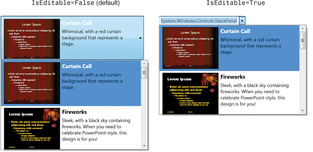
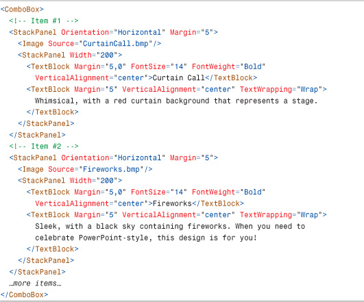
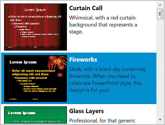
Listing 10.1 contains XAML for a ComboBox with complex items. Each item displays a PowerPoint design in a way that makes the ComboBox look like a Microsoft Office–style gallery, showing a preview and description for each item. A typical gallery in Office restricts the selection box to simple text, however, rather than keeping the full richness of the selected item. Figure 10.5 shows the rendered result of Listing 10.1, as well as what happens by default when this ComboBox is marked with IsEditable set to true.
Figure 10.5 By default, setting IsEditable to true causes ToString-based rendering in the selection box.
Listing 10.1 A ComboBox with Complex Items, Such as a Microsoft Office Gallery
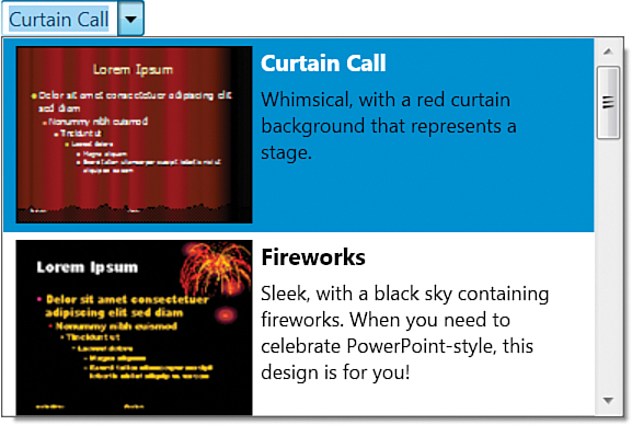
Obviously, displaying the type name of "System.Windows.Controls.StackPanel" in the selection box is not acceptable, so that’s where the TextSearch class comes in. TextSearch defines two attached properties that provide control over the text that gets displayed in an editable selection box.
A TextSearch.TextPath property can be attached to a ComboBox to designate the property (or subproperty) of each item to use as the selection box text. This works just like the DisplayMemberPath and SelectedValuePath properties; the only difference between these three properties is how the final value is used.
For each item in Listing 10.1, the obvious text to use in the selection box is the content of the first TextBlock because it contains the title (such as "Curtain Call" or "Fireworks"). Because the TextBlock is nested within two StackPanels, the desired property path involves referencing the inner StackPanel (the second child of each item) before referencing the TextBlock (the first child of each inner StackPanel). Therefore, the TextPath attached property can be applied to Listing 10.1 as follows:
This is a bit fragile, however, because the property path will stop working if the structure of the items is changed. It also doesn’t handle heterogeneous items; any item that doesn’t match the structure of TextPath is displayed as an empty string in the selection box.
TextSearch’s other attached property, Text, is more flexible but must be applied to individual items in the ComboBox. You can set Text to the literal text you want to be displayed in the selection box for each item. It could be applied to Listing 10.1 as follows:

You can use TextSearch.TextPath on the ComboBox and TextSearch.Text on individual items simultaneously. In this case, TextPath provides the default selection box representation, and Text overrides this representation for any marked items.
Figure 10.6 shows the result of using either TextSearch.TextPath or TextSearch.Text as in the preceding snippets.
Figure 10.6 A proper-looking Office-style gallery, thanks to the use of TextSearch attached properties.
Tip
You can disable TextSearch by setting ItemsControl’s IsTextSearchEnabled property to false. ItemsControl’s IsTextSearchCaseSensitive property (which is false by default) controls whether the case of typing must match the case of the text.
FAQ
When the SelectionChanged event gets raised, how do I get the new selection?
The SelectionChanged event is designed to handle controls that allow multiple selections, so it can be a little confusing for a single-selection selector such as ComboBox. The SelectionChangedEventArgs type passed to event handlers has two properties of type IList: AddedItems and RemovedItems. AddedItems contains the new selection, and RemovedItems contains the previous selection. You can retrieve a new single selection as follows:

And, like this code, you should never assume that there’s a selected item! Besides the fact that ComboBox’s selection can be cleared programmatically, it can get cleared by the user when IsEditable is true and IsReadOnly is false. In this case, if the user changes the selection box text to something that doesn’t match any item, the SelectionChanged event is raised with an empty AddedItems collection.
ComboBoxItem
ComboBox implicitly wraps each of its items in a ComboBoxItem object. (You can see this from code if you traverse up the visual tree from any of the items.) But you can explicitly wrap any item in a ComboBoxItem, which happens to be a content control. You can apply this to each item in Listing 10.1 as follows:

Notice that if you’re using the TextSearch.Text attached property, you need to move it to the ComboBoxItem element now that StackPanel is not the outermost element for each item. Similarly, the TextSearch.TextPath value used earlier needs to be changed to Content.Children[1].Children[0].Text.
FAQ
Why should I bother wrapping items in a ComboBoxItem?
ComboBoxItem exposes some useful properties—IsSelected and IsHighlighted—and useful events—Selected and Unselected. Using ComboBoxItem also avoids a quirky behavior with showing content controls in the selection box (when IsEditable is false): If an item in a ComboBox is a content control, the entire control doesn’t get displayed in the selection box. Instead, the inner content is extracted and shown. By using ComboBoxItem as the outermost content control, the inner content is now the entire control that you probably wanted to be displayed in the first place.
Because ComboBoxItem is a content control, it is also handy for adding simple strings to a ComboBox (rather than using something like TextBlock or Label). Here’s an example:
ListBox
The familiar ListBox control is similar to ComboBox, except that all items are displayed directly within the control’s bounds (or you can scroll to view additional items if they don’t all fit). Figure 10.7 shows a ListBox that contains the same items used in Listing 10.1.
Probably the most important feature of ListBox is that it can support multiple simultaneous selections. This is controllable via the SelectionMode property, which accepts three values (from a SelectionMode enumeration):
• Single—Only one item can be selected at a time, just like with ComboBox. This is the default value.
• Multiple—Any number of items can be selected simultaneously. Clicking an unselected item adds it to ListBox’s SelectedItems collection, and clicking a selected item removes it from the collection.
• Extended—Any number of items can be selected simultaneously, but the behavior is optimized for the single selection case. To select multiple items in this mode, you must hold down Shift (for contiguous items) or Ctrl (for noncontiguous items) while clicking. This matches the behavior of the Win32 ListBox control.
Just as ComboBox has its companion ComboBoxItem class, ListBox has a ListBoxItem class, as seen in earlier chapters. In fact, ComboBoxItem derives from ListBoxItem, which defines the IsSelected property and Selected and Unselected events.
Tip
The TextSearch technique shown with ComboBox in the preceding section is important for ListBox, too. For example, if the items in Figure 10.7 are marked with the appropriate TextSearch.Text values, then typing F while the ListBox has focus makes the selection jump to the Fireworks item. Without the use of TextSearch, pressing S would cause the items to get focus because that’s the first letter in System.Windows.Controls.StackPanel. (And that would be a weird user experience!)
FAQ
How can I get ListBox to scroll smoothly?
By default, ListBox scrolls on an item-by-item basis. Because the scrolling is based on each item’s height, it can look quite choppy if you have large items. If you want smooth scrolling, so each scrolling action shifts the items by a small number of pixels regardless of their heights, the easiest solution is to set the ScrollViewer.CanContentScroll attached property to false on the ListBox control, as shown previously in this chapter.
Be aware, however, that by making this change, you lose ListBox’s virtualization functionality. Virtualization refers to the optimization of creating child elements only when they become visible on the screen. Virtualization is possible only when using data binding to fill the control’s items, so setting CanContentScroll to false can negatively impact the performance of data-bound scenarios only.
FAQ
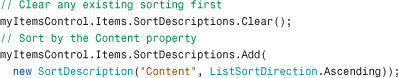
How can I sort items in a ListBox (or any other ItemsControl)?
Sorting can be done via a mechanism on the ItemsCollection object, so it applies equally to all ItemsControls. ItemsCollection has a SortDescriptions property that can hold any number of System.ComponentModel.SortDescription instances. Each SortDescription describes which property of the items should be used for sorting and whether the sort is in ascending or descending order. For example, the following code sorts a bunch of ContentControl items based on their Content property:
FAQ
How do I get the items in my ItemsControl to have automation IDs, as seen in tools such as UI Spy?
The easiest way to give any FrameworkElement an automation ID is to set its Name property, as that is used by default for automation purposes. However, if you want to give an element an ID that is different from its name, simply set the AutomationProperties.AutomationID attached property (from the System.Windows.Automation namespace) to the desired string.
ListView
The ListView control, which derives from ListBox, looks and acts just like a ListBox, except that it uses the Extended SelectionMode by default. But ListView also adds a property called View that enables you to customize the view in a richer way than choosing a custom ItemsPanel.
The View property is of type ViewBase, an abstract class. WPF ships with one concrete subclass, GridView. Its default experience is much like Windows Explorer’s Details view. (In fact, in beta versions of WPF, GridView was even called DetailsView.)
Figure 10.8 displays a simple ListView created from the following XAML, which assumes that the sys prefix corresponds to the System .NET namespace in mscorlib.dll:

Figure 10.8 The WPF ListView, using GridView.
GridView has a Columns content property that holds a collection of GridViewColumn objects, as well as other properties to control the behavior of the column headers. WPF defines a ListViewItem element that derives from ListBoxItem. In this case, the DateTime objects are implicitly wrapped in ListViewItems because they are not used explicitly.
ListView’s items are specified as a simple list, as with ListBox, so the key to displaying different data in each column is the DisplayMemberBinding property of GridViewColumn. The idea is that ListView contains a complex object for each row, and the value for every column is a property or subproperty of each object. Unlike ItemsControl’s DisplayMemberPath property, however, DisplayMemberBinding requires the use of data binding techniques described in Chapter 13.
What’s nice about GridView is that it automatically supports some of the advanced features of Windows Explorer’s Details view:
• You can reorder columns by dragging and dropping them.
• You can resize columns by dragging the column separators.
• You can cause columns to automatically resize to “just fit” their content by double-clicking their separators.
GridView doesn’t, however, support automatic sorting by clicking on a column header, which is an unfortunate gap in functionality. The code to sort items when a header is clicked is not complicated (you simply use the SortDescriptions property mentioned in the previous section), but you also have to manually create the little arrow in the header that typically indicates which column is being used for sorting and whether it’s an ascending or descending sort. Basically, ListView with GridView is a poor-man’s DataGrid. But now that WPF 4 has a real DataGrid control, the usefulness of the GridView control is diminished.
TabControl
The next selector, TabControl, is useful for switching between multiple pages of content. Figure 10.9 shows what a basic TabControl looks like. Tabs in a TabControl are typically placed on the top, but with TabControl’s TabStripPlacment property (of type Dock), you can also set their placement to Left, Right, or Bottom.
Figure 10.9 The WPF TabControl.
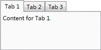
TabControl is pretty easy to use. You simply add items, and each item is placed on a separate tab. Here’s an example:

Much like ComboBox with ComboBoxItem, ListBox with ListBoxItem, and so on, TabControl implicitly wraps each item in its companion TabItem type. It’s unlikely that you’d add non-TabItem children directly to TabControl, however, because without an explicit TabItem there’s no way to label the corresponding tab. For example, the following XAML is the source for Figure 10.9:
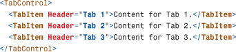
TabItem is a headered content control, so Header can be any arbitrary object, just like with GroupBox or Expander.
Unlike with the other selectors, with TabItem, the first item is selected by default. However, you can programmatically unselect all tabs by setting SelectedItem to null or SelectedIndex to -1.
DataGrid
DataGrid is a versatile control for displaying multicolumn rows of data that can be sorted, edited, and much more. It is optimized for easy hook-up to an in-memory database table (such as System.Data.DataTable in ADO.NET). Wizards in Visual Studio and technologies such as LINQ to SQL make this connection especially easy.
Listing 10.2 shows a DataGrid that directly contains a XAML-instantiated collection of two instances of the following custom Record type:
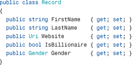
where the Gender enumeration is defined as follows:

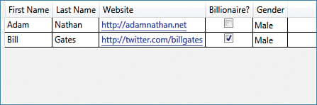
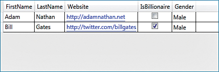
The five columns of data shown in Figure 10.10 (one for each property on the Record object) are defined in the Columns collection.
Figure 10.10 The WPF DataGrid, as constructed in Listing 10.2.
Listing 10.2 A DataGrid with Inline Data and a Variety of Column Types

The DataGrid automatically supports reordering, resizing, and sorting the columns, but any or all of this functionality can be disabled by setting any of the following properties to false: CanUserReorderColumns, CanUserResizeColumns, CanUserResizeRows, and CanUserSortColumns. The grid lines and headers can be easily disabled via the GridLinesVisibility and HeadersVisibility properties.
Listing 10.2 highlights the main column types supported by DataGrid:
• DataGridTextColumn—Perfect for strings, this column type displays a TextBlock for its normal display and a TextBox when the value is being edited.
• DataGridHyperlinkColumn—Turns what would be plain text into a clickable hyperlink. However, note that there is no default behavior associated with clicking that link (such as opening a web browser). You must explicitly handle such actions.
• DataGridCheckBoxColumn—Perfect for Boolean values, this column type displays a CheckBox to represent a true (checked) or false (unchecked) value.
• DataGridComboBoxColumn—Perfect for enumerations, this column type displays a TextBlock for its normal display and a ComboBox filled with possible values when the value is being edited.
WPF has one more built-in column type:
• DataGridTemplateColumn—Enables an arbitrary template to be set for a value’s normal display as well as its editing display. This is done by setting its CellTemplate and CellEditingTemplate properties.
Auto-Generated Columns
When DataGrid’s items are set via ItemsSource, it attempts to automatically generate appropriate columns. When this happens, DataGridTextColumn is automatically used for strings, DataGridHyperlinkColumn is automatically used for URIs, DataGridCheckBoxColumn is automatically used for Booleans, and DataGridComboBoxColumn is automatically used for enumerations (with an appropriate items source hooked up automatically).
Therefore, the following empty DataGrid:
produces almost exactly the same result as Figure 10.10 when its ItemsSource is set as follows in code-behind:
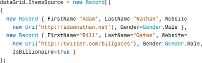
The only visual difference is the labels used in the headers, which now match the corresponding property names. Figure 10.11 shows the result.
Figure 10.11 The WPF DataGrid, with autogenerated columns that use Record's property names as the header text.
Besides being much simpler to construct, the DataGrid in Figure 10.11 automatically supports editing of the fields in each item, unlike when the items were placed directly in DataGrid’s Items collection. Cells in the first three columns automatically turn into editable TextBoxes when clicked, the CheckBoxes are clickable, and cells in the Gender column automatically turn into a ComboBox with the appropriate values when clicked. Keyboard gestures such as pressing the spacebar or F2 can also be used on the cell that has keyboard focus. All edits, when committed, are reflected in the underlying ItemsSource collection. (Unfortunately, checking the IsBillionaire box next to my name did not cause any change to be reflected in my bank account. Perhaps this sample has a bug.)
If a DataGrid already has explicit columns defined, any autogenerated columns are placed after them. You can customize or remove individual autogenerated columns by handling the AutoGeneratingColumn event, which is raised once for each column. When all the columns have been generated, a single AutoGeneratedColumns event is raised. To disable autogenerated columns altogether, simply set DataGrid’s AutoGenerateColumns property to false.
Selecting Rows and/or Cells
DataGrid supports multiple selection modes controlled by two properties—SelectionMode and SelectionUnit. SelectionMode can be set to Single for single-item selection or Extended for multiple-item selection (the default behavior). The definition of “item” depends on the value of SelectionUnit. It can be set to any of the following:
• Cell—Only individual cells can be selected.
• FullRow—Only full rows can be selected. This is the default.
• CellOrRowHeader—Either can be selected. (To select a full row, click a row header.)
When multiselection is enabled, the Shift key can be held down to select multiple contiguous items or the Ctrl key can be held down to select multiple noncontiguous items.
When rows are selected, the Selected event is raised and the SelectedItems property contains the items. For the DataGrid in Listing 10.2, these items would be the Record instances. When individual cells are selected, the SelectedCellChanged event is raised and the SelectedCells property contains a list of DataGridCellInfo structures that contain information about the relevant columns and data. Instances of DataGridRow and DataGridCell involved in the selection also raise their own Selected event and have an IsSelected property set to true.
Even if multiple cells or rows are selected, there is at most one cell that has focus at any time. You can get or set that cell with the CurrentCell property. In addition, the CurrentColumn property reveals the column containing CurrentCell, and CurrentItem contains the data item corresponding to CurrentCell’s row.
A lot of the support for bulk selection and selection transactions comes from the base MultiSelector class, which derives from Selector and was introduced in WPF 3.5. Other WPF controls support multiple selections, but DataGrid is the only one that derives from MultiSelector.
Additional Customizations
DataGrid supports a number of customizations easily, such as its interaction with the clipboard, virtualization, the ability to add extra details to rows, and the ability to “freeze” columns.
Clipboard Interaction
The data that gets copied to the clipboard from a DataGrid (such as when pressing Ctrl+C on a selection) can be customized with the ClipboardCopyMode property. It can be set to the following values:
• ExcludeHeader—Column headers are not included in the copied text. This is the default.
• IncludeHeader—Column headers are included in the copied text.
• None—Nothing can be copied to the clipboard.
Virtualization
By default, DataGrid’s rows are virtualized (UIElements are not created for rows offscreen, and the underlying data might even be fetched lazily, depending on the data source), but its columns are not. You can alter this behavior by setting EnableRowVirtualization to false or EnableColumnVirtualization to true. EnableColumnVirtualization is not true by default because it can slow down the frame rate when doing horizontal scrolling.
Extra Row Details
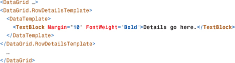
DataGrid supports showing extended details on rows by setting the RowDetailsTemplate property. Here’s an example:
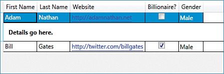
Ordinarily, the elements inside RowDetailsTemplate would use data binding to customize the contents for the current row, but this example uses a simple TextBlock. Figure 10.12 shows the result when selecting a row.
Figure 10.12 Showing details on a selected row in a DataGrid.
By default, details are shown only for the selected row(s), but this behavior can be changed with the RowDetailsVisibilityMode property. It can be set to one of the following values:
• VisibleWhenSelected—The row details are shown for only selected rows. This is the default value.
• Visible—The row details are shown for every row.
• Collapsed—The row details are not shown for any row.
Column Freezing
DataGrid supports “freezing” any number of columns, meaning that they never scroll out of view. This is a lot like freezing columns in Microsoft Excel. There are several limitations to this support: They can only be the leftmost columns, and frozen columns cannot be reordered among unfrozen columns (and vice versa).
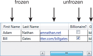
To freeze one or more columns, you simply set the FrozenColumnCount property to a value other than its default value of 0. Figure 10.13 shows the DataGrid from Listing 10.2 but with FrozenColumnCount set to 2. The columns after the first two have been scrolled, which is why you can’t see the header text for the third column.
Figure 10.13 The DataGrid from Listing 10.2 with FrozenColumnCount="2".
Editing, Adding, and Removing Data
We’ve already seen that editing the data in individual items works automatically with DataGrid’s ItemsSource. If the ItemsSource collection supports adding and removing items, then DataGrid automatically supports adding and removing items as well. With the previous example, wrapping the array in a List<Record> (so the static array is only used to initialize the dynamic list) is enough to enable this functionality:

FAQ
Can I freeze rows in a DataGrid?
No, there is no built-in support for that. The only other things that can be automatically frozen are row details. When AreRowDetailsFrozen is true, any row details that are shown do not scroll horizontally.
This gives the DataGrid an extra blank row at the bottom, so a new entry can be added at any time. DataGrid defines methods and commands for the common actions of beginning an edit (bound to F2), cancelling an edit (bound to Esc), committing an edit (bound to Enter), and deleting a row (bound to Delete).
IsReadOnly can be set to true to prevent editing, and CanUserAddRows/CanUserDeleteRows can be set to false to prevent adding and deleting. Listing 10.2 sets IsReadOnly to true to avoid exceptions, as the inline collection of Record objects does not support editing. Although editing (and switching a cell to editing mode) happens automatically, several events are raised during the process to customize the behavior: PreparingCellForEdit, BeginningEdit, CellEditEnding/RowEditEnding, and InitializeNewItem.
Warning: CanUserAddRows and CanUserDeleteRows can be automatically changed to false!
Depending on the values of other properties, CanUserAddRows and CanUserDeleteRows can become false even if you explicitly set them to true! For example, if DataGrid’s IsReadOnly or IsEnabled properties are set to false, these two previously mentioned properties become false. But even more subtly, if the data source doesn’t support adding and removing—ultimately revealed by IEditableCollectionView’s CanAddNew and CanRemove properties—then the two properties also become false. See Chapter 13 for more information about collection views such as IEditableCollectionView.
Menus
WPF has both of the familiar menu controls built-in—Menu and ContextMenu. Unlike in Win32-based technologies, WPF menus are not special-cased over other controls to have distinct prominence or limitations. They are just another set of items controls, designed for the hierarchical display of items in a series of cascading popups.
Menu
Menu simply stacks its items horizontally, with the characteristic gray bar (by default) as its background. The only public API that Menu adds to its ItemsControl base class is the IsMainMenu property. When true (which it is by default), the Menu gets focus when the user presses the Alt or F10 key, matching user expectations for Win32 menus.
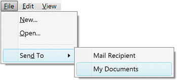
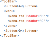
As with any other items control, Menu’s items can be anything, but it’s expected that you’ll use MenuItem and Separator objects. Figure 10.14 displays a typical menu created from the XAML in Listing 10.3.
Listing 10.3 A Typical Menu, with MenuItem and Separator Children
MenuItem is a headered items control (derived from HeaderedItemsControl), which is much like a headered content control. For MenuItem, Header is actually the main object (typically text, as in Figure 10.14). The Items, if any, are the child elements that get displayed as a submenu. Like Button and Label, MenuItem supports access keys by using the underscore prefix.
Separator is a simple control that, when placed in a MenuItem, gets rendered as the horizontal line shown in Figure 10.14. Separator is also designed for two other items controls discussed later in this chapter: ToolBar and StatusBar.
Although Menu is a simple control, MenuItem contains many properties for customizing its behavior. Some of the interesting ones are as follows:
• Icon—Enables you to add an arbitrary object to be placed alongside the Header. The Icon object gets rendered just like Header, although typically a small image or drawing is used.
• IsCheckable—Enables you to make a MenuItem act like a CheckBox control.
• InputGestureText—Enables you to label an item with an associated gesture (most commonly a keyboard shortcut such as Ctrl+O).
MenuItem also defines five events: Checked, Unchecked, SubmenuOpened, SubmenuClosed, and Click. Although handling a Click event is a common way to attach behavior to a MenuItem, you can alternatively assign a command to MenuItem’s Command property.
Warning: Setting InputGestureText doesn’t give a MenuItem its keyboard shortcut!
In a confusing departure from systems such as Windows Forms and Visual Basic 6, with WPF, setting MenuItem’s InputGestureText to a string such as "Ctrl+O" doesn’t automatically invoke the item when Ctrl+O is pressed! Instead, the string just serves as documentation.
To give a MenuItem a keyboard shortcut, you should hook it up to a command via its Command property. If the command has an associated input gesture, MenuItem’s InputGestureText property is automatically set to the correct string, so the shortcut is displayed without any explicit action.
Tip
When assigning MenuItem’s Command property to an instance of RoutedUICommand, its Header is automatically set to the command’s Text property. You can override this behavior by explicitly setting Header.
FAQ
How can I make Menu arrange its items vertically instead of horizontally?
Because Menu is just another items control, you can use the same ItemsPanel trick shown earlier for ListBox but replace the default panel with a StackPanel:

The default orientation for StackPanel is vertical, so you don’t need to set the Orientation property in this case. Figure 10.15 shows the result.
If you want the entire menu to be rotated to the vertical position (with sideways text, like what happens in older Microsoft Office programs when you drag and dock menus to the left or right edge of the window), you should instead use a RotateTransform.
ContextMenu
ContextMenu works just like Menu; it’s a simple container designed to hold MenuItems and Separators. You can’t embed ContextMenu directly in an element tree, however. You must attach it to a control via an appropriate property, such as the ContextMenu property defined on FrameworkElement and FrameworkContentElement. When a user right-clicks the element (or presses Shift+F10), the context menu is displayed.
Figure 10.16 displays a context menu applied to a ListBox as follows, using exactly the same MenuItems from Listing 10.3:
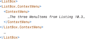
Figure 10.16 The WPF ContextMenu.

Besides the expected IsOpen property and Opened/Closed events, ContextMenu defines many properties for customizing the placement of the menu. By default, the menu appears with its upper-left corner directly under the mouse pointer. But you can change its Placement to something other than MousePoint (for example, Absolute) and/or set its HorizontalOffset and VerticalOffset to adjust this behavior.
Just as ToolTip has a companion ToolTipService static class for controlling properties from the ToolTip’s target, ContextMenu has a ContextMenuService static class for the same purpose. It contains several attached properties that correspond to many of the properties defined directly on ContextMenu.
FAQ
How do I get a context menu to appear when I right-click on a disabled element?
Just like ToolTipService, ContextMenuService contains a ShowOnDisabled attached property for this purpose. You can use it as follows:

Other Items Controls
The remaining items controls—TreeView, ToolBar and StatusBar—are neither selectors nor menus but can still contain an unbounded number of arbitrary objects.
TreeView
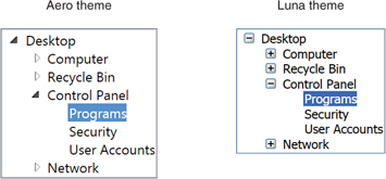
TreeView is a popular control for displaying hierarchical data with nodes that can be expanded and collapsed, as shown in Figure 10.17. Under the Aero theme, nodes have triangles indicating their expanded/collapsed state, but on the other themes, such as Luna, nodes have the familiar plus and minus indicators.
Figure 10.17 The WPF TreeView control.
TreeView, like Menu, is a very simple control. It can contain any items, and it stacks them vertically. But TreeView is pretty pointless unless you fill it with TreeViewItems.
TreeViewItem, just like MenuItem, is a headered items control. TreeViewItem’s Header property contains the current item, and its Items collection contains subitems (which, again, are expected to be TreeViewItems).
The TreeView in Figure 10.17 can be created with the following XAML:

TreeViewItem contains handy IsExpanded and IsSelected properties, as well as four events covering all four states from these properties: Expanded, Collapsed, Selected, and Unselected. TreeViewItem also supports rich keyboard navigation, with the plus (+) and minus (-) keys expanding and collapsing an item, and the arrow keys, Page Up, Page Down, Home, and End keys enabling several ways to move focus from one item to another.
Tip
As of WPF 4, TreeView supports virtualization, but you have to turn it on explicitly by setting the VirtualizingStackPanel.IsVirtualizing attached property to true on the TreeView. Doing so can save large amounts of memory and can significantly improve the performance of scrolling when there are lots of items.
Warning: Always use TreeViewItem to explicitly wrap items in a TreeView!
It might be tempting to use simple TextBlocks as leaf nodes, but when you do so, you can run into a subtle property value inheritance trap that can make the text in such TextBlocks seem to disappear. By default, selecting a parent node changes its Foreground to white, and if TextBlocks are direct logical children, their text turns white as well. (Although the implicit TreeViewItem is the visual parent for each TextBlock, the logical parent takes precedence for inheritance.) Against the default white background, such text cannot be seen. If you make TreeViewItem the explicit (logical) parent of each TextBlock, however, the undesirable inheritance no longer occurs.
ToolBar
The ToolBar control is typically used to group together many small buttons (or other controls) as an enhancement to a traditional menu system. Figure 10.18 displays a ToolBar created from the following XAML:

Notice that the Button and ComboBox controls used in the ToolBar look different than they normally do. In addition, Separator now gets rendered as a vertical line instead of the horizontal line seen when it is placed inside a Menu. ToolBar overrides the default styles of its items so that they automatically get the look that most people expect from a ToolBar.
ToolBars can be placed anywhere in an element tree, but they are typically placed inside a FrameworkElement called ToolBarTray. ToolBarTray holds a collection of ToolBars (in its content property called ToolBars) and, unless its IsLocked property is set to true, it enables users to drag and reposition the ToolBars. (ToolBarTray also defines an IsLocked attached property that can be placed on individual ToolBars.) ToolBarTray has an Orientation property that can be set to Vertical to make all its ToolBars arrange its items vertically.
If a ToolBar contains more items than it can fit within its bounds, the extra items move to an overflow area. This overflow area is a popup that can be accessed by clicking the little arrow at the end of the control, as shown in Figure 10.19. By default, the last item is the first to move to the overflow area, but you can control the overflow behavior of individual items with ToolBar’s OverflowMode attached property. You can use this property to mark an item to overflow AsNeeded (the default), Always, or Never.
Figure 10.19 ToolBar has an overflow area for items that don’t fit.
Tip
You can create a Visual Studio–style customizable ToolBar by setting ToolBar.OverflowMode to Never on each item, then adding a Menu with the header "_Add or Remove Buttons" and ToolBar.OverflowMode set to Always (so it always remains in the overflow area). You can then add MenuItems to this Menu that users can check/uncheck to add/remove the corresponding item to/from the ToolBar.
Tip
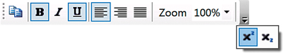
Whenever elements contain small, iconic images, it’s a good idea to set the RenderOptions.BitmapScalingMode attached property to NearestNeighbor. This makes such images look much crisper than their default rendering. The ToolBar in this section takes advantage of this property.
Although the property is placed on the ToolBar itself for brevity, it would be better to place it on each Button individually. That’s because when any of these Buttons are moved to the overflow popup, they no longer inherit this value. (The containing Popup element is not a child of the ToolBar.) The impact is subtle, but this is why the last two icons are blurry in Figure 10.20 compared to Figure 10.19.
Figure 10.20 The WPF StatusBar.
Digging Deeper: Customizing Keyboard Navigation
The following ToolBar exhibits potentially problematic keyboard behavior:
If you give focus to the ToolBar and repeatedly press Tab, the focus gets “stuck” in a cycle from A to B to C to D to A to B, and so on. And if you use the left or right-arrow key to focus on either MenuItem, the focus gets stuck oscillating between B and C as you keep pressing the arrow key.
The KeyboardNavigation class in the System.Windows.Input namespace defines a handful of attached properties for customizing this (and other) keyboard behavior. For example, to avoid the cycle when tabbing through a ToolBar, you can set KeyboardNavigation.TabNavigation to Continue (rather than Cycle) on the ToolBar. To avoid the cycle when navigating through a Menu with arrow keys, you can set KeyboardNavigation.DirectionalNavigation to Continue on the Menu.
StatusBar
StatusBar behaves just like Menu, but it stacks its items horizontally, as shown in Figure 10.20. It’s typically used along the bottom of a Window to display status information.
The StatusBar in Figure 10.20 can be created with the following XAML:

By default, StatusBar gives Separator a control template that renders it as a vertical line, just like when it is within a ToolBar. Items in a StatusBar (other than Separator) are implicitly wrapped in a StatusBarItem, but you can also do this wrapping explicitly. This way, you can customize their position with the layout-related attached properties discussed in Chapter 5.
FAQ
How can I get items in a StatusBar to grow proportionally?
It’s common to want StatusBar panes to remain proportionately sized. For example, perhaps you want a left pane that occupies 25% of the StatusBar’s width and a right pane that occupies 75% of the width. You can make this happen by overriding StatusBar’s ItemsPanel with a Grid and configuring the Grid’s columns as follows:
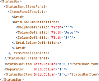
Note that items inside the StatusBar need to be explicitly marked with Grid.Column (which is meaningful only when Grid is the ItemsPanel) to avoid all being placed in column zero. Also, be aware that such layout properties work only for children of type StatusBarItem or Separator. That’s because other elements (such as the Label, ComboBox, and Button in the previous StatusBar snippet) would get implicitly wrapped with a StatusBarItem that would be missing the necessary attached properties. Therefore, you must wrap any such elements explicitly in a StatusBarItem.
Summary
Items controls are vital to understand for just about any WPF development. It’s hard to imagine a WPF application not using content controls and items controls. But unlike content controls, there’s a lot to learn about items controls! A recurring theme throughout this chapter is the importance of data binding if you’re working with a sizable or dynamic list of items. However, there are a few more areas of WPF to cover before we get to data binding in depth. The next chapter covers images, text, and other controls.