CHAPTER 5
Font/Character Formatting
- Looking again at text formatting methods
- Choosing between character styles versus direct character formatting
- Applying, clearing, and copying character formatting
- Using the Font dialog box and Mini Toolbar
- Learning about OpenType features
- Commanding character formatting keyboard shortcuts
In some early word processors, users applied text formatting by inserting formatting codes. For example, you had to add a code to turn on bold formatting, and add a second code to turn bold off later. Text between the codes was bold. This method of relying on a pair of codes often tripped up users. Accidentally delete one code in the pair, and you inadvertently changed the formatting for half the document.
Rather than letting you turn formatting on or off for a string of characters, Word uses an object-oriented formatting approach. In Word, you format objects such as letters, words, paragraphs, tables, pictures, and so on.
Another way to think about formatting is in units. Formatting can be applied to any unit you can select. The smallest unit that can be formatted is a single character. Discrete units larger than characters are words, sentences, paragraphs, document sections, and the whole document. Some types of formatting apply only to certain type of units. For example, you can't indent a single word; indention is a paragraph-level setting that applies to some or all of the lines in a paragraph.
Reviewing the Ways You Can Format Text in Word
Word has four levels of formatting: character/font, paragraph, section, and document. Character or font formatting includes bold, italic, points, superscript, and other attributes. You can apply character formats to a unit as small as a single character. Later chapters cover the other levels of formatting.
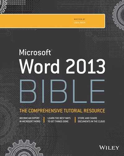
Font formatting might suggest for many people just changing from one font or typestyle design (for example Calibri, Times New Roman, Arial, or Tahoma) to another. The term character formatting used in this book more broadly encompasses all the formatting settings you can change for characters, but because Word positions all of these settings in a group called Font, as shown in Figure 5.1, font formatting and character formatting have come to be used interchangeably. It helps, however, to think in terms of character formatting, as a character is the smallest thing you can format in Word.
Find many character or font formatting settings in the Home tab's Font group.
NOTE
You also may see the term text level formatting in the Word interface; this term means the same thing as character formatting.
Note also that the Font group in the Home tab does not offer all the available character-level formatting. For example, the Font group doesn't include a tool for changing character spacing. In addition, the Font group's Change Case button (its menu has Sentence case, lowercase, and other commands) doesn't change formatting at all. Changing capitalization is distinct from applying the Small caps or All caps character-formatting settings to text.
Formatting Characters Directly or with Styles
Word includes paragraph styles and character styles. Paragraph styles can be applied only to a whole paragraph. Character styles provide formatting flexibility so that users can apply a style to characters within a paragraph. For example, you can create a style for all the article titles used within a document, or all the phone numbers, or all the web page addresses. Character styles enable you to distinguish one type of formal text from the surrounding paragraph text, and to do so consistently throughout the document.
A third type of style is a linked style. A linked style can behave like either a character or paragraph style, depending on the circumstances. If you have one or more entire words selected, selecting a linked style applies the style's character formatting to the selected words within the paragraph only. (Paragraph formatting such as line spacing is ignored.) The rest of the paragraph retains its original paragraph formatting. If you select the entire paragraph or merely place the insertion point within the paragraph without selecting any words, then an applied linked style behaves like a paragraph style, formatting the text with both the character and paragraph settings of the linked style. A number of the default styles in the Normal.dotm default template, including the heading styles, are linked styles.
The alternative to applying a character style is applying character formatting directly. As you're typing along, it's quite easy to use the Font group choices or shortcut keys to apply bold, italic, or underlining to text. That's called direct formatting, and often this is the easiest and fastest way to format text, particularly within a paragraph.
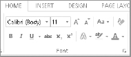
Word's default document template includes dozens of built-in styles, and Word gives you clues to help identify paragraph styles versus character styles, linked styles that you can use both ways, and direct formatting applied to text. Use the Styles task pane and Style Inspector to learn more about the styles and formatting applied to the selected text and also the styles that are available.
- Select the text that has the formatting you want to examine.
- Click the dialog box launcher in the Styles group of the Home tab. The Styles task pane appears. As shown in Figure 5.2, a symbol appears to the right of each style name. These symbols identify the type of style:
- Paragraph symbol: A paragraph style that can only be applied to whole paragraphs.
- Lowercase a character: A character style that that can be applied to selected text within a paragraph without changing the entire paragraph's formatting.
- Both a paragraph symbol and a lowercase a character: A linked style you can use either as a paragraph or character style. With the insertion point in the paragraph, applying the style formats the whole paragraph. With text selected in the paragraph, applying the style formats only the selected text.
- Click the Style Inspector (middle) icon at the bottom of the Styles task pane. The Style Inspector, also shown in Figure 5.2, opens. As you can see in Figure 5.2, this pane identifies the styles and formatting applied to the selected text:
- Paragraph formatting: Shows the applied paragraph style, Normal in this example.
- Text level formatting: Shows the applied character style, if any. In this example, the Subtle Emphasis style is also applied to the selected word within the paragraph.
- Plus boxes: Lists any direct character formatting applied in addition to the applied styles.
- Click the Close (X) button on the Style Inspector and Styles pane to close them.
Examine the styles and formatting applied to selected text in the Styles task pane and Style Inspector.
Given that creating and applying styles involves more thought, preparation, and work than using direct formatting, compare the pros and cons of each with regard to speed and functionality when creating and updating a document. Say you are creating a marketing document for your company's new product, and you want the product name to appear in bold throughout the document. You could apply the bold formatting directly by pressing Ctrl+B (for bold), typing the product name, and then pressing Ctrl+B again to toggle bold off each time you type the product name.
Next, your boss decides the product name should appear in bold and small caps. Because chances are you've also bolded other text in the document, you would have to manually find and reformat each instance of the product name to include the new small caps direct format.
If instead you had created a new character style named Product Name and applied it to each instance of the product name, you could simply modify the Product Name style to include the small caps formatting, and all product name instances would immediately display the new formatting.
The commandment is this: If the formatting is something you will need to repeatedly apply to certain categories of text (such as book titles, programming commands, product names, jargon, and so on), create a character style and use it.
If conversely the use is ad hoc and not something for which you'll have a recurring need, then go ahead and use direct formatting. For example, when you're writing a letter or memo, you may want to use bold or italics for emphasis. In those cases, using direct formatting fits the bill.
TIP
To streamline using styles, you can assign keyboard shortcuts to some of them. From Word Options (File ![]() Options), select the Customize Ribbon tab and click the Customize button beside Keyboard shortcuts. Choose Styles in the Categories list. Click the desired style in the Styles list, click in the Press new shortcut key text box, press the desired keys (the exact combination you want to assign, such as Alt+9 or Ctrl+Shift+F7), and then click Assign. Click Close to close the Customize Keyboard dialog box, and then click OK to close the Word Options dialog box.
Options), select the Customize Ribbon tab and click the Customize button beside Keyboard shortcuts. Choose Styles in the Categories list. Click the desired style in the Styles list, click in the Press new shortcut key text box, press the desired keys (the exact combination you want to assign, such as Alt+9 or Ctrl+Shift+F7), and then click Assign. Click Close to close the Customize Keyboard dialog box, and then click OK to close the Word Options dialog box.
Applying Character Formatting
There are at least six ways of directly applying various kinds of character formatting:
- Using the Font group on the Home tab of the Ribbon
- Using the Font dialog box (Ctrl+D or Ctrl+Shift+F, or click the Font group dialog box launcher)
- Using the Mini Toolbar (hover the mouse over selected text)
- Using keyboard shortcuts (see Table 5.1 later in this chapter or the topic Keyboard shortcuts for Microsoft Word in Word Help to learn about shortcuts beyond those presented in this chapter)
- Using the Font group's tools or buttons added to the Quick Access Toolbar (QAT)
- Using the Language tool on the status bar
This section describes these methods and gives a sense of which ones to use. A lot depends on your working style, but your choice can also depend on what you happen to be doing. On any given day many users may take advantage of at least five of the six methods.
Formatting techniques
To apply character formatting, you have three basic options:
- As you go method: Apply formatting before you start typing a word or passage, and then turn it off when you're done. For example, click the Bold button in the Font group of the Home tab, type a word, and then click the Bold button again.
- Selection method: Select the text you want formatted and then apply the formatting.
- Whole-word method: Click anywhere in a word and then choose the desired formatting.
NOTE
The whole-word method is settings-dependent. It will work by default, but it will not work if you've turned off “When selecting, automatically select entire word” in the Editing options section of Word Options (File ![]() Options
Options ![]() Advanced).
Advanced).
It would be redundant to repeat the basic steps for each and every formatting type. The techniques described here apply to all character formatting described in this chapter.
Repeating formatting (F4)
You can save a lot of time in Word by using the Repeat or Redo command keyboard shortcut, F4. Pressing F4 will repeats whatever you just did, from typing what you just typed again to repeat formatting.
Suppose for example that you're scanning a newsletter looking for people's names, which need to be made bold. You see the name John Smith, so you select it and press Ctrl+B. Thereafter, however, it might be faster to position one hand on the mouse and the other on the F4 key. From there, you can repeat the formatting on individual words or phrases. For example, if Jane Doe is the next name you find after John Smith, you could double-click on Jane, press F4, double-click on Doe, and press F4 again. Or, you could drag over Jane Doe to select both the first and last name, and then press F4. The F4 key enables you to temporarily forget about pressing Ctrl+B, right-clicking, or traveling to the top of the Word menu in search of a formatting tool.
Note that F4 and Ctrl+Y both do the same thing. Which you use is your choice. Many prefer F4 because it can be pressed with one finger. Others prefer Ctrl+Y because it doesn't involve as much of a stretch as F4.
TIP
F4 only repeats the last formatting applied, but not multiple formatting actions. For example, if you applied first bold and then italic to a word and then selected a new word and pressed F4, only the italic would be applied, not the bold. If you have multiple or compound character formatting to repeatedly apply to a non-style-formatted series of words or selections, use the Font dialog box instead of individual commands. When you use the Font dialog box, all changes applied when you click OK become a single formatting event to the F4 key, so F4 can now apply multiple types of character formatting all at once.
Copying formatting
If you don't want to use a character style but still need to apply numerous formatting settings to selected text, you can use one of two common methods for copying formatting: the Format Painter and the shortcut key combinations for copying and pasting formatting. Note that these tools aren't limited to direct formatting. They'll work with style formatting as well.
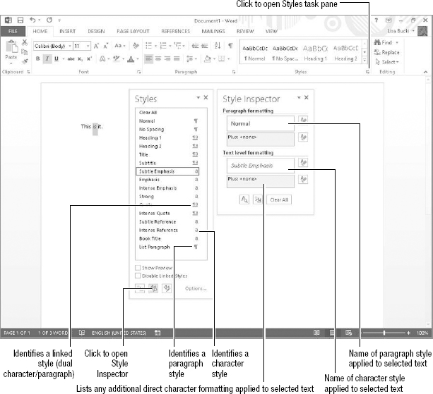
Format Painter
To use the Format Painter, click or drag to select the text with the formatting you want to copy. If you want to clone that formatting just once, click the Format Painter button in the Clipboard group on the Home tab, shown in Figure 5.3. If you want to apply that formatting multiple times, double-click the Format Painter. The mouse pointer changes to include a paintbrush.
Use the Format Painter in the Clipboard group to copy formatting.
To copy the formatting to a single word, double-click the word. Otherwise, drag over the destination text to format. If you double-clicked the Format Painter, repeat making selections until you're done applying the copied formatting. Press Esc or click the Format Painter again to deactivate it.
NOTE
If you are copying character formatting to a single word with Format Painter, you often can also simply click the destination word. However, if you accidentally click on a space between words, the formatting does not copy, so I've used double-click in the above instructions. Also note that if the text formatting you have copied is actually a paragraph or linked style, clicking or double-clicking with Format Painter active reformats the whole paragraph.
Keyboard method
If you prefer to use keyboard shortcuts for your formatting work where possible, use this method to copy and paste formatting:
- Select the text with the formatting to copy.
- Press Ctrl+Shift+C. This keyboard shortcut copies the formatting of the selected text.
- Select the text on which you want to paste the copied formatting.
- Press Ctrl+Shift+V. Word pastes the formatting on the selected text.
NOTE
When reformatting entire paragraphs with copied character formatting, be sure that when you select the text with the formatting to copy, you select the paragraph mark. The paragraph mark stores paragraph-level formatting such as line spacing and spacing before and after paragraphs. To ensure that your selection includes the paragraph mark, triple-click the paragraph or move the mouse into the left margin until the arrow pointer tilts right and double-click.
Clearing formatting
Clearing formatting removes formatting from text. There are two degrees of clearing formatting:
- Clearing direct character formatting only and returning the text to its underlying style. To clear text in this way, select it and then press Ctrl+Spacebar on the keyboard. Alternately, you can reapply the style via the Style gallery in the Styles group of the Home tab or the Styles pane you saw earlier in Figure 5.2. By default, reapplying the style clears direct formatting.
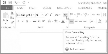
- Clearing all formatting and returning the text to the Normal style. After you select the text to return to the Normal style, click the Clear Formatting button in the Font group of the Home tab, shown in Figure 5.4. You also can click Clear All at the top of the Styles pane. Using these commands is the equivalent of copying a selection to the Clipboard and then using Paste Special
 Unformatted Text to paste it back into the document.
The Clear Formatting tool removes not only direct formatting, but also paragraph and style formatting.
NOTE
The ResetChar command clears direct formatting, whereas ClearAllFormatting returns the text to normal. While the Clear Formatting button on the Home tab represents the latter command, you can add a button for the former tab to either the QAT or a Ribbon tab.
Using the Font group on the Home tab
Figure 5.5 shows you the Font group of the Home tab. It includes more than a dozen direct formatting tools on two rows. Figure 5.5 identifies some of the tools in the group that offer formatting options you may not have considered previously, beyond the typical bold, italics, and underlining.
The Font group puts character formatting choices a mouse click away.
The pictures on some of the buttons in the Font group—such as Bold, Italic, and Underline—make their purpose obvious. The other buttons might call for more clarification. Hover the mouse pointer over each of the controls to see what it does. Notice that for many of the controls, keyboard shortcuts are indicated in the ScreenTip. Some tools, for whatever reason, might not show shortcuts. Jump ahead to the “Character formatting keyboard shortcuts” section later in this chapter if you're just dying to know what's assigned to what.
A number of the Font tools offer a Live Preview to help you make the best formatting selection:
- Font (the overall type design, such as Calibri)
- Font Size
- Text Highlight Color
- Font color
- Text Effects and Typography (which you'll see later in the chapter)
As shown in Figure 5.6, Live Preview shows you the results of the selected (but not yet applied) formatting. Two of the Live Preview controls—Font and Font Size—can be rolled up and out of the way, as shown in Figure 5.6. The others cannot.
Live Preview shows how the selected font would look when applied.
As shown in Figure 5.5, there's also the Font dialog box launcher, in the lower-right corner of the font group. Clicking it opens the Font dialog box, which you'll learn more about later in the chapter.
Font
As noted earlier, the font defines the overall appearance or style of text lettering. The fonts you apply are key to a document's appearance, formality, and readability. Windows includes dozens of built-in fonts you can apply in your documents, and you can find literally thousands more online that you can buy and install.
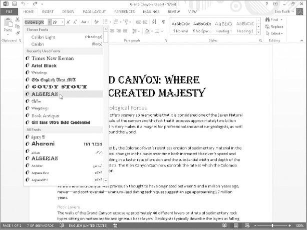
Use the Font drop-down list at the left end of the top row of the Font group of the Home tab to apply another font to selected text. Click the control's down arrow, scroll to display the available fonts, point to a font to see a Live Preview (refer to Figure 5.6), and then click the font to apply.
TIP
Limit the number of fonts used in a document to two or three to achieve a consistent look. Generally speaking, use one font for headings, one for body text, and one for special elements that you might want to emphasize, such as quotes or sidebars.
NOTE
If you have purchased or otherwise acquired unique fonts and installed them on your system, keep in mind that other users with whom you share documents may not have those fonts. When a document uses such a font, the text formatted with that font may not display or print correctly on other users' systems. To help avoid such problems, you can embed the fonts used in a document when saving. To turn on font embedding, choose File ![]() Options
Options ![]() Save. Under Preserve fidelity when sharing this document, click the Embed fonts in the file check box to check it. To embed only needed characters, also check Embed only the characters used in the document (best for reducing file size). You also can leave Do not embed common system fonts checked. Click OK to apply the settings change.
Save. Under Preserve fidelity when sharing this document, click the Embed fonts in the file check box to check it. To embed only needed characters, also check Embed only the characters used in the document (best for reducing file size). You also can leave Do not embed common system fonts checked. Click OK to apply the settings change.
Font Size
Font or Point Size controls the height of the font, generally measured in points. A point is 1/72 of an inch, so 12 points would be 12/72 (or ⅙) of an inch. For Word, a font set's point size is the vertical distance from the top of the highest ascending character to the bottom of the lowest descending character.
Use the Font Size drop-down list just to the right of the Font control in the Font group of the Ribbon to choose a size for selected text. You aren't limited to the range of sizes you see in the Font Size drop-down list. Word can go as low as one point and as high as 1,638 points. Plus, you can set the height in increments of half a point. Hence, a point size of 1637.5 is perfectly valid. To apply a size not included in the drop-down list, select the number shown in the Font Size control, type a new size, and press Enter.
NOTE
The ScreenTips for the Font and Font Size controls give shortcut key combinations of Ctrl+Shift+F and Ctrl+Shift+P, respectively, for the tools. These shortcut key combos do not activate the tools on the Ribbon. Instead, the shortcuts open the Font dialog box and select the applicable formatting setting there.
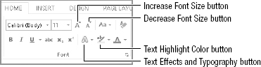
Increase Font Size and Decrease Font Size
You also can change text size with the Increase Font Size and Decrease Font Size tools (which are the two A buttons immediately to the right of the Font and Font Size tools in Figure 5.5). If you hover the mouse pointer over these you'll also learn that they both have shortcuts, Ctrl+Shift+. (the period character) and Ctrl+Shift+, (the comma character), respectively.
NOTE
The ScreenTips actually identify the shortcut key combinations as Ctrl+> and Ctrl+<, and technically that's right because > and < are a shifted period and comma, respectively. Presenting them both ways here will help you know exactly what keys to press.
If you click the drop-down arrow next to the Font Size tool, you'll notice that the font sizes listed do not consistently increase by twos. Instead, they go from 8 to 12 in increments of one, then from 12 to 28 in increments of two, and then leap to 36, 48, and 72. The Increase and Decrease Font Size tools follow the listed increments.
If you want a finer degree of control (for example, when you're trying to make text as large as possible without spilling onto an additional page), you should know about two additional default shortcut keys: Ctrl+[ and Ctrl+]. These two commands shrink or enlarge the selected characters by one point. The extra granularity often is just what you need to find the largest possible font you can fit inside a given space, such as a page, table, or text box.
Working with text color
Word has three color settings that you can apply at the character level:
- Font Color: The color of the characters themselves
- Shading: The color of the background immediately behind the text
- Text Highlight Color: The electronic equivalent of those neon-colored felt markers you use to focus your attention on key points buried within text
Font Color
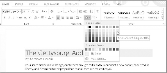
The Font Color setting determines the colors of the lettering for the selected text. Click the Text Color drop-down arrow in the Font group of the Home tab to open a palette or gallery of colors, as shown in Figure 5.7.
Changing text color

The theme applied to the document determines the available colors shown under Theme Colors in the gallery. The Automatic choice at the top can be black or white, and is based on the shading applied to the text. If the shading is so dark that black text can't be read without difficulty, Word automatically switches the Automatic color to white. The Standard Colors choices are the same no matter what theme is applied. You can click one of the colors under Theme Colors or Standard Colors to apply it to the selected text, or you can use the More Colors or Gradient choices to apply custom colors of blends of colors to the text.
Shading
Given that the Shading tool appears in the Paragraph group of the Ribbon, you might be tempted to believe that shading is paragraph-level formatting. Indeed, with nothing selected, your Shading choice applies to the entire current paragraph holding the insertion point.
However, if you select a single word or character, Shading suddenly acts like a character-formatting attribute. In reality, that's what it is. Because people seldom vary the shading within any given paragraph, Word includes it with the other paragraph formatting settings. And yet, just like font, font/point size, bold, and italic, shading is a character attribute. As shown in Figure 5.8, the combination of the Shading and Font Color settings both contribute to the readability of the text. There needs to be adequate contrast between the two in order for the document to remain readable.
Despite its position in the Paragraph group of the Home tab, shading can be applied to a selection of characters.
Text Highlight Color
The Text Highlight Color control—more generally known as the highlighter—is shown just to the left of the Font Color control in Figure 5.7. It actually has four modes of operation. Most people are aware of one mode or another, but not all four.
One method is to select text and then click the Text Highlight Color button in the Font group. This method, which directly applies the currently selected highlight color to the selected text, is the one that most users know and use. To change the highlight color, click the drop-down arrow and click a color in the gallery.
TIP
If you use this first highlight method, Word undoes the selection after you apply highlighting. This can be irritating if you use the wrong color, but if you immediately press Ctrl+Z or click Undo, Word not only undoes the highlighting, it also reselects that section of text so you can take another stab at highlighting it.
A second method is to turn the highlighter on by double-clicking the Text Highlight Color button, and then to use the mouse to select areas you want highlighted. The highlighter mouse pointer stays active until you click the Text Highlight Color button again, or until you press the Esc key.
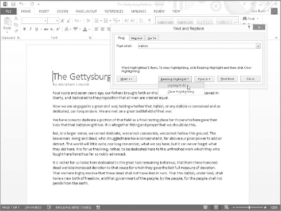
A third method can be used to apply highlighting to all occurrences of a given word or phrase in a document, using the most recently applied highlighting color:
- Click the arrow for the Find button in the Editing group of the Home tab, and click Advanced Find. The Find dialog box opens.
- Type the word or phrase to highlight in the Find what text box.
- Click Reading Highlight Highlight All, as shown in Figure 5.9. The figure also illustrates the result of applying the reading highlight to the specified word, nation. Several instances of the word are highlighted throughout the document. Note that you can use the Clear Highlighting choice on the Reading Highlight drop-down to remove the highlighting from the specified word or phrase.
- Click Close. The Find and Replace dialog box closes.
Use Find to apply a reading highlight to every occurrence of a word or phrase in your document.
A fourth highlighting method might be even more useful than the Reading Highlight feature. It works from the Replace dialog box. Press Ctrl+H (Replace). In the Find what text box, type the word or phrase you want to highlight. Clear the contents of the Replace with text box, but make sure that the insertion point remains in the text box. Click the More >> button, and in the lower-left corner choose Format ![]() Highlight. Click Replace All to apply highlighting to all occurrences of the word or phrase in the Find what text box. Click the Close button to close the dialog box. Highlighting applied this way is more robust than highlighting inserted via the Reading Highlight feature and will not disappear if you choose to manually manipulate highlighting.
Highlight. Click Replace All to apply highlighting to all occurrences of the word or phrase in the Find what text box. Click the Close button to close the dialog box. Highlighting applied this way is more robust than highlighting inserted via the Reading Highlight feature and will not disappear if you choose to manually manipulate highlighting.
Note that when the Replace with text box is blank but has associated formatting, the formatting is applied to text that matches the Find what text box. If both formatting and Replace with text are absent, Replace deletes all occurrences of the matching text.
By default, highlight formatting appears when you print the document. You can choose not to print highlighting, giving you the best of both worlds. You can mark up a document for your own benefit, and then—if you wish—print it out without the highlighting. Not only is this good for keeping internal guides private, it also saves money on yellow ink. To prevent the printing (or displaying) of highlighting, choose File ![]() Options, select the Display tab, and remove the check next to Show highlighter marks. If you hover over the information while you're here, the tip informs you that this controls both display and printing. Click OK when you're done. Of course, you'll need to repeat this process and check Show highlighter marks after printing to redisplay the highlighting onscreen.
Options, select the Display tab, and remove the check next to Show highlighter marks. If you hover over the information while you're here, the tip informs you that this controls both display and printing. Click OK when you're done. Of course, you'll need to repeat this process and check Show highlighter marks after printing to redisplay the highlighting onscreen.
NOTE
You may be wondering what the difference between text shading and highlight coloring is, as the two look very similar, and you use similar methods for applying them. The key difference is that the colors for the Text Highlight Color tool work the same as the Standard color choices or any custom colors you apply using another color gallery or palette: The applied text highlight color doesn't change when you change the document theme. In contrast, if you use one of the Theme Colors choices in the Shading gallery in the Paragraph group, the shading color does update when you change the document theme.
Change Case
The Change Case button doesn't really fit in the Font group, but that's precisely why I'm including it. Case is not formatting. Case is a choice of what capitalization to use—uppercase, lowercase, or some combination thereof. Why does Microsoft put it in the Font group? Probably because it can affect groups of characters, so it makes more sense here than anywhere else. And the Change Case setting for text is not saved as part of any style you create or update. The case options you can apply to selected text via the Change Case button in the Font group are:
- Sentence case: Capitalizes the first word in the selected text.
- lowercase: Removes all capitalization from the selection.
- UPPERCASE: Converts all letters of the selected text to uppercase.
- Capitalize Each Word: Capitalizes the first letter of each word.
- tOGGLE cASE: Reverses the case of each letter in the selection.
TIP
The formal method of capitalizing documents and section headings is called title case. You can easily achieve title case in your documents by applying the Capitalize Each Word setting and then converting prepositions, articles, and conjunctions back to lowercase, leaving only the major words capitalized.
TIP
When you need to distinguish between an uppercase i (I), a lowercase L (l), the number one (1), and the vertical line segment (|, usually typed with Shift+ on most U.S. keyboards), one font that makes the distinction clearest is Comic Sans. It's also a very comfortable and readable font, its nonprofessional-sounding name notwithstanding. If after applying Comic Sans you're still uncertain as to what's what, try toggling the case. Properly distinguishing among these characters, as well as between 0 (zero) and O (capital o), can make a world of difference when you are trying to convey part numbers, serial numbers, usernames, and passwords.
Language
By default, Word is set up to edit and perform spelling and grammar checks in a single language. To work with editing and formatting choices for a second language, you have to install the language in the Word Options dialog box. Choose File ![]() Options, and select the Language tab. Under Choose Editing Languages, open the [Add additional editing languages] drop-down list, click the language to add, and click Add. Click OK, and then restart Word when prompted so that the new editing language will take effect.
Options, and select the Language tab. Under Choose Editing Languages, open the [Add additional editing languages] drop-down list, click the language to add, and click Add. Click OK, and then restart Word when prompted so that the new editing language will take effect.
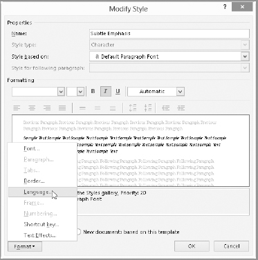
Even after that, language settings do not appear in the Home tab's Font group nor the Font dialog box, which you'll see shortly. So how do you know language is a character-formatting attribute? Two reasons: it can be applied to a single character in a document, and it can be included in a character-style definition, as shown in Figure 5.10.
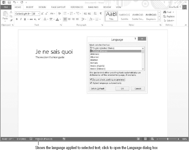
In many cases, Word correctly recognizes text from an installed language and formats it as such, but if not, you can set the language for selected text using the Language tool on the status bar. If you don't see the tool on the status bar, then right-click the status bar, click to enable Language, and then press Esc.
To open the Language dialog box to change settings for the selected text, click the language displayed on the status bar. Among the Language tool's more useful features is the Do not check spelling or grammar setting (see Figure 5.11), which you can apply to text. This can be handy for technical jargon and programming keywords that you might not want checked.
Language is included among the attributes associated with a character style.
Conversely, the Detect language automatically check box can be a real troublemaker. With that setting turned on, it's possible for text to unintentionally be tagged as some other language, resulting in large sections of text being flagged as misspelled. If the corresponding proofing tools are not installed, the text is not checked at all. This can leave large sections of text unintentionally unchecked. You should turn that setting off unless you actually need it. It is enabled by default!
To set the default for all documents based on the current template, choose the desired language as well as the desired settings for the last two options, and then click Set As Default. Confirm the settings by clicking Yes. Note that even though the confirmation box doesn't mention the latter two settings, they are included in the changes made to the underlying template.
The Do not check spelling or grammar setting can be useful for technical writers. Detect language automatically can cause problems for chronically bad spellers.
Formatting via the Font dialog box
The Font tab of the Font dialog box, shown in Figure 5.12, can be a useful tool when you're applying multiple character format changes at the same time. Note, however, that the Font dialog box and the Font group on the Ribbon do not provide identical capabilities. The Font dialog doesn't provide a full Live Preview and instead has a smaller preview area. On the other hand, it offers settings not available in the Font group, such as Underline color, Double strikethrough, Small caps, All caps, and Hidden. It also enables you to access detailed Text Effects settings.
The Font tab of the Font dialog box offers additional formatting choices beyond the Home tab's Font group.

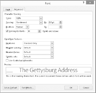
The Home tab's Font group offers none of the controls in the Font dialog box's Advanced tab, shown in Figure 5.13. Note the Scale and Spacing controls.
The Advanced tab of the Font dialog box enables you to scale and space characters.
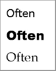
Use the Scale setting to stretch or compress the selected characters. You may want to do this to make text fill a particular amount of space in the document to create balance or to add emphasis or a modern appearance. The Spacing setting expands or condenses only the spacing between characters. Scaling and spacing expansion are demonstrated on the text shown in Figure 5.14. The bottom copy of the text was scaled to 150% and its Spacing set to Expanded By 2.8 pt. (That means an additional 2.8 points of spacing was inserted between each character.) In this example, the applied settings cause the bottom sample to span the width of the page.
Scaling and horizontal spacing can give text with the same basic font settings very different appearances.

The Position setting raises or lowers the selected characters by a specified number of points. Unlike spacing, which can vary by as little as .1 points, position's smallest gradation is .5 points. This tool is sometimes used to adjust subscripts and superscripts if the built-in versions don't accomplish the desired effect, or you need the subscripts and superscripts to be the same size as the surrounding text.
Kerning is an advanced typography control that adjusts the space between certain letter pairs when they appear together and are formatted in a proportional font (with varying letter widths). For example, in the letter pair Wa, kerning removes a little bit of space so that the a tucks in under the right side of the W, yielding a more attractive and readable appearance. Overall, kerning visually balances out the spaces between various letter combinations. Kerning is turned on by default for font sizes above 14 points, as the effects of kerning are more obvious the larger the font size. You can turn kerning off by clearing the Kerning for fonts check box on the Advanced tab of the Font dialog box, or you can change the accompanying font size to determine when kerning takes effect.
TIP
If you have a chronic need to adjust subscripts and superscripts, you might consider creating a character style that gives you the desired formatting.
Understanding OpenType features
Figure 5.13 also shows the OpenType Features settings on the Advanced tab. Developed largely by Microsoft, OpenType is the successor to TrueType fonts, which helped in making fonts scalable. OpenType adds additional features that allow you to manipulate some of the more intricate aspects of fonts and number spacing. For example, if you have problems aligning numbers in numbered lists, you might try a different Number spacing choice under OpenType features.
Many OpenType fonts include ligatures at certain sizes. When a ligature occurs, similar stroke components of adjoining characters are joined, so that the characters form a new glyph, or typographic character. This happens frequently for the lowercase letter f, as shown in Figure 5.15. You can turn ligatures off by choosing None from the Ligatures drop-down list of the Font dialog box, or use one of the other choices beside it and Standard Only to increase the number of ligatures that Word automatically applies. You also can change settings for OpenType Number forms and Stylistic sets.
The f and t are joined in the top two examples, but not the bottom one.
The Mini Toolbar
Yet another tool for applying formatting is the Mini Toolbar. This feature is fully explained in Chapter 1, “Taking Your First Steps with Word.” Shown in Figure 5.16, the Mini Toolbar has a sampling of character-formatting tools from the Font group of the Home tab.
The Mini Toolbar has a sampling of character-formatting tools from the Font group of the Home tab.
![]()
The Mini Toolbar's singular but important claim to fame for many users will be its ergonomic utility. When you need something on it, it's right there, close to the text. Many of its tools are easily accessible via direct keystrokes, as you'll see in the next section in this chapter.
Text Effects and Typography
Even though the Text Effects and Typography gallery is in the Font group of the Home tab and it does apply character formatting, its settings are so many and varied that it warrants separate discussion. You can use the tools found on this gallery to apply formatting that makes regular text look like a WordArt object. (For a detailed discussion of WordArt objects, see Chapter 14, “Adding Pictures and WordArt to Highlight Information.”) As in the example shown in Figure 5.17, you can use one of the choices at the top of the gallery to apply a WordArt-like overall appearance to selected text.
The Text Effects and Typography gallery in the Font group of the Home tab enables you to apply WordArt-like formatting and effects to regular text.

In addition, you can reopen the gallery and click any of the effects listed at the bottom of the gallery to see a subgallery of specific effects choices, as in the example in Figure 5.17. In most cases, the selected text will display a Live Preview of any effect you move the mouse pointer over. The available effects are:
- Outline: Displays a gallery where you can apply a theme or standard color for the text outline, as well as Weight and Dashes choices you can use to alter the outline style.
- Shadow: Make a choice from the Outer, Inner, or Perspective categories to add a text shadow, or click the choice under No Shadow to remove any existing shadow.
- Reflection: Use a choice to add a text reflection, which is a partial mirror image of the text.
- Glow: Click one of the Glow Variations choices (see Figure 5.17) to surround the selected text with a colored glow.
- Number Styles: If your text includes numbers, select a formatting variation here. The subgallery includes a description of each choice.
- Ligatures: When the text includes letter pairs that can be optionally joined with a ligature, make a choice here to determine whether Word applies some or all of the ligature types. The subgallery includes a description of each choice.
- Stylistic Sets: Click a choice here to add interest to the letter appearance. For example, one of the styles may size lowercase letters the same height as uppercase without changing letter shape.
TIP
As with other types of document formatting, resist the temptation to apply too many effects to document text. Doing so can reduce readability and even look a bit too gaudy.
Character formatting keyboard shortcuts
You can apply many of the character formatting settings discussed in this chapter via built-in keyboard shortcuts. Longtime Word users typically have many of these shortcuts committed to memory. Newcomers, however, might need a quick guide. As you navigate your way through Word 2013, keep your eyes open. Quite often, Word will show you its built-in key assignments. To make sure this happens, do the following:
- In File Options General, set ScreenTip Style to something other than Don't show ScreenTips.
- In File Options Advanced, scroll down to the Display section, and enable the Show shortcut keys in ScreenTips check box.
Table 5.1 provides a quick reference of keyboard shortcuts related to character formatting. This list might not be exhaustive.
TABLE 5.1 Default Character Formatting Keyboard Shortcuts
| Command | Keystroke |
| All Caps | Ctrl+Shift+A |
| Bold | Ctrl+B, Ctrl+Shift+B |
| Copy formatting | Ctrl+Shift+C |
| Font dialog box | Ctrl+D, Ctrl+Shift+F |
| Highlighting | Alt+Ctrl+H |
| Hyperlink | Ctrl+K |
| Italics | Ctrl+I |
| Paste formatting | Ctrl+Shift+V |
| Font/Point size | Ctrl+Shift+P |
| Font/Point size: decrease by one point | Ctrl+[ |
| Font/Point size: decrease to next preset | Ctrl+ < (Ctrl+Shift+,) |
| Font/Point size: increase by one point | Ctrl+] |
| Font/Point size: increase to next preset | Ctrl+ > (Ctrl+Shift+.) |
| Remove non-style character formatting | Ctrl+Space |
| Small caps | Ctrl+Shift+K |
| Subscript | Ctrl+= |
| Superscript | Ctrl+Shift+= |
| Symbol font | Ctrl+Shift+Q |
| Toggle case of selected text | Shift+F3 |
| Underline | Ctrl+U |
| Word underline | Ctrl+W |
Summary
For most of us, our words form the most important thing about the documents we create. Judiciously used character formatting can help our words convey greater meaning by highlighting important words and phrases in a document. In this chapter you've seen the variety of formatting changes you can make on words and characters. You should now be able to:
- Apply character formatting to a text selection of any size, from a single character up to a complete document
- Choose whether to apply formatting directly or to use a character style
- Distinguish between character formatting and characters
- Decide, from among the variety of formatting tools, which one to use in any given formatting situation
- Remove unwanted character formatting
- Explore advanced character formatting settings such as the use of OpenType ligatures and WordArt-like effects
- Save time by using keyboard shortcuts and shortcut techniques