
You use the same sorts of data sources for a chart as you do for other report elements. Connecting with data sources and creating data sets are topics that are discussed earlier in this book.
How you return and arrange chart data is often different from the way in which you use data elsewhere in BIRT. One important difference is the data set that you create for a chart. Charts do not aggregate data. To use totals in a chart, you must create a data set that returns total information, which is why we showed you how to do that in the tutorial that appears earlier in this book.
Another difference is the way in which you can manipulate chart data to make it more effective or visually appealing. You provide expressions that organize the data into visual elements, such as bars or lines. After you preview the chart, you may feel that you need additional or different data to make the meaning of the chart more complete or clear. For example, you can group data values or use chart axis settings to modify the range, scale, or formatting of the data that the chart displays.
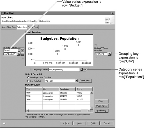
A chart displays data as one or more sets of points. In most chart types, you arrange points along the chart axes. For example, the basic bar chart in Figure 19-1 displays a set of bars that show budget values. The chart arranges the budget totals by year and enables a user to see the total budget growth for a group of cities.
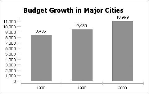
To build a chart, you organize your data points into sets of values that are called series. The two types of series are category and value. The category series determines what text, numbers, or dates you see on the x-axis. In the chart in Figure 19-1, the category series shows years. The value series, in a bar chart, determines the height of each bar, relative to the y-axis. In this chart, the values are budget values. The chart shows only one set of bars, so it uses only one value series.
The chart in Figure 19-2, however, displays three sets of bars. Each set displays the budget values for one city. This chart offers a different analysis from the single-series chart, showing that the New York budget dropped while the Chicago and Los Angeles budgets grew. The category series is the same as it was in the first chart. The chart still organizes the data on the x-axis by years. The three value series organize the budget totals by city.

The same principles of data organization apply to series in charts without axes. Figure 19-3 shows population information in a pie chart. The category series divides the pie into cities and the value series uses population values to determine the size of each city sector. The chart shows only one set of pie sectors, so it uses only one value series.

The chart in Figure 19-4, however, organizes the data into three sets of pie sectors. The three value series, one for each year, create three pies. The category series is the same as in the previous chart. The categories separate each pie into city sectors.

Now that you understand the series concepts, you learn how to specify the data to use for the series in your chart.
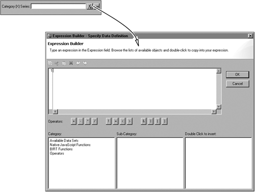
To define a series, you provide an expression. You add the expression to the chart builder. The expressions that you use in a chart are similar to the expressions that you use in a data field. For example, row[“Totals”] returns the value of the Totals column. This section assumes that you have read the information about expressions that appears earlier in this book.
Before you start to define expressions, you must link the chart element to a data set, as you did in the tutorial in Chapter 18, “Using a Chart in a Report.”
How to select a chart data set
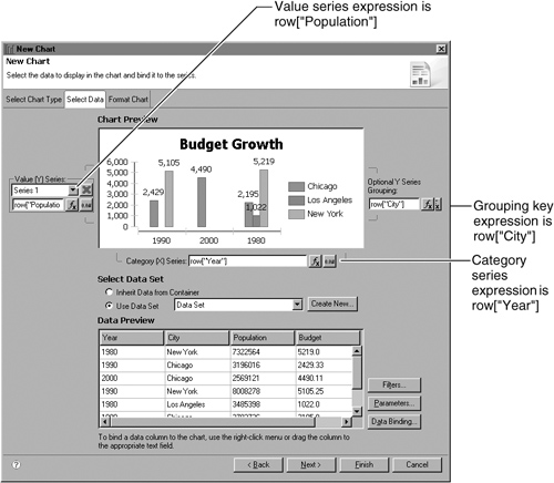
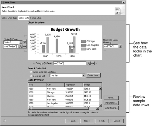
Navigate to the Select Data page of the chart builder. Figure 19-5 shows Select Data for a meter chart.
In Select Data Set, select an option:
To use the data set that is bound to the container element, such as a grid or table, in which the chart appears, select Inherit Data from Container.
To use a different data set, select Use Data Set, then select a data set from the drop-down list.
To build a new data set, select Use Data Set, and choose Create New.

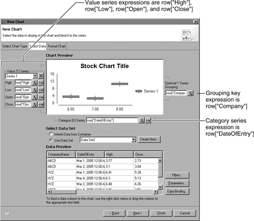
Data Preview shows some of the data for the data set. Reviewing sample data can help you decide which column to use for a series. For example, in Figure 19-6, Data Preview shows several columns of stock data.
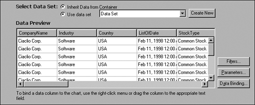
You can limit the data that the chart displays. To filter the data set, choose Filters. If you use a data set in which you defined parameters, you can review or change a parameter value. To see data set parameters, choose Parameters. You can also modify the column binding for the data in a chart. To see current binding settings, choose Binding.
BIRT charts process basic expressions, such as row[“Population”]. You cannot use an aggregate expression in a chart element. To use summary information in a chart, you must use a data source that includes summary data or create a query that calculates summary data from the values in the data source. After you retrieve or calculate the summary data, you can use a basic expression to set up that data in the chart. For example, the chart in Figure 19-7 displays the number of orders that sales representatives secured in one month.

The data for the chart appears in detail rows in the data source. Each order appears in a detail row that lists order information, such as the order number, the order date, the customer name, and the name of the sales representative who set up the order. To return the summary information, the query selects the sales representative names and aggregates the count of the order rows for each representative. Table 19-1 shows some sample rows from the data set that BIRT returns. For example, Barajas has eleven order rows in the original data. Castillo has six order rows. To create the chart, you include the aggregate field, COUNTofOrderID, in an expression, row[“COUNTofOrderID”].
The Select Data page in the chart builder is where you set up the series for a chart. You use one of three methods to provide a series expression:
Type an expression in the field, as shown in Figure 19-8.
Use Expression Builder to build an expression, as shown in Figure 19-9. You use Expression Builder to build chart expressions in the same way that you use it to build expressions for other report elements, such as data elements.
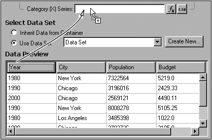
Select a column in the data preview, then drag it to the desired series field, as shown in Figure 19-10. You used this method in the tutorial.
An expression can include text, numeric, or date-and-time values. When you use a numeric or a date-and-time expression, you can apply number formatting to the values that the expression returns.
For a numeric expression, you can change the format in the following ways:
Add a prefix, such as a currency symbol, before the returned values.
Multiply values by a number, such as 100.
Add a suffix to a number value, such as the word million.
Determine the number of decimal places that numbers include.
Specify a number format pattern, such as #,###, which formats numbers with a thousands separator.
For a date-and-time expression, you can define one or more of the following attributes:
Type. You can use a standard date-and-time format, including Long, Short, Medium, and Full.
Details. You can specify that the format is Date or Date and Time.
Pattern. You can specify a date-and-time format pattern, such as MMMM to show only the month value or dddd to show only the day value, such as Wednesday.
How to format a numeric expression
 In the chart builder, to the right of the expression to format, choose Edit Format.
From the Data Type drop-down list, choose Number to see the number format options. Figure 19-11 shows the options.
To add a prefix, multiplier, or suffix, or to specify the number of decimal places to display, select Standard, then specify the format settings:
To add a number prefix, type the value in Prefix.
To multiply values by a number, type the number by which to multiply expression values in Multiplier.
To add a number suffix, type the value in Suffix.
To specify the number of decimal places to use, select the number in Fraction Digits.
To use a custom number pattern, select Advanced, then specify the format settings:
To multiply values by a number, type the number by which to multiply expression values in Multiplier.
To specify a number format pattern, type the pattern string in Pattern.
To use a custom fraction format, select Fraction, then specify the format settings:
Specify a delimiter symbol, such as / or :.
To add a prefix, type the value in Prefix.
To add a suffix, type the value in Suffix.
To define guidelines for representing fractions rather than using the default, select Approximate, then provide a suggested numerator or the suggested maximum number of denominator digits. For example, to show fractions with single-digit denominators, such as 1/2 or 3/8, supply 1 as the maximum number of denominator digits.
When you finish defining the format, choose OK.

How to format a date-and-time expression
- In the chart builder, to the right of the expression, choose Edit Format.
From the Data Type drop-down list, choose Date and Time to see the date-and-time format options. Figure 19-12 shows the options.
To use a predefined date or time format type, select Standard, then specify format options:
Select a format value in Type.
In Details, select Date or Date and Time.
To use a custom format pattern, select Advanced, then type the custom format string in Pattern.
When you finish defining the format, choose OK.

Each chart type uses series in a different way. For example, the value series in an area chart determines the upper border of a colored area, while the value series in a meter chart determines where a needle appears on a dial. The procedures in this section describe how to set up series expressions in each of the different chart types.
Area, bar, and line charts use series in similar ways. The category series determines how the chart arranges data on the x-axis. The expression that you choose determines what values the x-axis displays. The value series determines which values the chart plots on the y-axis. Each value series represents a set of data points, such as a colored section of the plot, a set of bars, or a line that connects data points.
To set up multiple sets of data points, such as multiple lines in a line chart or a number of colored plot sections, you can use multiple value series definitions. You can also use a grouping key to set up multiple sets. For example, the chart in Figure 19-13 uses a grouping key to define multiple sets of bars.

The data that the chart displays appears in Table 19-2.
Figure 19-14 shows the expressions to use to create the chart using data stored in this arrangement. The chart uses the category series expression to plot each year as a section on the x-axis and the values series expression to plot each population value as the top of a bar. The grouping key arranges values for each city in a set of bars of one color. The legend identifies the sets.
You can also create an area, bar, or line chart that uses multiple value series expressions. Multiple value series expressions enable you to organize all the data from one expression in one set of bars. For example, Figure 19-15 shows a chart with two sets of bars.

The chart in Figure 19-15 shows sales figures for different product categories at Fortune 500 companies and Fortune 1000 companies. The data that the chart displays appears in Table 19-3.
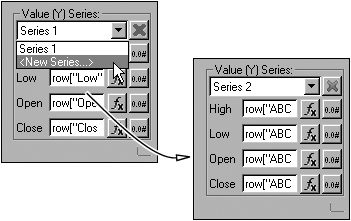
The category series expression is row[“Category”]. Each product category is a section on the x-axis. The two value series expressions are row[“F500 companies”] and row[“F1000 companies”]. The chart shows F500 values as one set of bars and F1000 values as a different set of bars. To provide more than one value series expression, you use the value series drop-down list. Select New Series, then use the expression field to supply the series expression, as shown in Figure 19-16. After you add one or more series, you use the drop-down list to navigate among the value series definitions.

A meter chart shows a data value as a needle that marks a position on a dial. You can create a chart that shows one or more needles on one dial or one that shows multiple dials, each displaying one needle. You cannot use multiple needles on multiple dials. Figure 19-17 shows two sample meter charts.

The meter value series specifies the needle value. The expression that you choose determines where on the dial the needle appears. To show multiple needles or meters, you can either use multiple meter value series expressions or use a grouping key.
A category series is not essential to a meter chart. You must, however, provide an expression in the category field. You can type a space that is enclosed by quotation marks in this field to satisfy this requirement.
For example, the chart in Figure 19-18 is a standard meter chart. Standard meter charts use only one needle for each meter. The chart uses population as the needle value and city as a grouping field. Because the chart builder requires a value in the category field, the chart designer provided '' '' as the category expression, even though it does not contribute to the chart.

The chart in Figure 19-18 uses the data in Table 19-4.
Figure 19-19 shows the expressions to use to create the chart. The chart uses the meter value series expression to plot each population value as a needle’s position on a dial. The chart uses the grouping key to set up a meter for each city. The legend identifies the meters. The category series expression is a blank string, “ ”.

You can also use multiple series definitions to create multiple meters or a meter with multiple needles. For example, the chart in Figure 19-20 is a superimposed meter chart that shows multiple needles in one meter. One needle shows interior temperature, and the other needle shows exterior temperature.
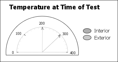
The chart in Figure 19-20 uses the data in Table 19-5.
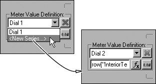
The first meter value series expression is row[“InteriorTemp”]. The second meter value series expression is row[“ExteriorTemp”]. The chart does not use a grouping key. Because the chart builder requires category field input, the chart designer used a blank expression, '' '', in the category field.
To provide more than one meter value series expression, you use the meter value series drop-down list. Select New Series, then use the expression field to supply the series expression, as shown in Figure 19-21. After you add one or more series, you use the drop-down list to navigate among the meter value series definitions.
In a pie chart, the category series defines how the chart divides the pie into sectors. The expression that you choose for the category series definition determines which sectors each pie displays. The value series is called a slice size series and determines the size of each sector in a pie. To show multiple pies, you can either use multiple slice size series definitions or use a grouping key that creates multiple pies from the values in one data column.
For example, the pie chart in Figure 19-22 shows product categories as pie sectors and uses sales totals to determine the size of each sector. The entire pie represents total overall sales.

The chart uses the data from the first two columns of Table 19-6.
Figure 19-23 shows the expressions to use to create the chart. The chart uses the category series expression to plot each product category as a sector of the pie. To determine the size of a pie sector, the chart uses the slice size expression. The chart legend identifies the sectors. You can also add the legend information to the data labels, as you did in the tutorial earlier in this book.

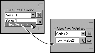
To display more than one pie, you can use a second slice size series expression. For example, to add data from the Value2 column as a second pie, you use row[“Value2”] as a second slice size series. The chart then shows one pie for the Value1 data and one pie for the Value2 data.
To provide more than one slice size expression, you use the slice size series drop-down list. Select New Series, then use the expression field to supply the series expression, as shown in Figure 19-24. After you add one or more series, you use the drop-down list to navigate among the slice size series.
You can also use a grouping key to show multiple pies. For example, the chart in Figure 19-25 shows a different pie for each year of sales data.

Table 19-7 shows the data that this chart displays.
To create a pie for each year and separate each pie into product category sectors, you use the row[“Category”] as the category series expression, row[“Sales”] as the slice size expression, and row[“Year”] as the grouping expression.
A scatter chart displays values along both the x-axis and the y-axis. A scatter chart data point represents the intersection of the two values. To show multiple sets of data points, you can either use multiple value series definitions or use a grouping key. For example, the chart in Figure 19-26 uses one value series to show budget and population values in different school districts in two cities.

The data for the chart appears in Table 19-8.
Figure 19-27 shows the expressions to use to set up the chart.
The chart uses the value series expression to place the dots on the y-axis and the category series expression to plot the dots along the x-axis. Each dot marks the intersection of a budget and population value. The grouping key creates two sets of dots, one for the districts in Chicago and one for the districts in Los Angeles.
In a stock chart, four different value series expressions provide the high, low, open, and close data. The category series expression arranges the values along the x-axis, typically along a date or time scale. To set up multiple sets of candlesticks, you can either define multiple value series definitions or use a grouping key. For example, the stock chart in Figure 19-28 shows stock data for two companies.

The data for the chart appears in Table 19-9.
Table 19-9. Data for a stock chart that uses a grouping key
CompanyName | DateOf Entry | High | Close | Low | Open |
|---|---|---|---|---|---|
ABCD | 3/1/2005 | 3.77 | 2.73 | 2 | 2.1 |
ABCD | 3/2/2005 | 3.1 | 3.04 | 2.6 | 2.71 |
XYZ | 3/1/2005 | 6.41 | 5.28 | 5.13 | 5.19 |
XYZ | 3/4/2005 | 6.3 | 5.13 | 5.13 | 6.21 |
XYZ | 3/2/2005 | 6.48 | 6.26 | 5.16 | 5.19 |
ABCD | 3/4/2005 | 3.86 | 3.56 | 2.74 | 2.79 |
XYZ | 3/3/2005 | 6.31 | 6.17 | 5.14 | 6.3 |
ABCD | 3/3/2005 | 2.8 | 2.78 | 2.65 | 2.66 |
Figure 19-29 shows the expressions to use to create the chart. The chart uses the value series expressions to set up the candlesticks and the category series expression to arrange the candlesticks in chronological order along the x-axis. The grouping key creates one set of candlesticks for each company.
You can also use multiple sets of value series expressions to create multiple sets of candlesticks. For example, you can create the same chart using data in a structure that looks similar to Table 19-10.
The table must also include fields for ABCDHigh, ABCDLow, and ABCDClose. Using this data, you use the following expressions to set up the chart:
The category series definition is row["DateOfEntry"].
The first set of value series expressions uses row["ABCDHigh"], row["ABCDLow"], row["ABCDOpen"], and row["ABCDClose"].
The second set of value series expressions uses row["XYZHigh"], row["XYZLow"], row["XYZOpen"], and row["XYZClose"].
To define multiple sets of value series expressions in a stock chart, you use the value series drop-down list. Select New Series, then use the expression fields to supply the series expressions, as shown in Figure 19-30. After you add one or more sets of series expressions, you can use the drop-down list to navigate among the value series.
A combination chart displays value series of different types. You must use at least two value series. For example, the chart in Figure 19-31 uses a line chart series and a bar chart series.

The chart must use multiple value series definitions to define the value series for each chart type. For example, the chart in Figure 19-31 uses one bar chart value series and one line chart value series. Both series use the same category series definition.
You can combine only area, bar, line, and stock chart series in a chart. To create the combination chart, you first create a chart of one type, such as a line chart. Next, you define the series expressions, and then you change the type of one of the series, as described in Chapter 20, “Laying Out and Formatting a Chart.”
When you create a chart, the category data appears in the order in which the query returns it. You can sort the data so that it appears in a different order on an axis or dial or in a pie. For example, you can show cities along the x-axis in alphabetical order or customer ranks in descending numeric order around a pie. You can sort the data in an ascending or a descending sort order. To sort data, navigate to the category series section of Format Chart, then select Ascending or Descending. Figure 19-32 shows the category series section of Format Chart for a bar chart.

You can group category data in a chart. Grouping data enables you to plot chart data using different category values from those that the expression returns. You can group text, numeric, or date-and-time data.
When you group text data, you use an interval to set up the groups. The interval that you choose determines how many rows compose each group. For example, if you use an interval of 20, each group contains 20 rows.
When you group numeric data, you use a value to set up the groups. The value that you choose determines how the chart builder selects rows for a group. The chart builder uses a base value of 1 to create numeric groups. For example, if you use a value of 20, the first group contains rows with values between 1 and 20, the second group contains rows with values between 21 and 40, and so on. If the chart does not include a value in a group section, that section does not appear in the report. If you group order numbers 150–300 using a value of 20, the first group section that appears in the chart is 141–160.
For example, Table 19-11 displays budget data for three cities.
To group using the Year field, you enable grouping, specify the data type of the field, and define a grouping interval. The data type that you select determines how the chart builder creates the groups:
If Year is a text field, selecting an interval value of 3 creates three groups. The first group includes the first three rows in the table, the second group contains rows four through six, and the third group contains the last three rows.
When you group text values, you must use a regular grouping interval. You cannot create groups of varied sizes or use a field value to create a group. To create sensible groups in the chart, you must arrange the data in your data source before you create the chart. To use more complicated grouping, you should use your query to group data, then you can use those grouped values in the chart.
If Year is a numeric field, selecting an interval value of 3 creates two groups. The first group includes the 1998 rows, because grouping by three from a base value of 1 creates one group that ends with 1998. The second group contains the 1999 rows and the 2000 rows.
After you define how to create the groups, you must select an aggregate expression that determines how the chart builder combines the values in each group. You can average or sum the group values.
How to group category series data
Navigate to the category series section of Format Chart. In Grouping, select Enabled to see the grouping options shown in Figure 19-33.
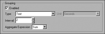
Use the following options to set up a group:
In Type, select Text, Numeric, or Date and Time. If you select Date and Time, you can specify the units to use to form the groups, such as Minutes.
In Interval, select a number that represents the size of the groups to create. For example, to group three-row sequences of text data, select 3. To group numeric data in sections of four, select 4.
In Aggregate Expression, select the function to use to aggregate the data in the group. You can select Average or Sum.
All types of charts except pie and meter charts use an x-axis and at least one y-axis. Pie and meter charts do not use visible axes. Typically, a y-axis is vertical and displays values, and an x-axis is horizontal and displays categories. Figure 19-34 shows the parts of an axis. You can make the following changes to the way axes display data:
Make an x-axis a value axis so it displays a value scale.
Change the number format of the divisions and labels on a numerical axis.
Change the scale of the axis to compress or expand the data.
Modify the scale of the data an axis displays.
Add a second y-axis.
Switch the x- and y-axes, so the x-axis is vertical, and the y-axis is horizontal.

Area, bar, line, pie, scatter, and stock charts use two types of axes:
A value axis positions data relative to the axis marks. The value of a data point determines where it appears on a value axis. You plot numeric and date-and-time data on a value axis. You do not plot text data on a value axis.
A category axis does not use a value scale. The segments of a category axis are regular and do not correspond to numerical values. Typically, the values on a category axis appear in the order in which they appear in the data source. You can also sort category data in ascending or descending order.
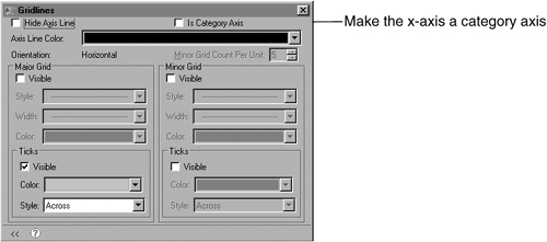
In most charts with axes, the y-axis is a value axis, and the x-axis is a category axis. By default, the x-axis of a scatter chart is a value axis, but you can make it a category axis. Navigate to the x-axis section of Format Chart, then choose Gridlines and select Is Category Axis. Figure 19-35 shows the Gridlines settings.
The axis data type and format determine how the axis arranges the data that appears on the axis. To set the axis type, you select one of the following settings:
Linear. A linear axis spaces values evenly. The distance between ticks and the numeric value that the distance represents are regular.
Logarithmic. A logarithmic axis spaces values on a scale that is based on multiplication rather than addition. Each step on a logarithmic plot is a multiple of 10.
Date and time. A date-and-time axis shows data on a date or time scale.
Text. A text axis displays text values only. A text axis spaces values evenly, and the location of a data point on a text axis does not indicate its size or value. Typically, a text axis is a category axis.
On axes that display numeric or date-and-time data, you can set the number format of the axis. The number format determines the format of the axis labels.
How to set the data type and format of an axis
On Format Chart, navigate to the axis section, then use the Type settings to change the data type of the axis. Figure 19-36 shows axis options.

When you set an axis intersection setting, you define at what value the axis joins the opposing axis. You can select one of the following values:
To have the axis intersect the opposing axis at the opposing axis’s minimum value, select Min.
To have the axis intersect the opposing axis at the opposing axis’s maximum value, select Max.
To have the axis intersect the opposing axis at a value that you specify, select Value.
Typically, a chart displays each axis intersecting the opposing axis at the minimum value. Figure 19-37 shows the results of selecting Min, Max, and Value for the y-axis of a scatter chart.

To set the intersection of an axis, on Format Chart, navigate to the page for that axis. In Origin, select Min, Max, or Value as the intersection setting. If you select Value, you must provide a value at which to join the axes.
The scale of an axis determines the range of values that a linear or logarithmic axis displays. When you first create a chart, the chart builder selects a maximum and a minimum axis value to fit the data that the axis displays. Typically, the chart builder selects a minimum value that is just below the lowest axis value and a maximum value that is just higher than the highest axis value, rounding down or up to the nearest major unit, so the markings on the axis span the range of data that it displays.
You can use axis scale to change the following settings:
The minimum and maximum values for an axis.
The span between major grid values and the number of minor grid marks between major grid values on the axis. The distance between major grid marks is the step value. The number of minor grid marks is the minor grid count.
For example, in Figure 19-38, the axis on the left shows values from 0 to 1200. The step value is 200, so the major grid marks indicate values of 200, 400, and so on. The minor grid count is five grid marks for each major unit. The axis on the right shows values from 0 to 800. The step value is 100, so the major grid marks indicate 100, 200, and so on. The minor grid count is two grid marks for each major unit.

You can set the scale of value axes only. Category axes do not support scale changes. The following procedures describe how to set the scale of an x-axis. To set the scale of a y-axis, complete the same steps on the y-axis page. Most scale items appear in the Scale dialog. To set the number of minor grid marks per major unit, you use the Gridlines dialog.
How to define the scale of an axis
On Format Chart, navigate to the section for the axis to modify, then choose Scale. Use the Scale options to change the range and divisions of data on an axis. Figure 19-39 shows the scale options.

How to define the minor grid count
On Format Chart, navigate to the section for the axis to modify, then choose Gridlines. Use Minor grid count per unit to set the number of minor grid marks between two major grid marks, as shown in Figure 19-40.

You can use more than one y-axis in a chart. Additional y-axes can use a different scale from the first y-axis. After you add the second axis, you must define the data that appears on that axis. Both y-axes use the same category expression and grouping key. To create a second y-axis, you use Select Chart Type. In Multiple Y Axis, select More Axes. Figure 19-41 shows Select Chart Type.

After you enable multiple axes, you must specify what data the additional axis displays. You must add a series expression for the axis. The category and grouping expressions apply to all y-axes. Figure 19-42 shows how to provide the data expression for the second y-axis.

You can switch the chart axes, so the x-axis is vertical and the y-axis is horizontal. Figure 19-43 shows a bar chart with transposed axes. You can transpose the axes of two-dimensional charts and charts with depth. You cannot transpose the axes in a three-dimensional chart. To transpose axes, navigate to Select Chart Type, then select Flip Axis.

As you set up the expressions that specify the data for your chart, you can use the chart builder to review the current chart setup and the available data columns. Figure 19-44 shows the data preview areas for a bar chart.
You can change the behavior of the sample chart that the chart builder displays. By default, the sample chart uses data from the data set that you have selected, as in the previous illustration. You can make the chart builder display randomly generated sample data, as in Figure 19-45. For example, if you want to design a chart before you connect to a production data source, you can use this option to see how a chart might appear using the settings that you choose.

You can also change the number of data rows that appear in chart builder. By default, the data preview section shows six rows of data. You can display more or fewer rows.
How to change chart preview preferences
Choose Window→Preferences.
Expand the Report Design list item, then choose Chart to see the options shown in Figure 19-46.
To have the chart builder use randomly selected data in the chart preview window, deselect Enable Live Preview.
To set the number of rows that Data Preview displays, type a value in the field.
Choose Finish.

Now you understand how to set up and manipulate the data that you use in a chart. The next chapter describes how to customize the appearance of a chart.