
Charts include many different visual elements. You can customize the appearance of most chart elements. To clarify the presentation of data or to create a more pleasing composition, you can rearrange the chart layout. For example, you can change where the chart title appears or add padding between a series of bars and the axis on which they are arranged.
You can also change the color and style of the chart parts. For example, you might need to modify a chart to use your company’s standard color scheme. You can outline or add a background color to most chart parts, such as the plot, legend, or labels. You can also change the color and shape of the series elements, such as the pies in a pie chart or the candlesticks in a stock chart.
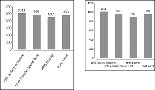
Figure 20-1 identifies some parts of a basic bar chart that uses default settings.

The titles and markers in Figure 20-1 are typical of most charts. These elements often help users to interpret the information that the chart displays, but you can remove or move them if necessary. You can also add elements, such as gridlines, that extend across the plot or data point labels to show the exact value of each bar. You can make the following types of changes to the chart appearance:
Laying out and formatting the chart area. You can change the background color or outline of different chart areas or modify the padding between chart areas.
Formatting an axis. You can adjust the line style of an axis. You can also modify the text style, position, coloring, or outline of axis labels or titles.
Formatting a series. You can change the type of a series, such as line or bar, and the color or style of the series markers. You can also change attributes that are specific to each series type.
Using styles to format a chart. You can use the property editor to apply a style to a chart.
You can adjust the formatting, such as coloring and outlines, of the chart background and peripheral areas. Figure 20-2 shows the chart areas to which you can apply color or line-style formatting or layout changes.

To change the size and placement of the chart area, the title, the legend, and the plot, you can adjust the inset spaces between them. For example, you can add padding between the title and the plot or increase the size of the chart area without increasing the size of the other areas.
In a chart with depth or a three-dimensional chart, you can also modify the color of the walls and floor, which stretch between the axes. When you first create a chart, the walls and floor are transparent.
The chart background can display a standard color, a custom color, a color gradient, or an image. You can also use a transparent background. A transparent background displays the background color of the report page on which it appears.
How to set a chart’s background color
In the chart builder, choose Format Chart, then navigate to the Chart Area section. Use the list on the left to navigate among sections. Figure 20-3 shows the Chart Area section.
Choose Background to open the color picker.
Figure 20-4 shows the color picker.
Use the color picker to select a background color or image:
To use one of the basic colors, select a colored square.
To use a transparent background, use the Opacity scroll tool to set the opacity to 0, then press Enter.
To use a gradient color, choose Gradient, then use the gradient editor to select a start color, end color, and rotation for the gradient pattern. Figure 20-5 shows the gradient editor.
To use a custom color, choose Custom Color to show the custom color list, then select a color.
To use a background image, choose Image, then use Open to navigate to and select the image to use.
The background color or image appears in Background on the chart builder.
To apply the color to the chart, choose Finish.


On the color picker, choose Define Custom Colors to show the custom color picker, as shown in Figure 20-6.
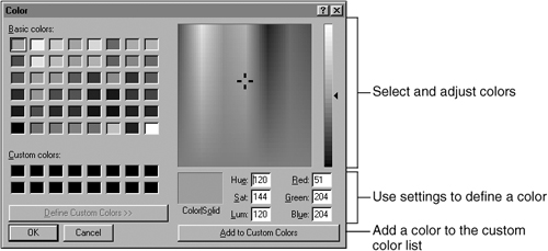
Use the color picker options to select or define a custom color. When you finish, choose Add to Custom Colors, then choose OK.
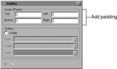
An outline can highlight the chart area. To add an outline, navigate to the Chart Area section of Format Chart, then choose Outline to see the outline options, as shown in Figure 20-7.

Select Visible to add the outline, then use the Style, Width, and Color fields to change the appearance of the outline.
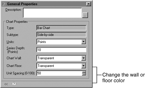
In a chart with depth or a three-dimensional chart, you can modify the color of the chart wall or floor. The default wall and floor color setting is transparent. Figure 20-8 shows where the wall and floor appear in a sample bar chart with depth.

Figure 20-9 shows where the wall and floor appear in a three-dimensional chart.

How to set the wall or floor color of a chart with depth or a three-dimensional chart
Navigate to the Chart Area section of Format Chart, then choose General Properties. Use the settings shown in Figure 20-10 to set a wall or floor color.
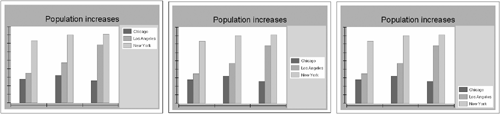
You can change the spacing around a chart area or between two chart areas. The settings around and between chart areas are called inset settings. To add more space, use a higher inset setting. For example, Figure 20-11 shows the effect of using two different chart top inset settings. In the second chart, the top section of the chart area is larger.

By default, inset values appear in points. To specify chart insets in a different unit, such as pixels, inches, or centimeters, use the chart builder to select the chart unit. The unit that you choose applies to chart settings, such as insets, or the width of series in three-dimensional charts and charts with depth.
To set the chart unit, navigate to the Chart Area section of Format Chart, then choose General Properties and select a unit, as shown in Figure 20-12.

How to set chart area insets
Navigate to the Chart Area section of Format Chart, then choose Outline to see inset options, as shown in Figure 20-13. Type a value in one or more of the Insets fields.
You can rearrange or format the plot, legend, or title area in a chart. Each area includes a client or text section in which data or text appears. For example, Figure 20-14 shows a chart with the legend area outlined. The text area in the legend uses a colored background.

You can set the background color and outline attributes of a chart area. To highlight the plot, legend, or title, you can add a shadow behind that area. For example, Figure 20-15 shows a shadow behind title text. A shadow uses basic or custom colors. You cannot use a gradient color as a shadow.

When you create a chart, the chart builder inserts the plot, legend, and title using default placement and size. You can change the location of these chart parts, add inset padding to separate a part from another part, or change the way a part resizes when the chart expands or contracts. You adjust the layout using the following settings:
Visibility
To hide a chart area, make the area invisible. For example, Figure 20-16 shows a chart that hides the title and the legend.
To change where the plot, legend, or title appears, change the anchoring. For example, Figure 20-17 shows some of the different anchoring options for the legend text area within the legend area.
Anchor positions are based on directions. For example, the first example chart in Figure 20-17 uses North_East.
Insets
To adjust the padding around a chart area, modify the inset settings. For example, Figure 20-18 shows the effect of increasing the top inset setting for the plot. The chart on the right uses a higher inset setting, so there is more space between the top of the plot and other chart parts, such as the title.
You also use inset settings to modify where the client area or text area appears within a chart area. For example, to change where series markers, such as bars in a bar chart, appear within the plot, change the plot client area insets. Figure 20-19 shows the effect of increasing the left inset for a bar chart plot client area. The chart on the right uses a higher inset setting, so more space appears between the plot client area, where the bars appear, and the edge of the rest of the plot.


The following sections describe how to arrange and format the chart plot, legend, and title.
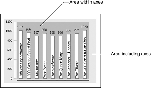
When you adjust the plot area, you can modify the entire plot area, which includes the axes, or only the area that appears within the axes. Figure 20-20 shows the two sections of the plot in a sample bar chart. The lighter area shows the area including axes. The smaller, darker area shows the area within the axes. To use one color across the entire plot, you must select that color in both areas.
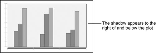
The default background color for the plot is transparent. You can also use a standard color, a custom color, a color gradient, or an image. Also, you can outline the plot and change the line color, style, and width. To highlight the plot area within the axes, you can use a shadow, similar to the one in Figure 20-21.
The following procedures describe how to set the plot color, outline, or shadow.
How to set a background color for the plot
Navigate to the Plot section of Format Chart. Figure 20-22 shows the Plot section options. Choose Background for either Area Including Axes or Area Within Axes, then use the color picker to select a background color. To apply the color to the plot, choose Finish.

How to outline the plot area
Navigate to the Plot section of Format Chart.
Select Visible in Outline for either the Area Including Axes or the Area Within Axes.
To change the outline attributes, choose Area Format to see the options shown in Figure 20-23. Use the settings to modify the outline.
When you are done, close Area Format, then choose Finish on the chart builder to save your changes.

How to shadow the plot area within the axes
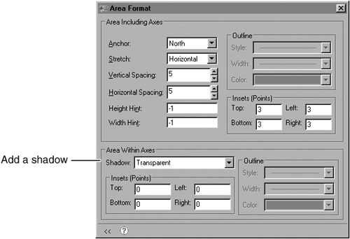
Navigate to the Plot section of Format Chart, then choose Area Format, which is shown in Figure 20-24. Choose Shadow, then use the color picker to select a shadow color.
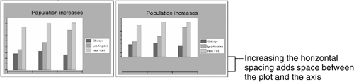
You can use anchor settings to modify where the plot appears within the chart and inset settings to determine how much padding appears between the plot and other chart features. You can use plot spacing settings to modify the space between the plot area and the chart axes. Plot spacing includes horizontal and vertical settings. For example, Figure 20-25 shows the effect of increasing the horizontal spacing in a bar chart. In the second chart, the space between the horizontal axis and the bottom edge of the plot is much larger.
How to adjust the placement and padding of a chart plot
Navigate to the Plot section of Format Chart, then choose Area Format to see the options that are shown in Figure 20-26. Use Area Format to modify the padding or spacing settings.

You can use the height hint and width hint settings to suggest a minimum height and width for the plot. In most cases, BIRT Report Designer uses the values you supply to size the plot. If you set a plot size that is too large to fit in the chart, or if other chart elements such as the legend or a title are too large to accommodate the suggested plot size, BIRT Report Designer ignores the settings.
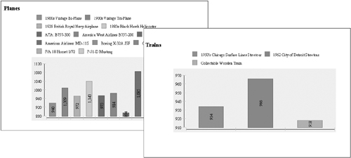
A height or width hint is most useful in a report that uses multiple charts, such as a report with different chart elements or a report that includes a chart element in a group section. Because chart sizing is dynamic, one chart element can produce multiple charts with plots of different sizes, as shown in Figure 20-27.

Height and width hints help you to regulate the plot sizes in a group of charts. For example, the illustrations in Figure 20-28 show the result of setting a height hint in a bar chart.
To set a height or width hint, navigate to the Plot section of Format Chart, then choose Area Format. Use the settings to provide a value for Height Hint or Width Hint, as shown in Figure 20-29.

When you first create a chart, it displays a title using default text. The title uses a transparent background and does not include an outline or a shadow.
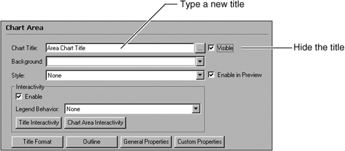
To hide or change the title text, navigate to the Chart Area section of Format Chart. Figure 20-30 shows the Chart Area options. Type a new title in the text box. To hide the title, deselect Visible.
You can modify the appearance of the title text. For example, you can change the font, size, color, style, or alignment of the text. You can also set the format to strike through text or change the rotation of the title to display text at an angle.
How to modify title text
Navigate to the Chart Area section of Format Chart.
To format the title, choose Title Format, then choose Invoke Font Editor to open the font editor, as shown in Figure 20-31.
Use the font editor settings shown in Figure 20-32 to modify the font.
To accept your changes, choose OK, close Title Format, and choose Finish on the chart builder.


When you apply a background color or outline to a chart title, you can work with the entire title area or with only the text area. Figure 20-33 shows the difference between the two areas in a sample chart. If you apply a background color to the title area, the same color appears in the text area unless you set a new background color for the text. You can add a shadow only to the text area. You cannot shadow the entire title area.

To add a background color, outline, or shadow to the chart title, navigate to the Chart Area section of Format Chart, then choose Title Format to see the options that are shown in Figure 20-34. Use the settings to modify the entire title area or only the text area.

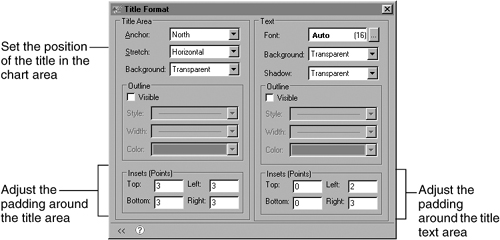
You can use anchor settings to modify where the title appears within the chart. To determine how much padding appears between the title or title text areas and other chart features, use the inset settings.
To adjust the placement and padding of a chart title, navigate to the Chart Area section of Format Chart, then choose Title Format to see the options shown in Figure 20-35. Use the settings to adjust the title.
By default, a chart displays a legend. The legend uses a transparent background and does not include an outline or a shadow. To highlight the legend area, you can add a background color, outline, or shadow. You can hide the legend or change its position in the chart area, and you can add a legend title or modify legend-text properties, such as the font size.
When you apply a background color or outline to a chart legend, you can work with the entire legend area or with the text area only. Figure 20-36 shows the difference between the two areas in a sample chart. If you apply a background color to the legend area, the color also appears in the text area, unless you set a background color in the text area that overrides the legend-area settings. You can add a shadow only to the text area. You cannot shadow the entire legend area.

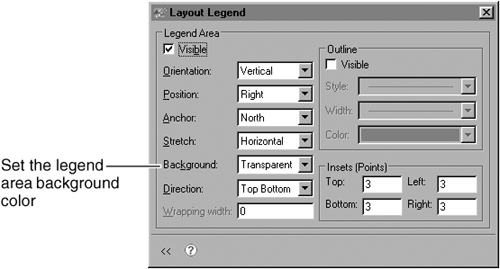
How to set the background color of a legend
To set the background color of the legend text area, use the Legend section of Format Chart. Figure 20-37 shows the Legend section options.

To set the background color of the entire legend area, choose Layout from the Legend section, then use Layout Legend, as shown in Figure 20-38.
How to add an outline or a shadow to a legend
To outline or shadow the legend text area, navigate to the Legend section of Format Chart, then choose Text Format. Use the settings on Format Legend Text to add an outline or shadow, as shown in Figure 20-39.

To add an outline to the legend area, navigate to the Legend section of Format Chart and choose Layout, then use the settings on Layout Legend to add or modify the outline, as shown in Figure 20-40.

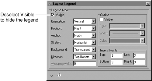
To hide the legend, navigate to the Legend section of Format Chart, then choose Layout. Deselect Visible, as shown in Figure 20-41.
You use anchor settings to modify where the legend appears within the chart. To determine how much padding appears between the legend or legend text areas and other chart features, use the inset settings.
To adjust the position of the entire legend area, rather than the client area where the legend items appear, change the legend-position setting. You position a legend relative to the plot. For example, Figure 20-42 shows different legend positions in a sample chart.
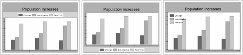
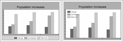
You can also organize legend items within the legend client area. For example, in Figure 20-43, the chart on the left shows legend items arranged horizontally. The chart on the right shows legend items arranged vertically. To adjust the positions of legend items in the legend-client area, set the legend orientation.
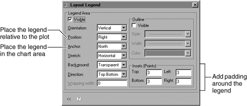
How to adjust the placement and padding of a chart legend
Navigate to the Legend section of Format Chart, then choose Layout. Use the settings on Layout Legend to pad or place the legend, as shown in Figure 20-44.
How to arrange legend items horizontally or vertically
Navigate to the Legend section of Format Chart, then choose Layout. Select an option in Orientation, as shown in Figure 20-45.

In a legend, you can display the value of a series item as well as the item name. To add value information to a legend, navigate to the Legend area of Format Chart, then select Show Value, as shown in Figure 20-46.

You can change the font style and size of the legend text. If you use more than one series, you can add a separator line between the items in one series and the items in the next. You can also enable text wrapping. To wrap legend text, you specify a maximum width for legend items. Items that extend beyond the wrapping width appear on multiple lines in the legend.
How to wrap legend text
Navigate to the Legend section of Format Chart and choose Layout. On Layout Legend, provide a Wrapping Width value to determine the maximum width for legend items.
How to format the legend text
Navigate to the Legend section of Format Chart and choose Text Format, then choose Invoke Font Editor to open the font editor, as shown in Figure 20-47. Use the font editor to modify the font attributes.

You can use a title for the chart legend. When you first add the title, it uses default font settings and appears above the list of legend items. You can change the font style and color of the title. You can also add a title outline, background color, or shadow, or position the title below, to the left, or to the right of the legend text.
How to add and format the title of the legend
Navigate to the Legend section of Format Chart. Figure 20-48 shows the Legend section options. Select Visible to show the title, then type the title text.

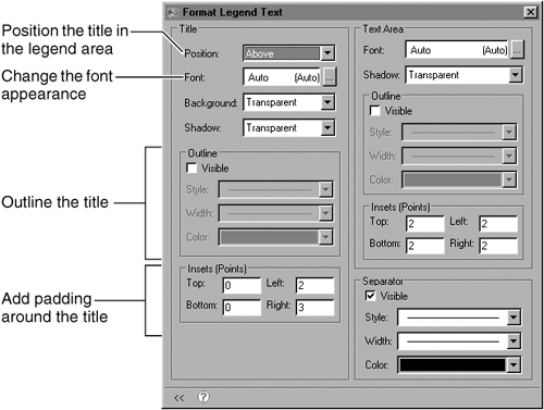
To format the title, choose Text Format. Then use the settings that are shown in Figure 20-49 to modify the title position or appearance.
When you format an axis, you work with titles, markers, lines, and labels. You can hide or reposition an axis element. For example, you can delete the title for an axis or move the axis tick marks. You can also change the color or style of an element, add an outline, or change the padding.
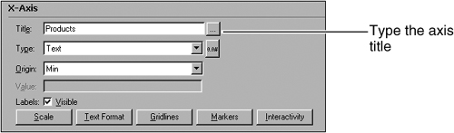
In an area, bar, line, scatter, or stock chart, you can add an x-axis or y-axis title. Navigate to the Format Chart section for the axis, as shown in Figure 20-50, then provide the title text. After you add a title, you can modify the title position, outline, padding, or text style. Navigate to the Format Chart section for the axis, and choose Text Format to see the options in Figure 20-51. Select Visible, then position and format the text.

Axis markers highlight numbers or ranges on two-dimensional charts or charts with depth. You can use the following types of markers:
A marker line is a line that extends across the plot from a point on the axis. You specify on what axis and from what value to draw the line.
A marker range is a rectangular area that highlights a range of values. You specify on what axis and between what values to draw the rectangle.
For example, Figure 20-52 shows a marker line and a marker range. Both markers highlight points on the y-axis. The marker line uses a label to show the marker value. You can change the style or color of the marker, change label text, or hide labels. You should only add a marker to an x-axis if it shows numeric or date-and-time data. Adding a marker to an axis that shows text values as categories does not help users read the chart.
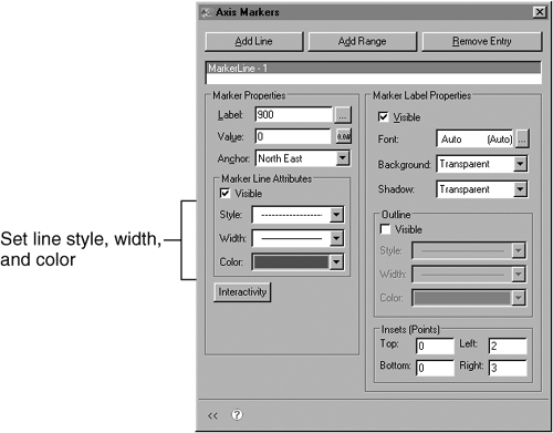
To create and format an axis marker, you use Markers. Navigate to the Format Chart section for the axis to which you want to add a marker, then choose Markers to see the options shown in Figure 20-53.

To create a marker line, choose Add Line. The marker appears in the marker list, as shown in Figure 20-54. In Value, type the value at which the line should start. To create an axis marker range, choose Add Range, then set the span of values the marker covers. In Start Value, type the value at which to begin the range. In End Value, type the value at which to end the range.

When you first create a marker, the marker uses default formatting and displays a label to identify the axis point or range that the marker highlights. You can adjust the attributes of a marker line, or change the fill color or outline of a marker range. You can also hide or format the label. To format a marker line, use the line-format settings, which are shown in Figure 20-55.
To format a marker range, use the range format settings that are shown in Figure 20-56.

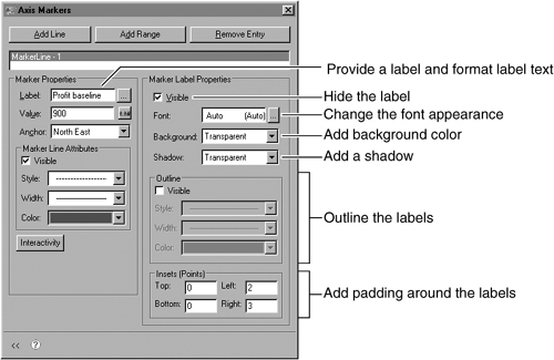
To hide or format a marker label, select the name of the line or range to format in the marker list, then use the settings to modify the label text, as shown in Figure 20-57.
When you first create a chart with axes, the axes use default line styles. You can modify the line style of an axis. Tick marks, which highlight points on the axis, also use default line styles and colors. You can modify the line style and position of the axis tick marks. Major ticks mark large intervals on the axis. Minor ticks mark smaller intervals. Typically, when you first create a chart, the axes use major ticks that are positioned across an axis. You can also position ticks to the left or right of a vertical axis or above or below a horizontal axis. Figure 20-58 shows different tick settings for a y-axis.

You can also add gridlines, which extend from an axis and span the plot area. For example, Figure 20-59 shows a chart that uses y-axis gridlines to clarify the data points. When you add major or minor gridlines to an axis, the chart includes a gridline for each major or minor interval on the axis.

Navigate to the Format Chart section for the axis, then choose Gridlines. Use the Gridlines settings to format the axis line, as shown in Figure 20-60.

How to modify axis tick marks
Navigate to the Format Chart section for the axis, then choose Gridlines. Use the Gridlines settings to format the tick marks, as shown in Figure 20-61. You can modify major or minor tick mark settings.
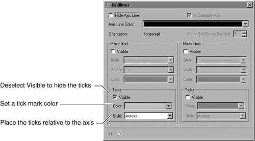
How to add or modify gridlines
Navigate to the Format Chart section for the axis, then choose Gridlines. Use the settings to add or change the axis gridlines, as shown in Figure 20-62. You can modify major or minor division settings.

By default, a chart displays labels to the left of a vertical axis and below a horizontal axis, as shown in Figure 20-63.

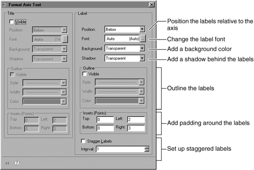
You can hide or reposition the labels on an axis. For example, you can show the labels on the y-axis to the right of the axis rather than the left, or rotate the labels on the x-axis so that they are easier to read. You can also modify the label font; add a background color, shadow, or outline; or change the padding around the labels.
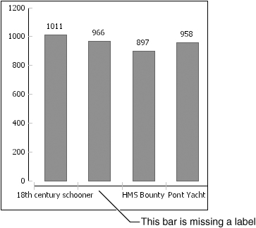
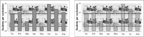
Sometimes, a chart displays so many values on an axis that the label text overlaps and becomes illegible. In this case, the chart builder drops some of the axis labels. Figure 20-64 shows a chart in which labels have dropped. In the chart, only three of four x-axis labels appear. The chart dropped the second label, because it overlapped the neighboring labels.
To fix this problem, you can rotate the labels or stagger them, so they do not overlap. Figure 20-65 shows the two solutions on an x-axis. In the chart on the left, the chart developer rotated the x-axis labels to fit all the labels in the space. The chart on the right uses staggered labels to display all axis categories.
You can also skip labels. For example, in Figure 20-66, the chart on the left shows all labels. The chart on the right skips every other label. To skip labels, set the interval at which labels should appear. For example, to show every other label, use an interval of 2. To show every fifth label, use an interval of 5.

To hide the axis labels, navigate to the Format Chart section for the axis, then deselect Visible. Figure 20-67 shows the Format Chart options for an axis.

Navigate to the Format Chart section for the axis, then choose Text Format. Use the Text Format options to update the position or style of the labels, as shown in Figure 20-68.
Most charts use value series of the same series type. For example, you can display three value series as three lines on a line chart. To create a combination chart that shows different series types in the same chart, you change the type of a series. You can also hide a series, so the chart includes data for that series but does not display it.
Some series changes apply to series of all chart types:
In value or category series of all chart types, you can set the color palette that series items use.
To value series of all chart types, you can add a trendline. You can also add a trendline to the category series in a scatter chart, because a scatter chart category series displays values.
Otherwise, the type of series determines what formatting options you can apply for that series. For example, in a series with depth, you can set the depth of the series, such as the depth of bars in a bar chart with depth. In a pie chart, you can explode the pie sectors from the center of the pie or add a pie sector outline.
To identify the data points in a series, you use data point labels. You format data point labels as you do other labels, specifying the position, style, outline, and insets settings. You can also determine which data the labels display and select a number or text format.
You can change the type of a value series in an area, bar, line, or stock chart. To change all the value series in a chart, change the chart type. To create a combination chart that displays value series of different types, you change the type of one of the series. You can combine only area, bar, line, and stock-chart series in a chart. To change the type of a series, navigate to the Series section of Format Chart, and select a new series type, as shown in Figure 20-69.

You can hide a series in a chart. A hidden series contributes data but does not appear in the chart. For example, you might want to use a series to contribute to a trendline without displaying the series data points. Typically, you hide a value series rather than a category series.
To hide a series, navigate to the Series section of Format Chart, and deselect Visible for the series, as shown in Figure 20-70.

You can make a chart series translucent so you can see an image or color behind the chart data. For example, Figure 20-71 shows two versions of a chart that uses an image as the plot background. The chart on the left uses a solid series. The chart on the right uses a translucent series.
To make a series translucent, navigate to the Series section of Format Chart, and select Translucent for the series.
You can specify which colors a series uses. Charts with axes, such as line and stock charts, use varied colors to distinguish between different value series. When a bar chart uses more than one set of bars, the default behavior is to show each set in a different color. If a bar chart uses only one set of bars, the bars are the same color. Figure 20-72 shows charts using the default settings.
In charts with axes, you can choose to color the chart by category series instead. This is useful when you have only one value series, but you want to show variously colored series elements, as in the chart in Figure 20-73. The chart uses one value series but shows each bar in the series in a different color. Note that coloring the chart by category series also displays the category series items, rather than the value series items, in the legend.

Pie charts and meter charts work differently. By default, a bar or a meter chart varies the category series colors to show each pie sector or needle in a different color, as shown in Figure 20-74.
Coloring by category series enables you to show all the sectors in a pie or all the needles on a meter in the same color. For example, Figure 20-75 shows a similar pie chart, colored by category series.

To determine which data the legend displays, navigate to the Series section of Format Chart, then use Color By to select Value Series or Categories, as shown in Figure 20-76.

When you create a chart, it uses default colors for series elements. To select different colors, you modify the series palette. The chart uses the colors that you select in the order in which they are in the palette list. If the chart displays more series elements than there are colors in the palette, it uses some colors more than once.
How to specify the palette for a category series
Navigate to the Category Series section of Format Chart, then choose Series Palette to see the options that are shown in Figure 20-77. Use the settings to modify the series palette:
To add a new color, select the color drop-down list to the right of Add, and use the color picker to select or create a color. When you finish, choose Add.
To remove a color, select the color in the list, and choose Remove.
To modify a color, select it, then use the color picker to select or create a color.
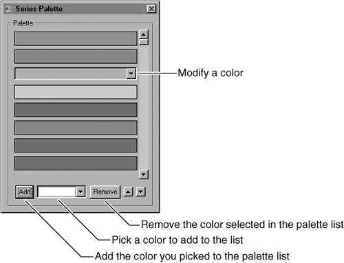
When you finish adjusting the color palette, close Series Palette, then choose Finish in the chart builder.
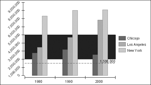
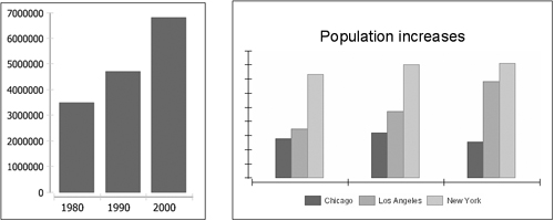
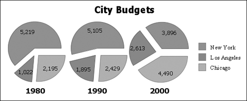
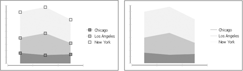
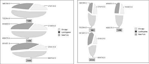
A curve-fitting line is a graphical representation of a trend in data. You can use a curve-fitting line to detect patterns in data or to predict future values. For example, the chart in Figure 20-78 uses curve-fitting lines to highlight population trends in several cities. You can use the trendlines to estimate population in the years after 2000. The population for Los Angeles, for example, is growing sharply, while the population in New York has increased less dramatically.

You use curve-fitting lines in two-dimensional and two-dimensional with depth area, bar, line, scatter, and stock charts. You cannot use curve fitting with a three-dimensional chart. A curve-fitting line in a BIRT chart places each curve-fitting point based on two factors:
The location of the neighboring data points
A weight function that takes into account all the data points that the curve-fitting line includes
A curve-fitting line can look very different depending on the span and amount of data that you use. Before adding curve fitting to your chart, ensure you have enough data to show a meaningful trend.
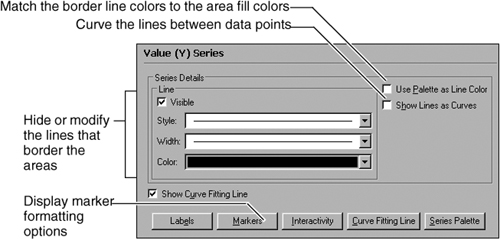
To add a curve-fitting line, navigate to the Value Series section of Format Chart, then select Show Curve Fitting Line, as shown in Figure 20-79. By default, a curve-fitting line uses a thin black line. You can change the line style or color.
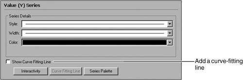
How to format a curve-fitting line
Navigate to the Value Series section of Format Chart, and choose Curve Fitting Line, then use the settings to change the style, width, or color of the line, as shown in Figure 20-80.

How to add labels to a curve-fitting line
Navigate to the Value Series section of Format Chart, and choose Curve Fitting Line. In Label, select Visible, then use the settings on Curve Fitting Line to format the labels, as shown in Figure 20-81.

You can stack the value series that you display in a chart. In a stacked chart, the data points from one value series are arranged on top of the data points of another series. Stacking helps to show each data point’s contribution to the total of all the data points in a category.
You can stack only area, bar, and line series. To stack a series, navigate to the Series section of Format Chart, then select Stacked for the series.
Different series types offer different formatting options. The procedures in this section describe how to modify the formatting of series with depth; three-dimensional series; and area, bar, line, scatter, meter, pie, and stock series.
To tell what type of series a chart uses, use the Series section of Format Chart. For example, in Figure 20-82, the Series section shows that a chart uses a standard series, called a simple series, for categories and a bar series for values. You can use the Type drop-down list to change the type of a series.

In a chart with depth or a three-dimensional chart, you can specify how far back the chart markers stretch. For example, you can specify the depth of lines in a three-dimensional line chart. You set the series depth in the chart unit, such as points.
How to set the depth of series elements in a chart with depth
Navigate to the Chart Area section of Format Chart, then choose General Properties. Provide a value in Series Depth, as shown in Figure 20-83.

When you format a three-dimensional chart, you can use axis rotation to change the orientation of the chart or use unit spacing to set the space between series.
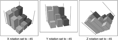
You can rotate the axes of a three-dimensional chart. When you rotate axes, you use the following settings:
The x-axis rotation controls how the chart tilts toward or away from the viewer.
The y-axis rotation controls how the chart pivots left and right on the y-axis in the center of the chart.
The z-axis rotation controls how the chart tilts up and down on the central z-axis.
By default, a three-dimensional chart uses an x-axis rotation of –20, a y-axis rotation of 45, and a z-axis rotation of zero. A chart that uses default rotation settings appears oriented like the one shown in Figure 20-84.

Figure 20-85 shows the effects of changing each setting in the sample chart.
To change the rotation of an axis, navigate to the Axis section of Format Chart, then provide a rotation value, as shown in Figure 20-86.

To control the space between the series in a three-dimensional chart, you use unit spacing. The unit-spacing value is the percentage of the series width that appears between each series. For example, the default unit spacing is 50. This means that the space between two series elements in the chart, such as two sets of bars, is approximately 50 percent of the width of one series element. For example, Figure 20-87 shows the difference between two unit-spacing settings in a sample three-dimensional bar chart.

To change the spacing, navigate to the Chart Area section of Format Chart, then choose General Properties. In Unit Spacing, provide a value. The value indicates the percentage of the series width to use to separate series elements.
When you format an area chart, you can change the style or color of the lines that border the areas or hide the lines altogether. To change the appearance of the areas, you can curve the lines between data points. Curved lines can help to show trends in the data.
For example, Figure 20-88 shows the difference between a chart with standard lines and a chart with curved lines.

You can also add point markers that identify the data points that an area encloses. The legend uses the markers to identify the areas. In a chart without markers, the legend uses lines. Figure 20-89 shows an area chart with and without markers.
How to format an area-chart series
Navigate to the Value Series section of Format Chart, then use the settings to modify the area chart lines or markers, as shown in Figure 20-90.
When you first create a bar chart, the chart uses default formatting. For example, bars typically appear as rectangles without outlines. You can show the bars as triangles or add a bar outline.
To format a bar-chart series, navigate to the Value Series section of Format Chart. Use the settings to modify the bars, as shown in Figure 20-91.

Line and scatter charts use the same formatting attributes. The default formatting of line and scatter charts is also similar, except that a line chart shows lines between data points, but a scatter chart does not. In either a line or a scatter chart, you can add shadows to the lines and data point markers, change the size and shape of the markers, or change the shape, line style, or color of the lines that connect the data points.
To format a line or scatter-chart series, navigate to the Value Series section of Format Chart. Use the settings to modify the chart lines and markers, as shown in Figure 20-92.

Sometimes, line charts include categories for which no data exists. You can define how the chart treats the empty values. The chart can either connect the line between the existing points or represent the empty value as a blank space in the chart. Figure 20-93 shows the two options in a line chart.

By default, the chart connects lines. To change the missing value setting, navigate to the Value Series section of Format Chart, then deselect Connect Missing Values.
When you format a meter-chart series, you work with the chart parts that are shown in Figure 20-94.
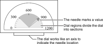
You can modify the following meter-chart attributes:
Dial size. You can determine the radius of the dial. You can also use start-and stop-angle settings to determine if the dial is circular or semicircular.
Dial scale and tick marks. Working with the dial scale and tick settings is similar to working with the same settings on an axis.
Needle formatting. You can modify the style and width of the needle or change how the pointer end of the needle appears.
Dial placement. If you create a chart that displays multiple dials, you can arrange the dials in a row or in columns.
Label settings. You can show or hide labels for regions and for the chart data point, which is where the needle falls on the meter.
Dial-region size, color, and placement. Working with dial-region settings is similar to working with axis-marker settings.
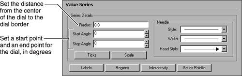
When you create a meter chart, the dial uses default sizing. To enlarge or shrink the distance between the center of the chart and the outside of the dial, you change the dial radius. Use percentage settings to size the dial relative to the meter that surrounds it. For example, a setting of 50 will create a dial radius that is half the distance from the center of the meter to its outer boundary. In a chart that uses more than one value-series definition, you can set the dial radius for either series, and it applies to both series. If different series contain different dial radius values, the dial uses the larger value.
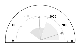
A default dial is a semicircle. To change the shape of a dial to encompass more or less of a circle, you change the dial start- and stop-angle settings. The angles are measured counter-clockwise from the right. For example, in Figure 20-95, the dial uses a start setting of 20 and a stop setting of 160.

To show a full circle, use values that produce 360 degrees. For example, the chart shown in Figure 20-96 uses a start angle of –90 and a stop angle of 270. The first value in the dial, 0, appears at –90 degrees, and the last, 1200, is not labeled but appears at 270 degrees.

The start and stop settings of the dial define the size of the meter that surrounds it. If you use an angle setting that is less than 0 degrees or greater than 180 degrees, the chart displays a full circle. If you use angle settings between 0 and 180, the chart displays a half-circle. For example, the chart shown in Figure 20-97 uses a start angle of –45 and a stop angle of 90.

How to set the size of a dial
Navigate to the Value Series section of Format Chart. Use the settings to modify the dial size, as shown in Figure 20-98.
The chart builder sets up a dial for a meter chart in much the same way that it sets up an axis in another chart, such as a bar chart. The chart builder uses the available data to set a span for the dial, then it places tick marks at appropriate intervals along it. Working with the settings on a dial is similar to working with axis settings. The dial scale determines the span of the data that the dial displays in the same way that the scale of an axis determines which data the axis displays. Tick marks on a dial work in the same way as on an axis.
How to change the scale of a dial
Navigate to the Value Series section of Format Chart, then choose Scale. Use the Scale settings to change the range or spacing of the data the dial displays, as shown in Figure 20-99.
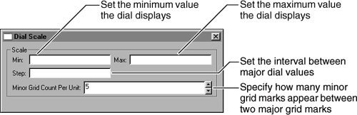
How to modify the tick marks on a dial
Navigate to the Value Series section of Format Chart, then choose Ticks. Use the settings to modify the major or minor grid ticks, as shown in Figure 20-100.

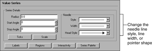
You can change the line style, width, and end settings of a needle. Navigate to the Value Series section of Format Chart, then use the settings in Needle to modify the needle appearance, as shown in Figure 20-101. To change the color of a needle, change the value-series palette.
To include all the dials in a meter chart in one meter, you must use the superimposed subtype. In a meter chart that displays multiple meters, you can position the meters and specify how many columns to use to display them. For example, in Figure 20-102, the chart on the left uses three columns. The chart on the right uses two columns.

To arrange the dials, navigate to the Chart Area section of Format Chart, then choose General Properties. Use Grid Column Count to supply the number of columns in which to display the meters, as shown in Figure 20-103.

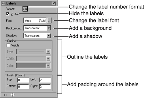
By default, a meter chart displays labels, similar to axis labels, that identify points on the dial. To format the labels, navigate to the Value Series section of Format Chart and choose Labels. Use the settings to hide or format the labels, as shown in Figure 20-104.
To highlight the values on the dial, you use dial regions. Dial regions are similar to axis markers. You determine a start and an end value for each region. After you set up the regions, you can change the region color or outline. If regions overlap, the last region that you create takes precedence in formatting. You can also change the radius of a region to determine where it starts or ends in relation to the position of the dial. For example, Figure 20-105 shows a chart with two regions. The region on the left has an outer radius of 50. The region on the right has an outer radius of 75.
How to add a dial region
Navigate to the Value Series section of Format Chart, then choose Regions to see the options that are shown in Figure 20-106.
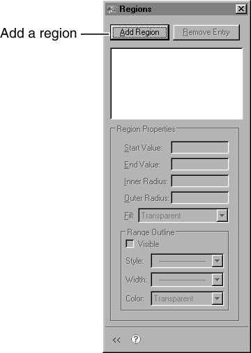
Choose Add Region. The region appears in the list at the top of the window. Provide a start and an end value for the region, as shown in Figure 20-107.
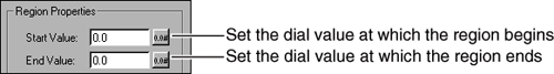
Navigate to the Value Series section of Format Chart, then choose Regions. Select the name of the region to format, then use Region Properties to modify the region settings, as shown in Figure 20-108.

When you first create a pie chart, the chart is a circle. The pie sectors appear exploded, or pulled away from the pie, and leader lines connect sectors and associated data labels. Figure 20-109 shows a pie chart that uses default settings.

If you minimize or expand the chart, it maintains a circular shape. You can change the ratio setting so that the pie adjusts to fit all the available horizontal or vertical space. In this case, resizing can produce an oval pie. You can format the pie sectors to change the color or outline properties. To control the size of the pie sectors, you can define a minimum value for sectors. Sectors below that value combine with other below-minimum sectors in a remainders sector.
You can also change the explosion settings that determine how the chart pulls sectors away from the center of the pie. To change how the chart identifies each sector, you can modify the leader lines that connect data labels and sectors. If a chart displays multiple pies, the formatting applies to each pie. In a pie chart that displays multiple pies, you also can arrange the pies in rows or columns.
You can change the height and width ratio so that the pie stretches to fit the horizontal or vertical space in the chart area. If you make the pie wider than it is tall or taller than it is wide, the chart can appear as an oval. For example, Figure 20-110 shows a sample chart that was widened into an oval.

To shape the chart as a circle or an oval, navigate to the Value Series section of Format Chart, then supply a value in Pie Ratio, as shown in Figure 20-111. Use 1 to retain the circular shape or 0 to allow the chart to stretch into an oval.
When you format a pie chart, you can modify the following features:
Pie sector formatting. You can outline each sector and change the outline properties. You can also select a color palette for the sectors.
Minimum sectors. You can set a minimum value for pie sectors. A sector with a value equal to or greater than the minimum appears as usual. Sectors with values below the minimum are combined in a new remainders sector. You can create a label for the remainders sector to display in the legend.
You can set the minimum as a static value or as a percentage of the pie value. For example, you can show sales totals for a group of customers and combine customers with sales below $1,000,000.00 in a sector called Infrequent Orders, or you can combine customers with sales below two percent of the total sales.
How to outline pie-chart sectors
Navigate to the Value Series section of Format Chart, then use Slice Outline to select an outline color, as shown in Figure 20-112.

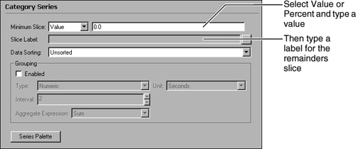
How to specify a minimum sector size
Navigate to the Category Series section of Format Chart, then use the settings to set up a minimum sector, as shown in Figure 20-113.
You can specify how far from the center of the pie the exploded sectors appear. You can also decide how a pie selects sectors to explode. Typically, you explode all sectors. You can also explode based on an expression. For example, you can explode only those sectors that compose more than 20 percent of the pie. To explode all pie chart sectors, do not provide an explosion expression.
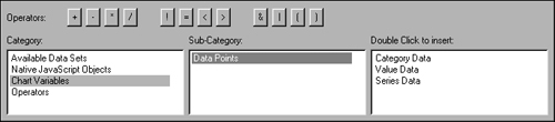
![]() When you create an explosion expression, you can type an expression. You can also use Edit Expression, which includes a Chart Variables category, as shown in Figure 20-114. You use this category to add elements such as Value Data or Category Data to your expression. For example, you can use an expression such as ValueData>200 to explode sectors that have a value greater than 200.
When you create an explosion expression, you can type an expression. You can also use Edit Expression, which includes a Chart Variables category, as shown in Figure 20-114. You use this category to add elements such as Value Data or Category Data to your expression. For example, you can use an expression such as ValueData>200 to explode sectors that have a value greater than 200.
How to explode pie sectors based on an expression
Navigate to the Value Series section of Format Chart. In Explode Slice When, provide an expression. When the expression is true for a sector, that sector pulls away from the pie.
For example, to explode sectors for which the category value is California, use the following expression:
CategoryData="California"
How to set the explosion distance
Navigate to the Value Series section of Format Chart. In By Distance, provide an explosion value. The explosion value represents the percentage of the original chart size by which to separate each sector from the pie center. For example, an explosion value of 50 pulls out exploded sectors half the distance of the original pie.
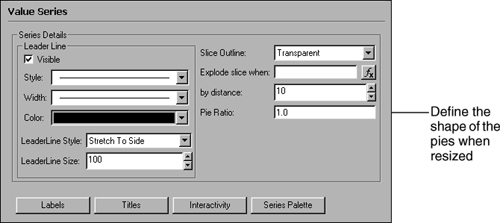
As with other lines in a chart, you can modify the line style, width, or color for leader lines in the same way as you modify the formatting attributes of other lines in a chart. You can also modify the length of the leader lines. When you first create a pie chart, the chart uses leader lines of a default length. To change the length, you change the leader line’s style setting. The leader-line style Stretch to Side indicates that the chart uses the default leader length. A chart with the leader-line style Fixed Length can use the length that you specify. You can also hide the leader lines.
Navigate to the Value Series section of Format Chart, then use the settings that are shown in Figure 20-115 to hide the lines, change the line style, or adjust the line length.

When you use multiple pies in a pie chart, you can specify how to arrange the pies. To arrange the pies, you specify how many columns to use to display them. For example, in Figure 20-116, the chart on the left uses one column. The chart on the right uses two columns.
How to arrange multiple pies in a pie chart
Navigate to the Chart Area section of Format Chart, then choose General Properties. In Grid Column Count, select the number of columns in which to display the pies.
To display values, a stock chart uses a candlestick, a box with lines extending up and down from the ends. The upper and lower edges of the box are the stock open and close values. The upper and lower points of the line are the high and low values. If the open value is higher than the close value, the box is shaded. If the close value is higher than the open value, the box is transparent. For example, in the chart in Figure 20-117, the marker for 03/01/2005 indicates that day’s close value was lower than the open value.

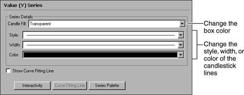
When you format a stock chart, you can change the color of the shaded boxes. You can also change the color and style of the box outline and the candlestick lines.
How to format a stock-chart series
Navigate to the Value Series section of Format Chart, then use the settings to change the appearance of the stock series, as shown in Figure 20-118.
By default, a chart displays labels that identify value-series values, such as the height of a bar in a bar chart or the size of a sector in a pie chart. You can hide labels; reposition the labels; add a background, shadow, or outline; or change the label font. You can also use inset settings to add padding around the labels to separate them from other chart elements, such as leader lines or the chart border.
To display different data in the labels, you change the data point settings. The data point settings determine what text each label displays. Typically, the label shows the value-series value, such as the height of a line chart point on the y-axis. You can also show where the point appears on the x-axis, use the series value to show to which group of data points a point belongs, or display the value as a percentage of the total value of all points in the chart.
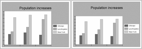
For example, in Figure 20-119, the first chart uses a legend to show which bar represents each series. The second chart labels each bar with the city name.

After you decide what data to show in the labels, you can change the number format of the data points or add a prefix or a suffix to the label expression. You can also use a separator between values. For example, in the chart in Figure 20-119, you can display the city value and the year value, separated by a comma, such as Chicago, 1980. In a different chart, you could add a currency symbol before a value or append text, such as Orders.
How to modify the data a label displays
Navigate to the Value Series section of Format Chart, then choose Labels. Use the settings in Values to set up the data the label displays, as shown in Figure 20-120.

How to format data point labels
Navigate to the Value Series section of Format Chart, then choose Labels. Use the settings in Values to set up the data the label displays, as shown in Figure 20-121.

You can use a style to apply several formatting attributes to the chart in one step or to apply the same attribute to several chart elements. Using a style in a chart is similar to using styles for other report elements.
BIRT supports the following style features for charts:
Font
Color
Background Color
Background Image
Padding
To apply a style to a chart, in the property editor, choose Properties, and, in Style, select the style to apply.