
A chart is a graphical representation of data or the relationships among sets of data. Charts display complex data in an easy-to-assimilate format. You can use a chart as a report in itself or combine a chart with other report elements to enhance or highlight related information.
The guidelines that you should follow when you plan a chart are similar to the guidelines that you use when you plan a report. To create an effective chart, you must decide what data to display, then you select the chart type that best represents that data. For example, to show the growth of a company’s business units over time, you use a chart that tracks data along an axis, such as a line chart or a bar chart.
Setting up a chart is different from setting up other report elements. After you select a chart type, you must supply expressions that organize the data in visual elements that are available for that chart type, such as bars in a bar chart. The BIRT Report Designer chart builder walks you through the steps that you need to complete to select a chart type and to create each type of chart.
This chapter introduces BIRT charts. It begins with a tutorial in which you build a chart using the BIRT sample database, Classic Models. As you complete the tutorial, you learn about the essential chart-building tasks.
This section provides step-by-step instructions for building a report that displays order totals that are organized by product line. The report shows the information graphically in a pie chart.
The chart uses data from the sample database, Classic Models. You install that database when you install BIRT. Figure 18-1 shows the chart that you create in the tutorial.

To create this chart, you complete the following tasks:
Set up the report design file. You create a new report, data source, and data set.
Add the chart to the report. You insert a chart element and select a chart type.
Provide data for the report. You link the chart to a data set and set up the expressions that the chart uses.
Review the chart. You use the previewer to examine the chart.
Update chart titles. You modify the chart title and remove an unnecessary title beneath the pie.
Refine the chart appearance. You remove the chart legend and modify the labels that identify each sector.
Before you start to design a chart, you must create a report design file in which to display the chart, then set up the data source and data set that the chart uses. These tasks are discussed in detail in earlier sections of this book, including a tutorial in which you build a sample report. This tutorial explains how to select the specific data that you use to build the sample pie chart.
Using the Blank Report template, create a new report design called Chart.rptdesign.
Build a data source for the report design file using the sample database, Classic Models.
Build a data set for the chart. Use the following data set name:
ChartData
Use the following SQL SELECT statement:
SELECT Products.ProductLine,
sum(OrderDetails.QuantityOrdered)
FROM OrderDetails,
Products
WHERE Products.ProductCode=OrderDetails.ProductCode
GROUP BY Products.ProductLine
ORDER BY Products.ProductLine
This statement gets values from the ProductLine column in the Products table. Then it groups the results by product line and calculates the sum of the order quantities for each group.
Preview the query to validate the data it returns. If you created the SELECT statement correctly, you should see the data rows that appear in Figure 18-2.
The first column lists product-line names. The second column shows the sum of the order totals for each product line. The sum column is called 2.
To rename the sum column to something more descriptive, choose Output Columns. Use the following text for the alias for the 2 column:
TotalOrders
Use the following text for the display name for the 2 column:
TOTALORDERS
Now you are finished setting up the report design file. To close Edit Data Set and open the layout editor, choose OK.

You use the palette to add a chart element, and then select a chart type. In this tutorial, you build a pie chart.
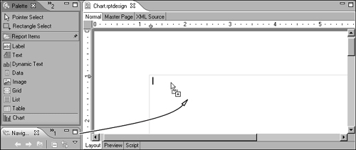
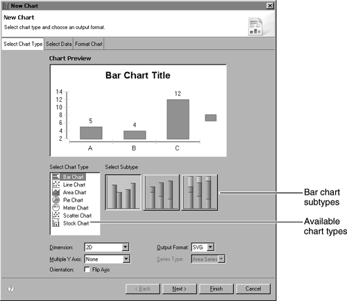
 Choose Palette, then drag a chart element from the palette to the report, as shown in Figure 18-3. The chart builder, New Chart, appears. If you have an existing chart, the window title is Edit Chart. The Select Chart Type page displays the different types of charts that you can create. Each chart type includes several subtypes, giving you an extensive range of available types. For example, when you first open the chart builder, you see three different bar chart subtypes, as shown in Figure 18-4.
Choosing a different type on Select Chart Type displays the available subtypes for that type of chart. These subtypes create two-dimensional charts. Later in this chapter, you learn how to use the Dimension option to show even more subtypes.
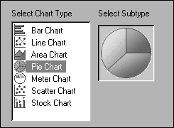
In the Select Chart Type list, select Pie Chart. The chart builder shows the pie chart in the preview window, as shown in Figure 18-5. Pie charts have only one two-dimensional subtype, so you see only one option in the Subtype area. As you design a chart, the preview window gives you an indication of the progress you are making. For example, if you change the color of the pie chart sectors or replace the default title text with a new title, the preview window reflects your changes.
In this tutorial, you already created the data source connection and data set that you need. If necessary, you can use the chart builder to build a new data set or create filters or parameters that refine the chart data. After selecting the data set to use, you must set up the expressions that the chart uses. Each type of chart uses data differently. For a pie chart, you must select data expressions that specify:
Which sectors appear in the pie. In this tutorial, you use an expression that creates one sector for each product line.
The size of each sector. In this tutorial, the number of orders determines the size of each product-line sector.
You can use different techniques to provide a data expression in a chart. The easiest way to specify the data to use is to drag a column from Data Preview to a field. You can also type the expression or use Expression Builder to create an expression.
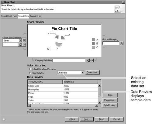
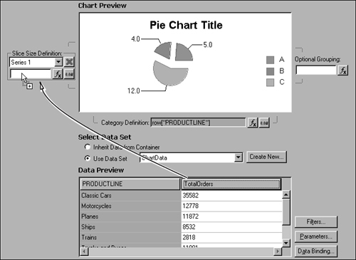
To navigate to the page you use to provide data, choose Next. Then, on Select Data, choose Use data set. Figure 18-6 shows the options that appear.
This report file includes only one data set, ChartData. If the file included more data sets, the data set names would appear in the drop-down list. In the lower half of the chart builder, Data Preview displays some of the data from the data set that you are using. You can see the product line and total orders columns. By default, Data Preview shows six data rows.
First, to determine which sectors the pie displays, you provide a category series expression. In Data Preview, select the PRODUCTLINE column header, and drag it to the empty field to the right of Category Definition, as shown in Figure 18-7.
The following expression appears in Category Definition:
row["PRODUCTLINE"]
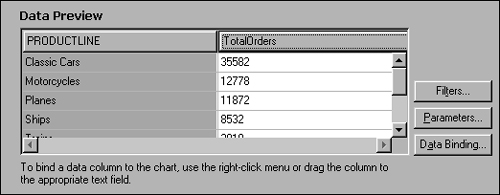
In Data Preview, the product-line column now appears colored to show that you have used the column in the chart. Figure 18-8 shows the selected column.
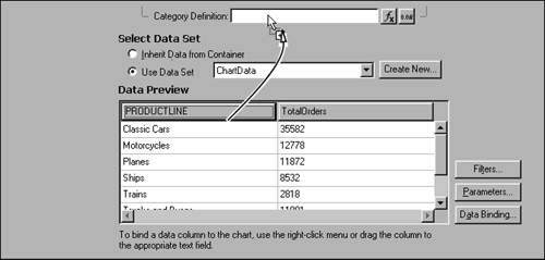
To set the size of each sector, select the TOTALORDERS column header, and drag it to the empty field below Slice Size Definition, as shown in Figure 18-9.
The following expression appears in Slice Size Definition:
row["TOTALORDERS"]
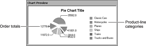
In Data Preview, the total orders column now appears colored to indicate that the column is used in the chart. The image in Chart Preview also changes to use the data you specified. The product lines are chart categories. Each sector represents one product line. The order totals are chart values. The size of each sector represents the total orders for that product-line category. You can use the preview image to verify that you supplied the correct expressions for the chart. The preview image should look like the one shown in Figure 18-10.
Now you have completed the necessary steps to create a basic pie chart. To confirm that the chart looks correct in the report, you view it in the previewer.
Testing as you go is an important aspect of the developer process. Reviewing your work at different points in the process ensures that you do not waste time by pushing the report in the wrong direction. The preview image in the chart builder is one way to check your progress. You should also use the previewer to review how the chart looks in a report document.
To close the chart builder, choose Finish. The chart element appears in the layout editor. The chart should look similar to the one shown in Figure 18-11.
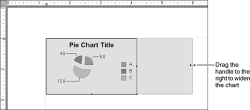
The chart element appears small, relative to the report page. To make the chart bigger so that the data appears more clearly and takes up more of the report page, enlarge the chart element to approximately 5 inches wide and 3 inches tall. To enlarge the chart, select it, then drag the handles that appear in the borders of the chart element, as shown in Figure 18-12.
Choose Preview to show the chart in the previewer. The chart looks like the one shown in Figure 18-13.

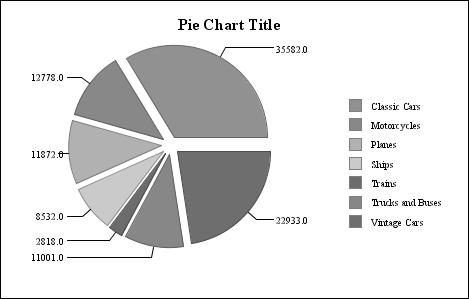
The chart uses the correct data, but the layout is not very attractive. You need to refine the chart appearance and organization to emphasize the points that you want. The remaining procedures in this tutorial help you to modify the chart. Some of the changes that you make include creating a new title, adjusting the data labels, and removing the legend.
Currently, the chart displays a default title. You provide new title text.
Choose Layout to return to the layout editor, then double-click the chart design to open the chart builder.
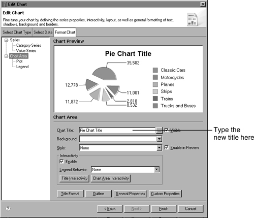
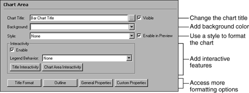
Choose Format Chart, then choose Chart Area in the list at the left. Figure 18-14 shows the chart builder.
In Chart Title, type:
Orders by Product Line
The preview image displays the change, as shown in Figure 18-15.

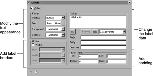
The chart includes labels that identify the value of each sector. A legend identifies which product line a sector represents. While the legend includes useful information, it takes up space and reduces the size of the pie. You can remove the legend and add the legend information to the sector labels to display the same information in a different way. An additional benefit to moving the labels is that, when you print the report, the chart clearly shows which sector represents a product line, even if the colors are not easily distinguished. Each data label will display category information (the sector name) and value information (the total number of orders for the sector). For example, the following label identifies the motorcycles sector:
Motorcycles: 12,778
To navigate to the legend section of the chart builder, choose Legend from the navigation list at the left, as shown in Figure 18-16.
To open the window from which to delete the legend, choose Layout at the bottom of the screen. Layout Legend appears, as shown in Figure 18-17.
Deselect Visible, then close the window. Chart Preview reflects the change. The chart looks like the one shown in Figure 18-18.
Now you can add the legend information to the sector labels. Navigate to the value series formatting section, then choose Labels. Labels shows you what data the sector labels display. You can also use Labels to change the label formatting, such as outlines and text style. Figure 18-19 shows Labels.
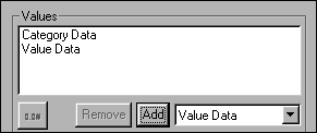
To add the section name to the label, ensure that Category Data appears in the drop-down list in the Values area, then choose Add. Category Data appears below Value Data in the list, as shown in Figure 18-20.
Using this setup, the labels show sector values, then sector names. You want to rearrange the label data so the sector names appear first. Select Value Data, and choose Remove, then, in the drop-down list, select Value Data again, and choose Add. Value Data now appears below Category Data in the list, as shown in Figure 18-21.
Now the labels will display information in the correct order, but you still need to change the label appearance. When you use more than one kind of information in a label, you can use a separator in between the different sections. The current separator is a comma.
To change the separator, in Separator, type a colon (:) then a space. Figure 18-22 shows where to type the separator text.
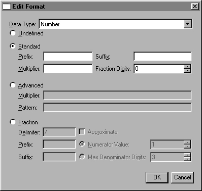
 Because the chart uses data with whole numbers, a number format that shows decimal values is unnecessary. To change the number format of the value part of the label, select Value Data in the list, then select Edit Format. You can use Edit Format to change the number format of date-and-time or numerical data.
Select Standard, then change the value in Fraction Digits to 0. At this point, Edit Format appears as shown in Figure 18-23.
Choose OK to close Edit Format.
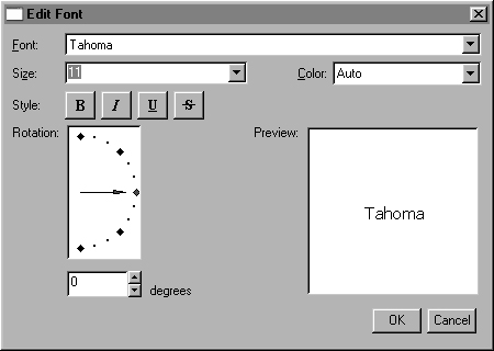
 To change the formatting attributes of the label text, choose Invoke Font Editor. Figure 18-24 shows where to find the Font Editor button.
Edit Font appears. You use Edit Font to change the text format of the labels.
Change the font to Tahoma and the size to 11, as shown in Figure 18-25. Then choose OK, and close Labels.
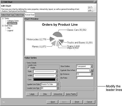
Now you set a consistent length for the leader lines that connect the labels to the sectors. Figure 18-26 shows where to find the leader line settings.
In Leader Line Style, select Fixed Length. Change Leader Line Size to 20.
You have finished creating and formatting the chart. To close the chart builder and see the chart element in the layout editor, choose Finish. Then, for the last time, choose Preview to preview the chart. The chart looks like the one shown in Figure 18-27.


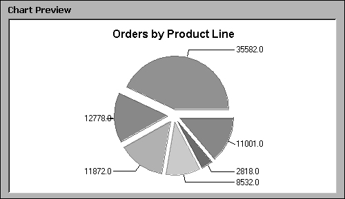


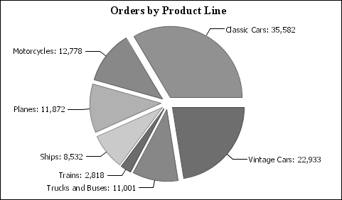
The completed chart shows the category names for each sector as well as the sector values. The size and organization of the chart make quick analysis possible, while still providing more detailed data. For example, the user can immediately see that the largest pie sector is Classic Cars, which has 35,582 orders, followed by Vintage Cars, which has 22,933. The two car sectors are larger than all other sectors combined. Other product-line groups, such as Trains, do not contribute significant numbers of orders.
To learn more about charts, review the following topics:
Exploring the chart builder. You use the chart builder to complete all tasks that are related to creating or adjusting a chart. The chart builder organizes tasks, so you can easily find the settings that you need. The tutorial explored the main chart builder sections and some of the most common settings.
Positioning a chart. In addition to stand-alone charts like the pie chart that you just created, you can use charts in combination with other report elements, such as lists or tables. You should understand how the position of a chart in a report with other elements can affect the data that the chart displays.
Chart types and subtypes. You should review the types and subtypes, so you know what formats are available to display your data.
Chart output formats. By default, the chart builder creates a chart in Scalable Vector Graphics (SVG) format. This format works well in most deployed reports. You can also create a chart in a static image file format, such as BMP or PNG.
Chart data. Each type of chart uses data differently. You can also manipulate the scale or placement of data on an axis or in a pie or meter to show information more effectively.
Chart formatting. In the tutorial, you formatted some parts of a pie chart, such as leader lines and data labels, using settings such as text style, position, and visibility. Other chart types offer different formatting options.
Interactive features. To make the chart more useful to the report users, you can add interactive features, such as hyperlinks and highlighting, which enable users to interact with the chart more effectively.
The tutorial that you just completed introduced the chart builder. You used the chart builder to complete the tasks that are mandatory when you create a chart, such as selecting data, as well as some tasks that are optional, such as formatting the labels. The structure of the chart builder makes it easy to complete the necessary tasks.
The chart builder has three main pages, which you access by choosing the buttons at the top:
Select Chart Type, on which you determine the type of chart and basic structural attributes such as orientation and the number of dimensions in which the chart appears.
Select Data, on which you specify the data that the chart displays.
Format Chart, on which you modify the appearance of the chart. Format Chart tasks can modify the data that the chart displays, such as the range of values an axis displays, or the visual elements of the chart, such as the color of the lines in a line chart.
This section describes the chart builder pages.
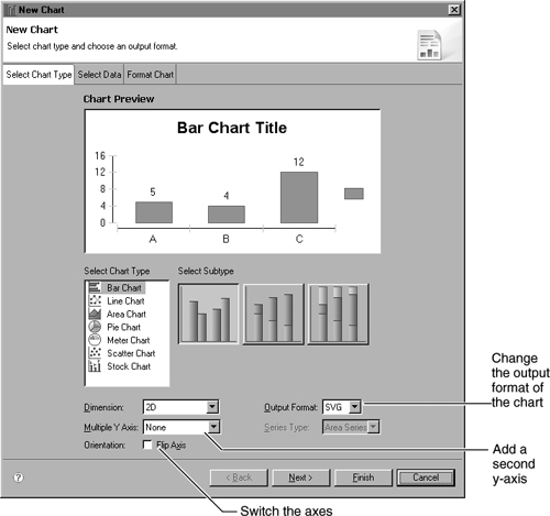
The most common task that you complete on Select Chart Type is selecting a chart type and subtype, as you did in the tutorial. You can also use Select Chart Type to modify the subtype you choose. You can show a chart in two dimensions, two dimensions with depth, or three dimensions, and you can flip the axes of a chart so the x-axis is horizontal. Select Chart Type is also where you can determine the output format of the chart. Figure 18-28 shows the options that appear on Select Chart Type.
You use Select Data to determine what data the chart displays. You select a data set, then you select columns from the data set and place them in the data fields.
Select Data appears different for each chart type, making it easy for you to see which expressions you must provide. For example, in Figure 18-29, Select Data displays the fields that you use for a bar chart.

You can also use Select Data to refine the chart data set. Data Preview shows you actual data rows, so you can see if you want to exclude values or use a parameter to return only certain data.
Every task on the Format Chart page is optional. You can successfully create a chart using only the Select Chart Type and Select Data pages. The options on Format Chart, however, enable you to manipulate and arrange the chart data so that it highlights the most important information. You can also use Format Chart to make a chart more attractive or easier to read.
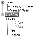
Format Chart includes several sections. The sections organize formatting tasks by the area of the chart to which they relate, such as the plot and the legend. You use the list on the left of the Format Chart page to navigate among sections. Figure 18-30 shows Format Chart. The Series section is the first section in the list.

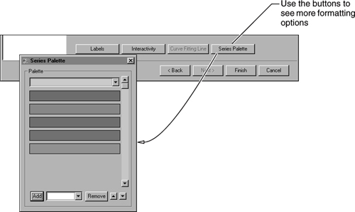
Each Format Chart section displays different formatting options. Most sections also include buttons that you can use to open windows that contain more detailed formatting options. For example, on the value series page, you can use the Series Palette button to open a window in which you change the colors a value series uses, as shown in Figure 18-31.
To see the main series section, choose Series in the list, as shown in Figure 18-32.

The information that appears provides an overview of the chart series. It lists the series a chart uses and enables you to hide or stack a series, or to make a series appear translucent against the plot. You can also provide a title for a series. Figure 18-33 shows the series section.

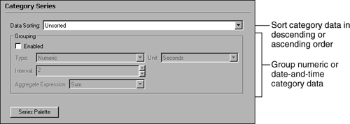
To see options for the category series or the value series, choose the relevant item in the list. You use the category series and value series sections to modify series details. For example, you can use the category series section to set up grouping or sorting of category data. Figure 18-34 shows the category series section.
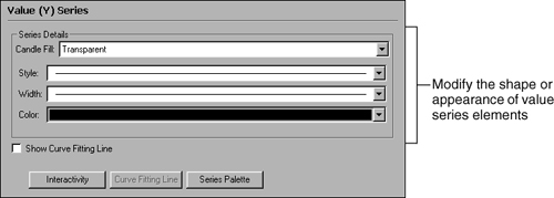
You can use the value series section to change the appearance of the value series, such as the bars in a bar chart or the lines in a line chart. For example, Figure 18-35 shows the options that you can change in a stock chart value series.
To see the chart area section, choose Chart Area in the list, as shown in Figure 18-36.
The section that appears displays options that you use to change the appearance of the entire chart element. For example, you can apply a style that modifies all the text in a chart or change the background color of the chart area. Figure 18-37 shows the chart area section.
To see the main axis section, choose Axis in the list, as shown in Figure 18-38.
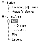
The information that appears provides an overview of the chart axes. Pie charts and meter charts do not use axes, so this section is not available for those chart types. You can use options in the main axis section to hide an axis, change the axis type, or modify the color of an axis. Figure 18-39 shows the axis section.
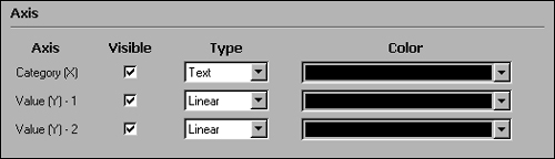
To see the section for the x-axis or the y-axis, choose the relevant item in the list. The options that appear are the same for an x-axis or a y-axis. You can change axis details, such as line color, labels, or scale. Figure 18-40 shows x-axis and y-axis options.

To see the plot section, choose Plot in the list, as shown in Figure 18-41.
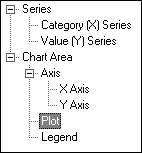
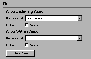
The section shows formatting options for the plot area, which is where the series elements, such as bars or lines, appear. You can set a background color or add an outline. To set more advanced plot options such as positioning and padding, choose Client Area. Figure 18-42 shows the plot section.
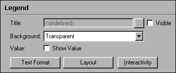
To see the legend section, choose Legend in the list, as shown in Figure 18-43.
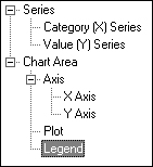
The section includes options that you can use to change the style, position or organization of the legend text, or to add a legend title. Figure 18-44 shows the legend section.
The chart in the tutorial is a stand-alone chart, meaning that it does not appear in a report with other data. You also can insert a chart in a section of a report that uses other report items, such as grids and lists, to display data.
You can specify a chart data set that is different from the data set that you use in the rest of the report. For example, a chart that you place in a customer list could show the total sales for each customer. The customer list might use one set of data, such as customer names and addresses, while the chart uses a data set that returns the sales totals.
A chart that you place in a table typically uses the same data set as the table. A table often groups data, and a report designer wants the chart data to use the same grouping setup as the table in which it appears. Where a chart appears in a table determines what data the chart displays. For example, in a table that includes grouping, you can place a chart element in the following places:
A table header or footer. The chart displays data for the entire data set.
A group header or footer. Each group section includes a chart, and each chart displays data for the group section in which it appears.
A detail row. Each detail row in the completed report includes a chart, and each chart displays data for the detail row in which it appears.
For example, Figure 18-45 shows the design for a report that includes Classic Models order information that is grouped by product line, such as Vintage Cars and Motorcycles. The report uses a chart to show the order totals graphically.
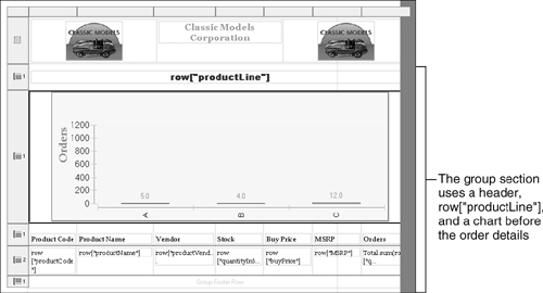
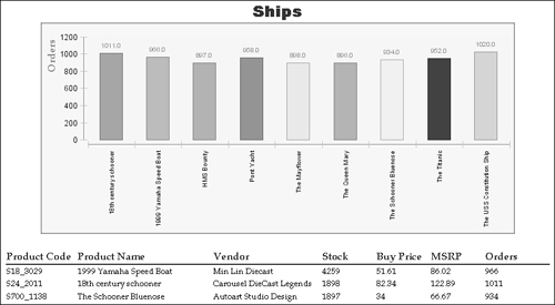
When you preview the chart, the data for a product-line group composes one section. Each group shows a chart before listing the order details, as shown in Figure 18-46.
BIRT supports several different types of charts. Some chart types, such as bar and line charts, use axes to arrange data. Other chart types, such as pie charts, do not use axes. The main difference between the two types is that charts without axes cannot use time values to plot data. A pie chart that shows sales by month does not help you see if sales are rising or falling, but a bar chart that shows the same information clearly shows not just the monthly values but any trends in the data. You learn more about how axes work in charts in the next chapter.
All chart types offer two-dimensional subtypes in which the chart shape appears flat against the chart background. BIRT charts are not limited to two dimensions. You can also use subtypes with depth, which use the appearance of depth to enhance a chart, and three-dimensional subtypes, which arrange series elements along a third axis in addition to the typical x- and y-axes. Figure 18-47 shows the difference between a bar chart with depth and a three-dimensional bar chart. In the first chart, the bars have the appearance of three-dimensional objects, but they are arranged on the x- and y-axes only. The second chart places bars back along the z-axis as well as on the x- and y-axis.

The charts in the previous illustration show each value as a separate bar. You can also stack the elements of an area, bar, or line chart to show series data as it contributes to a category total:
A stacked chart arranges the data points from one series on top of the data points of another series.
A percent stacked chart is similar to a stacked chart, except the total of the data points in a category fills the entire plot area for a category. The value of each data point is a percentage of the total of all data points for that category.
Figure 18-48 shows examples of a stacked bar chart series and a percent stacked bar chart series. The two options offer different ways to compare series contributions while still reviewing exact totals.
The following sections describe the main chart types.
An area chart displays data values as a set of points that are connected by lines. If you include several series on an area chart, the chart displays filled areas that overlap. For example, the area chart in Figure 18-49 shows product types as overlapping areas.
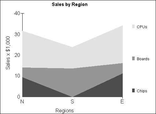
An area chart emphasizes change over time. A stacked or percent stacked area chart also shows the relationship of parts to a whole.
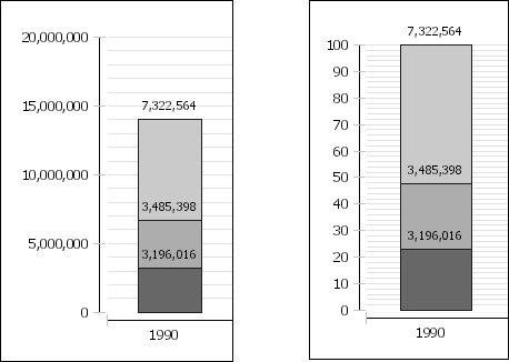
A bar chart typically displays data values as a set of vertical columns. You can flip the axes of a bar chart to display data values as a set of horizontal bars. For example, the bar chart in Figure 18-50 shows internet usage in the United States by connection speed and region.

A bar chart is useful to show data changes over a period of time or illustrate comparisons among items. When you flip the axes, as in the chart in the previous illustration, the chart emphasis is more on comparing values, typically with less emphasis on time. Stacked and percent stacked bar charts can also show the relationship of individual items to a whole.
A line chart displays data as a sequence of points, connected by a line. For example, the line chart in Figure 18-51 shows sales values for chips and boards.

You use a line chart to show trends in data at equal intervals, such as over a period of time. A stacked or percent stacked bar chart can show the contribution of individual items to a whole.
A meter chart shows a value as a needle pointer on a circle or semicircle. You use a meter chart to create a gauge or dashboard display. Dividing the meter background into sections, called dial regions, enables you to highlight the needle values. You can adjust the dial settings in the same way you adjust an axis, giving you many options for arranging and emphasizing the dial data. Figure 18-52 shows a meter chart that contrasts the speed of two products.
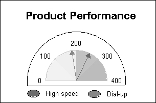
A meter chart is best used to show a small number of values in a visually impressive way.
You use a pie chart to show data as part of a total. For example, the chart in Figure 18-53 shows price quote totals for different product lines. Each sector shows total price quotes for an item as a percentage of the total for all items. For example, DSP is the smallest sector, with only eight percent of total sales.

A pie is useful to show the relationship of parts to a whole.
A scatter chart shows data as points. Scatter charts display values on both axes and do not use a category-axis. For example, the chart in Figure 18-54 compares two sets of numerical data for certain sports cars: the top speed and the price. You can use the chart to see how performance increases in relation to price.

A scatter chart shows the relationships among the numeric values of multiple data series. Scatter charts typically display scientific data.
A stock chart shows data as points on a time continuum, such as a business day. Stock values appear as a candlestick, a box with lines extending up and down from the ends. Open and close values mark the upper and lower edges of the box. High and low values mark the upper and lower points of the line. The default appearance of the bar depends on the chart values. If the open value is higher than the close value, the box is shaded. If the close value is higher than the open value, the box is white. You can change the color of the shaded boxes. Figure 18-55 shows a sample stock chart.

Although a stock chart typically displays stock price data, you can also use a stock chart to show scientific data, such as indicating temperature changes.
By default, the chart builder creates a chart in SVG format. SVG is a language that is used to describe two-dimensional graphics and graphical applications in XML. SVG enables report developers to include more accessible, searchable, and interactive images in their reports. For example, the legend interactive features that BIRT charts include use the SVG format to enable highlighting and hiding series data.
SVG output is appropriate for most charts. SVG files are typically smaller than image files in other formats and produce high-resolution images. You can also produce a chart in other image formats, such as PNG or BMP. For example, if your chart uses a photograph as a background image, you will likely want to use JPEG or PNG format, because those formats display photographic images particularly well. Some web browsers do not currently support SVG images. You must use the SVG format, however, if you want your chart to be interactive.
The following procedure explains how to change the chart output format.
How to change the chart output format
On the chart builder, choose Select Chart Type. Select Chart Type appears as shown in Figure 18-56.
In Output Format, select an option, such as PNG or BMP.
Choose Finish.

Now you have created a sample chart and become familiar with the different types of charts and the output formats a chart can use. The next chapter describes in detail how to use data in a chart.