6. Positioning Page Content
In Chapter 5, you saw how to use CSS (Cascading Style Sheets) to style text. There’s a whole lot more that CSS can do besides make your words look pretty—style sheets can also be used to lay out elements on your page.
This chapter covers the how-tos of positioning and how to use Dreamweaver’s layout tools in a way that suits your work style. You’ll also get a look at some of the great features in newer versions of Dreamweaver that help you use CSS for layout and positioning elements. We’ll wrap it all up with a historical overview of how older versions of Dreamweaver used to recommend that you position elements on your page and why those approaches just aren’t the right choices any longer.
CSS Layout Basics
When CSS first started becoming popular (that is, when enough browsers supported it consistently), its primary use was for styling text, and Web designers were thrilled to say goodbye to the font tag. It’s just as possible to use CSS to define how your page is laid out, and thankfully, modern browsers now have sufficient market share that we’ve gotten to the point where it’s feasible to make the switch.
The box model
When you’re talking about positioning elements with CSS, you immediately run into the term the box model. Here’s a quick overview of what you’ll need to know to be able to use CSS for positioning.
When working with CSS and layout, you’re creating boxes (almost always done by adding a div) and positioning them on your pages. Each box contains several elements (Figure 6.1): its margin, border, padding, and content. Using CSS, you can set rules for each element. Additionally, you can (for example) set different rules for the top, right, bottom, and left sides of an element.
Figure 6.1. The CSS box model, broken down into parts.

Let’s say that you want to put a line above and below your text. You can set the border around your text (that is, to the tag that contains your text) to 1px black solid just for the top and bottom. If you don’t set the other sides, they’ll be set to 0 by default.
Positioning your boxes
Now that you’ve created boxes on your page, you want to place them. In order to do that, you need to understand two new concepts: position and float.
The position of a box can be static, relative, inherit, absolute, or fixed (Figure 6.2).
Figure 6.2. An example of an absolutely positioned box with set dimensions.
• Static: The simplest position is static; it just means that the box ends up wherever it would normally end up, all on its own. Any left or top offsets you give it are ignored.
• Relative: The next simplest is relative, which is just like static except that you can set its left and top positions.
• Inherit: Inherit is used when you want a box to automatically inherit the properties of its parent (that is, its container). Wherever that box happens to be, it just takes on the position rules based on its container.
• Absolute: Absolute and fixed are similar, in that you can specify exactly where on your page you want the box to appear. The difference between the two involves their frame of reference: an absolutely positioned box is positioned in reference to its container. If you have an absolutely positioned box placed 100 pixels from the top of a page, and another absolutely positioned box inside that box that is also set to be 100 pixels down, the interior box will be 200 pixels down, not 100—because its frame of reference is to the box that it’s inside.
• Fixed: Fixed positioning, on the other hand, is based on the page itself. If you set a box to be fixed at 100 pixels down, it will always be there, even if you scroll the page. When you scroll, that box will move down with you so that it’s always 100 pixels down from the top of the visible page.
Floating your boxes
Alternatively, a box can be set to float, such that its contents stick to one side or the other of its containing element (Figure 6.3). The values for float are left, right, none, and inherit.
Figure 6.3. This graphic and its caption are both floated to the right.
• Left: A box that is floated to the left causes everything else on the page (everything that isn’t explicitly told to be somewhere else, that is) to wrap around it to the right.
• Right: Just like left, a box floated to the right causes everything else to wrap around it on the left.
• None: This is the default, but it’s sometimes useful to be able to explicitly tell a box, no, don’t float (usually when trying to work around browser bugs).
• Inherit: If you do want a box to inherit the float value of its container, just say so explicitly by setting float to inherit.
 Tips
Tips
• What’s described here is how browsers are supposed to handle positioning and floating boxes, and all of the browsers released in the last few years handle it well. Older browsers may have varying degrees of difficulty with these concepts. As always, we recommend testing your site in as many browsers (and versions and platforms) as possible.
• This is just a quick and dirty definition. Many pages (and possibly some entire books) have been written on the intricacies of the box model.
Using the Included Layouts
Initially, you might think that it’s difficult to get started using CSS for positioning, but thankfully, Dreamweaver has included something to make getting started easy as can be: using Dreamweaver’s included CSS layouts. These files are flexible, professionally developed templates that are available to use as a starting point.
To use the included layouts
1. From Dreamweaver’s menu, choose File > New. The New Document dialog appears (Figure 6.4).
Figure 6.4. The familiar New Document dialog contains handy CSS-based page designs to get you started. Look at the Preview column to decide which of the designs you want to use as the basis for your page.
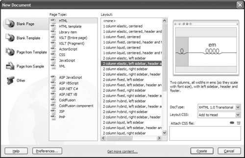
2. If it wasn’t chosen by default, select the category “Blank Page” and the Page Type “HTML,” and 32 designs will be listed in the center column. Choose any of these to see a preview in the right column. Directly below the preview is a short description of the design.
3. If you see a design you like, click Create. A new untitled Dreamweaver document opens in the chosen design (Figure 6.5). You now have a template for your site that’s entirely CSS-based. You can modify both the page content and its styles.
Figure 6.5. Here’s your new page, ready to take your content.

Tip
• Even if none of the included design files suits your taste, take a look at them and check out how they work. They’re a good way to learn how to use CSS to position elements on a page.
Laying Out Your Page
Here’s where things get interesting: now that we’ve got the theory, it’s time to put it into practice. With the included CSS styles, it’s straightforward.
Before you start laying out your page, you need to think about what you want on that page and where you want it to go. As discussed back in Chapter 2, the best way to do that is with pencil and paper. That should tell you what styles you’ll need: for instance, a header, footer, content area, and navigation area. Once you have a design in mind, look through the included CSS layouts to see which HTML page best fits your idea (Figure 6.6).
Figure 6.6. You’ll want to have a plan before you start laying out your page, and here’s our planned design.

Now you’re ready to start. In this case, we’ll start with the 2-column hybrid layout, with a left sidebar, header, and footer (Figure 6.7). The hybrid part of the name means that the left-hand sidebar is a fixed size, but the rest of the page can expand/shrink to fit the width of the browser.
Figure 6.7. Start by selecting a new blank page with a new layout.

To lay out your page
1. Choose the 2-column hybrid layout, and Dreamweaver gives you a bare-bones page to start (Figure 6.8).
Figure 6.8. This page doesn’t just contain dummy text—it also contains some helpful tips in the sidebar.

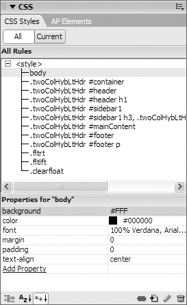
2. Almost all of the work will be done in the CSS Styles pane of the CSS panel (Figure 6.9). Here, the body styles are all fine except for the background—we want it to be white instead of the default gray, so we’ve changed its value to #FFF.
Figure 6.9. Start your new page off by changing the styles for the body tag.
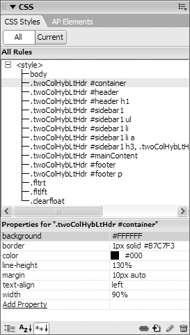
3. Next is the #container—that’s the one large div that contains everything on the page. We change the border from 1 pixel solid black to 1 pixel solid light blue, the margins from 0 pixels at the top and bottom to ten pixels, and the width from 80% to 90%. Finally we add two new properties by clicking the “Add Property” link near the bottom: color, which we set to black and line height, which is set to 130% (Figure 6.10).
Figure 6.10. Next, change the styles for the div named container.
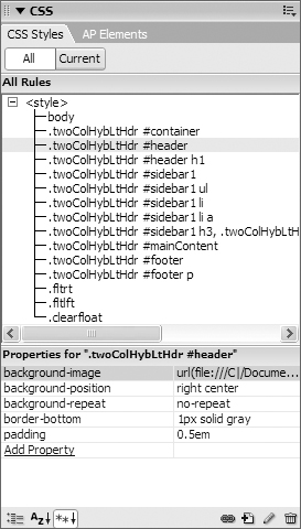
4. There are two parts to the page header: the background graphic and the foreground logo. We delete the gray background color property from the #header style and replace it with background-image (set to our background image), background-position (set to right center), and background-repeat (set to no-repeat). We also add a light gray bottom border, and change the padding value slightly (Figure 6.11).
Figure 6.11. Once you’ve set up the header, you’re a long way towards having your Web page just the way you want it.
Drag the logo over from the Assets panel (Figure 6.12). HTML defaults to putting it on the far left of the div, so it doesn’t need any positioning changes to be in the right place for this example. Your page should now look something like Figure 6.13.
Figure 6.12. Here’s what the header should end up looking like with both the background image and the foreground image.
Figure 6.13. And here’s what our page looks like so far. Next up: the sidebar.

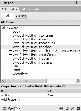
5. Next up is the navigation sidebar, which Dreamweaver has cleverly named sidebar1. We don’t want the gray background color, and since the default is to just let the underlying color through, the background color can be deleted. The same goes for the padding (Figure 6.14).
Figure 6.14. Change the sidebar to match our desired design.
6. Now it’s time to add three new rules to handle the navigation: one for the ul (Figure 6.15), one for the li (Figure 6.16), and one for the a tags (Figure 6.17); respectively, an unordered list, each individual list element, and the links themselves. You should recall from Chapter 5 that rules are added by clicking the New CSS rule button at the bottom of the CSS panel. The ul tags are set to have the list-style outside and a padding of 1em, the li tags to have a bottom border of light blue and no list-style, and the a tags are set to always be black but never be underlined.
Figure 6.15. Add the first of three new rules. This one is for all unordered lists with the sidebar.
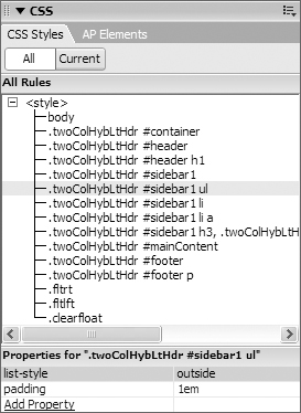
Figure 6.16. The second new rule applies to all list elements within the sidebar.

Figure 6.17. And the last new sidebar rule applies to all links within list elements.

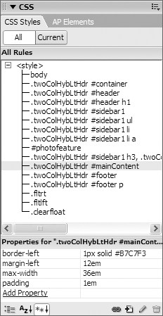
7. Next up is the main content area, and as you might guess, Dreamweaver has called it mainContent. It needs to be more complex than the default, so delete the margin property that came with the default, and set the left-hand border to be light blue, the left-hand margin to be 12em, the max-width to be 36em, and the padding to be 1em (Figure 6.18).
Figure 6.18. The mainContent div contains the main page content.
8. We have to add one div to the default layout to handle the photo and its caption. Add a div to the page by clicking the Insert Div Tag button in the Common tab of the Insert Bar  (Figure 6.19). The Insert Div Tag dialog appears (Figure 6.20). Set the ID to
 photofeature, and click the New CSS Style button. The New CSS Rule dialog appears (Figure 6.21). Click the Advanced radio button if it’s not already selected and set the Selector to #photofeature. Click OK to accept both dialogs, and you’ll see your new div on the screen.
Figure 6.19. We also need to add one new div, which will contain a photo and a caption. Here’s the Insert Div Tag button.
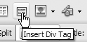
Figure 6.20. The Insert Div Tag dialog lets you choose whether or not to create a new CSS rule at the same time.
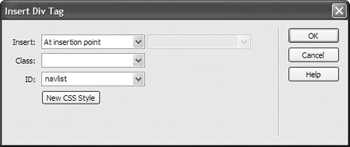
Figure 6.21. If you clicked the New CSS Style button, you get the New CSS Rule dialog. Here, you can tell Dreamweaver what you want your new rule to apply to.

In the CSS panel, set the color, the line-height, font-size and font-style, and the left and bottom padding. Also, set the div to float to the right (Figure 6.22).
Figure 6.22. Now set up the properties for photofeature, and the image and its caption will display just the way they should.

Drag an image from the Assets panel to the photofeature div, and add a caption. The result should now be similar to Figure 6.23.
Figure 6.23. The content and caption have been added here, and they’re doing just what they’ve been told to do.
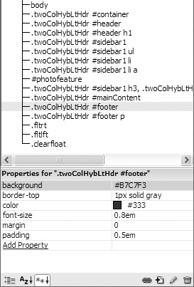
9. There’s only one last bit to go: the footer (Figure 6.24). We want our footer to be more prominent than it is in the default, so we’ll add a background color, a top border, and change the padding.
Figure 6.24. Here are the footer properties. The footer is not fixed in a particular place, so the page can be a variable length.
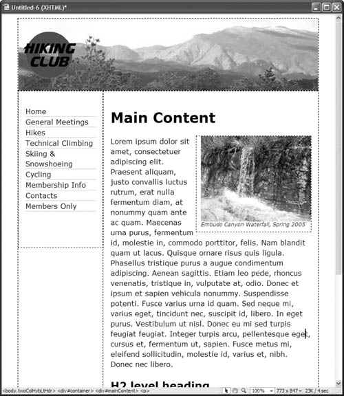
10. All that’s left is to add your text and navigation links, and your page is done (Figure 6.25).
Figure 6.25. Here’s our final page.

Tips
• Dreamweaver automatically adds the text ‘Content for id “idName” Goes Here’ whenever you create a new div. You’ll want to delete that, but don’t do it immediately. It can be hard to click inside an empty div, so leave that text there until you’ve added something inside.
• If you’re wondering why mainContent has a left margin of 12em (Figure 6.18), it’s because the sidebar has a width of 12em (Figure 6.14). That left margin keeps the main content area from overlapping the sidebar.
• If you hover over an element on the page (as in Figure 6.26), a pop-up tip appears giving you information about that element. In this case, you can see that it’s a div named footer. The tip also shows the values (if any) of float, position, top, right, bottom, left, width, height, and overflow.
Figure 6.26. Hovering over a div gives you useful information about that element.

• You don’t really need to know that white is #FFF—you can just select the color you want from the color well in the panel. We covered selecting from the color well and color picker back in Chapter 4, “Changing Font Color.”
Using the Visual Aids
Laying out pages with CSS can be frustrating because it can sometimes be difficult to tell which elements are where and why. Thankfully, Dreamweaver has a few handy features that make creating CSS-based layouts much simpler. Dreamweaver refers to these as Visual Aids.
Figure 6.25 shows our example CSS-based page with all visual aids turned off. It’s fine, but if we had a problem, it would be difficult to tell where each div begins and ends. That’s where the visual aids shine.
The visual aids can be found on the right side of the Document toolbar  .
.
Although it looks like a button, that little downward facing arrow means that it’s actually a pop-up menu. If you click it, you’ll get the options seen in Figure 6.27. Or, you can choose View > Visual Aids, and then select any of the submenu options (Figure 6.28).
Figure 6.27. Here’s the visual aids menu and your choices.

Figure 6.28. Or, you can get to it via the menu bar.

To turn each visual aid on or off, choose it from the menu to toggle its checkmark, or you can choose Hide All (Ctrl-Shift-I or Cmd-Shift-I) to turn them all off temporarily. For day-to-day use, we recommend keeping CSS Layout Backgrounds turned off, and CSS Layout Box Model and CSS Layout Outlines on.
Here’s a rundown of the CSS-related items in these menus:
• CSS Layout Backgrounds: Put on your sunglasses and turn on CSS Layout Backgrounds (Figure 6.29). With this aid, Dreamweaver assigns a different background color for every layout block. If you’ve already set a background color, that will go away, as will background images—note that while you can see the header logo, you can’t see the header background graphic.
Figure 6.29. CSS Layout Backgrounds are gaudy but useful.

Dreamweaver’s documentation describes the color choices as “visually distinctive,” but we prefer to not beat around the bush: we just call them loud and bright. Sorry, but there’s no way to change the color choices. On the other hand, the garishness makes it very clear which div is which.
• CSS Layout Box Model: You’ve seen the Layout Box Model aid (Figure 6.30) used previously in this chapter. When enabled, it shows just the selected element, including its margin, borders, and padding. If you recall from Figure 6.18, the mainContent div had a 1 pixel solid light blue left border, a 12em left margin, and a padding of 1em. When this visual aid is enabled, each of these is shown visually and uniquely on the document along with the dimensions of the div.
Figure 6.30. The CSS Layout Box Model shows you the exact limits of the currently selected element.

• CSS Layout Outlines: The CSS Layout Outlines option simply puts a dashed line around the border of each layout block (Figure 6.31). Again, you’ve seen it throughout most of this chapter. It can be tricky to see what your borders are set to when this is on, and you should also keep in mind that the dashed line includes the padding but excludes the margins.
Figure 6.31. CSS Layout Outlines give you a subtle way of telling your elements apart.

Using Design-Time Style Sheets
It’s common when working with CSS-based layouts to want something to display in a particular way while you’re designing—but only while you’re designing, that is, during design time. You can tell Dreamweaver to use certain style sheets only at design time, and even to turn off certain style sheets only at design time.
As with the previous visual aids, you wouldn’t want your real Web site to look like that, but it’s handy while trying to do those last few tweaks or track down a problem. If you want something that Dreamweaver’s built-in visual aids don’t provide, Design-time style sheets allow you to create your own.
To show a Design-time style sheet
1. Create and save a new style sheet containing the style rules that should display only inside Dreamweaver. Figure 6.32 shows an example that contains two simple rules: p is set to display:block and h1 gets a background color of orange. See the “CSS Layout Blocks” sidebar for an explanation of why you’d want to modify the p tag.
Figure 6.32. This very simple style sheet gives us extra information in Dreamweaver.

2. To choose a Design-time style sheet, either choose Text > CSS Styles > Design-time (Figure 6.33), or right-click inside the CSS Styles panel and choose Design-time from the contextual menu (Figure 6.34). The Design Time Style Sheets dialog appears (Figure 6.35).
Figure 6.33. Design-time style sheets can be chosen from the Text menu.

Figure 6.34. Or they can be chosen from the CSS panel.

Figure 6.35. But either way, you end up at the Design Time Style Sheets dialog.

3. To add a style sheet that shows only at design time, click the upper plus button  . The Select File dialog appears (Figure 6.36). Navigate to your new style sheet, choose it, and click OK.
Figure 6.36. The Select File dialog lets you choose your Design-time style sheet.

4. Back in the Design Time Style Sheets dialog, your new style sheet is now listed next to Show only at design time. If it’s correct, click OK.
5. The Web page now appears with some slight changes (Figure 6.37): the h1 title now has an orange background, and paragraphs can now be identified using the CSS Layout Box Model visual aid. If we use the CSS Layout Backgrounds visual aid (Figure 6.38), paragraphs are now clearly distinct from other elements on the page.
Figure 6.37. Now the h1 is all lit up.

Figure 6.38. Paragraphs are delineated when the background visual aid is used.

To hide a style sheet at design time
• Follow steps 2 through 4 from “To show a Design-time style sheetî earlier, but click the lower plus button instead. Select a style sheet to hide, and click OK.
In Figure 6.39, the main style sheet for the page has been hidden. This allows you to see the page without the effect of styles, or to see the page with some styles but not others. This can be a big help when trying to track down CSS-related issues.
Figure 6.39. Style sheets can also be hidden, as seen on this plain page.

To remove a Design-time style sheet
1. Bring up the Design Time Style Sheets dialog as described earlier. Select the style sheet to remove and click the minus button  above the style sheet name. If you have multiple style sheets to remove, continue to delete them in this way.
2. Click OK, and your Web page displays closer to the way it will appear on the Web.
Tips
• Design-time style sheets are an extremely powerful tool when used in conjunction with Dreamweaver’s CSS Layout Blocks.
• Despite how it looks, your document is not actually being changed. Design-time style sheets are not really added to or removed from your Web page: Dreamweaver handles it all internally.
• Don’t forget that you also have the Style Rendering toolbar (covered in Chapter 1), which you can use to display your page as it would appear with print style sheets, handheld style sheets, projection style sheets, and so on. You can also use the Style Rendering toolbar to turn off the display of style sheets altogether.
• It’s worth noting that when you remove Design Time Style Sheets from your document, you’re not actually deleting the style sheet itself—you’re just removing the relationship between your page and the style sheet.
Using the Grid
If you want items on a page to line up, a handy way to do it is to use the grid—a feature you may well be familiar with from other applications such as Photoshop. If you’re used to it elsewhere, it’s easy; if you’re not, here’s a quick overview.
The grid overlays graph paper–like lines on your Web page, making it easy to see if elements on the page are horizontally or vertically aligned. Nothing on your page is actually changed, and the lines are only visible inside Dreamweaver. If you choose to have elements on your page snap to the grid, whenever you move an element close to a grid line, it will “jump” (or snap) to match up with it. This way, you know for sure that your elements are perfectly aligned.
To turn the grid on or off
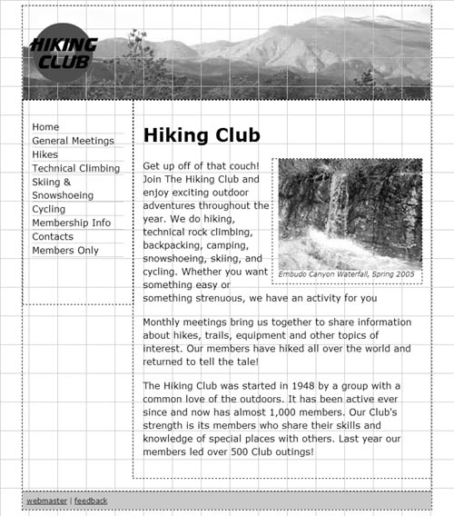
• To toggle the grid display, choose View > Grid > Show Grid (Figure 6.40), or click the View Options menu button on the Document toolbar (Figure 6.41) and choose Grid, or press Ctrl-Alt-G (Cmd-Option-G). Your document displays the grid if it wasn’t already displayed (Figure 6.42), and vice versa.
Figure 6.40. You can get to all the grid options from the menu...

Figure 6.41. ...and you can turn them on or off from the View Options menu.
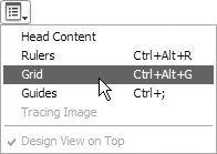
Figure 6.42. Here’s our usual page with the grid visible.
To change the grid settings
1. Choose View > Grid > Grid Settings (Figure 6.40). The Grid Settings dialog appears (Figure 6.43).
Figure 6.43. If you don’t like the grid defaults, the settings can be changed.
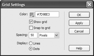
2. From this dialog, you can change the color, spacing, and whether the grid displays as lines or dots. You can also use this as a way to set the Show grid and Snap to Grid options at the same time. If you want to check how a setting looks, click Apply. When you like your results, click OK, and if the grid is set to show, your document appears with your chosen grid style. If the grid is not set to show, the settings will still be changed, and will display their new values the next time you show the grid.
To make elements snap to the grid
1. Choose View > Grid > Snap to Grid (Figure 6.40), or check the Snap to grid check box in the Grid Settings dialog (Figure 6.43), or press Ctrl-Alt-Shift-G (Cmd-Option-Shift-G).
2. Move an absolutely positioned page element. It snaps to line up with the grid if you move the element within a few pixels of a grid line.
Using Guides
Like grids, guides are another tool commonly found in other design applications. Guides can do almost everything grids can, and a whole lot more. For instance, guides can be locked into place, guides can be set to percentages of the page, and not only can elements snap to guides, but guides can be set to snap to elements.
To turn guides on or off
• To toggle the display of guides, choose View > Guides > Show Guides (Figure 6.44), or click the View Options menu button on the Document toolbar (Figure 6.45) and choose Guides, or press Ctrl-; (Cmd-;).
Figure 6.44. As you could with the grid, you can get to many guide options in the menu.

Figure 6.45. You can turn guides on and off from the View Options menu.

To add a guide to your page
1. Click the cursor in either the horizontal or vertical ruler, and drag into the document. The guide appears along with a tip that displays the number of pixels that the guide is currently away from the edge of the document (Figure 6.46).
Figure 6.46. By default, guides are measured in pixels.

2. When the guide is where you want it, release the mouse. The line remains, but the tip goes away.
To edit guide settings
1. Choose View > Guides > Edit Guides (Figure 6.44), and the Guides dialog appears (Figure 6.47).
Figure 6.47. Use the Guides dialog to change any of its settings.
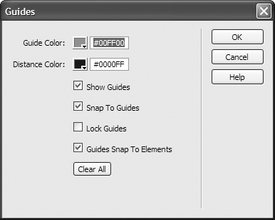
2. From here, you can set:
• The guide and distance colors.
• Whether guides should show.
• Whether elements should snap to guides, guides snap to elements, both, or neither.
• Whether guides are locked.
You can also use it to clear all the current guides by clicking the Clear All button.
3. When your changes are complete, click OK.
Tips
• To move a guide, move the mouse over the guide. When the cursor changes, click the guide and drag it to its new location.
• To remove a guide from your page, move the guide off the document. Mac users will see a little “puff of smoke” animation—sorry, Windows users! You can also remove all the guides at once (without the animated effect) by choosing View > Guides > Clear Guides (Figure 6.44) or by clicking Clear All in the Guides dialog (Figure 6.47).
• To inspect the current position of a guide, hover the cursor over the guide, and a tip showing the position appears.
• To position a guide based on the percentage distance of the document rather than pixels, hold down the Shift key while moving the guide (Figure 6.48). The tip displays the current location in both pixels and percentages when you’re moving it and also when you check the guide’s position later.
Figure 6.48. If you want a percentage instead of pixels, hold down the Shift key.

• To see how far a guide is from the sides of your document, hold down the Ctrl (Cmd) key. Lines appear showing the distance in pixels (and percentage, if set in the previous tip) to the edges of the document (Figure 6.49). If you have multiple guides on your page, the distance shown will be from guide to guide or from guide to edge.
Figure 6.49. Holding down the Ctrl (Cmd) key gives you the distance between the document edge and the guide.

• Guides can be locked on your page so that they can’t be moved. To do this, choose View > Guides > Lock Guides (Figure 6.44) or use the Guides dialog (Figure 6.47). It’s a toggle, so just do it again to unlock your guides.
• Rulers have to be visible for you to add guides, but you can view, move, and delete guides even when the rulers are hidden.
• Guides can be used to simulate dimensions of standard browsers. Choose View > Guides and pick one of the standard sizes from the bottom of the menu (Figure 6.44). This creates both vertical and horizontal guides on your page. Be careful, though, as you can still move them accidentally, and then they aren’t much use at giving you your dimension hints. This is the one exception to the previous tip: you can create guides with this method even when the ruler is hidden.
• As with the grid, you can choose to snap elements to your guides—but you can also choose to snap guides to your elements. Choose either View > Guides > Snap To Guides, View > Guides > Guides Snap To Elements, or even both (Figure 6.44). Or, you can set them in the Guides dialog (Figure 6.47).
• If you double-click a guide, the Move Guide dialog appears (Figure 6.50). Use this dialog to set the guide to a precise position in pixels, inches, centimeters, or percentages.
Figure 6.50. Double-click a guide to get to the Move Guide dialog.

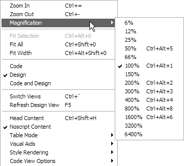
Zooming In On Your Page
Yes, it’s another feature borrowed from standard design applications, just like the grid and guides. The Zoom feature lets you design your pages more precisely. And as with the grid and guides, you’ll need to be in Design view to use it.
To zoom into your page
• Select the Zoom tool  from the status bar at the bottom right of your document, and your cursor changes to a magnifying glass with a plus
  . While in zoom mode, you can do either of two things:
• Click and drag to draw a box over the area you want to zoom in on (Figure 6.51). That rectangle expands to take up the entire document window.
Figure 6.51. You can zoom in on a particular part of the screen.
• Click the spot on the page you want to magnify. Continue to click it until you get the magnification level you want.
or
Press Ctrl-= (Cmd-=) until you’ve reached the level you want.
or
Select a magnification level from the Zoom pop-up menu in the status bar (Figure 6.52).
Figure 6.52. Pick a particular magnification level to make everything larger or smaller.

or
Type your desired magnification level into the Zoom text box in the status bar  .
.
or
Select View > Magnification and pick a magnification level (Figure 6.53).
Figure 6.53. You can also get to the magnification levels from the menu.
or
Select an element on the page, and then choose View > Fit Selection (Figure 6.53).
or
Select an element on the page, and then choose Fit Selection from the Zoom pop-up menu in the status bar (Figure 6.52).
To zoom out from your page
• Select the Zoom tool from the status bar at the bottom right of your document. Press Alt (Option) and the cursor changes to a magnifying glass and a minus  .
.
Click on the page to zoom out.
or
Press Ctrl- (Cmd-) until you’ve reached the level you want.
or
Select View > Magnification and pick a magnification level (Figure 6.53).
or
Choose View > Fit All or View > Fit Width (Figure 6.53).
or
Choose Fit All or Fit Width from the Zoom pop-up menu in the status bar (Figure 6.52).
Tips
• To edit your page in Zoom mode, select the pointer in the status bar  and click inside the page.
• To pan your page after you’ve zoomed in, select the hand icon in the status bar  , and then drag the page to move around.
Setting Page Dimensions
It’s handy to be able to easily set guides to show the dimensions of common browsers, but it’s not quite the same as seeing how your design actually appears in a window of that size. That’s where setting page dimensions comes in.
To resize the window to a preset size
• Click the Window Size pop-up menu in the status bar, and select one of the listed sizes (Figure 6.54). Your document window resets itself to that size.
Figure 6.54. Dreamweaver comes with preset window sizes for the most commonly used monitors.

To edit the preset window sizes
1. Click the Window Size pop-up menu in the status bar, and select Edit Sizes. The Status Bar preferences display appears (Figure 6.55).
Figure 6.55. You can view or edit the window sizes in the Status Bar category of Dreamweaver’s Preferences.

or
Open Dreamweaver’s preferences and select the Status Bar Category.
2. Click in any of the fields and write over the current value to replace it. To add a value, click in the first unfilled line (Figure 6.56). To delete a value, clear the entire line by deleting the contents of each field.
Figure 6.56. New sizes can be added just by clicking in the first unused line and typing the appropriate dimensions.

3. Click OK to accept. The new size now appears in the Window Size pop-up menu (Figure 6.57).
Figure 6.57. And here’s our new window size.

Tips
• You can resize the window to a fixed width (leaving the height alone) by entering only a width value. To make the window resize to a fixed height, enter only the height.
• You can’t resize a document on Windows if it’s maximized.
• While it looks like you can sort the values in the Status Bar preferences, you actually can’t.
• Sadly, if you enter a new window size, it doesn’t get added as a new possible value for creating guides—it’s only for resizing.
• While you’re in the Status Bar preferences, take the chance to reset the Connection speed if it’s not appropriate for you or your audience. That number is what Dreamweaver uses to calculate page download time, which is shown on the far-right end of the status bar.
Old Time Dreamweaver
Once upon a time, it was difficult to make a Web page look just the way you wanted it to look because browsers had very little support for layout. Dreamweaver worked hard to make positioning possible despite the poor browser support, and the primary way Dreamweaver did this was with what it calls layers. The remainder of this chapter covers them.
It’s important to note that Dreamweaver’s layers are not the same thing as the HTML layer tag. The layer tag was implemented in Netscape 4 and only Netscape 4. Neither earlier versions of Netscape, nor later versions of Netscape, nor any other browser ever included it—so don’t even bother with it.
Given the capabilities of Dreamweaver, and the browsers that are now commonly used, Dreamweaver’s layers are in nearly the same shape as that of the HTML layer tag: obsolete, and not for use going forward. However, you may have older sites that were set up with layers, so it’s worth learning a little about how they work.
Layers are now AP Elements
If Dreamweaver CS3 is the first version of Dreamweaver you’ve ever used, or if you never bothered with layers in the first place, you can skip this. For everyone else, though, you may be wondering: what happened to all my layer commands? The answer is, they were renamed AP (absolutely positioned) Elements.
You can create an AP Element by going to the Layout tab of the Insert Bar, clicking the Draw AP Div button  , and then drawing a box in the document window (Figure 6.58). Each box you draw is absolutely positioned on your Web page, with a fixed height and width and a fixed position from the top and left edges of the page.
Figure 6.58. When drawn, AP Elements look like a simple box on the screen.

The divs can be selected, moved, and resized by clicking the border of a layer. Once an AP Element is selected, you can see its selection handle and resize handles (Figure 6.59).
Figure 6.59. When you select an AP Element, it has selection and resize handles.
Once you’ve added your AP Elements to your page, they can be used in the same way divs were described earlier—you can add text, images, or whatever you’d like to your AP Elements.
Styles for AP Elements are internal, and each layer has a separate set of rules of its own—usually with meaningful names like apDiv1 and apDiv2. If you want to see which AP Element you’re working on, move the cursor over the div and a tip appears giving the id, size, and position of that div (Figure 6.60).
Figure 6.60. Hovering over an AP Element gives you the div’s name, size, and position.

AP Elements can overlap other AP Elements if you define them to do so (Figure 6.61). If you don’t want them to overlap, you can check the Prevent overlaps box in the AP Elements tab of the CSS panel (Figure 6.62). That panel also contains the visibility indicator: a blank space, or an open or closed eye, on the left side of the panel. If the eye is open, that AP Element is visible. If the eye is closed, that AP Element is hidden. If the column is blank, the AP Element inherits its parent’s visibility (AP Elements that have the document as their parent will be visible). The right column of the table is the Z-index of the AP Element. The Z-index indicates the stacking order of the elements. For example, an element with a Z-index of 2 will display over an element with a Z-index of 1 anywhere they overlap. Wherever two AP Elements overlap, the one with the higher Z-index displays. The numbers don’t have to be sequential; for instance, if you want something to always display, give it a huge Z-index such as 5000.
Figure 6.61. AP Elements can be overlapped, and you can tell Dreamweaver which goes on top.

Figure 6.62. The AP Elements tab of the CSS panel lets you show and hide divs as well as set the Z-index.

Converting AP Divs to tables
You could use AP Elements just like divs, and given that the AP Elements tool actually creates divs, that would be somewhat equivalent. But the real point of AP Elements was to be able to lay out pages visually in the days before divs had widespread browser support. So, that was the next step: converting AP Elements to tables. This is where things get ugly fast.
To convert an AP Divs-based page to tables
1. Choose Modify > Convert > AP Divs to Table (Figure 6.63). The Convert AP Divs to Table dialog appears (Figure 6.64).
Figure 6.63. Converting AP Divs to tables is found under the Modify menu.
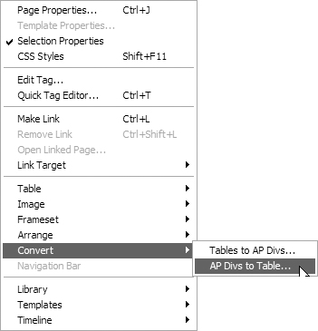
Figure 6.64. The Convert AP Divs to Table dialog lets you set several options, and Dreamweaver obeys some of them.
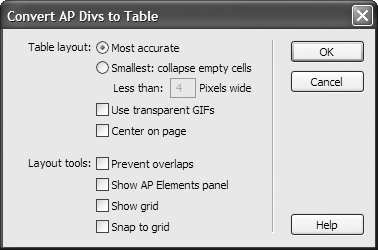
2. The Convert AP Divs to Table dialog gives you a number of choices:
• Whether you want your new table to be as close as possible to the original, or as small as possible, which collapses empty cells. If you choose the latter, you have the option of choosing how small cells must be before they’re collapsed.
• You can choose if you want to use transparent GIFs. If you do this, the bottom row of your table consists of spacer GIFs, forcing your new table into strictly sized columns.
• You can choose if you want your new table to be centered on the page.
• You’re given a choice of whether or not you want to prevent AP Div overlaps, but it doesn’t matter what you pick; Dreamweaver doesn’t care. If you turn this option off and turn off the Prevent overlaps choice on the AP Elements tab of the CSS panel, and then try to convert a page that contains overlapping AP Elements, you’ll still get Figure 6.65, which tells you that you can’t convert this page. If that’s your situation, move your divs until they no longer overlap (Figure 6.66).
Figure 6.65. Whether you care or not, Dreamweaver won’t let you convert your AP Elements to a table if there are any overlaps.
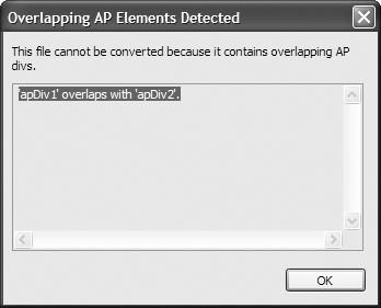
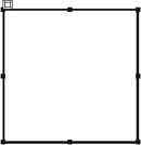
Figure 6.66. Here’s our simple page before the conversion.

• You’re given a choice of whether or not you want the AP Elements tab of the CSS panel to show after the conversion. If you turn this on, the AP Elements tab and CSS panel will be open when the conversion is done. If you turn it off, and the AP Elements tab was previously open, the CSS panel group collapses. If you turn it off and the AP Elements tab isn’t currently open, nothing happens.
• You also have a choice of showing the grid, and of whether you want to snap your new table cells to that grid. You can choose one, both, or neither.
3. Click OK to accept, and your page will be re-created in tables (Figure 6.67). Except...it doesn’t really work correctly. For instance:
• In the original layered version, the right-hand layer had 10 pixels of padding and the text was white. In the new tables version, all of that is gone. However, the colored backgrounds of both remain.
• If you look at the source code, the rules that were created for the two AP Elements still exist, even though they aren’t used any more.
Figure 6.67. And here’s our page after the conversion, not looking quite the same—the fonts and padding were lost.

Tips
• You can’t convert just some of the AP Elements on a page. The conversion process converts all AP Elements on the page.
• We’re not sure why anyone would want to check the Show AP Elements panel box. After all, once you’ve converted from AP Elements to tables, the AP Elements tab isn’t of any further use to you!
• There really is no excuse to create new pages with this method: you can start and end with tables if that’s what works for your site, or you can start and end with divs, but there is no reason to start with AP Elements and end with tables.
Converting tables to AP Divs
Okay, you’re convinced—tables aren’t the way to do layout any more, and you want to convert all your pages to CSS and divs. Great!
And then you remember that back in Figure 6.63 there was another option: Modify > Convert > Tables to AP Divs. Well, this is going to be easy, you think: after all, AP Divs are just a sort of div, right? Not so fast there.
To convert tables to AP Divs
1. Choose Modify > Convert > Tables to AP Divs (Figure 6.63). The Convert Tables to AP Divs dialog appears (Figure 6.68).
Figure 6.68. You can also convert tables to AP Divs, although you shouldn’t.
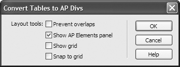
2. The Convert Tables to AP Divs dialog is similar to the Convert AP Divs to Table dialog, but it has considerably fewer options:
• You can choose to check Prevent overlaps, but whether or not you check this, none will be created.
• The Show AP Elements panel choice makes considerably more sense here than it did going the other way around.
• And again, you can choose to take this opportunity to Show grid and Snap to grid.
3. Click OK when you’re ready to see the mess that ensues. For instance, the HomeCook site (Figure 6.69) looks fine in tables; after its conversion to AP Elements (Figure 6.70), it appears rather odd:
• The HomeCook text in the header has moved up to the top of the screen, while the tagline below it has stayed in place.
• All the font styles have been lost.
• Font colors have been lost in some places but retained in others.
• The bullet points next to the navigation items are gone, and the navigation no longer goes all the way over to the left margin.
• The colored vertical bar on the right side that contains reviews now has varying widths.
Figure 6.69. Here’s a straightforward page designed with tables.

Figure 6.70. But that page doesn’t quite make the transition to AP Elements very well.
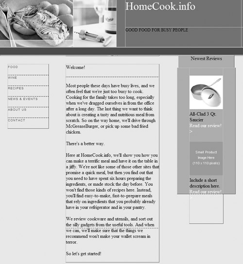
And so on. The new version also contains 22 divs, each of which has its own style rule including fixed size and position on the page.
Tip
• If you have a page that contains both tables and other elements, converting that page to AP Elements moves everything (not just the tables!) into AP Elements.