
In This Chapter
Getting acquainted with the mobile Internet
Settling on the purpose of your mobile site
Securing a mobile domain name
Designing, testing, and updating your mobile site
The rising tide of mobile device use, especially smartphones and connected devices (see Chapter 1) is the piston driving the mobile Web forward. As billions across the globe grow to rely on their mobile devices to connect and communicate, the mobile Web's importance expands exponentially.
Today, many users are wowed by mobile applications (see Chapter 9) designed to do everything from simply acting like a Zippo lighter, to recognizing songs on the radio, recommending restaurants in the immediate area, buying stuff, or conducting global banking and commerce. The current apps craze, while impressive in its sheer inventiveness, may ultimately be left behind by a richer mobile Web that provides users with the same content and functionality now found on the traditional Web (For the curious, see the sidebar titled, "The mobile Web versus apps and the role of HTML 5" at the end of this chapter for more on this topic.) To ignore or underestimate this natural progression of the mobile Web is to miss a huge marketing opportunity.
Moving forward, many first impressions between companies and consumers will be made on the mobile Web. If you don't have a mobile Web site for mobile users, your first impression could be your last. In fact, if you learn nothing else in this chapter, know that having a mobile Web site is absolutely crucial to your business, whether it's a full-fledged optimized site or a simple default site with your company's address and contact information.
In this chapter, we help you understand the mobile Web's nuances, potential, and limitations, consider the purpose of your mobile site, introduce site development tools, discuss design and site content considerations, and help you choose a domain strategy.
Offering up the same content and experience to mobile users that you provide people in a desktop environment is a huge mistake because mobile devices have a vastly different form of use than computers. The mobile Web implies an intimate one-to-one experience, often with a user that is on-the-go or visiting the mobile Web to perform a specific purpose (like checking sports scores and the weather forecast or looking to buy a specific item). The mobile Web is a completely different animal than the traditional Internet, which was and is developed for stationary consumption.
Tip
When building your mobile site, put yourself in the user's mindset. People on the go or with a specific agenda in mind have little time to dig through menus, scroll left or right, or wait for pages to load. They're frequently multi-tasking — walking down the street or drinking a cup of coffee with one free hand while browsing at the same time with the other. Keep in mind that about 90% of the population is right-handed, so you may want to optimize one-hand use with the idea that the right thumb can reach the primary features. It's critical that you think through what people will want to do on your site and make sure that your site lets them perform these actions quickly and easily.
One common mistake is trying to give mobile Web visitors quick access to your entire broadband Web site experience. A more prudent plan is to develop a simple, clean home page that loads quickly on a mobile device over the wide range of mobile networks and puts key information a click or two away. Simplifying makes sense. Creating a short, descriptive page title, using simple language, and providing order to the content you present are all great ways to stay on track.
The next sections show you how to think about the differences between the mobile Web and the traditional Web so you can have a new perspective and incorporate that perspective into your mobile Web site design.
Context should always be a high priority when developing a mobile Web presence, that is, a mobile Web site. Context simply refers to all the data that helps you understand how to make the site relevant to the user's current situation — that is, location and time are key contextual elements, as are events in the news, the weather, and so on, as well as all the things you may know about this person, like her past behavior, interests, and so on. For example, your customer might be trying to find directions to your store while she is her car. (Hopefully, she's pulled over to the side of the road!) Put yourself in the shoes of people coming to your site. They are usually looking for quick access to actionable information around a specific task. They probably aren't going to be browsing around to find out everything about your business. They usually do that type of browsing on a computer.
Note
The user experience is different on the mobile Internet. A recent Microsoft Advertising study (2010) noted that the average person conducting a search on the mobile Web finishes what she sets out to do, for example, performing a local search, in about an hour, whereas on a PC, this search effort on average takes a month.
Here are some other behaviors you may consider about mobile users. Today, for the majority of mobile users, people visiting your mobile site
Won't be planning their vacation, but they will be checking their arrival/departure times, searching for area restaurants, and looking for phone numbers, maps, and recommendations.
Won't be looking to compare mortgage or savings rates on their phone, but they will be looking for your nearest branch bank office.
Won't be reading in-depth news reports (unless they're on an Apple iPad or Cisco Cius), but they will be checking headlines, stories, sports scores, and checking the weather.
Won't be browsing your entire fall lineup of fall fashions, but will be looking for your contact info, special sales, and online coupons. Alternatively, they might buy a specific item like the latest Steve Madden shoe at
http://m.stevemadden.comor a printer cartridge from Best Buy atm.bestbuy.com.
Tip
You can help yourself discover the context your customers are most likely to be in by using a survey to ask them how they use your Web site and how they use mobile sites. Go to Chapter 5 to learn how to send out a mobile SMS survey, or consider doing it through e-mail. You can also use location detection and then use this data to determine what is happening around them.
Your approach to the mobile Web can have a direct impact on what customers think of your company. A simple example may prove illuminating. Suppose you're out holiday shopping. You can't find the perfect gift, so you look up a retail Web site to locate a store nearby and browse for gift ideas. One of three things is likely to happen, depending on how the retailer's mobile Web site is designed:
The Web site you go to is Flash-based or has a lot of scripting. Because most mobile phones don't display Adobe Flash content (the mobile video Web standard supported by Adobe) or scripts, your customers will see only broken links (see Figure 8-1). You move on and unconsciously write off the retailer.
User experience: Not good. The user can't even see the site.
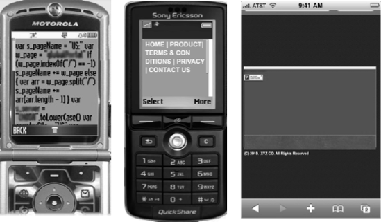
The Web site comes up, but the content is not relevant. Instead of information your customer needs, the site displays company information, press releases, career opportunities, and investor information. Your customer is forced to dig for the information they want, but eventually exit, thinking that the retailer doesn't really understand or value mobile users like them. Figure 8-2 is an example of this type of site.
User experience: Frustrating. The user can't easily find the information he needs.

Figure 8-2. Mobile site content can be difficult to navigate if it's not optimized for mobile devices.
The Web site is optimized for mobile users. Your customer is quickly able to find a phone number, store locator, sale links, and an online purchase path, like the site shown in Figure 8-3. He can browse sale items, call your store, find out that you have exactly what he needs, and spend part of his afternoon in your store buying gifts. He thinks "Cool. This company gets it. I'll be back." In fact, he does go back. Regularly.
User experience: Relevant and memorable. The user can easily view and interact with all aspects of the site.

You can find similar examples in most any line of business. When people use a mobile phone to access the Web, they demand three things:
Speed: Pages load much slower on most mobile devices than they do on a computer — even on a 3G network. That's because the device's processing power isn't as robust as that of a computer. Because time is of the essence for most mobile users, abandon rates (the percentage of people who get impatient and give up waiting for a site to load) on the mobile Web are much higher than on the traditional Internet. Most understand that if your site is slow to load, it probably hasn't been optimized for mobile, so it's a waste of their time to wait. When designing your site, use the minimum amount of content necessary to get your message across and format your images and videos for mobile devices.
Easy navigation: Because most mobile devices don't have a mouse and have a really small screen, your navigation links can't be the same as on a computer. Mobile navigation is often placed at the bottom of a site, as shown in Figure 8-4, but a variety of navigation schemes work for the small screen. (We discuss these in the section "Designing and Building Your Mobile Site" later in this chapter.)
Relevant content: Probably one of the most important things about a mobile site is the task-oriented nature of its content. People who browse the mobile Web are usually trying to accomplish a specific task — even if that task is just being entertained while killing time. Flip ahead to the "Creating Mobile Site Content" section to discover how to make your content more relevant to task-oriented visitors.

Why can't the rich, interactive Internet experiences you enjoy on your personal computers be seen on your mobile device? The answer is deceptively simple. Most Web sites aren't created using a language that the mobile Web browser can understand. It's like asking someone who only knows English to read and write in another language. Feature mobile phones, the phones with the largest penetration in the U.S — about 75% as of this writing — simply do not have the capabilities and format of a full computer, which leads to limitations in rendering traditional Web sites on the phone. Smartphones, which account for 25% of the phone penetration in the U.S., have much more capable browsers and can view rich media Web sites. Smartphones are expected to reach 50% market penetration in the U.S. by end of 2011. To compensate for these differences, new browser languages are being developed for the mobile phone.
To make matters more complicated, different mobile browsers, screen sizes, and handset features make it challenging to design your mobile Web site so each user on each handset has an optimal experience. Indeed, the very same handset can react differently depending on which mobile operator network it's running on.
You could build a different mobile site for every type of phone and operating system, but that wouldn't be practical because there are literally thousands of different mobile devices and operating systems. Although standards are emerging, you simply can't design a different site for every one of your customers. You would have to know what phone and operating system every one of your customers has! Fortunately, mobile Web application providers have a way around these rendering problems (the display of your mobile Web site on these different types of phones). First, they can offer you mobile device detection code for your broadband Web site to redirect mobile users to the mobile version of your Web site. Mobile Web app providers can also offer you code that detects which of the many thousands of devices may be requesting your page so that the application provider software can dynamically modify the site (size of images, width, scripts and code) to suit the phone. When someone comes to your mobile site, the code automatically detects the phone, browser, and operating system and renders the mobile site in the format that's best for that phone (see Figure 8-5).

Note
Of course, the code doesn't work by itself. Your application provider's platform has to be able to interact with the code to serve up your site's pages in all kinds of different configurations and it has to keep track of all the new phones, operating systems, and browsers coming on the market. Talk to your application provider to make sure your mobile Web site has the capability to render in all environments, especially to those mobile devices your market research has determined are carried by the majority of your customers. Review your Web site logs or use third-party research services like comScore and Nielsen to find out what devices your customers use.
Tip
Until standards are established for a format that works for all mobile devices, many mobile Web developers choose to design their sites based on the top four or five handsets and screens that are used by their target customer base, or by those phones visiting their broadband site. They may create two or three versions of the same mobile site that vary by image size, line breaks, columns, and so on. For example, they may create versions specially designed for the iPhone, Google Android, and BlackBerry. The version served up to the user is based on the detection code we mentioned previously. They then have their application provider's platform automatically render the site for the thousands of other phones. More on this in the section "Designing and Building Your Mobile Site" segment later in this chapter.
A traditional Web site is usually the destination for all your company's information including everything from products for sale to job postings. Mobile sites need to be established with a specific purpose in mind because people who view mobile sites aren't going to dig through hundreds of links to find the task-oriented information they need.
The next sections help you to establish a purpose for your mobile site so you can serve your customers and prospects with only the most relevant information.
Establishing a purpose for your mobile Web site should take the needs of your prospective visitors into account, not the needs of your company. Answering the following key questions can ultimately help lead to a solution that works for you and your customers:
What are your customers most likely trying to accomplish with your site? Make a list of all the tasks that your customers need to accomplish on the go. Examples include finding your phone number or directions to your store, looking up in-stock availability of an item, or making a reservation.
What functionality do you need to give customers on your site? You can serve up content like text, images, videos, and audio, or you can give them interactive functions such as chatting with customer support.
Will your audience be buying things through your mobile site? If so, you need to make sure your site can accommodate payment gateways and security. If not, your site can act as a source of information for making purchases through another means such as on a computer or in a store. Remember that people can phone in a purchase too. After all, it's still a phone!
Will social media be a consideration? Social media interaction on mobile devices is getting a lot more popular and familiar to mobile users. Make sure you build social media into your site if you have social media users among your customers and prospects.
These are just a few of the questions you should ask and answer for yourself. You know your business best, so think through them all. To help generate additional thoughts, see Chapter 2.
Before you head off to design and develop your mobile Web site, consider that there are many different types of sites, all of which have their uses. Among the many permutations, there are three basic types of mobile Web sites you need to be aware of:
Basic landing page: This is generally a simple, one-page site built to deliver basic information fast. Traffic frequently comes from online ads. Restaurants, small retailers, and service companies are often well served by this type of site. Populate the basic site with
Key contact information
Operating hours
Map/locator
Special events
Any other information important to people on the go
Promotional site: Promotional sites are built around a specific product, event, or limited time promotion. For example, a music festival would likely build a promotional site to provide festival-goers with the lineup/schedule, sponsorship information, maps, special events, and links to local happenings and restaurants. After the event is over, the site might go away.
Persistent site: Persistent sites are permanent, evolving sites designed to meet the ongoing needs of mobile Web site visitors. Businesses expecting constant customer traffic — from airlines and banks to social media and on-the-go information portals — build persistent sites to provide easy access to information mobile Web visitors constantly need. An airline company, for example, might create such a site to make it easy for visitors to check departure and arrival status, view reservations, and check in online.
Tip
Your mobile Web marketing strategy might involve building and maintaining more than one type of mobile site at a time. To avoid confusing your audience as to which site to visit, choose a domain name strategy that differentiates your mobile sites. We discuss mobile domain strategies in the next section.
Getting people to visit your mobile Web site requires them to know the address of that site, for example, www.mobilemarketingfordummies.com. Before you decide on a name, you need to know how to spot the different parts of a domain name:
The part of your site's address that includes the letters before the dot is called your site's domain name.
The part of your site's address that includes the letters after the dot is called your site's domain extension.
Your domain name strategy is critical because your audience needs to know your domain name in order to visit your site. You have several options when it comes to how to create your mobile domain:
Use a completely different domain for your mobile site. For example, you could use
abccompany.comfor your traditional site, andabccompanymobile.comfor your mobile site. This means you are asking customers to remember both your traditional Web site address and your mobile site address. This method is not recommended unless you're creating a special promotional mobile site that is named after your product or your event.Create a subdomain, such as
m.abcompany.comormobile.abccompany.com, to keep your mobile site as part of your brand. This method isn't much better than creating two different domains because ultimately you're still asking your customers to remember two different domains.Use a .mobi domain extension, as in abcompany.mobi. The .mobi extension is a top-level domain extension meant specifically for delivering the Web to mobile device users. A .mobi site signals to visitors that your site follows certain style guidelines to optimize it for easy viewing. Still, your customers need to remember to use the .mobi extension when visiting you on the mobile Web.
Use detection code on your server to parse traffic based on the device being used. (See the sidebar "How does broadband to mobile redirect work?" elsewhere in this chapter.) Your mobile Web application provider can give you code that automatically detects the device and sends computer users to your traditional Web site and mobile users to your mobile site. This method is often called user agent detection. This is a great solution, but keep in mind that your mobile users might sometimes want to see something on your traditional site. If you go with this method, include a link to your traditional site in your mobile site just in case your visitors need to find some content your mobile site doesn't contain (see Figure 8-6).
Tip
Whichever naming convention you choose, keep it short. Remember, typing a long URL into your mobile browser can make for the start of a bad user experience.

Web sites designed to be viewed by PCs are developed in a number of different programming languages, including HTML, Flash, XML, Ajax, PHP, and more. Your browser is designed to read and understand the instructions written in these languages, as well as learn new languages. The same concept holds for your mobile Internet browser. Languages have been developed to improve your experience when viewing the mobile Web — including WAP, XHTML, cHTML, and KHTML — but they are all device- and operator-dependent, meaning they don't work on all phones or networks. Because fewer than 1% of Web sites today can be viewed properly on a mobile phone, we have a long way to go before the mobile Web is a finished product.
One strategic decision sure to have ramifications for how you build your mobile site is what types of handsets you plan to support. Because handsets are not standardized, you need to determine which type of site to build:
To determine which type of site you need, take a good look at your audience. Who is coming to your site and what do they need to do on it? Site analytics can give you a very clear idea of what type of handsets access your site and what kind of site might be your best bet (see Chapter 14 for more on site analytics).
A default site should be designed for the lowest common denominator, to render the same on practically all mobile handsets. A default site is generally a basic, low-effort text site free of bells and whistles that gives visitors easy access to key information on your site using simple HTML, CSS, and semantic markup.
When designing a default site
Choose a readable font and size
Use a single-column format
Minimize scrolling
If a basic default site isn't enough, the next step up is a site designed to provide more functionality and a richer user experience. Using style sheets, forms, and map integration, for example, you can ensure that visitors can access a professional-looking site to get the information they need and take advantage of advanced handset capabilities. For more details on style sheets, forms, and maps, see Mobile Web Design For Dummies by Janine Warner.
When designing this type of site, determine what specific phone capabilities you want to take advantage of or enable before you get started. Testing is very important, as even the same handsets react differently depending on the network.
This type of site gives users access to videos, forms, maps, and other features and functionality enabled by iPhones, BlackBerrys and Windows Mobile phones, among others. If you want to ensure an optimal experience for customers on smartphones, this is the way to go. Although it takes more effort to build out your site, but it also provides considerably more benefit and improves usability for more sophisticated mobile users.
Building a simple mobile version of a Web site isn't difficult. Building a mobile site that looks good on multiple mobile-phone models and browsers is an entirely different story. Your options depend on your site's complexity, your expertise, and your budget. You have three primary options:
Working with an agency: If you have a budget, high expectations, a demanding timeline, and little expertise in mobile site building, working with an agency to develop a mobile Web site is a smart approach. Working with an agency offers many advantages, including brand consistency, ease of maintenance, and a single and trusted point of contact for updates. An agency can help you identify and answer all the key issues involved in your mobile site build. Check to be sure the agency you choose has the specific skills you need, plus broad expertise in the mobile space, Web site design and development, as well as the content development, database, and backend IT capacity you require.
Using automatic transcoders: Automatic transcoders are software tools that look at the HTML code in an existing Web site and translate the code into a mobile-friendly version on the fly or in order to produce a static mobile site. Transcoders work well for simple HTML Web sites. Buyer beware, however. Although they're a nice, simple solution, they are far from perfect. Pages are rendered based on templates, which can lead to a far less visually appealing site. DotMobi, the leading mobile domain registrar, offers a great free transcoder with the purchase of a .mobi domain. UsableNet offers high-end transcoding of existing sites at
www.usablenet.com.Using visual editors (see Figure 8-7): If you are creating a mobile site from scratch, or maybe just using assets from an existing wired site, a visual editor tool is a good choice. Visual editors are usually Web-based, drag-and-drop or WYSIWYG (What You See Is What You Get) site-building tools. They make it fairly simple to create a basic site. You can upload images and create and format pages simply. Some visual editors even have advanced features, such as the ability to pull in dynamic content from an RSS (Really Simple Syndication) feed and populate databases with user information (RSS is the industry standard for converting Web content into data feeds, like news stories, so that the content can be easily shared across the Internet). Visual editors are a great choice if you want to build a basic site that renders correctly on almost all phones and includes some complex features (RSS feeds and so on), but don't want to bother with designer or developer expenses. However, use caution. Aside from a few templates, visual editors give you little freedom to customize your site. Most sites created with a visual editor will be menu-driven, with copy and links stacked on top of each other. Many visual editors don't have the ability to arrange links horizontally, for example, and type, image, and color options are limited. Some of the leading providers include iLoop Mobile (
www.iloopmobile.com), Mad Mobile (www.madmobile.com), and Whoop (www.whoop.com).Using code editors: If you understand Web software coding and development, a code editor may make the most sense for you. Code editors allow you to upload your own code into a tool that ensures your site renders correctly on a mobile device. A code editor can solve some of the issues with customization that often arise when using a visual editor. Many visual editing tools have a code editor feature. If you have a large organization and multiple developers with different mobile skill levels, you should probably license a tool that has both a code and visual editor. Because many editors let you switch back and forth between code and visual editors, the visual editor/code editor combination can serve as a learning aid as your developers get comfortable with mobile development.

Using Web-standard code is always a smart idea: It saves time, simplifies future updates, and makes your pages more consistent across browsers and platforms. Web-standard code includes
HTML was the first standard to emerge and is widely used on the Web.
XML is an enhanced version of HTML. It's much more flexible than HTML and is designed to structure, store, and transport information.
CSS (Cascading Style Sheets) enables HTML and XML elements to be assigned an appearance and position on the page by applying specific styles to them.
Tip
Choose a standard that most closely fits the needs of your viewers. The W3C (World Wide Web Consortium) is a tremendous resource for mobile Web standards. For more information, go to their Web site at www.w3.org.
When coding your mobile site, make sure you avoid the following known hazards:
Frames: Stay away from frames, which can be problematic and unsupported by many devices.
Tables: Using tables for layout can force your viewers to do unnecessary scrolling. Stay away from them and nested tables.
Pop-ups: In general, pop-ups are unpredictable, cause confusion, delay users, and add costs.
Images: Limit the use of images for navigation and headers. Keep images small and write meaningful alternative text for users who turn images off.
No matter what kind of mobile site you're designing, always keep these guiding principles in mind:
Make sure key branding elements are in the header. This helps users find your page.
Place important content high on the page. This helps to minimize or eliminate scrolling.
Use images and other visual elements only when necessary. If you use images and want to control the user experience, consider designing various versions for different screen sizes.
Use short phrases and short blocks of text. If you must use long text, such as an extended article, make sure the page design is clear, that the user is being taken to an extended story, and that the pages are divided in a way that improves readability.
Design for both high- and low-end users. Have device detection code serve the appropriate experience to the end user (see the sidebar titled "How does broadband to mobile redirect work?" elsewhere in this chapter).
Design for search. Good design creates increased traffic to your mobile Web site. One of the rapidly growing consumer uses of mobile devices is search, meaning that consumers use Google (
www.google.com), Where (www.where.com), Yelp (www.yelp.com), and social media tools like Foursquare (www.foursqure.com) to search for things they're interested in. You want to make sure that your site has a good chance of showing up when a consumer conducts a search. You can do this by optimizing your site for organized search by using the design strategies we previously discussed, making sure your site is designed for a mobile phone. You can also contact local search providers like Google, Yelp, Where, and Citysearch (www.citysearch.com) directly to ensure your site is registered in their database.Consider using slide-down menus and charts. If your site detection determines that the customer's phone supports the feature, consider using slide-down menus and charts. When a link is clicked, the menu slides open (see
http://m.stevemadden.comfor an example). This capability optimizes the phone screen real estate and provides a good user experience for your customer.Include a recommendation engine. A recommendation engine is a Web site tool that automatically suggests products that are similar to the other products your customer is viewing or comparing. If your site is designed for people to buy or choose from a wide range of content, goods, or services, be sure to integrate a product comparison and recommendation engine. (Talk to your Web designer about ways to do this.) A good recommendation engine enhances the overall experience for the customer.
Add enhanced navigation features. Be sure to consider adding enhanced navigation features like Sort (sorts the content on the page), Jump-to (links the user to a page deeper into the site), Breadcrumbs (a navigation tool, often on the top of the page, that shows the user the path they've taken through the site such as Home>Products>Printers>HP, so that they don't have to use the Back button as much).
Leverage location. When at all possible, leverage the consumer's current location to tailor what content is displayed (talk to your Web designer about how to capture location data).
Integrate with social media. Integrate your site with social media elements like Facebook Like, Twitter, LinkedIn, Foursquare, and other services. This drives traffic to your site.
Be accessible to customers. Be sure to have links to customer support and care channels. Make it easy for your customer to text you, call you, e-mail you, check your knowledge database, or post a message to you to get help and answers to their questions.
Tip
When designing your site, one decision you definitely shouldn't overlook is the need to establish consistency with your wired site in content, design, and voice. If your wired site is predominantly blue and slightly irreverent in tone, your mobile site probably shouldn't be largely green and straightforward. You get the idea. Visitors to your wired site and mobile site should come away with no doubt that the sites are from the same company.
Tip
Another key decision to make is what handsets you're going to support. Alas, no standard screen size exists, so you have to be diligent with your design to avoid a user's worst nightmare: horizontal scrolling. There is no real standard for mobile device screen size, unless you count rectangles and squares as standards. The most common size is 240×320 pixels, though the trend is to larger screens, such as the iPhone's 320×480. Many smaller screens appear to be phasing out as the mobile Web grows. See the Device Atlas Web site (www.deviceatlas.com) to get a sense of all the different type of mobile devices that are out there.
In general, keep your style minimal and content linear so it's easy for users to get to the information they want without jumping around the page. In mobile Web design, less is more, so fight the urge to make the site flashy and deep. A site that's simple and uncluttered, with minimal content, is always your best bet.
All phones with Web browsers can handle a variety of different types of content, including
Text and data feeds
Links
Pictures
Video
Click-to-call phone numbers
Social media feeds
Maps and directions
Creating the content for your mobile site isn't a big challenge. It works much the same way as creating content for any Web site. The challenge comes when you have to deliver your content to the device because some content, such as video, needs to be formatted for proper display on every type of mobile device, browser, and operating system combination.
You can choose between four different ways to deliver your content through a mobile Web site:
Creating static content: Static content is just what it sounds like — site content that rarely, if ever needs to be changed. Your company address, product descriptions, promotional copy, and About Us copy generally falls in this category. Create it once, and you can be done with it. When creating static content, you can format your content once and leave it alone, but you also can't change the content to match a specific user's phone capabilities. For example, if one of your site's visitors has a touchscreen and another doesn't, your site's content won't change to accommodate it.
Employing dynamic content: Dynamic content changes each time the site is visited or the site page is refreshed. The advantage of dynamic content is that the content can change according to the type of device and even the context of the site visitor (such as when content is geographically relevant). Content for dynamic pages is typically pulled and updated from a content management system, most often via standard RSS and XML data feeds. If your content is stored in a content management system that doesn't support data-feed access, consider working with a company that can convert your data to standard RSS or XML, which can be streamed to your site.
Downloadable content: Downloadable content can be formatted for a variety of standards such as PDF documents or videos that play on the device. Downloadable content can be served up in different formats just like dynamic content, but your system doesn't have to do it on the fly because the user has to click a link to request the download. For example, when a mobile phone requests audio or video files, the content management system sends it the version of the content that's most suitable for the phone (3GPP, a video format defined by the 3rd Generation Partnership Project, or .MOV, the Apple QuickTime video format, for example). The content is fully downloaded to the phone and played on the device's resident player.
Streaming content: With streaming content, which is most likely audio and video content, the content isn't fully downloaded to the phone before it's played back; instead, it's streamed to the phone and begins to play back before the downloading is complete. One of the most common applications for video streaming is mobile television; for audio content, the most common applications are radio and sports broadcasts. Audio and video streaming are very specialized services that don't work across all carriers and handsets. Moreover, the data charges for these services can be quite high if a mobile subscriber is not on an unlimited data plan. Take special care in launching these services, and keep in mind that, as of yet, they're not ready for use in mass mobile marketing.
Warning
Streaming content requires speed. Most mobile users engage with this type of content only when they are on a smartphone with wireless access and they happen to be able to connect to a wireless source. These requirements limit your reach if you focus on streaming content.
After you create a site, test it on the top handsets used by your target audiences. Here are several approaches to consider:
Study research from comScore M:Metrics (
www.comscore.com) and Nielsen (www.niesen.com). These are two commercial mobile research firms that maintain a monthly record of the top handsets used by mobile subscribers throughout North America and Europe.Check reports from leading mobile Web and mobile app providers. AdMob, recently acquired by Google (
www.admob.com), provides a free report of top mobile handsets being used on its global network, as does Millennial Media (www.millennialmedia.com), GetJar (www.getjar.com), Netbiscuits (www.netbiscuits.com), and other leading advertising, mobile Web, and mobile application providers.Test your site with the dotMobi (
http://mtld.mobi) mobile-site readiness tool, mobi.Ready, which includes a free evaluation of your site for mobile friendliness, checking everything against industry best practices and mobile Web standards.Subscribe to a commercial service such as Mobile Complete's DeviceAnywhere (
www.deviceanywhere.com), which allows you to test your site on real phones via the Internet.
Although the commercial services are great resources, don't skip testing on live handsets, too. Pick a range of devices to test manually, including specific phones you're targeting. An examination of ten phones should get to most of your universe.
After you've created your mobile site, you need to develop a plan to keep it up to date. Many forget to keep their mobile site consistent with their traditional site. Using tools like RSS feeds help ensure that your mobile site and traditional site stay in sync.
Be sure to reevaluate your mobile site every three to six months. Take a survey of the marketplace, review your mobile Web reports and logs, and determine what types of handsets make up the majority of the traffic to your site. If a new handset is responsible for a large part of the traffic, you may want to create a version of the site customized for that type of handset.