
Each component is styled with CSS and contains two layers of style information—structural or component-specific and skinning or component-independent styles.
In this recipe, you will understand the difference between these two types of CSS, learn some useful selectors, and see an exemplary styling of the pickList component in the generated HTML.
To learn about different layers of style information, you can go to the PrimeFaces Showcase (http://primefaces.org/showcase) and look at it in the Firefox browser with an installed Firebug add-on (http://getfirebug.com). Firebug allows live editing, debugging, and monitoring CSS, HTML, and JavaScript in any web page. Another useful tool is the built-in Developer Tools for the Google Chrome browser, which is similar to the Firebug. Both these tools can be opened by pressing the F12 key.
Go to the PrimeFaces Showcase and choose the PickList component from the left sidebar (the PickList menu item belongs to the Data menu). Open the Firebug now. It has a toolbar with tabs and a small icon having the tooltip Click an element in the page to inspect. Select the HTML tab and then click on that small icon. After that, click on the left (source) area in the displayed Basic PickList box. You will see the HTML code that belongs to the selected area as seen in the following screenshot:
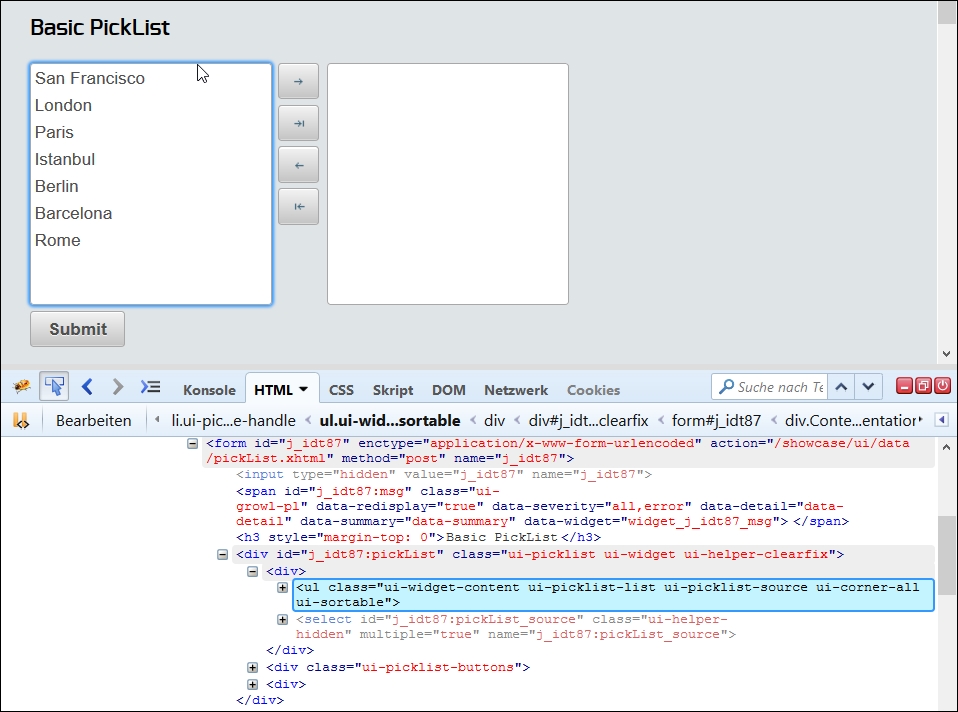
In the highlighted line in the preceding screenshot, the source area of pickList is presented as an HTML ul element with the following style classes:
ui-picklist-listui-picklist-sourceui-widget-contentui-corner-allui-sortable
Firebug also shows the corresponding styling with CSS next to the generated HTML code. For the Aristo theme, it looks as follows:
.ui-picklist .ui-picklist-list {
  height: 200px;
  list-style-type: none;
  margin: 0;
  overflow: auto;
  padding: 0;
  width: 200px;
}

.ui-widget-content {
  background: none repeat scroll 0 0 #ffffff;
  border: 1px solid #a8a8a8;
  color: #4f4f4f;
}

.ui-corner-all {
  border-radius: 3px;
}The first two style classes ui-picklist-list and ui-picklist-source are generated by PrimeFaces and provide a semantic presentation to indicate the role of an element within a component. In this case, it is a list of the pickList items. Other examples are ui-datatable for a table and ui-button for a button. These are structural style classes. In general, structural style classes define the skeleton of the components and include CSS properties such as margin, padding, display type, overflow behavior, dimensions, and positioning.
As already said, PrimeFaces leverages the jQuery ThemeRoller CSS Framework. The ui-widget-content and ui-corner-all classes in the preceding code are defined by ThemeRoller and affect the look and feel of the underlying HTML element and component. These are skinning style classes, which define CSS properties such as text colors, border colors, and background images.
These styles are applied consistently across all PrimeFaces components, so a clickable button and accordion tab have the same ui-state-default class applied to indicate that they are clickable. When a user moves the mouse over one of these elements, this class gets changed to ui-state-hover, and then to ui-state-active when these elements are selected. This approach makes it easy to ensure that all elements with a similar interaction state will look identical across all components.
The main advantage of the presented PrimeFaces selectors is a great flexibility in theming because you don't need to know each and every skinning selector to change the styles of all available components in your web application consistently.
Some style classes are not generated by PrimeFaces explicitly and not defined by the ThemeRoller. There is, for instance, the structural class ui-sortable (listed in the How to do it… section of this recipe). This class defines a sortable behavior and tells us that pickList items can be sorted by a drag-and-drop action. The PrimeFaces library utilizes the jQuery Sortable plugin (http://jqueryui.com/demos/sortable) for the underlying JavaScript widget used in pickList to enable a group of DOM elements to be sortable. The plugin adds the structural style class ui-sortable automatically, on the fly, while the component gets rendered.
It is also important to say that the prefix of both types of style classes is ui. Most jQuery-based plugins typically have this prefix too. This fact might lead to a CSS collision when you use a jQuery plugin, which overrides PrimeFaces styles. An example is the jQuery UI (native) and PrimeFaces dialogs. Both use the style class ui-dialog. Manage this case properly with a CSS selector's specificity to avoid CSS collisions. Selector's specificity is the weight of the selector applied when multiple selectors affect the same element (http://w3.org/TR/CSS21/cascade.html#specificity).
Note
More information on the ThemeRoller selectors can be found in the official documentation at http://api.jqueryui.com/theming/css-framework
Tip
Almost every component description in the PrimeFaces User's Guide (http://primefaces.org/documentation.html) contains a Skinning section with the component's structural style classes.