
The dataTable component offers enhanced features on its content, such as resizing of columns, reordering of rows and columns via drag and drop, and toggling of columns for visibility.
Resizing should be enabled by setting the resizableColumns attribute to true, as shown here:
<p:dataTable id="resizing" var="car" value="#{dataTableBean.cars}"
  resizableColumns="true">
  <p:column headerText="Year">
    <h:outputText value="#{car.year}" />
  </p:column>
  <p:column headerText="Name">
    <h:outputText value="#{car.name}" />
  </p:column>
</p:dataTable>Reordering of rows and columns is possible with the draggableRows and draggableColumns attributes respectively. A sample definition is given here:
<p:dataTable value="#{dataTableBean.cars}" var="car"
draggableRows="true" draggableColumns="true">
...
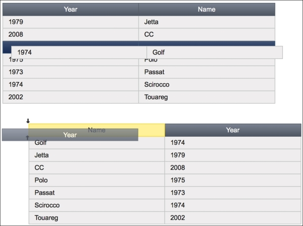
</p:dataTable>While performing reordering, the user is assisted with placeholders, as seen in this image:
Row toggling is supported by dataTable with the help of the <p:rowToggler> and <p:rowExpansion> components. The rowToggler component renders an expanding/toggling icon when placed in a column, and rowExpansion defines the content that will be displayed beneath the expanded row. An AJAX call is made with the expansion. The definition of the table will be as follows:
<p:dataTable id="rowToggle" var="car"
value="#{dataTableBean.cars}">
<p:column style="width: 20px">
<p:rowToggler />
</p:column>
<p:column headerText="Year">
<h:outputText value="#{car.year}" />
</p:column>
<p:column headerText="Name">
<h:outputText value="#{car.name}" />
</p:column>
<p:rowExpansion>
<h:panelGrid id="display" columns="2" cellpadding="4">
<f:facet name="header">
<p:graphicImage
value="/resources/images/autocomplete/#{car.name}.png"
width="60" height="40" />
</f:facet>
<h:outputText value="Name:" />
<h:outputText value="#{car.name}" />
<h:outputText value="Year:" />
<h:outputText value="#{car.year}" />
</h:panelGrid>
</p:rowExpansion>
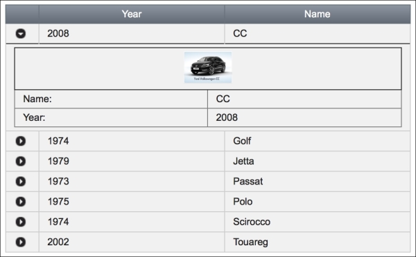
</p:dataTable>The visual output of the table with the first row expanded will be as follows:
The expandedRow attribute of dataTable with its value set to true, defines whether all the rows of the table should be expanded by default. The rowExpandMode attribute with the value single defines only whether one row should be expanded at a time. When set to multiple, which is the default value, the expanded row will not be collapsed when a second row gets expanded.
By default, while resizing a column by dragging it to the left-hand side or the right-hand side, a helper column line is rendered to state the possible final position of the column's line. If you want to resize the column in live mode without this helper, you can set liveResize to true to see it in action instantly.
The dataTable component provides the colResize AJAX behavior event that will be fired when a column is resized:
<p:dataTable id="resizingAJAX" var="car"
  value="#{dataTableBean.cars}" resizableColumns="true">
  <p:ajax event="colResize" listener="#{dataTableBean.onResize}"
    update=":mainForm:growl" />
</p:dataTable>
The onResize method will be invoked with an instance of org.primefaces.event.ColumnResizeEvent. The width and height of the resized column can be retrieved from the event instance. The definition for the onResize method is given here:
public void onResize(ColumnResizeEvent event) {
  MessageUtil.addInfoMessage("column.resized",
    "W:" + event.getWidth() + " - H:" + event.getHeight());
}The dataTable component provides the rowReorder AJAX behavior event that will be fired when a row is repositioned by dragging and dropping:
<p:dataTable id="reorderingAJAX" var="car"
  value="#{dataTableBean.cars}" draggableRows="true">
  <p:ajax event="rowReorder" update=":mainForm:growl"
    listener="#{dataTableBean.onRowReorder}" />
  ...
</p:dataTable>
The onRowReorder method will be invoked with an instance of org.primefaces.event.ReorderEvent. The start and end indices for the column that is repositioned can be retrieved from the event. The definition for the onReorder method is given here:
public void onRowReorder(ReorderEvent event) {
  MessageUtil.addInfoMessage("row.reordered", "From:" +
    event.getFromIndex() + " - To:" + event.getToIndex());
}
The dataTable component also provides the colReorder AJAX behavior event that will be fired when a column is repositioned by dragging and dropping. The column reorder doesn't support ReorderEvent with the listener method at the moment; AjaxBehaviorEvent should be used instead.
With the <p:columnToggler> helper component, it's possible to toggle the visible columns of the table. Here's how column toggling is used:
<p:dataTable id="colToggle" var="car"
  value="#{dataTableBean.cars}">
  <f:facet name="header">
    <p:commandButton id="toggler" type="button"
      value="Columns" />
    <p:columnToggler datasource="colToggle"
      trigger="toggler" />
  </f:facet>
  <p:column headerText="Year">
    <h:outputText value="#{car.year}" />
  </p:column>
  <p:column headerText="Name">
    <h:outputText value="#{car.name}" />
  </p:column>
</p:dataTable>
The id parameter of the table should be provided to the datasource attribute of columnToggler. With the trigger attribute, columnToggler attaches itself to a button where a list of all the columns will be rendered, along with a checkbox. By default, all the header text values are rendered in the UI. So, if you do not want a column to be on that list for toggling, you can set the toggleable attribute of that column to false.
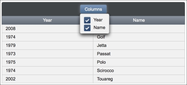
The visual output of columnToggler inside the header of the table is shown here:
The columnToggler component offers the toggle AJAX behavior event that will be fired when a column is toggled:
<p:dataTable id="colToggleAJAX" var="car"
  value="#{dataTableBean.cars}">
  <f:facet name="header">
    <p:commandButton id="togglerAJAX" type="button"
      value="Columns" />
    <p:columnToggler datasource="colToggleAJAX"
      trigger="togglerAJAX">
      <p:ajax event="toggle" update=":mainForm:growl"
        listener="#{dataTableBean.onColumnToggle}" />
    </p:columnToggler>
  </f:facet>
  ...
</p:dataTable>
The onColumnToggle method will be invoked with an instance of org.primefaces.event.ToggleEvent. The visibility of the column can be retrieved from the event as enum. The definition for the onColumnToggle method is given here:
public void onColumnToggle(ToggleEvent e) {
  MessageUtil.addInfoMessage("col.toggled",
    "Visibility:" + e.getVisibility());
}By default, columnToggler is stateless. While doing sorting and filtering on columns of a table where they are toggled, synchronization issues might occur, and this is because those columns will come right back in after filtering or sorting.
To make column toggling with sorting or filtering work, we will set the visible attribute of columns by binding them to a list from the backing bean here:
<p:dataTable id="colToggleAJAX" var="car"
  value="#{dataTableBean.cars}">
  <f:facet name="header">
    <p:commandButton id="togglerAJAX" type="button"
      value="Columns" />
    <p:columnToggler datasource="colToggleAJAX"
      trigger="togglerAJAX">
      <p:ajax event="toggle" update=":mainForm:growl"
        listener="#{dataTableBean.onColumnToggle}" />
    </p:columnToggler>
  </f:facet>
  <p:column headerText="Year"
    visible="#{dataTableBean.visibleList[0]}">
    <h:outputText value="#{car.year}" />
  </p:column>
  <p:column headerText="Name"
    visible="#{dataTableBean.visibleList[1]}">
    <h:outputText value="#{car.name}" />
  </p:column>
</p:dataTable>
The definition of the visible list and the onColumnToggle method on the backing bean is shown here:
private List<Boolean> visibleList;

public void onColumnToggle(ToggleEvent e) {
  visibleList.set((Integer) e.getData(),
    e.getVisibility() == Visibility.VISIBLE);
}This recipe is available in the demo web application on GitHub (https://github.com/ova2/primefaces-cookbook/tree/second-edition). Clone the project if you have not done it yet, explore the project structure, and build and deploy the WAR file on application severs compatible with Servlet 3.x, such as JBoss WildFly and Apache TomEE.
The showcase for the recipe is available at http://localhost:8080/pf-cookbook/views/chapter5/dataTableResizeReorderToggle.jsf.
For details about the MessageUtil class, see the Internationalization (i18n) and Localization (L10n) recipe in Chapter 1, Getting Started with PrimeFaces.