
The galleria component can be used to display a collection of images with a transition effect.
A basic definition for the galleria component for viewing a static list of car images would be as follows:
<p:galleria>
  <p:graphicImage value="/resources/images/autocomplete/CC.png" />
  <p:graphicImage
    value="/resources/images/autocomplete/Golf.png" />
  <p:graphicImage
    value="/resources/images/autocomplete/Polo.png" />
  <p:graphicImage
    value="/resources/images/autocomplete/Touareg.png" />
</p:galleria>The definition of the galleria component renders a car image in a panel and four other small images in a filmstrip right below it. This component also provides built-in iteration effects for the transition to occur between the images, which are provided by the autoPlay attribute, set as true by default. The transition happens within 4000 milliseconds and can be customized with the transitionInterval attribute.
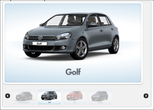
The visibility of the filmstrip is enabled by default with the showFilmstrip attribute set as true. You can disable it by setting the attribute to false.
The width and height of the galleria canvas can be customized with panelWidth and panelHeight attributes. The width and height of the frames, visualized in the filmstrip, can be also be customized with the frameWidth and frameHeight attributes respectively. All values should be provided in pixels.
While iterating through the images, it is possible to apply transition effects. The effect attribute can have the values blind, bounce, clip, drop, explode, fade (the default), fold, highlight, puff, pulsate, scale, shake, size, slide, and transfer. The effectSpeed attribute can also be used to decide on the duration of the transition. Its default value is 500 milliseconds.
It is also possible to visualize a collection of car images that is bound through the value attribute of the galleria component as a collection. The galleria component offers data iteration on the collection with the var attribute.
<p:galleria id="withData" value="#{galleriaBean.cars}"
  var="car" panelWidth="380" panelHeight="220">
  <p:graphicImage
    value="/resources/images/autocomplete/#{car.name}.png" />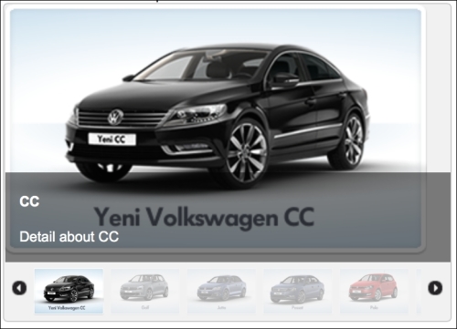
</p:galleria>The galleria attribute can also display detailed information about the image as an overlay that is placed at the bottom of the image. The title of this overlay can be retrieved from the image's title attribute and its description can be retrieved from the alt attribute.
<p:galleria id="withDataAndCaption" value="#{galleriaBean.cars}"
  var="car" panelWidth="380" panelHeight="220"
  showCaption="true">
  <p:graphicImage
    value="/resources/images/autocomplete/#{car.name}.png"
    alt="Detail about #{car.name}" title="#{car.name}" />
</p:galleria>
The visual of the component will be given as follows:
This recipe is available in the demo web application on GitHub (https://github.com/ova2/primefaces-cookbook/tree/second-edition). Clone the project if you have not done it yet, explore the project structure, and build and deploy the WAR file on every Servlet 3.x compatible application, server such as JBoss WildFly or Apache TomEE.
The showcase for the recipe is available under http://localhost:8080/pf-cookbook/views/chapter7/galleria.jsf.