
The panelGrid component extends the JSF's <h:panelGrid> component with the support of colspan, that is, the number of columns a cell should span, and rowspan, which is the number of rows a cell should span, and the theming ability. In this recipe, we will create panels with row and column span abilities.
A basic definition of the panel grid would be as follows:
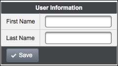
<p:panelGrid columns="2">
  <f:facet name="header">User Information</f:facet>
  <h:outputLabel for="firstname" value="First Name" />
  <p:inputText id="firstname" value="" label="firstname" />
  <h:outputLabel for="lastname" value="Last Name" />
  <p:inputText id="lastname" value="" required="true"
    label="lastname"/>
  <f:facet name="footer">
    <p:commandButton type="button" value="Save"
      icon="ui-icon-check" style="margin:0"/>
   </f:facet>
</p:panelGrid>
This will render two columns with header and footer facets, as shown in the following image:
The panelGrid component is rendered as an HTML table with borders by default. In order to remove borders, you can specify the custom style, as given here:
<p:panelGrid columns="2" styleClass="pGrid">
...
</p:panelGrid>

<style type="text/css">
  .pGrid tr, .pGrid td {
    border: none;
  }
</style>
The style segment should be placed in the head section of the page.
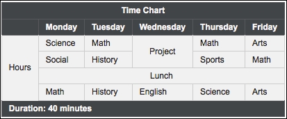
The p:row and p:column components can be used to provide column and row spanning on the grid. They could either be used in the header or footer facets or within the content of the panel. Here is a sample with the definition and the visual result:
<p:panelGrid style="margin-top:20px">
  <f:facet name="header">
    <p:row>
      <p:column colspan="6">Time Chart</p:column>
    </p:row>
    <p:row>
      <p:column/>
      <p:column>Monday</p:column>
      <p:column>Tuesday</p:column>
      <p:column>Wednesday</p:column>
      <p:column>Thursday</p:column>
      <p:column>Friday</p:column>
    </p:row>
  </f:facet>
  <p:row>
    <p:column rowspan="6">Hours</p:column>
    <p:column>Science</p:column>
    <p:column>Math</p:column>
    <p:column rowspan="2"
      style="text-align:center">Project</p:column>
    <p:column>Math</p:column>
    <p:column>Arts</p:column>
  </p:row>
  <p:row>
    <p:column>Social</p:column>
    <p:column>History</p:column>
    <p:column>Sports</p:column>
    <p:column>Math</p:column>
  </p:row>
  <p:row>
    <p:column colspan="6"
      style="text-align:center">Lunch</p:column>
  </p:row>
  <p:row>
    <p:column>Math</p:column>
    <p:column>History</p:column>
    <p:column>English</p:column>
    <p:column>Science</p:column>
    <p:column>Arts</p:column>
  </p:row>
  <f:facet name="footer">
    <p:row>
      <p:column colspan="6">Duration: 40 minutes</p:column>
    </p:row>
  </f:facet>
</p:panelGrid>
The preceding sample definition of column and row spanning will be rendered as shown in the following image:
The panelGrid component also supports responsive web design with the layout attribute, which effectively handles browser resizing. The default value for layout is tabular, and when the value of the attribute is set to grid, the content becomes responsive and promptly responds to the browser resizing, panning, and so on.
This recipe is available in the demo web application on GitHub (https://github.com/ova2/primefaces-cookbook/tree/second-edition). Clone the project if you have not done it yet, explore the project structure, and build and deploy the WAR file on application servers compatible with Servlet 3.x, such as JBoss WildFly and Apache TomEE.
The showcase for the recipe is available at http://localhost:8080/pf-cookbook/views/chapter4/panelGrid.jsf.