
Focus is a component that makes it easy to manage the focus setting on a JSF page. By default, the focus component finds the first enabled (editable) and visible input component on the page and applies focus. Typically, input components are associated with HTML elements, such as input, textarea, and select.
In this recipe, we will learn about the default and advanced behaviors of the Focus component. We will develop two h:panelGrid components with several input components in order to demonstrate the behavior of p:focus in detail.
The XHTML code snippet contains a total of three p:inputText components:
<p:messages/>

<p:focus context="secondGrid"/>

<h:panelGrid columns="2" style="margin-bottom:10px;">
  <h:outputLabel value="Dummy"/>
  <p:inputText/>
</h:panelGrid>

<h:panelGrid id="secondGrid" columns="2">
  <h:outputLabel for="firstname" value="Firstname *"/>
  <p:inputText id="firstname" required="true" label="Firstname"/>

  <h:outputLabel for="surname" value="Surname *"/>
  <p:inputText id="surname" required="true" label="Surname"/>
</h:panelGrid>

<br/>

<p:commandButton value="Submit" update="@form"/>
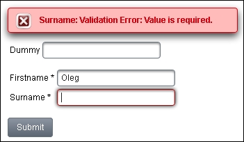
The following screenshot shows a focus set for the Surname field after a form is submitted. We entered something in the Firstname field but left the Surname field empty.
The default behavior of the focus component can be restricted by the context attribute. This attribute defines a search expression for the root component from which the Focus component starts to search for input components.
Tip
Chapter 1, Getting Started with PrimeFaces, provides more details on search expressions.
In the example, context points to the ID of the second h:panelGrid component. That means although we have two h:panelGrid components, only the second will be considered for p:focus. The content of the first h:panelGrid component gets ignored. If there are no validation errors, the focus is set implicitly on the first editable and visible input field within the second h:panelGrid component. This is the Firstname field. If there are any validation errors, the first invalid input component will receive the focus. This is the Surname field in the preceding screenshot.
If we want to set focus explicitly on an input component, we can use the for attribute that specifies exactly this input component.
Another feature is the minSeverity attribute. It specifies the message's minimum severity level to be used when finding the first invalid component. The default value is error. If you set it, for example, to info, the focus will not be normally set on the first invalid component due to the higher severity level of the created validation message matching this threshold. In this case, the default behavior is applied—the focus is set on the first enabled and visible input component.
This recipe is available in the demo web application on GitHub (https://github.com/ova2/primefaces-cookbook/tree/second-edition). Clone the project if you have not done it yet, explore the project structure, and build and deploy the WAR file on application servers compatible with Servlet 3.x, such as JBoss WildFly and Apache TomEE.
The showcase for the recipe is available at http://localhost:8080/pf-cookbook/views/chapter11/focusManagement.jsf.