
Droppable behavior is highly configurable. There are a lot of options to restrict dropping. They are useful in matching the draggable and droppable components more precisely.
In this chapter, we will meet options for tolerance and acceptance. We will take several h:panelGroup components and make them droppable with different tolerance and acceptance values.
Tolerance specifies which mode to use for testing if a draggable component is over a droppable target. There are four different tolerance modes. They can be chosen by the tolerance attribute of p:droppable. The following code snippet shows four h:panelGroup components with settings for tolerance:
<h:panelGrid columns="4">
<h:panelGroup id="dropFit" layout="block"
styleClass="dropTarget ui-widget-content">
<p class="ui-widget-header">Drop here (tolerance = fit)</p>
<p:droppable onDrop="handleDrop" tolerance="fit"/>
</h:panelGroup>
<h:panelGroup id="dropIntersect" layout="block"
styleClass="dropTarget ui-widget-content">
<p class="ui-widget-header">Drop here (tolerance = intersect)</p>
<p:droppable onDrop="handleDrop" tolerance="intersect"/>
</h:panelGroup>
<h:panelGroup id="dropPointer" layout="block"
styleClass="dropTarget ui-widget-content">
<p class="ui-widget-header">Drop here (tolerance = pointer)</p>
<p:droppable onDrop="handleDrop" tolerance="pointer"/>
</h:panelGroup>
<h:panelGroup id="dropTouch" layout="block"
styleClass="dropTarget ui-widget-content">
<p class="ui-widget-header">Drop here (tolerance = touch)</p>
<p:droppable onDrop="handleDrop" tolerance="touch"/>
</h:panelGroup>
</h:panelGrid>
<br/>
<h:panelGroup id="drag" layout="block"
styleClass="dragDiv ui-widget-content">
<p>Drag me to my target</p>
<p:draggable/>
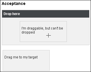
</h:panelGroup>The scope attribute is used for acceptance. Its aim is to group sets of the draggable and droppable components. Only a draggable component with the same scope value as a droppable one will be accepted during drag and drop. The following code snippet shows two draggable h:panelGroup components with different scope values. Only one can be dropped onto the droppable h:panelGroup component with the ID dropTarget2.
<h:panelGroup id="dropTarget2" layout="block"
  styleClass="ui-widget-content"
  style="height:120px; width:300px;">
  <p class="ui-widget-header" style="margin:0;padding:5px;">
    Drop here
  </p>
  <p:droppable onDrop="handleDrop" scope="dnd"/>
</h:panelGroup>

<br/>

<h:panelGrid columns="2">
  <h:panelGroup id="drag1" layout="block"
    styleClass="dragDiv ui-widget-content">
  <p>Drag me to my target</p>
  <p:draggable scope="dnd"/>
  </h:panelGroup>

  <h:panelGroup id="drag2" layout="block"
    styleClass="dragDiv ui-widget-content">
  <p>I'm draggable, but can't be dropped</p>
  <p:draggable scope="dummy"/>
  </h:panelGroup>
</h:panelGrid>
The following screenshot demonstrates that the handleDrop callback is not invoked when the h:panelGroup with scope set to dummy gets dropped onto the h:panelGroup with scope set to dnd:
In addition to scope, there is also the accept attribute. This is the jQuery selector that defines the accepted components. Only the draggable components matching the selector will be accepted by the droppable component.
This recipe is available in the demo web application on GitHub (https://github.com/ova2/primefaces-cookbook/tree/second-edition). Clone the project if you have not done it yet, explore the project structure, and build and deploy the WAR file on every Servlet 3.x compatible application server, such as JBoss WildFly or Apache TomEE.
The showcase for the recipe is available at http://localhost:8080/pf-cookbook/views/chapter8/advancedDroppable.jsf.