
The fileUpload component provides a file upload mechanism with enhanced features compared to the basic HTML <input type="file"> file upload definition. The component provides an HTML5-powered UI with capabilities such as drag-and-drop, uploading multiple files, and progress tracking; it also supports legacy browsers (for IE 8+) for compatibility by degrading gracefully.
A basic definition for the file upload would be as follows:
<h:form enctype="multipart/form-data">
<p:fileUpload value="#{fileBean.file}" mode="simple" />
<p:commandButton value="Upload" ajax="false"/>
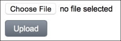
</h:form>The fileUpload component will be rendered as in the following image with a Choose File button and a text button stating no file selected:
Since the commandButton will not work in AJAX mode, the selected file will be uploaded to the server and set to file property in the backing bean, which is defined as org.primefaces.model.UploadedFile.
For the upload mechanism, PrimeFaces offers support for both the Servlet 3.X and Commons Fileupload implementations. It does the selection seamlessly by detecting the existence of JSF 2.2 or Commons FileUpload APIs respectively on the classpath. We can also force it to use our API selection with a context parameter configuration in web.xml.
<context-param>
  <param-name>primefaces.UPLOADER</param-name>
  <param-value>auto | native | commons</param-value>
</context-param>
The value of the parameter could be as follows:
autonativecommons
The default value is auto and PrimeFaces tries to detect the best method for uploading. If JSF 2.2 runtime gets detected on the classpath, the native uploading mechanism shipping with the Servlet 3.x is used. Otherwise, the commons file-upload mechanism is used.
With native, the native uploading mechanism shipping with Servlet 3.x is used. If the version of JSF runtime is below 2.2, an exception gets thrown.
With commons, the commons file-upload mechanism is used. This is more appropriate to use with the Servlet 2.5 environments where Java EE5 is being used. With this configuration, PrimeFaces FileUpload Filter needs to be defined in the web.xml deployment descriptor file.
<filter>
  <filter-name>PrimeFaces FileUpload Filter</filter-name>
  <filter-class>
    org.primefaces.webapp.filter.FileUploadFilter
  </filter-class>
</filter>
<filter-mapping>
  <filter-name>PrimeFaces FileUpload Filter</filter-name>
  <servlet-name>Faces Servlet</servlet-name>
</filter-mapping>
The filter definition could either be done by matching filter-mapping with the name of the FacesServlet name, or by defining its URL pattern. The filter has two default settings which are the threshold size for the uploaded file and the location of the uploaded file.
<filter>
  <filter-name>PrimeFaces FileUpload Filter</filter-name>
  <filter-class>
    org.primefaces.webapp.filter.FileUploadFilter
  </filter-class>
  <init-param>
    <param-name>thresholdSize</param-name>
    <param-value>51200</param-value>
  </init-param>
  <init-param>
    <param-name>uploadDirectory</param-name>
    <param-value>/Users/primefaces/temp</param-value>
  </init-param>
</filter>
The thresholdSize parameter sets the minimum size in bytes for the files that will be written directly to the disk, and the uploadDirectory parameter sets the directory used to temporarily store those files. The files will be stored in memory if they are smaller than the thresholdSize parameter. If the size is exceeded, they will be stored in the place specified by uploadDirectory, which is System.getProperty("java.io.tmpdir") by default.
In order to use the commons upload mechanism, dependencies for commons-fileupload and commons-io should be declared in the project as follows:
<dependency>
  <groupId>commons-fileupload</groupId>
  <artifactId>commons-fileupload</artifactId>
  <version>1.3</version>
</dependency>
<dependency>
  <groupId>commons-io</groupId>
  <artifactId>commons-io</artifactId>
  <version>2.2</version>
</dependency>
The versions listed above are compatible with PrimeFaces 5.2 that has been officially announced. Please check for possible new releases on the commons-fileupload and commons-io projects at http://commons.apache.org/fileupload/download_fileupload.cgi and http://commons.apache.org/io/download_io.cgi respectively.
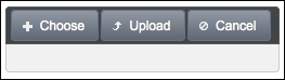
The fileUpload component provides the mode attribute, which can be either simple or advanced; it makes the component work in the simple mode like a normal HTML upload component, or in an advanced mode with HTML5 features. The default mode of the component is advanced. A definition and visual for the advanced file upload will be as follows:
<p:fileUpload value="#{fileBean.file}"
  fileUploadListener="#{fileBean.handleFileUpload}"
  update="growl" />
The visual of the fileUpload in advanced mode will be as follows:
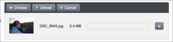
An image selected for upload will be previewed in the component as given next. The width of the previewed image can be adjusted with the previewWidth attribute.
Defining a file upload listener is a way to access the uploaded files. The definition of the handleFileUpload method is given next. The method receives an instance of org.primefaces.event.FileUploadEvent as a parameter.
public void handleFileUpload(FileUploadEvent event) {
  UploadedFile file = event.getFile();
  MessageUtil.addInfoMessage("upload.successful",
    file.getFileName() + " is uploaded.");
}
Texts for the upload and cancel buttons can be customized with the uploadLabel and cancelLabel attributes. The showButtons attribute enables/disables the visibility of the upload and cancel buttons in the button bar of the component. The auto attribute enables automatic file upload. A file will be uploaded automatically when it is selected or dragged-and-dropped to the component.
The fileUpload component allows us to restrict the file selection only to the types configured with the allowTypes attribute. The allowTypes attribute accepts a JavaScript regular expression that will be used to match against the name of the file to be uploaded. The following definition only accepts image files with an extension of gif, jpg, jpeg, or png:
<p:fileUpload fileUploadListener="#{fileBean.handleFileUpload}"
  allowTypes="/(.|/)(gif|jpe?g|png)$/" />
When an incorrect type of file is selected or dragged-and-dropped onto the fileUpload component, the component renders an error message to alert the user to the wrong file type. The following image shows the error message that occurred when a file with type flv was selected for upload:
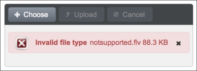
The error message Invalid file type can also be customized with the invalidFileMessage attribute.
Tip
Specifying allowTypes only does a check on the client side, so for security concerns, it's advisable to implement a server-side control for an additional file type check, such as verifying the type of the file by checking it against its content. Frameworks like simplemagic, http://256.com/sources/simplemagic, can be used to achieve this.
With the sizeLimit attribute, it's possible to restrict the maximum file upload size. The following definition limits the file size to a maximum of 10 KB:
<p:fileUpload fileUploadListener="#{fileBean.handleFileUpload}"
  sizeLimit="10240" />
The following image shows the error message that occurred when a file with size 2.6 MB was selected for upload:
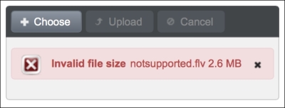
The error message Invalid file size can be customized with the invalidSizeMessage attribute.
By default, selecting multiple files for uploading, via browsing after clicking on the Choose button, is not supported by the component. Setting the multiple attribute to true enables multiple upload for the advanced version of the component. In the multiple mode, files get uploaded in the selected order and the method bound with the fileUploadListener attribute gets called for each uploaded file.
<p:fileUpload id="multipleUpload" multiple="true" update="growl"
fileUploadListener="#{fileBean.handleFileUpload}" />The fileUpload component supports hooking custom JavaScript methods when the upload process starts and ends. The following code snippet shows the upload component with the onstart and oncomplete attributes showing a progress dialog box while doing the upload:
<p:fileUpload fileUploadListener="#{fileBean.handleFileUpload}"
  onstart="showStatus()" oncomplete="hideStatus()" />
The showStatus and hideStatus methods are two simple methods for showing and hiding a dialog box component, which is also a PrimeFaces component.
<script type="text/javascript">
  function showStatus() {
    PF('statusDialog').show();
  }
  function hideStatus() {
    PF('statusDialog').hide();
  }
</script>

<p:dialog modal="true" widgetVar="statusDialog" header="Status"
  draggable="false" closable="false">
  <p:graphicImage value="/resources/images/ajax-loader.gif" />
</p:dialog>In supported browsers, a file can also be dragged-and-dropped for uploading with fileUpload, and the component itself will be the drop zone. The dragDropSupport attribute defines whether or not to enable drag-and-drop from the file system. By default, the value of this attribute is true. In order to provide drag-and-drop support, the fileUpload component should be in advanced mode, which is also the default mode. The definition of the fileUpload component for uploading files with drag-and-drop would be as follows:
<p:fileUpload id="upload" value="#{fileBean.file}"
  dragDropSupport="true"
  update="growl"
fileUploadListener="#{fileBean.handleFileUpload}" />This recipe is available in the demo web application on GitHub (https://github.com/ova2/primefaces-cookbook/tree/second-edition). Clone the project if you have not done it yet, explore the project structure, and build and deploy the WAR file on every Servlet 3.x compatible application server, such as JBoss WildFly or Apache TomEE.
The showcase for the recipe is available at the URLs listed in the following table:
|
Showcase example |
URL |
|---|---|
|
Basic and advanced file upload |
|
|
Multiple file upload |
|
|
Filtering file types for file upload |
|
|
| |
|
Client-side callback for file upload |
|
|
Uploading files with drag-and-drop |
|
For details about the MessageUtil class, see the Internationalization (i18n) and Localization (L10n) recipe in Chapter 1, Getting Started with PrimeFaces.