
The tree component visualizes hierarchical data in the tree format.
The data for tree is provided as instances of org.primefaces.model.TreeNode, which correspond to the nodes in the tree. A pure client-side tree might be useful to create tree-based navigation menus. A basic data model for a tree could be constructed as follows:
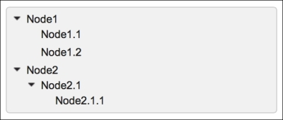
TreeNode root = new DefaultTreeNode("Root", null);
TreeNode node1 = new DefaultTreeNode("Node1", root);
TreeNode node2 = new DefaultTreeNode("Node2", root);
TreeNode node11 = new DefaultTreeNode("Node1.1", node1);
TreeNode node12 = new DefaultTreeNode("Node1.2", node1);
TreeNode node21 = new DefaultTreeNode("Node2.1", node2);
TreeNode node211 = new DefaultTreeNode("Node2.1.1", node21);
The definition of tree for the previously mentioned model will be as shown here:
<p:tree id="simple" value="#{treeDataBean.root}" var="node">
  <p:treeNode>
    <h:outputText value="#{node}" />
  </p:treeNode>
</p:tree>
The visual of the tree will be as shown in the following screenshot. By default, the nodes will not be expanded as given in the image; it's done for demonstration purposes.
If the hierarchical data model of tree contains too many nodes, it would be useful to dynamically load the tree by setting the dynamic attribute to true in order to load a part of tree when requested by expanding a node with a click.
Also, by enabling caching with setting the cache attribute to true, expanding a previously loaded node will not result in an AJAX request to load its children again. Here's the code that encapsulates this discussion:
<p:tree id="dynamic" value="#{treeDataBean.root}" var="node"
  dynamic="true" cache="true">
  <p:treeNode>
    <h:outputText value="#{node}" />
  </p:treeNode>
</p:tree>It's possible to provide different visuals for each node with custom node definitions. To achieve this, the <p:treeNode> component could be used with defined node types. The following definition contains two node definitions—one for expandable nodes with type="node" and one for the leaf nodes with type="leaf". To differentiate the nodes visually, the tree nodes use the ui-icon-minusthick icon for leaf nodes and ui-icon-plusthick for expandable icons:
<p:tree id="customNodes" value="#{treeDataBean.rootWithType}"
  var="node">
  <p:treeNode type="node" icon="ui-icon-plusthick">
    <h:outputText value="#{node}" />
  </p:treeNode>
  <p:treeNode type="leaf" icon="ui-icon-minusthick">
    <h:outputText value="#{node}" />
  </p:treeNode>
</p:tree>
The integration is achieved with the type attribute where it matches the parameter given to DefaultTreeNode. The code to construct the model is given here:
rootWithType = new DefaultTreeNode("node", "Root", null);
TreeNode node1_type = new DefaultTreeNode("node", "Node1",
  rootWithType);
TreeNode node2_type = new DefaultTreeNode("node", "Node2",
  rootWithType);

TreeNode node11_type = new DefaultTreeNode("leaf", "Node1.1",
  node1_type);
TreeNode node12_type = new DefaultTreeNode("leaf", "Node1.2",
  node1_type);

TreeNode node21_type = new DefaultTreeNode("node", "Node2.1",
  node2_type);
TreeNode node211_type = new DefaultTreeNode("leaf", "Node2.1.1",
  node21_type);
If you want the node to react to an expand/collapse action by changing its icon, you can use expandedIcon and collapsedIcon to display the different icons based on the status of the node.
The definition of the <p:treeNode> component with type set to node is given here with the aforementioned attributes:
<p:treeNode type="node" expandedIcon="ui-icon-minusthick"
  collapsedIcon="ui-icon-plusthick">
  <h:outputText value="#{node}" />
</p:treeNode>The tree component provides built-in selection with a single node or multiple nodes or with a checkbox selection on the nodes. The selectionMode attribute enables selection with its value set to single for the single selection mode, multiple for multiple node selection, and checkbox to select nodes with checkboxes. The selected nodes are collected in the selection attribute as an instance of TreeNode or as an array of TreeNode instances. Here's the code that encapsulates this discussion:
<p:tree id="single" value="#{treeDataBean.root}" var="node"
  selectionMode="single"
  selection="#{treeDataBean.selectedNode}">
  <p:treeNode>
    <h:outputText value="#{node}" />
  </p:treeNode>
</p:tree>

<p:tree id="multiple" value="#{treeDataBean.root}" var="node"
  selectionMode="multiple"
  selection="#{treeDataBean.selectedNodes}">
  <p:treeNode>
    <h:outputText value="#{node}" />
  </p:treeNode>
</p:tree>
Note
PrimeFaces also provides the CheckboxTreeNode model class that differs from the DefaultTreeNode model class with its partialSelected property, where it provides hierarchical selection. In order to modify selection behaviors, you can set the propagateSelectionUp and propagateSelectionDown attributes of tree that propagate upward selection to the root element or downward selection to children, respectively.
It's also possible to select multiple nodes with a modifier key, which would be Ctrl in Windows and Command in MacOS.
Reordering is possible between the nodes of a tree with drag and drop. It's also possible to drag nodes between multiple trees by placing them into a scope. Dragging and dropping within a tree is exemplified here:
<p:tree id="dnd" value="#{treeDataBean.root}" var="node"
  draggable="true" droppable="true">
  <p:treeNode>
    <h:outputText value="#{node}" />
  </p:treeNode>
</p:tree>
Dragging a node between different trees is exemplified here:
<p:tree id="dndSource" value="#{treeDataBean.root}" var="node"
  selectionMode="single"
  selection="#{treeDataBean.selectedNode1}"
  draggable="true" droppable="true"
  dragdropScope="treeScope">
  <p:treeNode>
    <h:outputText value="#{node}" />
  </p:treeNode>
</p:tree>

<p:tree id="dndTarget" value="#{treeDataBean.root2}" var="node"
  selectionMode="single"
  selection="#{treeDataBean.selectedNode2}"
  draggable="true" droppable="true"
  dragdropScope="treeScope">
  <p:treeNode>
    <h:outputText value="#{node}" />
  </p:treeNode>
</p:tree>
As seen in the code, dragdropScope should also be set to the same value for both trees. The draggable and droppable attributes of both trees could be set to true to enable drag and drop between the trees as well as between within the nodes of one tree.
The tree component supports AJAX behavior events in order to handle node expand/collapse or selection/unselection. The definition of the AJAX behavior events should be placed within the tree, as shown in the following code snippet:
<p:tree id="withAJAX" value="#{treeDataBean.root}" var="node"
  selectionMode="single"
  selection="#{treeDataBean.selectedNode}">
  <p:ajax event="expand" update=":mainForm:growl"
    listener="#{treeDataBean.onNodeExpand}" />
  <p:ajax event="collapse" update=":mainForm:growl"
    listener="#{treeDataBean.onNodeCollapse}" />
  <p:ajax event="select" update=":mainForm:growl"
    listener="#{treeDataBean.onNodeSelect}" />
  <p:ajax event="unselect" update=":mainForm:growl"
    listener="#{treeDataBean.onNodeUnselect}" />
  <p:treeNode>
    <h:outputText value="#{node}" />
  </p:treeNode>
</p:tree>
The events and their corresponding listener method's parameter types are given in the following table; for all the events, the tree can be accessed with the event.getNode() method call.
|
Action |
Event name |
Listener method parameter type |
|---|---|---|
|
When a node is expanded |
|
|
|
When a node is collapsed |
|
|
|
When a node is selected |
|
|
|
|
|
The tree component easily integrates with the contextMenu component, and the context menu can be assigned to the nodes for a right-click event. It is also possible to assign different context menus with different tree nodes using the nodeType attribute.
There are two context menu definitions—one for the nodes of the tree that contain child nodes and the other one for the leaf nodes that have no child nodes. They are given here with the tree definition (the menus differ according to the given nodeType attribute):
<p:tree id="withContextMenu" var="node" selectionMode="single"
  value="#{treeDataBean.rootWithType}"
  selection="#{treeDataBean.selectedNode}">
  <p:treeNode type="node">
    <h:outputText value="#{node}" />
  </p:treeNode>

  <p:treeNode type="leaf">
    <h:outputText value="#{node}" />
  </p:treeNode>
</p:tree>

<p:contextMenu for="withContextMenu" nodeType="node">
  <p:menuitem value="View" update="dialogPanel"
    icon="ui-icon-search"
    oncomplete="PF('nodeDialog').show()" />
</p:contextMenu>

<p:contextMenu for="withContextMenu" nodeType="leaf">
  <p:menuitem value="View" update="dialogPanel"
    icon="ui-icon-search"
    oncomplete="PF('nodeDialog').show()" />
  <p:menuitem value="Delete"
    actionListener="#{treeDataBean.deleteNode}"
    update="withContextMenu" icon="ui-icon-close" />
</p:contextMenu>
While only displaying the context menu with the view and delete actions for the leaf nodes of the tree, the context menu with just a view action will be displayed for the nodes that contain child nodes.
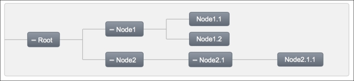
With the orientation attribute, it's possible to set the layout of the nodes as horizontal by setting the attribute to horizontal. The default value of the attribute is vertical. The visual output of the horizontal layout is given here. By default, the nodes will not be expanded as given in the image; it's done for demonstration purposes.
This recipe is available in the demo web application on GitHub (https://github.com/ova2/primefaces-cookbook/tree/second-edition). Clone the project if you have not done it yet, explore the project structure, and build and deploy the WAR file on application servers compatible with Servlet 3.x, such as JBoss WildFly and Apache TomEE.
The showcase for the recipe is available at http://localhost:8080/pf-cookbook/views/chapter5/tree.jsf.