
The autoComplete component provides suggestions while you type into the input field. This enables users to quickly find and select from the list of looked-up values as they type, which leverages the searching and filtering abilities.
For simple usage of the autoComplete component, all we need to do is to define the complete method that will be invoked with the user input, as follows:
<p:autoComplete id="simple" value="#{autoCompleteBean.txt1}"
  completeMethod="#{autoCompleteBean.complete}" />
This will be rendered as shown in the following screenshot:
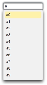
As the user types characters into the input text (as shown in the preceding screenshot) the component will assist 10 selections by appending numbers from 0 to 9. The completeMethod implemented for this in the autoCompleteBean backing bean is shown in the following code snippet. The user input is passed as the parameter to the method:
public List<String> complete(String input) {
  List<String> result = new ArrayList<String>();
  for (int i = 0; i < 10; i++) {
    result.add(input + i);
  }
  return result;
}
There are several attributes that could be used with the autoComplete component. With the minQueryLength attribute, we can specify the number of characters to be typed before starting query; its default value is 1. This minimizes the unnecessary lookups that could be done to the server since the input provided by the user, a couple of characters probably, is often not enough for meaningful prediction most of the time.
With the queryDelay attribute, we can specify the delay in milliseconds before sending each query to the server; its default value is 300 ms. This minimizes the round trips that are done to the server to reduce the load on the execution of completeMethod.
With the forceSelection attribute, a component only accepts input from the selection list; so the typed characters will be transient if no selection is made. This forces the user to select the proper content that could be validated properly via the assistance of the component. The user can also leave the component intact with no selection. Its default value is false.
When set to true, the dropdown attribute provides the autoComplete component to be used as a dropdown by rendering the drop-down icon. This will enable the selection of any of the autoComplete items by the user without inputting any character.
Starting with version 4.0, when the cache attribute is set to true, the autoComplete component caches previous server side suggestions on the client side if the same query is provided by the user. A time out value can also be set in milliseconds with the cacheTimeout attribute.
By default, autoComplete does not provide any feedback to the user when no records are found for the suggestion. To achieve this, the emptyMessage attribute can be used to display a custom message to the user.
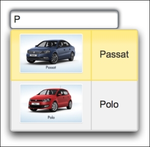
Instead of working with primitive types, most of the time we would be using the autoComplete component with domain objects. The basic definition of the component for listing the cars for a given brand, for example, would be as follows:
<p:autoComplete id="carPOJO"
  value="#{autoCompleteBean.selectedCar}"
  completeMethod="#{autoCompleteBean.completeCar}"
  var="car" itemLabel="#{car.name}" itemValue="#{car}"
  forceSelection="true">
  <f:converter
    converterId="org.primefaces.cookbook.converter.CarConverter" />
  <p:column>
    <p:graphicImage
      value="/resources/images/autocomplete/#{car.name}.png"/>
  </p:column>
  <p:column>#{car.name}</p:column>
</p:autoComplete>
Here, the component contains column definitions along with a converter declaration. The converter is responsible for converting the submitted value for each car, and with the help of the columns, we render images along with the name of each car. This will enhance the autocompletion for the user, and will ease the selection. The visual of the component definition will be as seen in this screenshot:
It's also possible to invoke a server-side method instantly when an item from autoComplete is selected. The autoComplete component provides the itemSelect AJAX behavior event that will be fired instantly when an item is selected:
<p:autoComplete value="#{autoCompleteBean.txt1}"
  completeMethod="#{autoCompleteBean.complete}">
  <p:ajax event="itemSelect"
    listener="#{autoCompleteBean.handleSelect}"
    update="messages" />
</p:autoComplete>
The itemSelect method will be invoked with org.primefaces.event.SelectEvent. The current value of the selected item can be retrieved with event.getObject(), and a Faces message could be added with the current item, as in the following code snippet:
public void handleSelect(SelectEvent event) {
  Object selectedObject = event.getObject();
  MessageUtil.addInfoMessage("selected.object", selectedObject);
}With autoComplete, it is also possible to select multiple items by setting the multiple attribute to true:
<p:autoComplete id="multipleSelect"
  value="#{autoCompleteBean.selectedTexts}"
  completeMethod="#{autoCompleteBean.complete}"
  multiple="true" />
With the help of multiple select, the selected texts can be retrieved as a list in autoCompleteBean.selectedTexts, which maps to the property List<String> selectedTexts.
The autoComplete component offers an advanced built-in tooltip that gets visible when the mouse is hovered over the suggested items. The following is the screenshot of the tooltip that is rendered for the Car domain objects:
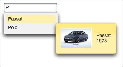
The content of the tooltip can be defined within a facet named itemtip as follows:
<p:autoComplete id="itemTip"
value="#{autoCompleteBean.selectedCar2}"
completeMethod="#{autoCompleteBean.completeCar}"
var="car" itemLabel="#{car.name}" itemValue="#{car}">
<f:converter
converterId="org.primefaces.cookbook.converter.CarConverter" />
<f:facet name="itemtip">
<h:panelGrid columns="2" cellpadding="5">
<p:graphicImage
value="/resources/images/autocomplete/#{car.name}.png"
width="80" height="50"/>
<h:outputText value="#{car.name} <br/>
#{car.year}" escape="false" />
</h:panelGrid>
</f:facet>
</p:autoComplete>With the value provided to the groupBy attribute, it's possible to create groups for the suggested items list. The following screenshot groups a list of cars whose names contain the query string:
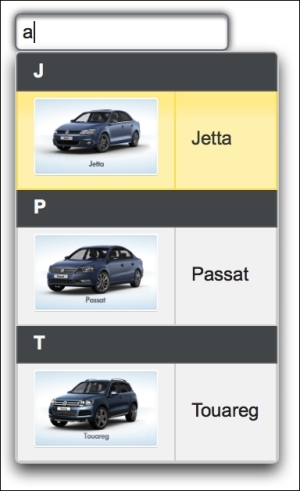
The names of the groups are created from the first character of each car's name. The component declaration and method definition for this grouping is given here:
<p:autoComplete id="grouped"
  value="#{autoCompleteBean.selectedCar}"
    completeMethod="#{autoCompleteBean.completeCarContains}
    var="car" itemLabel="#{car.name}" itemValue="#{car}"
    forceSelection="true"
    groupBy="#{autoCompleteBean.getGroup(car)}">
  <f:converter
    converterId="org.primefaces.cookbook.converter.CarConverter" />
  <p:column>
    <p:graphicImage
      value="/resources/images/autocomplete/#{car.name}.png"/>
  </p:column>
  <p:column>#{car.name}</p:column>
</p:autoComplete>

public char getGroup(Car car) {
  return car.getName().charAt(0);
}This recipe is available in the demo web application on GitHub (https://github.com/ova2/primefaces-cookbook/tree/second-edition). Clone the project if you have not done it yet, explore the project structure, and build and deploy the WAR file on every Servlet 3.x compatible application server, such as JBoss WildFly or Apache TomEE.
The showcase for the recipe is available under http://localhost:8080/pf-cookbook/views/chapter3/autoComplete.jsf.