
A tabbed panel component, tabView has powerful features such as dynamic content loading, orientations, and programmatically managing tabs. In this recipe, we will create tabs with the scrolling ability and with a different tab header orientation, along with the dynamic content generation and AJAX behaviors added.
A basic definition of a tabbed panel with two panels would be as follows:
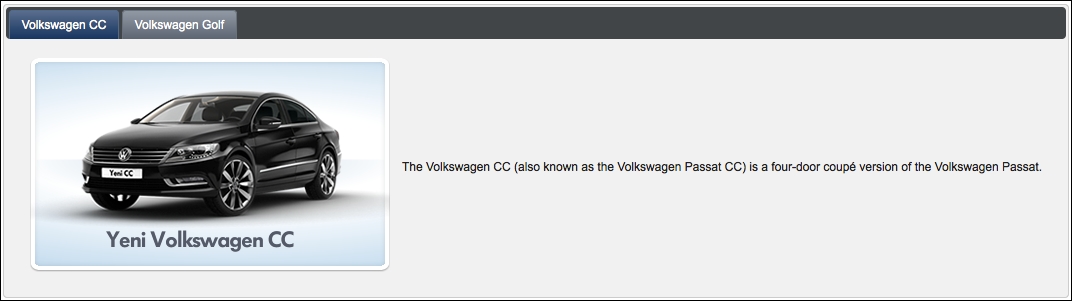
<p:tabView id="tabView">
  <p:tab title="Volkswagen CC">
    <h:panelGrid columns="2" cellpadding="5">
      <h:graphicImage library="images"
        name="autocomplete/CC.png" />
      <h:outputText value="The Volkswagen CC (also known as
        the Volkswagen Passat CC) is a four-door coupé version of
        the Volkswagen Passat." />
    </h:panelGrid>
  </p:tab>
  <p:tab title="Volkswagen Golf">
    <h:panelGrid columns="2" cellpadding="5">
      <h:graphicImage library="images"
        name="autocomplete/Golf.png" />
      <h:outputText value="The Volkswagen Golf is a small
        family car manufactured by Volkswagen since 1974 and
        marketed worldwide across six generations, in various
        body configurations and under various nameplates" />
    </h:panelGrid>
  </p:tab>
</p:tabView>
This will render two tabs, with the first tab activated by default, as shown in the following image:
We can also enable or disable a tab within the tab view according to a business rule. If we set the disabled attribute to true in the tab, the tab will have a grayed-out caption that indicates that the tab is disabled, as seen in the image here:

If you have more tabs that could be seen in the title, setting the scrollable attribute to true will render arrows for navigation in the tab panel header, as shown in the following image.

By setting the dynamic attribute to true, it's also possible to lazily load the content of the tabs with an AJAX request when they get activated in order to save bandwidth and reduce the size of the page. And by also setting the cache attribute to true, consecutive invokes on the same tab will not invoke an AJAX request.
Orientation of the tabs can be set with four positions: top, bottom, left, and right. By default, the orientation for the tabs is top.
Dynamic tab loading allows us to load the content of the tab view dynamically by providing a data model. The definition of the component for providing a data list of cars to the tabView component would be as follows:
<p:tabView value="#{tabViewBean.cars}" var="car">
  <p:tab title="#{car.name}">
    <h:panelGrid columns="2" cellpadding="5">
      <p:graphicImage value=
        "/resources/images/autocomplete/#{car.name}.png" />
    </h:panelGrid>
  </p:tab>
</p:tabView>
The data model here is the list of car objects that will be iterated through, to render each tab, along with the image and the name of the car.
With the effect attribute, effects can be applied for content transition between the tabs. The possible values are as follows:
blindclipdropexplodefadefoldpuffscaleslide
The effect duration can also be set with the effectDuration attribute. The possible values are slow, normal, and fast.
The tabView component provides the tabChange and tabClose AJAX behavior events that will be fired when a tab is changed or closed in a tab view. The definition of the event listeners for the tabView component would be as follows:
<p:ajax event="tabChange" listener="#{tabViewBean.onTabChange}"
  update=":mainForm:growl" />
<p:ajax event="tabClose" listener="#{tabViewBean.onTabClose}"
  update=":mainForm:growl" />
The listener methods, onTabChange and onTabClose, receive an instance of org.primefaces.event.TabChangeEvent and org.primefaces.event.TabCloseEvent, respectively, as parameters:
public void onTabChange(TabChangeEvent event) {
  MessageUtil.addInfoMessage("tab.changed", "Title: " +
    event.getTab().getTitle());
}

public void onTabClose(TabCloseEvent event) {
  MessageUtil.addInfoMessage("tab.closed", "Closed Tab: " +
    event.getTab().getTitle());
}This recipe is available in the demo web application on GitHub (https://github.com/ova2/primefaces-cookbook/tree/second-edition). Clone the project if you have not done it yet, explore the project structure, and build and deploy the WAR file on application servers compatible with Servlet 3.x, such as JBoss WildFly and Apache TomEE.
The showcase for the recipe is available at http://localhost:8080/pf-cookbook/views/chapter4/tabView.jsf.
For details about the MessageUtil class, see the Internationalization (i18n) and Localization (L10n) recipe in Chapter 1, Getting Started with PrimeFaces.