
A collection of data in a list layout is presented by dataList with several display types and features, such as AJAX pagination.
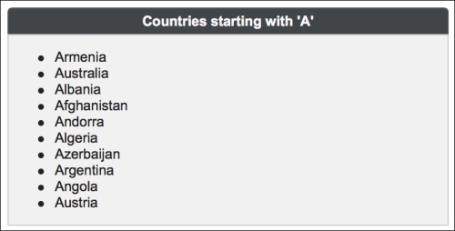
A basic definition of a data list with a header facet for listing the names of countries starting with the letter "A" would be as follows:
<p:dataList id="simple" value="#{dataListBean.countriesShort}"
  var="country" itemType="disc">
  <f:facet name="header">
    Countries starting with 'A'
  </f:facet>
  <h:outputText value="#{country}" />
</p:dataList>
By default, the dataList component renders an unordered list, which corresponds to the <ul> HTML tag. The visual output is given here:
The bullet type can be customized with the itemType attribute, which has the default value disc. For an unordered list, the other possible values are circle and square.
When type is set to ordered, dataList renders an ordered list, which corresponds to the <ol> HTML tag. The visual output is given here:
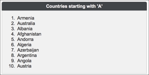
With ordered lists, the default value for the itemType is set to 1 to render a numerically ordered list. The other possible values to render alphabetically ordered characters as bullets in lowercase and uppercase are a and A, respectively. The last alternatives for rendering roman numbers as bullets in lowercase and uppercase are i or I.
The third type of the dataList component is definition, where an inline description can be visualized for each item. The next definition displays a list of car names along with their small images. The detailed definition should be provided with the facet named description. The definition of definition is provided here:
<p:dataList id="withDescription" value="#{dataListBean.cars}"
  var="car" type="definition">
  Name: #{car.name}
  <f:facet name="description">
    <p:graphicImage
      value="/resources/images/autocomplete/#{car.name}.png"
      width="60" height="40" />
  </f:facet>
</p:dataList>The dataList component has a built-in AJAX pagination that is enabled by setting the paginator attribute to true. To support the pagination, the number of rows to display per page should be set with the rows attribute. Its default value is 0, which indicates that all the data available will be displayed. Pagination can be customized using the paginatorTemplateOption attribute, which accepts keys to specify the content of the paginator:
FirstPageLinkLastPageLinkPreviousPageLinkNextPageLinkPageLinksCurrentPageReportRowsPerPageDropdown
The default rendering for the pagination would be as shown here:
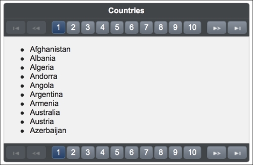
It would be the same as the pagination template, as shown in the following code snippet:
{FirstPageLink} {PreviousPageLink} {PageLinks} {NextPageLink}
{LastPageLink}
A more complex paginator definition is given here:
{CurrentPageReport} {FirstPageLink} {PreviousPageLink} {PageLinks}
{NextPageLink} {LastPageLink} {RowsPerPageDropdown}
This will be rendered as shown here:
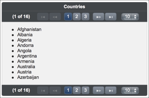
The {RowsPerPageDropdown} attribute has its own mechanism to produce templates, and the mechanism should be provided in order to render the dropdown (for example, rowsPerPageTemplate="5,10,15").
Also,{CurrentPageReport} has its own template defined with the currentPageReportTemplate option.
We can use the {currentPage}, {totalPages}, {totalRecords}, {startRecord}, and{endRecord} keywords within currentPageReportTemplate. The default value is {currentPage} of {totalPages}.
The pageLinks attribute defines the maximum number of page links to display. Its default value is 10. For the complex paginator definition given previously, it's set to 3.The paginator attribute can be positioned in three different locations by setting the paginatorPosition attribute to top, bottom, or both (the last value being the default value). The paginatorAlwaysVisible attribute defines whether the pagination should be hidden or not when the total data count is less than the number of rows per page.
The content of paginator can also be customized with a custom facet definition, as shown here:
<p:dataList value="#{dataListBean.countries}" var="country"
  rows="10" paginator="true"
  paginatorTemplate="{CurrentPageReport} {CustomContent}">
  <f:facet name="{CustomContent}">
    ..custom content..
  </f:facet>
  <f:facet name="header">
    Countries
  </f:facet>
  <h:outputText value="#{country}" />
</p:dataList>
As seen in the example, the name of the facets should match with the name of the token given in the template.
This recipe is available in the demo web application on GitHub (https://github.com/ova2/primefaces-cookbook/tree/second-edition). Clone the project if you have not done it yet, explore the project structure, and build and deploy the WAR file on application servers compatible with Servlet 3.x, such as JBoss WildFly and Apache TomEE.
The showcase for the recipe is available at http://localhost:8080/pf-cookbook/views/chapter5/dataList.jsf.