
The treeTable component visualizes tree where each tree item can have some additional fields that could be displayed in a tabular format.
A basic implementation for treeTable with three columns would be as follows:
<p:treeTable id="simple" value="#{treeTableBean.root}"
var="element">
<f:facet name="header">Tree Table</f:facet>
<p:column>
<f:facet name="header">Name</f:facet>
<h:outputText value="#{element.name}" />
</p:column>
<p:column>
<f:facet name="header">Column 1</f:facet>
<h:outputText value="#{element.column1}" />
</p:column>
<p:column>
<f:facet name="header">Column 2</f:facet>
<h:outputText value="#{element.column2}" />
</p:column>
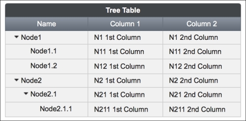
</p:treeTable>The visual output of the table expanded on every node will be as shown here:
The root element of the tree table will be an instance of org.primefaces.model.TreeNode. The whole model provided to the tree table would be a collection of TreeTableElement components wrapped by TreeNode instances. TreeTableElement is a simple class created for demonstration purposes and is defined as follows:
public class TreeTableElement implements Serializable {
  private String name;
  private String column1;
  private String column2;

  // getters & setters
}
The implementation of constructing the table would be as follows:
root = new DefaultTreeNode("root", null);
TreeNode node1 = new DefaultTreeNode(new TreeTableElement("Node1",
  "1st Column", "2nd Column"), root);
TreeNode node2 = new DefaultTreeNode(new TreeTableElement("Node2",
  "1st Column", "2nd Column"), root);
TreeNode node11 = new DefaultTreeNode(new TreeTableElement(
  "Node1.1", "1st Column", "2nd Column"), node1);
TreeNode node12 = new DefaultTreeNode(new TreeTableElement(
  "Node1.2", "1st Column", "2nd Column"), node1);
TreeNode node21 = new DefaultTreeNode(new TreeTableElement(
  "Node2.1", "1st Column", "2nd Column"), node2);
TreeNode node211 = new DefaultTreeNode(new TreeTableElement(
"Node2.1.1", "1st Column", "2nd Column"), node21);It's possible to make the table scrollable by setting the scrollable attribute to true. The scrollWidth and scrollHeight attributes can be provided to constrain the view of the table to a fixed width and height. Also, the width of the columns must be provided as fixed integer values when the scrollable attribute is set to true in order to preserve the layout.
The selectionMode attribute should be used to enable selection whenever a row is clicked on. Its value should be single for the single selection mode, and the selection attribute should be bound to an instance of TreeNode. To select multiple items with the modifier key (for example, Ctrl in Windows/Linux or Command in MacOS), the selectionMode attribute should be set to multiple and the selection attribute needs to be bound to an array of the TreeNode class.
It's also possible to handle selection with checkboxes by setting selectionMode to checkbox. As with multiple-selection mode, the selection attribute needs to be bound to an array of the TreeNode class.
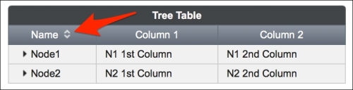
It's possible to enable sorting for the columns of a table by setting the sortBy attribute:
<p:treeTable id="sorted" value="#{treeTableBean.root}"
  var="element" style="width: 400px;">
  <f:facet name="header">Tree Table</f:facet>
  <p:column sortBy="#{element.name}">
    <f:facet name="header">Name</f:facet>
    <h:outputText value="#{element.name}" />
  </p:column>
  ...
<p:treeTable>
When sorting is enabled, the headers of those columns will have the sort direction represented with small arrow icons, as shown here:
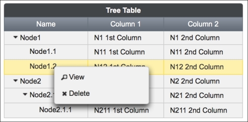
The treeTable component easily integrates with the contextMenu component, and the context menu can be assigned to the nodes for a right-click event. Using the nodeType attribute, it is also possible to assign different context menus with different nodes.
There are two context menu definitions—one for the nodes of the table that contain child nodes and the other one for the leaf nodes that have no child nodes. The definitions are given as follows with the tree table definition; the menus differ according to the given nodeType attribute:
<p:treeTable id="withContextMenu" value="#{treeTableBean.root}"
  var="element" selectionMode="single"
  selection="#{treeTableBean.selectedItemForContextMenu}">
  <f:facet name="header">Tree Table</f:facet>
  <p:column>
    <f:facet name="header">Name</f:facet>
    <h:outputText value="#{element.name}" />
  </p:column>
  <p:column>
    <f:facet name="header">Column 1</f:facet>
    <h:outputText value="#{element.column1}" />
  </p:column>
  <p:column>
    <f:facet name="header">Column 2</f:facet>
    <h:outputText value="#{element.column2}" />
  </p:column>
</p:treeTable>

<p:contextMenu for="withContextMenu" nodeType="node">
  <p:menuitem value="View" update="dialogPanel"
    icon="ui-icon-search"
    oncomplete="PF('nodeDialog').show()"/>
</p:contextMenu>

<p:contextMenu for="withContextMenu" nodeType="leaf">
  <p:menuitem value="View" update="dialogPanel"
    icon="ui-icon-search"
    oncomplete="PF('nodeDialog').show()"/>
  <p:menuitem value="Delete"
    actionListener="#{treeTableBean.deleteNode}"
    update="withContextMenu" icon="ui-icon-close"/>
</p:contextMenu>
The nodeType attribute is given while constructing the treeTable data model.
TreeNode node1 = new DefaultTreeNode("node", new
TreeTableElement("Node1", "1st Column", "2nd Column"), root);
...
TreeNode node11 = new DefaultTreeNode("leaf", new
TreeTableElement("Node1.1", "1st Column", "2nd Column"), node1);
...
While only displaying the context menu with view and delete actions for the leaf nodes of the table, the context menu with just the view action will be displayed for the nodes that contain child nodes.
The visual output of the table with the context menu triggered on a leaf is given here:
It's possible to invoke server-side methods instantly according to user interactions such as expanding, collapsing, and selecting a node. The declaration for the node's expand event of the table is given here:
<p:treeTable id="withAJAX" value="#{treeTableBean.root}"
  var="element">
  <p:ajax event="expand" update=":mainForm:growl"
    listener="#{treeTableBean.onNodeExpand}" />
  <p:ajax event="collapse" update=":mainForm:growl"
    listener="#{treeTableBean.onNodeCollapse}" />
  <p:ajax event="select" update=":mainForm:growl"
    listener="#{treeTableBean.onNodeSelect}" />
  <p:ajax event="unselect" update=":mainForm:growl"
    listener="#{treeTableBean.onNodeUnselect}" />
</p:treeTable>
The definition of the onNodeExpand method is given here:
public void onNodeExpand(NodeExpandEvent event) {
  MessageUtil.addInfoMessageWithoutKey("Expanded",
    event.getTreeNode().getData().toString());
}
The list of all possible events with their listener parameters is as follows:
|
Event name |
Parameter of the listener method |
When it gets executed |
|---|---|---|
|
|
|
This gets executed when the column is resized |
|
|
|
This gets executed when the node is collapsed |
|
|
|
This gets executed when the node is expanded |
|
|
| |
|
|
|
This gets executed when the node is unselected |
This recipe is available in the demo web application on GitHub (https://github.com/ova2/primefaces-cookbook/tree/second-edition). Clone the project if you have not done it yet, explore the project structure, and build and deploy the WAR file on application severs compatible with Servlet 3.x, such as JBoss WildFly and Apache TomEE.
The showcase for the recipe is available at http://localhost:8080/pf-cookbook/views/chapter5/treeTable.jsf.