
114 IBM Enterprise Workload Manager
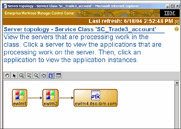
Figure 4-35 Server topology report
4.4.4 Real time performance monitors
These reports are available for service classes, transaction classes, process classes, and
managed servers. The objective for these reports is to monitor the achievement of the goal,
showing performance in real time. To use this graphical reporting, the minimum Java Runtime
Environment (JRE) release level is 1.4.1. All the following graphical reporting is based on the
last 10 second interval:
? Application topology
? Server topology
? Performance index monitor
? Goal achievement monitor
? Transaction count monitor
? Transaction rate monitor
Each of the graphs has a variety of views in addition to those shown; the views are configured
via the sliders on each. For further information on using these monitors, refer to the help in the
control center for each screen shown.
To start the monitor, select the monitor function from the pull-down menu and click Go. The
monitor is based on one of the following components:
? Goal achievement
? Performance index
? Transaction count and rate
? Processor utilization
Once you see a graphical monitor, there are some features (shown in Figure 4-36) in the
heading that are common through all the monitors, such as:
? View: Where you can:
– Select the color
– Show/hide annotations
– Show monitor in 2D or 3D
Chapter 4. Administering EWLM 115
? History: Where you can move back and forth on the data. Keeps an hour worth of history.
? Elevation/Rotation: These adjustments are useful in the 3D graphical view.
Figure 4-36 Report heading
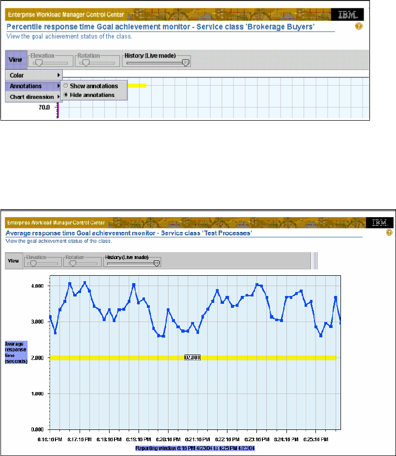
Let’s have a look at a sample of these graphical monitors. Figure 4-37 shows the average
response time report. The goal is represented by the flat line in the center and the jagged line
is the current trend of the service class. Thus it is easy to see if the installation is achieving
the goal in the displayed interval of time.
Figure 4-37 Average response time report
Figure 4-38 is a sample of the velocity goal report. Once again the goal is represented by the
flat line in the middle, and the jagged line is the current trend of the service class. You can
scroll the History bar if you want to see a different interval within the hour of collected data.

116 IBM Enterprise Workload Manager
Figure 4-38 Velocity goal report
Figure 4-39 shows a sample of a Transaction count report, where you can see the absolute
number of successfully processed transactions in the interval of time.
Figure 4-39 Transaction count report
The last report is the Performance Index monitor shown in Figure 4-40, where the goal of
PI=1 is indicated by the horizontal yellow line.The current PI is calculated and projected on
the chart against the target line: a PI > 1 is when the goal is being missed and a PI < 1 is
when the goal is being met. Everything below the line is an indication that the goal is being
exceeded (as in this example). Anything above the line (>1.00), indicates the service goal is
being missed. A PI > 1 through several monitoring intervals may indicate a problem.
..................Content has been hidden....................
You can't read the all page of ebook, please click here login for view all page.