Charts can help viewers of your presentation better understand quantitative information without overwhelming them with an avalanche of numbers. Using a chart, you can present complex data that can be understood at a glance. Charts illustrate the relationships between different sets of data, and they are also good for showing trends over time.
PowerPoint provides you with a wide variety of chart types, and you can manipulate those charts in many different ways to get your point across. You should have no problems tailoring charts to suit your taste and the needs of your presentation.
You can also animate the parts of a chart to have them appear on your slide one at a time. To create these chart builds, see Chapter 10.
In this chapter, you’ll learn about the different chart types; how to use PowerPoint to create charts; and how to manipulate those charts so that they look the way you want.
PowerPoint can create eleven different types of charts, as shown in Table 9.1. Each type of chart is useful for displaying a particular kind of data.
Table 9.1. Chart Types
CHART TYPE | DESCRIPTION |
|---|---|
Column | Column charts show unique values. They are useful when comparing values, such as sales, over different time periods. Stacked column charts, like area charts, display both individual values and the sum of several values for a given item. |
Line | Line charts show data trends over time or other intervals. They are useful for showing variations in values, such as stock prices. |
Pie | Pie charts show proportional relationships between several values and a whole, often expressed as percentages. |
Bar | Bar charts, like column charts, show individual items and their relationship to one another. The stacked bar chart variation is similar to the stacked column chart. |
Area | Area charts show the magnitude of change over time. A variation, stacked area charts, also shows the magnitude of change over time, and they display both individual values and the sum of all values in the chart. |
X Y (Scatter) | Scatter charts are often used for scientific data, and plot two groups of numbers as one series of xy coordinates, or shows the relationships among the numeric values in several data series. |
Stock | These are usually used to plot stock price data, and show the high, low, and closing prices of one or more stocks. |
Surface | Surface charts display data plotted over a 3D surface area, and compare two groups of data combinations. Similar colors and patterns indicate similar ranges of values. |
Doughnut | Similar to a pie chart, except that it can show more than one data series. Like the pie chart, it shows the proportion of parts to the whole. |
Bubble | A variation of the XY chart, this chart compares sets of three values. The size of the bubble indicates the value of the third variable. |
Radar | The radar chart compares multiple data series that are all related to a single item. |
It’s not always easy to decide on which kind of chart to use. Sometimes the data that you’re trying to present will practically beg for a particular chart type; for example, when you’re trying to show values as percentages that add up to 100%, a pie chart is almost always the right approach. But in other instances, several chart types might fit your data and do a good job of presenting it. Here are a few tips to help you choose the right chart for the job.
Evaluate the data that you are trying to present, particularly the aspect of the data that you want to highlight. Data where the totals are more important than the individual values are good candidates for area charts, stacked bar charts, and stacked column charts.
If you have many data series to present, use a chart type like bar, column, or X Y (Scatter), which shows many data points well.
Choose the chart type that produces the simplest chart for your data. If necessary, switch between the different types in PowerPoint to see the visual effect of each type on the data. Because your viewers don’t have control of how long your slide is on screen, it will help if you give them charts they can grasp quickly.
Pie charts shouldn’t be used to represent data with more than five to eight data series. Each series will appear as a slice of the pie, and too-small pieces will not have good visual impact.
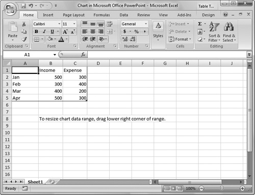
Before you begin creating charts, you’ll need to know a little about the terminology PowerPoint uses to refer to the different parts of a chart, and the different tools that PowerPoint gives you to manipulate charts. The column chart in Figure 9.1 labels the main parts that appear on a slide. PowerPoint uses Excel 2007 to enter the information that makes up the chart (Figure 9.2, on the following page). Data behind the chart is entered in an Excel worksheet. When you have selected a chart in PowerPoint, the Chart Tools contextual tabs (Design, Layout, and Format) appear in the Ribbon, which gives you many controls that allow you to customize the chart (Figure 9.3, on the following page).


The data for the chart appears in the plot area, which contains the bars, columns, lines, etc. Most chart types (except for pie, doughnut, and radar charts) have two axes, the horizontal category axis and the vertical value axis. The value axis is where you read the values you are charting. For example, in Figure 9.1, the value axis is the vertical axis, the one with the numeric labels. In column charts, area charts, and line charts, the vertical axis is the value axis. For bar charts, the horizontal axis is the value axis, and the vertical axis is the category axis. Pie, doughnut, and radar charts don’t have a value axis.
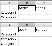
Charts show the relationship between two types of data (for example, financial performance over a time period such as months or years). These two data types are called the data series and data sets. In Figure 9.2, each row in the worksheet represents a data series, and each column represents a data set. The legend is the label (or labels) on the chart that explains what the different data series represent.
You’ll want to add a chart to a slide that has plenty of room for the chart, though you can add a chart to any slide, especially slides that have a content box. Of the built-in slide layouts, the ones that are most appropriate for charts are Title and Content, Two Content, Comparison, Content with Caption, Title Only, and of course Blank, which is a good layout to use for charts that need to be as large as possible.
Procedure 9.1. To add a chart to a slide:
Display the slide where you want to add a chart.
If your layout has a content box, click the Chart icon (Figure 9.4).
or
Choose Insert > Illustrations > Chart (Figure 9.5).
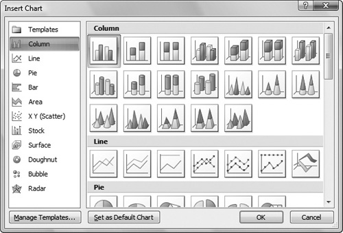
The Insert Chart dialog appears (Figure 9.6).
Choose the chart type that you want from the category on the left, then choose a chart style in the scrolling list on the right.
Excel 2007 launches, with some sample data already entered. Surrounding the sample data is a border delineating the chart data range (Figure 9.7). The row and column labels and the data within this border will appear on the chart.
Enter your data into the Excel worksheet.
For more information about using the worksheet, see the next section.
✓ Tips
If you already have an Excel worksheet with your data, you can create the chart in Excel, then copy the chart and paste it into PowerPoint. There won’t be any difference in the look of the chart versus creating it in both Excel and PowerPoint.
You can add as many charts as you want to a slide, subject only to how many will fit on the slide, and to your sense of good taste.


When you create a new chart in PowerPoint, the Excel worksheet is filled by default with four rows and three columns of sample data. Chances are this won’t be the data that you want, so the first thing you’ll need to do is get rid of the sample data so that you don’t accidentally mistake it for your own data. Next, you’ll need to change the row and column labels so that they match your chart’s data. After that, you can enter your data in the Excel worksheet’s cells.
Once your data is in place, you can rearrange it by moving rows or columns around on the worksheet, and you can even choose parts of the worksheet data to include in the chart.
Procedure 9.2. To delete all data in the Excel worksheet:
Click and drag over the sample data in the worksheet to highlight it (Figure 9.8).
Choose Home > Editing > Clear, then from the pop-up menu, choose Clear Contents (Figure 9.9).
or
Press Delete.
The values in the selected cells disappear.


Procedure 9.3. To change row or column labels:
In the worksheet, click the name of the row or column that you want to change.
The cell containing the name is highlighted (Figure 9.10).
Type the new name.
The new name replaces the old.
Click outside the label to accept the change.
Procedure 9.4. To enter data in the worksheet:
Press the Tab key to complete the entry and move the selection to the right.
See Table 9.2 for more ways to enter data and move the selection in the worksheet.
Table 9.2. Chart Data Entry Shortcuts
KEY
WHAT IT DOES
Tab
Completes a cell entry and moves the selection to the right
Shift-Tab
Completes a cell entry and moves the selection to the left
Enter
Completes a cell entry and moves the selection down
Shift-Enter
Completes a cell entry and moves the selection up
Home
Moves the selection to the beginning of the row
Arrow Keys
Moves the selection one cell in the direction of the arrow
(Optional) If you need another row, click in the last cell of the worksheet, then press Tab.
or
Drag the handle at the lower-right corner of the chart data range to the right (to add a column) or down (to add a row).
The chart data range expands.
Procedure 9.5. To move rows or columns:
In the worksheet, click one of the row or column headers to select the row or column.
The row or column highlights.
Choose Home > Clipboard > Cut, or press
 .
.The selected area shows a border with a moving dotted line.
Click where you want to move the highlighted cells.
Choose Home > Cells > Insert > Insert Cut Cells.
The row or column moves.
✓ Tip
You must insert the cut cells within the chart data area. If you do not, Excel will show an error message.
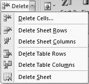
Procedure 9.7. To delete a row or column:
Click a row or column label to select an entire row or column.
Choose Home > Cells > Delete, then choose the action you want from the Delete pop-up menu (Figure 9.11).
or
Move the mouse pointer over the selected data, then right-click to bring up the shortcut menu, then choose Delete.
The row or column disappears.
Procedure 9.8. To hide or unhide a row or column:
If you have data in your worksheet that you don’t want to be part of the chart, you can hide it. Begin by selecting the row or column you want to hide.
Right-click and choose Hide from the shortcut menu.
The row or column disappears, and the chart in PowerPoint changes to reflect the new data, recalculating totals and other data as needed.
To unhide the row or column, select the rows and columns before and after the hidden row or column. Then right-click and choose Unhide.
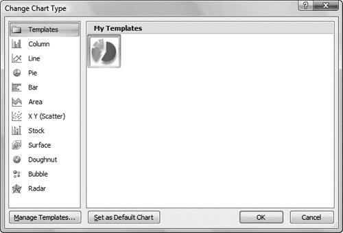
You can change the chart type at any time in PowerPoint. All you need to do is select the chart and then choose from the Type group in the Chart Tools or use the shortcut menu.
Procedure 9.9. To change the chart type:
Select a chart.
Right-click and choose Change Chart Type from the shortcut menu (Figure 9.12).
or
Choose Chart Tools > Design > Type > Change Chart Type.
The Change Chart Type dialog appears, which looks just like Figure 9.6 with a different window title.
Choose the chart type that you want from the category on the left, then choose a chart style in the scrolling list on the right.
Click OK.
The chart changes. The options in the Ribbon’s Chart Tools tabs also change to show options appropriate to the new chart types.

Sometimes you need to look at your data in a different way, and PowerPoint can transpose the way it plots the data series and data sets, to give you a different perspective on your data.
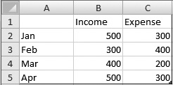
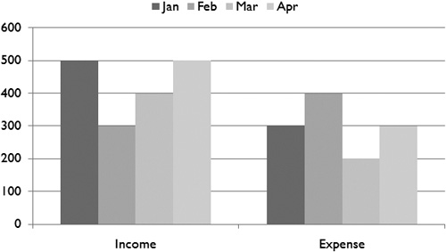
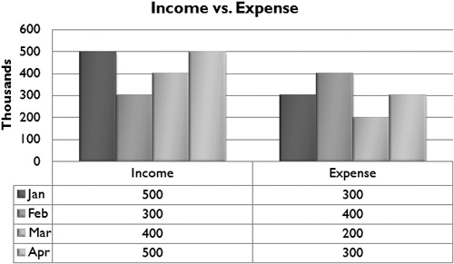
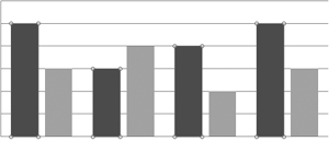
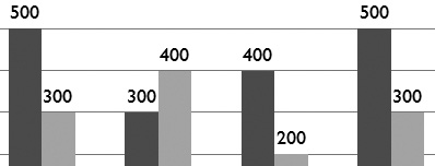
In the example in Figure 9.13, the rows (data series) in the worksheet show income and expense figures distributed across four months, which are expressed in the columns (data sets). The resulting graph (Figure 9.14) groups each month’s financial results together. If we transpose the data series and data sets, we get a very different view of the same data (Figure 9.15). In this view, you can see how income and expenses change over the four months. The income figures and the expense figures for all months are grouped together, making it easier to see the trend for each group over time. PowerPoint changes the legend of the graph to reflect the new ordering of the data.

The benefit of being able to transpose data series and data sets is that it allows you to change the presentation of the data in the worksheet without the need to retype your data.
Procedure 9.10. To transpose data series and data sets:
Select a chart on a slide.
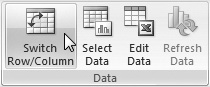
Choose Chart Tools > Design > Data > Switch Row/Column (Figure 9.16).
The chart changes.
Like most other objects in PowerPoint, charts appear with a default style that matches the presentation’s theme. A chart style is a combination that includes the chart’s fonts and colors, and also effects, such as 3-D, shadow, or beveled effects on the parts of the chart. As usual with PowerPoint 2007, you are able to pick different chart styles from a gallery.
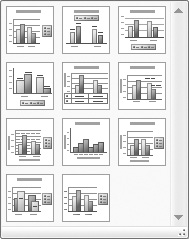
PowerPoint also includes 11 different preset chart layouts. A chart layout is a set of chart elements with a particular arrangement. For example, one layout includes a chart title, with the legend at the right side of the chart. Another one puts the legend above the chart, and also includes a data table that shows all of the values that are normally hidden in the worksheet.
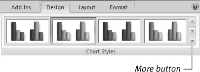
Procedure 9.11. To change the chart style:
Select the chart on your slide.
Choose one of the styles in the Chart Tools > Design > Chart Styles gallery (Figure 9.17).
The style is applied to your chart.
(Optional) If you want to see all of the styles available, click the More button in the Chart Styles gallery.
The gallery expands to show you all the choices. Click one of the styles to apply it to your chart.
Procedure 9.12. To apply a chart layout:
Select the chart on your slide.
Choose one of the styles in the Chart Tools > Design > Chart Layouts gallery (Figure 9.18).
The chart takes on the layout you chose (Figure 9.19).
You can format the different parts of a chart to serve your needs. You can change the chart’s colors, fonts, gridlines, legend, and axis labels and control the formatting of numbers in charts.
You’ll use the Chart Tools tabs to make most of the formatting changes to your charts.
There’s not much difference between the text and graphics on a chart and any other text and graphic objects in PowerPoint. You select the item you wish to change, then use the same kinds of tools to make the modifications as you would any similar text or graphic.
You change chart colors as you would any graphic, and you can apply image, gradient, or color fills, change the opacity, add shadows, and change the line styles.
For more details about working with text, see Chapter 4; for more about working with graphics, see Chapter 5.
Procedure 9.13. To change text in charts:
Select the text that you wish to change.
You can select several text boxes in each chart: the chart title, the legend, the data point labels (if they are visible), the category axis label, and the value axis label.
Use the tools in the Fonts and Paragraph groups of the Home tab of the Ribbon to adjust the appearance of the text (Figure 9.20).

Procedure 9.14. To change graphics in charts:
Select the graphic element that you wish to change.
In bar and column charts, if you select one element in a series, all the elements in that series are selected (Figure 9.21). In a pie chart, you can select one or more wedges of the pie.
Use the graphics tools in the Chart Tools > Format > Shape Styles group to adjust the fill, outline, shadow, or other effects of the selected object or objects (Figure 9.22).

Procedure 9.15. To remove formatting:
Sometimes you may want to restore the chart to the default theme style. Begin by selecting the chart.
Choose Chart Tools > Layout > Current Selection > Reset to Match Style.
Any style modifications you’ve made are eliminated, and the chart returns to its default style.
Axis elements include the labels for the category axis and value axis, gridlines, the range of values that are displayed along the value axis, and the number format of the values in the chart. You can also adjust the borders of the chart. You’ll find the controls for these settings in the Labels and Axes groups of the Layout tab of Chart Tools (Figure 9.23).

Procedure 9.16. To change chart and axis labels:
Select the chart.
In the Labels group of the Layout tab of Chart Tools, make one or more selections from the pop-up menus for the element you want to change.
The pop-up menus are different for each kind of element. For example, to add data labels to each chart element, you can choose where you want to position the data labels (Figure 9.24).
As you make changes to the pop-up menus, the chart changes.

Procedure 9.17. To change the range of displayed values on the value axis:
Choose Chart Tools > Layout, then choose Vertical (Value) Axis from the Chart Elements pop-up menu at the top of the Current Selection group (Figure 9.25).
The vertical axis will be selected.
Choose Chart Tools > Layout > Current Selection > Format Selection.
The Format Axis dialog appears, set to the Axis Options category (Figure 9.26).
Choose one or more of the following:
In the Minimum field, click the Fixed button, then enter a number.
This number will be the value that will be shown at the chart origin, which is where the category axis and the value axis meet.
In the Maximum field, click the Fixed button, then enter a number.
This will be the highest number displayed on the value axis label. It must be as high as or higher than the highest value in your data set.
Click the Fixed button, then enter values for the Major unit and Minor unit fields.
This creates marks in the value axis with values at equal intervals. The more steps that you specify, the more axis markings there will be.
Select the Values in reverse order or Logarithmic scale checkboxes. The latter works best when your chart values cover a large range.
If you want to show units in the chart, make a selection from the Display units pop-up menu (Figure 9.27).
When you’re done modifying the axis display, click Close.


Procedure 9.18. To set the number format of chart values:
Select the chart.
Choose Chart Tools > Layout, then choose Vertical (Value) Axis from the Chart Elements pop-up menu at the top of the Current Selection group.
The vertical axis will be selected.
Choose Chart Tools > Layout > Current Selection > Format Selection.
The Format Axis dialog appears.
Click the Number category.
The dialog displays the Number options (Figure 9.28).
Choose a number category from the list.
The dialog changes to show different options, depending on the category you pick.
Make the number formatting changes you want.
Click Close.

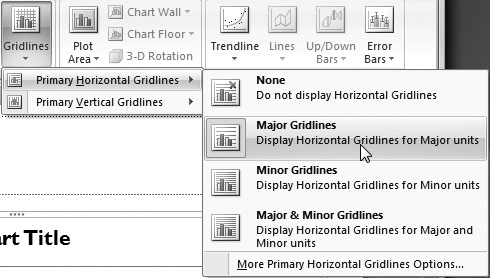
Procedure 9.19. To format axes and gridlines:
Select the chart.
In the Axes group of the Layout tab of the Chart Tools, make one or more selections from the pop-up menus for the element you want to change.
Each of the two pop-up menus—Axes and Gridlines—has Horizontal and Vertical submenus, with several options for each one (Figure 9.29).
Pie charts work a bit differently than the other charts in PowerPoint. Because a pie chart doesn’t have a category axis and a value axis, PowerPoint charts only the first data set in the worksheet. If the data series are in rows in the worksheet, only the first column will be charted. If the data series are in columns in the worksheet, only the first row will be charted. A single pie chart represents a single data set, and each wedge in the pie chart represents one element of that set. If there are other data sets in the worksheet, and you switch the chart type to a pie chart, the excess data sets will not disappear, but they will not be used, either.
PowerPoint allows you to manipulate the individual wedges of a pie chart separately. You can select a wedge and manually drag it away from the main body of the pie chart for effect, or you can use a slider to “explode” a wedge of the chart if you like, separating it from the rest of the chart by a specified percentage. You can also rotate an entire pie chart, to show off a particular part.
✓ Tip
You can chart any data set that is in your worksheet by moving it to the first position in its row or column.
Procedure 9.21. To explode a pie chart:
Drag the wedge away from the rest of the pie (Figure 9.30).
or
To explode all of the wedges away from one another, right click the pie chart and choose Format Data Series from the shortcut menu (Figure 9.31).
The Format Data Series dialog appears.
In the Pie Explosion section, use the slider or the numeric field to explode the pie segments, then click Close.
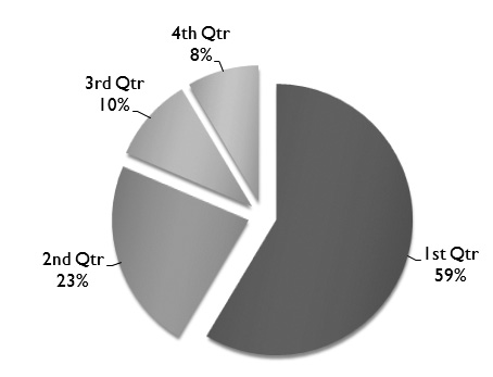
The wedges separate from one another (Figure 9.32).
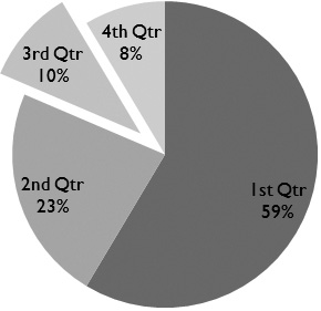


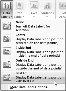
Procedure 9.22. To show and format values in pie wedges:
In Chart Tools > Layout > Labels, select a label format from the Data Labels pop-up menu (Figure 9.33).
This turns on the value labels for each data point in the chart (Figure 9.34).
To format the data value labels, right-click the pie and choose Format Data Labels from the shortcut menu.
The Format Data Labels dialog appears (Figure 9.35).
Make changes in this dialog as needed, then click Close.
The data labels are formatted as you command (Figure 9.36).


When you’ve spent a lot of time formatting a chart, you don’t want to reinvent it every time you need that format. PowerPoint lets you save charts as templates. Instead of re-creating the chart, you can simply apply the chart template.
Procedure 9.24. To save a chart as a template:
Select the chart that you want to save as a template.
Choose Chart Tools > Design > Type > Save As Template (Figure 9.37).
The Save Chart Template dialog appears, set to save the template in the template folder where PowerPoint expects to find templates. Don’t change this.
Give the template a name, and click OK.
PowerPoint saves the template.

Procedure 9.25. To apply a saved chart template:
Select a chart on your slide.
Choose Chart Tools > Design > Type > Change Chart Type.
The Change Chart Type dialog appears.
Click Templates, select the previously saved template (Figure 9.38), and then click OK.
The chart takes on the formatting of your chart template.