BEFORE YOU CHOOSE AN ACTIVITY: LEARNING ABOUT YOUR PRODUCT AND USERS
CASE STUDY A: COMPETITIVE INTELLIGENCE: MINING DESIGN CONCEPTS FROM BUSINESS SCHOOL LIBRARIES
CASE STUDY B: PERSONAS: A CASE STUDY BY MICROSOFT CORPORATION
Introduction
When working with a product team, your first objectives are to learn about the product and the users. It is key for you to ascertain as much as possible about the existing product in terms of its functionality, competitors, customers, etc. In addition, you need to assess what is currently understood about the users and begin to create user profiles. This information will enable you to choose appropriate user requirements activities so that you can ultimately improve your product. In this chapter we will detail how to collect product information from a variety of sources and how to make sense of the information readily available to you. We will also discuss how to create user profiles, personas, and scenarios, and how to use these as design tools. Finally, we present two excellent case studies. The first illustrates how to conduct a competitive analysis and the second details the successful use of personas.
Learn About Your Product
Before you even begin working with a single user, you need to understand the domain you are working in. We cannot stress enough how important it is to do your homework before jumping into one of the user requirements activities described in this book. You may be extremely pressed for time and think you can learn the domain while you are collecting data from users. Big mistake! You will need to answer many questions for yourself. What are the key planned or available functions of the product? Who are the competitors? Are there any known issues with the product? Who are the product’s perceived users? In addition to helping you collect effective requirements, this knowledge will also earn you necessary respect and trust from the product team (refer to Chapter 1, Introduction to User Requirements, “Become a Virtual Team Member” section, page 19).
Limiting your homework to speaking with the product team is often not enough. We hope that the product team you are working with is composed of experts in the domain and that they have done their homework as well. Unfortunately, this is not always the case. Particularly with new products, the product team is learning about the users and the domain at the same time you are. It is important to interview the product team and learn everything you can from them, but you must also supplement that information with data from other sources. In addition, the more you know about the product and domain, the more respect you get from the product team. You may never know as much as some of the product managers; however, there are always some fundamentals they will expect you to know or to pick up quickly. In the very beginning you can get away with being naive; but with time, stakeholders will expect you to understand what they are talking about.
In this chapter, you will read about a variety of sources that you can use to learn about the product you are dealing with, and your end users. Keep in mind that this section is not intended to tell you what to do instead of collecting user requirements. It is intended to tell you about some of the research you will want to conduct before you even consider running a user requirements activity. In addition, we have included two very enlightening case studies, one related to gaining a better understanding of your product, and the other to gaining a better understanding of your users. The first study is from Diamond Bullet Design and it discusses a competitive analysis that was done to compare online business school libraries. The second study is from Microsoft and it details the process of creating and using personas.
If you do not have a background in usability, you will need to be aware of some of the founding principles. You need to understand what questions can be answered by a usability activity and what questions should be answered by a design professional. We strongly recommend that you refer to Appendix A (page 678) to learn about usability resources available to you as well as Appendix B (page 688) for a list of usability training courses. If you require supplemental assistance, you can refer to Appendix D (page 698) for a list of usability consultants that can work with you.
Data are out there that can help you learn a lot about the product. In this section, we tell you how you can use log files, marketing, customers, and general research to help you become a domain expert. Regardless of whether this is a brand new product or a new release of an existing product, there is still a lot of existing information that can help you.
Use Your Product
It may sound trite, but the best way to learn about your product is to use it (if it already exists). In the case of a travel website, you should search for a hotel and flight, make a reservation, cancel your reservation, ask for help. Stretch the product to its limits.
Networking
You are surrounded by people who know about your product and domain, you just have to get to know them. Start by finding out whether your company has a usability group (that is if you are not a part of such a group). Meet the people who support your product and read their usability reports. If you are unable to watch a live activity, ask to view tapes of previous activities for your product and related products. What previous usability issues were encountered? What user requirements have been documented so far?
You should also meet the content writers for the company. These are the folks who create the user manuals and online help (for websites and web applications). What is difficult to document – either because it is difficult to articulate or because the product is so complicated to explain?
If your company offers training courses, attend classes. Speak with the folks who teach the courses. What is hard to teach? What types of question are users asking? What tips (not documented) are the instructors offering?
Customer Support Comments
If you are working on a product that already has an existing version and your company has a Help Desk or Customer Support Group, you can learn a great deal about your product by visiting that department.
People rarely call or e-mail in compliments to tell a company how wonderful their product is, so those calls pertain to issues that you should become familiar with. If you can access logs of customer questions, problems, and complaints over time, you will see trends of difficulties users are encountering. Perhaps the user’s manual or Help isn’t helpful enough. Perhaps the product has a bug that wasn’t captured during QA. Or perhaps users do not like or cannot figure out a “feature” the product team thought every user had to have. This can give you a sense of where you will need to focus your efforts to improve the product.
Users may not be able to accurately describe the problem they are having or may misdiagnose the cause. Likewise, customer support may not have experience with the product under consideration. Although this should never be the case, it often is. If the support staff are not very familiar with the product in question, they may also misdiagnose the cause of the customer’s problem or may not capture the issue correctly. This means that, once you have a log of customer feedback, you may need to conduct interviews or field studies with users to get a full understanding of the issues.
Log Files
If you are responsible for the usability of a website, web server log files may provide an interesting perspective for you. When a file is retrieved from a website, server software keeps a record of it. The server stores this information in the form of text files.
The information contained in a log file varies but will typically include: the source of a request, the file requested, the date and time of the request, the content type and length of the transferred file, the referring page, the user’s browser and platform, and error messages. Figure 2.1 shows a sample of a server log file.

Programs are available that can analyze log files and produce usability data. However, you will likely need to work with your organization’s IT department to have useful information captured in your server log file in order to conduct usability analysis.
Information that can be captured includes:
![]() Unique ID for each visitor so you can see who is returning
Unique ID for each visitor so you can see who is returning
![]() Click path (i.e., the pages users visit and the sequence in which they visit them)
Click path (i.e., the pages users visit and the sequence in which they visit them)
![]() Where visitors leave the site (what page)
Where visitors leave the site (what page)
![]() Actions taken (e.g., purchases made, downloads completed, information viewed).
Actions taken (e.g., purchases made, downloads completed, information viewed).
There are some issues or limitations that you should be aware of when interpreting the data you collect from log files.
![]() The log files often contain an Internet Protocol (IP) address temporarily assigned by an Internet Service Provider (ISP) or a corporate proxy server. This prevents unique identification of each user.
The log files often contain an Internet Protocol (IP) address temporarily assigned by an Internet Service Provider (ISP) or a corporate proxy server. This prevents unique identification of each user.
![]() Browser caching leaves gaps in the recorded click stream. If a page is cached, the log files do not record the second, third, or 100th time it is visited during the user’s stay at your site. It also fails to capture the pages called when the Back browser button is used. Consequently, the last page recorded in the log file may not be the last page viewed if the user exited on a previously cached page. As a result, you cannot be sure what the “exit page” was for the user.
Browser caching leaves gaps in the recorded click stream. If a page is cached, the log files do not record the second, third, or 100th time it is visited during the user’s stay at your site. It also fails to capture the pages called when the Back browser button is used. Consequently, the last page recorded in the log file may not be the last page viewed if the user exited on a previously cached page. As a result, you cannot be sure what the “exit page” was for the user.
![]() Log files record when a request was made for a page but not when the transfer was completed. Also, if a user spends 30 minutes on a single page, you don’t know why. Did the user walk away or look at another site or program, or was the user viewing the page the entire time?
Log files record when a request was made for a page but not when the transfer was completed. Also, if a user spends 30 minutes on a single page, you don’t know why. Did the user walk away or look at another site or program, or was the user viewing the page the entire time?
![]() You cannot be sure whether the user completed his/her goal (i.e., purchasing, downloading, looking for information) if you don’t know the user’s goal. Perhaps the user wanted to buy three CDs but could find only one. Perhaps the user was looking for information and never found it.
You cannot be sure whether the user completed his/her goal (i.e., purchasing, downloading, looking for information) if you don’t know the user’s goal. Perhaps the user wanted to buy three CDs but could find only one. Perhaps the user was looking for information and never found it.
You can work with your IT department to address each of these issues, but it takes time and knowledge of what you need versus what can be captured. External companies like WebTrends (www.netiq.com/webtrends/default.asp) can be hired to capture web usage data. These companies are a great source of basic usage data once you have a website running (e.g., number of hits per hour or per day, what page the user came from, how the user got here, time spent on the home page, number of excursions to other pages, time spent on each page, ads clicked on). They can collect data on almost any user action you want to keep track of.
Examining the time users spend per page is a more meaningful measure than the number of hits per page. When analyzing time data in a log file, it is best to use median rather than average times because the median is less susceptible to outliers.
In addition to capturing information about user motivation, you can learn about visitor profiles and activity from log files. However, it is best to study log files over a long period to discover data that compliments or spurs studies in greater depth. For example, you can identify areas of a site for further testing.
Your Marketing Department
Frequently, your company’s marketing department will conduct focus groups or competitive analysis to determine the need for a product and how best to promote and place it. Although this information is meant to drive sales, it is an excellent source to learn about the product, as well as potential customers and competitors.
Unfortunately, you do not always learn a lot about end users. Marketing information should not be confused with user requirements. The data from the marketing department can reflect the end users’ needs, but not always. Marketing collects information about the value and perceived worth of a product, whereas usability professionals collect information about how something is used and how the product’s worth is realized.
Additionally, the information you collect from the marketing department is only part of the information needed when creating a user profile. It is often missing contextual information about circumstances and environment that can affect a user’s decision to use and how to use your product. This is often the case for products that are to be used by corporations rather than an individual (e.g., Human Resources applications versus a website designed to sell books to the public). In the case of corporate products, the marketing department is typically interested in the business needs of the marketplace (i.e., companies that could be potential buyers) rather than the end users. Regardless, this information can be very helpful to you when you are starting out.
When you contact the marketing department, you may want to ask them questions such as:
Early Adopter or Partner Feedback
Frequently, companies will align themselves with a small number of customers in the early stages of development. These customers may play an active role in the design of the product and become partners in the process. They may implement early versions of the product on a small scale in their own companies. This relationship is beneficial to all parties. The customers get to help design the product to meet the needs of their own companies. On the other side, the product team gets early feedback and the company can ask for references when selling the product to others.
The feedback early adopters provide can be enlightening because the product can be implemented and used in a real-world setting (as opposed to testing in the lab). You can leverage these existing relationships to learn about the product space and some of the product’s known issues. However, when you are ready to move on to the next stage and collect user requirements, be wary of basing all of your user requirements on the few existing customers. You should obtain user requirements from a variety of users (refer to “Learn About Your Users” section, page 41).
Competitors
You can learn a lot from your competitors. A competitive analysis can be an effective way to gain an advantage over your competitors. It is beneficial to conduct a competitive analysis when you are creating an entirely new product or simply entering a new product domain. It can also be a great strategy if your product is failing, but your competitor’s product is thriving. It is wise to periodically check out your competition to see where you stand with the rest of the pack. Some companies have product analysts whose primary job is to keep tabs on the competitors and the market. Get to know this person and learn everything he or she knows. If the product does not have a product analyst, this is something that you can do.
Do not limit yourself to direct competitors. You should also examine surrogate products. These products may or may not compete directly with your product but they have similar features to your product and should be studied to learn about your strengths and weaknesses. For example, if you are adding a shopping cart to your travel website, check out companies that have shopping carts, even if they don’t compete with you (e.g., online book stores). Some people make the mistake of thinking their product or service is so innovative that no one else does it; therefore, they skip competitive analysis. No product is so revolutionary that there isn’t someone out there to learn from.
Traditional competitive analysis focuses more on cost, buying trends, and advertising. A usability competitive analysis is more concerned with the user experience (user interface, features, user satisfaction, overall usability). The goals of both types of competitive analysis are to learn from your competitors and snag a strategic advantage. Below we will concentrate on conducting a usability competitive analysis.
To identify your competitors, speak with the product team, sales or marketing department, conduct a web search, read trade magazines, and conduct user surveys, interviews, or focus groups. Market analysts and researchers – such as CNet, ZDNet, Gartner, Anderson, Forrester, and IDC – can be a great way to collect information about your product’s market space and competitors. These companies identify and analyze emerging trends in products and their impact on business.
Keep in mind primary competitors as well as secondary competitors. A secondary competitor can be a smaller company with a less threatening product offering, one having only a few features in common with your product, or one competing indirectly with your product. For example, the bricks and mortar travel agency does not compete directly with your online travel company but it is an alternative that should not be ignored.
Once you have identified your competitors, you should ascertain their:
![]() Customer base (profile of users, size of customer base, loyalty, etc.)
Customer base (profile of users, size of customer base, loyalty, etc.)
In gathering this information, it is extremely helpful to access some of the competitors’ products. If a product can be bought off the shelf, or is an easily accessible website, this should not be a problem. However, some products or services are sold only directly to companies. Most major software companies state in their licensing agreement that you are not allowed to conduct competitive tests against their product. They also state that you cannot show the installation of the product (or the product in use) to a competitor company.
If you are able to evaluate the competitor product yourself, you should identify a set of core tasks with which to compare your product (if you have one at this stage) and the competitor’s. This is particularly important if you plan to include functionality from the other product, because you may learn that a function doesn’t work well. Take numerous screenshots or photos and record your interaction as you conduct the evaluation.
Whether or not you are able to access the product yourself, surveys (Chapter 8, page 312), interviews (Chapter 7, page 246), focus groups (Chapter 12, page 514), and wants and needs analyses (Chapter 9, page 370) will be valuable ways to learn about users’ perceptions of the product. By conducting these kinds of activities with users of your competitor’s products, you can learn about the strengths, weaknesses, and key features of these products. In a competitive analysis, the majority of your effort should be spent mining the competitor’s product for ideas (e.g., functionality, user interface style, widgets, task structure, terminology).
There are a number of companies available to measure the usability or user satisfaction of a website (e.g., Vividence, Biz Rate, OpinionLab). They can do this for your site or for your competitor’s site. These companies send actual or target customers to any website (i.e., yours or a competitor’s) and then collect qualitative, quantitative, and behavioral data as users pursue actual tasks in a natural environment, such as their own homes and offices. Most companies allow clients to easily analyze both the quantitative and qualitative data gathered during an evaluation. This approach can be quite beneficial, but it is often expensive and requires that users can easily access the website. If the web-based product must be purchased or is behind a firewall, you will have to provide the users with access. In the case of a competitor that sells licensed software, this option is not possible.
As you conduct your competitive analysis, it is helpful to create a grid comparing your product against the competitor’s (see Table 2.1). List the key features, design strengths and weaknesses, usability scores or issues … anything you can learn. Tracking this information over time will show you how your product compares and how the market may be changing.

Learn About Your Users
If you do not understand who your users (or potential users) are, your product is doomed to failure. The single most critical activity to developing a quality product is understanding who your users are and what they need, and documenting what you have learned. This begins by developing a user profile – a detailed description of your users’ attributes (job title, experience, level of education, key tasks, age range, etc.). These characteristics will typically reflect a range, not a single attribute (e.g., ages 18–35). Your users should fall within those ranges. A user profile will help you understand who you are building your product for, and will help you when recruiting for future usability activities.
Once you have developed a thorough user profile, you can develop personas (exemplars of your end user) and scenarios (a day-in-the-life of your end user).
![]() Personas are designed to help keep specific users in focus during design discussions.
Personas are designed to help keep specific users in focus during design discussions.
![]() Scenarios help you test your system and to build functionality into your product that users will actually want to use.
Scenarios help you test your system and to build functionality into your product that users will actually want to use.
Table 2.2 compares these three types of user documents. You may have very little information to develop these initially – that is why you conduct user requirements activities. As you conduct user requirements activities, you will collect information to feed back into the user profiles, personas, and scenarios (see Figure 2.2). Figure 2.2 illustrates the relative time to spend at each stage of the cycle. Please note its iterative nature; you should always feed the results of requirements activities back into your initial understanding of your users. User profiles, personas, and scenarios are discussed in detail in the following sections.


Figure 2.1 Illustration of the relative time to spend at each stage of the lifecycle. This is the ideal case with multiple iterations
Keep in mind as you learn about your users that you should not focus on only the “best” or most experienced users. Someone who is considered an expert on a system may not be an expert on all parts of the system. It is much more likely that an individual will leverage only key areas of the product over and over while ignoring other parts. You should consider a range of users to ensure that your product works for at least 80% of your user population. However, it is not impracticable to target 90–95% of the population. If a consumer product has one million users and 2% of them call customer support for a usability problem that could have been identified via more research, you have just earned an additional 20,000 calls. If each call costs the company $6, preventing those 20,000 calls would save $120,000! As a final note, making a change to the product that enables only 80% of the users to use the new release, where 90% of the users could use it in the previous version, is a very bad thing. Guidelines like “80% use” are just that – guidelines. Other factors must be taken into consideration when deciding what the acceptable level of usability is for your product.
Step 1: User Profile
The first step in understanding your users is to create a user profile.
Finding Information to Build Your User Profile
Before you can conduct a user requirements activity, you need users. It is vital to get the right users, otherwise the data you collect are not only worthless, they can actually harm your product, your credibility, and the credibility of usability activities. But who are your users? What are their goals?
You should begin by developing a user profile. This is a detailed description of your users’ attributes (job title, experience, level of education, key tasks, age range, etc.).
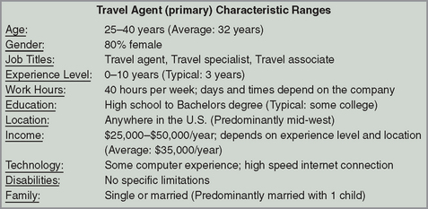
For example, the typical users might be between 18 and 35 years of age, have job titles like “Travel Specialist,” “Travel Agent,” or “Travel Assistant,” and work for travel agencies with fewer than 50 employees.
Creating a user profile is an iterative process. You will likely have some idea of who your users are at first, but this will probably not be detailed and may even be just a guess. But it is a place to start. The example above is just our first, best guess of who our travel agent user might be. You can capture the initial information to build your user profile from:
Once you have an initial stake in the ground, you can develop a phone screener and begin recruiting for your user requirements activity (refer to Chapter 5, Preparing for Your User Requirements Activity, “Recruiting Participants” section, page 156). As you conduct your activities and learn more about the end users, you should come back to the user profile and update it. Your first guess may have been slightly off left. At the very least it probably is not as detailed as it could be.
Understanding the Types of Users
You need to define what you mean by “user.” Most people consider the individuals who will interact directly with the product as their users, but you may need to consider other individuals as well:
![]() The manager of your direct user
The manager of your direct user
![]() The system administrator who configures the product for the direct user
The system administrator who configures the product for the direct user
![]() People who receive artifacts or information from the system
People who receive artifacts or information from the system
![]() People deciding whether they will purchase your software
People deciding whether they will purchase your software
![]() People who use competitors’ products (you want to convert them to use your product).
People who use competitors’ products (you want to convert them to use your product).
Try to categorize your users into one of three categories: primary, secondary, and tertiary. Primary users are those individuals who work regularly or directly with the product. Secondary users will use the product infrequently or through an intermediary. Tertiary users are those who are affected by the system or the purchasing decision-makers. All of these individuals have an interest in the product. This does not mean that you have to conduct user requirements activities with the secondary and tertiary users, but you should at least know who they are. If the tertiary decision-makers do not purchase your product, the primary users will never use it. If the secondary system administrators cannot figure out how to customize and implement the product, the primary users will have a painful experience with it.
It is also important to realize that a single user may have several roles and sometimes these roles can have contradictory needs. For example, many online auction users are both buyers and sellers. Buyers want to pay the least they can while sellers want to get as much as they can, and a single auction site must support both these contradictory roles without harming either. Additionally, the product should behave similarly for both roles – users should not have to learn a different interaction model, navigation, terminology, etc. based on their role. Only the information presented and some of the functions available should be different.
Creating a User Profile
There are several characteristics you need to consider in order to develop a thorough user profile. We provide an ideal list of characteristics below, but you will likely not have access to all of this information. As you do further research and conduct additional user requirements activities, you will fill in these blanks, but you may never find the answers to some of the questions. Ideally, you should determine not only the typical or most frequent level for each of the characteristics, but also the range and the percentage of users who fall along that range. As a final note, some of the characteristics on page 46 are more important than others in regards to your product and situation. Prioritize the characteristics and spend the majority of resources capturing information on those key characteristics for your product. For example, if a human resources administrator enters in the wrong social security number into a financial application, you might not get paid. This is terrible, but if a medical professional enters in the wrong social security number in an electronic chart, you might get the wrong medication. This is much more serious so it is important to understand not only the tasks a user does but the consequences of a possible error. Figure 2.3 shows a sample user profile.
![]() Demographic characteristics – age, gender, location, socio-economic status
Demographic characteristics – age, gender, location, socio-economic status
![]() Occupation experience – current job title, years at the company, years of experience at that position, responsibilities, previous jobs and job titles
Occupation experience – current job title, years at the company, years of experience at that position, responsibilities, previous jobs and job titles
![]() Company information – company size, industry
Company information – company size, industry
![]() Education – degree, major, courses taken
Education – degree, major, courses taken
![]() Computer experience – computer skills, years of experience
Computer experience – computer skills, years of experience
![]() Specific product experience – experience with competitors’ products or other domain-specific products, usage trends
Specific product experience – experience with competitors’ products or other domain-specific products, usage trends
![]() Tasks – primary tasks, secondary tasks
Tasks – primary tasks, secondary tasks
![]() Domain knowledge – the users’ understanding of the product area
Domain knowledge – the users’ understanding of the product area
![]() Technology available – computer hardware (monitor size, computing speed, etc.), software, other tools typically used
Technology available – computer hardware (monitor size, computing speed, etc.), software, other tools typically used
![]() Attitudes and values – product preferences, fear of technology, etc.
Attitudes and values – product preferences, fear of technology, etc.
![]() Learning style – visual learner, audio learner, etc.
Learning style – visual learner, audio learner, etc.
![]() Criticality of errors – in general, the possible consequences of a user’s error.
Criticality of errors – in general, the possible consequences of a user’s error.
Once you determine the range of responses for each of the characteristics and the percentage of users along that range, you will want to categorize your users into groups based on their similarities. Some groupings you may use are:
You can use an affinity diagram to organize the characteristics into groups(see Appendix F, page 714). The groups should be significantly different from each other in order to justify them as different user types. As with many things, this is more of an art than a science and there are rarely clearly marked boundaries that put every user in one group or another. Having multiple stakeholders take part in the affinity diagram exercise can help when creating these groups and also assures stakeholder buy-in from the very beginning (refer to Chapter 1, Introduction to User Requirements, “Getting Stakeholder Buy-in for Your Activity” section page 14).
Now that you have a handle on your user population, you can develop personas, scenarios, and a recruitment screener (refer to Chapter 5, Preparing for Your User Requirements Activity, “Recruiting Participants” section, page 156). As you collect user requirements over time, you can add the information into your personas and scenarios to make them more robust and realistic. Composing a persona or scenario may even point out areas where you need more information and help you identify user requirement activities you need to conduct.
Step 2: Personas

© The New Yorker Collection 1993 Roz Chast from cartoonbank.com. All Rights Reserved
Alan Cooper developed a method called “Goal-Directed Design” in which personas are a key part. Personas were first introduced to the world in Cooper’s 1999 book The Inmates are Running the Asylum.
Benefits of Personas
Personas take a user profile and then fill in details to create a “typical” user. A persona is simply a fictional individual created to describe a specific user. Since you cannot possibly speak with every end user, you must create a model that can represent those end users.
There are many benefits to using personas. Because it can be difficult to feel connected to an abstract description of something, personas give your users life and help team members feel connected to them. They also get everyone on the same page by encouraging all team members to think about the same persona, instead of each individual working towards his or her own vision of who the end user is. Trying to build a product for the generic “user” is like trying to hit a moving target. Without a specific target to focus on, “the user” can change from the expert to the novice to your grandmother, all in the midst of a single conversation. Designing for a small set of personas will assure greater success of hitting that target. A persona can be used in meetings as a discussion tool (e.g., “Mary would never use that feature”), in cognitive walkthroughs, storyboarding, role-playing, and other usability activities. Finally, personas can also help new team members quickly learn who the end user is. You should create at least one persona per user type (e.g., one for the travel agent, one for the travel customer).
Things To Be Aware of When Creating Personas
You may want to develop multiple personas for each user type. This will help you cover the range of characteristics for each user type. For example, if one of your user types is a “novice travel agent,” you may want to create multiple “novice” personas: one at a small company, one at a large company, one who received formal training, one who was self-taught, etc. By limiting your vision to just one persona, you may end up filtering out valuable data from end users who do not match that one profile. For example, if we did not create a persona for the self-taught travel agent, team members might assume all travel agents receive formal training and make all their design decisions based on that fact. Having multiple personas for each user type will prevent people from building the product around a single user and help develop a product that works for all of your users. However, you should keep the set of personas manageable. It is a balancing act. If you have too many personas to represent one user type, they will simply blur together in everyone’s mind and diminish their benefits. You want your personas to be memorable. Three primary personas is a common recommendation.
You must also make sure that the personas you devise are specific to the product or feature you are developing. As we mentioned above, not all users use all parts of a product or system; therefore, it is unrealistic to assume that the same persona will work for all parts of your product. In the second case study at the end of the chapter, the authors warn about the dangers of persona reuse.
As a final note, we want to stress that personas should never replace conducting usability activities with your end users. Personas should be based on the data from usability activities. In most cases you cannot have users present with you all the time, so personas act as placeholders in cases where you cannot speak with your end users. They allow the users’ voice to be heard even when they are not physically present. Of course you should still conduct user requirements activities wherever possible.
Creating a Persona
There are several components to a persona. You can add as much detail to each of these areas as you have, but you may not be able to fill in all areas at first. The details will come from the information in your user profile. Just as developing a user profile is an iterative process, so is persona development. As you conduct user requirements activities, you should take what you learn to validate and beef up your personas. When creating a persona, it should be fictional but describe attributes from real users. Provide details and maintain authenticity. The list below is an idealized list – you may not have all the information below. Fill in what you can.
![]() Identity. Give this user a first and last name. Provide an age and other demographic information that would be representative of the user profile. Include a picture as well. If you have a face to go with the name, the persona is more realistic and easier to associate with.
Identity. Give this user a first and last name. Provide an age and other demographic information that would be representative of the user profile. Include a picture as well. If you have a face to go with the name, the persona is more realistic and easier to associate with.
![]() Status. Is this a primary, secondary, tertiary, or anti-user of your system?
Status. Is this a primary, secondary, tertiary, or anti-user of your system?
![]() Goals. What are this user’s goals? Do not limit yourself to goals related to your specific product.
Goals. What are this user’s goals? Do not limit yourself to goals related to your specific product.
![]() Skill set. What is the background and expertise of your user? This includes education, training, and specialized skills. Again, do not limit yourself to details related to your specific product.
Skill set. What is the background and expertise of your user? This includes education, training, and specialized skills. Again, do not limit yourself to details related to your specific product.
![]() Tasks. What are the basic or critical tasks the user conducts? What is the frequency, importance, and duration of those tasks? More detailed task information is included in scenarios (see below).
Tasks. What are the basic or critical tasks the user conducts? What is the frequency, importance, and duration of those tasks? More detailed task information is included in scenarios (see below).
![]() Relationships. Understanding with whom the user associates is important. Including relationships in the persona keeps you thinking about secondary and tertiary stakeholders.
Relationships. Understanding with whom the user associates is important. Including relationships in the persona keeps you thinking about secondary and tertiary stakeholders.
![]() Requirements. What does your user need? Including quotes will really drive those needs home.
Requirements. What does your user need? Including quotes will really drive those needs home.
![]() Expectations. How does the user think the product works? How does the user organize the information in his or her domain/job?
Expectations. How does the user think the product works? How does the user organize the information in his or her domain/job?
![]() Photograph. Include a photo in your persona to put a human face to your end user.
Photograph. Include a photo in your persona to put a human face to your end user.
Just as there are several types of user profiles, there are several types of personas: primary, secondary, tertiary, and the anti-users (or negative users). The primary, secondary, and tertiary users have been described. An anti-user is one who would not buy or use your product in any way. You want to keep this persona in mind to warn you when you are getting off track. For example, if you are designing a product for an expert user but find more and more instruction text, tutorials, and help dialogs creeping into the product, you should check your anti-user persona (a novice user in need of a “walk up and use” product) to see whether this product would now work for him/her. If so, you are on the wrong track. You want to be sure that you are designing for the primary user while considering the secondary and tertiary users. You should be aware of the anti-users but do not design for them. Figure 2.4 shows a persona for a travel agent.


Step 3: Scenarios
Scenarios, often referred to as “use cases,” are stories about the personas you have just created. A good scenario begins with a persona and then adds more detail based on your user requirements activities. The story describes how a particular persona completes a task or behaves in a given situation. It provides a setting, has actors, objectives or goals, a sequence of events, and closes with a result.
Benefits of a Scenario
Scenarios are another way to bring your users to life during product development. They can be used to test a system during early evaluation. Is this a system that meets your users’ needs? Does it satisfy the goals and fit in the user’s workflow? You can also use scenarios to create “day-in-the-life” videos. These are useful artifacts for focus groups (refer to Chapter 12 page 514).
Things To Be Aware of When Creating Scenarios
Scenario development can be time-consuming. It is not necessary to create a library of scenarios that cover every conceivable task or situation the end users might encounter. Focus on developing scenarios for the primary tasks users will encounter, and then, if there is time, move to secondary tasks. Never let user profiles, personas, or scenarios replace usability activities with actual users. You need data from real users to build your product and to keep your profiles, personas, and scenarios fresh. People change over time. Their needs, expectations, desires, and skills are not permanent – so your scenarios shouldn’t be either.
Creating Scenarios
Scenarios normally include descriptions about:
![]() The individual user (i.e., the persona)
The individual user (i.e., the persona)
![]() The user’s desired outcome/goal for that task
The user’s desired outcome/goal for that task
You may also want to include exceptions. What are some of the rare events that happen? (Remember, frequency does not equate to importance!) By understanding the extreme or infrequent situations users encounter, you may identify situations where your product would be obsolete or even problematic. You could also identify key features that would benefit your end users.
Using the list of tasks in the user profile and/or persona, choose the critical tasks and begin creating scenarios with your stakeholders. In one scenario, describe the ideal way the persona might complete a given task. In another scenario, describe a problem (or problems) the persona might encounter while completing this task and how the persona would react. Continue building a set of scenarios for each of your personas until you feel you have covered the functionality of your product and the tasks/situations users encounter. As with user profiles and personas, you should use the information from user requirements activities to validate your scenarios and add more information to them.
Scenarios should not describe individual widgets. For example, you should avoid things like “… and then Mary selected her preferred hotel from the droplist” or “Mary scrolled to the bottom of the page and clicked the ‘Submit’ button.” Instead, you should describe the basic actions, like “Mary selected her preferred airline” or “Mary submitted the information.” Below is an example of a very simple scenario:
Sally needs to plan a vacation for her family. She decides to hop on Travel-Smart.com and do both the research and reservations there. She begins by researching the top family-friendly destinations as recommended by TravelSmart.com customers. She wants to compare the travel time, travel costs, hotel costs, hotel availability, and amusement activities for each destination. For each of those criteria, Sally gave a weighting to help her make her decision. She finally settled on the destination that required the least travel time, cheapest travel costs, moderate hotel costs, good availability, and a large selection of activities for the whole family. From that spot, Sally begins searching for the flights and hotels that meet her criteria. She decides to save those results for later because she wants to be sure the whole family is in agreement before she makes the reservations with her credit card.
Scenarios can be more sophisticated depending on the information you have collected. Often they will start out small – based on the information you were able to collect initially – and then expand to give more detail as you gather data from user requirements activities.
One scenario proponent suggests there are five types of scenario components (McInerney 2003). To help you cover a large portion of the users, tasks, functionality, and situations, make sure that your set of scenarios covers these five components. All of the scenario elements we listed above (e.g., the individual, task, desired outcome, envisioned features) will still be included in the scenarios, but also make sure that your set of scenarios includes the five components or topics below:
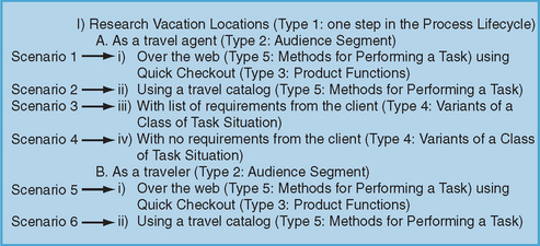
1. Process lifecycle. Take a large-scale process and break it down into several steps. Each step should be represented by a different scenario. Using our travel example, the process might be booking a vacation. The steps (and therefore, individual scenarios) might be Research Locations, Create Itinerary, Book Plane Ticket.
2. Audience segments. Your scenarios should examine the different user types (or audience) and their experiences, goals, skills, patterns of use, etc. Using our travel example, scenarios might include “Travel agent booking vacation for client,” and “Traveler booking his/her own vacation.”
3. Product functions. A product may have very different features/functions that support different, unrelated tasks. Your set of scenarios should cover the range of features/functions your product supports. Scenarios for a travel website may focus on “Viewing recommendations,” and “Creating a personal profile.”
4. Variants of a class of task situation. A single task (or goal) may be accomplished by different means. Ideally, the set of scenarios should examine those variants for each task. If your task is Book Plane Ticket, some scenarios might include “Buy a ticket for a full flight” or “Buy a ticket with Frequent Flyer Miles.”
5. Methods for performing a task. This scenario component is similar to Product functions above. A single task is selected and alternate features/functions/methods for accomplishing that task are examined. If the task is Book Plane Ticket, the scenarios might include “Book ticket on the web,” “Book ticket with travel agent,” or “Book ticket over phone with airline.”
Each individual scenario does not have to include all five components, but the set of scenarios for a persona should. In other words, do not select one type of topic and ignore the other four. One partial set of scenarios might be as set out in Figure 2.5 – this would result in six separate scenarios. When you are first creating your user profile you may be able to develop only a simple scenario, but with further research it should expand into more detailed scenarios.
To make scenarios more consistent between each other and more complete, a template is recommended for each scenario. One possible template is provided below (McInerney 2003). The sections include:
![]() Title. This provides a general description of the situation. Avoid being too specific or character driven. For example, “Sally needs to research locations for a family vacation” should be worded instead “Research vacation locations.”
Title. This provides a general description of the situation. Avoid being too specific or character driven. For example, “Sally needs to research locations for a family vacation” should be worded instead “Research vacation locations.”
![]() Situation/task. In a paragraph or two, describe the initial situation, the challenge facing the user, and the user’s goal. Do not discuss how the user will accomplish his/her goal yet – that is covered next.
Situation/task. In a paragraph or two, describe the initial situation, the challenge facing the user, and the user’s goal. Do not discuss how the user will accomplish his/her goal yet – that is covered next.
![]() Method to address the situation. Either in a bullet list or a task flow diagram, describe how the users cope with the situation. There are many ways in which the user could accomplish a given task. The task flow should show the different possibilities in about 5 to 15 steps. This section should be generic and technology neutral (don’t include specific design elements). The specific technology is discussed next.
Method to address the situation. Either in a bullet list or a task flow diagram, describe how the users cope with the situation. There are many ways in which the user could accomplish a given task. The task flow should show the different possibilities in about 5 to 15 steps. This section should be generic and technology neutral (don’t include specific design elements). The specific technology is discussed next.
![]() Execution path. In a narrative form, describe how the task is completed and the user’s goal is reached. Now you can discuss specific features or technology used. You will likely have multiple “Execution path” sections – one for each possible way of accomplishing the task shown in the “Method to address the situation” step above. Alternatively, you may want to illustrate how different designs would accomplish each task. This section should be updated as design decisions are made. The other parts of the scenario will remain relatively unchanged over time.
Execution path. In a narrative form, describe how the task is completed and the user’s goal is reached. Now you can discuss specific features or technology used. You will likely have multiple “Execution path” sections – one for each possible way of accomplishing the task shown in the “Method to address the situation” step above. Alternatively, you may want to illustrate how different designs would accomplish each task. This section should be updated as design decisions are made. The other parts of the scenario will remain relatively unchanged over time.
Figure 2.6 is a detailed scenario using the template described above.


Pulling It All Together
In this chapter, we have covered various sources you can turn to in order to learn more about your product domain and end users. Doing your homework is critical to the success of your product! It provides a solid foundation from which to build your future usability activities and can save you a great deal of time and money further down the road.
Competitive Intelligence: Mining Design Concepts from Business School Libraries
Derren Hermann and Tom Brinck, Diamond Bullet Design (www.diamondbullet.com)
The Problem
The Michigan Business School, along with our design firm Diamond Bullet, had recently completed a major redesign of the school’s central website (Brinck et al. 2003), and at the school the Kresge Business Administration Library was ready for a significant upgrade to their site to accomplish these goals:
![]() Integrate the design with the newly redesigned business school website
Integrate the design with the newly redesigned business school website
![]() Make information and resources easier to find
Make information and resources easier to find
![]() Achieve a design that reflects the best of practice in online library services.
Achieve a design that reflects the best of practice in online library services.
The Kresge website consisted of approximately 140 pages (Figure 2.7). The site’s primary function was to enable people to select and access over 70 online databases. These databases can be searched for articles, books, journals, corporate information, stock information, and a wide variety of other topics. In addition, the library site provides details on the library’s hours, services and policies, access to reference assistance, School publications, and course materials. The site’s most frequent users are business school students, faculty, library staff, and the school staff. Additional user groups include alumni, the broader university community, and the general public.

Figure 2.7 The Michigan Business School wished to update this older version of the Kresge Library website. The current site can be viewed at www.bus.umich.edu/KresgeLibrary
With a large number of heterogeneous resources available, there was a significant concern that people doing research were not able to locate the most effective resource and were often unaware that given resources even existed. As a first step, the library conducted a survey of site users with 376 respondents. The survey indicated what resources were most desired and what people liked and disliked from the site. However, a survey doesn’t effectively provide specific solutions to improve the site.
Our Approach
While we – as a consulting firm hired to design and develop the primary school website – were quite familiar with the business school as a whole, the library domain itself was rich, complex, and specialized. Understanding the wide range of searchable databases provided on the library site was a challenge that immediately suggested reviewing other library websites to see what organizational options had been explored. In addition, we spent considerable time with library staff to understand the types and organization of the information they provide.
Analysis of the competition proved to be an excellent shortcut that quickly provided a range of viable design solutions: organizational schemes, labeling, layout, functionality, and content. This enabled us to avoid spending time on exploring ineffective approaches in the design space.
Our goal in performing any competitive analysis is to identify features and design ideas from related products to create a new product that is demonstrably better, and which is more considered and complete than it might have been because we have examined the design thinking behind other products currently in use. A broad outline of our approach to this project was the following:
The primary competitive review took approximately 40 hours, but it was further elaborated and revisited throughout the design process as we discovered detailed areas of interest.
Before the competitive analysis had even begun, we set the groundwork by establishing our target audiences, short typical usage scenarios, and a list of high-priority tasks the site would need to support. After a quick review of the competitors we had identified, we identified evaluation criteria and then visited each competitor. On each competitor’s site, we stepped through the pages of the site, seeking their approaches to supporting users in the principal tasks and gathering evidence to support a high or low rating on each of our criteria. In the process, we collected a set of observations about what constituted an effective solution and built up a set of recommendations based on those observations.
Identifying Competitors
Kresge staff provided an initial list of five competitors that exhibited characteristics they found desirable. We then added five more that represented the libraries of other well-known business schools. After our primary analysis we found a large online index of business school library sites around the world (www.lib.berkeley.edu/BUSI/businessLibs.html). Using this list, we opened windows onto every listed site and did a cursory review of each, saving a few standouts for deeper analysis. Few of these sites are really considered “competitors,” for the simple reason that many of these institutions work collaboratively or target different audiences. The choice of comparison sites was really to find any that had useful ideas to draw from. The ten primary sites we reviewed for our analysis were:
![]() Northwestern University Library
Northwestern University Library
![]() Vanderbilt Walker Management Library
Vanderbilt Walker Management Library
![]() Lippincott Library at Wharton (Penn)
Lippincott Library at Wharton (Penn)
![]() Columbia Business & Economics Library
Columbia Business & Economics Library
An additional international site we located later that was helpful was Macquarie University Library, at www.lib.mq.edu.au.
Evaluation Criteria
We defined a set of evaluation criteria that would help us establish the best of practice elements for online library services (Table 2.3).
Table 2.3
Evaluation criteria applied to business school library websites
| Criteria | Definition | Examples |
| Site features | Items promoted on site, usually on home page | Featured news, quick links, online chat |
| Items of note | Unique and innovative elements or issues with the site | Missing meta tags, audience-oriented approach, unusual layout |
| Top–level navigation | The main navigation of the site at the top 1-2 levels | About Us, Services, Research Materials, Help |
| Utility links | Links common to all pages of the site, usually at bottom of pages | Site map or index, Contact Us, Policies |
| External links | Links to other websites within the university | University home page, other campus libraries |
One of our main areas of focus was the organization and presentation of each library’s electronic resources (the searchable databases). We broke down our analysis of this section into the following subsections:
![]() Categorization – the organizational scheme of resources including labeling and grouping
Categorization – the organizational scheme of resources including labeling and grouping
![]() Types of resources – the various resource types, like journals or electronic books, offered by a library
Types of resources – the various resource types, like journals or electronic books, offered by a library
![]() Subjects – the topics used to categorize resources
Subjects – the topics used to categorize resources
![]() Individual entries – the descriptive fields, like title and access notes, attached to an individual resource entry
Individual entries – the descriptive fields, like title and access notes, attached to an individual resource entry
![]() Features – additional features worthy of note associated with the presentation and organization of resources.
Features – additional features worthy of note associated with the presentation and organization of resources.
Furthermore, we evaluated each site within the following areas according to a rating scale ranging from 1 to 5 (poor to excellent):
![]() Aesthetic appeal – overall visual organization, balance, color scheme, contrast, imagery, and design identity
Aesthetic appeal – overall visual organization, balance, color scheme, contrast, imagery, and design identity
![]() Layout – consistency, organization, balance, visual hierarchy, and use of space
Layout – consistency, organization, balance, visual hierarchy, and use of space
![]() Navigation – consistency, labeling, organization, presentation, and functionality
Navigation – consistency, labeling, organization, presentation, and functionality
![]() Utility features – quantity and quality
Utility features – quantity and quality
![]() Site features – quantity, quality, uniqueness, and presentation
Site features – quantity, quality, uniqueness, and presentation
![]() Help/Instruction – quantity of help options, embedded help options, display, organization, quality, and presentation
Help/Instruction – quantity of help options, embedded help options, display, organization, quality, and presentation
![]() Electronic resource presentation – organization, presentation, labeling, browsing, and searching options
Electronic resource presentation – organization, presentation, labeling, browsing, and searching options
![]() Usability and accessibility – how effectively and efficiently a person can utilize the site in order to meet his or her needs regardless of their abilities.
Usability and accessibility – how effectively and efficiently a person can utilize the site in order to meet his or her needs regardless of their abilities.
Below is a summary of observations we made of the other business libraries to illustrate the types of issues we looked at and ideas those sites generated. These observations provide a sense of conventions and design solutions used on library sites. In the requirements phase, the features that are observed are used to suggest features that may be requirements for our own design. In addition, the lack of features suggests valuable opportunities for distinguishing our own design solution. At later points in the design, specific design approaches suggest common design solutions, organizational schemes, and terminology to use. The benchmarks provide a qualitative way to assess whether proposed feature sets and designs would compare favorably against competitors.
Our Observations
The most common features that we found on the home pages of the sites evaluated included a prominently displayed news or featured items section, quick links (drop-down menus of shortcuts), online chat with a librarian, and the library’s contact information.
Usability and Accessibility
The majority of the sites showed little attention to web usability and accessibility issues. For example, only six of the ten sites included alternate text for images, and none of the sites provided back-up functionality for JavaScript in case a user has their scripting turned off in their browser preferences. Other items lacking from the majority of the sites included missing meta tags (hidden meta data that provides keywords and descriptions of each page – a surprise to us that library websites would lack this type of markup), and a lack of breadcrumb links (which indicate a page’s position within the overall website).
Navigation Categories
Almost all of the sites reviewed included an audience-oriented approach to organization, clearly indicating the resources and services that are available to each of their audiences (e.g., faculty, students, alumni). The most common top-level navigation items included Services, Resources, Help, and About Us. Other common options were Catalogs, Course Information, Career Information, and a News or Featured Items section.
Categorization of Online Databases/Electronic Resources
Library websites typically contain anywhere from a couple dozen searchable databases to well over one hundred. These databases, often called “Electronic Resources,” allow people to search library catalogs, journal articles, corporate financial data, and a wide variety of other data from an extremely diverse group of information providers, each with unique searching interfaces.
The categorization schemes for the databases were quite similar for each site. All sites included the alphabetical A through Z listing of resources. The other most common approaches included organization by resource type (e.g., books versus journals) and by subject. Interestingly, fewer than half of the sites evaluated included the ability to search the databases by keyword. Only one site, MIT, allowed users to search for databases by provider.
A variety of resource types were used to categorize electronic resources. While ideally it is the decision of the library staff to determine the level of specification in their classification system, articles, journals, and newspaper articles were the most common resource type categorizations. Others of note included electronic books, statistical sources, biographical sources, dictionaries and thesauri, directories, encyclopedias, government, market research, reference sources, research guides, search engines, and working papers.
While some of the library sites in this analysis covered more than business-related areas, only subjects broadly related to business were analyzed. The most common business subjects included economics, psychology, management, law, finance, marketing, and social sciences.
Each individual entry listing for an electronic resource includes descriptive information to help users determine whether it is the resource to meet their needs. The more extensive the information, the better equipped users are to make an informed decision. All of the sites included the title, URL, a description, and access information with each entry. (Owing to the heterogeneity of these resources, many have different access privileges, serving different subsets of the user population.) Other common fields included the dates of coverage, help and research guides, the type of resource or format, the resource provider or publisher, related subjects, and the frequency of publication.
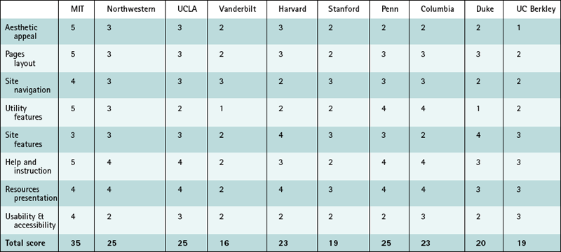
Ratings
Sites were rated on a scale of 1 to 5, where 1 represented “poor” and 5 represented “excellent” (Table 2.4 on page 67). With eight categories, the highest total possible score was 40. These scores were subjectively determined by a single evaluator (one of the present authors). For our purposes, a qualitative rating was sufficient to clarify that some sites substantially differentiated themselves from others, and this table helped guide the writing of recommendations by helping to emphasize which sites we could revisit to refine our ideas on a particular design issue or find a good example to emulate.
The Individual Libraries
Below we discuss the results for each school’s website.
MIT
The MIT Libraries’ website received the highest ratings of all for its clear, simple, and easy-to-use approach. There are no extraneous elements to clutter the pages. The focus is on presenting information in a clear and consistent manner that allows for targeted searches as well as browsing. The site nicely categorizes the different research resources (Figure 2.8 on page 68 shows an organization of databases by type or format of the resource) and provides a variety of help options, explaining for instance how to conduct research online and all other means of getting help, through face-to-face assistance, phone, e-mail, chat, and so forth (Figure 2.9 on page 68). Furthermore, the site is organized in a manner that allows for a variety of information-seeking preferences and approaches.


Northwestern
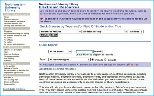
The Northwestern, UCLA, and Penn websites all include excellent presentation of their electronic resources and excellent help instruction. Northwestern allows browsing electronic sources by type, field of study, and/or title along with plenty of explanatory text (Figure 2.10). The site also includes a well-organized help section.
UCLA
UCLA Library offers electronic resources organized by online materials, books, articles, research guides by subject area, and help with research. Furthermore, they include embedded help icons with each section that include a wealth of useful information (Figure 2.11).

Their interface of multiple drop-down menus seems to be potentially confusing, but it suggests an alternative we might not have otherwise considered that manages the complexity of a large number of options. In this spirit, competitive analysis is primarily an idea-generation exercise – we don’t necessarily conclude that the competitors have designed a “good” or “correct” interface, and our own design cannot be assumed to be well designed just because it imitates another. Competitive analysis does not remove the need for evaluating and refining our own designs, preferably through user testing and related techniques.
Penn
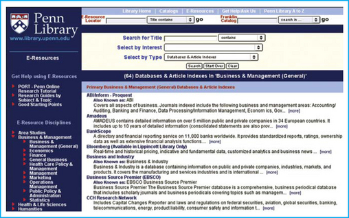
The Penn Library site offers a variety of search and browse options for electronic sources (Figure 2.12), including search by title, select by interest or type, browse by alphabetical listing, browse by area of discipline, search e-resources, and search the catalogs. Plus, they offer help sections for using their e-resources: an online research tutorial, research guides by subject and topic, and instruction on good starting points.
The Penn site provides abstracts for each resource that include the ability to view more information about the resource – including other names for the resource, the URL for the resource, who is allowed to use the resource, a description of the resource, and topics or subjects to which the resource is relevant (Figure 2.13).
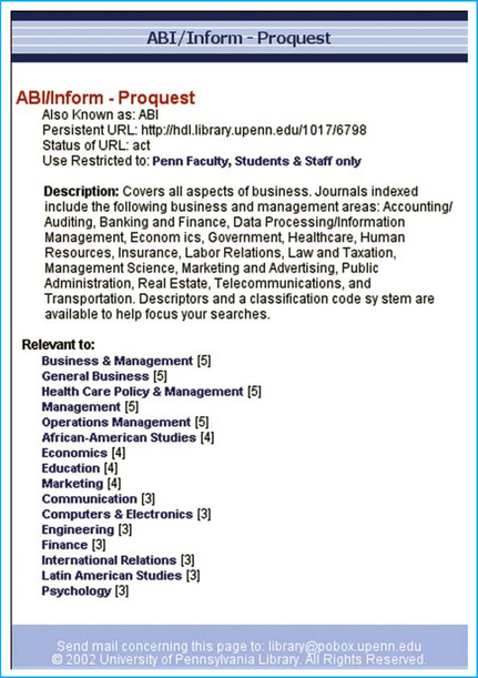
This detailed list of specific information features is one of the most valuable aspects to a competitive analysis, as it ensures a more complete consideration of possible information we can provide for our own users. While we may not duplicate all the components of a competitor’s product, by creating an inventory of all possibilities, we can prioritize and select the ones appropriate to us.
Design Recommendations
The results of this analysis provided a variety of recommendations for the Kresge Library website. These are some highlights of those recommendations, based on observations like those listed above. Note that these are not meant to be absolute requirements. These recommendations are grounded in analysis of the possibilities of the information structure, examination of common practices, and a qualitative consideration of their benefits for the target audience. We followed this competitive analysis with user interviews and testing to help corroborate these recommendations and to explore the rationale behind uncertain ones.
General Site Features
![]() Prominently display the latest news highlights on the home page.
Prominently display the latest news highlights on the home page.
![]() Include a quick-links drop-down menu to the most used pages or sections of the website on all pages of the site and limit the list of options to 15 at most.
Include a quick-links drop-down menu to the most used pages or sections of the website on all pages of the site and limit the list of options to 15 at most.
![]() Include the library address, phone number, and possibly hours on all pages of the site.
Include the library address, phone number, and possibly hours on all pages of the site.
Usability and Accessibility
![]() Follow web accessibility standards and guidelines, at least the Section 508 standards (www.section508.gov), to meet the needs of disabled users. This includes the proper implementation of alternate text for images.
Follow web accessibility standards and guidelines, at least the Section 508 standards (www.section508.gov), to meet the needs of disabled users. This includes the proper implementation of alternate text for images.
![]() Provide alternate functionality for when users have scripting turned off so that drop-down menus will still function properly.
Provide alternate functionality for when users have scripting turned off so that drop-down menus will still function properly.
![]() Include keyword and description meta tags for the major pages of the site.
Include keyword and description meta tags for the major pages of the site.
Navigation
![]() Include audience-oriented sections covering the needs and options available to students, faculty and staff, alumni, the University of Michigan community, and campus visitors.
Include audience-oriented sections covering the needs and options available to students, faculty and staff, alumni, the University of Michigan community, and campus visitors.
![]() Include breadcrumbs to provide a better sense of location within the site for users.
Include breadcrumbs to provide a better sense of location within the site for users.
![]() Provide utility links at the bottom of each page of the site – including site index, help, feedback, and “Contact us” links.
Provide utility links at the bottom of each page of the site – including site index, help, feedback, and “Contact us” links.
![]() Provide links to the University of Michigan, the Business School, and the main campus library below the utility links on all pages of the site.
Provide links to the University of Michigan, the Business School, and the main campus library below the utility links on all pages of the site.
Electronic Resources
![]() Categorize databases (electronic resources) by type, topic/subject, and alphabetical ordering. Include more extensive information about each resource, including usage privilege restrictions.
Categorize databases (electronic resources) by type, topic/subject, and alphabetical ordering. Include more extensive information about each resource, including usage privilege restrictions.
![]() Use at least the following category fields to organize electronic resources: alphabetical, resource type, relevant subjects, and keywords for searching capabilities.
Use at least the following category fields to organize electronic resources: alphabetical, resource type, relevant subjects, and keywords for searching capabilities.
![]() Use at least the following resource type fields to organize electronic resources: articles, journals, electronic books, newspaper articles, and other types identified by library staff.
Use at least the following resource type fields to organize electronic resources: articles, journals, electronic books, newspaper articles, and other types identified by library staff.
![]() Use at least the following subject fields to organize electronic resources: economics, management, marketing, finance, company profiles, law, company financials, industry research, and statistics.
Use at least the following subject fields to organize electronic resources: economics, management, marketing, finance, company profiles, law, company financials, industry research, and statistics.
![]() Use at least the following individual entry field descriptors to organize electronic resources: access privileges, dates and coverage, help and/or guides, types or formats, provider or publisher, relevant subjects, and frequency of publication.
Use at least the following individual entry field descriptors to organize electronic resources: access privileges, dates and coverage, help and/or guides, types or formats, provider or publisher, relevant subjects, and frequency of publication.
![]() Include a drop-down menu of the most popular database resources on either the home page of the site or the entry page to electronic resources section of the site and limit the list to 15 at the most.
Include a drop-down menu of the most popular database resources on either the home page of the site or the entry page to electronic resources section of the site and limit the list to 15 at the most.
Note that these recommendations are derived from a variety of aspects of our evaluation. The “general site features” reflect a set of common practices observed online. The “usability” and “navigation” recommendations are grounded in strengths and weaknesses we observed on other sites. Finally, our approach of doing an inventory of other sites was particularly informative in the structure of the online databases/electronic resources, where we can list suggested fields to structure the information.
Lessons Learned
This competitive analysis provided essential information to the design task. Our clients at the library were enthusiastic in reading the analysis. Even beyond the scope of the current site redesign, this analysis provided a snapshot of what was going on in their industry that gave insight toward longer-term strategies.
One of the lessons we learned from this particular analysis was to be more systematic at the very beginning of the process in reviewing all of the competitors. Choosing examples from the top 10 business schools was effective at finding sites that were generally better than average; but when we found a comprehensive list of all the competitors and reviewed them, we identified some additional ones with very useful ideas. These were added to our recommendations but did not receive a thorough review due to time limitations.
We also want to address some common confusions about competitive analysis. While the approach outlined here can be combined with a more traditional business analysis of competitors’ financial and market positions, we have a very different focus on identifying detailed design characteristics. Our approach applies to many kinds of product design, but it is particularly appropriate in the complex domain of software and website design where design options are intricate and not always obvious.
In addition, this approach of mining design ideas is distinct from techniques of competitive user-testing, where benchmarks are established in user-testing to determine whether your design is better or worse than competitors’. Competitive user-testing is a useful extension of our qualitative ratings, and helps predict whether your product will be well-received in the market; but user-testing a competitor’s product primarily provides information about the flaws in a competitor’s product, which is far less useful in design iteration than testing your own product. We find that in the early stages of design, a more economical and insightful approach is to analyze and inventory the competitor’s product, as described here, to establish requirements and set a design direction for your own product.
Personas: A Case Study by Microsoft Corporation
John Pruitt, Trish Miner, Tracey Lovejoy, Robert Graf, Tjeerd Hoek, & Shanen Boettcher, Microsoft Corporation
This case study describes our approach and experience with personas, an interaction design technique introduced by Alan Cooper’s 1999 book, The Inmates are Running the Asylum. In over three years of use, we have extended Cooper’s technique to make personas a powerful complement to other usability and product design methods. We have used personas on a wide range of projects from small to large. This case study focuses on the latter in an attempt to illustrate how far the method can be taken, given adequate resources and attention. We don’t propose that what we describe is the best or most appropriate use of personas; it is simply a description of what we did and how it affected our development team and the product we were working on. The main goal of this effort was to help the development team identify and understand its target audience; aiding in design and development decisions.
The Challenge
Microsoft Corporation released the first version of the Windows® operating system for desktop computers in November of 1985, and since that time, several additional versions have been released. The product development team for Windows platform development is now working on the next version of Microsoft® Windows®, code name “Longhorn.”
Developing a new version of the operating system is a multi-year, complex, and expensive effort. For example, the Windows® 2000 operating system took three and a half years to develop at an estimated cost of $2 billion. While there are over 6000 people in our product division, the actual number of people actively working on a particular release changes greatly over time. The process starts with several hundred members and grows to several thousand at the peak of the effort, which of course, happens across multiple years during the development cycle. Like those in most software companies in the industry, the development team is comprised of many disciplines and job roles – developers, quality assurance testers, program managers, designers, technical writers, product planners, user researchers, user assistance specialists, marketing professionals, and countless others.
Our Approach to Personas
There are three main points from the above description that are important to our persona effort. Our development cycle is quite long, so maintaining long-term focus on a clear target is important. Our team is very large, and thus, getting everyone moving down the same path is difficult. As our team changes over time, there is a regular need for new people to become educated on the product goals and target audience in an effective way.
Not surprisingly, when asked who they are building our product for, and why, many members of the product team would say something like “We’re building it for everyone -the new version will have the latest technology that runs better and faster.” Also, while they may not have consciously thought about it, members of the product team tend to have a “typical” user or set of users in mind while doing product design. A major goal of the personas effort for the Longhorn release is to have every team member designing for the same explicit and focused set of target users, rather than trying to design for everyone, or designing for the variety of individual users they tend to think about.
Historically, our product team had regularly included market research, traditional usability and user-lefted design techniques as part of its product definition and development activities. Though personas and other representations of users had not been used broadly on our team, other product teams at our company had been using them for several years. Thus, by the time we began our team’s personas effort, the persona methodology used around Microsoft had matured significantly. Several previous persona efforts had suffered from four basic problems:
![]() The characters were not believable; either they were obviously designed by committee (not based on data) or, if data were used to define them, the relationship to the data was not clear. This led to a certain lack of use by some product team members, and even total objection to the method outright.
The characters were not believable; either they were obviously designed by committee (not based on data) or, if data were used to define them, the relationship to the data was not clear. This led to a certain lack of use by some product team members, and even total objection to the method outright.
![]() The characters were not communicated well. Often the main communication method was a resumé-like document – blown up to poster size and posted around the hallways – that was not easily understood or remembered. The result here was that most people on the product team didn’t know much about the personas. Thus there was really no sense of shared understanding or language.
The characters were not communicated well. Often the main communication method was a resumé-like document – blown up to poster size and posted around the hallways – that was not easily understood or remembered. The result here was that most people on the product team didn’t know much about the personas. Thus there was really no sense of shared understanding or language.
![]() There were no explicit uses of the personas beyond discussion in design meetings. In particular, there was typically nothing that spoke to all disciplines or was applicable during all stages of the development cycle. As a result, many people on the team, including those that understood the personas and wanted to use them, were not able to deeply utilize them in their work efforts.
There were no explicit uses of the personas beyond discussion in design meetings. In particular, there was typically nothing that spoke to all disciplines or was applicable during all stages of the development cycle. As a result, many people on the team, including those that understood the personas and wanted to use them, were not able to deeply utilize them in their work efforts.
![]() Persona projects were often grass-roots efforts with little or no high-level support (such as people resources for creating and promoting personas, budget for posters or other materials to make the personas visible, or a mandate from team leaders to use the personas). Thus, in many cases, persona use was limited to a select few and typically died out over time.
Persona projects were often grass-roots efforts with little or no high-level support (such as people resources for creating and promoting personas, budget for posters or other materials to make the personas visible, or a mandate from team leaders to use the personas). Thus, in many cases, persona use was limited to a select few and typically died out over time.
The personas method used in our current development cycle was evolved specifically to address these problems. And fortunately, because of the persona “buzz” around the industry, the general notion had become more familiar and fairly well accepted by the development team. In fact, the executives and leaders of the development team asked us to investigate the possibility of creating personas rather than our having to convince the team that personas would be useful.
Our Experience in Creating and Using Personas
The team for our persona creation and validation effort consisted of roughly 22 people – several technical writers, several usability engineers, four product planners, and two market researchers – and took about three months. After our personas were created, the ensuing persona campaign involved the part-time efforts of several usability engineers, ethnographers, graphic designers, and product planners, and the campaign is ongoing at the time of writing this case study (roughly two and a half years). A high-level description of our process and activities follows.
However, before moving on, it is important to note that not every persona effort needs to involve so many people over such a long period. We believe that you can go deep or go cheap. That is, you can benefit from these methods even if you do not have the ability to spend many resources and much time on generating them. Obviously the deeper you go, the more articulate and valuable your knowledge of your users will become. And of course, you don’t need the personas method to gain this kind of knowledge, but the method does help make it happen.
To create the personas, we divided the 22-person team into sub-teams so that each persona to be created would have two or more dedicated people to do the work. Based on the advice of other persona “practitioners,” we wanted to keep the set of characters down to a manageable number – roughly six personas – which meant that we knowingly left out segments to help drive priorities and focus. Also, we were given the directive from our executive staff that we must address three broad customer sets: consumers, large enterprises, and a new, growing market for us, small businesses. Related to these three broad customer sets, our market research team had previously executed several large-sample, quantitative market segmentation analyses. One in particular was our customer taxonomy 2000 – well-known and regularly referred to by our product planners, market researchers, and executive staff. Such analyses typically provide cohesive, differentiable and identifiable groups of users (i.e., segments) with common characteristics: common demographics, attitudes, behaviors, etc. In each of our three major markets, we chose two or three of the most important segments to be developed into personas. The relative importance of the various segments was determined by market size, historical revenue, influence, and strategic or competitive placement. With these segments as a starting point, the bulk of our persona creation effort during the following two to three months focused on collecting, consuming, and filtering data from other previously executed user research. This body of research included field studies, focus groups, surveys, interviews, and other market research from both internal and external sources.
Because our personas effort drew on many research studies, we divvied up the research documents for consumption, with each team member becoming well acquainted with only a few studies. We then held “affinity” sessions where we physically cut out data points and interesting/relevant facts from the results documents and pinned them to a wall to form groups of related findings across studies. The resulting groups of findings were used in writing narratives that attempted to “tell the story of the data.” As we wrote the personas’ stories, we used qualitative data and observational anecdotes wherever possible. We also strived to support each and every detail in our personas explicitly with user data.
Although we did not create a set of international personas, we included international market information in each of our personas by having field reps in each market review our personas, highlighting key differences.
We created a single “foundation” document for each persona which was used as a storehouse for information about that persona (key attributes, photos, relevant data points, reference materials, etc.). More specifically, the foundation document contained goals, fears, and typical activities that would motivate and justify scenarios that were soon to appear in feature specs, vision documents, story boards, and so forth. (See Figure 2.14 for the standard table of contents of a foundation document.) Links between persona characteristics and the supporting data were made explicit in the foundation documents using the “Comment” feature in Microsoft® Word. Thus, these documents contained copious footnotes, comments on specific data, and links to research reports that support and explain the personas’ characteristics.

In the last month of the three-month development phase, and once the basic persona descriptions were written, we set up “reality check” field studies with participants who matched the personas on high-level characteristics to see how well they matched on low-level characteristics. We did this because our creation method utilized multiple data sources, many of which were not directly comparable or inherently compatible. We wanted to make sure that through this process we didn’t inadvertently match characteristics that were either incompatible or not representative. As it turned out, our personas descriptions were largely on track, though we did do a small amount of rewriting where it seemed appropriate. (We discuss these site visits a bit more later.)
At this point, our persona descriptions had become stable and we were getting close to the point of sharing them broadly with our team. Up to this point, we had been using stock photos to put a face on each persona. Other persona efforts at our company had avoided stock photo galleries because they typically offer only one or two shots of a given model. Also, many of the images in stock photo galleries were simply “too professional”; the people looked like models, not like typical customers. So, we recruited a few local people to serve as models and held one- to two-hour photo shoots to get visual material to illustrate and communicate each persona.
Once the basic persona documents and materials were in place, we organized multiple kick-off meetings to introduce the personas to the team at large. These meetings not only included descriptions of the personas, but also introduced the basic persona method and provided details about how different roles on the team could use them. (We discuss more on this latter part shortly.) From that point, communicating our personas took the form of a multifaceted, multimodal, and ongoing campaign. Of course, the foundation documents described earlier were made readily available to anyone on the team who wished to review them, but they were not considered the primary means for delivering information. Instead, we created many variations of posters, flyers, and handouts spread out over many months and years. We even created a few gimmicky (and popular) promotional items (e.g., squeeze toys, beer glasses, magnetic whiteboards) – all sprinkled with persona images and information.
It is important to note here that the use of costly media is not critical to the success of the communication campaign. Our own materials ranged in quality and cost depending on the availability of resources at the time that we were producing them. For example, some of our posters were merely nicely formatted Word documents printed on tabloid-size paper. The more important aspect of the persona campaign was that the information in the personas was communicated in “consumable” chunks that suited the people being communicated to. Not surprisingly, e-mail and intranets are heavily used at our company. To capitalize on this, we started an ongoing “persona fact of the week” e-mail campaign; where details about the personas were slowly but regularly revealed and reinforced. As a quirky promotional gimmick, each persona got a real e-mail address which we used occasionally to send “thank you” notes to the development team from specific personas as certain features were being developed. We created an internal website to host the foundation documents and provide links to supporting research, related customer data, and scenarios – as well as links to a host of tools for using the personas (screening material for recruiting usability test participants, spreadsheet tools, comparison charts, posters and photos, etc.). The top-level pages of the website featured high-level summaries of the personas – the information we felt was most important for all team members to know – instead of simply linking to the foundation documents. All persona illustrations and handout materials included the URL to the persona website to enable team members to access the detailed supporting documentation (including the foundation documents).
Figure 2.15 shows two basic persona posters created to enhance the team’s general understanding of our personas. The first one allows for the comparison of important characteristics across four of the personas. The second one communicates the fact that our personas are based on real people. It attempts to provide a sense of the essence of one of the personas by providing quotations from real users who are similar to that persona. (Some of the poster images presented here are intentionally blurred to hide proprietary information.) Figure 2.16 shows a poster that provided information about how customers think about security and privacy; also using real quotes from real people who fit our various persona profiles.

Figure 2.15 Two persona posters: one comparing characteristics across personas; the other presenting real quotations from users that fit the profile of one of our personas

Figure 2.16 A more targeted poster communicating aspects of security and privacy across our personas
As mentioned earlier, we instruct our team in specific persona use and try to provide tools to help when possible. Cooper describes persona use mostly as a discussion tool – asking questions of your personas, such as “Would Patrick use this feature?” This is valuable, but we have generated some additional persona-oriented activities and incorporated them into specific development processes. We created a few spreadsheet tools (discussed below) and document templates for clearer and consistent persona utilization. We have strongly encouraged our product team to utilize the personas as they write vision documents, create storyboards, and generate feature specification documents. In doing so, they have typically written short scenarios that extended the personas by extrapolating from their basic characteristics (e.g., “walk-through” scenarios that illustrate how a certain feature would be used). It is interesting to note that our persona foundation documents do not contain all, or even most, of these feature scenarios. There are literally hundreds of feature specification documents that get created over time (several months to several years) by a wide variety of team members. Each feature specification document might contain as many as 15 scenarios (though most contain only three or four). Thus, over time, some growing portion of the persona information exists outside of their core definitions (i.e., outside of the “foundation” documents). Because of this, we collected persona scenarios from across the product team in a spreadsheet that enabled us to track and “police” the use of the personas. We did this by combing through each of the feature specification documents and manually pasting the scenarios into a spreadsheet. With simple filters and pivots on this spreadsheet, we were able to roughly gauge the direction of a product as it is developed (e.g., How many scenarios are written for Toby vs. Abby? Are all of the Abby scenarios appropriate to Abby’s core persona?).
We use a spreadsheet tool that we call the “feature-persona weighted priority matrix” that can help our team prioritize proposed features for the product. Figure 2.17 shows an abstract version of a feature-persona weighted priority matrix. Such a matrix can be executed in a rigorous fashion or somewhat casually. Of course, the more rigor that is applied, the more you can trust the outcome.

There are three steps in creating such a matrix. First, weights are given to each persona that represent how important each persona is to your product. For our product, these weights were derived from measures of market size, and historical and projected revenues. Next, the planned features of the product are scored. In the example, the scoring in the feature rows is as follows:
![]() Minus 1 – the persona is confused, annoyed, or in some way harmed by the feature
Minus 1 – the persona is confused, annoyed, or in some way harmed by the feature
![]() Zero – the persona doesn’t care about the feature one way or the other
Zero – the persona doesn’t care about the feature one way or the other
![]() Plus 1 – the feature provides some value to the persona
Plus 1 – the feature provides some value to the persona
![]() Plus 2 – the persona loves this feature or the feature does something wonderful for the persona even if the person doesn’t realize it.
Plus 2 – the persona loves this feature or the feature does something wonderful for the persona even if the person doesn’t realize it.
Ideally, these scores are derived from user research (e.g., focus groups or surveys) in which your proposed features are shown to participants and measures of appeal etc. are taken. In our particular case, the scoring was done by a committee of people on our team that had thorough knowledge of the personas and supporting data as well as a good understanding of the proposed features. In such a case, though, care must be taken so that such scores are not full of personal bias and misunderstanding.
Finally, a weighted sum is calculated. In the example, the weighted sum of feature 1 is calculated as follows: (0 × 50) + (1 × 35) + (2 × 15). Once completed, the rows (i.e., the features) are then sorted according to the weighted sum showing which features are most important for the team to develop. Our team then used the results to determine which features we would pursue and which features should be dropped – or at least reconsidered. In the example, it is clear that features 2 and 4 should be made a high priority for the development team, while feature 3 should probably be dropped.
It is stressed to the team that this tool is not “golden,” it is a guide; exceptions can and should be made, when appropriate for strategic or business reasons. That is, meeting end-user needs is not the only thing that makes a product or business successful. Our team needs to be aware of cost, time to market, competitive products, key influential people (e.g., a well-known product reviewer), and any other factors that influence the purchase and adoption of our products. So, these factors can all be included in the exception-making process. The point here is that the inclusion or exclusion of features is much more explicit and understandable to the broader team.
Our design teams have made use of the personas also as inspiration for visual design by doing creative visual explorations based on the personas. More specifically, they have created branding and style collages by cutting and pasting images that “feel like” our personas from a variety of magazines onto poster boards (see Figure 2.18). They then used these boards to create a variety of visual treatments for several feature areas of the product (see Figure 2.19). These explorations were then used in focus groups to aid in understanding what aspects of the designs were appealing to users and how they worked together to form the visual style.


Figure 2.19 A design exploration based on the style collage in Figure 2.18
We wanted our personas to have value beyond feature definition and design; to extend their value into the feature development phase. To do this we needed to create screeners that would allow us to identify and recruit real people who matched the personas and bring them into the development process via user-lefted design methods like focus groups, participatory design sessions, advisory panels, user research surveys, usability lab evaluations, etc.
As discussed earlier in this case study, the first user research we conducted with real representatives consisted of site visits for the purpose of doing a “reality check” of our understanding of each persona. Our first attempt at recruiting these representatives made it evident that the screener criteria needed to be carefully selected to identify only the most important characteristics that clearly defined a persona and discriminated between different personas. Any additional nonessential criteria had the potential to dramatically reduce the number of qualified respondents.
For example, we planned to do five home visits to meet, interview, and observe Abby–Toby pairs – two of our personas that represent a mother and a son. On the surface the criteria seemed simple enough: we were looking for a woman with at least two years of college, 40-50 years old, and with a son aged 14–16 years. Additionally, the mom and son needed to self-rate their PC experience within predefined ranges and have an Internet-connected PC in the household. Recruiting proved very difficult; surprisingly, we couldn’t find one such household after making nearly 50 calls.
Further investigation revealed that there was a multiplicative effect of the percentage representation of the specific criteria within the general population. A quick check of the census bureau’s age data showed that women from 40–49 years of age comprise 15% of the population and males from 15–19 (a four-year age span) comprise 7.5%. Since we were looking for a three-year span we reduced the percentage by three-fourths, estimating the percentage at 5.6%. The probability of finding a household that met both of these simple criteria was estimated by multiplying 15% and 5.6%, which yielded a probability 0.0084 (approximately 8 hits in 1000).
Realizing that writing effective and useful screeners would not be an easy task, we conducted several meetings with stakeholders from around the team to identify and agree upon the minimum essential defining criteria for each persona. Our goal was to identify the largest possible pool of candidates from which to recruit. We reduced the Abby screener to six criteria, removed the gender, age, and educational requirements, and used a response scale to make the requirements softer and more flexible.
Some teams needed additional criteria to meet the needs of their feature domain. For example, though not particularly core to the Abby persona, it made sense to recruit only those “Abby”s with an interest in home networks to conduct usability studies on home networking products. We allowed optional refinements to be added to the persona screeners to accommodate this need. However, the core criteria had to be met first. The home-networking “Abby”s had to be a proper subset of all “Abby”s.
After agreeing upon the criteria for all six personas, we created a spreadsheet to help our recruiters identify usability participants by asking the minimum number of questions. We did this to avoid the need to ask all screener questions on all phone calls. The spreadsheet implemented a branching flow chart we created to show the shortest route for identifying any given persona. Since personas were mutually exclusive, we were able to skip large portions of questions that would be irrelevant for any given branch.
We used these screeners for our next major user research activity. We used an outside agency to recruit and manage an online panel of over 6000 persona representatives. We created the panel to conduct quick turn-around quantitative research with a large population of persona representatives. We would send surveys every two weeks to one or more of these personas.
During the recruiting process, the outside agency reported that three of our screeners were excessively restrictive. One screener was qualifying less than 1% of potential candidates. They also reported question-by-question qualification percentages, so we could focus on the most problematic questions. We reconvened meetings with the appropriate stakeholders to review and relax the criteria by eliminating questions or by allowing a wider range of answers on the response scales. The agency had recorded all responses and could automatically recompute the effect of these modifications without having to resubmit the questions to the panel. Eventually, we got all qualifications rates between 8% and 27%. The modified screeners that resulted from this research became the new standard for other user research activities.
Though it is clear that creating participant recruiting screeners was a much more difficult task than we had assumed, the results proved to be well worth the effort. Not only were we able to recruit participants who were similar to our personas for ongoing usability, ethnographic, and market research; we were also able to categorize, analyze, and report our findings by persona. This served as a tremendously effective means of communicating the essence of personas and the value of usability research for the development team at large. Seeing real examples of our personas in the usability lab or in the field had an amazing effect on participating team members. Also, based on the findings of our various research endeavors, we have continued to enrich our persona definitions with new information.
Finally, other disciplines within our team have used the personas to a lesser extent to fill their need for user definition. For example, our quality assurance test team has used the personas to organize “bug bashes” as well as to select and refine scenarios for their automated testing. Similarly, one of our technical writing groups used the personas to plan and write “how to” and reference books for the popular press. In doing so, they expanded the persona definitions based on their own research endeavors to include notions of learning style, book usage patterns, and so forth, to enrich how they wrote for the specific audiences.
Lessons Learned
Our experience has identified several benefits and risks associated with persona use, as explained below.
Benefits of Personas
It is clear to us that personas can create a strong focus on users and their work contexts. Though we have not tried to rigorously measure the impact of our personas, there are several indications that the method has had an impact.
![]() First, the development team and executives have generally perceived the personas and their effect on the product as useful and positive. As a result, we have seen the persona approach go from scattered use in the company to widespread adoption. We have also had partner teams building related but different products, adopting and adapting our personas in an effort to enhance cross-team collaboration, synergy, and communication.
First, the development team and executives have generally perceived the personas and their effect on the product as useful and positive. As a result, we have seen the persona approach go from scattered use in the company to widespread adoption. We have also had partner teams building related but different products, adopting and adapting our personas in an effort to enhance cross-team collaboration, synergy, and communication.
![]() Second, our personas are actually being used in the design and development process. A wide range of team members, both inside and outside of our product team -from line-level developers and designers to company executives – know about, design for, and discuss the next version of our product in terms of the personas. Our personas are seen everywhere and are used broadly. For example, they are seen in feature specs, vision documents, storyboards, demo-ware, design discussions, and “bug bashes.” They are used even by VPs arguing for user concerns in product strategy meetings.
Second, our personas are actually being used in the design and development process. A wide range of team members, both inside and outside of our product team -from line-level developers and designers to company executives – know about, design for, and discuss the next version of our product in terms of the personas. Our personas are seen everywhere and are used broadly. For example, they are seen in feature specs, vision documents, storyboards, demo-ware, design discussions, and “bug bashes.” They are used even by VPs arguing for user concerns in product strategy meetings.
![]() Third, our team appears to know who our target audience is. Prior to the personas, asking team members about our target audience generally resulted in a different answer from every person asked.
Third, our team appears to know who our target audience is. Prior to the personas, asking team members about our target audience generally resulted in a different answer from every person asked.
![]() Fourth, the personas have generally raised awareness of user-lefted design. That is, not only have our development teams engaged with personas, but correspondingly they have engaged with our other user-lefted activities. Our persona campaign generated a momentum that increased general user focus and awareness.
Fourth, the personas have generally raised awareness of user-lefted design. That is, not only have our development teams engaged with personas, but correspondingly they have engaged with our other user-lefted activities. Our persona campaign generated a momentum that increased general user focus and awareness.
The act of creating personas has helped us make our assumptions about the target audience more explicit. Once created, the personas have helped make our decision-making criteria for the product equally explicit – Why are we building this feature? Why are we building it like this? Without personas, our development teams routinely made decisions about features and implementation without recognizing or communicating their underlying assumptions about who would use the product and how it would be used. The “feature-persona weighted priority matrix” described earlier is a good example of how the personas have helped clarify our decision-making. Using that tool regularly results in “pet” or favored features (or even seemingly important features) being pushed down in the priority list. When this happens, our team members have to be very explicit with their reasoning to get a feature back in the plan.
Personas are a medium for communication; a conduit for information about users and work settings derived from ethnography, market research, usability studies, interviews, observations, and so on. Once a set of personas is familiar to a team, a new finding can be instantly communicated: “Sondra cannot use the search tool on your web page.” This communication style has an immediacy lacking from the finding “A subset of participants in the usability study had problems with the search tool” – especially for team members who now, for all intents and purposes, see Sondra (the persona) as a real person. We have found this to be extremely powerful for communicating results and furthering our teammates’ understanding of the personas.
Finally, personas focus attention on a specific target audience. The method helps establish who is and consequently who is not being designed for. Personas explicitly do not cover every conceivable user; they help focus sequentially on different kinds of users. For example, a quality assurance engineer can test a product one day focusing on Patrick scenarios and another day focusing on Abby scenarios. As stated in the previous section, this works for testers and other product team members, in “bug bashes” for example. An experienced tester reported feeling that he was identifying “the right kind” of problems in drawing on knowledge of a persona in guiding his test scripts and activities.
Risks of Personas
Getting the right persona or set of personas is a huge challenge. Cooper argues that designing for any one external person is better than trying to design vaguely for everyone or specifically for oneself. This may be true, and it does feel as though settling on a small set of personas provides some insurance; but it also seems clear that personas should be developed for a particular effort. In making choices it becomes clear that the choices have consequences. For example, they will guide participant selection for future studies and could be used to filter out data from sources not matching one of the persona profiles.
Related to this is the temptation of persona reuse. After the investment in developing personas and acquainting people with them, it may be difficult to avoid over-extending their use when it would be better to disband one cast of characters and recruit another one. It can be good or bad when our partner teams adopt or adapt our personas. Different teams and products have different goals, so the personas are stretched a bit. So far, the stretching around our company has been modest and closely tied to data (because our target customers do indeed overlap), but it is a concern.
In addition, marketing and product development have different needs that require different persona attributes, and sometimes different target audiences. Marketing is generally interested in buyer behavior and customers; product development is interested in end-users. We’ve had some success in collaborating here, but there are rough edges.
Finally, we have seen a certain level of “persona mania” within our organization and others. Personas can be overused. At worst, they could replace other user-lefted methods, ongoing data collection, or product evaluation. Readers of this case study might conclude that we have gone overboard regarding our persona effort. It is important to note that the things we have described here have happened over several years. Not everything was created up front. There are periods of persona focus and periods where we do many other types of UCD-oriented work. We know that personas are not a panacea. We believe personas should augment and enhance – augment existing design processes and enhance user focus. We have found that personas can enhance user testing and other evaluation methods, field research, scenario generation, design exploration, and solution brainstorming.
Persona use does require decision-making. It isn’t a science. If not used appropriately, any powerful tool can take one down the wrong path, as in lying with statistics or using unrepresentative video examples. Personas are one such powerful tool. It is up to all of us together to develop effective and appropriate ways to use them.
Acknowledgments. Many people contributed to the personas effort described in this case study. We thank Kelly Fisher, Manish Sharma, Dave Ciuba, Kris Tibbetts, Lisa Olfert, Louise Kapustka, Leslie Scott, Scott Ottaway, Steve Scallen, Stacy Lewis, Karen Carncross, Colleen Dunham, Kent Sullivan, Shannon Kallin, Nelle Steele, Craig Hally, Jenny Lam, Greg Melander, Mark Ligameri, Heesung Koo, Dan Black, Neil Powell, and Hillel Cooperman. We also thank Jonathan Grudin for encouraging us to publish our experiences with personas as well as reflecting with us on the method.