
Chapter 4. Sizing, Positioning, and Transforming Elements
When building a WPF application, one of the first things you must do is arrange a bunch of controls on the application’s surface. This sizing and positioning of controls (and other elements) is called layout, and WPF contains a lot of infrastructure to provide a feature-rich layout system.
Layout in WPF boils down to interactions between parent elements and their child elements. Parents and their children work together to determine their final sizes and positions. Although parents ultimately tell their children where to render and how much space they get, they are more like collaborators than dictators; parents also ask their children how much space they would like before making their final decision.
Parent elements that support the arrangement of multiple children are known as panels, and they derive from the abstract System.Windows.Controls.Panel class. All the elements involved in the layout process (both parents and children) derive from System.Windows.UIElement.
Because layout in WPF is such a big and important topic, this book dedicates three chapters to it:
 Chapter 4, “Sizing, Positioning, and Transforming Elements”
Chapter 5, “Layout with Panels”
Chapter 21, “Layout with Custom Panels”
This chapter focuses on the children, examining the common ways that you can control layout on a child-by-child basis. Several properties control these aspects, most of which are summarized in Figure 4.1 for an arbitrary element inside an arbitrary panel. Size-related properties are shown in blue, and position-related properties are shown in red. In addition, elements can have transforms applied to them (shown in green) that can affect both size and position.

The next chapter continues the layout story by examining the variety of parent panels built in to WPF, each of which arranges its children in unique ways. Creating custom panels is an advanced topic reserved for the final part of the book.
Controlling Size
Every time layout occurs (such as when a window is resized), child elements tell their parent panel their desired size. WPF elements tend to size to their content, meaning that they try to be large enough to fit their content and no larger. (Even Window does this, but only when you explicitly set its SizeToContent property as done in the preceding chapter.) This size can be influenced on individual instances of children via several straightforward properties.
Height and Width
All FrameworkElements have simple Height and Width properties (of type double), and they also have MinHeight, MaxHeight, MinWidth, and MaxWidth properties that can be used to specify a range of acceptable values. Any or all of these can be easily set on elements in procedural code or in XAML.
An element naturally stays as small as possible, so if you use MinHeight or MinWidth, it is rendered at that height/width unless its content forces it to grow. In addition, that growth can be limited by using MaxHeight and MaxWidth (as long as these values are larger than their Min counterparts). When using an explicit Height and Width at the same time as their Min and Max counterparts, Height and Width take precedence as long as they are in the range from Min to Max. The default value of MinHeight and MinWidth is 0, and the default value of MaxHeight and MaxWidth is Double.PositiveInfinity (which can be set in XAML as simply "Infinity").
Warning: Avoid setting explicit sizes!
Giving controls explicit sizes, especially ContentControls such as Button and Label, opens up the risk of cutting off text when users change system font settings or if the text gets translated into other languages. Therefore, you should avoid setting explicit sizes unless absolutely necessary. Fortunately, setting explicit sizes is rarely necessary, thanks to the panels described in the next chapter.
To complicate matters, FrameworkElement also contains a few more size-related properties:
DesiredSize (inherited from UIElement)
RenderSize (inherited from UIElement)
ActualHeight and ActualWidth
Unlike the other six properties that are input to the layout process, these are read-only properties representing output from the layout process. An element’s DesiredSize is calculated during layout, based on other property values (such as the aforementioned Width, Height, MinXXX, and MaxXXX properties) and the amount of space its parent is currently giving it. It is used internally by panels.
RenderSize represents the final size of an element after layout is complete, and ActualHeight and ActualWidth are exactly the same as RenderSize.Height and RenderSize.Width, respectively. That’s right: Whether an element specified an explicit size, specified a range of acceptable sizes, or didn’t specify anything at all, the behavior of the parent can alter an element’s final size on the screen. These three properties are, therefore, useful for advanced scenarios in which you need to programmatically act on an element’s size. The values of all the other size-related properties, on the other hand, aren’t very interesting to base logic on. For example, when not set explicitly, the value of Height and Width are Double.NaN, regardless of the element’s true size.
All these properties are put into context in Chapter 21.
Warning: Be careful when writing code that uses ActualHeight and ActualWidth (or RenderSize)!
Every time the layout process occurs, it updates the values of each element’s RenderSize (and, therefore, ActualHeight and ActualWidth as well). However, layout occurs asynchronously, so you can’t rely on the values of these properties at all times. It’s safe to access them only within an event handler for the LayoutUpdated event defined on UIElement.
Alternatively, UIElement defines an UpdateLayout method to force any pending layout updates to finish synchronously, but you should avoid using this method. Besides the fact that frequent calls to UpdateLayout can harm performance because of the excess layout processing, there’s no guarantee that the elements you’re using properly handle the potential reentrancy in their layout-related methods.
Margin and Padding
Margin and Padding are two very similar properties that are also related to an element’s size. All FrameworkElements have a Margin property, and all Controls (plus Border) have a Padding property. Their only difference is that Margin controls how much extra space gets placed around the outside edges of the element, whereas Padding controls how much extra space gets placed around the inside edges of the element.
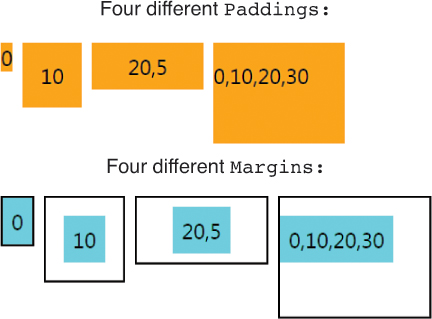
Both Margin and Padding are of type System.Windows.Thickness, an interesting class that can represent one, two, or four double values. The meaning of these values is demonstrated in Listing 4.1, which applies various Padding and Margin settings to Label controls. The second set of Labels is wrapped in Borders because the margin settings would not be noticeable otherwise. Figure 4.2 shows the rendered result for each Label if each one is individually placed in a Canvas (a panel covered in the next chapter). Although not shown in this figure, Margin permits negative values. Padding does not.
LISTING 4.1 Applying Padding and Margin Values with One, Two, or Four Digits
<!-- PADDING: -->
<!-- 1 value: The same padding on all four sides: -->
<Label Padding="0" Background="Orange">0</Label>
<Label Padding="10" Background="Orange">10</Label>
<!-- 2 values: Left & Right get the 1st value,
Top & Bottom get the 2nd value: -->
<Label Padding="20,5" Background="Orange">20,5</Label>
<!-- 4 values: Left,Top,Right,Bottom: -->
<Label Padding="0,10,20,30" Background="Orange">0,10,20,30</Label>
<!-- MARGIN: -->
<Border BorderBrush="Black" BorderThickness="1">
<!-- No margin: -->
<Label Background="Aqua">0</Label>
</Border>
<Border BorderBrush="Black" BorderThickness="1">
<!-- 1 value: The same margin on all four sides: -->
<Label Margin="10" Background="Aqua">10</Label>
</Border>
<Border BorderBrush="Black" BorderThickness="1">
<!-- 2 values: Left & Right get the 1st value,
Top & Bottom get the 2nd value: -->
<Label Margin="20,5" Background="Aqua">20,5</Label>
</Border>
<Border BorderBrush="Black" BorderThickness="1">
<!-- 4 values: Left,Top,Right,Bottom: -->
<Label Margin="0,10,20,30" Background="Aqua">0,10,20,30</Label>
</Border>
Label has a default Padding of 5, but it can be overridden to any valid value. That is why Listing 4.1 explicitly sets the first Label’s Padding to 0. Without the explicit setting, it would look like the fifth Label (the one demonstrating the implicit Margin of 0), and the visual comparison to the other Padding values would be confusing.
 FAQ: What unit of measurement does WPF use?
The LengthConverter type converter associated with the various length properties supports specifying explicit units of cm, pt, in, or px (the default).
By default, all absolute measurements, such as the numbers used in this section’s size-related properties, are specified in device-independent pixels. These “logical pixels” are meant to represent 1/96 inch, regardless of the screen’s DPI setting. Note that device-independent pixels are always specified as double values, so they can be fractional.
The exact measurement of 1/96 inch isn’t important, although it was chosen because on a 96-DPI display, 1 device-independent pixel is identical to 1 physical pixel. Of course, the notion of a true “inch” depends on the physical display device. If an application draws a 1-inch line on my laptop screen, that line will certainly be longer than 1 inch if I hook up my laptop to a projector!
What is important is that all such measurements are DPI independent. But this functionality alone doesn’t prevent items from shrinking when you increase the screen resolution. To get resolution independence, you need the automatic scaling functionality discussed in the next chapter.
Visibility
Visibility (defined on UIElement) might sound like a strange property to talk about in the context of layout, but it is indeed relevant. An element’s Visibility property actually isn’t Boolean but rather a three-state System.Windows.Visibility enumeration. Its values and meanings are as follows:
Visible—The element is rendered and participates in layout.
Collapsed—The element is invisible and does not participate in layout.
Hidden—The element is invisible yet still participates in layout.
A Collapsed element effectively has a size of zero, whereas a Hidden element retains its original size. (Its ActualHeight and ActualWidth values don’t change, for example.) The difference between Collapsed and Hidden is demonstrated in Figure 4.3, which compares the following StackPanel with a Collapsed Button:
<StackPanel Height="100" Background="Aqua">
<Button Visibility="Collapsed">Collapsed Button</Button>
<Button>Below a Collapsed Button</Button>
</StackPanel>
to the following StackPanel with a Hidden Button:
<StackPanel Height="100" Background="Aqua">
<Button Visibility="Hidden">Hidden Button</Button>
<Button>Below a Hidden Button</Button>
</StackPanel>

Controlling Position
This section doesn’t discuss positioning elements with (X,Y) coordinates, as you might expect. Parent panels define their own unique mechanisms for enabling children to position themselves (via attached properties or simply the order in which children are added to the parent). A few mechanisms are common to all FrameworkElement children, however, and that’s what this section examines. These mechanisms are related to alignment and a concept called flow direction.
Alignment
The HorizontalAlignment and VerticalAlignment properties enable an element to control what it does with any extra space that its parent panel gives it. Each property has a corresponding enumeration with the same name in the System.Windows namespace, giving the following options:
HorizontalAlignment—Left, Center, Right, and Stretch
VerticalAlignment—Top, Center, Bottom, and Stretch
Stretch is the default value for both properties, although various controls override the setting in their theme styles. The effects of HorizontalAlignment can easily be seen by placing a few Buttons in a StackPanel and marking them with each value from the enumeration:
<StackPanel>
<Button HorizontalAlignment="Left" Background="Red">Left</Button>
<Button HorizontalAlignment="Center" Background="Orange">Center</Button>
<Button HorizontalAlignment="Right" Background="Yellow">Right</Button>
<Button HorizontalAlignment="Stretch" Background="Lime">Stretch</Button>
</StackPanel>
The rendered result appears in Figure 4.4.
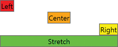
These two properties are useful only when a parent panel gives the child element more space than it needs. For example, adding VerticalAlignment values to elements in the StackPanel used in Figure 4.4 would make no difference, as each element is already given the exact amount of height it needs (no more, no less).
Content Alignment
In addition to HorizontalAlignment and VerticalAlignment properties, the Control class also has HorizontalContentAlignment and VerticalContentAlignment properties. These properties determine how a control’s content fills the space within the control. (Therefore, the relationship between alignment and content alignment is somewhat like the relationship between Margin and Padding.)
The content alignment properties are of the same enumeration types as the corresponding alignment properties, so they provide the same options. However, the default value for HorizontalContentAlignment is Left, and the default value for VerticalContentAlignment is Top. This wasn’t the case for the previous Buttons, however, because their theme style overrides these settings. (Recall the order of precedence for dependency property value providers in the preceding chapter. Default values have the lowest priority and are trumped by styles.)
Figure 4.5 demonstrates the effects of HorizontalContentAlignment, simply by taking the previous XAML snippet and changing the property name as follows:
<StackPanel>
<Button HorizontalContentAlignment="Left" Background="Red">Left</Button>
<Button HorizontalContentAlignment="Center" Background="Orange">Center</Button>
<Button HorizontalContentAlignment="Right" Background="Yellow">Right</Button>
<Button HorizontalContentAlignment="Stretch" Background="Lime">Stretch</Button>
</StackPanel>
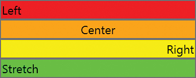
In Figure 4.5, the Button with HorizontalContentAlignment="Stretch" might not appear as you expected. Its inner TextBlock is indeed stretched, but TextBlock is not a true Control (rather just a FrameworkElement) and, therefore, doesn’t have the same notion for stretching its inner text.
FlowDirection
FlowDirection is a property on FrameworkElement (and several other classes) that can reverse the way an element’s inner content flows. It applies to some panels and their arrangement of children, and it also applies to the way content is aligned inside child controls. The property is of type System.Windows.FlowDirection, with two values: LeftToRight (FrameworkElement’s default) and RightToLeft.
The idea of FlowDirection is that it should be set to RightToLeft when the current culture corresponds to a language that is read from right to left. This reverses the meaning of left and right for settings such as content alignment. The following XAML demonstrates this, with Buttons that force their content alignment to Top and Left but then apply each of the two FlowDirection values:
<StackPanel>
<Button FlowDirection="LeftToRight"
HorizontalContentAlignment="Left" VerticalContentAlignment="Top"
Height="40" Background="Red">LeftToRight</Button>
<Button FlowDirection="RightToLeft"
HorizontalContentAlignment="Left" VerticalContentAlignment="Top"
Height="40" Background="Orange">RightToLeft</Button>
</StackPanel>
The result is shown in Figure 4.6.

Notice that FlowDirection does not affect the flow of letters within these Buttons. English letters always flow left to right, and Arabic letters always flow right to left, for example. But FlowDirection reverses the notion of left and right for other pieces of the user interface, which typically need to match the flow direction of letters.
FlowDirection must be explicitly set to match the current culture (and can be done on a single, top-level element). This should be part of your localization process.
Applying Transforms
WPF contains a handful of built-in 2D transform classes (derived from System.Windows.Media.Transform) that enable you to change the size and position of elements independently from the previously discussed properties. Some also enable you to alter elements in more exotic ways, such as by rotating or skewing them.
All FrameworkElements have two properties of type Transform that can be used to apply such transforms:
LayoutTransform, which is applied before the element is laid out
RenderTransform (inherited from UIElement), which is applied after the layout process has finished (immediately before the element is rendered)
FAQ: How do I apply a 3D transform?
In Silverlight and the XAML framework for Windows Store apps, elements have a Projection property that enables you to easily perform perspective transforms. WPF elements do not have this property, however. Instead, you must use the 3D features described in Chapter 16, “3D Graphics.”
Figure 4.7 demonstrates the difference between applying a transform called RotateTransform as a LayoutTransform versus a RenderTransform. In both cases, the transform is applied to the second of three consecutive Buttons in a StackPanel. When applied as a LayoutTransform, the third Button is pushed out of the way, and the second Button’s width isn’t impacted by the StackPanel’s width. But when applied as a RenderTransform, the third Button is placed as if the second Button weren’t rotated, and the second Button’s width is the StackPanel’s width.

FIGURE 4.7 The difference between LayoutTransform and RenderTransform on the middle of three Buttons in a StackPanel.
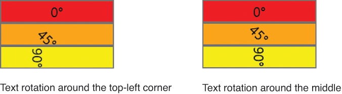
UIElements also have a handy RenderTransformOrigin property that represents the starting point of the transform (the point that remains stationary). For the RotateTransform used in Figure 4.7, the origin is the Button’s top-left corner, which the rest of the Button pivots around. LayoutTransforms, on the other hand, don’t have the notion of an origin because the positioning of the transformed element is completely dictated by the parent panel’s layout rules.
RenderTransformOrigin can be set to a System.Windows.Point, with (0,0) being the default value. This represents the top-left corner, as in Figure 4.7. An origin of (0,1) represents the bottom-left corner, (1,0) is the top-right corner, and (1,1) is the bottom-right corner. You can use numbers greater than 1 to set the origin to a point outside the bounds of an element, and you can use fractional values. Therefore, (0.5,0.5) represents the middle of the object. Figure 4.8 demonstrates the five origins most commonly used with the RenderTransform from Figure 4.7.
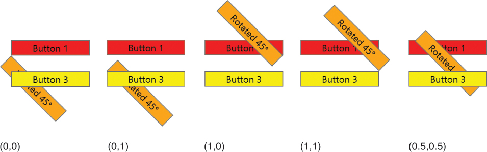
Thanks to System.Windows.PointConverter, the value for RenderTransformOrigin can be specified in XAML with two comma-delimited numbers (and no parentheses). For example, the Button rotated around its center at the far right of Figure 4.8 can be created as follows:
<Button RenderTransformOrigin="0.5,0.5" Background="Orange">
<Button.RenderTransform>
<RotateTransform Angle="45"/>
</Button.RenderTransform>
Rotated 45°
</Button>
At this point, you might be wondering why you would ever want to have a rotated Button in an application! Indeed, such transforms look silly on standard controls with their default style. They often make more sense in a heavily themed application, but even with default-styled controls, transforms can add a nice touch when used within animations.
This section looks at the five built-in 2D transforms, all in the System.Windows.Media namespace:
RotateTransform
ScaleTransform
SkewTransform
TranslateTransform
MatrixTransform
RotateTransform
RotateTransform, demonstrated in the preceding section, rotates an element according to the values of three double properties:
Angle—Angle of rotation, specified in degrees (default value = 0)
CenterX—Horizontal center of rotation (default value = 0)
CenterY—Vertical center of rotation (default value = 0)
The default (CenterX,CenterY) point of (0,0) represents the top-left corner. CenterX and CenterY are only useful when RotateTransform is applied as a RenderTransform because when LayoutTransforms are applied, the position is still dictated by the parent panel.
FAQ: What’s the difference between using the CenterX and CenterY properties on transforms such as RotateTransform versus using the RenderTransformOrigin property on UIElement?
When a transform is applied to a UIElement, the CenterX and CenterY properties at first appear to be redundant with RenderTransformOrigin. Both mechanisms control the origin of the transform, and both mechanisms work only when the transform is applied as a RenderTransform.
However, CenterX and CenterY enable absolute positioning of the origin rather than the relative positioning of RenderTransformOrigin. Their values are specified as device-independent pixels, so the top-right corner of an element with a Width of 20 would be specified with CenterX set to 20 and CenterY set to 0 rather than the point (1,0). Also, when multiple RenderTransforms are grouped together (described later in the chapter), CenterX and CenterY on individual transforms enable more fine-grained control. Finally, the individual double values of CenterX and CenterY are easier to use with data binding than the Point value of RenderTransformOrigin.
That said, RenderTransformOrigin is generally more useful than CenterX and CenterY. For the common case of transforming an element around its middle, the relative (0.5,0.5) RenderTransformOrigin is easy to specify in XAML, whereas accomplishing the same thing with CenterX and CenterY would require writing some procedural code to calculate the absolute offsets.
Note that you can use RenderTransformOrigin on an element simultaneously with using CenterX and CenterY on its transform. In this case, the two X values and two Y values are combined to calculate the final origin point.
Whereas Figures 4.7 and 4.8 show rotated Buttons, Figure 4.9 demonstrates what happens when RotateTransform is applied as a RenderTransform to the inner content of Buttons, with two different values of RenderTransformOrigin. To achieve this, the simple string inside each Button is replaced with an explicit TextBlock as follows:
<Button Background="Orange">
<TextBlock RenderTransformOrigin="0.5,0.5">
<TextBlock.RenderTransform>
<RotateTransform Angle="45"/>
</TextBlock.RenderTransform>
45°
</TextBlock>
</Button>
The TextBlocks in the Buttons on the left side of Figure 4.9 might not seem to be rotated around their top-left corners, but that’s because the TextBlocks are slightly larger than the text. When you give the TextBlocks an explicit aqua Background, the rotation makes more sense. Figure 4.10 demonstrates this.

RotateTransform has parameterized constructors that accept an angle or both angle and center values, for the convenience of creating the transform from procedural code.
ScaleTransform
ScaleTransform enlarges or shrinks an element horizontally, vertically, or in both directions. This transform has four straightforward double properties:
ScaleX—Multiplier for the element’s width (default value = 1)
ScaleY—Multiplier for the element’s height (default value = 1)
CenterX—Origin for horizontal scaling (default value = 0)
CenterY—Origin for vertical scaling (default value = 0)
A ScaleX value of 0.5 shrinks an element’s rendered width in half, whereas a ScaleX value of 2 doubles the width. CenterX and CenterY work the same way as with RotateTransform.
Listing 4.2 applies ScaleTransform to three Buttons in a StackPanel, demonstrating the ability to stretch them independently in height or in width. Figure 4.11 shows the result.
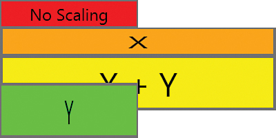
LISTING 4.2 Applying ScaleTransform to Buttons in a StackPanel
<StackPanel Width="100">
<Button Background="Red">No Scaling</Button>
<Button Background="Orange">
<Button.RenderTransform>
<ScaleTransform ScaleX="2"/>
</Button.RenderTransform>
X</Button>
<Button Background="Yellow">
<Button.RenderTransform>
<ScaleTransform ScaleX="2" ScaleY="2"/>
</Button.RenderTransform>
X + Y</Button>
<Button Background="Lime">
<Button.RenderTransform>
<ScaleTransform ScaleY="2"/>
</Button.RenderTransform>
Y</Button>
</StackPanel>
Figure 4.12 displays the same Buttons from Listing 4.2 (and Figure 4.11) but with explicit CenterX and CenterY values set. The point represented by each pair of these values is displayed in each Button’s text. Notice that the lime Button isn’t moved to the left like the orange Button, despite being marked with the same CenterX of 70. That’s because CenterX is relevant only when ScaleX is a value other than 1, and CenterY is relevant only when ScaleY is a value other than 1.

As with other transforms, ScaleTransform has a few parameterized constructors for the convenience of creating it from procedural code.
FAQ: How do transforms such as ScaleTransform affect FrameworkElement’s ActualHeight and ActualWidth properties or UIElement’s RenderSize property?
Applying a transform to FrameworkElement never changes the values of these properties. This is true whether it is applied as a RenderTransform or LayoutTransform. Therefore, because of transforms, these properties can “lie” about the size of an element on the screen. For example, all the Buttons in Figures 4.11 and 4.12 have the same ActualHeight, ActualWidth, and RenderSize.
Such “lies” might surprise you, but they’re for the best. First, it’s debatable how such values should even be expressed for some transforms. More importantly, the point of transforms is to alter an element’s appearance without the element’s knowledge. Giving elements the illusion that they are being rendered normally enables arbitrary controls to be plugged in and transformed without special handling.
FAQ: How does ScaleTransform affect Margin and Padding?
Padding is scaled along with the rest of the content (because Padding is internal to the element), but Margin does not get scaled. As with ActualHeight and ActualWidth, the numeric Padding property value does not change, despite the visual scaling.
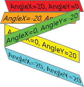
SkewTransform
SkewTransform slants an element according to the values of four double properties:
AngleX—Amount of horizontal skew (default value = 0)
AngleY—Amount of vertical skew (default value = 0)
CenterX—Origin for horizontal skew (default value = 0)
CenterY—Origin for vertical skew (default value = 0)
These properties behave much like the properties of the previous transforms. Figure 4.13 demonstrates SkewTransform applied as a RenderTransform on several Buttons, using the default center of the top-left corner.
TranslateTransform
TranslateTransform simply moves an element according to two double properties:
X—Amount to move horizontally (default value = 0)
Y—Amount to move vertically (default value = 0)
TranslateTransform has no effect when you apply it as a LayoutTransform, but applying it as a RenderTransform is an easy way to “nudge” elements one way or another. Most likely, you’d do this dynamically based on user actions (and perhaps in an animation). With all the panels described in the next chapter, it’s unlikely that you’d need to use TranslateTransform to arrange a static user interface.
MatrixTransform
MatrixTransform is a low-level mechanism that can be used to create custom 2D transforms. MatrixTransform has a single Matrix property (of type System.Windows.Media.Matrix) representing a 3x3 affine transformation matrix. In case you’re not a linear algebra buff, this basically means that all the previous transforms (or any combination of them) can also be expressed using MatrixTransform.
The 3x3 matrix has the following values:
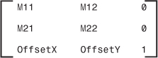
The final column’s values are fixed, but the other six values can be set as properties of the Matrix type (with the same names as shown) or via a constructor that accepts the six values in row-major order.
Combining Transforms
A few different options exist for combining multiple transforms, such as rotating an element while simultaneously scaling it. You can apply both a LayoutTransform and a RenderTransform simultaneously. Or, you could figure out the correct MatrixTransform representation to get the combined effect. Most likely, however, you would take advantage of the TransformGroup class.
TransformGroup is just another Transform-derived class (so it can be used wherever the previous classes are used), and its purpose is to combine child Transform objects. From procedural code, you can add transforms to its Children collection, or from XAML, you can use it as follows:
<Button>
<Button.RenderTransform>
<TransformGroup>
<RotateTransform Angle="45"/>
<ScaleTransform ScaleX="5" ScaleY="1"/>
<SkewTransform AngleX="30"/>
</TransformGroup>
</Button.RenderTransform>
OK
</Button>
Figure 4.14 shows the result of all three transforms being applied to the Button.
For maximum performance, WPF calculates a combined transform out of a TransformGroup’s children and applies it as a single transform (much as if you had used MatrixTransform). Note that you can apply multiple instances of the same transform to a TransformGroup. For example, applying two separate 45° RotateTransforms would result in a 90° rotation.
Warning: Not all FrameworkElements support transforms!
Elements hosting content that isn’t native to WPF do not support transforms, despite inheriting the LayoutTransform and RenderTransform properties. For example, HwndHost, used to host GDI-based content and discussed in Chapter 19, “Interoperability with Non-WPF Technologies,” does not support them. Frame, a control that can host HTML (described in Chapter 9, “Content Controls”), supports them completely only when it is not hosting HTML. Otherwise, ScaleTransform can still be applied to scale its size, but the inner content won’t scale.
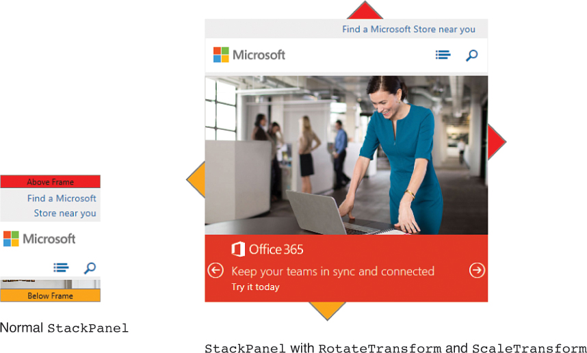
Figure 4.15 demonstrates this with a StackPanel containing some Buttons and a Frame containing a webpage (constrained to be 100x100). When the entire StackPanel is rotated and scaled, the Frame does its best to scale but doesn’t rotate at all. It ends up hiding most of the rotated Buttons.
Summary
That concludes our tour of the layout properties that child elements can use to influence the way they appear on the screen. In this chapter, you also got some first glimpses into user-visible features unlike anything you’d see in Win32 or Windows Forms: rotated and skewed controls!
But the most important part of layout is the parent panels. This chapter repeatedly uses a StackPanel for simplicity, but the next chapter formally introduces this panel and all the other panels as well.