
Chapter 21. Layout with Custom Panels
Chapter 5, “Layout with Panels,” examines the variety of panels included with WPF. If none of the built-in panels do exactly what you want, you have the option of writing your own panel. Of course, with all the flexibility of the built-in panels, the layout properties on child elements (discussed in Chapter 4, “Sizing, Positioning, and Transforming Elements”), plus the ability to embed panels within other panels to create arbitrarily complex layout, it’s unlikely that you’re going to need a custom panel. Actually, you never need a custom panel; with enough procedural code, you can achieve any layout with just a Canvas. It’s just a matter of how easy and automatic you want to be able to repetitively apply certain types of layout.
For example, perhaps you want to create a version of WrapPanel that stacks or wraps in a different direction than the two built-in directions. Or perhaps you want to create a version of StackPanel that stacks from the bottom up, although you could alternatively get this effect pretty easily with a DockPanel by giving each element a Dock value of Bottom. User interface virtualization might be a good incentive for creating a custom panel, such as creating a VirtualizingWrapPanel much like the VirtualizingStackPanel that already exists. You could also create a custom panel that incorporates automatic drag and drop, similar to ToolBarTray.
Although writing a custom panel can often be avoided by combining more primitive panels, creating a new panel can be useful when you want to repetitively arrange controls in a unique way. Encapsulating the custom logic in a panel can make the arrangement of a user interface less error prone and help to enforce consistency. Panels that are made for very limited scenarios can also perform much better than the super-flexible WPF panels, especially if you replace multiple nestings of generic panels with a single, limited one.
To understand the steps involved in creating a custom panel, we’ll first create two panels in this chapter that replicate the functionality of existing panels in WPF. After that, we’ll create two unique panels. The good news is that there is no special mechanism for creating a custom panel; you use exactly the same approach used by the built-in panels. But this also means we should take a closer look at how panels and their children communicate, which was glossed over in Chapters 4 and 5.
Communication Between Parents and Children
Chapters 4 and 5 explain that parent panels and their children work together to determine their final sizes and positions. To strike a reasonable balance between the needs of the parent and its children, layout is a recursive two-pass process. The first pass is called measure, and the second pass is called arrange.
The Measure Step
In the measure step, parents ask their children how big they want to be, given the amount of space available. Panels (and children, when appropriate) do this by overriding the MeasureOverride method from FrameworkElement. Here’s an example:
protected override Size MeasureOverride(Size availableSize)
{
...
// Ask each child how big it would like to be, given a certain amount space
foreach (UIElement child in this.Children)
{
child.Measure(new Size(...));
// The child's answer is now in child.DesiredSize
...
}
...
// Tell my parent how big I would like to be given the passed-in availableSize
return new Size(...);
}
All children can be accessed via the panel’s Children collection (a UIElementCollection), and asking each child for its desired size is done by simply calling its Measure method (inherited from UIElement). Measure doesn’t return a value, but after the call, the child’s DesiredSize property contains its answer. As the parent, you can decide if you want to alter your behavior based on the desired sizes of any of your children.
Warning: In MeasureOverride, panels must always call Measure on each child!
You might want to implement a panel that doesn’t have any use for checking its children’s DesiredSize values simply because it doesn’t care how big its children want to be. Still, all panels must ask their children anyway (by calling Measure) because some elements don’t work correctly if their Measure method never gets called. This is somewhat like asking your significant other “How was your day?” when you really don’t care about the answer but want to avoid the repercussions. (Or so I’m told. Personally, I always care about the answer!)
The preceding snippet of C# code, like all MeasureOverride implementations, uses two important Size values, discussed in the following sections.
The Size Passed to Each Child’s Measure Method
This value should represent the amount of space you’re planning to give the child. It could be all the space given to you (captured in MeasureOverride’s availableSize parameter), some fraction of your space, or some absolute value, depending on your desires.
In addition, you can use Double.PositiveInfinity for either or both of Size’s dimensions to find out how large the child wants to be in an ideal situation. In other words, this line of code means, “How big do you want to be given all the space in the world?”:
child.Measure(new Size(Double.PositiveInfinity, Double.PositiveInfinity));
The layout system automatically handles the child layout properties discussed in Chapter 4, such as Margin, so the size ultimately passed to the child’s implementation of MeasureOverride is the size you passed to Measure minus any margins. This also means that the availableSize parameter passed to your own MeasureOverride implementation represents whatever your parent allocated for you minus your own margins.
The Size Returned by MeasureOverride
The Size you return represents how big you want to be (answering your parent’s request, just as your children have already answered it for you). You could return an absolute size, but that would ignore the requests from your children. More likely, you’d pick a value that enables you to “size to content,” being big enough to fit all your children in their ideal sizes but no bigger.
Warning: You can’t simply return availableSize from MeasureOverride!
Whether because of its simplicity or because of your own greediness, it’s tempting to use the passed-in availableSize parameter as the return value for MeasureOverride. This basically means, “Give me all the space you’ve got.”
However, whereas a Size with Double.PositiveInfinity in both dimensions is a legal value for availableSize, it is not a valid value for DesiredSize. Even when given unlimited space, you must choose a concrete size. If you ever end up returning an infinite size, UIElement’s Measure implementation throws an InvalidOperationException with a helpful message: “Layout measurement override of element 'XXX' should not return PositiveInfinity as its DesiredSize, even if Infinity is passed in as available size.”
If you have only one child, sizing to your content is as simple as returning that child’s DesiredSize as your own desired size. For multiple children, you would need to combine the widths and heights of your children according to how you plan to arrange them.
The Arrange Step
After measurement has been completed all the way through the element tree, it’s time for the physical arranging of elements. In the arrange step, parents tell their children where they are getting placed and how much space they are given (which might be a different Size than the one given earlier). Panels (and children, when appropriate) do this by overriding the ArrangeOverride method from FrameworkElement. Here’s an example:
protected override Size ArrangeOverride(Size finalSize)
{
...
// Tell each child how much space it is getting
foreach (UIElement child in this.Children)
{
child.Arrange(new Rect(...));
// The child's size is now in child.ActualHeight & child.ActualWidth
...
}
...
// Set my own actual size (ActualHeight & ActualWidth)
return new Size(...);
}
You tell each child its location and size by passing a Rect and a Size to its Arrange method (inherited from UIElement). For example, you can give each child its desired size simply by passing the value of its DesiredSize property to Arrange. You can be certain that this size is set appropriately because all measuring is done before any arranging begins.
Unlike with Measure, you cannot pass an infinite size to Arrange (and the finalSize passed to you will never be infinite). The child can choose to occupy a different amount of space than what you’ve specified, such as a subset of the space. Parents can determine what actions (if any) they want to take if this happens. The actual size chosen by each child can be obtained from its ActualHeight and ActualWidth properties after the call to Arrange.
As with your children, the size you return from ArrangeOverride becomes the value of your RenderSize and ActualHeight/ActualWidth properties. The size must not be infinite, but unlike with MeasureOverride, it’s valid to simply return the passed-in Size if you want to take up all the available space because finalSize can never be infinite.
As with the measure step, in the arrange step, properties such as Margin are handled automatically, so the information getting passed to children (and the finalSize passed to you) has any margins subtracted. In addition, alignment is automatically handled by the arrange step. When a child is given exactly the amount of space it needs (for example, passing its DesiredSize to its Arrange method), alignment appears to have no effect because there’s no extra space for the element to align within. But when you give a child more space than it occupies, the results of its HorizontalAlignment and/or VerticalAlignment settings are seen.
Warning: Don’t do anything in MeasureOverride or ArrangeOverride that invalidates layout!
You can do some exotic things in MeasureOverride or ArrangeOverride, such as apply additional transforms to children (either as LayoutTransforms or RenderTransforms). But be sure that you don’t invoke any code that invalidates layout; otherwise, you could wind up in an infinite loop!
Any method or property invalidates layout if it calls UIElement.InvalidateMeasure or UIElement.InvalidateArrange. These are public methods, however, so it can be difficult to know what code calls them. Within WPF, dependency properties that use these methods document this fact with one or more metadata flags from the FrameworkPropertyMetadataOptions enumeration: AffectsMeasure, AffectsArrange, AffectsParentArrange, and/or AffectsParentMeasure.
If you feel that you must execute some code that invalidates layout, and you have a plan for avoiding a never-ending cycle, you can factor that logic into a separate method then use Dispatcher.BeginInvoke to schedule its execution after the current layout pass completes. To do this, be sure to use a DispatcherPriority value no higher than Loaded.
Creating a SimpleCanvas
Before creating some unique panels, let’s see how to replicate the behavior of existing panels. The first one we’ll create is a simplified version of Canvas called SimpleCanvas. SimpleCanvas behaves exactly like Canvas, except that it only respects Left and Top attached properties on its children rather than Left, Top, Right, and Bottom. This is done only to reduce the amount of repetitive code, as supporting Right and Bottom looks almost identical to supporting Left and Top. (As a result, the arrange pass in SimpleCanvas is negligibly faster than in Canvas, but only for children not already marked with Left and Top.)
Implementing SimpleCanvas (or any other custom panel) consists of the following four steps:
1. Create a class that derives from Panel.
2. Define any properties that would be useful for customizing layout, potentially including attached properties for the children.
3. Override MeasureOverride and measure each child.
4. Override ArrangeOverride and arrange each child.
Listing 21.1 contains the entire implementation of SimpleCanvas.
LISTING 21.1 SimpleCanvas.cs—The Implementation of SimpleCanvas
using System;
using System.ComponentModel;
using System.Windows;
using System.Windows.Controls;
using System.Windows.Media;
namespace CustomPanels
{
public class SimpleCanvas : Panel
{
public static readonly DependencyProperty LeftProperty =
DependencyProperty.RegisterAttached("Left", typeof(double),
typeof(SimpleCanvas), new FrameworkPropertyMetadata(Double.NaN,
FrameworkPropertyMetadataOptions.AffectsParentArrange));
public static readonly DependencyProperty TopProperty =
DependencyProperty.RegisterAttached("Top", typeof(double),
typeof(SimpleCanvas), new FrameworkPropertyMetadata(Double.NaN,
FrameworkPropertyMetadataOptions.AffectsParentArrange));
[TypeConverter(typeof(LengthConverter)),AttachedPropertyBrowsableForChildren]
public static double GetLeft(UIElement element)
{
if (element == null) { throw new ArgumentNullException("element"); }
return (double)element.GetValue(LeftProperty);
}
[TypeConverter(typeof(LengthConverter)),AttachedPropertyBrowsableForChildren]
public static void SetLeft(UIElement element, double length)
{
if (element == null) { throw new ArgumentNullException("element"); }
element.SetValue(LeftProperty, length);
}
[TypeConverter(typeof(LengthConverter)),AttachedPropertyBrowsableForChildren]
public static double GetTop(UIElement element)
{
if (element == null) { throw new ArgumentNullException("element"); }
return (double)element.GetValue(TopProperty);
}
[TypeConverter(typeof(LengthConverter)),AttachedPropertyBrowsableForChildren]
public static void SetTop(UIElement element, double length)
{
if (element == null) { throw new ArgumentNullException("element"); }
element.SetValue(TopProperty, length);
}
protected override Size MeasureOverride(Size availableSize)
{
foreach (UIElement child in this.Children)
{
// Give each child all the space it wants
if (child != null)
child.Measure(new Size(Double.PositiveInfinity,
Double.PositiveInfinity));
}
// The SimpleCanvas itself needs no space
return new Size(0, 0);
}
protected override Size ArrangeOverride(Size finalSize)
{
foreach (UIElement child in this.Children)
{
if (child != null)
{
double x = 0;
double y = 0;
// Respect any Left and Top attached properties,
// otherwise the child is placed at (0,0)
double left = GetLeft(child);
double top = GetTop(child);
if (!Double.IsNaN(left)) x = left;
if (!Double.IsNaN(top)) y = top;
// Place at the chosen (x,y) location with the child's DesiredSize
child.Arrange(new Rect(new Point(x, y), child.DesiredSize));
}
}
// Whatever size you gave me is fine
return finalSize;
}
}
}
Listing 21.1 begins by defining the Left and Top attached properties, which each consist of the DependencyProperty field with the pair of static Get/Set methods. As with Canvas’s Left and Top attached properties, their default value is Double.NaN, which serves as the not-set-to-anything value. The registration passes FrameworkPropertyMetadataOptions.AffectsParentArrange to the FrameworkPropertyMetadataOptions constructor to tell WPF that when the values of these properties change on child elements, the parent SimpleCanvas needs to redo its arrange layout pass so it can place the element in its new location.
The static Get/Set methods are a standard implementation of the two attached properties. Notice the association with the LengthConverter type converter, which allows these properties to be set to a variety of strings in XAML, such as "Auto" (mapped to Double.NaN) or numbers with explicit units ("px", "in", "cm", or "pt"). The AttachedPropertyBrowsableForChildren attribute helps with design-time support by requesting that designers show these two properties in the list of available properties that can be set on children.
The implementation of MeasureOverride couldn’t be simpler, which makes sense considering the desired behavior of SimpleCanvas. It just tells each child to take all the space it wants, and then it tells its parent that it doesn’t require any space for itself (because its children do not get clipped to its bounds unless ClipToBounds is set to true, thanks to behavior inherited from FrameworkElement).
ArrangeOverride is where the interesting work is done. Each child is placed at (0,0) with its DesiredSize unless it is marked with a Left and/or Top attached property. To check for this, ArrangeOverride simply calls GetLeft and GetTop and looks for values other than Double.NaN.
You can see that the panel doesn’t need to care about any of the children’s layout properties (Height, MinHeight, MaxHeight, Width, MinWidth, MaxWidth, Margin, Padding, Visibility, HorizontalAlignment, VerticalAlignment, LayoutTransform, and so on). In addition, tabbing between child elements is handled automatically. The tab order is defined by the order in which children are added to the parent.
The project included with this book’s source code consumes SimpleCanvas as follows:
<Window x:Class="CustomPanels.SimpleCanvasWindow"
xmlns="http://schemas.microsoft.com/winfx/2006/xaml/presentation"
xmlns:x="http://schemas.microsoft.com/winfx/2006/xaml"
xmlns:local="clr-namespace:CustomPanels"
Title="Four Buttons in a SimpleCanvas">
<local:SimpleCanvas>
<Button Content="1" Background="Red"/>
<Button local:SimpleCanvas.Left="40" local:SimpleCanvas.Top="40"
Content="2" Background="Orange"/>
<Button local:SimpleCanvas.Left="80" local:SimpleCanvas.Top="80"
Content="3" Background="Yellow"/>
<Button local:SimpleCanvas.Left="120" local:SimpleCanvas.Top="120"
Content="4" Background="Lime"/>
</local:SimpleCanvas>
</Window>
The XAML for the Window maps the CustomPanels .NET namespace to a local prefix, so SimpleCanvas and its attached properties can be used with the local: prefix. Because SimpleCanvas.cs is compiled into the same assembly, no Assembly value needs to be set with the clr-namespace directive.
Note that the SimpleCanvas implementation could reuse Canvas’s existing Left and Top attached properties by getting rid of its own and changing two lines of code inside ArrangeOverride:
double left = Canvas.GetLeft(child);
double top = Canvas.GetTop(child);
Then the panel could be used as follows:
<Window x:Class="CustomPanels.SimpleCanvasWindow"
xmlns="http://schemas.microsoft.com/winfx/2006/xaml/presentation"
xmlns:x="http://schemas.microsoft.com/winfx/2006/xaml"
xmlns:local="clr-namespace:CustomPanels"
Title="Four Buttons in a SimpleCanvas">
<local:SimpleCanvas>
<Button Content="1" Background="Red"/>
<Button Canvas.Left="40" Canvas.Top="40"
Content="2" Background="Orange"/>
<Button Canvas.Left="80" Canvas.Top="80"
Content="3" Background="Yellow"/>
<Button Canvas.Left="120" Canvas.Top="120"
Content="4" Background="Lime"/>
</local:SimpleCanvas>
</Window>
It’s pretty nonstandard, however, for one panel to require the use of a different panel’s attached properties.
Creating a SimpleStackPanel
Let’s look at replicating one more existing panel, but one that does a bit more work while measuring and arranging. We’ll create a SimpleStackPanel that acts just like StackPanel. The only major difference between SimpleStackPanel and StackPanel is that our version is missing some performance optimizations. Listing 21.2 contains the entire implementation.
LISTING 21.2 SimpleStackPanel.cs—The Implementation of SimpleStackPanel
using System;
using System.Windows;
using System.Windows.Controls;
namespace CustomPanels
{
public class SimpleStackPanel : Panel
{
// The direction of stacking
public static readonly DependencyProperty OrientationProperty =
DependencyProperty.Register("Orientation", typeof(Orientation),
typeof(SimpleStackPanel), new FrameworkPropertyMetadata(
Orientation.Vertical, FrameworkPropertyMetadataOptions.AffectsMeasure));
public Orientation Orientation
{
get { return (Orientation)GetValue(OrientationProperty); }
set { SetValue(OrientationProperty, value); }
}
protected override Size MeasureOverride(Size availableSize)
{
Size desiredSize = new Size();
// Let children grow indefinitely in the direction of stacking,
// overwriting what was passed in
if (Orientation == Orientation.Vertical)
availableSize.Height = Double.PositiveInfinity;
else
availableSize.Width = Double.PositiveInfinity;
foreach (UIElement child in this.Children)
{
if (child != null)
{
// Ask the first child for its desired size, given unlimited space in
// the direction of stacking and all our available space (whatever was
// passed in) in the other direction
child.Measure(availableSize);
// Our desired size is the sum of child sizes in the direction of
// stacking, and the size of the largest child in the other direction
if (Orientation == Orientation.Vertical)
{
desiredSize.Width = Math.Max(desiredSize.Width,
child.DesiredSize.Width);
desiredSize.Height += child.DesiredSize.Height;
}
else
{
desiredSize.Height = Math.Max(desiredSize.Height,
child.DesiredSize.Height);
desiredSize.Width += child.DesiredSize.Width;
}
}
}
return desiredSize;
}
protected override Size ArrangeOverride(Size finalSize)
{
double offset = 0;
foreach (UIElement child in this.Children)
{
if (child != null)
{
if (Orientation == Orientation.Vertical)
{
// The offset moves the child down the stack.
// Give the child all our width, but as much height as it desires.
child.Arrange(new Rect(0, offset, finalSize.Width,
child.DesiredSize.Height));
// Update the offset for the next child
offset += child.DesiredSize.Height;
}
else
{
// The offset moves the child down the stack.
// Give the child all our height, but as much width as it desires.
child.Arrange(new Rect(offset, 0, child.DesiredSize.Width,
finalSize.Height));
// Update the offset for the next child
offset += child.DesiredSize.Width;
}
}
}
// Fill all the space given
return finalSize;
}
}
}
Similar to Listing 21.1, this listing begins with the definition of a dependency property—Orientation. Its default value is Vertical, and its FrameworkPropertyMetadataOptions reveals that a change in its value requires its measure layout pass to be re-invoked. (This also re-invokes the arrange pass, after the measure pass.)
In MeasureOverride, each child is given the panel’s available size in the non-stacking direction (which may or may not be infinite) but is given infinite size in the stacking direction. As each child’s desired size is revealed, SimpleStackPanel keeps track of the results and updates its own desired size accordingly. In the stacking dimension, its desired length is the sum of all its children’s desired lengths. In the non-stacking dimension, its length is the length of its longest child.
In ArrangeOverride, an offset (“stack pointer,” if you will) keeps track of the position to place the next child as the stack grows. Each child is given the entire panel’s length in the stacking direction and its desired length in the non-stacking direction. Finally, SimpleStackPanel consumes all the space given to it by returning the input finalSize. With that, SimpleStackPanel behaves just like the real StackPanel.
Creating an OverlapPanel
The OverlapPanel is truly a custom panel. It builds on the work we did to create SimpleStackPanel but adds a few tweaks that make its behavior unique. Like SimpleStackPanel, it sequentially stacks its children based on the value of its Orientation property. But, as its name suggests, rather than allow its children to be arranged beyond its bounds, it overlaps its children when the available space is less than the desired space. In this case, children are still given the same size as they are given in SimpleStackPanel, but their locations are evenly “compressed” to completely fill the width or height (depending on Orientation) of the panel. When OverlapPanel is given more space than needed to stack its children, it stretches its children to (again) completely fill the dimension of stacking. Figure 21.1 shows OverlapPanel in action, used in the following Window:
<Window x:Class="CustomPanels.OverlapPanelWindow"
xmlns="http://schemas.microsoft.com/winfx/2006/xaml/presentation"
xmlns:x="http://schemas.microsoft.com/winfx/2006/xaml"
xmlns:local="clr-namespace:CustomPanels"
Title="Four Buttons in an OverlapPanel">
<local:OverlapPanel>
<Button FontSize="40" Content="1" Background="Red"/>
<Button FontSize="40" Content="2" Background="Orange"/>
<Button FontSize="40" Content="3" Background="Yellow"/>
<Button FontSize="40" Content="4" Background="Lime"/>
</local:OverlapPanel>
</Window>

With its evenly distributed overlapping and stretching behavior, OverlapPanel behaves somewhat like a single-column (or single-row) Grid, where each child is in its own *-sized cell. The main difference is that it allows each child to render outside its effective “cell,” which doesn’t happen in a Grid cell unless each child is wrapped in a Canvas. But when you wrap an element in a Canvas, you lose the stretching behavior. In Figure 21.1, you can’t tell whether the Buttons are truly overlapping or just cropped, but you can tell the difference with nonrectangular elements or, in the case of Figure 21.2, translucent elements.

FIGURE 21.2 Giving the Buttons in Figure 21.1 an Opacity of .5 reveals that they are truly overlapping and not simply cropped.
Listing 21.3 contains the entire implementation of OverlapPanel and uses boldface for the code that differs from SimpleStackPanel from Listing 21.2.
LISTING 21.3 OverlapPanel.cs—An Updated SimpleStackPanel That Either Overlaps or Stretches Children
using System;
using System.Windows;
using System.Windows.Controls;
namespace CustomPanels
{
public class OverlapPanel : Panel
{
double _totalChildrenSize = 0;
// The direction of stacking
public static readonly DependencyProperty OrientationProperty =
DependencyProperty.Register("Orientation", typeof(Orientation),
typeof(OverlapPanel), new FrameworkPropertyMetadata(Orientation.Vertical,
FrameworkPropertyMetadataOptions.AffectsMeasure));
public Orientation Orientation
{
get { return (Orientation)GetValue(OrientationProperty); }
set { SetValue(OrientationProperty, value); }
}
protected override Size MeasureOverride(Size availableSize)
{
Size desiredSize = new Size();
foreach (UIElement child in this.Children)
{
if (child != null)
{
// See how big each child wants to be given all our available space
child.Measure(availableSize);
// Our desired size is the sum of child sizes in the direction of
// stacking, and the size of the largest child in the other direction
if (Orientation == Orientation.Vertical)
{
desiredSize.Width = Math.Max(desiredSize.Width,
child.DesiredSize.Width);
desiredSize.Height += child.DesiredSize.Height;
}
else
{
desiredSize.Height = Math.Max(desiredSize.Height,
child.DesiredSize.Height);
desiredSize.Width += child.DesiredSize.Width;
}
}
}
_totalChildrenSize = (Orientation == Orientation.Vertical ?
desiredSize.Height : desiredSize.Width);
return desiredSize;
}
protected override Size ArrangeOverride(Size finalSize)
{
double offset = 0;
double overlap = 0;
// Figure out the amount of overlap by seeing how much less space
// we got than desired, and divide it equally among children.
if (Orientation == Orientation.Vertical)
{
if (finalSize.Height > _totalChildrenSize)
// If we're given more than _totalChildrenSize, the negative overlap
// represents how much the layout should stretch
overlap = (_totalChildrenSize - finalSize.Height) /
this.Children.Count;
else
// In this case, this.DesiredSize gives us the actual smaller size
overlap = (_totalChildrenSize - this.DesiredSize.Height) /
this.Children.Count;
}
else
{
if (finalSize.Width > _totalChildrenSize)
// If we're given more than _totalChildrenSize, the negative overlap
// represents how much the layout should stretch
overlap = (_totalChildrenSize - finalSize.Width) /
this.Children.Count;
else
// In this case, this.DesiredSize gives us the actual smaller size
overlap = (_totalChildrenSize - this.DesiredSize.Width) /
this.Children.Count;
}
foreach (UIElement child in this.Children)
{
if (child != null)
{
if (Orientation == Orientation.Vertical)
{
// The offset moves the child down the stack.
// Give the child all our width, but as much height as it desires
// or more if there is negative overlap.
child.Arrange(new Rect(0, offset, finalSize.Width,
child.DesiredSize.Height + (overlap > 0 ? 0 : -overlap)));
// Update the offset for the next child
offset += (child.DesiredSize.Height - overlap);
}
else
{
// The offset moves the child down the stack.
// Give the child all our height, but as much width as it desires
// or more if there is negative overlap.
child.Arrange(new Rect(offset, 0,
child.DesiredSize.Width + (overlap > 0 ? 0 : -overlap),
finalSize.Height));
// Update the offset for the next child
offset += (child.DesiredSize.Width - overlap);
}
}
}
// Fill all the space given
return finalSize;
}
}
}
The only difference between OverlapPanel’s MeasureOverride and SimpleStackPanel’s MeasureOverride is that OverlapPanel doesn’t give each child infinite space in the direction of stacking; instead, it gives the availableSize in both dimensions. That’s because this panel tries to compress its children to fit in its bounds when they are too big. It also captures the total length of its children in the dimension of stacking (which is also its desired size in that dimension) in a separate _totalChildrenSize variable to be used by ArrangeOverride.
In ArrangeOverride, the difference between the available space and desired space is determined in order to calculate a proper overlap value that can be subtracted from the offset when each child is arranged. A positive overlap value indicates how many logical pixels of overlap there are between each child, and a negative overlap indicates how many logical pixels of additional space each child is given.
Notice the odd-looking expression added to the stacking dimension length in each call to child.Arrange:
(overlap > 0 ? 0 : -overlap)
This adds the absolute value of overlap to the size of the child, but only when overlap is negative. This is necessary to enable the children to stretch when they are spaced out further than their natural lengths, as seen in Figure 21.1. Without adding this value, the stretched Buttons would appear as they do in Figure 21.3.
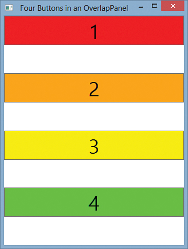
FIGURE 21.3 How OverflowPanel would behave if it didn’t give its children the gift of extra space in the direction of stacking.
Note that the stretching in Figure 21.1 happens only because of Button’s default VerticalAlignment of Stretch. If each Button were marked with a VerticalAlignment of Top, then the correct implementation of OverlapPanel would still give the result shown in Figure 21.3. But that’s fine; it’s the panel’s job to indicate how much space each child is really given, and it’s each child’s decision whether it wants to stretch to fill that space or align with certain edges of it.
Creating a FanCanvas
The final custom panel is a bit unusual and special purpose. FanCanvas arranges its children in a fan shape. The killer application for such a panel is to arrange playing cards like the ones from the previous chapter. Listing 21.4 contains the entire implementation of FanCanvas.
LISTING 21.4 FanCanvas.cs—The Implementation of FanCanvas
using System;
using System.Windows;
using System.Windows.Controls;
using System.Windows.Media;
namespace CustomPanels
{
public class FanCanvas : Panel
{
public static readonly DependencyProperty OrientationProperty =
DependencyProperty.Register("Orientation", typeof(Orientation),
typeof(FanCanvas), new FrameworkPropertyMetadata(Orientation.Horizontal,
FrameworkPropertyMetadataOptions.AffectsArrange));
public static readonly DependencyProperty SpacingProperty =
DependencyProperty.Register("Spacing", typeof(double),
typeof(FanCanvas), new FrameworkPropertyMetadata(10d,
FrameworkPropertyMetadataOptions.AffectsArrange));
public static readonly DependencyProperty AngleIncrementProperty =
DependencyProperty.Register("AngleIncrement", typeof(double),
typeof(FanCanvas), new FrameworkPropertyMetadata(10d,
FrameworkPropertyMetadataOptions.AffectsArrange));
public Orientation Orientation
{
get { return (Orientation)GetValue(OrientationProperty); }
set { SetValue(OrientationProperty, value); }
}
public double Spacing
{
get { return (double)GetValue(SpacingProperty); }
set { SetValue(SpacingProperty, value); }
}
public double AngleIncrement
{
get { return (double)GetValue(AngleIncrementProperty); }
set { SetValue(AngleIncrementProperty, value); }
}
protected override Size MeasureOverride(Size availableSize)
{
foreach (UIElement child in this.Children)
{
// Give each child all the space it wants
if (child != null)
child.Measure(new Size(Double.PositiveInfinity,
Double.PositiveInfinity));
}
// The FanCanvas itself needs no space, just like SimpleCanvas
return new Size(0, 0);
}
protected override Size ArrangeOverride(Size finalSize)
{
// Center the children
Point location = new Point(0,0);
double angle = GetStartingAngle();
foreach (UIElement child in this.Children)
{
if (child != null)
{
// Give the child its desired size
child.Arrange(new Rect(location, child.DesiredSize));
// WARNING: Overwrite any RenderTransform with one that
// arranges children in the fan shape
child.RenderTransform = new RotateTransform(angle,
child.RenderSize.Width / 2, child.RenderSize.Height);
// Update the offset and angle for the next child
if (Orientation == Orientation.Vertical)
location.Y += Spacing;
else
location.X += Spacing;
angle += AngleIncrement;
}
}
// Fill all the space given
return finalSize;
}
double GetStartingAngle()
{
double angle;
if (this.Children.Count % 2 != 0)
// Odd, so the middle child will have angle == 0
angle = -AngleIncrement * (this.Children.Count / 2);
else
// Even, so the middle two children will be half of
// the AngleIncrement on either side of 0
angle = -AngleIncrement * (this.Children.Count / 2) + AngleIncrement / 2;
// Rotate 90 degrees if vertical
if (Orientation == Orientation.Vertical)
angle += 90;
return angle;
}
}
}
FanCanvas shares some similarities with each of the three previous panels. FanCanvas is similar to SimpleStackPanel and OverflowPanel in that children are basically stacked in one dimension. FanCanvas defines an Orientation dependency property like the others, although it defaults to Horizontal and is marked AffectsArrange instead of AffectsMeasure. Changes to Orientation don’t affect the measure pass because of a difference in FanCanvas’s MeasureOverride implementation that makes it agnostic to Orientation.
FanCanvas defines two more dependency properties that control the amount of fanning done. Spacing controls how far children are spread apart in terms of logical pixels. It’s like the overlap variable in OverlapPanel, except that it’s the amount of nonoverlap. AngleIncrement controls how much each child is rotated compared to the previous child. It is expressed in terms of degrees. Both Spacing and AngleIncrement have a default value of 10 and, like Orientation, affect only the arrange pass. The fact that these are dependency properties opens the door to performing some cool animations with this panel.
FanCanvas is called a “Canvas” mainly because its MeasureOverride implementation is identical to Canvas (and SimpleCanvas earlier in this chapter). It tells each child to take all the space it wants, and then it tells its parent that it doesn’t require any space for itself (again because its children do not get clipped to its bounds unless ClipToBounds is set to true). That’s why measurement is Orientation agnostic; the logic doesn’t care in which direction the stacking is performed. The “Canvas” designation also helps to justify its relatively simplistic layout support! A better implementation would account for the exact angles and spacing of the children to figure out an appropriate bounding box for its own desired size. Instead, the consumer of FanCanvas likely needs to give it an explicit size and appropriate Margin in order to get the exact results desired.
The logic in ArrangeOverride is pretty close to ArrangeOverride in SimpleStackPanel, aside from the fact that it rotates each child with a RenderTransform that uses an ever-increasing angle. The starting angle is determined by GetStartingAngle, which ensures that the middle child is unrotated or, if there are an even number of children, the middle two children evenly straddle the unrotated angle (0° when Horizontal or 90° when Vertical).
Changing properties on the children (such as RenderTransform) is generally not a good thing for a panel to do. It can cause confusion when child properties that were already set by the consumer don’t end up working, and it can break programmatic assumptions made by the consuming code. Another approach would be to define and use a FanCanvasItem content control that implicitly contains each child so you can apply the transforms to these instead. This is normally done for items controls, however, rather than panels. Despite its limitations, this version of FanCanvas works perfectly well for limited reuse.
Figure 21.4 shows FanCanvas in action with instances of the PlayingCard custom control from the previous chapter. Lots of interesting patterns can be created by adjusting the Spacing and AngleIncrement properties!

Summary
This chapter digs into the mechanism used by child elements and parent panels—how they compromise to give great results in a wide variety of situations. Implementing your own custom panels is considered an advanced topic only because it’s rare that you would need to do so. As you’ve seen, custom panels are pretty easy to write. Because of the measure/arrange protocol and all the work automatically handled by WPF, existing controls can be placed inside brand-new custom panels, and they still behave very reasonably.
As with creating a custom control, you should spend a little time determining the appropriate base class for a custom panel. The choices for panels are easy, however. Most of the time, as with the panels in this chapter, it makes sense to simply derive from Panel. If you plan on supporting user interface virtualization, you should derive from VirtualizingPanel, the abstract base class of VirtualizingStackPanel. Otherwise, it could be handy to derive from a different Panel subclass (such as Canvas or DockPanel), especially if you plan on supporting the same set of attached properties that these classes define.